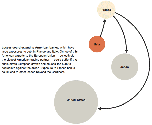
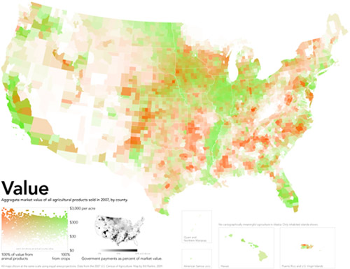
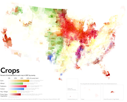
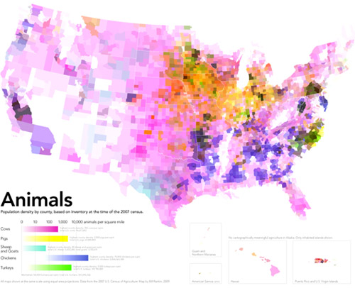
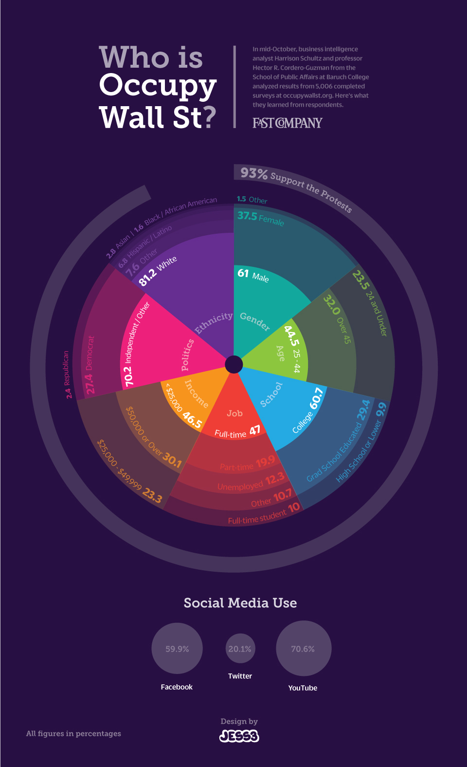
Uncategorized

New York Times 100 Notable Books - Authors' Academic Affiliations

What works

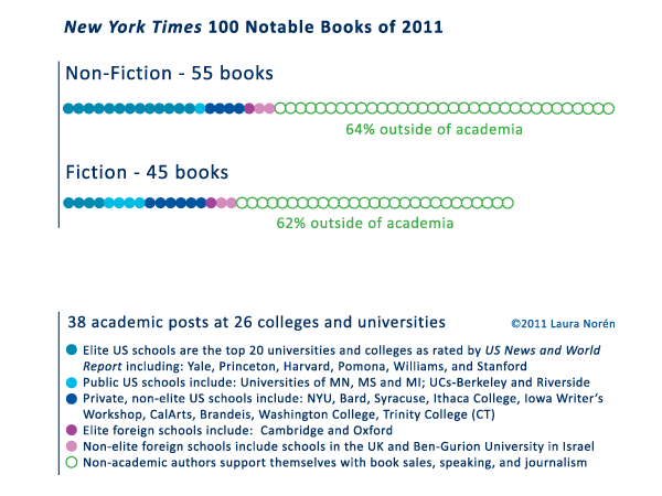
Using the New York Time’s list of 100 Notable books of 2011 that ran over the weekend as part of their Holiday Gift Guide, I created the graph above. As an almost-academic, I am interested in the scope of academic work and found it interesting that less than half of the notable books were written by people with academic affiliations. Michael Burawoy and Craig Calhoun have both called for new roles for scholarship and the university, emphasizing that an academy unhitched from the public sphere is not a viable model and might very well be considered irresponsible, given the scale and scope of social, scientific, and technological challenges facing the globe right now and for the foreseeable future.

So what does it mean that non-academics are writing more of the notable books than are academics?

I cannot answer that question definitively, but I can offer three possible avenues for exploration. First, it could be that academics are irresponsible or lazy and that they have either failed to write well or to address relevant topics. They are off publishing pedantic articles in academic journals that nobody reads to fill out their CVs. This scenario is grave. There is an element of truth to it.

An alternative explanation would be that, in part because this is a *gift* suggestion list, these books are not necessarily the most important, but they are the most well written. If that is the case, then the fact that so many non-academic voices make the list indicate that writing itself is an art, one that is spread much more judiciously across the American populous than are academic positions. It also suggests that thinking clearly and writing well are going on in all sorts of places, not just the ivory tower. This is encouraging. There is an element of truth to it.

A third version of this story begins where the second one left off and suggests that, in fact, if academic books do appear on holiday gift lists of notable books, those academics are shirking their duties as academics. Any book with broad public appeal probably is NOT doing much to advance a field. It’s probably just regurgitating existing research in a kind of “Research Thought X for dummies” kind of way. [Many of the people who adhere to this line of thinking have deep and abiding negative thoughts about Malcolm Gladwell.] The view from this perspective argues that asking academics to be responsible to public audiences is akin to asking people to text and drive. It’s dangerous. It takes one’s eye off the critically important field of action and reorients it, likely towards one’s own navel. The primary activity – analytical research and publishing – will suffer, perhaps taking down innocent bystanders along the way. This is a fairly rigid understanding of the best practice for academic research. There is an element of truth to it.

I invite debate on the points I mentioned and those that I have overlooked in the comments.

What needs work

This graphic is not as elegant as I would like. There are far too many words.

I am fascinated with the nitty gritty details of the schools at which those with academic appointments are working. Including the names of so many schools made the endnotes lengthy. I am of two minds on that. Like I said, I enjoy knowing the details, especially when it comes to fleshing out a category like “Elite.” It’s important to know just how eliteness has been defined. In this case, I used US News and World Report. With respect to most of the schools – Princeton, Harvard, Yale, Oxford, Cambridge, Columbia – I think there is widespread agreement that these schools are at the top of the academic heap and have been for a while. Some might quibble about Pomona and Williams.

The point I was trying to illustrate was that those in academia who have books on the notables list could be seen to be public intellectuals or at least they are doing better at making their work accessible to the public than their colleagues who never make it to such lists. It is especially important that the professors in elite institutions make their work accessible because, unlike their colleagues at public schools or less exclusive private schools, the metaphor about the ivory tower as a mechanism of separation is apt. Very few of us have access to elite institutions. Some have argued that those in academia have some responsibility for making their work accessible to broader publics.

References

Burawoy, Michael. (2005 [2004]) http://ccfi.educ.ubc.ca/Courses_Reading_Materials/ccfi502/Burawoy.pdf [Presidential Keynote Address at the Annual Meeting of the American Sociological Association] American Sociological Review Vol. 70.

Calhoun, Craig. (2006) “Social Science for Public Knowledge”>The University and the Public GoodThesis Eleven Vol. 84(7).

New York Times, Sunday Magazine. (November 2011) “100 Notable Books of 2011” [Holiday Gift Guide]

Who visits occupywallst.org? | Harrison Schultz and Hector R. Cordero-Guzman

What works

The graphic above was constructed using 5,006 surveys filled out by people who visited occupywallst.org. Here’s what the survey found:

Gender
Men 61%
Women 37.5%
Other 1.5%

Age
45 y/o 32%

Race/Ethnicity
White 81.4%
Black, African American 1.6%
Hispanic 6.8%
Asian 2.8%
Other 7.6%

Education
H.S. or less 9.9%
College 60.7%
Grad. School 29.4%

Annual Income
$50,000 30.1%

Employment
Unemployed 12.3%
Part-time 19.9%
Full-time 47%
Full-time student 10%
Other 10.7%

Politics
Support the protest 93%
———————
Republican 2.4%
Democrat 27.4%
Independent 70.7%

What needs work

I have two issues. First, I think the graphic is beautiful but functionally useless. It is nearly impossible to get any intuitive sense of anything at a glance. The circular shape forces the categories to come in the order of their popularity which is not always the most logical order. Look at the income data. That should come in order of least income to most income, but it doesn’t (why would anyone put incremental numerical data out of order?). The rounded sections of wedges are also nearly impossible to intuitively compare to one another in size, so I cannot figure out what the functional value of displaying demographic data in this modified pie chart is. In summary, it appears that the information part of the information graphic did not win the contest between aesthetics and utility. Remember: there should not be a contest between aesthetics and utility in the first place.

My second concern with this graphic is its overall reliability. The FastCompany article it accompanies is titled, “Who is Occupy Wall Street”. That title more than implies that this survey of visitors to a particular website associated with the movement – but not THE official website of the movement (there isn’t one) – accurately represent the protesters on the ground. I don’t think that the professor and his partner who conducted the surveys would make such grand claims.

References

Captain, Sean. (2 November 2011) Who is Occupy Wall Street? FastCompany.

Jess3. (2 November 2011) Who is Occupy Wall Street? [information graphic] FastCompany.

Best sociology books of all time | W. W. Norton

What works

Anthony Giddens, Mitch Duneier, Richard Appelbaum, and Deborah Carr put together this list of keyworks in sociology starting way back in 1837. W. W. Norton illustrated each book with a simple diagram that helps illustrate what that book’s main argument is – some are kind of humorous if you happen to be a sociologist – and then laid the whole thing out in a snake stack.

Here’s what I like:

+ the book list includes Harriet Martineau who is often overlooked
+ the book list is short enough to fit on a poster – ask most sociologists about keyworks and they are likely to still be going on about it a week later.
+ the book list uses graphic depictions of the content – spare but intriguing – rather than an annotated bibliography of short summaries. This version is so much more interesting for having said less. Want to know?: read the book.

What needs work

I would have included Simmel, Toqueville, and Mary Douglas. I might have tried to find a way to represent multiple works by the same author (like Marx, Durkheim, and Weber who appear more than once here) in the same grid slot so that more other authors could be included. In order to accomodate that change, I think it would have been possible to arrange this not in a rigid timeline, but in a partitioned grid with early, middle, and contemporary works (or something like that). Even categories like: >100 years ago, between 50 and 100 years ago, in the last 50 years.

One more quibble – the background color has too much green in it to read as a soft brown. I would have liked a soft brown better. Somehow with the green, it ends up with a repellant quality. HOWEVER, I bet this is one of those situations where the poster was designed to be printed, looks fantastic coming off whatever printer it was calibrated for, and looks slightly more pukey on the screen. Trade offs, trade offs.

Recommendation

I have been mightily enjoying W.W. Norton’s tumblr which is where I found this poster. The archive is the best way to get introduced to what they’ve been doing. It certainly is neither primarily about information graphics nor primarily about sociology, but it is wholly intellectual in the most fun kind of way.

If you are more of a twitter person and/or you would like sociology information more than the potpourri of information on the tumblr, W. W. Norton has a twitter feed, too.

References

Giddens, Anthony; Duneier, Mitch; Appelbaum, Richard; and Carr, Deborah. (16 August 2011) Keyworks in Sociology. [information graphic] New York: W. W. Norton.

Box Plot with code
Box Plot with code

What works

This is elegant and information rich. Box plots are an old standard in the display of quantitative data, useful because they are able to show average tendencies, upper and lower confidence intervals, outliers (nice addition here, outlier display is optional), and thus give not only concrete data points but an impressionistic view of skewness.

You can make box plots like this using your own data. The javascript is available. It was created by Mike Bostock using d3 which is something you should check out. From mbstock’s website for d3.js:

“D3 is a small, free JavaScript library for manipulating HTML documents based on data. D3 can help you quickly visualize your data as HTML or SVG, handle interactivity, and incorporate smooth transitions and staged animations into your pages. You can use D3 as a visualization framework (like Protovis), or you can use it to build dynamic pages (like jQuery).”

I haven’t had a chance to try doing anything much with it yet, but I will. It’s extremely exciting to me and I couldn’t wait for myself to mess around with it. I had to post right away.

What needs work

I need to work – my overscheduled self needs to carve out some time and try it.

Javascript code is available

There are a bunch of javascript codes available for a range of different kinds of visualization, including the box plot and code to make things that look like this:

Chord Diagram | d3.js by mbostock

or this:

Force directed graph | d3.js by mbostock

References

Bostock, Mike. (2011) d3.js repository on GitHub. [Code for generating information graphics] See also: Mike Bostock’s webpage

Network Map of Largest Global Capitalists | New Scientist
Network Map of Largest Global Capitalists | Vitali, Glattfelder, and Battiston

Note: The 1318 transnational corporations that form the core of the economy. Superconnected companies are red, very connected companies are yellow. The size of the dot represents revenue (Image: PLoS One).

The top 50 of the 147 superconnected companies

1. Barclays plc
2. Capital Group Companies Inc
3. FMR Corporation
4. AXA
5. State Street Corporation
6. JP Morgan Chase & Co
7. Legal & General Group plc
8. Vanguard Group Inc
9. UBS AG
10. Merrill Lynch & Co Inc
11. Wellington Management Co LLP
12. Deutsche Bank AG
13. Franklin Resources Inc
14. Credit Suisse Group
15. Walton Enterprises LLC
16. Bank of New York Mellon Corp
17. Natixis
18. Goldman Sachs Group Inc
19. T Rowe Price Group Inc
20. Legg Mason Inc
21. Morgan Stanley
22. Mitsubishi UFJ Financial Group Inc
23. Northern Trust Corporation
24. Société Générale
25. Bank of America Corporation
26. Lloyds TSB Group plc
27. Invesco plc
28. Allianz SE 29. TIAA
30. Old Mutual Public Limited Company
31. Aviva plc
32. Schroders plc
33. Dodge & Cox
34. Lehman Brothers Holdings Inc*
35. Sun Life Financial Inc
36. Standard Life plc
37. CNCE
38. Nomura Holdings Inc
39. The Depository Trust Company
40. Massachusetts Mutual Life Insurance
41. ING Groep NV
42. Brandes Investment Partners LP
43. Unicredito Italiano SPA
44. Deposit Insurance Corporation of Japan
45. Vereniging Aegon
46. BNP Paribas
47. Affiliated Managers Group Inc
48. Resona Holdings Inc
49. Capital Group International Inc
50. China Petrochemical Group Company
* Lehman still existed in the 2007 dataset used

What works

This graphic has been running all over the internet so I will point you to the New Scientist to get the back story. I will focus on the graphic itself.

Network graphics are difficult to produce. They are inherently challenging to graph because network space is Euclidean, not Cartesian. What I mean by that is that the distance between any two nodes in a network cannot be measured in miles or any other linear sort of distance. The distance between two nodes in a network is measured by how many other nodes you would have to go through in order to get from one node to the next. If the two nodes are connected they have a distance of one. If we would have to take a path that hits four other nodes before we can connect our node A to our desired node B, we have a distance of four. That distance does not relate to actual space. The distance between two people in a dorm social network is not the distance between their rooms, it depends on how many friends and friends of friends you would have to talk to if you wanted to get from one person in a dorm to some other randomly chosen person in a dorm.

Representing these paths that are not related to physical distance is hard. Network diagrams are often quite difficult to produce – how do you plot the 1318 nodes in this network of capitalists? Usually people do not create network diagrams by hand, they write code (or use someone else’s code) to make these visualizations. In this case the authors, Stefania Vitali, James Glattfelder, and Stefano Battiston, used the Cuttlefish program developed in their research group and the services of someone acknowledged as D. Garcia.

This graphic is done relatively well. It is easy to see that there is some kind of red cluster though the red cluster is not located in the middle. I think it is better off to the side – if it were in the middle it would be harder to identify it as a cluster because it would just look like the red nodes in the middle. The point of this diagram is to communicate that clustering within these 1318 powerful, globally dominant companies is inherently dangerous because the impact of a copy-cat phenomenon is greater when all the most powerful companies are well-positioned to copy one another. It’s hard for them to get new information when all of their information is coming from within the same highly clustered group of companies.

What would a more stable arrangement look like? In theory, it would look like a network with, oh, say about 4-6 clusters spread around the larger network of these 1318 companies. Rather than one big cluster of the most powerful, there would have been smaller clusters composed of both really big, powerful companies and smaller, less powerful companies. Companies that are not yet at the peak of their power (or trying to get to a new peak of capital under management) are going to look for different kinds of information and thus have different information to share and different management/development strategies in place than the larger, more well-capitalized companies. These two groups might do well to share their information with one another, even if – and maybe especially because – they will not act on it in the same way. The entire capitalist system would be more stable if there were more strategies being tested and rejected simultaneously.

I’m not sure the graphic actually communicates that point on its own, but it certainly makes the case in the text stronger by visually displaying the concentration of capital. It also makes this research more accessible to a broader audience who would not be able to understand the meaning of a clustering coefficient.

What needs work

I like the white background version better than the black background version because it is much easier to see the edges.

1318 biggest capitalists in the world | Glattfelder

Seeing the edges is nice – without being able to see all the little edges scattered around it is possible to think that all edges lead to that central cluster and that there are hardly any connections between nodes that are not in the center.

References

Vitalia, Stefania; Glattfelder, James; and Battiston, Stefano. (2011) “The network of global corporate control” working paper from Systems Design, Zurich ETH.

Coghlan, Andy and MacKenzie, Debora. (24 October 2011) Revealed – the capitalist network that runs the world The New Scientist.

Efficiency Diagram of a Skyscraper | Kate Ascher

What works

Kate Ascher has a new book coming out soon – The Heights: Anatomy of a Skyscraper – which is hopefully just as good as her previous book: The Works: Anatomy of a City. The Works dissected the infrastructure cities need – from solid waste to electricity to water mains – using information graphics and relatively brief textual discussions. In that book Ascher did an incredible job of answering questions everyone has – where does all the garbage go? – and adding information that we probably ought to know but would never think to worry about (like: how can we design cities to mitigate the threat of flash flooding which is exacerbated by all the hard surfaces and the relative dearth of water-absorbing terrain?)

This graphic is from her new book which, from the looks of it and the kind words in Wired Magazine, will be just as good as her previous work. What she does here is display the land-use efficiency of skyscrapers. One of the things skyscrapers do particularly well, their raison d’etre depending on who you ask, is to concentrate activity and resources in a very small footprint. Ascher shows us what that footprint would look like if it were spread out in a typical suburban density. The typical skyscraper in the diagram takes up 60% of a New York City block. Unstacked and spread in a typical suburban-style configuration it would take up 21+ blocks.

What needs work

Nothing needs work here. This is a clever diagram, easy to understand at first glance, easy enough to translate out of the New York City grid by using the number of square feet dedicated to each purpose that Ascher has listed. The colors are well used, the textual explanation provided is necessary but not too much, and the diagonal layout makes the image much more dynamic.

I would love to say more about the diagrams in the rest of the book but I haven’t yet seen it. Hopefully, they are all just as good as this one.

References

Ascher, Kate. (2011) The Heights: Anatomy of a skyscraper. New York: Penguin Books.

Roper, Caitlin. (2011, November) “Sky-High Efficiency” Wired Magazine, p. 36.

Euro Zone Debt Crisis Visualized | Overview: It's all connected
Euro Zone Debt Crisis Visualized | The Immediate Trouble
Euro Zone Debt Crisis | The Risk of Contagion
Euro Zone Debt Crisis | A possible scenario
Euro Zone Debt Crisis | Continental Contagion
Euro Zone Debt Crisis | Global Reverberations

What works

This series of graphics by the New York Times Sunday Review does an excellent job of explaining the European debt crisis in terms of the banking relationships that exist among partners within the Eurozone as well as between Eurozone members and their trading partners outside of the Eurozone. I hardly feel like commenting. The one graphic design decision I loved the most – because it is subtle and easily overlooked – is that after the overview graphic, the total size of the graphic starts small and grows larger. This mirrors the way the crisis itself develops and reinforces that element of the message visually. It would have been extremely easy to simply use the full paste-board available for each of the images in this progression. The designers decided to use the available white space to tell part of the story.

In the overview graphic, the countries that are not impacted or impacted only slightly are represented in grey. In the more detailed graphic progression, these grey elements are dropped out and represented by white space. This is a somewhat counter-intuitive move. Information graphics are supposed to be chock-full of information, right? So why would the designers *drop* countries, especially the US, when running a graphic about the global impact of the European debt crisis in an American newspaper? Because the way they are able to use white space helps drive home one of the key elements of the debt crisis – that it is so far small and could either get much bigger or stay relatively small in the coming months, depending on what steps are taken now to mitigate the rippling out of negative impacts.

What needs work

Nothing needs work. This is a great graphic.

References

Marsh, Bill. (2011, 22 October) “It’s all connected: An overview of the Euro crisis” in nytimes.com Sunday Review. Other authors/designers listed include: Xaqun G. V., Alan McClean, Archie Tse, Seth Feaster, Nelson Schwartz, and Tom Kuntz.

Pie chart humor | I love charts tumblr blog
Pie chart humor | The shouting end of life via I love charts tumblr blog

What works

What can I say, I think it’s funny. Pie chart humor with real pie. Ha.

I am impressed at the time and effort someone put into trimming the pie plates, thinking through the crosshatching, and trying to get some different colors going on.

The text of the original post reads:

“THIS IS THE MOST IMPORTANT VISUAL PUN TO HAVE EVER BEEN POSTED ON THE INTERNET.”

I’d take that with a grain of salt, especially considering the gratuitous use of all caps. Probably it’s meant to be ironic or sarcastic or some other hipster attitude that I am too old to absorb osmotically.

What needs work

I still don’t like pie charts.

References

The shouting end of life tumblr

I love charts tumblr blog

Figure 5. Average Salaries in New York City | Report 12, Office of the New York State Comptroller, Thomas DiNapoli

What works

This may not be the worldest most attractive graphic, but it makes its point: financial workers have much, much higher annual income than the rest of us and the gap is growing over time. The text of the New York State Comptroller’s report said the same thing in words.

Wages (including bonuses) paid to securities industry employees who work in New York City grew by 13.7 percent in 2010, to $58.4 billion. Nonetheless, wages remained below the record paid in 2007 ($73.9 billion), reflecting job losses. In 2010, the securities industry accounted for 23.5 percent of all wages paid in the private sector even though it accounted for only 5.3 percent of all private sector jobs. In 2007, the industry accounted for 28.2 percent of private sector wages.

In 2010, the average salary in the securities industry in New York City grew by 16.1 percent to $361,330 (see Figure 5), which was 5.5 times higher than the average salary in the rest of the private sector ($66,120). In 1981, the average salary in the securities industry was only twice as high as in all other private sector jobs.

You be the judge. I think the graphic leaves a greater impact than the text alone. The two together are striking. Maybe we should…occupy Wall Street to demand a decrease in inequality?

The short report has a few more interesting graphs. First, they throw together a quick graph of Wall Street bonuses. These bonuses are tied to performance and so big that they often represent more than a finance worker’s annual salary. As you can see, they took a dip, but they didn’t disappear even though the US economy is still not great.

Wall Street Bonuses | New York State Comptroller's Report No. 12, 2011

The other interesting metric the report contains is a compensation-to-earnings ratio graph, which is the right context for this discussion. Bankers often defend their large salaries and even larger bonuses by pointing out how much money they have made for their banks. I agree with the bankers that this is the place to look. The question should not be: “How much are individual bankers making?” Rather, it should be, “How much does the banking sector make and is that the way we as a society want to distribute our surplus, primarily to banks and bankers through processes of financialization?”

Ratio of banker's (and insurer's) compensation-to-net-revenues | New York State Comptroller's Report No. 12, 2011

What needs work

The graphs are not attractive and the first one reads as cluttered. I generally go with line graphs for this kind of trend data to cut down on the clutter impact, something I have repeated again and again so I won’t hammer on that point too much. I like the information behind these graphs so I am not going to swat at them too much. Excel is not a graphic design tool for graphs; I have occasionally made some sweet tables with it.

I’m glad the report put these data points into graphs, glad that the report is available during the discussions brought on by the OccupyWallStreet crowd, and glad that the New York State Comtroller’s office rolled right on ahead with the release of some fairly damning evidence against the status quo.

Want more?

Another Society Pages blog, Thick Culture, ran a post including graphs that deal with the compensation and wealth differentials between the tippy-top echelon of financiers and the rest of us at Tax Gordon Gekko.

References

DiNapoli, Thomas and Bleiwas, Kenneth. (October 2011) “The Securities Industry in New York City” Report No. 12, Office of the State Comptroller.

See also: A blog I wrote – Americans estimate our wealth distribution and fail. Horribly. using a Dan Ariely graphic about how bad Americans are at estimating the distribution of wealth in this country. Teaser: we think it is much more equitable than it actually is.

The most popular blog post of all time on Graphic Sociology: Champagne Glass Distribution of Wealth

American Agricultural Value map | Bill Rankin, Radical Cartography
American Cropland map | Bill Rankin, Radical Cartography
American livestock map | Bill Rankin, Radical Cartography

What works

Produced by Bill Rankin, Assistant Professor of History of Science at Yale University and editor/graphic designer at Radical Cartography, these three maps work together to show how American agriculture is organized both spatially and economically. [Click through to Radical Cartography to see much bigger versions. Since that site is in Flash, I can’t embed links that take you directly to the big versions. Once you get to Radical Cartography click: Projects -> The United States -> Animal/Vegetable.] The top map here is the dollar value combination of the cropland and livestock areas in the US. For activist types, what’s even more exciting is the small black and white inset map that takes into account federal agriculture subsidies. The next two maps were combined to produce the top map – one shows how cropland is distributed, the other displays the distribution of livestock.

Bill Rankin is a rigorous researcher with a background in history and the thing he does best here is context. In order to understand the top map – which is what I believe Prof. Rankin wants viewers to store in their memory banks as the critical take-away – he first shows us how cropland and livestock land are distributed and then layers them over one another to show us how they are differentially valued. This type of data is sensitive to geography and location in two ways: 1. crops are sensitive to elements of geography like climate and available water supplies – there are no crops growing in the dessert of the American southwest 2. because the US hands out a variety of agricultural subsidies, the political boundaries of states have to be seen in conjunction with the crop distribution in order to understand how the political levers lead to the current subsidy scenario.

What needs work

The approach he takes is to color each county based on the percentage of area covered by a particular crop. This means that counties with multiple crops will end up with blended color values. For instance, cotton is coded blue and ‘fruits, nuts, and vegetables’ are coded maroon. This means that in some southern counties growing roughly equal amounts of cotton and ‘fruits, nuts, and vegetables’ the counties are neither blue nor maroon but purple. But wait. The blue of cotton might have combined not with the maroon of ‘fruits, nuts, and vegetables’ but with the brighter red of soybeans to produce that purple color. Confused? I am. I don’t know if those southern counties are a mix of peanut and cotton farms (likely) or a mix of soybean and cotton farms (also likely).

Another problem with the additive colors is that the choice of each color has a major impact on the impressionistic take-away of the maps overall. Corn is the most prevalent crop in the US covering over 144,000 square miles. The next most prevalent crop is soybeans which covers about 100,000 square miles. Soy beans and corn are often grown in the same counties (unlike, say, wheat which is a hardier crop and therefore ends up as a monoculture in northern counties where growing corn and soy are riskier endeavors). This means that soy and corn are going to have layering colors the same way that we saw crops layering with cotton along the Mississippi River in the south. Since the bright red color for soy is more aggressive than the somewhat subdued dusty orange chosen for corn, the impression we take away from the map is that soy is more prevalent than corn where the opposite is true. If the color values had been switched so that corn was coded in bright red and soy was coded in the dusty orange, the middle section of the country would end up looking like a corn field, not a soy bean field. Either way, the trouble with blending colors is that our eyes are not very good at looking at a color and saying – “Gee, that looks like it’s about 50% blue and 50% red.” We just say, “Gee, that looks like purple”. Or, in this case, “Gee, all those reddish colors either look like soy beans or maybe an 80% coverage of the ‘fruit, nut, vegetable’ category.”

A solution (that I am too lazy to put together)

In summary, the inclination to display crop and livestock coverage using maps was a solid inclination. I often criticize the inappropriate use of maps. In this case, I still think it could have gone either way. A clever Venn-diagram that used circles based on the total coverage of each crop which then overlapped with other crops in places where they are grown together could have been more illustrative. It would have been easier to see that corn is king, for instance, and that cotton and wheat are never grown together because cotton needs heat and wheat is cold-tolerant. The same sort of Venn-diagram could have been constructed for livestock. A final Venn diagram where the size of the circles is keyed to the dollar-per-square mile value of these crops could have then displayed how agriculture functions economically.

References

Rankin, Bill. (2009) Food: Animal/Vegetable” [Information Graphic, Flash] RadicalCartography.net.