Uncategorized

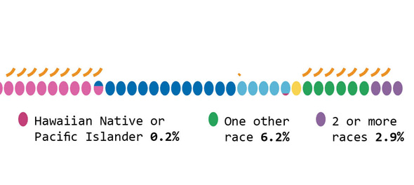
Intro to assisted fertility

Any successful pregnancy is viable with just one egg. As an increasing number of women delay pregnancy until their 30s and 40s, getting pregnant is increasingly a sociotechnical process. Assisted reproductive technologies can force women’s ovaries to produce a clutch of eggs at once…but it cannot force women to produce high quality, viable eggs. Quality still depends on age, with a higher rate of chromosomal abnormalities present in any given egg, the older mom is. The question becomes: what quantity of mixed quality eggs is enough to get to a live birth? Is the likelihood of getting a live birth correlated with the number of eggs retrieved? Yes. But how many eggs does it take?

As with almost all fertility issues, that question rests on the age of the egg. Usually, the age of the egg is the same as the age of the mom-to-be. Now that eggs can be frozen (in time and in the freezer), the age of the egg can be younger than the age of the mom-to-be.

A study by Sunkara, Rittenberg, Raine-Fenning et al. looked at data from 400,135 IVF cycles performed in the UK from 1991 to 2008. They found that 15 eggs is basically the magic number. No matter her age, a woman’s chance of getting a live birth increases up to ~15 eggs. Less than that OR more than 20, her chances for live birth are lower. Notably, most women did not make 15 eggs: “The median number of eggs retrieved was 9 [inter-quartile range (IQR) 6–13] and the median number of embryos created was 5 (IQR 3–8).”

For those freezing eggs, it is especially productive to wonder how the number of frozen eggs impacts the chance of a live birth because egg freezers could opt for more than one cycle (if they can afford it). The study I am quoting does NOT look at egg freezers, it only looks at IVF patients. There are not enough egg freezers who have gone on to try to become moms to produce data nearly this robust. Biologically, the stimulation protocol for egg freezers and IVF patients is largely the same so the number of eggs harvested should be decently reliable across populations. Egg freezers may produce more eggs than IVF patients, because egg freezers aren’t reporting infertility. On the other hand, IVF patients in this study were infertile for a number of reasons, the largest percentage had male-factor infertility. Pregnancy rates may vary between IVF and egg freezing patients. IVF patients usually get pregnant using fresh embryos. If they do freeze material before implantation, they usually freeze embryos which survive the thawing process better than a single egg does.

What Works

The nomogram above is able to display chances of live birth by age group using a U-turn in the trend line for each age cohort. This demonstrates that the chance of live birth rises until 15 and then drops for egg counts higher than ~20 no matter how old the woman.

This graphic has a number of key characteristics. First, it is legible in black and white, which is key for printing in academic journals. Academic journals rarely print in color. Second, the nomogram allows each age cohort to be visualized without overlap. If this were presented with a million lines – one for each age cohort – there would be overlap or bunching and it would be harder to understand each age cohort clearly. Third, the U-turn shape allows us to see that there is an optimal number of eggs, above and below which sub-optimal outcomes arise. Fourth, the authors do not try to hide the fact that these types of assisted fertility are low probability events. The maximum probability of a live birth is just over 40% for the youngest cohort of women who produce the optimal number of eggs for retrieval.

Overall, the two key strengths of the nomograph type are that it is able to show each age cohort without overlap and that it allows for the data to U-turn in cases where there is an inflection point.

What needs work

Many of us are accustomed to comparing slopes in trend lines. This format does not allow for any kind of slope, making it difficult to visualize the shape of the trend. From looking at other plots, live-by-birth by eggs retrieved appears to be a Poisson distribution. In other words, it is a lot better to have, say, 8 eggs retrieved than 7, but only a little bit better to have 15 eggs retrieved than 14 because the slope rises faster for smaller numbers. The nomogram *does* visualize this. Look at all the space between 1 and 2 eggs retrieved and the small amount of space between 14 and 15 eggs retrieved. I happen to think it is easier to understand the changes in relative marginal impact with slopes than distances. That could simply be because I am more used to seeing histograms and line charts than nomograms, but I see no reason to pretend that visual habits don’t matter. Because people are used to making inferences based on slopes, using slopes to visualize data makes sense.

What does this mean for fertility

Women who are undergoing IVF – meaning that they are aiming to end up with a baby ASAP – cannot do much more than what they are already doing to increase their egg count. Women who are planning to freeze their eggs for later use may be able to use this information to determine how many cycles of stimulation they undergo. One cycle may not be enough, especially if they are expecting to have more than one child. Eggs from two or more stimulation cycles can be added up to get to the 15-20 egg sweet spot per live birth.

Of course, egg freezing is still an elective procedure not covered by insurance. The cost is likely to prohibit many women from pursuing even one round of egg freezing, let alone multiple rounds.

References

Sesh Kamal Sunkara, Vivian Rittenberg, Nick Raine-Fenning, Siladitya Bhattacharya, Javier Zamora, Arri Coomarasamy; Association between the number of eggs and live birth in IVF treatment: an analysis of 400 135 treatment cycles. Hum Reprod 2011; 26 (7): 1768-1774. doi: 10.1093/humrep/der106

Stakeholder Theory Diagram - Firm Centric. Based on R. Edward Freeman
Stakeholder Theory Diagram – Firm Centric. Based on R. Edward Freeman

What Works

Many business courses introduce students to the stakeholder theory of management (Freeman, 2007) which offers a theoretical model that effectively opposes shareholder models in which decisions end up being viewed solely from the perspective of what might serve the firm’s financial goals. In many firms, financial goals are tied to shareholders or venture capitalists or other sorts of more creative investing scenarios.

I find that it is useful to show students a finance-centri version of the same diagram to make the point that the goals of finance (or financiers) are not exactly the same as the goals of the overall firm.

Stakeholder Theory Diagram - Finance- or Profit-Centric. Based on R. Edward Freeman
Stakeholder Theory Diagram – Finance- or Profit-Centric. Based on R. Edward Freeman

Once students see that finance and the firm are distinct, they are more open to the suggestion (which is made in R. Edward Freeman’s article) that any of the primary stakeholders could be viewed as the central stakeholder. In fact, as a theoretical exercise, every primary stakeholder *should* cycle into position at the center of the stakeholder donut to help understand what each stakeholders priorities are and what all the diverse sources of value may be.

When employees are at the center of the diagram, job tenure and ability to move into fresh and better-paid positions becomes part of the conversation. This is not some revolutionary idea in management. It’s the type of knowledge that becomes available in an organized way by systematically using the diagram to consider each successive primary stakeholder as the most central stakeholder.

Stakeholder Theory Diagram - Employee Centric. Based on R. Edward Freeman
Stakeholder Theory Diagram – Employee Centric. Based on R. Edward Freeman

When customers are at the center of the model, the user experience, product durability, cost, and delivery become the most salient characteristics alongside marketing and, for a growing number of customers, social and environmental responsibility.

Stakeholder Theory Diagram - Customer Centric. Based on R. Edward Freeman
Stakeholder Theory Diagram – Customer Centric. Based on R. Edward Freeman

What needs work

This set of static diagrams would work better as an animation.

Still, using them one after the next in a slide deck allows time to have a class discussion about what is at stake when the central stakeholder changes.

The New York Times Notable Books, 1998-2014; The emergence of gender equality

What works

The above graphic represents the absolute volume of authors who have been mentioned in The New York Times year-end list of notable books. Since 2004 the newspaper has capped the list at 100 books, but prior to that the total number of listed books varied significantly from year to year. Therefore, displaying the absolute number of books considered notable is more illustrative of patterns within the organization than showing only the relative percentage of authors by gender.

One of the interesting things that this visualization implies is that capping the list at 100 at first drastically reduced the absolute number of authors who were mentioned in the list, but that this burden hit women hardest. During the first year after the cap was introduced only five women who wrote works of non-fiction in the previous year were mentioned. Fourteen women novelists and poets were listed. That’s only 19% of the hundred authors considered notable that year. In fact, I would argue that the most notable quality of the list that year was its dismal gender parity. It is possible some in the organization were able to confront the gender disparity because it started to move closer to 50/50, jumping to 39/61 the next year. But then…the best intentions may have faltered as the proportions slipped little by little back towards the one-third women, two-thirds men scenario that was more or less the pattern in the pre-2004 years.

Then in 2012 numbers once again jumped to 40/60. And in 2013 and 2014 the numbers held steady at an even split overall AND there was gender parity within the fiction and non-fiction verticals. In my head, I imagine some firm voice at a meeting demanding a quota, dammit, because all past efforts to agree to do the right thing with respect to gender parity had resulted in a lukewarm 40/60 that couldn’t hold up for more than a year at a time. This same voice probably also pointed out that it was not going to work to disproportionately recognize women novelists and poets and continue to leave women non-fiction writers under-appreciated. The quota covered the overall balance of the 100 notables and it applied within the fiction/poetry and non-fiction verticals. OK. That took a while.

Gender isn’t the only category of interest in these top book lists. Back in 2011 I looked at the number of academic authors who had made the list to better understand the backgrounds of our public intellectuals. Unsurprisingly, the NYTimes turned out to be partly populist, partly academic aristocracy.

What needs work

As with so many depictions of gender, this one is locked into a gender binary. There were some trans authors mentioned. For example, Deirdre McCloskey’s Crossing: A memoir made the list in 1999. In her case, since she currently identifies as a woman, I counted her as a woman even though her book was about the experience of transitioning from one gender to another. It is an exemplary instance of why it might be more accurate to have a gender spectrum instead of a gender binary. Alas, I didn’t visualize that here. I’m not yet up to that challenge. I also failed to deal with publications released by committees or coalitions. Since they were impossible to categorize with respect to gender I left them out. The best example of a left out publication is the 9/11 report.

Another problem with this graphic is that it is static, not interactive. It would be more interesting if it had hover-over capabilities that could pop up the absolute numbers to which the area of the shapes are representing.

The gender disparity in the highest reaches of the literary scene is well known and widespread. Keep reading for some history on the gender parity problem in the literary profession that demonstrates both how well known and widespread it is. Choosing to represent only a single reviewing organization – The New York Times notable books list – is faulty in a couple ways. First, it implies that this particular organization is somehow at fault for a pattern that has been shown to be endemic in the field. Second, The New York Times has taken what appear to be successful steps towards ensuring an equal number of women and men get accolades for their work, regardless of whether they write fiction or non-fiction. This is a great success with respect to gender equity within that particular list, but it is lazy to assume other literary review organizations have been as successful. In fact, VIDA reports that most other organizations are still struggling to get to gender parity in terms of the authors whose books are reviewed and in terms of which types of people are publishing the reviews.

The history of gender equity in literary publishing

There is an entire organization set up to investigate the gender parity problem in literary circles called VIDA. Their mission is to “to increase critical attention to contemporary women’s writing as well as further transparency around gender equality issues in contemporary literary culture” using a “research driven” methodology. Since 2010 they have been putting together pie charts that show the gender parity within a whole range of literary field publications, including The New York Times book review, The New York Review of Books, n+1, The New Yorker, and many others. Also, they look at the gender of the people writing the reviews in addition to the gender of the people whose books are being reviewed.

These pie charts are all from The New York Times book review because that is where the data for the chart above was published. VIDA has many more pie charts available. Part of what I was trying to do with the chart above is improve on the pie chart visualization technique.

VIDA-New-York-Times-Authors-2010

VIDA-New-York-Times-Authors-2011

VIDA-New-York-Times-Authors-2012

VIDA-New-York-Times-Authors-2013

VIDA uses a team of interns to gather the publication history of all the newspapers and magazines they consider part of the literary scene. Mostly, these interns are unpaid. That is amazing. For the chart above, I grabbed all the data and did not rely on what they had done.

What else could work: A Datathon

Most savvy computational sociologists would recommend using a web scraper to generate a database with publication information and take a first pass at assigning a gender to the authors and reviewers. Some authors and reviewers will use initials (e.g. J. K. Rowling), have gender-ambiguous names (e.g. Pat, Parker, Taylor), or have otherwise difficult to gender-ize names. These would still need to be investigated by humans equipped with a search engine, but the workload would be dramatically reduced.

Does anyone feel like getting together at a datathon and scraping all the web-based publishers in a single weekend? Reply in comments.

References

100 Notable Books of 2014 The New York Times Published 2 December 2014.

100 Notable Books of 2013 The New York Times Published 27 November 2013.

100 Notable Books of 2012 The New York Times Published 27 November 2012.

100 Notable Books of 2011 The New York Times Published 21 November 2011.

100 Notable Books of 2010 The New York Times Published 24 November 2010.

100 Notable Books of 2009 The New York Times Published 6 December 2009.

100 Notable Books of 2008 The New York Times Published 26 November 2008.

100 Notable Books of 2007 The New York Times Published 2 December 2007.

100 Notable Books of 2006 The New York Times Published 3 December 2006.

“100: Fiction and Poetry Notable Books of the Year.” New York Times (1923-Current file): 3. Dec 04 2005. ProQuest. Web. 27 Jan. 2015. [Note: This file also included non-fiction titles though that would not be implied from the document’s title. For inexplicable reasons, the 2005 Notable Books list was not available through The New York Times search function at nytimes.com and had to be downloaded through the ProQuest database which is a proprietary service that I accessed through the New York University library.]

100 Notable Books of 2004 The New York Times Published 5 December 2004.

Notable Books of 2003 The New York Times Published on 7 December 2003.

Notable Books of 2002 The New York Times Published 8 December 2002.

Notable Books of 2001 The New York Times Published 2 December 2001.

Notable Books of 2000 The New York Times Published 3 December 2000.

Notable Books of 1999 The New York Times Published 5 December 1999.

Notable Books of 1998 The New York Times Published 6 December 1998.

VIDA Count of books reviewed by the New York Times book review in 2010 VIDA Published 16 May 2011.

VIDA Count of books reviewed by the New York Times book review in 2011 VIDA Published 28 January 2012.

VIDA Count of books reviewed by the New York Times book review in 2012 VIDA Published 28 January 2013.

VIDA Count of books reviewed by the New York Times book review in 2013 VIDA Published 24 February 2014.

Dissertation defended

I defended my dissertation last fall and am returning to Graphic Sociology to keep writing about data visualization. The field has advanced quite a bit since I started this blog. In order for me to catch up I’m going to be learning new skills like web-scraping, software-driven visualization, and web-based interactive graphics.

My progress will be slow and self-taught, but I’ll try to explain what I’m learning along the way in case readers want to join in.

us-hispanic-population

What works

The Hispanic population is the fastest growing minority ethnic group in America. In the previous post about Race and Ethnicity in America, I showed the overall racial and ethnic proportions in America (2010 data). The graphic here specifically looks at what we mean when we say Hispanic in America. The predominant country of origin for Hispanic Americans is Mexico, accounting for almost two-thirds of the Hispanic population (63%). The Mexican American population continues to grow; Mexico is a much more populous place than, say, Puerto Rico, Cuba, or the Dominican Republic which is one explanation for the disparity in locations of origin. However, because Puerto Rico is part of the United States, it is the next largest source of Hispanic Americans at 9.2% followed closely by Hispanics from Central American countries at 7.9%.

What needs work

Admittedly, the graphic is nothing special just a stacked bar. I’m sharing it because it seemed miserly of me withhold it since it offers a better understanding of the ethnic make-up of America than the previous graphic alone. I probably should have posted it in the previous post, but it’s too late for that now.

References

Ennis, Sharon, Merarys Rios-Varga, and Nora Albert. 2011. The Hispanic Population. Census Briefs 2010. US Census Bureau.

race-and-ethnicity-in-america

What works

This graphic does a great job of depicting race and ethnicity as distinct concepts. The orange hash marks above the racial groupings indicate the proportion of people in the racial categories that are also Hispanic by ethnicity. I made this to correct the graphics that lump race and ethnicity together (and – bafflingly – they still add up to 100%).

Race and ethnicity are not the same. Race refers to differences between people that include physical differences like skin color, hair texture and the shape of eyelids though the physical characteristics that add up to a social decision to consider person A a member of racial group 1 can change over time. Irish and Italian people in America used to be considered separate racial groups, based in part on skin color distinctions that most Americans could no longer make. What does “swarthy” look like anyway?

Ethnicity – a closely related concept – refers to shared cultural traits like language, religion, beliefs, and foodways. Often, people who are in a racial group also share an ethnicity, but this certainly isn’t always true. American Indians are considered a racial group but there are hundreds and hundreds of distinct tribes in the US and their religions, beliefs, foodways, and languages vary from tribe to tribe. Hispanics in America often share common language(s) (Spanish and/or English) but they may not share the same race. At the moment, most Hispanics in America self-identify as white. I have often wondered if, when I’m 60, the ethnic boundaries currently describing Hispanic people will have faded away, much like the boundaries describing Italian and Irish folks faded away, becoming more of a symbolic ethnicity that can become more important during the holidays and less important during day-to-day life.

What needs work

The elephant on the blog is that I have been on hiatus since February. I’m writing my dissertation and I plan to stay on hiatus through the spring to finish that. My decision may seem irresponsible from the perspective of regular readers and I apologize for my absence.

Close-up of graphic
Close-up of graphic


As for the graphic, it was designed to run along the bottom of a two-page spread so it does not work well here on the blog. If anyone wants a higher-resolution version to use in class or in a powerpoint, shoot me an email and I’ll send it.

References

US Census, 2012 using 2010 data.

Through the Gyre by Jacob McGraw-Mickelson via GOOD Transparency

Information graphics and Illustrations

Information graphics generally do not include significant elements of illustration. It is even more rare that they are dominated by illustrations the way “Through the Gyre” is. Jacob McGraw-Mickelson created the illustration – it’s his imagination of what the Pacific Gyre might be like, not an anatomical cross-section. Using an illustration in a place where we come to expect something schematic and, therefore, representative of reality could be a dangerous play-on-truth using images and conventional expectations to convince viewers of a truth they will never be able to confirm. The Pacific Gyre is nearly impossible to visualize because it is operating at competing scales. The pieces of plastic are teeny tiny but they cover a swath of ocean that’s about as big as Texas. Reports of its density at various depths are still being developed.

Because the gyre is so difficult to visualize McGraw-Mickelson’s illustration of it has an easy time standing in for reality. We have no other photographs or scientific diagrams (yet) that aim to give us a visual overview. The ease of convincing a viewership could be seen as a kind of deceit-with-images but I prefer to think of it as art in the service of environmentalism. It may not be ‘representative’ of reality or even provide a schematic for thinking through oceanographic relationships. But it does bring gravity and depth to the following factoids that were developed as more traditional information graphics around the main illustration of the gyre.

Location of Pacific Gyre - Zoom of "Through the Gyre" by Jacob McGraw-Mickelson and GOOD transparency
Location of Pacific Gyre – Zoom of “Through the Gyre” by Jacob McGraw-Mickelson and GOOD transparency
Make-up of plastic pieces in the Pacific Gyre - Zoom of "Through the Gyre" by Jacob McGraw-Mickelson
Make-up of plastic pieces in the Pacific Gyre – Zoom of “Through the Gyre” by Jacob McGraw-Mickelson
Impact of the Pacific Gyre - Zoom of "Through the Gyre" by Jacob McGraw-Mickelson and GOOD transparency
Impact of the Pacific Gyre – Zoom of “Through the Gyre” by Jacob McGraw-Mickelson and GOOD transparency

What Works

This graphic gave me a whole new way to think through problems related to representing important concepts and ideas that do not have clear schematics, photos, or graphics but can inspire deep reflection. I bought a copy of the print of just the ‘gyre’ to remind myself to be cautious about my embrace of the American lifestyle. I could end up eating that plastic bag again someday as it makes it way into the food cycle.

References

McGraw-Mickelson, Jacob. (2009) “Through the Gyre” [illustration] featured in 2009’s best information graphics at GOOD Transparency blog

50 years of space Exploration
50 years of space Exploration | by Sean McNaughton and Samuel Velasco
50 years of space exploration, zoom-in
50 years of space exploration, zoom-in | by Sean McNaughton and Samuel Velasco

Why space exploration is like a small-group network graph

This blog is supposed to be about social data and while there are certainly social components to space exploration, that’s not the angle I am going to discuss here. [See Alex Madrigal’s piece in The Atlantic Moondoggle: The forgotten opposition to the space program” to get a taste of the sociopolitical forces behind the American space program.] Rather, what excited me about this graphic was the form and it’s potential application to relatively small network visualizations. Here’ what I’m thinking: say you have small work groups (like, for instance, in my dissertation) and you would like to visualize some kind of behavior or linkage pattern in that network. You might also like to have the power hierarchy in the visualization – and this would be the structural hierarchy that exists in relation to, but not as a cause of, the pattern of linkages and/or traffic in the network. You could use a nest-y network map like this:

Clear, well-visualized network graph

OR…the formal standards in the space exploration graphic could be modified to suit network traffic, assuming a network with a small number of nodes. The planets could be people and they could be scaled and positioned to reflect their structural hierarchy. The edges – which in the space graphic are the trips – could be meetings or emails or any other kind of linkage that is important in the network. In the case of meetings, some meetings last longer or are otherwise more consequential so the edge could be thicker or more saturated with color.

Lots of network analysis looks at big networks where the nest-y network graph visualization technique is a good fit. But networks with fewer nodes and edges in which we know something about the social structure of the arrangement end up losing some of that context when they are represented in the nest-y network graphs. Those graphs are designed to help identify patterns where researchers either do not know much about the patterns in the first place or want to find an unbiased way to test their assumptions about the patterns they will find. But with the networks I am studying, I have discovered social patterns through ethnographic methods that I would like to have represented in my graphs. This space exploration graphic looks a lot like my back-of-napkin sketches for small groups. Of course, it is far more polished and more well-integrated with the ‘site plan’ running along the bottom of the graphic that helps establish scale, much like the way architect’s include a thumbnail site plan on their blue prints to establish a context for the siting of the building that’s represented in much greater detail on the plan.

Coming attractions

Over the next week, I hope to have a better sketch of a small-group network informed by ethnographic research up on Graphic Sociology.

References

Graphic Designers
Sean McNaughton, National Geographic Staff, www.nationalgeographic.com
Samuel Velasco, 5W Infographics, www.5wgraphics.com [this website was under renovation at the date of this blog post]

Madrigal, Alex. (Sept. 2012) Moondoggle: The forgotten opposition to the space program”. The Atlantic.

Hat-tip to Adam Crowe and <a href="http://www.flickr.com/photos/adamcrowe/sets/72157622579426670/"his flickr account.

Housing vacancy rate in Wisconsin, 2010
Housing vacancy rate in Wisconsin, 2010 | Jan Willem Tulp

What works

The “Ghost Counties” interactive visualization by Jan Willem Tulp that I review in this post won the Eyeo Festival at the Walker Art Center last year. The challenge set forth by the Eyeo Festival committee in 2011 (for the Festival happening in 2012) was to use Census 2010 data to create a visualization using Census data that did not rely on maps…or if it did rely on maps, it had to use maps in a highly innovative way. This is an excellent design program – maps are over-used. Yet it’s one thing to assert that maps are over-used and another thing to produce an innovative graphic representation that is not a map.

Tulp does a great job of leaving the map behind. He also does a phenomenal job of incorporating a large dataset (8 Mb of data serve the images in the interactive graphic from which the stills in this post were captured). The graphic has a snappy response time once it has loaded and his work makes a solid case for the beautiful union of large data and clear representation thereof.

The color scheme is great and reveals itself without a key. Those counties with low vacancy are teal, those sort of in the middle are grey-green, and those with high vacancy are maroon. The background is light, but not white. White would have been too stark – like an anesthetized space. He experimented with darker backgrounds (see his other options at his flickr stream here) but those ended up presenting an outer space feel. The background color he settled on was (and is) the best choice. Background colors set the tone for the entire graphic, along with the font color, and Tulp’s work is positive evidence of the value of carefully considering them.

Pie charts might be better than circles-in-circles

The dot within a dot is difficult for the eye to measure. Pie charts- which I only recommend if there are very few wedges – would have worked well with this type of data because there are only two wedges (see here for an example of a two wedged pie chart). I just finished reading Alberto Cairo’s important new book The functional art and he had a solid critique of the circle-in-circle approach that helped me realize what’s so appealing, but just plain wrong, about circles-in-circles:

“Bubbles are misleading. They make you underestimate difference….If the bubbles have no functional purpose, why not design a simple and honest table? Because circles look good. (emphasis in original)”

In this case, a wedge in a pie chart could have represented the percent of total housing units occupied.

Why is it so hard to ‘see’ rural vs. urban?

The x-axis is a log scale for population size. It’s clear from what we know about the general trend towards urbanization that we would expect urban areas to have lower vacancy rates than rural areas. Even in 1990 – two census surveys before the 2010 data that was used here – the New York Times ran a story about the population decline in rural America and there has been widespread coverage of the trend towards urbanization by both journalists and academics (the LSE Cities program does nice work).

Housing vacancy rate in Minnesota, 2010
Housing vacancy rate in Minnesota, 2010 | Jan Willem Tulp
Housing vacancy rate in New York, 2010
Housing vacancy rate in New York, 2010 | Jan Willem Tulp

The two states shown here – New York and Minnesota – both have some big cities and a whole of small cities in rural areas. Some small cities are also in suburban areas. That’s a problem with this visualization, the distinctions that have been established in academic literature between rural, suburban, ex-urban, and urban are difficult to pick out of this visual scheme. While it would be difficult to find a sociologist who could wrangle the data to produce this kind of visualization, I imagine many of my intellectual kin would be confused by this visual scheme and demand to return to a map-based graphic because at least in that case they could see patterns associated with the rural-urban spectrum the old-fashioned way. I am not wedded to the notion that a map is the only way to “see” the rural-urban spectrum, but the current configuration makes it difficult to think with the existing literature about housing patterns even though the attempt to distinguish between population size was built into the graphic on the x-axis. Population size is not always a great proxy for urban vs. rural, so it is a weak operationalization of spatial concepts social scientists have found to be meaningful. For instance, a small, exclusive ex-urban area filled with wealthy folks and their swimming pools is conceptually much different from a small, depopulating rural town even if they have roughly similar population sizes.

It is important in a research community to build on good existing work and reveal the weaknesses of existing work where it’s falling short. Either way, it is a bad idea to ignore existing work. Where a project does not relate to existing work – neither building momentum in a positive direction nor steering intellectual growth away from blind alleys – it will likely become an orphan. In this case, the project is only an orphan with respect to urban scholarship. As a computational challenge, it most definitely advanced the field of web-based interactive visualization of large datasets. As a visual representation, it adhered to a design aesthetic that I would like to see more of in academic work. But as a sociological analysis, it’s nearly impossible to ‘see’ clearly or with new eyes any of the existing questions around housing patterns. It is also my opinion – and this is far more easily contested – that it does not raise new important questions about housing patterns in urban, suburban, or rural America either.

My critique here is not that all data visualization is pretty but useless and that we should stick to our maps because they tie us to our existing disciplines and silos of knowledge. Rather, my critique is that in order for data visualization to become a useful tool in the analytical and communication toolkits of social scientists, the work of social science is going to have to find a way into the data visualization community. As anyone who has tried to use Census data knows, looking at piles of data is not synonymous with analysis. While Tulp’s graphics certainly present an analysis, that analysis seems to have turned its back on a fairly sizable swath of journalism on urbanization, not to mention the hefty body of academic work on the same set of topics.

Graphic Sociology exists in part to find a way to keep social scientists motivated to produce higher quality infographics and data visualizations than what is currently standard in our field. But the blog is equally good for sharing a social scientific perspective with computer scientists and designers who are ahead of us with respect to the visual analysis and display of social data. There is a way to bring the strengths of these fields together in a meaningful, positive way. We are not there yet.

References

Cairo, Albert. (2013) “The Functional Art: An introduction to information graphics and visualization.” Berkeley: New Riders.

Eyeo Festival.

Tulp, Jan Willem. (2011) “Ghost Counties” [Interactive Visualization] Submitted to Eyeo Festival and selected the winner in 2012.

Hot Dog Eating Contest Graph
Hot Dog Eating Contest Graph – Large version

Preface to the book review series

There are two ideal types of infographics books. One ideal type is the how-to manual, a guide that explains which tools to use and what to do with them (for more on ideal types, see Max Weber). The other ideal type is the critical analysis of information graphics as a particular type of visual communications device that relies on a shared, though often tacit, set of encoding and decoding devices. The book reviews I proposed to write for Graphic Sociology include some of each kind of book, though they lean more towards the how-to manuals simply because more of that type have come out lately. As with all ideal types, none of the books will wholly how-to or wholly critical analysis.

I meant to review two of Edward Tufte’s books first so that we would start off with a good grounding in the analytical tools that would help us figure out which parts of the how-to manuals were likely to lead to graphics that do not commit various information visualization sins. However, I have spent the past six weeks at a field site (a graphic design studio nonetheless) and it rapidly became completely impractical to lug the two oversized, hard cover Tufte books around with me. I found Nathan Yau’s paperback “Visualize This” to be much more portable so it skipped to the head of the line and will be the first review in the series.

The Tufte review is next up.

Review of Visualize This by Nathan Yau

Visualize This book cover

Yau, Nathan. (2011) Visualize This: The FlowingData guide to data, visualization, and statistics Indianapolis: Wiley.

Visualize This is a how-to data visualization manual written by statistician Nathan Yau who is also the author of the popular data visualization blog flowingdata.com. The book does not repeat the blog’s greatest hits or otherwise revisit much familiar territory. Rather, this was Yau’s first attempt to offer his readers (and others) a process for building a toolkit for visualizing data. The field of data visualization is not centralized in any kind of way that I have been able to discern and Yau’s book is a great way to build fundamental skills in visualization that use tools spanning a range of fields.

The three primary tools that Yau introduces in the book are two programming languages – R and python – and the Adobe Illustrator design software. Both R and Python are free and supported by a bevy of programmers in the open source world. R is a programming package developed for statistics. Python has a much broader appeal. Both of them can produce data visualizations. Adobe Illustrator is neither free nor open source but it is worth the investment if you are planning to do just about any kind of graphic design whatsoever, including data visualizations. Yau mentions free alternatives, and there are some, but none have all of the features Illustrator has.

Much of the book starts readers off building the basic bones of a visualization in R or python, based on a comma-separated value data file that has already been compiled for us by Yau. He notes that getting the data structured properly often takes up more than half the time he spends on a graphic, but the book does not dwell much on the tedium of cleaning up messy data sources. Fine by me. One of the first examples in the book is a graphic built and explored in R, then tidied up and annotated in Illustrator using data from Nathan’s Hot Dog Eating contest.

This process is repeated throughout:
   1. start visualizing data with programming;
   2. try to find patterns with programming;
   3. tidy up and annotate output from program in Illustrator.

The panel below shows you what R can do with just a few lines of code. Hopefully, it also becomes clear why it is necessary to take the output from R into Illustrator before making it public.

Visualize This - example from chapter 4
Visualize This – example from chapter 4

Great tips

There are hints and tips sprinkled throughout the book covering everything from where to find the best datasets to how to convert them into something manageable to how to resize circles to get them to accurately represent scale changes. This last tip is one of my favorites. When we visualize data and use circles of varying sizes to represent the size of populations (or some other numerical value) what we are looking at is the area of the circle. When we want to represent a population that is twice as big as the size of some other population, we need to resize the circle so its area is twice as big, not its circumference.

How to scale circles for data visualization

More great tips:
1. First, love the data. Next, visualize the data.*
2. Always cite your data sources. Go ahead and give yourself some credit, too.
3. Label your axes and include a legend.
4. Annotate your graphics with a sentence or two to frame and/or bolster the narrative.

*Love the data means take an interest in the stories the data can tell, get comfortable with the relationships in the data, and clean up any goofs in the dataset.

Pastry graphics: Pie and donut charts

Yau’s advice about pie charts diverges from mine. I say: use them only when you have four or fewer wedges because human eyes really have trouble comparing the area of one wedge to another wedge, especially when they do not share a common axis. Yau acknowledges my stubborn avoidance of pie charts but advises a slightly different attitude:

Pie charts have developed a stigma for not being as accurate as bar charts or position-based visuals, so some think you should avoid them completely. It’s easier to judge length than it is to judge areas and angles. That doesn’t mean you have to completely avoid them though. You can use the pie chart without any problems just as long as you know its limitations. It’s simple. Keep your data organized, and don’t put too many wedges in one pie.

The Yau explains how to visualize the responses to a survey he distributed to his own readers at FlowingData to see what they’d say they were most interested in reading about. He showed the readers of the book a table with the blog readers’ responses which I’ve recreated below [Option A]. I think the data is easier to read in the table than in either the pie chart or the closely related donut chart [Option(s) B]. In life as in visualization, a steady stream of pies and donuts is fun but dumb. Use sparingly.

Visualize This example from chapter 5

Interactive graphics

Learning about pie charts was great fun even though I don’t like pie charts because Yau taught us how to use protovis, a javascript library that yields interactive graphics. We built a pie chart just like the one(s) in Option B that popped up values on mouseover the wedges. Protovis was developed at Stanford and has now morphed into the d3.js library. The packages developed in Protovis are still stable and usable. I highly recommend this exercise for anyone who wants to make infographics for the web. It helps to have a basic understanding of html going in.

What needs work

The overarching problem I had with Visualize This is that it spent relatively little time generating different types of graphics using the same data. We saw a little bit of that above when Yau used both a pie chart and a donut chart to visualize the same survey responses, but since donut charts are just variations on pie charts, it was not the best example in the book. The best example came when Yau visualized the age structure of the American population from 1860 – 2005 (I updated the end date to 2010 since I had access to 2010 census data).

First, Yau shows readers how to make this lovely stacked area graph in Illustrator. That’s right. No R. No Python. Just Illustrator.

Aging Americans
Aging Americans | Stacked area graph version

Then Yau admits that the stacked area chart has some general limitations:

One of the drawbacks to using stacked area charts is that they become hard to read and practically useless when you have a lot of categories and data points. The chart type worked for age breakdowns because there were only five categories. Start adding more, and the layers start to look like thin strips. Likewise, if you have one category that has relatively small counts, it can easily get dwarfed by the more prominent categories.

I tend to disagree that the stacked area chart ‘worked’ for displaying the age structure of the US population, but not because there were too many categories. I’ll get to why I don’t think the stacked area graph worked shortly, but first, let’s have a look at the same data represented in a line graph. This was Yau’s idea, and it was a good one. What we can see by looking at the data in a line graph rather than a stacked graph is the size ordering of these age slices. Yeah, I can kind of see that the 20-44 group was the biggest group in the stacked graph. But I had to think about it. In the line graph, I don’t wonder for a second which group was biggest. The 20-44 group is on top. The axes in line graphs just make more sense. I admit that the line graph is not an aesthetic marvel the way the area graph was. But, you know, you can figure out your own priorities. If you want pretty, go with the area graph and get smart about colors (with the wrong color scheme, any graphic can look awful. See also: what Excel generates automatically). If you want a graphic for thinking with, avoid stacked area graphs.

Aging Americans
Aging Americans | Line graph version

Coming back to what I think about visualizing the age structure of the American population. Call me old-fashioned, say that I adore my elders too much, I’ll just tell you we all stand on the backs of geniuses. I like the age pyramids for visualizing the age structure of a population. Here’s one I plucked from the Census website.

Population Aging in the United States | Traditional age pyramid graphic

The pyramid has these advantages:
   1. It shows gender differences. Males are on the left. Females are on the right.
   2. This graphic does a better job of showing the structure of the population because the older people appear to balance on the younger people. This is useful because the older people actually do kind of balance on the younger people when it comes to things like Social Security. The structure of the population does not come through in the area graph or the line graph. Both of those show us that there are more old people now than there were before but displaying more is a less sophisticated visual message than showing us just how many older people and how much older and how these things have changed over time. See all those and’s in the previous sentence? Yeah. That’s how much better the pyramid is.
   3. It is possible to see both the forest and the trees in this age pyramid. What do I mean? Well, the stacked area graph and the line graph had to lump rather large (and disproportionately sized) groups of ages together. In the age pyramid, the slices are even at every five years and if you happen to want to figure out just how the 20-24 year olds are changing over time, you can. But this granularity does not make it difficult to understand the overall structure of the pyramid.

To summarize my larger disappointment, I wish that Yau had gone through a number of examples of displaying the same data with different graphics in order to teach readers how to choose the best graphic. To his credit, he did visualize crime data with a bunch of different graphics, but I didn’t like any of the graphic types. I’m including the one I liked most, but it’s mostly for historical reasons. This type of weird fanned out pie wedges is called a Nightingale chart and was developed in part by Florence Nightingale way back when information graphics didn’t exist. He visualized this same crime data with Chernoff faces and with star graphics, neither of which were interpretable, in my opinion.

US Crime Rates by State - Nightingale charts
US Crime Rates by State – Nightingale charts

Heatmaps

Unlike Chernoff faces, star charts, and Nightingale charts which I think are totally useless, heatmaps have promise as data visualizations. This is a good example of how I wished Yau would have started working hard to get the data to lash up better with the visualization. This is his final version of the heatmap of a whole bunch of different basketball game statistics with the players who were responsible for scoring, assisting, and rebounding (among many other things). I am a basketball fan. I went linsane last season. But I just do not get excited when I look at this heatmap because the visualization does not reveal any patterns. Ask yourself: would I rather have this information in a table? If the answer is yes, well, then you know there’s at least one other kind of representation besides this one that you would prefer if this is the data you are trying to display.

NBA heatmap via FlowingData

So what would I do? Well, I’d do a couple things. First, I would probably try restricting this heatmap to the top ten players or even to my favorite players. Throwing in 50 players and about 20 statistics per player without condensing anything means we are looking at 1000 data points. Ooof. So…if not cutting down the number of players, maybe put the scoring statistics in a different heatmap than all the other statistics (playtime, games played, rebounds, steals, blocks, turnovers, and so on). Maybe strip out the “attempts” and just leave the completed free throws, field goals, and three-pointers. I do not know if these things would have revealed patterns, I just know that the current graphic is still looking like a data soup to me.

Maps triumphant

Overall, this was a great how-to for data visualization and I want to end on an appropriately high note. One of the biggest wins in the book was Chapter 8 in which Yau walks us through the most meticulous and involved demo in the book. The payoff is big. He shows us how to use google maps and FIPS codes to make choropleths (these are large maps in which colors mated with numerical values fill in small, politically bounded units, usually counties but sometimes census tracts). He does not use ArcGIS which is one of the reigning mapping tools on the market. But ArcGIS is expensive. And Yau shows us how to generate maps without spending a dime. You will have to spend some time. If you are a cartography geek or you follow the unemployment rate, you’ve probably already seen this graphic because it was widely circulated, for good reason.

Unemployment map via FlowingData