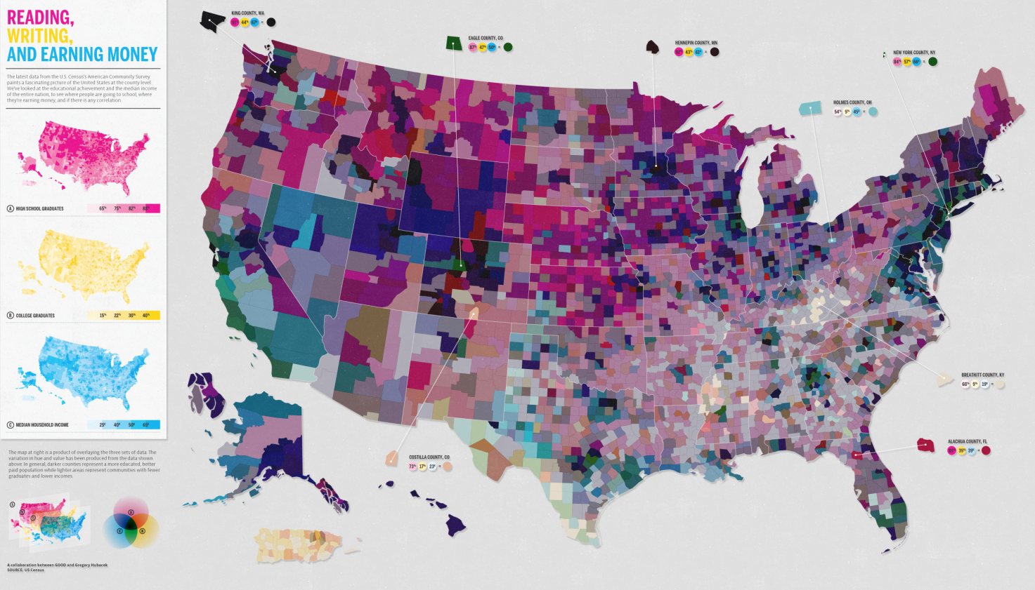
Uncategorized

Reading, Writing, and Earning Money | GOOD Transparency Blog

What works

Nothing is working for me with this graphic except possibly the few places where the designers offered detailed information about a particular location’s high school graduation ranking, college graduation ranking, and income ranking. But that’s being generous.

What needs work

Horrible use of a map. Maps should only be used where there is good reason to believe the information being conveyed is tied closely to geography. This information is not tied closely to geography though it might be tied closely to states. But states need not always be represented as geographical entities. Often, they are political entities and their particular geography is not salient.

The math that led to the graphic flattens important details and renders this a useless graphic. What I believe the designers did was something like this:

  • They took all of their numbers and turned them into some scale between 0 and 100%
  • Then they decided to represent each of the three variables with pure Cyan, Magenta, or Yellow. The higher the state scored on the scale from 0-100, the more saturated the color value.
  • Then they gave each county a combined score by building new colors from mixing the values of the previous three. Higher scoring states ended up with more saturated colors. Basically, higher scoring states started to approach black. States that scored high on just one vector ended up having a clearer, lighter color profile.

Here’s the big problem with this. It was hard for me to explain to my MIT-educated friend so I’m not sure this is going to make sense the first time ’round. Representing everything on a scale from 0-100 is a slide towards obfuscation. The graduation rates are both unadulterated rates. The income data represents un-scaled median incomes. I appreciate that they are not scaled, but I have a hard time adding 65% with $45,000. That’s some troubled math. At least in the monochrome maps we know what we’re looking at before the three variables get added up.

A grave sin was committed when the numbers for these three different variables were added up. Now, of course, it wasn’t the numbers that were added up. It was the color values of each of the three separate data points that were added up. Additive color seems to be something that does not send up a red flag. I can guarantee you that if they had presented something – a table or graph – where they had ended up adding values from high school graduation, college graduation, and income, red flags would have been flying. Why? Well, maybe you’re starting to catch my drift, but I’ll help you by spelling it out. What happens when the colors are added is a clear violation of the ‘apples to apples’ rule. Comparisons do not work unless you are sure you are comparing like things. Graduation rates are not like income. They are two different kinds of numbers – one is a rate the other is either a linear value or a log-linear value. Either way, they cannot be added up and still make sense. It’s no surprise that the graphic ends up looking like an incomprehensible slurry of a gray area.

References

GOOD and Gregory Hubacek. (March 2011) Reading, Writing, and Earning Money in GOOD Transparency Blog.

When the Data Struts Its Stuff | Natasha Singer for the New York Times

Reading Suggestion

In case you missed it over the weekend, the New York Times ran a story about information graphics and the people who use them to communicate with the public. Unsurprisingly, Hans Rosling of Gapminder in Sweden – one of the new heroic figures in infographics – was the man in the picture and the first to be quoted. Rosling deserves the attention – gapminder had fairly humble origins and has grown because it draws from sound data, it is free to use, and it does a predictably good job of providing a visual overview of country level comparisons over time. Natasha Singer, the journalist who wrote the article, also interviewed Professor Ben Schneiderman of the Human-Computer Interaction Lab at the University of Maryland and Jim Bartoo of the Hive Group. And that’s where the article obliquely addressed the growing divide between infographics that are meant to be serious, complex, and complete and those that are meant to be beautiful and compelling, but user-directed. This second sort of infographic is the sort of thing that gets accused of being ‘info-porn’ and often covers information that is of dubious social value. Do we really care about celebrity’s twitter usage patterns? Is that as important as the work Hans Rosling does? What can the academic side of information graphics makers learn from the commercial side?

The article has a slightly different take on these questions,

The fact that serious software companies are now tree mapping the pop charts is a sign that data visualization is no longer just a useful tool for researchers and corporations. It’s also an entertainment and marketing vehicle.

but it’s clear that there are some divisions within the world of infographics that are worth considering more seriously. Nobody ever claimed that all writing is of the same species or that everything on TV is trying to do the same thing. Documentaries are not like sit coms which are not like dramas which are not like soap operas…but then again, they can all be found on TV and thus have some common elements. It’s no surprise that there is a wide variety of infographics out there with distinct goals.

Figuring out just how each type fits into the information ecology and changes the expectations about the entire range of infographics is worthwhile. When graphic designers started to take infographics seriously, it raised the bar for social scientists who were trying to communicate with information graphics. No longer was a chunky bar graph going to look sophisticated. It might look so generic and grade-school that it would reflect poorly on the overall quality of the argument.

References

Singer, Natasha. (2 April 2011) When the data struts its stuff. New York Times, Business Day Section: Slipstream.

Hans Rosling. Gapminder.org Hans Rosling is also a frequent TED Talks presenter.

Jim Bartoo. Hive Group.

Ben Schneiderman. Human Computer Interaction Lab at the University of Maryland.

Hillman, Dan [Director and Producer] | Rosling, Hans [Presenter] (7 December 2010 was first broadcast date) The Joy of Stats BBC. [Documentary] 60 minutes.
In the US you can stream The Joy of Stats from Hans Rosling’s gapminder.org website. Perhaps this works in other countries as well, but I haven’t had a chance to test it.

Percentage of Americans Never Married, 1900-2010

What Works

There are two great things about this:

  1. We see that the current rise in never married Americans still doesn’t match the numbers of unmarried Americans back at the turn of the century.
  2. We see that what is changing now isn’t so much the overall number of never married Americans (which has been hovering at around 30% for the past three decades) but the number of relatively older Americans who have never been married. I couldn’t find consistent numbers for people any older than the 30-34 year old category, nor could I find numbers for the 30-34 year olds available online from before 1960. I am still working on extending that portion of the graphic back to 1900.

What needs work

I need more numbers! I can’t understand the overall trend – which is the increase in never married Americans – without getting more historical context. I need that 30-34 year old category to extend all the way back. I also need to know what the deal is with slightly older cohorts, like 40-44 year olds. If all this graph tells us is that people are getting married later that is a very different story than the one that sounds like: “Americans aren’t getting married at all”. Marrying late and never marrying are two different scenarios. I cannot yet tell from the numbers I’ve got, just what is going on. And the problem with the aggregate data is that it is not granular enough to help understand current trends. Pooling 30 year olds with their parents and grandparents does not help me understand the 30 year olds (or the 20 year olds). And I really want to know what is going to happen in the near future, not what happened in the relatively distant past.

Other people have complained that the ’15 and older’ marital status category is crazy. Who gets married at 15?? But the problem is that we have to keep looking at that category or we cannot follow trends over time. That was the way the category was established back in the beginning, so in order to look across time, we have to keep the boundaries of the category the same. Now, to get around that problem, I included the 30-34 year olds, but that data slice doesn’t go all the way back.

Tricky census data.

And it’s black and white for easy printing. Otherwise I would have gone color.

Childhood Obesity in the US, 1980 - 2008

What works

This infographic was part of a competition put forth by GOOD magazine on their transparency blog. This graphic didn’t win (winners are here), but I thought it was worth talking about the way Sarah Higgins represented changes in childhood obesity over time. She realized that in order to provide an accurate portrayal of the percentages of children who are overweight and obese, she would do well to display the overall change in the population of children in the US. Where there are just more kids in the US, there will be increases in the absolute number of children who are overweight/obese even if the percentages stay the same. Sometimes people care most about absolute numbers, sometimes they care more about proportions. It can be difficult to tell which is more important than the other. Figuring out a way to display both is often useful.

She shows us the total population as a function of the diameter of the circle. Then the proportion of kids who are overweight and obese are shaded in. We don’t know what the change in the absolute number of kids who are overweight and obese is. Let’s say you are an insurance company and you have to cover the cost of treating kids with, say, early onset Type II diabetes. In that case, you might like to have both the proportions and the absolute figures.

What needs work

If I were Sarah, I would have included some absolute numbers in each of the portions of the circle.

My larger concern is that I don’t believe the size changes in the circle are moving in step with reality. I don’t think the population of children in America is increasing as fast as the graphic suggests. I’m guessing that in order to make the concentric circles comply with the imagination that they ought to be clearly concentric, some fudging happened. Where fudging happens, using actual numbers to clarify is critical. But I don’t support fudging at all. Good infographics pick a rule that works numerically and visually. In this case, I’m guessing that if she had figured out a scalar that worked, her concentric circles would have overlapped one another and been very hard to read. She might have been able to find another scalar factor that would have been able to translate her datapoints into a 2D shape, but without trying it myself, I’m not sure this would have been so easy.

I still think this kind of concentric circle concept is worth considering when you’re confronted with an overall change in your population (more kids!) as well as changes within that population (more overweight and obese kids). If she had simply portrayed changes in the proportions of overweight and obese children we would have missed the idea that the absolute numbers are growing even faster because the underlying population is getting bigger.

References

Higgins, Sarah. (July 2010) Childhood Obesity. [Infographic}

http://www.datapointed.net/

Data Pointed

I experienced the vastness of the internet today, stumbling across Data Pointed which is a not-new blog featuring original data visualizations. Why haven’t I come across it before? I wish I knew the answer to that as well as to the related question: how many other interesting data visualizations sites are out there that I do not know about?

What you see above is the most recent post at Data Pointed by Stephen Von Worley. He produces sophisticated graphics across a wide array of subject areas. Just so happens that this one is about the inter-relationship of the income distribution and the tax distribution which is of keen interest to social scientists, and policy people in particular. I find this visualization to be beautiful looking but a little hard to read. Each year is represented by a line, that line is drawn through all of the income brackets you see along the x-axis. As the line passes through these income brackets it changes both color and thickness. Thick red lines indicate areas in which people are paying more than their share of taxes; thin blue lines are areas in which people are paying less than their share of taxes. Von Worley had this to say:

“A modified Reagan-era tax system lingers to this day. To his credit, Dubya did reduce taxes on very low earners, so they’re no longer getting hammered. But, the people at our economy’s core – the full-time workers earning between $20,000 and $150,000 a year – still pay at up to double the rate of the ultra-wealthy, relative to what history suggests they should.”

Personally, I had a hard time drawing that message out of the graphic, despite the fact that it is so beautiful and elegant that I was compelled to stare at it and read the explanation until I could figure out how it worked.

McDonald’s Distances in the US

Von Worley himself notes that Data Visualization was not the popular success he had hoped, at least not at first. [Note: Graphic Sociology isn’t exactly a success in terms of page traffic, but it has a core of steady followers generating a four-digit count of unique page views per week.] Data Visualization got popular after Von Worley created the map graphic below that uses blobbiness to indicate distances between points on the US map and the nearest McDonald’s. The farthest you can get from a McDonald’s in the US is 107 miles and you would be in South Dakota.

Distance to nearest McDonald's in the US | Stephen Von Worley

Does the map work?

I am not entirely sure the map is working – again, it is beautiful. Beautiful is compelling and being compelled, I wanted to spend time looking at it. I also love that it kind of looks like fat globules. How appropriate and subtly political. We also end up with a very good proxy for American population density. Not bad. But what would have been even more awesome is if we could tell this was a distance map without having to read the caption. I want to know that there’s a McD’s at the center of each blob and that what I’m supposed to notice is the distance I need to go to get from the darkness to the light. (In my version, I might have had the centers of the blobs be dark and the peripheries be light but I’m guessing it wouldn’t read as well visually no matter how well it fits with my understanding of McD’s as a morally shady place.)

References

Stephen Von Worley (15 March 2011) Shifting Burdens: U.S. Taxes By Income Level Over The Years at Data Pointed Blog.

A recent (well, 2010 so not *that* recent) report from the UNDP traces the history of information graphics as tools for the promotion of public health. Illustrious crusaders from the yesteryear of public health like John Snow and Florence Nightingale developed some of the earliest ‘infographics’ in service of their public health goals. I’ll post more on that portion of the report later this week. But for now, I’d like to discuss the bulk of the report which was dedicated to the decisions that César Hidalgo (Professor at MIT’s Media Lab, Student at Harvard’s Center for International Development, Associate Professor at Northeastern’s School of Art and Design) made as he developed an appropriate information graphic to represent country level data generated by the Human Development Index. (See also: Measure of America’s Human Development Index graphics for the US only and the Graphic Sociology post about them).

The graphic below this is not intended to be a graphic. It is the basic formula upon which the Human Development Index (HDI) is based. The HDI is a single number that represents a composite score that takes contributions from educational, income, and health measures (which are themselves composite scores). The authors first came up with a simple, almost graphical representation of the relationship between the contributing factors that’s a sort of formula/graphic hybrid. Many social scientists would stop here and move on to the writing of the report, content to let a table with country-level data do the reporting for them.

Basic Human Development Index Relationship | César Hidalgo

HDI Spline Tree

From this hybrid between a formula and a graphic, Hidalgo developed the spline tree you see below. It shares some aspects with the basic formula above, that much is visually clear, but already the lengths and colors of the components are taking on meaning, allowing each country/year combination to produce a tree that is distinct from other trees, but similar enough to be comparable.

The HDI Tree - Spline Design | César Hidalgo

One of designer’s common strengths/weaknesses is the inability to stop designing. Design is never done because the design has reached some obvious and agreed-upon level of perfection. Usually design is deemed ‘done’ when the deadline rolls around. It would appear that Hidalgo was ahead of schedule and decided to go for another iteration, coming up with the diamond tree you see below. Though, as you’ll also see, he did not completely abandon the spline tree. It shows up again.

HDI Diamond Tree

The diamond HDI tree takes an area-based approach, one that is easier to understand visually at first glance than the spline tree. With the spline tree approach, the challenge is that the viewer needs to visually compare the lengths of lines that are not parallel to one another to gain full comprehension. Granted, one might most often compare the lengths of lines that ARE parallel to one another because viewers might mostly be comparing one country to the next. But that isn’t always the case. And even that is not as easy as comparing the areas in the diamond tree approach.

The Human Development Tree - Diamond Tree | César Hidalgo

The rules for the HDI diamond tree (and I’m quoting Hidalgo and team here) are as follows:

* The height of the tree trunk is proportional to the total value of the HDI
* The side of the tree branches are proportional to each sub-indicator
* The branches are ordered in increasing order from left to right
* The color of the trunk is the average color of the components

All together

And here is one country’s worth of Diamond and Spline trees, represented over time. This is where I think the two tree graphics – and the diamond tree in particular – work their magic best. Human eyes are good at doing comparison’s in this sort of way. The trees are more or less the same thing over and over again so this repetitive presentation allows the eye to pick out the relatively small changes over time, especially as they aggregate from one year to the next.

HDI in Rwanda 1970-2005 | César Hidalgo

Pan-Africa

With the last graphic in the series, you can see what it would look like to present the entire continent of Africa, by country, in two different years. It’s a little tough to fit a properly sized graphic into the format of the blog. I encourage you to click through to the full report in the references where you can see a much better version of the final graphic.

Human Development in Africa by country, 1970-2005 | César Hidalgo

Kudos

My biggest applause goes out to the Hidalgo team for abandoning the use of any map at all. This graphic should prove the point that just because one is faced with country level data – something that seems geographical in nature – one should not feel that they must use a map. A map would not have added anything to this information and it probably would have precluded the development of the tree concepts that are working pretty well.

References

Hidalgo, César A. (2010) Graphical Statistical Methods for the Representation of the Human Development Index and its Components [Research Paper] United Nations Development Program.

In theory there is an interactive portal for comparing any two HDI Diamond Trees of your choosing but I was not able to get it to work in Firefox. Worked like a charm in Safari and Chrome.

For ongoing comments on these graphics see: The HDI Tree: A visual representation at “Let’s Talk Human Development” a website published by the United Nations Development Project.

Percentage of US citizens holding passports, by state
Percentage of US citizens holding passports, by state | Andrew Sullivan

Passport background

In 2008 as part of the war against terror, US citizens were required to have a passport to travel to countries like Canada and Mexico that had previously allowed passport-free travel. US citizens could drive or walk into Canada and Mexico with a driver’s license and be allowed to drive or walk right back in. In 2011, we see from this map that even now, not all US citizens have passports, not even close. Getting a passport is time consuming, costly, and generally requires some evidence that the person applying for the passport intends to travel outside the US. That last requirement is kind of a no-brainer, why would anyone want to go through the effort to obtain a passport if they never planned to leave the US?

What works

Always skeptical about mapping data that could appear in a table or chart, I have decided that I’m neutral on this particular use of mapping as a presentation device. If the map had included Canada and Mexico rather than just making the US appear to float in space, I would probably have been more convinced that the map was the way to proceed with this information. If I had created a chart or a table, I would have divided the US states into two groups: those that border foreign countries and those that do not. Have a glance at the map again and you will see that the states bordering foreign countries have higher percentages of passport holders, on average, than those states that do not border foreign countries. Florida and Illinois do not border foreign countries and yet they both have high percentages of passport holders. In the Florida case, I would say it’s almost as if Florida borders foreign countries since so many of its near neighbors are island nations – Haiti, the British Virgin Islands, the Dominican Republic, and so forth.

Illinois is home to Chicago, a destination for immigrants and immigrants often leave family in other countries whom they would like to visit. Thus, they will need passports. The same is true for most big cities – New York and California (home to New York City and Los Angeles) also have large immigrant populations and large numbers of passport holders. On the other hand, Saskia Sassen might point out that what’s going on in Chicago, LA, and New York is that all of these cities are global cities, hubs of activity in Finance, Insurance and Real Estate (FIRE industries). These FIRE industries are global industries and require their workers to travel internationally at higher rates than the same kinds of workers in other industries.

It would be interesting to compare the rates of passport holders to both the rates of first generation immigrants and the proportion of workers in the FIRE industries in all these states.

What needs work

As I mentioned, presenting this information as a map begs to have Canada and Mexico included. In order to visualize the story here, it would be helpful to see what is happening at the borders, to remind ourselves that the US does not simply float in space. It is geographically specific and it matters that some states have international borders and others do not. Sometimes these borders ARE the story and I think when we’re talking about passport holders, the borders are important.

If this information were to be presented as a set of bar graphs, we would risk some information overload since there would be 50 bars. But that might be alright if it became instantly visually clear that the border states have higher rates of passport holdership than the interior and non-bordering states. Plus, with a bar graph, the numbers could have been layered on each bar (and really, they could have been layered on each state in the map) so that we would be able to get a more precise calculation. Simply knowing that we are working with some number in a 10% range is kind of sloppy for my tastes. That’s just me. And sometimes with information like this it’s silly to try to get granular because the data collection method could have a fairly wide margin of error. Though I should hope that the feds know who is holding passports. I suppose people could apply for them in one state and then move to another state. The feds may not know about moves following passport application and that could introduce some fuzziness.

Note: I tried to go to the original source of the map several times but the page timed out repeatedly. Therefore, I ended up citing Andrew Sullivan at the Atlantic since that is where I encountered the map and it is a website that I believe you can visit whereas cgpgrey.com/blog is not visit-able. If I had been able to visit I might have been able to figure out where the passport data came from in the first place – presumably some federal department.

References

Sullivan, Andrew. (8 March 2011) Map of the Day: How many Americans have a passport, by state in The Daily Dish at The Atlantic online. [Graphic by cgpgrey.com/blog]

Sassen, Saskia. (2001 [1991]) The Global City: New York, London, Tokyo, 2nd ed. Princeton, New Jersey: Princeton University Press.

Regroup, Ex-Google workers at their next jobs | R. Justin Stewart
2am 2pm, Minneapolis Transit on a Sunday | R. Justin Stewart

Art and infographics intersect

Artist R. Justin Stewart has taken infographics into the third dimension. His work is more art than information but it’s clear that it builds on the visual tropes of information graphics.

The first image depicts the way that ex-Google workers dispersed into new jobs after their time at Google. The point is not that any of us happen to care deeply about Google workers – someone does but probably not the readers of this blog – but to see how Stewart depicts network graphs in actual space.

The second two images depict a transit system in Minneapolis over a twelve hour period on a Sunday morning. It’s elegant but far too abstract to ‘work’ as an infographic. This is not a critique – I do not think Stewart wanted to make literal art – but it does not take much creativity to see that it would be easy to layer more information onto the artistry of the presentation.

My major contribution to this discussion and the reason that I decided to post Stewart’s work is that much of the art that has been inspired by the data revolution has happened in digital space. We have seen some amazing pixel-based animations and visualizations on this very blog. But I have not come across too much work in three dimensions, real space, that shares so many conventions with information graphics or data-based ways of knowing. A million points tell a story. Usually they tell that story in the same digital realm in which they were born, but Stewart takes them offline into actual spaces. They get installed. He has to come up with the way he wants to represent intangible information with tangible physical components.

Meta Infographic | Think Brilliant

What works

Using an infographic to deconstruct and critique trends in infographic design is a bit more clever than what I do – using text to deconstruct and critique infographics – though I still think there is good reason to do what I’m doing.

Even though Think Brilliant does a good job of spelling out some of tropes of information design that often populate information graphics, they leave some of these pesky problems obvious-yet-unarticulated. In particular, I love the way they split the word DIAGRAMS in odd places so that it would conform to the shape of the text box it inhabits. I very much dislike that sort of trick. The text need not conform so tightly to its text box that it stops looking like a word and starts looking like an advertisement for the typeface.

Click through on the image or the caption and read it over yourself. Notice that Think Brilliant agrees with me about maps – they get used at times when it seems as though there is barely any geographical information being displayed. Sure, cities exist somewhere in the global geography, but if the viewer is supposed to be comparing one city to the next, it is usually far easier to do that using a graph, table, or chart than a map. If you want to tell me about the weather, go ahead and use a map. But if there is no good reason to use a map rather than a chart or table, using that map often dilutes the message by implying that geography is the primary element determining the quantities in question when it is rarely the case that geography is primary.

I also dislike 3D graphs because they make it harder for the eye to connect the bar back to the axis in for purposes of interpretation. And even though it often seems that infographics have the number one purpose of being pretty, in fact, their number one purpose is to make complicated multi-variable situations easier to interpret.

Well done, Think Brilliant.

Friday afternoon thoughts about infographics vs. writing

Writing about something generally requires a linear interpretation because it is nearly impossible to read two things at the same time and it isn’t all that easy to read something that does not have a singular flow. I guess one could read unordered, bulleted lists…but that’s tedious and inelegant. Making an infographic does not require linearity. It does require just as much thought and craft as writing. Where the story is mostly linear, by all means do us all a favor and write about it. Unless you cannot write and then you are welcome to try your hand at infographic creation (ahem, NYU undergrads, that bit about not being able to write well includes more of you than you think).

In the best of all possible worlds, graphics will be used alongside writing in order to offer readers/viewers multiple ways to understand and engage with your work. Social scientists generally present multi-layered research findings based on sometimes complex sets of assumptions. Asking the reader to get with the program and hold all those moving parts in mind at once can be a lot to ask. For all we know, the reader has not consumed anywhere near the amount of caffeine that they need to operate at peak efficiency. Help the reader. Tell the same story with your words, graphics, and images. This goes for both qualitative and quantitative methods. Just because a project is based on interview and ethnographic data does not mean it is impossible to make graphics or acceptable to skip their inclusion in your work.

As you can see from the graphic above, people can see through designerly gimmicks. Folks want meaningful information in their graphics. Better to create a simple infographic that risks being a bit plain than to skip creating a graphic (or to turn a simple graphic into something that makes ridiculous use of 3D, color, maps, typeface, layout, or any other graphic design trope applied without any value-add in the meaning department).

American Shame | Charles Blow for the New York Times

What works

To social scientists: you can make your own information graphics with the programs you are already comfortable using. This graphic is something you could put together in Excel. One of the common questions I hear goes something like this: “I want to use more infographics but HOW do I make them?” I often use the Adobe Suite to make my graphics, but sometimes Excel can be a decent tool for making fairly sophisticated tables. I would not recommend trying to use Word to make graphics. You will become so frustrated with the clunkiness of trying to use a word processor as a graphic design tool that you may be tempted to pick up your computer and throw it out the window. Or, if you are a pacifist, to pick up yourself and leave the office for the rest of the day. But Excel is a more robust, stable program that won’t get finicky if you start manipulating cell colors and border conditions.

What needs work

In general, Excel is probably not the program that’s going to generate elegance. It will allow you to use color and line weight to add layers of visual information, but as you can see here, the results are not necessarily going to be attractive.

In particular, this graphic makes weird color assumptions. The red is bad, the gold is good, and though there is a kind of natural spectrum between red and gold, this graphic doesn’t follow it. I would have used a single color and varied the hue. I have no idea why the middle category is grey. In my mind, grey does not appear on the color spectrum between red and gold. To strengthen this table-as-graphic, I’d go ahead and let every cell (except the empty ones) sit on the color spectrum being used to represent the best and worst. Color can be most meaningful only when it is used consistently. As it stands, there is an inconsistency in the middle categories here with the grey and an unnecessary use of two colors where one would have been enough.

I’m on the fence about the use of apparent depth or 3D-ness. The ‘worst’ buttons stick out like red pimples. On the one hand, the wannabe rebel in me is pleased to see that sort of flagrant display. On the other hand, the depth doesn’t so much add information as it adds visual clutter. Red is enough to make the ‘worst’ seem bad, right? I don’t know. Like I said, I’m on the fence. Maybe the depth element adds value because it helps anchor the eye *somewhere* in this rather extensive table. But it’s used so much that I’m not sure that purchase rings up when all is said and done.

Overall, presenting tables-as-graphics introduces an information overload scenario, one that this particular approach did not surmount. But that doesn’t mean all tables are bad or all uses of color in tables is bad.

I am also deeply skeptical about the Gallup Global Well-Being Index. I’d skip it. Who the heck knows what it means to have a failure to thrive? Very skeptical…

References

Blow, Charles. (2011) “Empire at the End of Decadence” in The New York Times, 19 February 2011. Featuring information graphic “American Shame”.