maps

Mapping the Nation by Susan Schulten

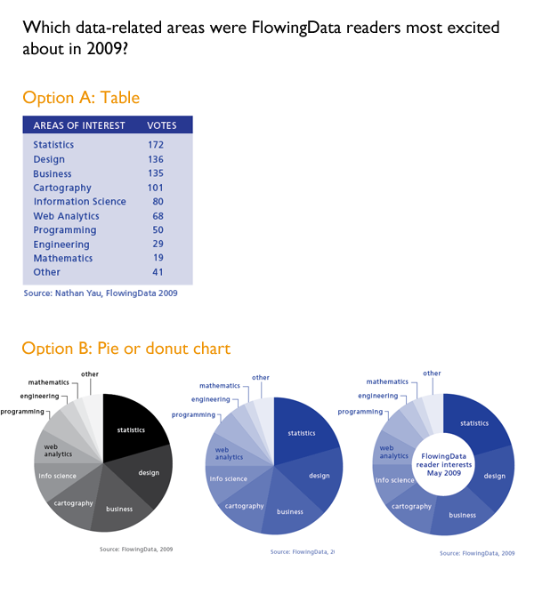
I reviewed Susan Schulten’s new book, Mapping the Nation: History and cartography in 19th Century America, for publicbooks.org but there were so many images (90%) that did not make it into that review I decided to write a post here, too. This blog tends to focus on contemporary graphics, but information graphics are not new and the historical context of infographic forms is fascinating, especially in light of research that examines the status of information graphics as the output of inscription devices (Latour and Woolgar, 1979). How did we end up with the selection of graphic forms we now have? In what way were these images originally used and by whom?

The images in Schulten’s book – and on her superb companion website – are mostly maps, but there are also a surprising number of information graphics. As Schulten writes, maps and mapping were both made possible because America became a country (and thus had a government that could be petitioned to support the expense of creating maps and provide a centralized repository in which maps could be collectively held and made available) and they made America an imaginable possibility. In short, the establishment of American government made mapping possible and the existence of national maps made America an imaginable possibility. Without being able to see not only the colonies, but also the rest of the North American continent, it would have been far more difficult to imagine and pursue westward expansion, for instance. The first chapters of the book provide a nice companion to Benedict Anderson’s “Imagined Communities” that focused on the role of newspapers and novels in creating a national imagination. Schulten is also interested in printed matter, but for her the big deal is mapping.

Maps as propaganda

If mapping in the immediate post-colonial and early frontier eras was exciting – and it was – it got even more exciting during the contentious lead-up to the Civil War. One of the maps I’m including here is propaganda for the abolition of slavery. I have included the whole map as well as a close-up, but I encourage you to click through to Schulten’s companion website where you will find high quality scans of all the maps that will give you far more detail than I am able to show here.

Antebellum Historical Geography Map of US
Antebellum Historical Geography Map of US | by John Smith
Close-up of antebellum historical geography map | John Smith

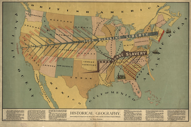
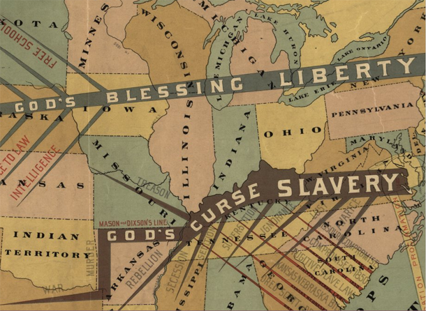
Propaganda is typically not something maps are used for now, at least not in the blatant fashion of the pre-Civil War years, but it is true that maps are depictions of political boundaries and, as such, are ripe for the delivery of political messages. [For a more recent example of US maps used in politically charged ways see modern artist Jasper Johns.]

What I found more intriguing were the maps that displayed their political messages almost invisibly using choropleth techniques. The choropleth technique is still extremely common today and relies on shading assigned to political divisions like state or county lines. Census tract boundaries can also be used. It’s debatable whether or not census tracts are political boundaries but they certainly are not boundaries based on natural features like streams or mountain ranges. Some of the first choropleths were developed to show more precise locations and densities of slave labor in an effort to discredit Southern claims that slavery covered the South like a blanket without which Southern economies would freeze.
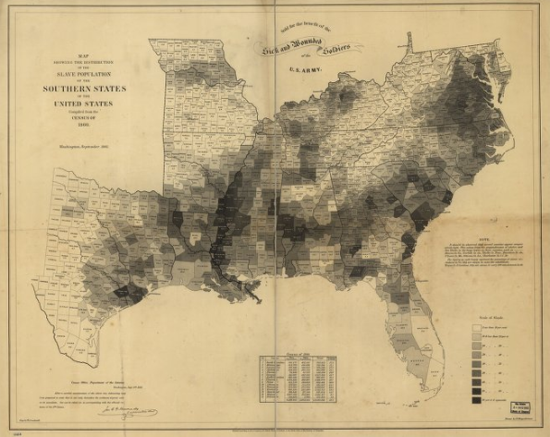
Slavery map of US, 1861
Slavery map of US, 1861 | Edwin Hergsheimer
Slavery map of US, 1861 [closeup]
Slavery map of US, 1861 [closeup] | Edwin Hergsheimer

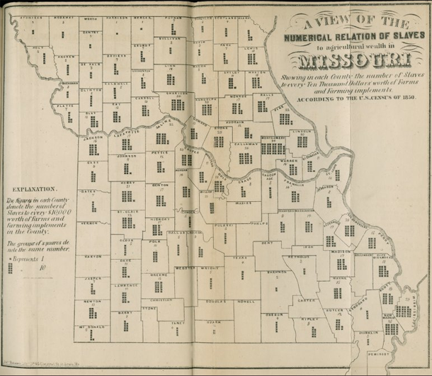
Another attempt at a similar political message – to display variation in slave holdings in order to prove that other economic models were viable and operant in the South during the 1850s – failed as a map but introduced an interesting graphical form. This Missouri map shows county boundaries within each of which there is a small graphic with the overall intent of providing:

A view of the numerical relation of slaves to agricultural wealth in Missouri, Showing in each county the number of slaves to every ten thousand dollars worth of farms and farming implements according to the US Census of 1850.

To interpret the map, then, keep in mind that counties with more dots rely more heavily on slave labor rather than mechanical labor. Of course, counties with few dots could either be utilizing human labor more efficiently, and thus have lower slave-to-machine ratios, or they could have had very little agricultural practice of any kind, slave or free. Because the graphic elements represent such an obscure, unfamiliar measure (slaves-to-machines), the map ought not to be considered a great success. But it is an excellent example of maps depicting thematic data without resorting to choropleths. We could use more of this boundary pushing map-graphic hybridity now

Missouri Slave Density map, 1850 | Edwin Leigh

Disease mapping in America

With some chagrin, I admit Schulten’s book corrected an inaccurate belief of mine with respect to the use of maps in the detection of disease. I had erroneously thought that John Snow was the first person to use maps as a tool to detect the cause of disease when he pinpointed the cause of London’s cholera epidemic to a public water pump. He was not the first to use maps to discover disease. Americans in Baltimore, Boston, and New Orleans were mapping all sorts of potential causes of diseases like cholera including weather patterns, train routes, proximity to open water, and the eventual culprit, proximity to public water. Snow was the first to hone in on the cause, but he was not the first to use maps. Further, he was likely aware of American public health mapping efforts.
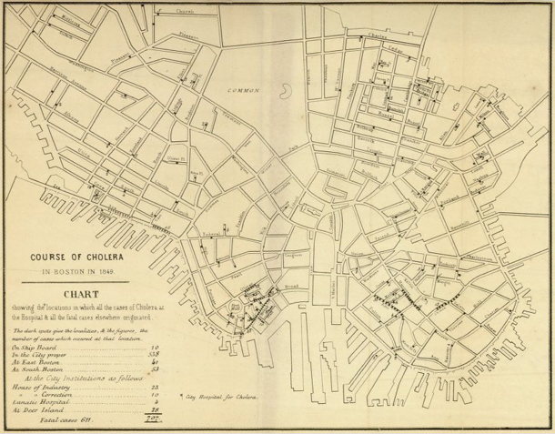
Cholera map of Boston, 1849 | Henry Williams
Cholera map of Boston, 1849 [closeup] | Henry Williams

Bonus image

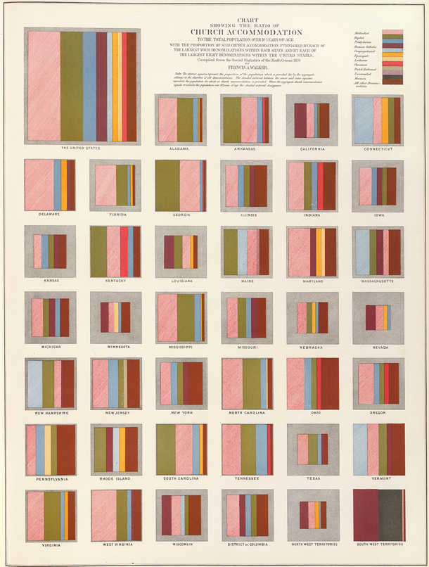
I am including one more image – not a map – to show just how fresh 19th century graphics were. This is a graphic that uses states as categories but breaks them out of the map form in order to present them as squares. It is easier to divide squares into percentages, which is just what Francis A. Walker did to show the types of church denominations present from one state to the next. It is easy to see why he avoided using a map – it would be difficult to divide the irregular shapes of states into precise percentages. Further, even if he could divide the irregular areas properly, if he then filled the areas with particular denominations, it would have appeared that the denominations were geographically tied to particular places within the states. His choice of squares as representations of the states is logical. From this graphic solution to his problem we end up with a visual technique for representing all sorts of information that is bound to related categories.

Church denominations in the US by state
Church denominations in the US by state | Francis A. Walker via Susan Schulten

References

Latour and Woolgar. (1979) Laboratory Life: The Social Construction of Scientific Facts. Beverly Hills: Sage.

Schulten, Susan. (2012) Mapping the Nation: History and cartography in 19th Century America. Chicago: University of Chicago Press. [see also Mapping the Nation website]

Norén, Laura. (2013) Mapping a young America Review of Susan Schulten’s “Mapping the Nation: History and cartography in 19th Century America. PublicBooks.org

Hot Dog Eating Contest Graph
Hot Dog Eating Contest Graph – Large version

Preface to the book review series

There are two ideal types of infographics books. One ideal type is the how-to manual, a guide that explains which tools to use and what to do with them (for more on ideal types, see Max Weber). The other ideal type is the critical analysis of information graphics as a particular type of visual communications device that relies on a shared, though often tacit, set of encoding and decoding devices. The book reviews I proposed to write for Graphic Sociology include some of each kind of book, though they lean more towards the how-to manuals simply because more of that type have come out lately. As with all ideal types, none of the books will wholly how-to or wholly critical analysis.

I meant to review two of Edward Tufte’s books first so that we would start off with a good grounding in the analytical tools that would help us figure out which parts of the how-to manuals were likely to lead to graphics that do not commit various information visualization sins. However, I have spent the past six weeks at a field site (a graphic design studio nonetheless) and it rapidly became completely impractical to lug the two oversized, hard cover Tufte books around with me. I found Nathan Yau’s paperback “Visualize This” to be much more portable so it skipped to the head of the line and will be the first review in the series.

The Tufte review is next up.

Review of Visualize This by Nathan Yau

Visualize This book cover

Yau, Nathan. (2011) Visualize This: The FlowingData guide to data, visualization, and statistics Indianapolis: Wiley.

Visualize This is a how-to data visualization manual written by statistician Nathan Yau who is also the author of the popular data visualization blog flowingdata.com. The book does not repeat the blog’s greatest hits or otherwise revisit much familiar territory. Rather, this was Yau’s first attempt to offer his readers (and others) a process for building a toolkit for visualizing data. The field of data visualization is not centralized in any kind of way that I have been able to discern and Yau’s book is a great way to build fundamental skills in visualization that use tools spanning a range of fields.

The three primary tools that Yau introduces in the book are two programming languages – R and python – and the Adobe Illustrator design software. Both R and Python are free and supported by a bevy of programmers in the open source world. R is a programming package developed for statistics. Python has a much broader appeal. Both of them can produce data visualizations. Adobe Illustrator is neither free nor open source but it is worth the investment if you are planning to do just about any kind of graphic design whatsoever, including data visualizations. Yau mentions free alternatives, and there are some, but none have all of the features Illustrator has.

Much of the book starts readers off building the basic bones of a visualization in R or python, based on a comma-separated value data file that has already been compiled for us by Yau. He notes that getting the data structured properly often takes up more than half the time he spends on a graphic, but the book does not dwell much on the tedium of cleaning up messy data sources. Fine by me. One of the first examples in the book is a graphic built and explored in R, then tidied up and annotated in Illustrator using data from Nathan’s Hot Dog Eating contest.

This process is repeated throughout:
   1. start visualizing data with programming;
   2. try to find patterns with programming;
   3. tidy up and annotate output from program in Illustrator.

The panel below shows you what R can do with just a few lines of code. Hopefully, it also becomes clear why it is necessary to take the output from R into Illustrator before making it public.

Visualize This - example from chapter 4
Visualize This – example from chapter 4

Great tips

There are hints and tips sprinkled throughout the book covering everything from where to find the best datasets to how to convert them into something manageable to how to resize circles to get them to accurately represent scale changes. This last tip is one of my favorites. When we visualize data and use circles of varying sizes to represent the size of populations (or some other numerical value) what we are looking at is the area of the circle. When we want to represent a population that is twice as big as the size of some other population, we need to resize the circle so its area is twice as big, not its circumference.

How to scale circles for data visualization

More great tips:
1. First, love the data. Next, visualize the data.*
2. Always cite your data sources. Go ahead and give yourself some credit, too.
3. Label your axes and include a legend.
4. Annotate your graphics with a sentence or two to frame and/or bolster the narrative.

*Love the data means take an interest in the stories the data can tell, get comfortable with the relationships in the data, and clean up any goofs in the dataset.

Pastry graphics: Pie and donut charts

Yau’s advice about pie charts diverges from mine. I say: use them only when you have four or fewer wedges because human eyes really have trouble comparing the area of one wedge to another wedge, especially when they do not share a common axis. Yau acknowledges my stubborn avoidance of pie charts but advises a slightly different attitude:

Pie charts have developed a stigma for not being as accurate as bar charts or position-based visuals, so some think you should avoid them completely. It’s easier to judge length than it is to judge areas and angles. That doesn’t mean you have to completely avoid them though. You can use the pie chart without any problems just as long as you know its limitations. It’s simple. Keep your data organized, and don’t put too many wedges in one pie.

The Yau explains how to visualize the responses to a survey he distributed to his own readers at FlowingData to see what they’d say they were most interested in reading about. He showed the readers of the book a table with the blog readers’ responses which I’ve recreated below [Option A]. I think the data is easier to read in the table than in either the pie chart or the closely related donut chart [Option(s) B]. In life as in visualization, a steady stream of pies and donuts is fun but dumb. Use sparingly.

Visualize This example from chapter 5

Interactive graphics

Learning about pie charts was great fun even though I don’t like pie charts because Yau taught us how to use protovis, a javascript library that yields interactive graphics. We built a pie chart just like the one(s) in Option B that popped up values on mouseover the wedges. Protovis was developed at Stanford and has now morphed into the d3.js library. The packages developed in Protovis are still stable and usable. I highly recommend this exercise for anyone who wants to make infographics for the web. It helps to have a basic understanding of html going in.

What needs work

The overarching problem I had with Visualize This is that it spent relatively little time generating different types of graphics using the same data. We saw a little bit of that above when Yau used both a pie chart and a donut chart to visualize the same survey responses, but since donut charts are just variations on pie charts, it was not the best example in the book. The best example came when Yau visualized the age structure of the American population from 1860 – 2005 (I updated the end date to 2010 since I had access to 2010 census data).

First, Yau shows readers how to make this lovely stacked area graph in Illustrator. That’s right. No R. No Python. Just Illustrator.

Aging Americans
Aging Americans | Stacked area graph version

Then Yau admits that the stacked area chart has some general limitations:

One of the drawbacks to using stacked area charts is that they become hard to read and practically useless when you have a lot of categories and data points. The chart type worked for age breakdowns because there were only five categories. Start adding more, and the layers start to look like thin strips. Likewise, if you have one category that has relatively small counts, it can easily get dwarfed by the more prominent categories.

I tend to disagree that the stacked area chart ‘worked’ for displaying the age structure of the US population, but not because there were too many categories. I’ll get to why I don’t think the stacked area graph worked shortly, but first, let’s have a look at the same data represented in a line graph. This was Yau’s idea, and it was a good one. What we can see by looking at the data in a line graph rather than a stacked graph is the size ordering of these age slices. Yeah, I can kind of see that the 20-44 group was the biggest group in the stacked graph. But I had to think about it. In the line graph, I don’t wonder for a second which group was biggest. The 20-44 group is on top. The axes in line graphs just make more sense. I admit that the line graph is not an aesthetic marvel the way the area graph was. But, you know, you can figure out your own priorities. If you want pretty, go with the area graph and get smart about colors (with the wrong color scheme, any graphic can look awful. See also: what Excel generates automatically). If you want a graphic for thinking with, avoid stacked area graphs.

Aging Americans
Aging Americans | Line graph version

Coming back to what I think about visualizing the age structure of the American population. Call me old-fashioned, say that I adore my elders too much, I’ll just tell you we all stand on the backs of geniuses. I like the age pyramids for visualizing the age structure of a population. Here’s one I plucked from the Census website.

Population Aging in the United States | Traditional age pyramid graphic

The pyramid has these advantages:
   1. It shows gender differences. Males are on the left. Females are on the right.
   2. This graphic does a better job of showing the structure of the population because the older people appear to balance on the younger people. This is useful because the older people actually do kind of balance on the younger people when it comes to things like Social Security. The structure of the population does not come through in the area graph or the line graph. Both of those show us that there are more old people now than there were before but displaying more is a less sophisticated visual message than showing us just how many older people and how much older and how these things have changed over time. See all those and’s in the previous sentence? Yeah. That’s how much better the pyramid is.
   3. It is possible to see both the forest and the trees in this age pyramid. What do I mean? Well, the stacked area graph and the line graph had to lump rather large (and disproportionately sized) groups of ages together. In the age pyramid, the slices are even at every five years and if you happen to want to figure out just how the 20-24 year olds are changing over time, you can. But this granularity does not make it difficult to understand the overall structure of the pyramid.

To summarize my larger disappointment, I wish that Yau had gone through a number of examples of displaying the same data with different graphics in order to teach readers how to choose the best graphic. To his credit, he did visualize crime data with a bunch of different graphics, but I didn’t like any of the graphic types. I’m including the one I liked most, but it’s mostly for historical reasons. This type of weird fanned out pie wedges is called a Nightingale chart and was developed in part by Florence Nightingale way back when information graphics didn’t exist. He visualized this same crime data with Chernoff faces and with star graphics, neither of which were interpretable, in my opinion.

US Crime Rates by State - Nightingale charts
US Crime Rates by State – Nightingale charts

Heatmaps

Unlike Chernoff faces, star charts, and Nightingale charts which I think are totally useless, heatmaps have promise as data visualizations. This is a good example of how I wished Yau would have started working hard to get the data to lash up better with the visualization. This is his final version of the heatmap of a whole bunch of different basketball game statistics with the players who were responsible for scoring, assisting, and rebounding (among many other things). I am a basketball fan. I went linsane last season. But I just do not get excited when I look at this heatmap because the visualization does not reveal any patterns. Ask yourself: would I rather have this information in a table? If the answer is yes, well, then you know there’s at least one other kind of representation besides this one that you would prefer if this is the data you are trying to display.

NBA heatmap via FlowingData

So what would I do? Well, I’d do a couple things. First, I would probably try restricting this heatmap to the top ten players or even to my favorite players. Throwing in 50 players and about 20 statistics per player without condensing anything means we are looking at 1000 data points. Ooof. So…if not cutting down the number of players, maybe put the scoring statistics in a different heatmap than all the other statistics (playtime, games played, rebounds, steals, blocks, turnovers, and so on). Maybe strip out the “attempts” and just leave the completed free throws, field goals, and three-pointers. I do not know if these things would have revealed patterns, I just know that the current graphic is still looking like a data soup to me.

Maps triumphant

Overall, this was a great how-to for data visualization and I want to end on an appropriately high note. One of the biggest wins in the book was Chapter 8 in which Yau walks us through the most meticulous and involved demo in the book. The payoff is big. He shows us how to use google maps and FIPS codes to make choropleths (these are large maps in which colors mated with numerical values fill in small, politically bounded units, usually counties but sometimes census tracts). He does not use ArcGIS which is one of the reigning mapping tools on the market. But ArcGIS is expensive. And Yau shows us how to generate maps without spending a dime. You will have to spend some time. If you are a cartography geek or you follow the unemployment rate, you’ve probably already seen this graphic because it was widely circulated, for good reason.

Unemployment map via FlowingData

New York City subway map after Sandy

New York City subway map, Hurricane Sandy hangover map

New York City ghosted lines subway map

New York City subway map
New York City subway map with all of the lines ghosted in

Not back to normal

For those of you living in New York, the subway map is probably familiar to you. For those who are not here, but are listening to reports, I thought I would post the maps to illustrate that the subways are not back to normal. The national broadcasts I listen to keep mentioning that the subways are coming back, which is true, but Sandy essentially knocked the center out of the network. What was once one network is now two networks with very strange structures. They connect, if at all, not through their abdomens like spiders’ legs, but at the very ends of their extremities and there is no recognizable abdomen.

The storm also knocked out some specific edges of the network, like the end of the A train that ran past JFK and into the Rockaways. Note to travelers: The New York City subway is no longer connected to JFK airport.

As of this morning, I am hearing different reports about the 7 train in Queens. It might be running to the connection with the F train according to WNYC, but the mta.info website does not yet reflect that change. I left the line partially ghosted in. There are no reports that the 7 train is running all the way into Manhattan.

Brooklyn

There is subway service between Queens and Manhattan but Brooklyn has been cut off almost completely.

Global charitable giving

Global charitable giving map, 2011
Global charitable giving map, 2011 | Charities Aid Foundation

How much do people give?

Globally, there are some major differences in giving rates on a national basis. The Charitable Aid Foundation conducts and annual global poll that asks about giving money, giving time, and helping individual strangers. The 2011 report notes that when it comes to predicting which countries have the most generous citizens:

The countries whose populations are the most likely to give are not necessarily the world’s most affluent. Only five of the countries that feature in the World Bank’s top 20 by GDP (PPP) per capita feature in CAF’s World Giving Index top 20.

World Giving Index by World Region
World Giving Index by World Region, Charities Aid Foundation

The US moved from 5th place in 2010 to 1st place in 2011 with increases in the number of people donating time, money, and aid to individual strangers. I guess we respond to the economic crisis by donating to specific people and causes while demanding lower taxes? Anyone else want to try to interpret that?

As for the graphic, I wish there were a key. I figured out eventually that the number inside the circle represents the country’s overall rank and that the size of the circle is proportional to per capita giving. I had to look at the graphic for a while to convince myself that the size of the circles was proportional to per capita rather than total giving per country. The one thing I like most is the inclusion of the small inset map in the upper right corner that helps relate the circles back to the map of the world that we are used to seeing.

But let’s take a look at giving in the US, since we are supposedly the top of the heap as of 2011.

US charitable giving

Charitable giving in the US by region, 2000

How much do Americans give?

Caveat: I was not able to find US data from 2011 so the bottom half of this blog and the top half are out of sync temporally. Also, the US study only looked at cash donations whereas the global index looks at donations of cash and time as well as helping behavior towards individual strangers.

Individual giving in America is divided between two general categories of giving – religious and secular. Many church members give cash and write checks to their churches either as part of tithing or in less formal donations to the offering plate when they get around to attending a service. Measures of religiosity in the US indicate that Americans are slowly becoming less religious over time. A WIN-Gallop poll of global religiosity came out on July 27th and showed that only 60% of Americans are regular churchgoers, down from 73% seven years ago. I wondered how that would impact charitable giving here in the US. Unfortunately, the only free data I could find was from 2000 which is well before the findings from the recent poll data. [Note: If you are extremely interested in charitable giving in the US there are quite a few reports available to those willing to pony up some cash at Giving USA.]

The table above is a summary of the state-level, individual cash donation activity of Americans in 2000 that was originally constructed by John Havens and Paul Schervish at Boston College’s Center on Wealth and Philanthropy. They used a slightly different methodology from the one used by the aforementioned Giving USA group that I found more compelling. Giving USA was looking at cash giving by examining the itemized deductions folks list on their annual income tax forms. However, many people (especially lower income people) do not itemize their deductions. Further complicating matters at the state level is the fact that some states have many more itemizers than others. Therefore, looking at itemizers in one state is very different than looking at itemizers in another state. In one state we might only capture fairly wealthy people. In other state, we might be looking at a much broader cross section of the population. Havens and Schervish not only tried to make sure they had comparable samples of people from each state, they also took into account costs of living in different states and weighted their totals based on the number of households in each state.

I summarized their major findings above. What frustrated my data visualization self the most was that I could not make a similar cartograph that would allow us to see the US the way we can see the globe in the cartograph at the top. Havens and Schervish pooled data for a number of states together – see where I have tried to list all the states in each of the regions? See how it says ‘Other States’ four different times? The explanation for this was that the sample size in some states was so small it had to be pooled in order to maintain the subjects’ anonymity. Fair enough. I just wish it were otherwise.

Are states within the same region similar when it comes to charitable giving? For the most part, no.

The midwest has no major outliers, high or low (at least, not that I can tell given that some states are lumped into that obscure “other states” category). The other three regions show wider dispersion. The west, for example, has the most generous state (Utah: $2632) but just next door is Nevada with a very low rate of giving (Nevada: $303). The south looks fairly generous on average, but that average obscures some dramatic differences. Two states pull up the average (Alabama: $1842 and South Carolina: $1243) and make up for the two of the least generous states which are also in the South (Kentucky: $218 and the District of Columbia: $273). With respect to DC, my hunch is that wealthy lawmakers and other multi-state residents buzzing around DC may be reporting all of their charitable giving on their tax forms for their “home” states. I cannot explain why Kentucky gives so little. Another notable miser of a state is New Hampshire (New Hampshire: $246). Shall we take a moment to ponder the implications of the “live free or die” ideology?

References

Charities Aid Foundation. (2011) World Giving Index [information graphic] Kent, UK.

Charities Aid Foundation. (2011) World Giving Index 2011. [Report]. Kent, UK.

Havens, John and Schervish, Paul. (2005, November) Geography and Generosity: Boston and Beyond [report] Boston: Center on Wealth and Philanthropy at Boston College. For convenience, I extracted the relevant table for download <a href="generosity-report-extract“>here.

Wind Map

Viewing note

Click on the image above or here to go to the actual graphic. What you see above is just a screen grab. If you like the screen grab, you will love the active graphic in which you can see what it would look like the visualize the wind blowing across the US right now. Yes, whenever you are reading this, you can download recent data to populate the graphic.

What works

This is a great use of a map to display information. Think, for instance, what the same data would look like in a table.

State                     Speed      Direction
Bismarck, SD          16 mph     S
Columbus, OH        5 mph      W
Fargo, ND               8 mph      N
Minneapolis, MN     2 mph      SW
New York, NY         6 mph      E

In a table, cities would probably be arranged alphabetically which is fine if you want to know exactly what is happening in a given city but terrible if you are trying to discern if there’s any geographical pattern to wind flows. Looking at the map, it is easy to detect geographical patterns. In fact, it would be nearly impossible to avoid detecting geographical patterns. Huge win for the map as a graphic with respect to wind data.

The fact that the wind appears to blow is a programming achievement.

The fact that users can update the graphic with a fresh pull-down from the National Digital Forecast Database is another major programming achievement.

The creators of the graphic at hint.fm offer this disclaimer, “We’ve done our best to make this as accurate as possible, but can’t make any guarantees about the correctness of the data or our software. Please do not use the map or its data to fly a plane, sail a boat, or fight wildfires”. That being said, I think the graphic could be useful for those sorts of purposes. I also think it could be used to perform site selection for windfarms or at least as an educational tool to explain to people why the Dakotas make excellent states to harvest wind while the neighboring state Minnesota is a poor choice.

What needs work

I wish there were an easier way to find graphics like this. I stumbled upon this one via Albert Cairo’s twitter feed, but there must be other awesome graphic work out there just waiting to be discovered.

Reading suggestions

On that note, if you happen to enjoy stumbling upon information graphics, I highly recommend visiting visualizing.org and visual.ly, two websites that aggregate information graphics by allowing people to upload their own work. Both sites have relatively high collective standards for design and are trying to maintain the same high standards for data quality.

Then there’s Nathan Yau’s blog, flowingdata.com, which has long been on my list of must-reads. I assume many of my readers know about flowingdata but it is worth mentioning because it’s a great blog.

Good.is has a portion of their site set aside for GOOD information graphics.

For a more strictly aesthetic experience, behance.net is a giant collection of graphic artists’ portfolios. Looking through it is the digital equivalent of walking around in a flea market – great stuff, unique stuff, and lots that is instantly forgotten even though its presence adds to the atmosphere. Most graphic artists are not information graphic designers so much of what is on behance is not information oriented.

I sometimes find things on pinterest, too, which is more like the digital equivalent of a mash-up between jcrew and a flea market. Oddities organized. It’s much harder to find good information graphics there because, for reasons I do not understand, pinterest is dominated by the long vertical graphics that require lots of scrolling. I’m not a huge fan of those. They encourage laziness – nothing needs to be integrated when you have an infinite length of scroll to just layer unaffiliated fact upon unaffiliated fact and hope that with a picture or two thrown in, a narrative will emerge.

Besides newspapers and magazines, where else do you find information graphics?

References

hint.fm (2012) Wind Map Graphic.

visual.ly
visualizing.org
flowingdata.com
behance.net
pinterest.com

Living Alone by Gender, Age Cohort in the US
Living Alone by Gender, Age Cohort in the US since 1850

What works

This post is an update to an earlier post about the increasing rate of Americans living alone. The first graph does an excellent job of visualizing the change in Americans’ tendencies to live alone, by age and gender. It’s clear that living alone is on the rise, especially for Americans over 45. It’s interesting that there seems to be a collective slow down in this trend in the decade between 35 and 45 when I suppose some of the late-to-marry people finally settle down and before the marital dissolution rate starts to fire up.

The graphics in this post accompanied an article by Eric Klinenberg in the New York Times Sunday Review that laid out the basic findings in his latest book, “Going Solo” that was based on 300 interviews with people living alone. He finds that while for some, living alone is an unwanted, unpleasant experience, most people who live alone are satisfied with their personal lives more often than not. In fact, they are more social, at least in some ways, than are their counter-parts who live with others. Singletons (his word, not mine. I prefer ‘solos’ in part because it’s an anagram), go to restaurants and other social spaces more often than do those who live with others.

Living alone in Minneapolis

In a number of cities, including Minneapolis, more than 40% of households are single-people households. The article included an interactive map down to the census tract level that shows what percentage of households in that tract were single-person households in 2010. I took a look at Minneapolis and St. Paul and found that the map supported Klinenberg’s qualitative findings. The highest concentration of solos is in the center city areas where opportunities to get out and be social in the community are the highest. The suburbs and rural areas have fewer solos.

I encourage others to use the map and see if their local cities replicate this pattern, that more solos live in ‘happening’ areas than in quieter areas. Of course, this could be caused by a third variable, the presence of households that are affordable for single-earner households…but there isn’t enough analytical power in the map tool to be able to sort out the dependencies.

What needs work

The information about who lives alone by age, marital status, and race that is displayed in the following long skinny stack of datapoints is the right kind of detailed information to use as an entrance into a deeper discussion about living alone, now that we’ve gotten a sense of the view from 30.000 feet. The problem is that this graphic is hard to read, too long for a single computer screen (but in order to make sense of it, one needs to see the whole thing at once), and too optimistic about what color differences are able to do than is reasonable.

The article does a better job of subtly navigating the movement from historical and international context into a detailed, robust analysis. By awkwardly pinning all the data points onto the stalk at once, viewers lose the ability to see patterns within data subsets. Here’s a test. Look at the following data and try to explain to yourself how race and living alone go together. Or how age and living alone go together. The graphic designer was hoping color would be able to do more than it has been able to accomplish here. The color is supposed to tunnel your vision down to a particular color-coded subset so that you can start to understand well just what it is about race or age or marital status that produces particular patterns in living alone. But I had a lot of trouble with the color frame because, quite literally, I had to keep shifting the frame around this graphic – it didn’t fit on my laptop screen. [Graphic designers often work on nice, roomy screens where they end up seeing more at once than their eventual audience who is probably peering at this thing from a web browser on a laptop or occupying half of a monitor somewhere.]

All the clustering around the mean is another problem that could have been avoided had the graphic been organized differently. As it is, all sorts of groups lump on top of one another down around 14%.

I also kind of hate that I can’t add categories together in any meaningful way here. I can tell that being a widow would put someone at high risk for living alone, but that’s kind of a no-brainer, isn’t it? I would have gotten more mileage out of visualizing the absolute numbers of people living alone by marital status, age, and race. Maybe over half of all widows live alone, but I haven’t the faintest idea how many widows there are in America so I don’t know if half of all widows is half a million people? Or 3 million people? Or whether it’s more or less than the 38% of separated people who are living alone. 19% of never married’s live alone, but because these people are likely to be young, maybe that is actually a larger absolute group than the 58% of widows living alone.

Final verdict: There was both a data fail and a graphic design fail.

Who lives alone?
Who lives alone? A demographic breakdown

References

Going Solo Cover
Going Solo Cover

Klinenberg, Eric. (2012) Going Solo: The Extraordinary Rise and Surprising Appeal of Living Alone. The Penguin Press HC.

Klinenberg, Eric. (2012) One’s a Crowd. New York Times Sunday Review.

Weber, Susan and Beveridge, Andrew. (2012) [infographics]
Solo in America graphic Line graph looking of the changing percentage of singleton households in America, 1850-2000
More on their own here…and even more abroad American and International singleton households.
Mapping the US Census: Percentage of Households with only one occupant Interactive graphic of US singleton households by census tract.

2008 Political Party Identification in the US | David Sparks
2008 family income | David Sparks

What works

I like these maps because they use a smoothing technique currently being developed by David Sparks, a doctoral candidate in political science at Duke University. He uses data with the same kind of granularity – county or census-tract – but then smooths over the harsh (and probably unrealistic) edges that can occur where one county or census block abuts another with a different value for the variable of interest.

Here’s an example of a typical, non-smoothed map visualization using a map made by sociology students at Queens College that I posted about last week:

Percent change in hispanic population in the Dakotas, Minnesota, Iowa, Nebraska, Kansas, Oklahoma

As you can see in this map, each county boundary is stark and it appears that there are cases in which counties with no growth in the Hispanic population are right next to counties with sizable increases in Hispanic people. While this is technically true, there are many cases in which it is more useful to give viewers a clearer impressionistic image that depicts where population concentrations are the highest overall backed up by the granular data without displaying all of the granularity itself.

When it is important to portray an impressionistic point – there are more Democrats on the coasts than in the middle of the country – a smoothed map is a much more effective tool.

Sparks was able not only to achieve a better impressionistic glance by smoothing, he also varied the transparency based on the population density. For instance, because the population density in Montana is much lower than the population density in New York, he made Montana a much more ‘transparent’ state so that it would be easy to get an impressionistic sense of the cumulative spread of the variable. When looking at the purple map of Hispanic population increase in the middle states, no consideration was made for the population densities of cities versus rural areas. This visualization style tips the impressionistic balance away from the more densely populated areas.

What needs work

Since I am generally a fan of the smoothed maps for a clear visual depiction of a data story that is meant to be digested from the 30,000-foot view rather than the microscopic examination of differences between counties or even residential blocks, there is not much to dislike in Sparks’ new smoothed maps. However, I would not recommend the use of this kind of smoothed data for looking at micro-level trends. What Sparks offers is a great way to see patterns from 30,000 feet, one that improves on existing common practices in visualizing map data.

My one issue with the distribution of people’s political persuasion in 2008 is that the colors on the ends of the spectrum – blue and red – blend to form the color in the middle of the spectrum – purple. Therefore, places in which there are lots of independents look purplish. So do places where people living close together are evenly split between Republicans and Democrats. Color choice is essential. The color mix made by the colors at the ends of the spectrum should not mix to produce the color chosen to represent a third position. Small quibble and one that Sparks would have had a hard time satisfying. The colors associated with Republicans and Democrats have already been established.

References

Sparks, David B. (2011) Isarithmic maps of public opinion data [blog post and map graphics] dsparks.wordpress.com

Increase and decrease in Hispanic population in the Dakotas, Minnesota, Iowa, Nebraska, Kansas, and Oklahoma | 2010 Census

What works

This is a quiet story, the kind of thing that may or may not be picked up by a major national newspaper like the New York Times. Rural America is often used as a political flag to wave by politicians, but there is not often too much coverage of day-to-day life. The 2010 Census clearly shows,

The Hispanic population in the seven Great Plains states shown below has increased 75 percent, while the overall population has increased just 7 percent.

What is equally odd is that this story is running two graphics – the set of maps above and the one below – that more or less depict the same thing. I salivate over things like this because it gives me a chance to compare two different graphical interpretations of the same dataset.

The two maps above includes a depiction of the change in the white population as a piece of contextual information to help explain where populations are growing or shrinking overall. These two maps show that 1) in many cases, cities/towns that have experienced a growth in their hispanic populations also received increases in their white populations (hence, there was overall population growth) but that 2) there are some smaller areas that are experiencing growth in the Hispanic populations and declines in the white populations.

The second map shows only the growth in the Hispanic population without providing context about which cities are also experiencing growth in the white population. Looking at the purple map below, it’s hard to tell where cities are growing overall and where they are only seeing increases in the Hispanic population which is a fairly important piece of information.

Percent change in hispanic population in the Dakotas, Minnesota, Iowa, Nebraska, Kansas, Oklahoma

What needs work

For the side-by-side maps, the empty and colored circles work well in the rural areas but get confusing in the metropolitan areas. For instance, look at Minneapolis/St. Paul. Are the two central city counties – Hennepin and Ramsey – losing white populations to the suburbs? That is kind of what it looks like but the graphic is not clear enough to show that level of detail. But at least the two orange maps allow me to ask this question. The purple map is too general to even open up that line of critical analysis.

This next point is not a critique of the graphics, but a direction for new research. The graphics suggest, and the accompanying article affirms, that Hispanic newcomers are more likely to move into rural areas than are white people. Why is that? Is it easier to create a sense of community in a smaller area, something that newcomers to the area appreciate? If that is part of the reason new people might choose smaller communities over larger ones, for how many years can we expect the newcomers to stay in rural America? Will they start to move into metro areas over time for the same reason that their white colleagues do?

Are there any other minority groups moving into (or staying in) rural America? Here I am thinking about American black populations in southern states like Alabama, Mississippi, and Arkansas. Are those groups more likely to stay in rural places than their white neighbors? For that matter, what about white populations living in rural Appalachia. Are they staying put or are they moving into cities like Memphis, Nashville, and Lexington?

How do things like educational attainment and income levels work their way into the geographies of urban migration?

References

Queens College Department of Sociology. (13 November 2011) Changing Face of the Rural Plains [information map graphics] Queens College: New York.

Sulzberger, A.G. (13 November 2011) Hispanics Reviving Faded Towns on the Plains New York Times: New York.

The internet crosses the ocean

What works

I like the colors in the graphic above, however, the version I found does not come with a key but if you click through you can see one. The internet does not always deliver material the way it was originally designed or in the way that we would prefer it.

So I went looking for the original, the one that would probably have had a key attached to it, and found this map of the same information instead.

The internet's undersea world | The Guardian

I realize it is hard to see the tiny thumbnail of a graphic so you can either click through to the full version at the Guardian or look through the images I’ve distilled from the original below.

The internet undersea world | Thumbnail from the Guardian

Besides the map above, which shows where all of the cables are laid out and is very similar to the colored version at the top of this post, the Guardian cartographers/infographic designers included useful contextual graphics. Often, there is much more to maps than just the map, and to fully understand why and how the geography matters, it is critical to understand characteristics of the relationship that are not available through the map alone. For instance, in the case of undersea internet cables, the paths and linkages indicate that connections between, say, New York and London are probably quicker than connections between Minneapolis and Leeds. But it is also useful to know how fat the cables are because this is a good proxy for their bandwidth. If the traffic between two points in this network approaches the carrying capacity of the cable, connections might slow down, there would be reasons to build more cables, and so forth.

Undersea internet cable width | The Guardian

The Guardian carried on with this sort of critical analysis by showing how submarine operations sell capacity to other carriers, who mostly buy it as back-up. On the busy trans-Atlantic route, 80% of the capacity is purchased but only 29% of it is being used. This kind of arrangement is in place for times when communication bandwidth needs spike far, far higher than normal and when cables are cut.

World cable capacity, inset | The Guardian

Discussion

I was turned on to ferreting out these maps by a book I’m reading by Michael Likosky called “Obama’s Bank: Financing a Durable New Deal.” In the book, Likosky points out that one strand of the global internet infrastructure was privately financed, though still heavily reliant on governmental cooperation.

He writes:

In 1995, the US West finalized an agreement fo the construction of the Fiber Optic Link Around the Globe (FLAG). This $1.5 billion project would run a fiber-optic cable from the United Kingdom to Japan. In the process, it would link up twenty-five political jurisdictions. It contributed to a series of interlacing global information infrastructure project. Although underwater telegraphic cables had been laid at the close of the previous century, this project represented the first ever privately initiated and financed transnational communications link of this size and scale. FLAG was only as strong as the public guarantees of the twenty-five licensing authorities involved in legitimizing the project. In other words, it was a transnational public-private partnership.”

I was left wondering who financed the other strands of this aquatic internet infrastructure, realizing that it was probably more reliant on the public sector than the private sector, which is why FLAG is so unique. One of the reasons this matters is that global communications connectivity makes the current trans-national spoke and hub pattern of US business development possible. Without high speed communications connectivity, it would not be feasible for multi-national corporations to situate call centers and other communications-heavy activities far from the hub of commercial activities they are supporting.

If the US Federal government was indeed responsible for some of the early undersea internet bandwidth, I wonder if they had an inkling of how that might impact the development of off-shoring. It has been argued, though maybe not recently, that off-shoring is a good thing because it puts environmentally and socially negative jobs outside of America. Then we can reap all the rewards of growth up the management chain by locating the better jobs here. Clearly, it is irresponsible to locate environmentally detrimental projects in places were regulations are lax for the sake of increasing profits here. The same argument holds with respect to social ills like poor safety standards for workers, child labor, inhumane hours, and other negative working conditions. Increasing the ability to communicate instantly with far flung places makes the spoke-and-hub pattern more possible.

What needs work

Neither of the maps show who paid for the cables or who generates what kind of revenue from their use. I really want to know. I was hoping the color-coded one might do that, but without the key it’s impossible to tell.

References

Likosky, Michael. (2010) Obama’s Bank: Financing a durable New Deal. New York: Cambridge University Press.

Johnson, Bobbie. (2008, 1 February) How one clumsy ship cut off the web for 75 million people. The Guardian, Technology Section. Map graphic by telegeography.com.

American Agricultural Value map | Bill Rankin, Radical Cartography
American Cropland map | Bill Rankin, Radical Cartography
American livestock map | Bill Rankin, Radical Cartography

What works

Produced by Bill Rankin, Assistant Professor of History of Science at Yale University and editor/graphic designer at Radical Cartography, these three maps work together to show how American agriculture is organized both spatially and economically. [Click through to Radical Cartography to see much bigger versions. Since that site is in Flash, I can’t embed links that take you directly to the big versions. Once you get to Radical Cartography click: Projects -> The United States -> Animal/Vegetable.] The top map here is the dollar value combination of the cropland and livestock areas in the US. For activist types, what’s even more exciting is the small black and white inset map that takes into account federal agriculture subsidies. The next two maps were combined to produce the top map – one shows how cropland is distributed, the other displays the distribution of livestock.

Bill Rankin is a rigorous researcher with a background in history and the thing he does best here is context. In order to understand the top map – which is what I believe Prof. Rankin wants viewers to store in their memory banks as the critical take-away – he first shows us how cropland and livestock land are distributed and then layers them over one another to show us how they are differentially valued. This type of data is sensitive to geography and location in two ways: 1. crops are sensitive to elements of geography like climate and available water supplies – there are no crops growing in the dessert of the American southwest 2. because the US hands out a variety of agricultural subsidies, the political boundaries of states have to be seen in conjunction with the crop distribution in order to understand how the political levers lead to the current subsidy scenario.

What needs work

The approach he takes is to color each county based on the percentage of area covered by a particular crop. This means that counties with multiple crops will end up with blended color values. For instance, cotton is coded blue and ‘fruits, nuts, and vegetables’ are coded maroon. This means that in some southern counties growing roughly equal amounts of cotton and ‘fruits, nuts, and vegetables’ the counties are neither blue nor maroon but purple. But wait. The blue of cotton might have combined not with the maroon of ‘fruits, nuts, and vegetables’ but with the brighter red of soybeans to produce that purple color. Confused? I am. I don’t know if those southern counties are a mix of peanut and cotton farms (likely) or a mix of soybean and cotton farms (also likely).

Another problem with the additive colors is that the choice of each color has a major impact on the impressionistic take-away of the maps overall. Corn is the most prevalent crop in the US covering over 144,000 square miles. The next most prevalent crop is soybeans which covers about 100,000 square miles. Soy beans and corn are often grown in the same counties (unlike, say, wheat which is a hardier crop and therefore ends up as a monoculture in northern counties where growing corn and soy are riskier endeavors). This means that soy and corn are going to have layering colors the same way that we saw crops layering with cotton along the Mississippi River in the south. Since the bright red color for soy is more aggressive than the somewhat subdued dusty orange chosen for corn, the impression we take away from the map is that soy is more prevalent than corn where the opposite is true. If the color values had been switched so that corn was coded in bright red and soy was coded in the dusty orange, the middle section of the country would end up looking like a corn field, not a soy bean field. Either way, the trouble with blending colors is that our eyes are not very good at looking at a color and saying – “Gee, that looks like it’s about 50% blue and 50% red.” We just say, “Gee, that looks like purple”. Or, in this case, “Gee, all those reddish colors either look like soy beans or maybe an 80% coverage of the ‘fruit, nut, vegetable’ category.”

A solution (that I am too lazy to put together)

In summary, the inclination to display crop and livestock coverage using maps was a solid inclination. I often criticize the inappropriate use of maps. In this case, I still think it could have gone either way. A clever Venn-diagram that used circles based on the total coverage of each crop which then overlapped with other crops in places where they are grown together could have been more illustrative. It would have been easier to see that corn is king, for instance, and that cotton and wheat are never grown together because cotton needs heat and wheat is cold-tolerant. The same sort of Venn-diagram could have been constructed for livestock. A final Venn diagram where the size of the circles is keyed to the dollar-per-square mile value of these crops could have then displayed how agriculture functions economically.

References

Rankin, Bill. (2009) Food: Animal/Vegetable” [Information Graphic, Flash] RadicalCartography.net.