criminology

Education vs. Prison in California | Public Administration

What works

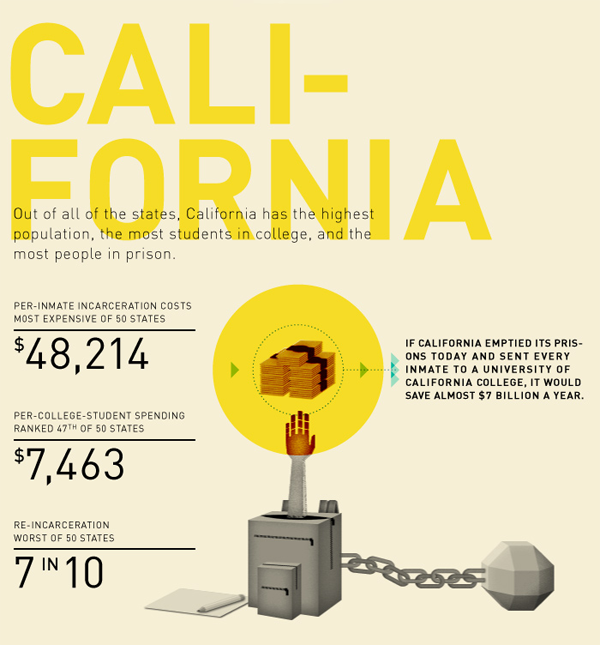
The only part of this graphic I kind of liked was the part about California. Here, we are able to compare the average cost of education for a year with the average cost of prison for a year. This is better than comparing the cost of a single school to the average cost of prison, especially when that school is as expensive as Princeton. I still have a problem with this comparison because the cost of school is running over about 8 months whereas the cost of prison is running the full 12 months, or at least that seems to be true from what I can gather. My back-of-the-envelope math suggests prison would be about $32,143 for 8 months. This is still much higher than the average of $7,463 per student spending for 8 months of school. Parent and student contributions to schooling are not factored in, though the point of the graphic is to compare what the state spends on students to what it spends on prisoners, ignoring the total amount spent on students.

What needs work

The information included in this graphic could have been presented in about one fifth of the space. I support the addition of graphical elements to information presentation only when they increase the clarity of the information provided or make the information delivery inarguably more elegant.

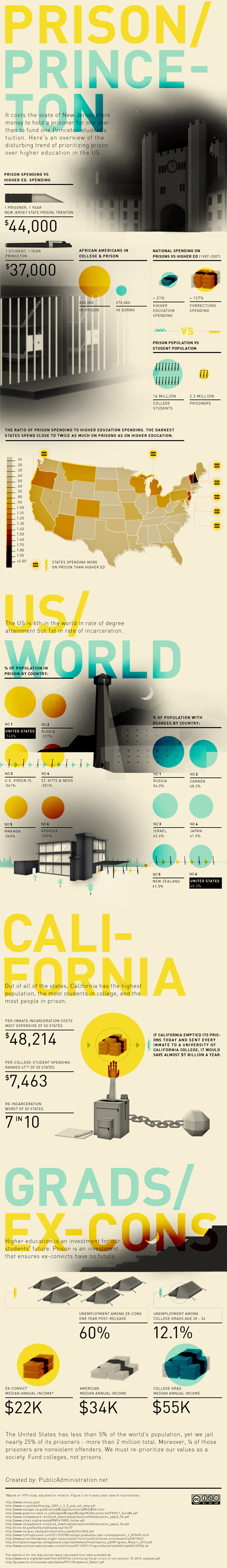
What I vastly dislike are the long columns of graphics stacked on top of each other, meant to be viewed as some kind of visual essay. That was where I drew the California graphic from. I pasted it below.

I’m curious. Do other people like these long, internet-only graphic essays? I find them extremely hard to digest. They seem to be plagued by apples-to-oranges faux comparisons, and unbashedly so. A year’s tuition at Princeton doesn’t include room and board. Prison does. Even if that were taken into account, the time frame is off.

One more item to highlight

Note that in the last panel they clue us into an uncomfortable reality: recent college graduates have a higher unemployment rate (12%) than the general population (9%). Ouch.

Prison vs. Princeton | Public Administration

References

Public Administration. (October 2011) “Prison vs. Princeton” [information graphic]

Resnick, Brian. (1 November 2011) Chart: One year of prison costs more than Princeton The Atlantic online.

Drug Cartel Areas in Mexico | Christian Science Monitor

Drug cartels cause social ills

Unless you’ve had your head in a bucket since 2007, you are at least vaguely aware that Mexican drug cartels trafficking their goods into the US have caused significant social illness in Mexico, especially in areas close to the US border. Social illness here can be measured in cartel-driven murders, but that captures only the most gruesome, sensational branches of the drug virus. Besides the deaths are fear, anxiety, mistrustfulness as well as poverty, corruption, and vast inequality.

Is mapping the right way to understand Mexico’s drug trafficking problem?

The graphics here try to pack all of the complexity and destruction of those social ills into maps. Maps are rational. They allow us to feel we have a handle on the components that make up a problem. In this case, I am sure they are not explaining the whole story. I’m also not sure they are trying to explain the whole story.

What I like about the first map is that the map makers lay out the obvious: which cartels are where. Then they go one step further and highlight the contested territory. In case the colors aren’t coming through clearly, the white areas are the disputed areas. There are a lot of white areas.

And yet…

One would expect most of the violence in a situation like this to be in the disputed areas. But that isn’t the case. Most of the violence is near the US border. The border is another kind of contested territory, one that is much more important than white areas as far as violence prevention is concerned. In fact, those areas aren’t governed by one cartel or another because those areas are not critically important to drug trafficking. None of the cartels much care.

So let’s take a look at another map because I’m thinking the first one implies that we should find violence in the middle of the country.

Drugs and deaths in Mexico

Drug-related crimes south of the US border | The National Post

This graphic shows not only traffic patterns – where do the drugs go? – but also maps of where the deaths have been. It quickly becomes clear that the drug-related deaths are up near the US border, not in the ‘disputed areas’ highlighted in the previous map. In this map, (thanks unnamed National Post graphic designer) that undisputed area is left unclaimed and unlabeled. That’s a more accurate way to understand those regions and the inset series of maps below the main map do a good job of visually locating cartel-related violence.

The other thing I love about this map is that it specifies *which* drugs are being trafficked. Call me crazy, but I have found it odd that there is a great deal of talk about ‘drugs’ in Mexico as if there is no good reason to talk about which drugs are being moved where. Why is it useful to know which drugs are going where? First, it’s nice to know which drugs because different drugs have different price points per volume and weight. Economics matter. If one drug has a higher profit margin than another because it retails for more per ounce but doesn’t cost much more to produce/transport, one could assume that it will become more popular. Then again, demand matters, too. Even if pot is easy to produce, doesn’t mean you can convince cocaine users to try weed. They probably already tried it and moved on.

Another reason it matters which drugs we’re talking about is that detection and apprehension vary from drug to drug. An easy example: a pot sniffing dog probably won’t lead authorities to a stash of ephedra. What’s more, being able to tell where things are coming from and going to means that it is easier for authorities to target weak points in the routes. We know from news stories (I recommend looking at the LATimes, see references below), we know that drug runners pour much energy into protecting the drug routes right at the US border. But they aren’t digging tunnels under all of Mexico. There are points in the chain of drug traffic that are more vulnerable. Some of those points are deep within Mexico where it might be difficult to get well-trained, cooperative authorities with the necessary tools and manpower to perform raids.

My main gripe about these graphics is that they display this problem as a Mexican problem. This is not a Mexican problem. It is a Mexico-US problem. The demand in the US is pulling all those drugs up from south of the border. Looking at it this way helps introduce conversations about economic imbalances. I imagine that one of the reasons drugs come from Mexico is the same reason that many large companies choose not to have large labor forces in the US: labor is cheaper in Mexico. Various instantiations of poverty also tend to encourage corruption; encouraging local police to fight the cartels is hard when they are out-gunned and out-manned by cartels who can afford to pay off whoever they want including witnesses, other cops, border agents, and whoever else is likely to become cooperative after the application of a bit of grease.

Conclusion

The drug-related social illness in Mexico is an unfolding problem, one that has been discussed with more complexity elsewhere. I hope to illustrate that while the rationality of mapping patterns is appealing, it also tends to obscure complexity. It’s easier to misinform than inform with a map. They are deceivingly neat, these maps.

References

LATimes “Mexico Under Siege” special section, US News.

Llana, Sara Miller. (13 January 2011) “Mexico drug war death toll up 60 percent in 2010. Why?” in The Christian Science Monitor, World/Americas section.

National Post Staff. (31 December 2010) Graphic: Drug Terror Just South of the Mexico Border in The National Post. [Graphic].

Original Version of the bar graph

How is the scoring system determined?

British researchers affiliated with the Independent Scientific Committee on Drugs met for a one day workshop and constructed a composite scoring system to determine which drugs are most harmful both to individuals and to society collectively. Scores can range from 0 – 100. Authors David Nutt, Leslie King and Lawrence Phillips found that,

heroin, crack cocaine, and metamfetamine were the most harmful drugs to individuals (part scores 34, 37, and 32, respectively), whereas alcohol, heroin, and crack cocaine were the most harmful to others (46, 21, and 17, respectively). Overall, alcohol was the most harmful drug (overall harm score 72), with heroin (55) and crack cocaine (54) in second and third places.

The full list of factors that were included in the composite score are here:

  • Mortality
  • Damage
  • Dependence
  • Impairment of mental functioning
  • Loss of tangibles
  • Loss of relationships
  • Injuries to others
  • Crime increase
  • Environmental degradation
  • Family breakdowns
  • International turmoil
  • Economic cost
  • Loss of community cohesion and reputation

Though it is possible to go into an explanation of how each of these was measured and subsequently combined to produce the composite scores, I am going to leave that discussion to the authors of the original study. There’s an overview graph below and the full article Drug Harms in the UK: A multi-criteria decision analysis is at the Lancet.

Composite scores showing contributions from harm to individuals and harm to society

What can be done?

I found it interesting that there was no attempt made to distinguish between legal and illegal drugs. Yes, of course, some drugs are not clearly legal or illegal. They are legal when prescribed and supervised by a doctor but illegal when used off-label or outside the medical authority system (like anabolic steroids, methadone, and marijuana in California). I assumed that most methadone users are under some kind of supervision but that most anabolic steroid users are using the steroids off-label (ie illegally). You can quibble with my choices below. The point here is that I found the graph to have more context if the legality issue was visually inscribed into it.

Photoshopped version of graph that highlights legal drugs

There are age limits and places where it’s illegal to smoke or drink, but for the most part everyone will be able to use alcohol and tobacco legally for most of their lives. Methadone is probably being used legally in most cases. That’s why I shaded those bars grey. I am not expert on methadone, but I see that it is much less harmful to users and to society than heroin, the drug it stands in for, so I guess if this were the only data I had to make a decision about continuing methadone treatment programs, I would keep them going. I would also call for close scrutiny of methadone programs. Something is clearly not working as well as it could be.

As for alcohol and tobacco…well…it’s hard to argue *for* the continuing legality of alcohol. How large do detriments to society have to be to trigger additional control mechanisms? The authors of the study noted that alcohol is part of society and it isn’t going anywhere. I agree. Prohibition was a failed experiment in this country and I’m not suggested we try it again. However, I would like to reopen the debate about how the negative impacts of alcohol can be alleviated. I recommend that all new cars must have breathalyzers in them. If the driver cannot blow a legal sample, the car won’t start. Yes, people could game that system by having their friends blow for them, but often one’s friends are also drunk. And hopefully, friends really wouldn’t let their friends drive drunk. Once upon a time, seatbelts were considered extraneous and seatbelt laws were considered constraints upon American’s rights to freedom and the pursuit of happiness. Well, when a drunk driver kills one of your family members, you might decide that the sudden loss of your mother or son or niece puts a much bigger crimp in your pursuit of happiness than a breathalyzer in your car ever would have. Will breathalyzers make cars cost more? Probably. But the cost of dealing with car accidents caused by drunken driving, even when they aren’t fatal, is absorbed by random individuals who happened to be in the wrong place/time as well as tax payers who pay to repair guard rails, subsidize public hospitals and EMTs, pay cops’ salaries, and so on.

References

Nutt, David J, Leslie A King, and Lawrence D Phillips. (6 November 2010) “Drug harms in the UK: a multicriteria decision analysis” The Lancet, Vol 376(9752): 1558 – 1565.

Map comparison highlighting walking distances in urban grid vs. cul-de-sac layout
Cul-de-sac urban planning limits walking distances | Urban Design 4 Health

What works

This side by side comparison is meant to show the length of all possible paths from a given point, assuming a person walks for five minutes. (Or maybe it’s ten minutes, but you get the idea.) Because the grid goes on forever – remember calculus? a line is defined by two points in space but continues for infinite length – the length of linear X-minute walking paths is longer than the more ‘organic’ length of cul-de-sacs. Of course, in cities, we are not talking about the ideal typical infinite lines found in calculus nor are cul-de-sacs some naturally determined path based on where deer walked down to the stream to get water before developers plopped a suburb down in the same spot. Both the grid and the cul-de-sac based suburb are planned developments. The question has become (see references below for a small sample of the people who are asking it): is the grid better than cul-de-sacs?

The folks who constructed the graphic above are interested in fit cities. They want you to see that because cul-de-sacs make it much harder to walk (or bike) around the neighborhood, they might be contributing to car culture and, in the end, making us fat. Fit cities are the antidote to fat cities and there is much urban design being driven by our collective (and towering) BMI. Lawrence Frank, Bombardier Chair in Sustainable Transportation at the University of British Columbia gets his hands dirty researching this question and he found that, “neighborhoods in King County, Washington: Residents in areas with the most interconnected streets travel 26% fewer vehicle miles than those in areas with many cul-de-sacs.” Furthermore, “Recent studies by Frank and others show that as a neighborhood’s overall walkability increases, so does the amount of walking and biking—while per capita, air pollution and body mass index decrease.

Cul-de-sac illustration
Illustration by Lauren Nassef

I think the concept behind the above graphic is solid. It doesn’t do the best job at showing distances walked, but it does a great job of visually demonstrating general walkability. The grid is good at making space permeable; cul-de-sacs are good at making space rather impermeable. I would point out that everything could have been much cleaner if some of the information and colors in the background had been dropped out. A grey-scale representation of the available routes overlaid with the walking routes in color would have put some polish on the visual without altering the concept. Plus, I would have liked a key somewhere telling me if this is 5 or 10 minute walking distance.

What needs work

Collective fitness has only recently hit the urban planning scene as a concern foremost in designers’ minds. Back in the 1980s when crime rates tended to be higher, for example, there was a great deal of concern about safety. Shane Johnson and Kate Bowers did a similar comparison also setting cul-de-sacs up against the grid (sadly, without generating any infographics) but this time they were wondering if cul-de-sacs experienced fewer burglaries than linear streets. Before you get your panties in a snit about demographic issues like income that could impact both burglary rates and the likelihood of living in a cul-de-sac neighborhood, I’m telling you that Johnson and Bowers controlled for income. They also controlled for ethnic heterogeneity. They were not able to measure whether or not cul-de-sac neighbors were more likely to have home security systems. What did they find? Cul-de-sacs are safer – fewer burglaries. They point out that there could still be elements of cul-de-sac neighborhoods that have nothing to do with urban design that they weren’t able to fit in their statistical model. Feel free to read the paper and make your own decision, but I was compelled by the fact that even the presence of foot paths connecting cul-de-sac hoods tended to increase the incidence of burglaries.

Johnson and Bowers sum it up thus:

For this study area at least, the policy implications would seem to be quite clear; permeability should be limited to that necessary to facilitate local journeys and sustainable transportation. Additional connectivity may lead to elevated burglary risk and so should be avoided. Cul-de-sacs, in particular, would appear to be a beneficial design feature of urban areas and so should be encouraged.

Overall, then, I think the jury is still out on the question of cul-de-sacs. Perhaps the most important point is to note that like many other things – fashion, food, sport – scholarship has trends. The trend in urban design now focuses on public health, especially fitness. It used to be crime. Before that one might remember that fears of nuclear annihilation influenced design. I’m not picking on urban designers for being faddish. Trends flow through all disciplines with which I am familiar.

References

Johnson, Shane and Bowers, Kate. (Online | December 2009, Print | March 2010) Permeability and Burglary Risk: Are Cul-de-Sacs Safer? . Journal of Quantitative Criminology Vol. 26 (1).

Popken, Ben. (23 June 2010) Cul-de-sacs are making us fat at Consumerist.

New York Times Magazine. (2009) “Ninth Annual Year in Ideas: The Cul-de-Sac Ban”. [above illustration by Lauren Nassef].

New York Chapter of the American Institute of Architects. (2010) Fit City 5: Promoting Physical Activity Through Design” Architecture Lab.

Wieckowski, Ania. (May 2010) Back to the City in Harvard Business Review.

Recidivism rates of US prisoners - reduced color palette
Figure 6.3 from Henslin's Intro to Soc - Recidivism of US Prisoners

On color

When architects draft plans and sections, they pay close attention to line weight. Part of the craft of draftsmanship is knowing which line weights are just right and making sure to apply the right line weight in the right instance. One of the criticisms older architects who were used to drafting boards and pencils levied against younger architects who draft using AutoCAD programs is that they just don’t do line weights properly. CAD displays layers in different colors and the younger architects were happy to rely on the appearance of these different colors as they worked on their monitors without making smart choices about line weights. When the documents were printed, all the lines could be the same weight, or if there were different line weights, they appeared to be arbitrarily chosen. Why were the older architects so upset? Because line weight carries meaning in architectural drawings. Get it right, and a simple section can speak volumes to the trained eye. Get it wrong and it’s like hearing a sentence without inflection (or perhaps worse, with inflections in the wrong places).

I feel the same way about color that the older architects feel about line weight. Color should mean something in a graphic. When the paint bucket comes out, there better be a reason for it beyond ‘decoration’. Graphic design is not about decorating otherwise drab diagrams. It is about enhancing the amount of information that can be communicated that privileges the image over the word because words always already require translation and the potential for misunderstanding.

The two bar graphs above depict the same information. One uses color with no apparent meaning attached to it – the bars are different colors just because it looks nice. The backdrop is yellow perhaps “to make the graphic jump off the page”. In my opinion, the full bleed back drop is like a heavy cloak, burying the information the chart contains in a Halloween costume. This Halloween celebration continues with the use of randomly selected colors for each bar on the chart. And the use of italics and bold where it isn’t needed is much like costume jewelry.

The gray-scale graphic uses color to highlight the originating question for the graphic. Each of the bars is shaded in accordance with the recidivism level for that crime – those imprisoned for auto theft have a 79% chance of being rearrested so that bar is 79% saturated with black. The bottom bar represents a 41% rearrest rate so it is 41% saturated with black. In this way, the saturation level reinforces the length of the bar and the numerical value printed in the bar.

References

Color graphic from: Henslin, James. (2009) Essentials of Sociology: A down-to-earth approach 8th ed., Pearson Publishing: New Jersey. Figure 6.3.

Gray-scale graphic: By Norén.

Accounting of Daily Gun Deaths - Bill Marsh

What Works

This is an odd kind of chart, it uses 2004 data to show how the average of 81 people who die each day by guns are killed – suicides, homicides, accidents/police action. Note that people who die in war are not included. I find this both intriguing and incomplete. For contextualizing sensational events like yesterday’s murders and suicide in Alabama, this is useful. People die everyday at the wrong end of guns, some as a result of homicide, more as a result of suicide in older cohorts. But…

What Needs Work

… where’s the depth? The dotted circles grouping the bullets are not all that sensitive. It’s the same dots across the board, no matter what’s being grouped. Somehow that seems too hasty; it takes a lot of reading to decode this graphic. There could have been a way to do it so that race and gender were visually obvious without needing the words. Maybe the bullets representing dead females could have taken on a feminine form. Maybe race could have been represented by colored bands around the bullets.

Relevant Resources

Arum, Richard and Taylor, Edward. (2007, 7 May) The Sociology of School Shootings Edited transcript and audio link of a recent Voice of America interview with Richard Arum of the SSRC and Edward Taylor of U. Minn., presented with the permission of VOA. From the SSRC site.

Dewan, Shaila. (2009, March 10) Gunman Kills at Least 10 in Alabama, Then Takes His Own Life After a Chase in The New York Times US Section.

Marsh, Bill. (2007, 21 April) An Accounting of Daily Gun Deaths in the New York Times.

World Gun Deaths - From the AP
Death Penalty Costs in Maryland - The New York Times

What Works

As you may recall from last week’s post on the death penalty, the use of the death penalty is not a deterrent to murder. Today in the New York Times, an article by Ian Urbina focuses on the fiscal reality of the death penalty citing a study done by the Urban Institute along with proposed legislation to get rid of the death penalty to help states meet their budgetary goals. “The Urban Institute study of Maryland concluded that because of appeals, it cost as much as $1.9 million more for a state prosecutor to put someone on death row than it did to put a person in prison. A case that resulted in a death sentence cost $3 million, the study found, compared with less than $1.1 million for a case in which the death penalty was not sought.”

What works about the graphic is the combination of bars with numbers. Basically this is just a spreadsheet with some bars next to the costs. For those of you social scientists out there who have grown fond of your tables, think about adding bars with interval level data (like costs and population).

What Needs Work

The bars should also appear in the last row on the table where the totals are displayed if this bar-in-table trick is going to work. I can see that the graphic would have had to stretch to accomodate the $3m bar, but the visual effect of having the whole table stretched to fit that bar would have been powerful. As it is, the visual impact of the bar technique is not fully realized.

Relevant Resources

Roman, John; Chalfin, Aaron; Sundquist, Aaron; Knight, Carly; and Darmenov, Askar. (1 March 2008). The Cost of the Death Penalty in Maryland. Washington, DC; The Urban Institute.

Urbina, Ian. (24 February 2009) Citing Cost, States Consider End to Death Penalty. The New York Times, US Section.

The Story From Across the Pond

There are so many stories that get played out on the legal stage and the stakes are highest when death is involved. I found two graphics each of which attempted to provided an overview of the death penalty in America. We start with the view from London (though the writer of the article was in New York while he was writing).

The Death Penalty in the US - An Overview with an emphasis on Texas

The graphic they’ve come up with over at The Independent does a great job of summarizing the story of the death penalty in the US. The best part of this graphic is the right-most graph showing that the states with the death penalty started with lower murder rates and *still* have lower murder rates than those states that have the death penalty. Murder rates in both types of states change over time, but those changes seem to be largely independent of the death penalty. Great way to show that the death penalty does not make a good deterrent.

One last notable point from this article is that the graphic seems to do a better job at representing “just the facts” than the text. From the other side of the pond, the continued use of the death penalty in the US looks, well, barbaric beyond anachronism.

From Usborne writing in The Independent: “China tops the world’s executions league table (officially it used the death penalty 470 times last year, though Amnesty International believes the true figure is far higher), followed by Iran and Saudi Arabia. Among developed industrialised nations, only the US, Japan and South Korea persist in retaining capital punishment. None of the United States’ European allies entertain it nor do its neighbours, Mexico and Canada.”

In case you aren’t accustomed to decoding dry British writing, it is most certainly not a good thing to fall into the same category as China or Iran when it comes to human rights.

The Story from the Backyard

Not to be outdone, the New York Times has also run a number of graphics about the death penalty which is a recurrent topic of popular and academic debate.

Death Penalty Overview - The New York Times

Here’s where the difference between the US depiction and the UK depiction starts to stand out. The UK added up all the executions since 1976 which tends to imply a great magnitude of death. There’s a big red 409 over Texas in their graphic and ‘just’ 20 in the NYTimes graphic, because the Times took a statistician’s more favored approach of looking at the number of death sentences per 1,000 murder convictions. This makes it easier to compare state by state data because it acts as a control for population size and murder rate. In this version, Oklahoma, Nevada, and Idaho appear to be more invested in the death penalty than Texas. Don’t mess with Texas becomes don’t mess with Nevada. (I guess what happens in Vegas really does stay in Vegas…but not in a good way).

The NYTimes graphic also looks at the sentencing rates when the race of the victims and perpetrators are the same and when they’re different. The way they’ve simply represented the facts speaks clearly to the continued machinations of racism in America. When whites are the victims, the perpetrators are more likely to be sentenced to death, especially if those perpetrators are black. Look at that part of the chart for a while then think about why the writer from The Independent has such strong negative feelings about America’s death penalty.

The Story from the US – 2003

Juries Reluctant to Give the Death Sentence

This post is not about how the general population in America feels about the death penalty – check out some of the death penalty blogs listed below for more on public opinion. I was beguiled by this next graphic because it so simply illustrated ambivalence which is not all that easy. Each block is a case, every case has to have only one outcome with respect to death sentencing, and the designer manipulated this binary to produce a picture of declining conviction. Bravo.

The article’s text offered about five competing reasons for the decline in the rate of death sentences applied, including poor representation. They ended with this one:

Alan Vinegrad, a former United States attorney in Brooklyn, said the recent statistics represented something larger.

”It reflects that the tide is turning in this country with regard to attitudes about the death penalty,” Mr. Vinegrad said. ”There has been so much publicity about wrongfully convicted defendants on death row that people sitting on juries are reluctant to impose the ultimate sanction.”

Relevant Resources

About.com’s list of the Top Ten Death Penalty Blogs. Most are not big on graphics or visuals of any kind.

Amnesty International’s Human Rights Now blog which hosts their posts on the death penalty.

The Death Penalty Information Center

Liptak, Adam. (18 November 2007) Does the Death Penalty Deter Murders? in The New York Times. National Section.
–Including this, ““You have two parallel universes — economists and others,” said Franklin E. Zimring, a law professor at the University of California, Berkeley, and the author of “The Contradictions of American Capital Punishment.” Responding to the new studies, he said, “is like learning to waltz with a cloud.””

Liptak, Adam. (15 June 2003) Juries Reject Death Penalty in Nearly All Federal Trials. National Section.

Usborne, David. (7 August 2008) Why is the United States still imposing the death penalty? in The Independent.

Spotting a Hidden Handgun - Graphic by Megan Jaegerman

What Works

This is one of my favorite information graphics of all time. A somewhat smaller version of this appeared in the New York Times and was then amended as you see above to appear in Edward Tufte’s book “Beautiful Information”. Since Edward Tufte is seen by many as the king of presenting data visually, I’d say his endorsement is worth far more than mine. Click through the links under Relevant Resources to see what he has to say about this graphic on his blog (which is basically a scan of a page or two from his $52 book). You will also get to see more of Megan Jaegerman’s graphics including the lifecycle of women in the developed world, the price of mowing the lawn, the price of quitting smoking, a complete strength training workout, a guide to rest/ice/compression/elevation after a soft-tissue injury, and sports graphics covering hockey, figure skating, baseball, gymnastics, and diving.

I want you to have time to look at the stylistic conventions she has developed. So follow the first link below.

What Needs Work

Megan disappeared from the graphics scene. Megan, if you’re out there, know that you are missed.

Relevant Resources

Edward Tufte reviews Spotting a Hidden Handgun by Megan Jaegerman.

Tufte, Edward. (2006) Beautiful Evidence. The Graphics Press.

Jaegerman, Megan. (June 1997) Life: Start Here Women’s Health graphic adapted for the web. The New York Times.

Marijuana Arrests in New York City 1977 - 2006 (Harry G. Levine)

What Works

Sometimes simple is powerful. Everything here is well-labeled, the time periods move in even intervals and the source is cited. The point that arrests for marijuana possession have skyrocketed comes across almost instantly.

The graphic is taken from testimony given by Harry G. Levine, Professor of Sociology at Queens College and the CUNY-Grad Center to the New York State Assembly on Codes and Corrections:

“New York City has arrested about 100 mostly young people a day, every day, for the last ten years. By the end of today another 90 to 100 will be arrested. About 85% of the people arrested are Black or Latino, most are working class or poor, from the outer boroughs and from less affluent and poorer neighborhoods.”

Marijuana Arrests in New York 1987-2006 | Whites, Blacks, Hispanics

What Works

Levine includes this graphic in his testimony to demonstrate the uneven distribution of all these marijuana possession arrests across racial/ethnic boundaries. He is right to make sure to include a little decoder text about the distribution of whites, blacks, and hispanics as percentages of population of New York overall. Remember that in a world of equal arrest rates, whites would be arrested for possession roughly according to their percentage of the population, which is 36% in New York during the 1987-2006 period. But they were only accounted for 14% of the possession arrests. On the other hand, blacks should have been arrested 27% of the time but instead were arrested 54% of the time. Hispanics were the closest to even, representing 27% of the total population and 30% of the possession arrests.

What Needs Work

These stacked bar graphs always confuse people. So here we can use the y-axis to determine absolute number of arrests by racial/ethnic group but in other uses of this technique I’ve seen the bars all add to 100% and the viewer is supposed to suss out the relative proportion of the bar dedicated to the categorical break down. That clearly is not how this graph works, but still, where there is any chance of confusion, more work needs to be done to clear things up. I might have tried a hint of 3D, popping the white bar in front of the grey bar and the grey bar in front of the black bar just so that each bar reads as a distinct entity.

I would also have stuck the arrestee percentages directly next to the population percents. It would look more like:

Arrestees          Population
Blacks     54%     27%
Hispanics 30%     27%
Whites     14%     36%

Simple to do. Makes much more sense to read that data across rows. I would then have stuck the color shading key to the left of that little table and cut the “blacks arrested”, “whites arrested”, and “hispanics arrested” labels which would have cut down on the total amount of text the viewer would have to read through.

Go ahead and click through to the full report to see the other graphics and read the whole story about the astronomical increase in marijuana possession arrests in NYC with the disappointing follow-on that the arrests are being doled out in minority communities disproportionately more often than elsewhere in the city.

One parting quote to provoke you to jump across and read it all, in response to why there are so many arrests so unevenly distributed across the city’s population, “it is not because of any dramatic increase in marijuana use – which has not changed significantly since the early 1980s. Nor is the dramatic racial imbalance in the arrests the result of marijuana use patterns. In fact, marijuana use among Blacks and Hispanics is lower than for Whites, and has been for decades, as U.S. government statistics show. “

One More Thing

If you’re wondering where all the weed comes from, as I was, you might want to link through to the 2007 article “Home Grown” in The Economist via Proquest (subscription required) which notes in classically dry Economist fashion, “Marijuana is now by far California’s most valuable agricultural crop. Assuming, very optimistically, that the cops are finding every other plant, it is worth even more than the state’s famous wine industry.”

Relevant Resources

Becker, Howard. (1953) On Becoming a Marihuana User originally in American Journal of Sociology Vol. 59 November 1953 (235-242).

Dwyer, Jim. (30 April 2008) On Arrests, Demographics, and Marijuana The New York Times, NY/Region Section.

Levine, Harry G. (May 2007) Testimony before the New York State Assembly Committees on Codes and Assemblies.

Schlosser, Eric. (2003) Reefer Madness: Sex, Drugs and Cheap Labor in the American Black Market. First Mariner Books.

Home Grown: Cannabis in California (20 October 2007) in The Economist Vol. 385, Issue 8551 (60).