relationships

What a man wanted, what a man wants | Boxer, Noonan and Whelan
What a man wanted, what a man wants | Boxer, Noonan, and Whelan
What Men and Women Want in a Mate, 1939-2008
What Men and Women Want in a Mate, 1939-2008 | Boxer, Noonan, and Whelan

Update on references

As you can see in the comments, Christie Boxer, the lead author of the journal article behind the Coontz Opinionator piece has contacted me to let us all know that the article is currently in revise and resubmit phase but will be published in Journal of Family Issues shortly.

What works

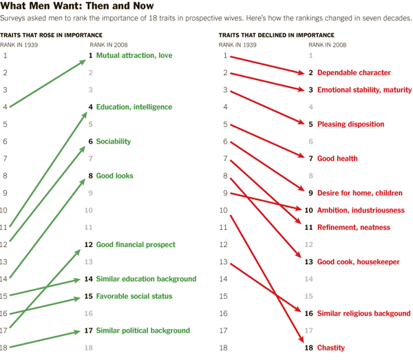
The graphic is more legible than the chart from which the data originated. I’m guessing the Journal of Family Issues would not allow such a “fancy” series of graphics in the final published piece so I don’t mean this as a critique of the article’s authors. Just pointing out that there is good reason for journals and other publishers to reconsider their policies about how data can most usefully be presented.
I happen to have created a few graphics in this style myself and tend to favor it over the chart (e.g. this one about agricultural subsidies) in the past and think they work well for displaying changes in attitudes over time.

What needs work

Illustrations to Accompany "The M.R.S. and the PhD" by Stephanie Coontz, New York Times

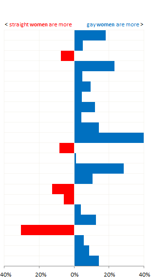
The article from which this news story is drawn clearly provides information on both what women want and what men want in greater detail than what’s seen here. Why did the news story choose to run with less than half the data?
The chart clearly contains information on what men want in a mate AS WELL AS what women want in a mate. I see no reason for going (less than) halfway on this story. In fact, what I find most interesting is the convergence on some things – nobody cares much about chastity in a mate any more – and divergence on other traits – women rank men’s desire for home and children much higher than men rates women’s desire for home and children. That’s a puzzler worthy of thought in a way that a story that reflects only what men want is…well…just not all that interesting. Pair bonding takes two, as I’m sure Coontz knows because she’s been researching marriage for years. It’s unclear if the Times pressured her to come up with a more attention grabbing headline “The M.R.S. and the PhD” or if she chose that on her own or if it was a combination of factors.

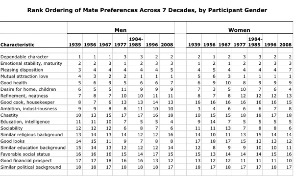
I’m glad to see that, at least as far as I can tell from what is available to scholars other than Coontz (who might have an early full-length, unreleased draft of the Boxer, Noonan, Whelan paper), the scholars whose data led to the graphic were not so singly concerned with what men want in a mate. They were looking at how mate selection characteristics have been adjusted over time for both men and women and I hope that their article looks at the consonance and dissonance between the two genders’ mate selection ideals.

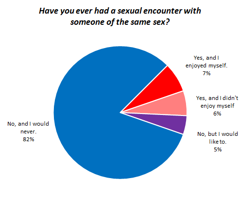
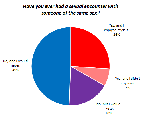
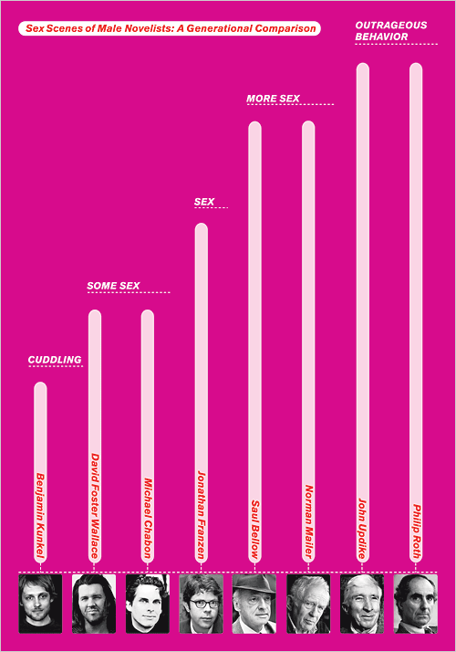
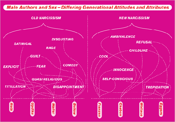
I would have preferred more attention paid to the graphic – like, say, the inclusion of what women want or an integrated graphic that displayed the overlaps and distances between what men and women want – and less time put into the accompanying illustrations which I have included to the left. I welcome regular readers of Sociological Images (and others) to comment on the messages coming out of the illustrations.

References

Coontz, Stephanie. (2012) “The M. R. S. and the PhD”. The New York Times, Sunday Review, Opinionator. [Information graphic by Bill Marsh/The New York Times]

Boxer, Christie; Noonan, Mary; and Whelan, Christine. (forthcoming) “Measuring Mate Preferences: A Replication and Extension” Journal of Family Issues. [Table drawn from Christine Whelan’s research webpage]

Living Alone by Gender, Age Cohort in the US
Living Alone by Gender, Age Cohort in the US since 1850

What works

This post is an update to an earlier post about the increasing rate of Americans living alone. The first graph does an excellent job of visualizing the change in Americans’ tendencies to live alone, by age and gender. It’s clear that living alone is on the rise, especially for Americans over 45. It’s interesting that there seems to be a collective slow down in this trend in the decade between 35 and 45 when I suppose some of the late-to-marry people finally settle down and before the marital dissolution rate starts to fire up.

The graphics in this post accompanied an article by Eric Klinenberg in the New York Times Sunday Review that laid out the basic findings in his latest book, “Going Solo” that was based on 300 interviews with people living alone. He finds that while for some, living alone is an unwanted, unpleasant experience, most people who live alone are satisfied with their personal lives more often than not. In fact, they are more social, at least in some ways, than are their counter-parts who live with others. Singletons (his word, not mine. I prefer ‘solos’ in part because it’s an anagram), go to restaurants and other social spaces more often than do those who live with others.

Living alone in Minneapolis

In a number of cities, including Minneapolis, more than 40% of households are single-people households. The article included an interactive map down to the census tract level that shows what percentage of households in that tract were single-person households in 2010. I took a look at Minneapolis and St. Paul and found that the map supported Klinenberg’s qualitative findings. The highest concentration of solos is in the center city areas where opportunities to get out and be social in the community are the highest. The suburbs and rural areas have fewer solos.

I encourage others to use the map and see if their local cities replicate this pattern, that more solos live in ‘happening’ areas than in quieter areas. Of course, this could be caused by a third variable, the presence of households that are affordable for single-earner households…but there isn’t enough analytical power in the map tool to be able to sort out the dependencies.

What needs work

The information about who lives alone by age, marital status, and race that is displayed in the following long skinny stack of datapoints is the right kind of detailed information to use as an entrance into a deeper discussion about living alone, now that we’ve gotten a sense of the view from 30.000 feet. The problem is that this graphic is hard to read, too long for a single computer screen (but in order to make sense of it, one needs to see the whole thing at once), and too optimistic about what color differences are able to do than is reasonable.

The article does a better job of subtly navigating the movement from historical and international context into a detailed, robust analysis. By awkwardly pinning all the data points onto the stalk at once, viewers lose the ability to see patterns within data subsets. Here’s a test. Look at the following data and try to explain to yourself how race and living alone go together. Or how age and living alone go together. The graphic designer was hoping color would be able to do more than it has been able to accomplish here. The color is supposed to tunnel your vision down to a particular color-coded subset so that you can start to understand well just what it is about race or age or marital status that produces particular patterns in living alone. But I had a lot of trouble with the color frame because, quite literally, I had to keep shifting the frame around this graphic – it didn’t fit on my laptop screen. [Graphic designers often work on nice, roomy screens where they end up seeing more at once than their eventual audience who is probably peering at this thing from a web browser on a laptop or occupying half of a monitor somewhere.]

All the clustering around the mean is another problem that could have been avoided had the graphic been organized differently. As it is, all sorts of groups lump on top of one another down around 14%.

I also kind of hate that I can’t add categories together in any meaningful way here. I can tell that being a widow would put someone at high risk for living alone, but that’s kind of a no-brainer, isn’t it? I would have gotten more mileage out of visualizing the absolute numbers of people living alone by marital status, age, and race. Maybe over half of all widows live alone, but I haven’t the faintest idea how many widows there are in America so I don’t know if half of all widows is half a million people? Or 3 million people? Or whether it’s more or less than the 38% of separated people who are living alone. 19% of never married’s live alone, but because these people are likely to be young, maybe that is actually a larger absolute group than the 58% of widows living alone.

Final verdict: There was both a data fail and a graphic design fail.

Who lives alone?
Who lives alone? A demographic breakdown

References

Going Solo Cover
Going Solo Cover

Klinenberg, Eric. (2012) Going Solo: The Extraordinary Rise and Surprising Appeal of Living Alone. The Penguin Press HC.

Klinenberg, Eric. (2012) One’s a Crowd. New York Times Sunday Review.

Weber, Susan and Beveridge, Andrew. (2012) [infographics]
Solo in America graphic Line graph looking of the changing percentage of singleton households in America, 1850-2000
More on their own here…and even more abroad American and International singleton households.
Mapping the US Census: Percentage of Households with only one occupant Interactive graphic of US singleton households by census tract.

Percentage of Americans Never Married, 1900-2010

What Works

There are two great things about this:

  1. We see that the current rise in never married Americans still doesn’t match the numbers of unmarried Americans back at the turn of the century.
  2. We see that what is changing now isn’t so much the overall number of never married Americans (which has been hovering at around 30% for the past three decades) but the number of relatively older Americans who have never been married. I couldn’t find consistent numbers for people any older than the 30-34 year old category, nor could I find numbers for the 30-34 year olds available online from before 1960. I am still working on extending that portion of the graphic back to 1900.

What needs work

I need more numbers! I can’t understand the overall trend – which is the increase in never married Americans – without getting more historical context. I need that 30-34 year old category to extend all the way back. I also need to know what the deal is with slightly older cohorts, like 40-44 year olds. If all this graph tells us is that people are getting married later that is a very different story than the one that sounds like: “Americans aren’t getting married at all”. Marrying late and never marrying are two different scenarios. I cannot yet tell from the numbers I’ve got, just what is going on. And the problem with the aggregate data is that it is not granular enough to help understand current trends. Pooling 30 year olds with their parents and grandparents does not help me understand the 30 year olds (or the 20 year olds). And I really want to know what is going to happen in the near future, not what happened in the relatively distant past.

Other people have complained that the ’15 and older’ marital status category is crazy. Who gets married at 15?? But the problem is that we have to keep looking at that category or we cannot follow trends over time. That was the way the category was established back in the beginning, so in order to look across time, we have to keep the boundaries of the category the same. Now, to get around that problem, I included the 30-34 year olds, but that data slice doesn’t go all the way back.

Tricky census data.

And it’s black and white for easy printing. Otherwise I would have gone color.

Same Sex Encounters Between Men | OKCupid Blog
Same Sex Encounters between Women | OKCupid Blog

What Works

I have been posting about marriage lately and I thought I would take a break from that, but stick with the relationship topic. If you haven’t discovered the blog at OKCupid, I highly recommend heading over. With a strong mathematical background, the folks at OKCupid are thrilled to take their users’ likes, dislikes, and reported behaviors, run the stats, and provide us with the infographics. I promise it will be worth your while to head over…later on in the post where I located the pie charts above, there is a quote which I am reposting here because I thought it was the most hilarious reference to Karl Marx that I’ve encountered in a very long time:

According to Verta Taylor and Leila Rupp, who wrote a piece for Contexts called “Straight Girls Kissing”, homosexual experimentation in the US is possible for women in a way that it is not for men. At first glance, much of the ‘straight girls kissing’ going on at bars and fraternity parties appears to be a rather perverse appropriation of female sexuality for the visual pleasure of men. The history of the male gaze is so entrenched here that anything sexual going on with women is assumed to be for men, even when the sexual behavior is homosexual – especially if it is done in public as spectacle. [Note: If the girls kissing get so into it that they appear to be ignoring the male attention altogether, they do risk social sanctioning laced with homophobic slurs. So straight girls kissing better make sure they maintain some kind of connection to heteronormative behavior or they could, I don’t know, have beer poured all over them. See Rupp and Taylor.] What this means is that women who have experience with other women do not necessarily fall outside of the category ‘heterosexual’ which for many women, makes the experimentation seem quite a bit safer than if they felt that any homoerotic behavior would automatically queer their social sexuality. The same is not true for men.

Rupp and Taylor found that ‘straight girls kissing’ is not just another example of girls gone wild trying to get male’s attention by flaunting ‘extreme’ sexuality. In interviews, many of the women involved reported that at least some of the instances of their public encounters with other women opened up the possibility for them to explore their self-generated (rather than crowd-generate) attractions to other women. OKCupid’s report indicates that having this culturally condoned space to get out there and try kissing girls without risking the stigma of being labeled lesbian allows a fair number of women to have enjoyable encounters with other women. What’s more, a fair proportion of the women who haven’t done it feel like they are missing out.

If our heteronormative culture could relax the rigid classification of male sexuality to afford the same kind of bi-curious space for men, maybe they would feel more free to experiment with other men and enjoy themselves.

What needs work

I hate pie charts. I would have rather seen this one as a set of bar graphs – the ‘tried it and liked it’ in the same color as the ‘haven’t tried it but want to do it’. Then the ‘never, and don’t want to’ can be lumped with the ‘tried it and didn’t like it’. Though I do wonder if the ‘tried it and didn’t like it’ might have been specific to the person they were trying it with on that occasion. It would be useful to know if those people would try it again.

Humor

I found the quote below so funny that I laughed out loud in the class where I was supposed to be serving as a TA rather than as an internet surfer. The class is taught by Paula England about Sex and Love in Modern Society, so looking at OKCupid’s blog was right on topic, but still. Laughing in class distracts the students.

“Religion is the opiate of the masses, so long as the masses are straight. However, amass a bunch of lesbians and you’re going to need actual drugs.”

Women's Personality Traits by Sexual Orientation | OKCupid Blog


Before anyone gets angry and posts to my blog, take a deep breath. Is it possible that straight people are claiming to be lesbians and then reporting drug use just to make lesbians look drugged out on OKCupid? Yes. But that’s a stretch. Is it possible that lesbians feel pressure to report being adventurous, thereby indicating an openness to drug use, if not actual use? Yes, it’s possible that they are reporting more drugs than they’re actually using or that they are the only honest people on OKCupid and all the straight people and gay men are under-reporting drug use. My point is that twisting Marx around like that was sociology nerd humor at it’s best.

OKCupid’s numbers come from 3.2 million dating profiles. Dating profiles may not be the place you’ll find soul-searching truths. However, what we do find are the embellishments people adopt to make their actual selves slouch closer to their ideal selves so as to attract their ideal mates.

References

Rupp, Leila and Taylor, Verta. (Summer 2010) Straight Girls Kissing Contexts Magazine.

Rudder, Christian. (12 October 2010) Gay vs. Straight Sex. OKCupid Blog.

Out of wedlock childbirth rates | Heritage Foundation

Bad title

Why draw attention only to the fathers? Clearly there must be quite a few unmarried mothers out there as well. I hope this isn’t suggesting that deciding to take a relationship into marriage is somehow only or primarily the man’s responsibility. Both women and men have agency around the marital decision. It would be nice if cultural constructs supported equal opportunity for popping the question…but headlines that emphasize men’s agency over women aren’t going to get us any closer to equality on that front.

What works

It’s nice to see that this graph points out where definitions of racial categories change. It is also nice that it draws attention to the problem that many American children are being born into poverty or at least situations where resources are extremely constrained. In another graph elsewhere, the same group also reminds us that these births are largely NOT happening to teen parents.

The other critical point is that out of wedlock births are on the rise even though birth rates for teen mothers are declining. If in the past it was possible to think that the problem is just that teens are out having unprotected sex that leads to accidental births, we can no longer be so sure that this is what is happening. Age at first sex is decreasing which means that most of the people having children out of wedlock are capable of having sex without getting pregnant. They probably have been doing just that for years. Having children out of wedlock is best understood to be a choice, then, not an accident. Any efforts to prevent child poverty are probably not going to be successful if they rest on sex ed or free condoms (though I personally believe those things are important for other reasons). The American Heritage Foundation believes that if people would just get married, these kids wouldn’t be born into poverty. Others aren’t so sure it’s that simple.

What needs work

The problem with the write-up accompanying this chart is that it implies that the causal mechanism goes something like this: for whatever reason couples have children together but do not get married. The failure to get married means that these children will be far more likely to be raised in poor or impoverished conditions. For emphasis, I’ll restate: the parents’ failure to marry one another leads to children being raised in poverty.

Now. Here’s what I have to say about the chart. First, if that is the message, why not depict the out-of-wedlock birth rate by poverty status, preferably poverty status prior to pregnancy? I’d settle for poverty status at some set time – like the child’s birth or first birthday, but that isn’t as good. I feel like showing these numbers by race is subtly racist, implying that race matters here when what really matters is poverty, at least according to the story that they are telling and the story that many marriage scholars care about. Yes, it is true that poverty and racial status (still) covary rather tightly in America, but if the story being told is about poverty, I’d like to see the chart address that directly rather than through the lens of race. Furthermore, if race DOES matter, where are Asians? American Indians?

Moving away from the chart for a moment and getting back to the causal story, marriage researcher Andrew Cherlin finds that the causal arrow might go the other way. Being poor may be a critical factor in preventing folks from getting married. William Julius Wilson was an earlier proponent of this concept, especially with respect to poor African Americans. His work suggested that during and after the post-industrial decline in urban manufacturing jobs, African American men were systematically excluded from the work force and this made them appear to be poor marital material. Cherlin’s more recent work applies more broadly, not specifically to African American men, and bolsters the idea that marriage is something Americans of all backgrounds feel they shouldn’t get into until they are economically comfortable. What ‘comfortable’ means varies a lot, but most people like to have steady full-time jobs, they like to be confident that they won’t get evicted, that the heat or electricity will not be turned off, that they will have enough to eat.

The more important question would be: why don’t these assumptions apply to having children? Whereas getting married can represent an economic gain if you are marrying a working spouse, having children certainly does not (state subsidies do not cover the full cost of having children no matter how little the children’s parents make). Perhaps what we are faced with is people for whom getting married may not represent an economic gain. Marrying a person without a steady job could present more of a drain on your resources than staying single, whether or not you have kids.

Married people and their wages compared to single people, by gender

What works

Thank you, Pew Research, for all of your hard work.

This set of lines does not tell a story about marriage and wages, it poses a question. Let me first take a moment to stop and praise the graph maker for choosing lines instead of bars. This is basically a series of timelines presented on the same axes. When displaying trends, lines are better than boxes. A line can travel over time, a box just sits there. Of course, then, for time series data, unless there is a compelling reason to discourage people from feeling a sense of movement over time, then go with a line. You might want to choose a box or series of boxes if you have reason to believe your dataset is not truly continuous.

Second, let me say that I enjoy the way the context provided here forces the viewer to wonder why it was that the wages of single people flattened out. While it might be tempting – and some have done it – to assume that getting married makes you rich, looking at the trends presented the way they are here makes it hard to jump to that conclusion. We can see changes over time in the relative wages of married and single men and women, but we cannot see any reason to think that it is marriage that leads to increased wages. Folks who study marriage and wages (Andrew Cherlin, Betsy Stevenson and Justin Wolfers, Kathleen Gerson, and many others) have long pointed out that even though there has long been a correlation between marriage and wages (married people tend to have higher wages) we have no idea whether being married leads to higher wages or having higher wages leads to getting/staying married. The set of lines above does a good job of making sure it is difficult to jump to a causal conclusion.

Karen Sternheimer at Everyday Sociology blog which is part of Norton publishing covered this question a long time ago, but she focused on the gender difference in wage returns. It used to be that women benefited economically by getting married but now that women’s and men’s salaries are getting closer to parity, men see a bit more of a per capita bump than do women when they get married.

This still does not explain why single people make so much less or whether marriage preceeds the wage increase or the actual or promised high wages attract marriage partners.

Dalton Conley, in Elsewhere, USA, pointed out that what could be more alarming than the distance between single and married people is the way that equality in marriage partners (folks are starting to equalize their strategy for choosing mates – more and more we all want to marry wealthy, attractive people who are likely to continue to be wealthy and attractive. This holds regardless of whether we are men or women.). This means that folks with high incomes marry other folks with high incomes and increase the distance between top earning households and lower earning households. He calls it doubling down, though I suppose if you are a high earner married to another high earner you might consider it doubling up. Either way, the distance between the haves and the have-nots may actually be exacerbated (in some ways) by the sexual revolution, especially if single people’s wages flatten out. I’m thinking in particular of single parents, who are going to be raising kids on sole salaries lower than their married counterparts, for whatever reason. Their kids are competing for spots in the good high schools and colleges with all the kids whose high earning parents doubled up.

I love graphics that make me ask questions.

What needs work

The married men’s trend line ends up looking like a shadow of the married women’s trend line even though men are not actually women’s shadows. I would have recommended a different color scheme to make sure we don’t read men as existing in women’s shadows.

References

Sternheim, Karen. (2010, February) “Men and Marriage” at Everyday Sociology by W.W. Norton Publishing.

Married with Children | The Venn Diagram

What works

1. Menlo is my favorite font of the moment for information graphics.
2. I have no idea why I haven’t seen this Venn diagram before. In my humble opinion, if you are a social scientist and you are attempting to display a concept that may or may not have solid numbers to back it up, start with the Venn diagram because:
a. Venn diagrams are easy to make.
b. Venn diagrams are easy to understand.
c. Venn diagrams are not expected to represent solid numbers. They certainly can be employed in that way, but they are not always employed in that way so you are not likely to mislead readers that you are backing your claim up with census data.
3. I am doing a bit of research on marriage and I have run up against many arguments that seem to believe that marriage and childbearing always go together, or at least that they OUGHT to always go together. News flash: 36.9% of children are born out of wedlock (Cherlin, 2008). Other adults get married but do not have children. Yet other adults get married, have children, and then end up unmarried again because divorce and death ended their marriage. The above graphic should help clear up what actually happens in the world. Marriage and child raising frequently have no overlap.

What needs work

I was so upset that I didn’t stop and look up the actual data for each of these segments. In part, I wanted to leave it as a universal concept and NOT tie it to US data. But yeah, I realize it would be better if I had sat down and figured out how many people are in each of these three areas. That’s coming in the article version. And after I take a deep breath to disperse the anger I feel at people who make illogical arguments.

References

Cherlin, Andrew. (2008) “The Marriage Go-Round.” New York: Vintage.

Sex Scenes of Male Novelists:  A Generational Comparison
Sex Scenes of Male Novelists: A Generational Comparison | Paula Scher
Male Authors and Sex-Differing Generational Attitudes and Attributes
Male Authors and Sex-Differing Generational Attitudes and Attributes | Paula Scher

Katie Roiphe wrote an excellent article – “The Naked and the Conflicted” – in the New York Times that tracks the treatment of sex by male novelists from writers like Norman Mailer, Philip Roth, and John Updike through to contemporary writers like Jonathan Franzen, Michael Chabon, and Benjamin Kunkel. The upshot is that newer male novelists do not include the exuberant, even extreme, sex that got previous male novelists in trouble, but at least made them interesting. The younger writers’ sex scenes involve a lot more cuddling if they have any sex scenes at all. It’s a good article, I recommend that you read it.

What works

I really like that an article about novels and plots – not something that easily lends itself to information graphics – includes not one, but two different visualizations. I also happen to like that they are magenta. It’s a story about sex – magenta is a good way to scream for attention.

What needs work

I don’t know about you, but these are probably only good as jokes. And joking with information graphics is just fine by me. I encourage it.

If one were to try to interpret these as graphics, though, I have a few recommendations. First, I would have ordered the authors in the same way on both visualizations. Right now they are mirror images and it makes it harder to follow the patterns. I think the graphic could have been funnier and more helpful if there had been an axis labeled with what constitutes sex, more sex, outrageous behavior. If you read the article, some of this becomes clear, but the graphic doesn’t stand on its own without the article. And the snake-y graphic just doesn’t do much at all. There is no reason for all the snakiness – just makes it hard to read which obscures the point. It might have even been funnier if each of the adjectives had been in its own bubble where the size of the bubble increased the more authors that could be described with that adjective.

References

Roiphe, Katie. (December 2009) The Naked and the Conflicted in The New York Times Sunday Book Review with graphics by Paula Scher.

Trends in Marital Stability (2004) | Betsey Stevenson and Justin Wolfers

What Works

Last night this blog received a deluge of spam from someone with an IP address in Australia promoting wholesale wedding dresses. In response, I first exercised a wholesale ‘delete’ event. Now we’ve got a graph about the stability of marriage in the US since the 1950s. The next time someone tells you that 50% of marriages end in divorce, you’ll know how to show them that they’re wrong.

As you can see from the above graphic representation, marriages in the 1950’s were less likely to end in divorce within the first 25 years of marriage than any subsequent cohort of married folks. We have no idea if those were ‘good’ marriages that lasted, we just know that they were less likely to end in divorce. From the representation we see that divorce rates climbed through the 1960s and 1970s but started falling in the 1980s and continues to fall, inching back towards 1960s levels.

Measures of Annual Marriage and Divorce Rates | Betsey Stevenson and Justin Wolfers

Furthermore, from this next graph, we can see that the decrease in the divorce rate is not only due to marriages lasting, but that any given person is less likely to experience divorce because we are now less likely to get married in the first place. If one doesn’t get married, one cannot get divorced. It would seem that people might actually be making fairly appropriate decisions around the ‘I do’ moment because the people who choose marriage are staying married longer. In other words, the folks less likely to stay married may somehow recognize this about themselves and opt out of marriage altogether.

Using multiple graphs tells a much more complete picture than relying on just one. The first graph was designed to debunk the notion that 50% of marriages end in divorce by showing that for a brief moment, marriages formed in the 1970s may have approached that dissolution rate but that marrieds have been sticking together more and more since then. The second graph is more interesting to me because it details overall trends in marriage, including the slow slide away from marriage altogether. It could be that people are just waiting longer to get married, in which case the decline in the marriage rate recently might just be a lag. Lifetime marriage rate is something I’d still be interested in checking out, though I feel that we haven’t maxed out on age at first marriage so it would be hard to see, at least not in 2010, if the trend is toward later marriage or no marriage at all. My prediction would be that age at first marriage will start to hit a plateau at around 30 for women because reproductive ability tends to decrease markedly starting at about 35, or so I’ve been told, and many people get married at least in part because they’d like to have some kids. But we’ve got a long way to go before we hit 30 for women’s marrying age. Median age at first marriage for women is just 26 and even though it is climbing, it isn’t skyrocketing.

References

Stevenson, Betsey and Wolfers, Justin. (2007) Trends in Marital Stability. Working Paper.

Wolfers, Justin. (21 March 2008) Misreporting on Divorce. on the Freakonomics blog at the New York Times.

How Genetics Works - repost from 9gag

I felt like sharing this one with you but I have no commentary because none is necessary.

Reference

9gag (photographer) How Genetics Works which was possibly originally from a book of photographs published in the 1960s. I couldn’t find that source with certainty.