
What works
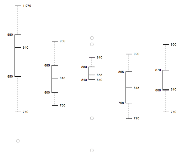
This is elegant and information rich. Box plots are an old standard in the display of quantitative data, useful because they are able to show average tendencies, upper and lower confidence intervals, outliers (nice addition here, outlier display is optional), and thus give not only concrete data points but an impressionistic view of skewness.
You can make box plots like this using your own data. The javascript is available. It was created by Mike Bostock using d3 which is something you should check out. From mbstock’s website for d3.js:
“D3 is a small, free JavaScript library for manipulating HTML documents based on data. D3 can help you quickly visualize your data as HTML or SVG, handle interactivity, and incorporate smooth transitions and staged animations into your pages. You can use D3 as a visualization framework (like Protovis), or you can use it to build dynamic pages (like jQuery).”
I haven’t had a chance to try doing anything much with it yet, but I will. It’s extremely exciting to me and I couldn’t wait for myself to mess around with it. I had to post right away.
What needs work
I need to work – my overscheduled self needs to carve out some time and try it.
Javascript code is available
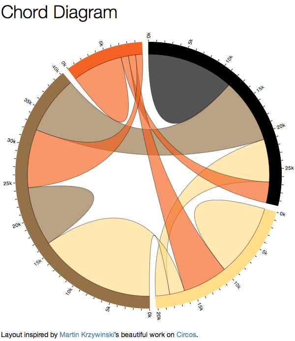
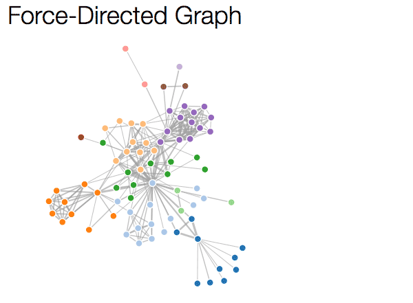
There are a bunch of javascript codes available for a range of different kinds of visualization, including the box plot and code to make things that look like this:
or this:
References
Bostock, Mike. (2011) d3.js repository on GitHub. [Code for generating information graphics] See also: Mike Bostock’s webpage