tables

American Shame | Charles Blow for the New York Times

What works

To social scientists: you can make your own information graphics with the programs you are already comfortable using. This graphic is something you could put together in Excel. One of the common questions I hear goes something like this: “I want to use more infographics but HOW do I make them?” I often use the Adobe Suite to make my graphics, but sometimes Excel can be a decent tool for making fairly sophisticated tables. I would not recommend trying to use Word to make graphics. You will become so frustrated with the clunkiness of trying to use a word processor as a graphic design tool that you may be tempted to pick up your computer and throw it out the window. Or, if you are a pacifist, to pick up yourself and leave the office for the rest of the day. But Excel is a more robust, stable program that won’t get finicky if you start manipulating cell colors and border conditions.
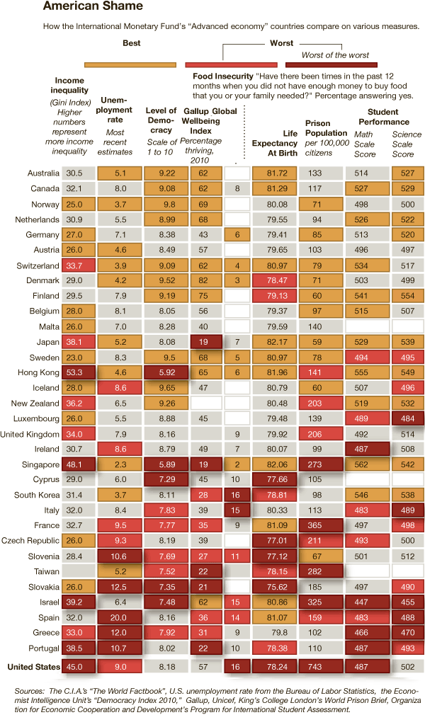
What needs work

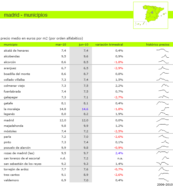
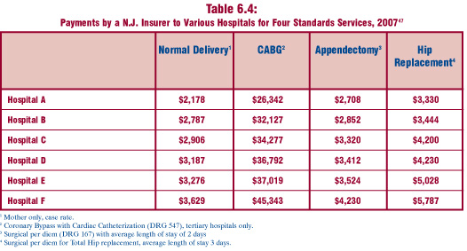
In general, Excel is probably not the program that’s going to generate elegance. It will allow you to use color and line weight to add layers of visual information, but as you can see here, the results are not necessarily going to be attractive.

In particular, this graphic makes weird color assumptions. The red is bad, the gold is good, and though there is a kind of natural spectrum between red and gold, this graphic doesn’t follow it. I would have used a single color and varied the hue. I have no idea why the middle category is grey. In my mind, grey does not appear on the color spectrum between red and gold. To strengthen this table-as-graphic, I’d go ahead and let every cell (except the empty ones) sit on the color spectrum being used to represent the best and worst. Color can be most meaningful only when it is used consistently. As it stands, there is an inconsistency in the middle categories here with the grey and an unnecessary use of two colors where one would have been enough.

I’m on the fence about the use of apparent depth or 3D-ness. The ‘worst’ buttons stick out like red pimples. On the one hand, the wannabe rebel in me is pleased to see that sort of flagrant display. On the other hand, the depth doesn’t so much add information as it adds visual clutter. Red is enough to make the ‘worst’ seem bad, right? I don’t know. Like I said, I’m on the fence. Maybe the depth element adds value because it helps anchor the eye *somewhere* in this rather extensive table. But it’s used so much that I’m not sure that purchase rings up when all is said and done.

Overall, presenting tables-as-graphics introduces an information overload scenario, one that this particular approach did not surmount. But that doesn’t mean all tables are bad or all uses of color in tables is bad.

I am also deeply skeptical about the Gallup Global Well-Being Index. I’d skip it. Who the heck knows what it means to have a failure to thrive? Very skeptical…

References

Blow, Charles. (2011) “Empire at the End of Decadence” in The New York Times, 19 February 2011. Featuring information graphic “American Shame”.

Time and Newsweek Circulation from the year 2007

Time and Newsweek Reader Demographics - Table
Time and Newsweek Reader Demographics Table (US Pop. data from 2008 American Community Survey)

Time and Newsweek Reader Demographics - Graph

What works

These graphics accompany the graphic in my previous post about the counts of humanitarian images in Time and Newsweek. They are meant to give context to the methods section which describes these two magazines in terms of a few demographic variables and circulation information. I do not have access to the original source so I could not go back and get more demographic information besides household income and readers’ ages. It is possible that those were the only two pieces of information available in that source about reader demographics.

What needs work

The big question is: do you like the graph of the demographic data or should I just leave it in a table? I won’t tell you which way I’m leaning so as not to prejudice your opinions.

Go ahead, feel free to leave a one word comment (the one word being graph, table, or neither). If you’re feeling especially motivated, it would be nice if you explained your reasoning. But it’s August, so I’ll cut you some slack if all you can muster is a single word.

References

American Community Survey – 2008.

Mediamark Research & Intelligence (MRI). 2008 (Fall). Magazine Audience Estimates. New York: MRI.

Second Trimester 2010 Rental Prices in Madrid
Second Trimester 2010 Rental Prices in Madrid | idealista.com

What works

This idea is so simple and demonstrates the reason tables are great as well as the reason trend lines are great. In general, tables are capable of organizing more information than most information graphics. Sure, you can have small 2×2 tables but there can also be tables that go on almost to infinity (or so it seems if you are asked to turn them into an information graphic). But tables are extremely flexible and this is just one simple example of how they can accommodate trend lines.

The folks at idealista.com prepared a report covering second trimester rental prices in Spain and above you can see what has been going on in the neighborhoods of Madrid. They include the numbers as well as trend lines that demonstrate in a glance the recent history of prices in those neighborhoods. It isn’t rocket science to stick those trend lines right in the table, but it is useful. This should also remind all of us that trend lines are legible even when they are very small.

What needs work

Those trend lines need at least a start date and an end date. It is tempting to think that they start at the beginning of the trimester and end of at the end of that trimester but it is unclear (and unlikely, in my opinion). Plus, some of the trend lines seem to start up in the middle rather than at the beginning.

Rental prices in Spain – 2010

In case you came to this blog because you are, in fact, concerned about housing rental prices in Spain, here’s a summary of the report. While there have been statistically significant but small price changes in some markets, in Madrid and Barcelona, rents are basically holding steady.

References

idealista.com (2010 16 July) Evolución del precio de la vivienda en alquiler [Rental housing price report]

Suicide Rates of Canadians by sex, age, and First Nations status

What works

What do you all think of the bar graph/table combination? I’m liking it. It’s not elegant, but it shows both trends and granular data. Furthermore, it would be easy for someone without much training in graphic design (ahem, most social scientists) to recreate this double-up style.

What needs work

Of course, of course, the biggest and most relevant criticism one could levy against this table + bar graph combo is that one or the other should suffice. If one needs to add a table to explain the bar graph based on the table, something isn’t jiving, right? Well, maybe.

Adding one to the other doesn’t actually add any new information and takes up space which used to be under a great deal of pressure but got somewhat cheaper online, especially in the vertical dimension.

The bar graph shows trends in a way that enters your mind on EZ mode. No thinking required – just cast a glance and you can immediately tell something is decreasing and one bar is a lot taller than the rest in most cases. A table, on the other hand, always requires thinking. Lest it sound like I am against thinking, the reason I approve of this doubling up is that tables contain enough information for inquiring minds to concoct even more patterns than the graphic alone. Coming up with new patterns does require some thinking, but I support it. Thinking is fine, it’s just that mindlessness is a nice fallback, a solid no-frills default. Suicide is highest among the young (though the very young are nearly exempt) and decreases with age. First Nations males have the highest rates just about all the time and they are dramatically higher than other males and higher than First Nations females. [By the way, the Canadian trends shown here are also true for males living on American Indian reservations in the US.]

The other issues I have concern the construction of this sort of graphic. The line weights here are all even. Simply making the ones defining the bar graph different than the ones defining the table would help pull the two elements apart visually, even if the spacing remains the same.

On spacing: I would have put an empty line after the line containing the age range labels and before the first line of observations in the table. Otherwise, the eye has some difficultly figuring out if the labels are labels or if they are observations.

I would have chosen two dramatically different colors for males and females. Blue and gray are different, but not dramatically so. What about purple and green or blue and gold? There’s some drama there which would help mentally divide each of the clusters of four bars into halves (the male half and the female half).

While we are making a table, I would have either included cells showing the difference in male and female First Nations people or between female/male non-First Nations Canadians and female/male First Nations Canadians. The most interesting part about the graph, to me, is not that suicide declines with age but that the First Nations folks have much higher rates. It used to be taught in Intro to Sociology textbooks that American Indians had lower suicide rates, but at least in the past decade, the reverse has been true: American Indians have higher suicide rates, especially among the young.

The graphic remains agnostic about the causes of the differences in suicide rates across the population. I will do the same.

References

Community Health Programs Directorate, First Nations and Inuit Health Branch (2001), Citing: Health Canada (1996), using Health Canada in-house statistics.

Admissions rates at top schools drop | Yale Daily News

What Works

The above graph was produced by Yale Daily News. It is clean and does a good job of displaying their admission status compared to their competitors. The reason I thought it was worth mentioning is that a few small aesthetic decisions make the graph pleasing. I like the open circles. I like the fact that the ending values are included as numbers. I would have liked it if they had included starting numerical values, too.

Comparison

For those going through the college admissions process, it can be all-consuming. The New York Times runs a blog called The Choice that focuses solely on this process from the testing to wait lists to moving, transferring and everything in between. Unsurprisingly, then, they ran a table showing similar information about a larger number of schools which they gathered through a mix of old-fashioned reporting – contacting schools and asking them – and Web 2.0 reporting in which schools who had not made the initial deadline could email their data in to be added to the table. Have a look below.

The Choice blog at New York Times 2010 admissions data |  J. Steinberg
The Choice blog at New York Times 2010 admissions data | J. Steinberg

Ask yourself about the difference between a table and a graph when it comes to conveying information. Edward Tufte is a fan of tables because they can display a great deal more information than a graph. That is true in this case – look at how many more categories of information there are in the table. What do you think? When is it better to present a table full of all the details and when is it better to display a graph like the one above?

References

Lu, Carmen. (5 April 2010) Admissions game getting riskier. Graph. Yale Daily News.*

Sternberg, Jacques. (2 April 2010) Applications to Selective Colleges Rise as Admission Rates Fall. The New York Times “The Choice” blog.

*Note that I wonder if the graphic designer got the data from The Choice blog piece – the publication dates could just be coincidental.

Death Penalty Costs in Maryland - The New York Times

What Works

As you may recall from last week’s post on the death penalty, the use of the death penalty is not a deterrent to murder. Today in the New York Times, an article by Ian Urbina focuses on the fiscal reality of the death penalty citing a study done by the Urban Institute along with proposed legislation to get rid of the death penalty to help states meet their budgetary goals. “The Urban Institute study of Maryland concluded that because of appeals, it cost as much as $1.9 million more for a state prosecutor to put someone on death row than it did to put a person in prison. A case that resulted in a death sentence cost $3 million, the study found, compared with less than $1.1 million for a case in which the death penalty was not sought.”

What works about the graphic is the combination of bars with numbers. Basically this is just a spreadsheet with some bars next to the costs. For those of you social scientists out there who have grown fond of your tables, think about adding bars with interval level data (like costs and population).

What Needs Work

The bars should also appear in the last row on the table where the totals are displayed if this bar-in-table trick is going to work. I can see that the graphic would have had to stretch to accomodate the $3m bar, but the visual effect of having the whole table stretched to fit that bar would have been powerful. As it is, the visual impact of the bar technique is not fully realized.

Relevant Resources

Roman, John; Chalfin, Aaron; Sundquist, Aaron; Knight, Carly; and Darmenov, Askar. (1 March 2008). The Cost of the Death Penalty in Maryland. Washington, DC; The Urban Institute.

Urbina, Ian. (24 February 2009) Citing Cost, States Consider End to Death Penalty. The New York Times, US Section.

<a href=
New Jersey Commission on Rationalizing Health Care Resources
Hospital Pricing Graph - SF Bay Area originally published in Health Affairs by Uwe Reinhardt

What Works

This comparison is a fairly straightforward examination of the relative merits of tables vs. charts.  Both of these images are trying to help explain the tricky business of health care pricing.  The bar graph comes from an article in Health Affairs by Uwe Reinhardt that starts by taking a look at the cost of a single procedure across hospitals within a small sample of hospitals in the state of California.  The table does the same sort of thing but it was written by the New Jersey Commission on Rationalizing Health Care Resources so it looks at hospitals in New Jersey.  It also looks across a number of treatments, not just one.

Each of these presentation styles has its merits.  The graph is an instantly legible message:  the cost of a chest X-ray varies a lot from one hospital to the next.  The table doesn’t have the same instant legibility but it provides much more detail across a range of treatments, demonstrating that the pattern of discrepant charges is not restricted to a single treatment.  Further, the table demonstrates a pattern – the relative cost of hospital treatments is fairly stable.  If a hospital charges at the low end for one treatment, it probably charges at the low end for all treatments.

What Needs Work

The bar graph does a good job of providing instant legibility but it doesn’t give much detail.  It works in the introduction of the paper to orient the reader but would not be nearly as useful in the results section because it shows only one treatment.

The table provides a lot of detail, but unless someone is already deeply interested in the problem of health care costs, they may not take the time to read it. No patterns are immediately obvious – it’s just a boxy sea of numbers. The presentation of the table as a graphic does little to help the eye.  At least the columns are arranged from lowest payment to the greatest payment.  They might have been made more visually legible if the font increased or the boxes got progressively darker as payment values increased down the columns.

Relevant Links

Chaos Behind a Veil of Secrecy in Health Affairs by Uwe E. Reinhardt

How Do Hospitals Get Paid – A Primer” on Nytimes.com Economix blog  by Uwe E. Reinhardt

New Jersey Commission on Rationalizing Health Care Resources, Final Report 2008 by the State of New Jersey Department of Health and Senior Services