race

us-hispanic-population

What works

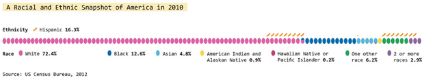
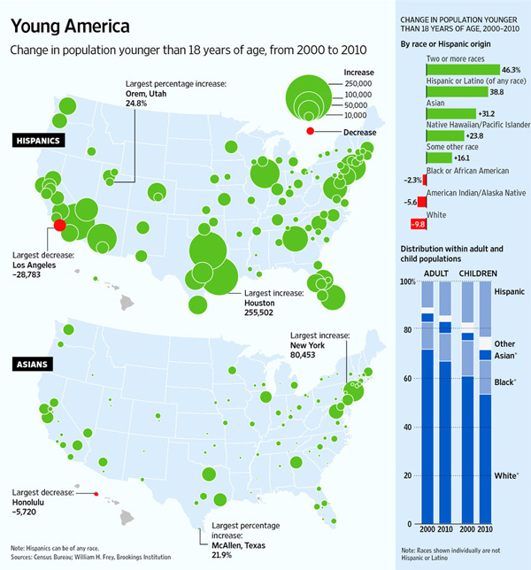
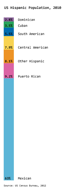
The Hispanic population is the fastest growing minority ethnic group in America. In the previous post about Race and Ethnicity in America, I showed the overall racial and ethnic proportions in America (2010 data). The graphic here specifically looks at what we mean when we say Hispanic in America. The predominant country of origin for Hispanic Americans is Mexico, accounting for almost two-thirds of the Hispanic population (63%). The Mexican American population continues to grow; Mexico is a much more populous place than, say, Puerto Rico, Cuba, or the Dominican Republic which is one explanation for the disparity in locations of origin. However, because Puerto Rico is part of the United States, it is the next largest source of Hispanic Americans at 9.2% followed closely by Hispanics from Central American countries at 7.9%.

What needs work

Admittedly, the graphic is nothing special just a stacked bar. I’m sharing it because it seemed miserly of me withhold it since it offers a better understanding of the ethnic make-up of America than the previous graphic alone. I probably should have posted it in the previous post, but it’s too late for that now.

References

Ennis, Sharon, Merarys Rios-Varga, and Nora Albert. 2011. The Hispanic Population. Census Briefs 2010. US Census Bureau.

race-and-ethnicity-in-america

What works

This graphic does a great job of depicting race and ethnicity as distinct concepts. The orange hash marks above the racial groupings indicate the proportion of people in the racial categories that are also Hispanic by ethnicity. I made this to correct the graphics that lump race and ethnicity together (and – bafflingly – they still add up to 100%).

Race and ethnicity are not the same. Race refers to differences between people that include physical differences like skin color, hair texture and the shape of eyelids though the physical characteristics that add up to a social decision to consider person A a member of racial group 1 can change over time. Irish and Italian people in America used to be considered separate racial groups, based in part on skin color distinctions that most Americans could no longer make. What does “swarthy” look like anyway?

Ethnicity – a closely related concept – refers to shared cultural traits like language, religion, beliefs, and foodways. Often, people who are in a racial group also share an ethnicity, but this certainly isn’t always true. American Indians are considered a racial group but there are hundreds and hundreds of distinct tribes in the US and their religions, beliefs, foodways, and languages vary from tribe to tribe. Hispanics in America often share common language(s) (Spanish and/or English) but they may not share the same race. At the moment, most Hispanics in America self-identify as white. I have often wondered if, when I’m 60, the ethnic boundaries currently describing Hispanic people will have faded away, much like the boundaries describing Italian and Irish folks faded away, becoming more of a symbolic ethnicity that can become more important during the holidays and less important during day-to-day life.

What needs work

The elephant on the blog is that I have been on hiatus since February. I’m writing my dissertation and I plan to stay on hiatus through the spring to finish that. My decision may seem irresponsible from the perspective of regular readers and I apologize for my absence.

Close-up of graphic
Close-up of graphic


As for the graphic, it was designed to run along the bottom of a two-page spread so it does not work well here on the blog. If anyone wants a higher-resolution version to use in class or in a powerpoint, shoot me an email and I’ll send it.

References

US Census, 2012 using 2010 data.

CNN's interactive racial voting bloc calculator
Screen capture of CNN’s interactive racial voting bloc calculator [Warning: the information in this image is misleading]

CNN’s Racial Voting Bloc Calculator is a perfect vehicle for demonstrating how to critically evaluate interactive graphical displays of data and 2) how ideological assumptions can be embedded in and reified by data, graphics and data analysis tools.

The calculator is designed to show how different patterns of racial voting might affect the upcoming election. At the top of the page five slider bars allow the user to set the level of White, Black. Latino, Asian and “Other” support for each candidate. So one can look at electoral college outcomes if say 56% of Whites, 10% of Blacks and 50% of everyone else votes for Romney.

The problem with this approach is that racial voting blocs don’t exist in the way this tool presents them. There are three ways to demonstrate this using data from the calculator and its associated data.

1) We can observe the absence of racial voting blocks directly by looking closely at the secondary data provided by the calculator. If you click on one of the state buttons a table appears at the right which lists (among other things) the vote by race for that state in 2008 based on exit poll data. The Washington state data look like this:

CNN's interactive racial voting bloc calculator for Washington
CNN’s interactive racial voting bloc calculator for Washington

Close up of the important chart:

cnn-racial-voting-bloc-WA-closeup
CNN racial voting bloc, close-up on Washington state information

The “2008 results” column shows that in 2008 55% of white voters in Washington state voted for Obama. If you look at every state, you will find that the proportion of whites that voted for Obama varied from 10% in Alabama to 86% in the District of Columbia and 70% in Hawaii. Even if we exclude the most extreme cases the middle thirty states range from 33% (Idaho and Alaska) to 53% (Minnesota and Delaware). This is nothing like the cross state racial uniformity imposed by the calculator. The implicit assumption of the racial bloc voting calculator is that racial proportions are consistent across states and this is clearly untrue.

2) The data imply that race is not very important in elections. Look again at the table for Washington and note the absence of data for Blacks, Latinos, Asians, or “Others” in 2008 despite the fact that these groups make up 17% of the Washington electorate. Washington is not unique, missing data are endemic in these results. Data for Asians and Others are missing for 48 states, data for Latinos are missing in 37 states and for Blacks in 22 states.

The great French sociologist Pierre Bourdieu once wrote that missing data are often the most important data. That is surely the case here. Media organizations spend vast sums to collect poll data on the electorate. If race isn’t important enough for data collection, then it probably isn’t very important for understanding elections. There is a general lesson here, the presence or absence of data is often an independent indicator of importance.

3) It is also possible to use the calculator to make an argument by contradiction. That is, by demonstrating that the calculator gives nonsensical results under sensible assumptions. One of the calculator’s default options is to use “approximate 2008 polls.” In this case, Obama wins with 417 electoral votes which is more than he actually won in 2008. Also interesting are the state level results under this baseline scenario. Assuming bloc voting at 2008 levels causes changes in the electoral outcomes of 23 states. Even more interesting are the specific states that change their colors. Under the kind of bloc voting that the CNN calculator allows, the south becomes very strong for Obama, who would win Alabama, Mississippi, Georgia, and Louisiana with more than 60% of the vote in each of those states. In fact, these were among the weakest states for Obama, which again, implies that bloc voting is not occurring. So, if bloc voting existed 2008 election results would have been radically different from the actual results which implies that bloc voting does not exist.

Does this mean that race does not affect politics or that political appeals to race never work? No. It means that appeals to race work – when they work at all – from a baseline that varies from place to place. A far more interesting tool would allow for increasing the vote of a particular racial group from its preexisting state baseline. With this imaginary tool, one could add some percentage of the vote to a candidate in each state without forcing racial uniformity across states. For example, if we added 5% of the White vote for Romney the white vote would rise from 88% to 93% in Alabama and from 42% to 47% in Washington.

As constituted, the racial voting bloc calculator is useless for thinking about actually existing American politics. It is useful for encouraging caste based racial fantasies. And so it is no surprise that as I write this, the top google result for the words racial voting bloc calculator link to discussion forums at the white supremacist website stormfront.org.

One such fantasy might involve setting support for Mitt Romney to 100% among whites and 0% among Blacks Latinos Asians and Others. This produces a Romney landslide with Obama collecting only 7 electoral votes. The difference between this hypothetical and reality tells me that racial voting blocs do not exist. What it tells the stormfront.org discussion participant, FunktionMann, who ran the same “simulation” is that:

We need to clean house. ALL of our problems in this nation have been delivered to us by white traitors. Until we have identified, villified and run them out of business, we will not make any progress.

I began this post saying that we would see how to critically evaluate graphic data tools and see how ideology is embedded in those tools. The racial ideology embedded in the calculator isn’t the supremacist ideology of stormfront but it is a racial essentialism that assumes and privileges racial identity while inscribing race into our understanding of politics in ways that make no sense if we but take a moment to consider them closely.

*Alec Campbell is a Visiting Associate Professor of Sociology at Reed College in Portland, Oregon. He blogs at Follow the Numbers where this post was originally published.

References

Campbell, Alec. (2012) “Racial voting bloc calculator fact or fiction” at Follow the numbers and reposted here with permission.

Merrill, Curt. (2012) CNN racial voting bloc calculator cnn.com

Congressional demographics
Congressional demographics | “Who are the members of Congress?” graphic by Kiss Me I’m Polish from the textbook “We the people: An introduction to American politics” by Ginsberg, Lowi, Weir, and Tolbert.

What works: Big picture

In the midst of election season, it can be easy to lose sight of the forest because we’re so entranced by the trees (or the leaves, for that matter). This graphic was developed by the design firm kiss me i’m polish in partnership with W. W. Norton and the authors of “We the People” to help students think through what it means to live in a representative democracy. The biggest outer arch of the rainbow depicts the breakdown of the total US population. So, for instance, we are split 50/50 when it comes to gender and just slightly less than half of us are Protestant. Then the middle arch illustrates how the 435 members of the House are divided and the smallest inner arch does the same thing for the 100 members of the Senate. It’s a great way to keep students thinking about not only the members of Congress but also about how that membership compares to the population they are supposed to represent.

The graphic lead me to wonder how it is that we come to collectively held opinions about what kind of parity is important. Gender parity – having about the same percentage of women in the House and Senate as we do in the general population – is a worthy goal. But age parity and educational parity are murkier. Legally, there are age minimums for serving in the House and Senate so we are never going to have age parity. I tend to agree with the founding folks who believed that wisdom and age have a measurable positive correlation, though I would probably argue that age is simply a fairly reliable proxy for experience. A young person with a great deal of life experience might be considerably wiser than an older person with very little life experience.

It would be easy enough to argue that we should also elect more well-educated people and feel like we are making a sensible choice as we do so. Right? More well-educated people have taken up lots of the facts and ideas circulating in a given time and place so education is probably a good thing for representatives to have. But education is correlated with class. Electing people who are overwhelmingly more well-educated also tends to mean we elect higher class folks. Of course, this is not a perfect relationship and it matters only if we think that class and political behavior are related. And, well, they are, but not in entirely linear ways, especially if education is our only proxy variable for class.

The main concern of this particular post is to show you a graphic that does an excellent job of raising fairly complicated questions without simultaneously implying answers. I am not going to push closer to any answers about how to understand the meaning of parity between individuals and their elected representatives is something we’d like to see in our representative democracy.

What works: Specific details

Color: The use of color here – especially for race – overcomes the typical tendency to try to use pink for women and maybe something dark brown for African American people. Yeah, both of those choices may make sense in some contexts, but unless there is a great justification for reinforcing stereotypes, buck stereotypes.

Fan + rainbow shape: The fan + rainbow shape is striking from a distance and allows for both segments and stripes. It offers more visual vectors for categories than I would have imagined. I probably would have gotten hung up thinking only about the stripes in rainbows and forgotten that the rainbow shape is also like a fan, and fans have segments.

Rainbow and Fan

Numbers are not layered over the graphic: The graphics stand on their own and the numbers are presented directly adjacent to them in small tables. This is a best-of-both-worlds approach that displays the actual numbers accompanying the impressionistic visualization of the data without having to deal with the clutter of seeing the numbers layered over or arrowing into the data which messes up the visual comparison task and also makes the numbers harder to read.

What I would have liked…

The age variable is listed as averages here, nothing visual. That’s fine, but whether or not the information is displayed just as a mean or it is developed as a graphic similar to the others, it would have been nice to be reminded that Senators have to be at least 30 and Representatives have to be at least 25 years old. This is a relevant contextual touch, helping to remind the (young) students that there are slightly different elements structuring the age disparity. Some of the extremely astute students might have been reminded that the racial category used to have a similar asterisk pointing to the role of law in politics.

References

(2012) “Who are the members of Congress?” [infographic] by kiss me i’m polish. New York.

Ginsberg, Benjamin; Lowi, Theodore; Weir, Margaret; and Tolbert, Caroline. (2012) We the people: An introduction to American politics, 9th edition. New York: W. W. Norton.
[Note: The link here goes to the web page for the 8th edition of this book but the graphic was taken from the 9th edition. A similar graphic was included in the 8th edition. The 9th edition image above includes updates that reflect the results of elections that have happened since the 8th edition was published but the overall look-feel and the design concept remained the same.]

Graphic: Gender ratio of recent US graduates by degree
Gender ratio of recent US graduates by degree | Laura Norén | click caption for pdf

Is higher education “dominated” by women?

There has been plenty of news coverage recently about the rise of women and the decline of men. While I have always disliked the irrational use of zero-sum language – why do we have to frame this discussion as men who are losing because women are making some gains? – I thought it would be worth taking a closer look at the gender ratio in higher education. I found many text-heavy stories (the Guardian, the New York Times, the Chronicle of Higher Ed, Huffington Post, The Atlantic, and many others) about female students earning more bachelors but surprisingly few graphics.

Graphics can do an excellent job of summarizing the gender gaps as they have developed over time within bachelors, masters, and professional+doctoral degrees. One graphic, quite thought provoking. All of the three degrees were more likely to be earned by men in 1970. Then between 1970 and 1980 women made rapid gains which continued through the 1980s. The gains for women slowed down once they hit the 50/50 mark for both bachelors and masters degrees and I predict they will also slow down for phd and professional degrees. Though it’s hard to tell by looking at the graphic, women are earning the largest proportion of masters degrees (projected to be 61% in 2020) which is slightly more than the 58% of bachelors degrees they are projected to earn in 2020.

Why aren’t women earning more if they are so well educated?

There is still a pay gap in earnings between men and women. Within the university, male faculty members tend to make slightly more than female faculty members. Overall, the most powerful explanation for pay gaps is not so much a failure to pay men and women equally for the same job. Rather, women are more likely to get degrees that lead to positions which are paid less than the positions men are more likely to get following their collegiate specializations. More women end up in education and nursing; more men end up in engineering and computer science. Education and nursing are not as likely to be lucrative as jobs that require engineering and computer science degrees.

To answer the question about women “dominating” higher education it is clear from the numbers that there are more female students at every level, though some majors still tilt towards men. What’s perhaps more important, women may or may not go on to match the earning potential of men, in part because they may not always choose the majors that lead to the most lucrative careers. Some argue that earning potential should drive choice-of-major but I’m still of the mind that going to school is not all about (or even primarily about) producing good workers. Going to school is about taking the time to explore different ways of thinking in depth and without undue concern for their ability to produce economic return. I’m glad that we have gotten to the point where there is enough gender parity to return to conversations about what school is for rather than who school is for…

Does the gender gap in graduation rates vary by race/ethnicity?

Graphic: 2009 US bachelors degrees by race/ethnicity and gender
2009 US bachelors degrees and gender gaps by race/ethnicity | Laura Norén | click caption for pdf

…but on the other hand, there are still critical gaps in access to higher education and degree completion that trend along racial/ethnic lines (class lines, too, but I didn’t get into that in this post). The graphic above displays the share of bachelors going to different racial/ethnic groups in 2009. In order to provide a relevant framework for comparison, I plotted the share of degrees earned next to the share of the total population of 18-24 year olds constituted by each racial group. There are some missing categories – mixed race people, for instance – but I couldn’t find graduation rates broken down any further than the five traditional racial/ethnic categories. Asians and Pacific Islanders only make up 4% of the population but they earn 7% of the bachelors in 2009 and their gender gap that year was only 10%. Whites were similarly over-represented in degree-earners and had a similar gender gap of 12%. But then things got interesting. The gender gaps for American Indians and Hispanics were much higher at 22% and the gender gap for blacks/African Americans was even higher still at 32%.

Especially when it comes to studying gender which is often constructed as a binary in which both groups make up about 50% of the whole, it is important to realize that analytical rigor might be increased by further segmenting these gender categories by some other key analytical variable. In this case, adding vectors for race/ethnicity provided a new perspective, one that might be a decent proxy for class.

References

Norén, Laura. (4 September 2012) Gender ratio of recent US graduates [infographic] New York.

Norén, Laura. (4 September 2012) US bachelors degrees by race/ethnicity [infographic] New York.

National Center for Education Statistics. (2011) Table 283: Degrees conferred by degree-granting institutions, by level of degree and sex of student: Selected years, 1869-70 through 2020-21 [Available in html and xls] US Department of Education.

National Center for Education Statistics. (2011) Table 300: Bachelor’s degrees conferred by degree-granting institutions, by race/ethnicity and sex of student: Selected years, 1976-77 through 2009-10 US Department of Education.

US Census Bureau. (2012) Table 10: Resident Population by Race, Hispanic Origin, and Age: 2000 and 2009 In The 2012 US Statistical Abstract. [Available in pdf and xls.

Growth of the population of Hispanic and Asian children in America, 2000-2010
Growth of the population of Hispanic and Asian children in America, 2000-2010 | Wall Street Journal

What works

It’s nice to see all of the Census 2010 data coming out and generating infographics. This one comes from the Wall Street Journal which distilled the above panel of stills from an interactive graphic which also has maps for white and black kids and detailed tables by race and geography.

Though the two stills here do not do a good job of demonstrating the claim in the headline, that there are fewer white kids, the bar graph on the right and the interactive graphics, do, in fact, back up the headline claim. We could quibble about the flipside to the headline – rather than saying there are fewer white kids, should it have pointed out that there are more Hispanic and Asian kids? – but quibbling about headlines isn’t my concern here. Other news outlets did take that spin on the same set of information.

What I like here is that the graphs did not try to show everything all at once – each of the four racial categories included in this series gets its own graph. Yes, there are more than four racial categories and yes, it would be nice to see where other racial categories fit. But inasmuch as I am concerned with the overuse of mapping data, especially when those maps get layered up with all sorts of information that makes them illegible, I am happy to report that these folks had the commonsense to generate one map for each of the racial categories they decided to depict.

One of the incidental facts portrayed here is that the country continues to tip towards the southwest. The big red ‘decrease’ blobs appear in the northeast for whites and blacks and are not compensated for by blue ‘increase’ blobs among Hispanic and Asian births. Because I wouldn’t necessarily have picked this up from looking at a table, I think it’s clear to say that the use of maps was justified in this case because at least part of the story is geographic in nature.

What needs work

I have a tough time with the blob maps. I can get an overview but I have a tough time doing additions, let alone additions and subtractions. The bar graph that appears in the stills helps present the same information in a different way. In this case, the maps can only display the big picture. The bar graph is necessary to help understand how all these blobs add up. In particular, the top graph shows a large increase in the number of mixed-race kids by percentage, but this group is still so small that the absolute numbers wouldn’t even register on the blob maps.

Food for thought

The second, vertical, bar graph is my favorite part that ties all of rest of the information together. We see that white kids still make up more than half of the children born in the US, though it appears that this may not be the case in 2020. We see most clearly that Hispanic kids are growing faster than any other category of kids. I’m going to take this moment to note that Hispanic-ness is an ethnicity, not a race, and that many Hispanic kids are considered white. Remember that Central and South America were colonies of Spain and Portugal and we tend to consider Spanish and Portuguese people white. I’m not prepared to get into a discussion about what it takes to be white in America, just pointing out that Hispanic people are, in many cases, racially white even though they may consider themselves to be ethnically Hispanic. It is possible to hold both of those identities at the same time. Furthermore, if we look back in history there was a time when Irish and Italian immigrants were considered non-white. I have wondered if today’s Hispanics are similar to yesterday’s Irish and Italian immigrants in the sense that they will eventually come to be seen as white ethnics.

This is a debate I’m hardly qualified to comment on and I welcome others who are more qualified to take up this issue in the comments. In particular, I’m wondering how the numbers matter. If there are more and more Hispanics born in the US, will that mean that they are not under pressure to assimilate to mainstream white-ness and will have more opportunities to maintain a distinct identity? Or will the decreasing number of white folks mean that there is pressure to recruit new populations into the white identity as part of our one-drop anti-black legacy? I don’t know what this all means, but I do feel like the numerical balance is meaningful.

References

Frey, William H. (2011) Brookings Institution analysis of 2010 Census Data.

Dougherty, Conor. (6 April 2011) New Faces of Childhood: Census Shows Hispanic and Asian Children Surging as Whites, Blacks Shrink. Wall Street Journal.

Out of wedlock childbirth rates | Heritage Foundation

Bad title

Why draw attention only to the fathers? Clearly there must be quite a few unmarried mothers out there as well. I hope this isn’t suggesting that deciding to take a relationship into marriage is somehow only or primarily the man’s responsibility. Both women and men have agency around the marital decision. It would be nice if cultural constructs supported equal opportunity for popping the question…but headlines that emphasize men’s agency over women aren’t going to get us any closer to equality on that front.

What works

It’s nice to see that this graph points out where definitions of racial categories change. It is also nice that it draws attention to the problem that many American children are being born into poverty or at least situations where resources are extremely constrained. In another graph elsewhere, the same group also reminds us that these births are largely NOT happening to teen parents.

The other critical point is that out of wedlock births are on the rise even though birth rates for teen mothers are declining. If in the past it was possible to think that the problem is just that teens are out having unprotected sex that leads to accidental births, we can no longer be so sure that this is what is happening. Age at first sex is decreasing which means that most of the people having children out of wedlock are capable of having sex without getting pregnant. They probably have been doing just that for years. Having children out of wedlock is best understood to be a choice, then, not an accident. Any efforts to prevent child poverty are probably not going to be successful if they rest on sex ed or free condoms (though I personally believe those things are important for other reasons). The American Heritage Foundation believes that if people would just get married, these kids wouldn’t be born into poverty. Others aren’t so sure it’s that simple.

What needs work

The problem with the write-up accompanying this chart is that it implies that the causal mechanism goes something like this: for whatever reason couples have children together but do not get married. The failure to get married means that these children will be far more likely to be raised in poor or impoverished conditions. For emphasis, I’ll restate: the parents’ failure to marry one another leads to children being raised in poverty.

Now. Here’s what I have to say about the chart. First, if that is the message, why not depict the out-of-wedlock birth rate by poverty status, preferably poverty status prior to pregnancy? I’d settle for poverty status at some set time – like the child’s birth or first birthday, but that isn’t as good. I feel like showing these numbers by race is subtly racist, implying that race matters here when what really matters is poverty, at least according to the story that they are telling and the story that many marriage scholars care about. Yes, it is true that poverty and racial status (still) covary rather tightly in America, but if the story being told is about poverty, I’d like to see the chart address that directly rather than through the lens of race. Furthermore, if race DOES matter, where are Asians? American Indians?

Moving away from the chart for a moment and getting back to the causal story, marriage researcher Andrew Cherlin finds that the causal arrow might go the other way. Being poor may be a critical factor in preventing folks from getting married. William Julius Wilson was an earlier proponent of this concept, especially with respect to poor African Americans. His work suggested that during and after the post-industrial decline in urban manufacturing jobs, African American men were systematically excluded from the work force and this made them appear to be poor marital material. Cherlin’s more recent work applies more broadly, not specifically to African American men, and bolsters the idea that marriage is something Americans of all backgrounds feel they shouldn’t get into until they are economically comfortable. What ‘comfortable’ means varies a lot, but most people like to have steady full-time jobs, they like to be confident that they won’t get evicted, that the heat or electricity will not be turned off, that they will have enough to eat.

The more important question would be: why don’t these assumptions apply to having children? Whereas getting married can represent an economic gain if you are marrying a working spouse, having children certainly does not (state subsidies do not cover the full cost of having children no matter how little the children’s parents make). Perhaps what we are faced with is people for whom getting married may not represent an economic gain. Marrying a person without a steady job could present more of a drain on your resources than staying single, whether or not you have kids.