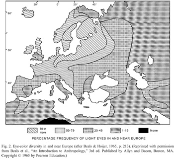
biology

What works

This is an example of activism by animation. It’s not an information graphic so I’m not going to offer a critique, but I find it interesting that the economic benefits of coral reefs like tourism, fishing, and pharmaceutical discovery are foregrounded while environmental concerns like species biodiversity and ocean acidity are mentioned afterwards.

Have a happy Friday, readers.

What I would enjoy seeing

I would love to see an animation of this quality that explained the process of ocean acidification and what we would have to do to reverse it. How much would our carbon emissions have to be decreased to make a difference at this point? And how much would that impact the typical American lifestyle?

References

World Resources Institute. (9 July 2012) “Coral reefs: Polyps in peril”. Animation by Jim Toomey.

Axes of Peeing in Public
The social and biological axes of public peeing

What works

This was something I used to help me think through the two main axes that determine peeing behavior – biological and social control. Urination is a biological function that has been subjected to a great degree of social control. Unfortunately, urban design has not kept pace with the demand for clean, easily accessible public restrooms for humans. And there has been no attempt to create any kind of system to deal with canine urine. In most cities it is illegal for humans to pee in public but both legal and widely accepted for dogs to pee where ever they like (in New York, they cannot pee on the grass in parks).

What worked about this as a graphic is that it helped me sort out how I was thinking about the problem of access to the city when the bladder is a leash. I couldn’t quite sort out how to think about what it means that some public peeing is acceptable even though it is mostly completely unacceptable. One of the odd side effects of the introduction of the new TSA pat down procedures is that it revealed just how many people struggle with incontinence, either needing to urinate frequently or needing to wear diapers (or both). I was aware of those issues before the TSA started sticking their hands in private places, but I wasn’t sure how to simultaneously think about adult diapers, dogs peeing on the street, and taxi/truck drivers peeing in jugs while still in their cabs. Where social control is very strong – as it is in the case of urination – it can almost trump biological needs, especially if the biological needs offer a level of control. Clearly, not all peeing can be put under biological control, but a good deal of it can. I stuck vomiting on the map since that is harder to control than peeing and it was useful to include a biological drive that has not been so easy to tame with the civilizing process.

What needs work

The glaring problem here is the ‘who cares’ problem. Very few care about the axes of social and biological control, though there are a few other case types that could use these axes (burping/farting, posture, chewing, etc). But the re-use of this exact same set of axes is not the point. Nor do I particularly care if you are interested in public peeing.

I introduced this graphic because it was helpful to me in thinking through the analysis of a multi-faceted problem. All social science problems are multi-faceted. Setting up four quadrants as a field is superior to setting up four quadrants in a two by two table, though that is a variant of this approach. I find that approach is too reductive, forcing things to be lumped together that really are not all that similar. In this case, I was able to add more nuance by leaving the mid-section of the biological control vector unmarked while I singled out incontinence and retention (where retention is beyond routine continence).

This approach to thinking through forces you to come up with the two critical dimensions that organize both the empirical information you’ve gathered and the theoretical arc you would like to follow. If you are skilled, you could add a third dimension. A 2×2 table only gives you boxes, not spectrums. What’s more, the spectrum approach is more open, allowing the addition of further segmentation or layering which is not as easy to achieve in a 2×2 table.

Getting drugs to market faster, timeline graphic | Wired Magazine May 2010
Getting drugs to market faster | Wired Magazine May 2010

What works

I am not a huge fan of this graphic though I admit it works better in print than it does in this crappy scan of the print article. My apologies. Click through here for a crisp version.

In summary, the article is about the way that research is done in the presence of many more data points (specifically, complete DNA maps of numerous individuals) and much more processing capacity. They argue using a case study revolving around the personal story of Sergey Brin who is at risk of developing the as-yet-untreatable Parkison’s disease, that data mining means research will progress much faster with no loss of accuracy over traditional research methods. They use a medical research case so they get to conclude that moving to data mining will mean people who might have died waiting around for some peer review committee (or other tedious component of double-blind research methodology) will live. Hallelujah for data mining!

They summarize their happiness in this Punky Brewster of a timeline.

What needs work

First, why did the art director order a timeline and not a diagram about how the assumptions underlying the research method have changed? It is clear that the article is taking a stand that the new research methods are better because they are faster and, in the case of Parkinson’s, could save lives by speeding things up. That is undoubtedly true, as it would be for any disease for which we currently don’t have anything that could be referred to as a “cure”. However, as a skeptical sort of reader, I find it difficult to simply believe that the new data-mining variety research is always going to come up with such a similar result – “people with Parkinson’s are 5.4 times more likely to carry the GBA mutation” (hypothesis driven method) vs. “people with Parkinson’s are 5 times more likely to carry the GBA mutation” (data-mining method). If the article is about research methods, which is ostensibly what it claims. However, featuring the chosen cause of e-world celebrity Sergey Brin could indicate that Wired doesn’t so much care about changing research methods as it cares about selling magazines via celeb power. Fair enough. It’s kind of like when Newsweek runs a cover story about AIDS in Africa accompanied by a picture of Angelina Jolie cradling a thin African child. Are we talking about the issue or the celebrity? In this particular article, it seems to me that if the core message were to focus appropriately on the method, the graphic could have depicted all of the costs and benefits of each research model. The traditional model is slower but it makes more conservative assumptions and subjects all findings to a great deal of peer review which offers fairly robust protection against fallacies of type 1 and type 2 (ie it protects us from rejecting a true hypothesis as false and accepting a false hypothesis as true). In the data mining scenario, since the process begins not with a hypothesis but with the design of a tool, there are reasons to believe that we may be more likely to run into trouble by designing tools that too narrowly define the problem. A graphic describing just how these tools are constructed and where the analogous checks and balances come in – where are the peer reviewers? What is the hypothesis? How do data-miners, who start by developing tools to extract data rather than hypotheses in line with the current literature, make sure they aren’t prematurely narrowing their vision so much that they only end up collecting context-free data (which is basically useless in my opinion)?

Don’t get me wrong, I am excited by the vast quantities of data that are both available and easy to analyze on desk top computers (even more can be done on big work stations and so forth). Caution is in order lest we throw out all that is reliable and robust about current research methods in favor of getting to a result more quickly. We could use the traditional hypothesis driven, double-blind kind of trial procedure coupled with the power of DNA analysis and greater processing capacity. It’s somewhat unclear why we would abandon the elements of the traditional scientific method that have served us well. There is a way to integrate the advances in technology to smooth over some of our stumbling blocks from the past without reinventing the wheel.

Concerns about the graphic

My second major problem is that this graphic is one of a type commonly referred to as a ‘time line’. In this case, what we appear to have is a time line warped by a psychedelic drug. This might, in fact, be appropriate give that the article is about neurology and neuropathy. Yet, the darn thing is much harder to read in the Rainbow Brite configuration than it would be if it were, well, a line. Time. Line. And the loop back factor implies that there is going to be a repetition of the research cycle starting with the same question (or dataset) all over again. That’s sort of true – the research cycle has a repetitive quality – but it is not strictly true because hopefully the researchers will have learned enough not to ask the exact same question, following the exact same path all over again.

References

Goetz, Thomas. (July 2010) Sergey’s Story Wired Magazine.

Wired magazine. (12 March 2009) Science as Search: Sergey Brin to Fund Parkinson’s Study on the Wired Science blog.

23andme (11 March 2009) A New Approach to Research: The 23andMe Parkinson’s Disease Initiative. [This was an early announcement about this project from 23andme who offered the DNA analysis].

'A Common Mistake' [original caption]
'Identity Crisis' [original caption]

What Works

Think about explaining in words: “So you see kids, sharks get confused. They see a surfer and it looks like a seal to them.” Now think about being a little tyke and imagining a surfer and a seal. They don’t look anything alike to you. You wonder if sharks are practically blind or something.

Now think about showing them the first graphic. Instant comprehension. The kids don’t even have to think, they just know. This is graphic design at its best.

As for the second graphic, man, I think everyone loves some Venn diagrams. Such a powerful way to depict the union of two sets. This one is even better than average so I thought I would share it.

What needs work

I might have run these without captions. Errol Morris had a piece, “Photography as a Weapon” about how much captions can change the meaning of an image and ever since I read it, I’ve been looking at images with and without captions to see if it changes the way I think about them.

References

Morris, Errol. (2008, 11 August) “Photography as a Weapon” [blog entry] New York Times Zoom Blog.

Philips, Mason. (2009) Shark graphics for the Discovery Channel’s shark week.

Water Resources and Withdrawals by Continent

These graphics accompanied a great article about water shortages in episode of The Economist which arrived last week. The article was well written and comprehensive, handily summing up the way water resources are related to the growth of urban centers, climate change, the rising affluence of the world’s poorest people (and their conversion from vegetarianism to omnivorousness) and the question of whether or not fresh water is a global or a local problem. I highly recommend reading it. Unfortunately, I think you would do almost as well reading it without the accompanying graphics as with them.

The first one is so confusing I still don’t know what I am seeing here. Table data usually has the attribute that the longer you look at it, the more you get, with an occasionally painfully long initialization period in which you can’t make out any pattern whatsoever. I spent a good bit of time on this one and I still don’t know how to make sense of it. The article rightly points out that fresh water is unevenly distributed across the globe–some places have a lot, some places hardly have any. No big surprise. Also not surprising: some continents use more fresh water than others based on overall population size and agricultural production practices. So when I looked at this graphic, I was kind of hoping to get a sense of both how efficient each continent was with their resources and how dire their straits were. The graphic sort of does that. Sort of. We’ve got a measure of total renewable water resources but it doesn’t take into account total land area. It does take into account population, sort of, and maybe population is more relevant than total land area in this case.

Ratio of Water Use to GDP

The second graphic does not stand well on it’s own. I can see here that it appears that these selected countries seem to have been becoming more efficient with their water use. Since 1995, all of these countries have lowered the number of cubic metres of water used per dollar (or dollar equivalent) of GDP. This graphic does nothing on its own to help me understand why that might be true. Have these countries moved out of water intensive agricultural production? Have they made their agricultural production more efficient? If so, is it technological change leading to increased efficiency or did they just shift to more efficient crops? Or maybe the change is in the GDP variable, not the water variable. The graphic really just doesn’t clear any of these things up.

What Works

Water Used to Grow the Same Crop in Different Countries

I like the third graphic. It’s clear and adds to the text in the article. This isn’t the first time I have read about water shortages and one of the biggest and possibly easiest changes we could make to prevent the water shortage from becoming any more of a problem than it already is, would be to introduce drip irrigation in places that do not already have it. Yes, it costs some money. But it is far more cost effective than many of the other strategies introduced to combat climate change. Drip irrigation technology is not overly complex nor does it require extensive training or equipment to install. Tubing perforated along its length with small holes, buried under the surface of the earth, delivers water directly to plant roots. Much less water is lost to evaporation or seepage into non-crop areas. Control over water resources is better – during rains cisterns collect and store water for later distribution through the drip tubing during dry periods.

Relevant Resources

The Economist. (2009, 8 April) Water shortages go global: Sin aqua non. Istanbul.

Simple SIR model - Epidemic Spread

What Works

The relationship between infectious agents and the host populations is a tricky one, with three-parts at the very least. In order to understand how they relate, it helps to visualize what could otherwise be spelled out. In this graph, s(t) represents the proportion of the population who is susceptible (ie unexposed) to the infectious agent, r(t) represents the recovered population, and i(t) represents in the infected population – all are varying over time. You can see that everyone starts out susceptible, but slowly that proportion drops, though it doesn’t drop to zero. Some portions of the population are likely to remain uninfected. Note that the exact shape and inflection of these trend lines will depend on the particulars of the infectious agent – fatal agents have models that look different from non-fatal agents, long latency periods model differently than short latency periods.

Note the the peak of the i(t) trend will come before the crossover of the recovered and susceptible trends, as it does in this case. As soon as the derivative of the infection rate becomes negative, more people will have recovered than are susceptible and those two trend lines will intersect. I love this sort of graph.

What Needs Work

I would love this graph a whole lot more if it had a legend and applied to some specific disease. That’s mostly my fault.

State of the World's Fisheries and Aquaculture - UNEP GRID-Arendal

What Works

I couldn’t end the agriculture week without including a bit about the state of the oceans as a source of food. To be clear, agriculture is often related to farming the land and raising land-based livestock. Aquaculture is the term used to talk about fish farming. Catching fish out of the open water is not considered agriculture. I ought to have used the broader theme of food production.

I like this graphic because it’s got multiple levels of information – aquaculture vs. open water catches by volume, fish catch by country, and the status of the stocks by oceanic region. It can be difficult to figure out how to represent global level data when it isn’t possible to fall back on national boundaries. It’s a little odd to see the oceans chunked into squares, though.

What Needs Work

This graphic has a sort of not-quite-done look to it overall. The treatment of the aquaculture vs. open water catch could have been more elegantly integrated – superimposing the red and blue blocks on one another makes it look a little bit like the kids left their wooden blocks laying around on top of a map. I might have preferred pie charts with two pie pieces – one for the aquaculture bit and one for the open catch bit to communicate relative share. The size of the pies would be determined by absolute value of the total catch + aquaculture.

What I really would have liked to see would have been a more logical representation of the catch volume by oceanic region. The colors chosen don’t indicate much of anything, except perhaps the static areas which are just blue, standard ocean color. What would have been great would have been to indicate the relationship between areas that have decreased yields because they have been overfished and areas that are currently being overfished which will soon have decreased yields even though their current yields are high. This is complicated because the largest increase and the largest decrease are far more closely related to one another than they are to steady areas or areas with only a slight increase. It would be great if the ocean regions could be depicted by the replacement rate with an extra classification for areas that have been severely over-farmed to the point that the concept of replacement rate no longer has the same meaning.

Relevant Resources

United Nations Environment Programme – GRIDA (2009) State of the World’s Fisheries and Aquaculture

Public Service Announcement: The amount of mercury and arsenic found in predator fish is high enough that people who eat these fish recently can suffer the effects of heavy metal poisoning. To figure out what is safe to eat and what should be avoided, check out the Monterrey Aquarium, one of the best, if not *the* best source for guidelines about what to eat when what you’re eating lived in the water. They even have an iPhone app for easy reference at the grocery store and your favorite restaurants.

Monterrey Aquarium Seafood Watch

Huge Flow of Waste - New York Times

What Works

The clean color palette gives this graphic the aseptic look of ‘pure information’ while the inclusion of the numerical data (in tons of manure) backs up the intention of the graphical representation with checkable facts. I like the three different versions of the same concept; it increases my confidence in the basic point that raising livestock produces vast quantities of waste. It’s mostly a pigs and cows problem but it isn’t restricted to Iowa.

Measuring animal waste per capita is a brilliant way to remind readers that they play a role in this system. These animals are a special class of animals called livestock which means that they only exist to provide food for humans. Measuring waste per capita is a subtle, but incontrovertible way to remind us that all animal eaters are contributing to the pile-up of animal waste.

What Needs Work

The animal cut-outs overlaying the outline of the nation in the first panel and Iowa in the third panel seem like a first draft idea, not a final draft idea. The relative size of the animals seem to relate to their ability to fit within the outline behind them more than to relative proportions of waste.

I have no idea why animal waste should be related to the weight of a Prius. This is an unnecessary politicization of the data. There is no logical reason to measure animal waste in Priuses. I can only think of political reasons to do so. Tons is just fine. The Prius portion of this graphic could be lopped off and no information would be lost.

It makes sense to me to move sequentially through levels of analysis. In that case, I would have put Iowa in the middle so that our thoughts would move from largest level of analysis to smallest. This is especially true in this case where the Iowa level data and the national level data measure animal waste per capita while the cow’s waste is measured annually, not per capita. I would have translated the cow’s waste into per capita data, too, just to make the narrative of the graphic more cohesive.

Bittman writes, “Americans are downing close to 200 pounds of meat, poultry and fish per capita per year (dairy and eggs are separate, and hardly insignificant), an increase of 50 pounds per person from 50 years ago. We each consume something like 110 grams of protein a day, about twice the federal government’s recommended allowance; of that, about 75 grams come from animal protein. (The recommended level is itself considered by many dietary experts to be higher than it needs to be.) It’s likely that most of us would do just fine on around 30 grams of protein a day, virtually all of it from plant sources.” And that’s something I’d like to see represented in the graphic too – the fact that Americans don’t need meat to meet their nutritional needs. That isn’t to say we could easily do without meat – much of eating is cultural and from that perspective many Americans would be set adrift, at least from a culinary perspective, without meat.

Bonus: I would like to see more about the waste lagoons – something that talks about what happens to the waste over time would be incredibly useful because this graphic begs the “where does it all go?” question.

Relevant Resources

Bittman, Mark. (27 January 2008) Rethinking the Meat Guzzler in The New York Times, The World.

Flora, Jan; Chen, Qiaoli; Bastian, Stacy; Hartmann, Rick. (October 2007) Hog CAFOs: The Impact on Local Development and Water Quality in Iowa Report from the Iowa Policy Project.

John Snow - Mapping Cholera 1854

What Works

This is a combination of a map and a chart whose creation helped epidemiologists understand that cholera was not caused by a ‘miasma’ carried by the fog from the river, but rather was a germ carried in the water. It’s one of my personal favorite early examples of information graphics as a tool not of publication, but of analysis and discovery. Snow mapped the area around the Broad Street pump and then represented deaths with bars (not dots as some later cartographers have done when re-presenting Snow’s maps). The bars end up looking like stacked bodies, reinserting the gravity of the situation into the fairly sterile context of the map as info graphic.

The pattern is imperfect, but clear. Proximity to this well is directly proportional to mortality risk. The point of this entry it to encourage the use of information graphics not only in the publication stage of the research process, but also in the analysis stage. Granted, epidemiology isn’t a social science, but this is a classic example that sets the scene for contemporary examples of graphics as tools of analysis.

What Needs Work

There are other more comprehensive maps of the whole neighborhood that show the patterns even more clearly. What I have here is just a close up, probably a mistake on my part. The full version is here as a pdf. The romantic in me wanted to restrict this post to the original grainy, scanned map* drawn by Snow himself.

The realist in me notes that even though I believe the creation of information graphics can be used as analytic tools, the story in the John Snow case isn’t a perfect fit. An article by Brody et al in The Lancet points out that, “Snow developed and tested his hypothesis will before he drew his map. The map did not give rise to the insight, but rather it tended to confirm theories already held by the various investigators.” So Snow didn’t get his brilliant insight just by examining the map but he did use the map as an analytical tool later in the process to help confirm his hypothetical hunches. It wasn’t like he just threw the map/chart together to present at a conference or while he was writing up an article which is how I feel many social scientists end up using info graphics.

*This version is actually the second version though it’s main difference from the very first map is that the pump has moved just slightly off from the exact corner of Broad Street closer to the house of 18 deaths.

Relevant Resources

John Snow website at UCLA School of Public Health where I found many maps.

Brody, H., M. R. Pip, et al. <2000) “Map-making and myth-making in Broad street: The London Cholera epidemic, 1854.” The Lancet 356, (9223): p64-68.

Eye Color Map from Peter Frost (2006) via Beals & Hoijer (1965) An Introduction to Anthropology
Eye Color Map of Europe - In color!

What Works

Color works. It helps that in this case, the characteristic being mapped is eye color, so it’s kind of a no-brainer to shade the areas where blue eyes are prevalent in blue and the areas where brown eyes are prevalent in brown. Even if this graph were to be printed in a grayscale journal (which is probably why the one on the left tries to use hatching to distinguish the areas), using degrees of full shading is easier to distinguish than using hatching patterns. Most printers can handle printing 10% gray, 50% gray, and so on.

What Needs Work

The areas that need some work, even in the color version, are the areas between blue and brown. Right now, those areas are lighter blue and lighter brown. The problem is that because the blue is mapping directly to the characteristic in question – blue eyes, blue area – it’s easy to think that the lighter blue areas represent areas where people have really light blue eyes. But, in fact, those areas are full of a mix of people, some with light eyes, some with dark eyes. I might have gone with a staggered blue/brown pattern or just chosen a color that doesn’t have anything to do with eye color, like purple.

Relevant Resources

Peter Frost (2006) Why Do Europeans Have So Many Hair and Eye Colors?

Western Paradigm blog (February 2008) The Blue Eye Map of Europe [Note to Readers: I couldn’t find the original version of the color map so I am linking to the blog where I found it rather than the original source.]