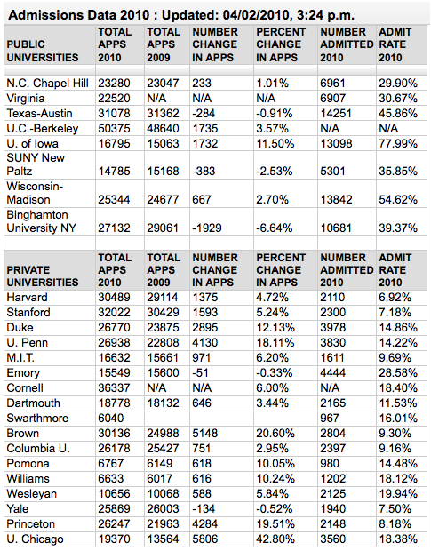
higher education

Community college demographics
Community college demographics | The New York Times, Education Life section

What works

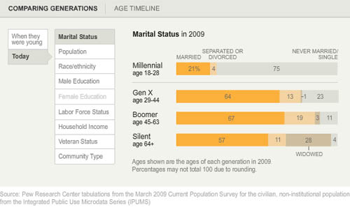
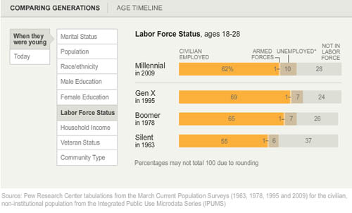
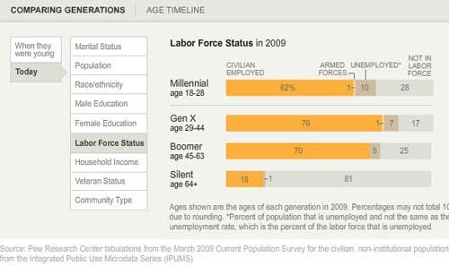
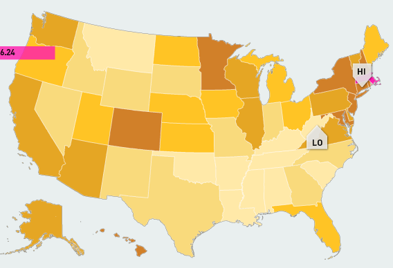
What I like about the graphic is that it provides a quick demographic snapshot of the community college population so that readers of the adjacent article have an additional piece of context as they try to absorb what it is that is new about The New Community College at CUNY” program. Graphics like this one make for dry written copy, but they add an important element of depth and context to news articles. News articles are always trying to find what is new which can make it challenging for journalists to slip demographics into their stories. Demographics are usually fairly slow-to-change and almost never make the news. Occasionally, there are stories about the crossing of particular tipping points (see any mention of <a href="http://www.theatlanticcities.com/neighborhoods/2012/05/us-metros-are-ground-zero-majority-minority-populations/2043/"majority-minority cities, states, and other places). But typically, demographics alone are not new enough to be newsworthy even though demographic information is salient for the critical analysis of many programs and social issues.

Community colleges in Obama’s plan for a better economic situation

This graphic ran in a long article about a new community college program at the City University of New York in which students will be required to take a strictly defined course in which remedial education is integrated into syllabi and will receive close, frequent mentoring. The number of stories about the social, educational, and financial situation facing community colleges in the US has increased over the past 6-12 months, thanks in part to efforts by Obama’s administration. In February the White House Press office announced a program to train 2 million workers by relying on the community college system that followed the 2010 announcement of the “Skills for America’s Future” community college-employer partnership program, a joint effort with the Aspen Institute.

Dr. Jill Biden, Joe Biden’s wife, worked in community colleges for 18 years and it is nice to see that her expertise is not being overlooked.

What needs work

After that lengthy praise for the inclusion of demographics above, I have many points of improvement.

First, demographic information is snapshot information. It’s taken at one point in time of what, in this case, is only part of the population. What I would have done, two options:

1+st option: compare community college demographics now to community college demographics of the past. Is the current enrollment pattern stable? Is it changing in important ways? This will help readers figure out whether the new program the article mentions is addressing change well.

+ 2nd option (my favored option): compare the community college population to the high school population and to the 4-year college population. The article is about the design of educational institutions so let’s see how community college enrollments compare to their nearest brethren.

Second, the graphic is off to a great start but doesn’t include enough demographic data. From the Aspen Institute’s website (which used data from the American Association of Community Colleges), I gathered up this additional demographic information.

As of 2007–2008 (American Association of Community Colleges)

  • Average age of community college students: 28
  • Median age of community college students: 23
  • 21 or younger: 39%
  • 22-39: 45%
  • 40 or older: 15%
  • First generation to attend college: 42%
  • Single parents: 13%
  • Non- US Citizens: 6%
  • Veterans: 3%
  • Students with disabilities: 12%

As of fall 2008

  • Women: 58%
  • Men: 42%
  • Minorities: 45%

For the age data, I would have graphed it so that we could see that even though the median age is relatively high, it’s pulled that way by a long tail to the right.

Further, the Aspen Institute page got into a bit more detail on the way students with remedial needs fare in the community college system.

The percentage of community college students who must take one or more remedial courses is estimated at about 80%. Fewer than 25% of community college students who took a remedial education course completed a degree within 8 years of enrollment. (Community College Resource Center)

We can compare the 80% who reportedly need remedial courses to the 42% who have taken them as well as the fact that actually taking time out to get the remedial coursework seems to slow progress to graduation to understand why the CUNY program integrated remedial work into existing courses.

The final piece of information that the Aspen Institute included in their overview that wasn’t in the NYTimes graphic is not demographic data, but it is still important for many of the same reasons that demographic data are relevant.

Revenue Sources for Community Colleges (American Association of Community Colleges)

  • State funds 36%
  • Local funds 19%
  • Tuition and fees 16%
  • Federal funds 14%
  • Other: 15%

In both cases, the information is presented in a basic list format. Not all that visually stimulating. I like the Aspen Institute’s lists better because they do not privilege numbers by making them huge compared to the text. While it would have been possible to do more with graphics in both cases, I would rather have the information included and spare than excluded because it fails to meet designerly criteria.

References

Pérez-Peña, Richard. (20 July 2012) The New Community College Try. The New York Times, Education Life section.

The White House. (13 February 2012) FACT SHEET: A Blueprint to Train Two Million Workers for High-Demand Industries through a Community College to Career Fund. Office of the Press Secretary.

Education vs. Prison in California | Public Administration

What works

The only part of this graphic I kind of liked was the part about California. Here, we are able to compare the average cost of education for a year with the average cost of prison for a year. This is better than comparing the cost of a single school to the average cost of prison, especially when that school is as expensive as Princeton. I still have a problem with this comparison because the cost of school is running over about 8 months whereas the cost of prison is running the full 12 months, or at least that seems to be true from what I can gather. My back-of-the-envelope math suggests prison would be about $32,143 for 8 months. This is still much higher than the average of $7,463 per student spending for 8 months of school. Parent and student contributions to schooling are not factored in, though the point of the graphic is to compare what the state spends on students to what it spends on prisoners, ignoring the total amount spent on students.

What needs work

The information included in this graphic could have been presented in about one fifth of the space. I support the addition of graphical elements to information presentation only when they increase the clarity of the information provided or make the information delivery inarguably more elegant.

What I vastly dislike are the long columns of graphics stacked on top of each other, meant to be viewed as some kind of visual essay. That was where I drew the California graphic from. I pasted it below.

I’m curious. Do other people like these long, internet-only graphic essays? I find them extremely hard to digest. They seem to be plagued by apples-to-oranges faux comparisons, and unbashedly so. A year’s tuition at Princeton doesn’t include room and board. Prison does. Even if that were taken into account, the time frame is off.

One more item to highlight

Note that in the last panel they clue us into an uncomfortable reality: recent college graduates have a higher unemployment rate (12%) than the general population (9%). Ouch.

Prison vs. Princeton | Public Administration

References

Public Administration. (October 2011) “Prison vs. Princeton” [information graphic]

Resnick, Brian. (1 November 2011) Chart: One year of prison costs more than Princeton The Atlantic online.

American Generation Age Timeline (Age measured in 2009) | Pew Research

What works

Pew Research has created a tidy series of interactive graphics to describe the demographic characteristics of American generational cohorts from the the Silent Generation (born 1928 – 1945) through the Boomers (born 1946 – 1964), Generation X (1965 – 1980) [this is a disputed age range – a more recent report from Pew suggests that Gen Xers were born from 1965-1976), and the Millennial Generation (born 1981+ [now defined as being born between 1977 and 1992]). The interactive graphics frame the data well. They offer the timeline above as contextual background and a graphic way to offer an impressionistic framework for understanding generational change.

Then users can flip back and forth between comparing each generation to another along a range of variables – labor force participation, education, household income, marital status – while they were in the 18-29 year old age group OR by looking at where each generation is now. The ability to interact makes the presentation extremely illustrative and pedagogically meaningful. It is much easier to understand patterns that are changing over time versus patterns that are life course specific.

Marital status

Marital status by generation measured when young | Pew Research
Marital status by generation measured in 2009 (snapshot) | Pew Research

For instance, marital trends have been hard to talk about because the age at first marriage moves up over time, so it’s hard to figure out at what age we can expect that people will have gotten married if they are ever going to do so (I tried looking at marriage here).

What I like about the Pew Research graphics is that they show us not only what the generations looked like when they were between 18 and 29 years old (above) but also what they look like now (below). Not only does it become obvious how many millennials are choosing to remain unmarried (either until they are quite a bit older or forever – hard to say because the oldest millennials are still in their 30s), but it also becomes clear that in addition to divorce, widowhood is a major contributor to the end of marriage. Keep that in mind: somewhere around half of all marriages end in divorce so that means the other half ends in death. I would guess that a vanishingly small number of couples die simultaneously which means there are quite a few single older folks who did not choose to be single (of course, even if they didn’t choose to outlive their spouses, they may prefer widowhood to other alternatives, especially if their spouse had a long illness).

Labor force participation

Here’s another set of “when they were young” vs. “where they are now” comparisons, this time on labor force participation. It appears that the recession has walloped the youngest, least experienced workers the hardest. They have the highest unemployment rate AND the highest rate of educational attainment (and school loan debt), which leaves them much worse off as they start out than their parents were in the Boomer Generation. Even if their parents were in Generation X, they were still better off than today’s 20-something Millennials.

American labor force participation by generation (2009) | Pew Research
American Labor Force Participation by Generation (measured in 2009) | Pew Research

What needs work – Are generations meaningful?

My first minor complaint is that the graphic does not make clear *exactly* what “when they were young” means. If we look at the first graphic in the series, the timeline, it appears that “when they were young” was measured when each generation was between 18 and 29 years old. I hope that is the case. I might have had an asterisk somewhere explaining that “when they were young = when they were 18-29 years old”.

The concept of generations, in my opinion, is a head-scratcher. The idea that I had to come update this blog because the definition Pew was using to define Millennials and GenXers changed (without explanation that I could find) adds to my initial skepticism about the analytical purchase of generational categories. What is the analytical purchase of looking at generations – strictly birth-year delimited groups that supposedly share a greater internal coherence than other affinal or ascribed statuses we might imagine? If we believe that social, technological, and most all kinds of change happen over time, of course there are going to be measurable differences between one generation and the next. I imagine, though I have never seen the comparison, that if social scientists split people into 10- or 20-year pools based on their birth years they would end up with the same sorts of results. So why not think of generations as even units? And is it clear that the meaningful changes are happening in 20-year cycles? Or would 10-year age cohorts also work?

The real trickiness comes in when we think about individuals. Say someone is like myself, born in a year on the border between one generation and the next. Am I going to be just as much like a person born firmly in the middle of my cohort as a person on the far end of it? Or will people like me have about as much in common with the people about 8 years above and below us, but less in common with the people 15 years older than us who are considered to be in the same generation, and thus to have many similar tendencies/life chances/characteristics?

A better way to measure the cohort effect would seem to be to consider each individual’s age distance from each other individual in the sample – the closer we are in age, the more similar we could be expected to be with respect to things like labor force participation and educational attainment. Large structural realities like recessions are going to hit us all when we have roughly similar amounts of work force experience, impacting us similarly (though someone 10 years older and still officially in the same generation will probably fare much better). Since it is computationally possible to run models that can take the actual age distances of individuals in the same into account, I don’t understand the analytical purchase of the concept of generations.

The take-away: great graphics, bad premise.

References

Taylor, Paul and Keeter, Scott, eds. (24 February 2011) The Millenials. Confident. Connected. Open to Change. [Full Report] [See also: Executive Summary and Interactive Infographic] Washington, DC: Pew Research Center.

Reading, Writing, and Earning Money | GOOD Transparency Blog

What works

Nothing is working for me with this graphic except possibly the few places where the designers offered detailed information about a particular location’s high school graduation ranking, college graduation ranking, and income ranking. But that’s being generous.

What needs work

Horrible use of a map. Maps should only be used where there is good reason to believe the information being conveyed is tied closely to geography. This information is not tied closely to geography though it might be tied closely to states. But states need not always be represented as geographical entities. Often, they are political entities and their particular geography is not salient.

The math that led to the graphic flattens important details and renders this a useless graphic. What I believe the designers did was something like this:

  • They took all of their numbers and turned them into some scale between 0 and 100%
  • Then they decided to represent each of the three variables with pure Cyan, Magenta, or Yellow. The higher the state scored on the scale from 0-100, the more saturated the color value.
  • Then they gave each county a combined score by building new colors from mixing the values of the previous three. Higher scoring states ended up with more saturated colors. Basically, higher scoring states started to approach black. States that scored high on just one vector ended up having a clearer, lighter color profile.

Here’s the big problem with this. It was hard for me to explain to my MIT-educated friend so I’m not sure this is going to make sense the first time ’round. Representing everything on a scale from 0-100 is a slide towards obfuscation. The graduation rates are both unadulterated rates. The income data represents un-scaled median incomes. I appreciate that they are not scaled, but I have a hard time adding 65% with $45,000. That’s some troubled math. At least in the monochrome maps we know what we’re looking at before the three variables get added up.

A grave sin was committed when the numbers for these three different variables were added up. Now, of course, it wasn’t the numbers that were added up. It was the color values of each of the three separate data points that were added up. Additive color seems to be something that does not send up a red flag. I can guarantee you that if they had presented something – a table or graph – where they had ended up adding values from high school graduation, college graduation, and income, red flags would have been flying. Why? Well, maybe you’re starting to catch my drift, but I’ll help you by spelling it out. What happens when the colors are added is a clear violation of the ‘apples to apples’ rule. Comparisons do not work unless you are sure you are comparing like things. Graduation rates are not like income. They are two different kinds of numbers – one is a rate the other is either a linear value or a log-linear value. Either way, they cannot be added up and still make sense. It’s no surprise that the graphic ends up looking like an incomprehensible slurry of a gray area.

References

GOOD and Gregory Hubacek. (March 2011) Reading, Writing, and Earning Money in GOOD Transparency Blog.

Trends in returns to college degrees, 1973-2009

What works

Looking at change over time is often best when using simple trend lines. They are easy for the eye to follow – easier than if the same figures were depicted as bar graphs. Given that there are measurable and meaningful differences between the returns for men and women, it is a good idea to show two separate trend lines, as they have done here.

What needs work

The major problem is that returns to college education do not come only from the education received. This trend line is a simple construction that cannot sort out how much income can be attributed to college alone. Sociologists know that a combination of factors – from parents’ educational attainment and parents’ income to things like the student’s aptitude – impact measures of the student’s attainment (like income and wealth). A far more sophisticated model would estimate just how much income one could expect, all other things being equal, for each additional year of schooling. That’s a much tougher model to construct and it wouldn’t be something that could be plotted using trendlines.

In fact, one of the big problems with trend lines is that they are often overly simplistic. On the other hand, they can be excellent representations of the big picture, whatever that might be. There is no simple rule I can think of that would help sort out when a trend line is a great idea and when it is overly simplistic. In this case, change over time is hardly the main story. The real wrinkle when it comes to education is that it can be difficult to determine if students are receiving indoctrination into social networks, ways of acting, and professional networks while they are at college and that these are the advantages that lead to the later bump in income or if they are receiving important knowledge that makes them better, more qualified workers. What’s more, even if we will never be able to divorce the networking from the knowledge gained, we still wouldn’t know how much the background a student starts school with influences their later life choices. Think about this. If someone deeply embedded in a network of people who would usually be a college attender chose not to go to college but continued to hang out with the same people and therefore received much of the same college experience, social and professional networks, how would they fare later in life? Since social scientists cannot randomly assign some students to attend college and others not to, it is very difficult to answer this question. And in this case, a trend line is an oversimplification that misses the major questions about returns to higher education altogether.

Knowing what we know about the various influences on wages later in life and what we see in the trend line, we might assume that women are better able to use educational attainment to escape lower incomes that would have been predicted by, for instance, their parents’ education and/or income. But again, the suggestion that educational attainment has some kind of positive influence on wage premiums is correct, but incomplete. Any assertion about the relationship represented by this graphic is likely to be inaccurate and certain to be incomplete.

References

Blau and Duncan’s Status Attainment Model.

Tenure Trends | Robin Wilson for The Chronicle of Higher Education

Tenure dies, three graphics

Tenure is declining. There are many reasons for this, most of which are economic. Tenured professors are very expensive compared to, say, adjuncts and graduate student TAs. Once upon a time in departments far far away, even recitation/discussion sessions were led by tenured faculty members. The only experience I ever had with such a situation was in a department (physics) heavily funded by dollars from the Department of Defense. Don’t say the militaristic state never gave you anything, my fellow classmates. I’m not bragging, but I do think I am pretty clever when it comes to Newtonian physics, at least for a sociologist.

The story here is clear in the graphics…or is it?

This first graphic ran in The Chronicle of Higher Education last July in an article written by Robin Wilson who asked:
“What does vanishing tenure mean for higher education? For starters, some observers say that college faculties are being filled with people who may be less willing to speak their minds: contingent instructors, usually working on short-term contracts….But others argue that the disappearance of tenure is actually not the worst thing that could happen in academe. The competition to secure a tenure-track job and then earn tenure has become so fierce in some disciplines that academe may actually be turning away highly qualified people who don’t want the hassle. A system without tenure, but one that still gave professors reasonable pay and job security, might draw that talent back.”

It’s not my place to get into that discussion here, but I do want to interrogate the graphic that ran with the story to see if it captured the essence of the tenure story.

First, the Chronicle’s graphic has numbers that do not add to 100%. So I went back to the report from the American Association of University Professors that the Chronicle had pulled their numbers from and came up with this:

Trends in Faculty Status, 1975 - 2007 | AAUP

This report clearly has more detail – we can see where those missing numbers are (full-time non-tenured faculty) – as well as understand the distinction between full-time already tenured faculty and those who are in the process of seeking full-time tenured positions.

I decided to compile this information into a line graph for two reasons. First, a line graph is the best way to show trends over time. Second, the data were collected at odd intervals so the eye would not have an easy time just stringing together a line connecting the bar graphs to understand the pattern. I imposed a grid. I added in the missing category. I gave it some color (darker colors correspond to more reliable, financially sound employment categories; lighter colors refer to more fleeting or otherwise less remunerative employment categories).

Tenure is Dying | Laura Noren

References

(16 December 2010) The disposable academic: Why doing a phd is often a waste of time The Economist. Accessed online but it ran in the print edition.

Relevant quote:
“The earnings premium for a PhD is 26%. But the premium for a master’s degree, which can be accomplished in as little as one year, is almost as high, at 23%. In some subjects the premium for a PhD vanishes entirely. PhDs in maths and computing, social sciences and languages earn no more than those with master’s degrees. The premium for a PhD is actually smaller than for a master’s degree in engineering and technology, architecture and education.”

Wilson, Robin. (4 July 2010) Tenure, RIP. In The Chronicle of Higher Education.

The Annual Report on the Status of the Profession, 2007. The American Association of University Professors. Fact Sheet: 2007.

Human Development Index Map
Massachusetts Human Development Index

What works

Mapping the Measure of America is a social science project that deliberately includes information graphics as a communication mechanism. In fact, it is the primary tool for communicating if we assume that more people will visit the (free) website than buy the book. And even the book is quite infographic dependent. I support this turn towards the visual. I also support the idea that they hired a graphic designer to work with them. Often, social scientists do not do well when left to their own under-developed graphic design skill set. Fair enough.

The website presents a unified view of the three images above. I couldn’t get them to fit in the 600 pixel width format, so I presented them one at a time. I encourage you to go to the website because one of the greatest strengths of this approach is the interactivity and layering. I happen to have picked Massachusetts, but each state plus DC has it’s own graphics available. There are other charts and whatnot available, but I think that this set of graphics (which you see all at once) are the strongest.

What needs work

Maps. Maps are too often used. Here’s why I think maps are a problem. Look, folks, political boundaries are meaningful when it comes to making policy or otherwise dealing with state-based funding. And that’s about it. Political boundaries occasionally coincide with geographical boundaries, but not always. Geographical boundaries are meaningful for some things – life opportunities may be based on natural resources or on historical benefits accruing to natural resources. But political boundaries and maps are often not all that useful because they imply that the key divisions are the divisions between states or counties or neighborhoods. Like I said, sometimes this is true because funding tends to be like the paint bucket tool – it flows right up to the boundaries and not beyond, even if the boundaries are arbitrary or oddly shaped. But where the issues are not heavily dependent on funding, thinking in terms of political boundaries makes it harder to see patterns that are organized along other axes. For instance, I wonder what would have happened if some of these categories – education, longevity, income – had been split between urban, suburban, and rural areas. Or urban and ex-urban areas if you prefer that perspective on the world as we know it.

In the end, I think the title is both accurate and disappointing: “Mapping the Measure of America”. Figuring out how to do information graphics well means figuring out which variables are the key variables. In this case, it seems that the graphic options might have determined the display of the information. Maps are easy enough – they appear to offer a comparison between my local and other people’s local. Those kinds of comparisons offer readers an easy way to access the information because everyone is from somewhere and there is a tendency to want to compare self to others. But ask yourself this: to what degree do you feel that state-level information is a reflection of yourself? Do you see yourself in your state?

References

Burd-Sharps, Sarah and Lewis, Kristen. (2010) Mapping the Measure of America with the American Human Development Project. Site design credit goes to Rosten Woo and Zachary Watson.

LifeMap life timeline | Ritwik Dey

What works

This is a great timeline. If all CVs were displayed like this I think employers would have a much better idea who they’re hiring.

Here’s why I like it:

    LifeMap

  • shows simultaneity – layering colored strips
  • shows relative weights – some stripes are fatter than others
  • shows the split between two classes of life – academic and personal by simply sticking the axis between them and then emphasizing this split with a different color scheme for each class
  • mixes words seamlessly with the graphic elements – each of the activities on the map is listed only once, even if the band it occupies shifts noticeably. Re-listing each element would add clutter and the colors are easy for the eye to follow across the graph even where there are discontinuities.
  • displays location at the top without making location seem like the primary element. It’s hard to get the thing that appears at the top NOT to seem like the most important. Clearly, in the course of a life, moving from Mumbai to New York is a big deal, so this is a critical component, but it doesn’t dominate the graphic. We are able to see the elements that make the leap from one place to the next but we aren’t quite sure if it was the shift from one place to the next or from one level of schooling to the next…and maybe even Mr. Dey doesn’t know. How can anyone untangle the causality of an individual trajectory?

It’s clear to me that many of the design elements here will be useful for future portrayals of social science data. In this case, I’d say we are looking at an enhanced CV, brave enough to indicate the passing of a parent and even a mother’s new relationship (which preceded the passing of the father). Spare visual narrative, intriguing in what is left out, remarkably rich nevertheless.

What needs work

The font relative to the graphic is too small. I know that this was probably intended as a poster and displayed at such a scale that the font wasn’t a problem. I apologize that you have to click through to see all of the categories.

Another comment while we’re on the topic of fonts and words relative to graphics: Mr. Dey was able to describe all of his interests with one or two words. It looks great. He expanded his accomplishments a bit beyond the two word limit, but they are still quite brief. I like the idea of choosing the one, two or three most precise words and making sure the graphic itself can carry the rest of the message. It’s a good test to see if your design is helping – when it can speak almost on its own things are looking good.

The limited number of words makes the whole thing not only visually and verbally poetic but also increases its functional value. One of my functionality measuring sticks is the number of words a person would have to translate if they were trying to read this graphic in a foreign language. The fewer words, the easier it is for non-English speakers. The more specific the words are, the more likely they are to translate appropriately. Therefore, ‘swimming’ and ‘3D modeling’ probably translate without difficulty. I have no idea if there is any kind of meaningful translation of “scouts” or “scouting” in any language other than English, but that is not a problem any graphic designer is going to be able to solve.

I wonder, though, if no-more-than-two-words rule led to the choice of the word “derive”. I know what that means in the context of calculus. I have no idea what that means in the context of a LifeMap, but it remains salient for years so I wish I did know what it meant. Sometimes the word restriction rule leaves out the phrase that would best describe whatever it is you might be trying to describe. Or maybe Mr. Dey does a lot of theoretical derivations.

References

Dey, Ritwik. (2005) LifeMap Project for Information Design course with Dmitry Krasny at Parsons School of Design in New York City.

Science News Cycle | phd comics

What Works

This could easily be applied to just about all research, not just bench science.

What needs work

Why is it that the media believe their consumers to be so daft? Where did the sound bite come from and what has it done to the production of news? To the practice of scientific research?

What is missing from this depiction of the research ‘cycle’ is that some researchers interpret the pressure to turn complex reality into a series of sensational sound bites as a sign that they should alter the way that they write up results in order to better fit the media’s model of dissemination. It’s hard to say this is always a bad thing – if it means that scientists actively seek a more active role in the dissemination of their work in order to pursue a real discourse, it can be a good thing. If it means that researchers promote their results in a skewed fashion, fail to fully disclose/discuss the conditions in which their findings will hold, or start choosing projects based on what will be more likely to make the news, then this science news cycle can be sincerely detrimental.

Admissions rates at top schools drop | Yale Daily News

What Works

The above graph was produced by Yale Daily News. It is clean and does a good job of displaying their admission status compared to their competitors. The reason I thought it was worth mentioning is that a few small aesthetic decisions make the graph pleasing. I like the open circles. I like the fact that the ending values are included as numbers. I would have liked it if they had included starting numerical values, too.

Comparison

For those going through the college admissions process, it can be all-consuming. The New York Times runs a blog called The Choice that focuses solely on this process from the testing to wait lists to moving, transferring and everything in between. Unsurprisingly, then, they ran a table showing similar information about a larger number of schools which they gathered through a mix of old-fashioned reporting – contacting schools and asking them – and Web 2.0 reporting in which schools who had not made the initial deadline could email their data in to be added to the table. Have a look below.

The Choice blog at New York Times 2010 admissions data |  J. Steinberg
The Choice blog at New York Times 2010 admissions data | J. Steinberg

Ask yourself about the difference between a table and a graph when it comes to conveying information. Edward Tufte is a fan of tables because they can display a great deal more information than a graph. That is true in this case – look at how many more categories of information there are in the table. What do you think? When is it better to present a table full of all the details and when is it better to display a graph like the one above?

References

Lu, Carmen. (5 April 2010) Admissions game getting riskier. Graph. Yale Daily News.*

Sternberg, Jacques. (2 April 2010) Applications to Selective Colleges Rise as Admission Rates Fall. The New York Times “The Choice” blog.

*Note that I wonder if the graphic designer got the data from The Choice blog piece – the publication dates could just be coincidental.