
What works
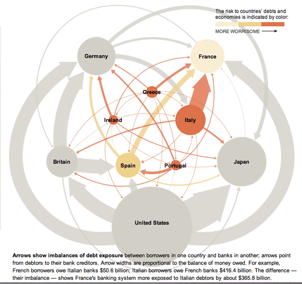
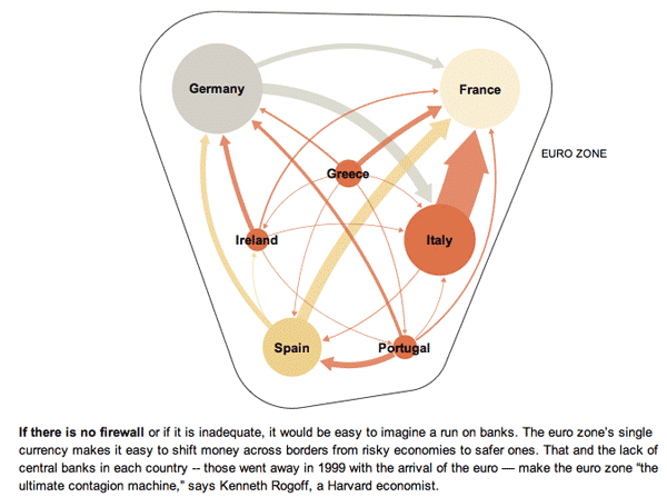
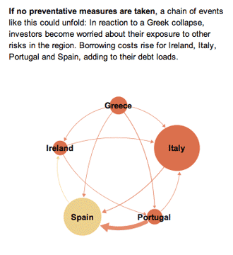
This series of graphics by the New York Times Sunday Review does an excellent job of explaining the European debt crisis in terms of the banking relationships that exist among partners within the Eurozone as well as between Eurozone members and their trading partners outside of the Eurozone. I hardly feel like commenting. The one graphic design decision I loved the most – because it is subtle and easily overlooked – is that after the overview graphic, the total size of the graphic starts small and grows larger. This mirrors the way the crisis itself develops and reinforces that element of the message visually. It would have been extremely easy to simply use the full paste-board available for each of the images in this progression. The designers decided to use the available white space to tell part of the story.
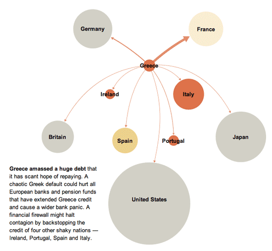
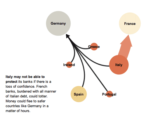
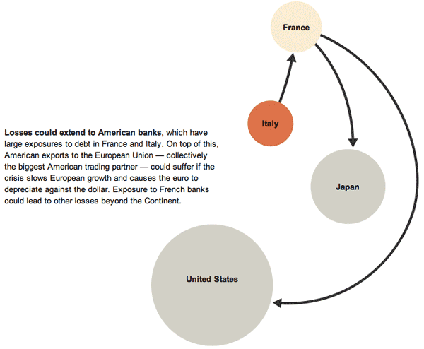
In the overview graphic, the countries that are not impacted or impacted only slightly are represented in grey. In the more detailed graphic progression, these grey elements are dropped out and represented by white space. This is a somewhat counter-intuitive move. Information graphics are supposed to be chock-full of information, right? So why would the designers *drop* countries, especially the US, when running a graphic about the global impact of the European debt crisis in an American newspaper? Because the way they are able to use white space helps drive home one of the key elements of the debt crisis – that it is so far small and could either get much bigger or stay relatively small in the coming months, depending on what steps are taken now to mitigate the rippling out of negative impacts.
What needs work
Nothing needs work. This is a great graphic.
References
Marsh, Bill. (2011, 22 October) “It’s all connected: An overview of the Euro crisis” in nytimes.com Sunday Review. Other authors/designers listed include: Xaqun G. V., Alan McClean, Archie Tse, Seth Feaster, Nelson Schwartz, and Tom Kuntz.
Comments 1
Euro-zone crisis visualized | effective presentation | Scoop.it — November 2, 2011
[...] Euro-zone crisis visualized Euro Zone Debt Crisis Visualized | Overview: It's all connected Euro Zone Debt Crisis Visualized | The Immediate Trouble Euro Zone Debt Crisis | The Risk of Contagion Euro Zone Debt Crisis | A possible scenario Euro Zone Debt Crisis |... Source: thesocietypages.org [...]