living alone

Living Alone by Gender, Age Cohort in the US
Living Alone by Gender, Age Cohort in the US since 1850

What works

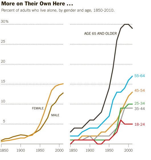
This post is an update to an earlier post about the increasing rate of Americans living alone. The first graph does an excellent job of visualizing the change in Americans’ tendencies to live alone, by age and gender. It’s clear that living alone is on the rise, especially for Americans over 45. It’s interesting that there seems to be a collective slow down in this trend in the decade between 35 and 45 when I suppose some of the late-to-marry people finally settle down and before the marital dissolution rate starts to fire up.

The graphics in this post accompanied an article by Eric Klinenberg in the New York Times Sunday Review that laid out the basic findings in his latest book, “Going Solo” that was based on 300 interviews with people living alone. He finds that while for some, living alone is an unwanted, unpleasant experience, most people who live alone are satisfied with their personal lives more often than not. In fact, they are more social, at least in some ways, than are their counter-parts who live with others. Singletons (his word, not mine. I prefer ‘solos’ in part because it’s an anagram), go to restaurants and other social spaces more often than do those who live with others.

Living alone in Minneapolis

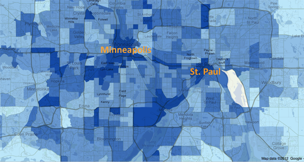
In a number of cities, including Minneapolis, more than 40% of households are single-people households. The article included an interactive map down to the census tract level that shows what percentage of households in that tract were single-person households in 2010. I took a look at Minneapolis and St. Paul and found that the map supported Klinenberg’s qualitative findings. The highest concentration of solos is in the center city areas where opportunities to get out and be social in the community are the highest. The suburbs and rural areas have fewer solos.

I encourage others to use the map and see if their local cities replicate this pattern, that more solos live in ‘happening’ areas than in quieter areas. Of course, this could be caused by a third variable, the presence of households that are affordable for single-earner households…but there isn’t enough analytical power in the map tool to be able to sort out the dependencies.

What needs work

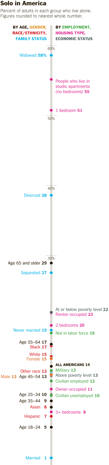
The information about who lives alone by age, marital status, and race that is displayed in the following long skinny stack of datapoints is the right kind of detailed information to use as an entrance into a deeper discussion about living alone, now that we’ve gotten a sense of the view from 30.000 feet. The problem is that this graphic is hard to read, too long for a single computer screen (but in order to make sense of it, one needs to see the whole thing at once), and too optimistic about what color differences are able to do than is reasonable.

The article does a better job of subtly navigating the movement from historical and international context into a detailed, robust analysis. By awkwardly pinning all the data points onto the stalk at once, viewers lose the ability to see patterns within data subsets. Here’s a test. Look at the following data and try to explain to yourself how race and living alone go together. Or how age and living alone go together. The graphic designer was hoping color would be able to do more than it has been able to accomplish here. The color is supposed to tunnel your vision down to a particular color-coded subset so that you can start to understand well just what it is about race or age or marital status that produces particular patterns in living alone. But I had a lot of trouble with the color frame because, quite literally, I had to keep shifting the frame around this graphic – it didn’t fit on my laptop screen. [Graphic designers often work on nice, roomy screens where they end up seeing more at once than their eventual audience who is probably peering at this thing from a web browser on a laptop or occupying half of a monitor somewhere.]

All the clustering around the mean is another problem that could have been avoided had the graphic been organized differently. As it is, all sorts of groups lump on top of one another down around 14%.

I also kind of hate that I can’t add categories together in any meaningful way here. I can tell that being a widow would put someone at high risk for living alone, but that’s kind of a no-brainer, isn’t it? I would have gotten more mileage out of visualizing the absolute numbers of people living alone by marital status, age, and race. Maybe over half of all widows live alone, but I haven’t the faintest idea how many widows there are in America so I don’t know if half of all widows is half a million people? Or 3 million people? Or whether it’s more or less than the 38% of separated people who are living alone. 19% of never married’s live alone, but because these people are likely to be young, maybe that is actually a larger absolute group than the 58% of widows living alone.

Final verdict: There was both a data fail and a graphic design fail.

Who lives alone?
Who lives alone? A demographic breakdown

References

Going Solo Cover
Going Solo Cover

Klinenberg, Eric. (2012) Going Solo: The Extraordinary Rise and Surprising Appeal of Living Alone. The Penguin Press HC.

Klinenberg, Eric. (2012) One’s a Crowd. New York Times Sunday Review.

Weber, Susan and Beveridge, Andrew. (2012) [infographics]
Solo in America graphic Line graph looking of the changing percentage of singleton households in America, 1850-2000
More on their own here…and even more abroad American and International singleton households.
Mapping the US Census: Percentage of Households with only one occupant Interactive graphic of US singleton households by census tract.

Loneliness and Fat Consumption among middle-aged adults | Cacioppo and Williams

What works

Written by a social neuroscientist, the book Loneliness contained this heartfelt graph on page 100. Yes, even I feel the phrase ‘heartfelt graph’ is an oxymoron. But the way that the graphic artist worked over the details here – the way the edges of the butter columns are rounded, the way that the paper is folded back, even the way that the grid lines are rendered makes this two bar graph captivating. I am also intrigued by the mix of digital and hand-rendered – most everything was hand-drawn except the axial numerals and the text labels. I like the mix. I probably would have liked it better if the lettering had also been hand-rendered but I think that’s just me being a bit too precious about hand-rendered images.

The book describes the way that loneliness is a neurological event, one that overlaps with social and psychological parameters to produce a more or less predictable set of occurrences. In this graph, authors Cacioppo and Williams are discussing recent findings that indicate lonely middle-aged adults tend to get more of their calories from fats than non-lonely middle-aged adults. For younger adults, loneliness does not seem to have an effect on either food consumption patterns or exercise patterns.

Socially contented older adults were thirty-seven percent more likely than lonely older adults to have engaged in some type of vigorous physical activity in the previous two weeks. On average they exercised ten minutes more per day than their lonelier counterparts. The same pattern held for diet. Among the young, eating habits did not differ substantially between the lonely and the nonlonely. However, among the older adults, loneliness was associated with the higher percentage of daily calories from fat that we noted earlier (and that is illustrated in Figure 6).

Perhaps because this book is about empathy-inducing loneliness, it is especially nice to see a tenderly hand-drawn graph rather than something far less engaging, the standard excel-produced item. The same numerical information would have been conveyed – and in fact that information was conveyed fairly well in the text itself – but the hand drawn element indicates that the topic is worthy of more than quantitative concern alone.

I am about halfway through this book and so far, I recommend it. Even if you are not interested in loneliness, the book does a good job of demonstrating how diverse research fields can be woven together to examine a topic common to all. The book draws from psychology, sociology, evolutionary biology, and neuroscience to help explain why some people are lonelier than others and what the impact of loneliness can be on the short-term and long-term health and social outcomes for individuals.

What needs work

For the record: I cannot draw or render or do anything good with a pencil besides finding a way to hold my hair out of my face. I tend to be overly appreciative of drawings and people who can draw. My critique here is of myself and others like me who swoon over the hand drawn.

I also wish there might have been a way to get the exercise information included, if not on the same graph, than on a companion graph right next to the butter sticks.

In a public announcement sort of way: folks lonely and nonlonely seem to take much solace in eating. That’s a large amount of fat consumption.

References

Cacioppo, John T. and William Patrick. (2009 [2008]) Loneliness: Human nature and the Need for Social Connection. New York: W.W. Norton.

Percentage of Americans Never Married, 1900-2010

What Works

There are two great things about this:

  1. We see that the current rise in never married Americans still doesn’t match the numbers of unmarried Americans back at the turn of the century.
  2. We see that what is changing now isn’t so much the overall number of never married Americans (which has been hovering at around 30% for the past three decades) but the number of relatively older Americans who have never been married. I couldn’t find consistent numbers for people any older than the 30-34 year old category, nor could I find numbers for the 30-34 year olds available online from before 1960. I am still working on extending that portion of the graphic back to 1900.

What needs work

I need more numbers! I can’t understand the overall trend – which is the increase in never married Americans – without getting more historical context. I need that 30-34 year old category to extend all the way back. I also need to know what the deal is with slightly older cohorts, like 40-44 year olds. If all this graph tells us is that people are getting married later that is a very different story than the one that sounds like: “Americans aren’t getting married at all”. Marrying late and never marrying are two different scenarios. I cannot yet tell from the numbers I’ve got, just what is going on. And the problem with the aggregate data is that it is not granular enough to help understand current trends. Pooling 30 year olds with their parents and grandparents does not help me understand the 30 year olds (or the 20 year olds). And I really want to know what is going to happen in the near future, not what happened in the relatively distant past.

Other people have complained that the ’15 and older’ marital status category is crazy. Who gets married at 15?? But the problem is that we have to keep looking at that category or we cannot follow trends over time. That was the way the category was established back in the beginning, so in order to look across time, we have to keep the boundaries of the category the same. Now, to get around that problem, I included the 30-34 year olds, but that data slice doesn’t go all the way back.

Tricky census data.

And it’s black and white for easy printing. Otherwise I would have gone color.

Married with Children | The Venn Diagram

What works

1. Menlo is my favorite font of the moment for information graphics.
2. I have no idea why I haven’t seen this Venn diagram before. In my humble opinion, if you are a social scientist and you are attempting to display a concept that may or may not have solid numbers to back it up, start with the Venn diagram because:
a. Venn diagrams are easy to make.
b. Venn diagrams are easy to understand.
c. Venn diagrams are not expected to represent solid numbers. They certainly can be employed in that way, but they are not always employed in that way so you are not likely to mislead readers that you are backing your claim up with census data.
3. I am doing a bit of research on marriage and I have run up against many arguments that seem to believe that marriage and childbearing always go together, or at least that they OUGHT to always go together. News flash: 36.9% of children are born out of wedlock (Cherlin, 2008). Other adults get married but do not have children. Yet other adults get married, have children, and then end up unmarried again because divorce and death ended their marriage. The above graphic should help clear up what actually happens in the world. Marriage and child raising frequently have no overlap.

What needs work

I was so upset that I didn’t stop and look up the actual data for each of these segments. In part, I wanted to leave it as a universal concept and NOT tie it to US data. But yeah, I realize it would be better if I had sat down and figured out how many people are in each of these three areas. That’s coming in the article version. And after I take a deep breath to disperse the anger I feel at people who make illogical arguments.

References

Cherlin, Andrew. (2008) “The Marriage Go-Round.” New York: Vintage.

Trends in Marital Stability (2004) | Betsey Stevenson and Justin Wolfers

What Works

Last night this blog received a deluge of spam from someone with an IP address in Australia promoting wholesale wedding dresses. In response, I first exercised a wholesale ‘delete’ event. Now we’ve got a graph about the stability of marriage in the US since the 1950s. The next time someone tells you that 50% of marriages end in divorce, you’ll know how to show them that they’re wrong.

As you can see from the above graphic representation, marriages in the 1950’s were less likely to end in divorce within the first 25 years of marriage than any subsequent cohort of married folks. We have no idea if those were ‘good’ marriages that lasted, we just know that they were less likely to end in divorce. From the representation we see that divorce rates climbed through the 1960s and 1970s but started falling in the 1980s and continues to fall, inching back towards 1960s levels.

Measures of Annual Marriage and Divorce Rates | Betsey Stevenson and Justin Wolfers

Furthermore, from this next graph, we can see that the decrease in the divorce rate is not only due to marriages lasting, but that any given person is less likely to experience divorce because we are now less likely to get married in the first place. If one doesn’t get married, one cannot get divorced. It would seem that people might actually be making fairly appropriate decisions around the ‘I do’ moment because the people who choose marriage are staying married longer. In other words, the folks less likely to stay married may somehow recognize this about themselves and opt out of marriage altogether.

Using multiple graphs tells a much more complete picture than relying on just one. The first graph was designed to debunk the notion that 50% of marriages end in divorce by showing that for a brief moment, marriages formed in the 1970s may have approached that dissolution rate but that marrieds have been sticking together more and more since then. The second graph is more interesting to me because it details overall trends in marriage, including the slow slide away from marriage altogether. It could be that people are just waiting longer to get married, in which case the decline in the marriage rate recently might just be a lag. Lifetime marriage rate is something I’d still be interested in checking out, though I feel that we haven’t maxed out on age at first marriage so it would be hard to see, at least not in 2010, if the trend is toward later marriage or no marriage at all. My prediction would be that age at first marriage will start to hit a plateau at around 30 for women because reproductive ability tends to decrease markedly starting at about 35, or so I’ve been told, and many people get married at least in part because they’d like to have some kids. But we’ve got a long way to go before we hit 30 for women’s marrying age. Median age at first marriage for women is just 26 and even though it is climbing, it isn’t skyrocketing.

References

Stevenson, Betsey and Wolfers, Justin. (2007) Trends in Marital Stability. Working Paper.

Wolfers, Justin. (21 March 2008) Misreporting on Divorce. on the Freakonomics blog at the New York Times.

Living Single is More Expensive than Marriage? | The Economist Online

What Works

In this particular case, where the point is to show the difference between two groups (not three or four) it is acceptable to use the stacked bar graph approach. This technique emphasizes the difference between the two groups. When people use the same technique with three or four groups, it becomes very difficult to pick out the visual differences. But the folks at the Economist stuck to two groups and it does show the difference in earnings between singles and married-with-two-kids people.

What Needs Work

The picture is not helping anything. Please, people, think twice before inserting stock photography in your infographics. There should never be an element of an infographic that fails to communicate information clearly. The whole money in the clouds motif is also…questionable in terms of the art direction.

Aside from my qualms about the aesthetic choices, I have a more important contention. It would seem that the point of this graphic is to suggest that married people operate under more favorable tax laws than unmarried people. If that is the case, I think it would be nice to see some information about the taxes coming into play. I say this in part because the commenters to the article revealed that they mistakenly believed this data is pre-tax. But it isn’t. Furthermore, this graphic implies that marrieds have more money on hand than singles in the same income brackets, but that isn’t necessarily true either. Those kids do cost something – they need clothes, food, bigger houses, bigger cars, and an endless list of other things. So even though Mr. and Ms. Single do not take home as much, I bet they have fewer carrying costs. Granted, the graphic is about taxation policy, not about discretionary spending opportunities, but it fails to emphasize taxation and leaves itself open for other interpretations. These interpretations are available for your reading pleasure in the comments section following the original post. I do encourage you to read the comments because it makes clear that people do not read, not even the single paragraph of explanatory text.

Reference

Economist Online Staff. (11 May 2010) Single supplement: The average single worker takes home less than his married counterpart. The Economist online.

US household size shrinks, living alone increases

Living Alone

I am helping a professor develop some graphics for his forthcoming book about the increase in people living alone. Above is just a rough draft; I’m still thinking about adding a border. Comments are welcome. More graphics coming in drips and dribbles.

References

US Census: Living Alone