food

US food security map | Gallup via Marketplace.org

What works

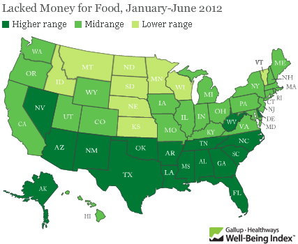
Food insecurity – worrying about having enough money to buy food – is an extremely important problem. Gallup came up with new poll numbers on the prevalence of food insecurity in the US just this week and spokesman Frank Newport did an interview on the findings with Tess Vigeland of the radio show Marketplace. Marketplace ran the map graphic above on their website which is somewhat rare for a radio program given that graphics just do not have much of a place on the radio.

The survey question was:

Has there been one time in the last 12 months when you did not have enough money to buy the food that you or your family need? And overall, 18 percent of Americans so far this year — the first half of the year — said yes, there has been at least one time.

The graphic makes clear that the problem of food insecurity has a north-south pattern to it. People in the South have “high” levels of reporting food insecurity while people in the middle and on the west coast have “moderate” levels of food insecurity and folks in the north have “low” levels of food insecurity. But…

What needs work

…where are the numbers? What ranges are represented by the “low”, “medium”, and “high” levels of reported food insecurity? This information should be in the graphic. Legends matter.

What we can imply from the interview is that the states in the “high” range have 20% of their poll respondents reporting that they’ve had trouble paying for the food they need in the last 12 months. The “low” level of insecurity includes states like North Dakota where 10% of people reported having trouble paying for food. That still seems high given how wealthy Americans are on the whole. This food insecurity data is one way to think about just how economic inequality plays out in the US. Folks cannot even afford the food they need.

Here’s another graphic to think about, the rate of the use of food stamps (SNAP):

Food stamp program participation 1970-2010
Food Stamp program participation 1970-2010

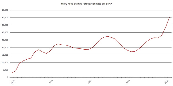
Understanding food insecurity is one of those things that is going to require more than a single map based on a single survey question asked at one point in time. Well-designed graphics can and should aim to depict complexity and nuance…kind of like any other representation of critical analysis (writing, reporting, etc).

References

Vigeland, Tess. (23 August 2012) Americans struggle to feed their families. [Interview with Frank Newport] marketplace.org

Food blog content characteristics and frequency of use | The Food Blog Study

What works

I conducted a web-based survey of food bloggers last summer as a doctoral intern at Microsoft Research in the Social Media Collective. I am now analyzing the mountains of data that I gathered in the interviews (N=30), survey (N=303), and web crawler (N=30,000) and getting ready to send out papers for publication. I thought it would be nice to share some of the findings here in advance of the slow academic publishing process.

Since I made the graphic and since I am modest, I’ll just say that I like the colors and I like that I was able to find a way to keep all of the granular detail of tabular data while adding visual impact.

If you would rather hear about the substance of the study than about the struggles I had while creating the graphic, skip to the bottom third of the post and the “What surprised me” heading.

What needs work

Since I have the benefit of having seen the data I can say that two things certainly need work. First, the survey asked about many more behaviors than I have decided to depict in this graphic. I left out data mostly because I want to be able to publish it and publishers are not keen on accepting already-published material. Some of them are not too bothered if bits and pieces of the findings are blogged about here and there. Some of them are hugely bothered and will not accept submissions that have been written about on blogs at all. There are good reasons for subjecting the findings to peer-review – like having smart people verify that the findings are not fabricated from thin air or otherwise constituted by complete rubbish. All that being said, my biggest problem with this graphic is that it is just the tip of the iceberg in terms of what the survey had to say about the characteristics of food blog content.

The second big problem with this is that I had a very difficult time dealing with proportional data in the rows and the columns. In case you still haven’t figured out what this graphic is saying – and I don’t blame you if you find it hard to digest – the graphic is depicting the frequency with which about 300 food bloggers (303 to be exact) reported using the listed types of content. For example, 96% of food bloggers report using video 20% of the time or less. Video just is not all that common on food blogs and most food bloggers hardly ever use it. Images, on the other hand, are included in food blog posts most of the time by most food bloggers. Seventy-four percent of food bloggers use photos 80% of the time or more. Reviews of restaurants, cookbooks, and kitchen gear, on the other hand, end up on 11% of food bloggers posts very frequently (80% or more posts contain reviews) while fully half of food bloggers hardly ever post reviews (20% or fewer of their posts contain reviews).

Since most food bloggers like to mix things up at least a little – hardly anyone has such a firmly established template for their blog content that 100% of their posts contain recipes and photos while 0% of their posts contain videos or discussion of non-food content (which would include mentions of important life events like getting a book contract, having a child, getting married, or getting cancer). With content, then, I wanted to let food bloggers explain about how often they posted a variety of different kinds of content. But then I had this difficulty of having proportions in the rows and the columns of the graphic which makes it difficult to interpret. Believe me, the tabluar data without the blocks changing sizes and colors was even harder to interpret so turning this information into a visual did help the analysis along by making the patterns clearer.

What surprised me

I was expecting many more bloggers to report including recipes more often. Only 37% said that 80% or more of their posts contained recipes. From what I gathered in the interviews, having someone else make your recipe and then leave a comment about it is one of the routine gratifications associated with food blogging. Web traffic to the site from google.com and on mini-search engines within the site is generally related to recipes, as well. So whether food bloggers care about the deeper meaning associated with food blogging and being part of a community or the hard-nosed economics and web traffic side of writing a blog, from the interviews, I was expecting recipes to be a bigger part of reported content than what I found in the survey. Recipes are one of the main activities around which both creativity and community are wound. They also draw a lot of traffic. On blogs, traffic often equals money (though not all that much money, which is why I think the meaning associated with recipes is more interesting than the money associated with recipes).

I was not at all surprised that most bloggers ignore nutritional information but I think that people who have never done much with food blogs would be surprised to see that three-quarters of bloggers mention nutrition and nutritional information 20% of the time or less. Food blogging gets its meaning and importance through practices of creating and community-making, not because the blogs are used as archives or tracking devices for those trying to lose weight or achieve other health goals. There are blogging communities organized around those things, but generally speaking, folks in those communities do not identify with the term ‘food blogger’.

Reference

Norén, Laura. (2012) Infographic: The Content of Food Blogs. The Food Blog Study. [www.foodblogstudy.info/findings.html]

Saveur food blog award nominees and winners by gender, 2010-2012

Gender in food blogging

Last summer I conducted a survey of food bloggers (N=283) which found that 85% of food bloggers are women (see here for more demographic statistics from the survey). I also conducted interviews with food bloggers and started to get the impression that food blogging is a community dominated by women in which the relatively few men end up being disproportionately successful. This kind of gender disparity – a group that is overwhelmingly women in which men are more likely to occupy positions of power or prestige – has been written about in the sociological literature with respect to elementary school teaching and nursing. In elementary schools, for example, the majority of the teachers were women but administrators (like the principal and vice principals) were disproportionately likely to be men. This gender disparity in the schools is no longer as pronounced as it once was. Women now occupy more of the administrative positions but men have not moved in to occupy more teaching positions. If food blogging follows the same trajectory, we can expect women to occupy more of the most prominent food blogging positions over time.

But what is a ‘prominent food blogging position’?

Since food bloggers are not working professionals within a clear hierarchy like teachers and nurses, I decided to look at food blog awards data as a proxy for success in the food blog world. The magazine Saveur hosts the longest running, most extensive set of food blogging awards of any organization. I used their awards nominees and winners to pull together the graphic above and find out how gender and success in food blogging interact.

Using the Saveur awards data, it is clear that there is a pattern of disproportionate male success within the food blog nominees and winners. In a perfectly gender-neutral world, we would expect that when 15% of the food blogs are written by men, 15% of the food blogging awards will be distributed to men. In fact, 26% of the nominees (chosen by Saveur) were men and 36% of the winners (voted on by the internet audience) were men. In other words, both the Saveur selections and the internet-audience voters were inclined to select men more often than strict chance would have predicted.

My interviews indicated that there could be a few explanations for this kind of pattern. However, I’m curious to hear what food bloggers – especially those who voted for or won Saveur‘s awards – have to say.

The comments are open.

Methodological note

N=194

I removed blogs whose writers’ genders were not revealed and blogs written by couples or other mixed-gender groups. I also removed blogs that did not meet my original definition of food blog which include the two categories for blogs about alcohol and the category for blogs about kitchen tools/gadgets.

References

Saveur Food Blog Awards 2012.
Saveur Food Blog Awards 2011.
Saveur Food Blog Awards 2010.

Norén, Laura. (2012) Saveur food blog award nominees and winners by gender, 2010-2012. [Blog post] Graphic Sociology blog.

The Backbone of the Flavor Network | Ahn, Ahnert, Bagrow, Barabási

Each node denotes an ingredient, the node color indicates food category, and node size reflects the ingredient prevalence in recipes. Two ingredients are connected if they share a significant number of flavor compounds, link thickness representing the number of shared compounds between the two ingredients. Adjacent links are bundled to reduce the clutter. Note that the map shows only the statistically significant links, as identified by the algorithm of Refs.28, 29 for p-value 0.04. A drawing of the full network is too dense to be informative. We use, however, the full network in our subsequent measurements.

What Works

Trying to visualize the connections between flavors (ingredients?) is a new direction for both visualization and network research, though there has been some work on which flavors/ingredients tend to go well together (see Michael Ruhlman’s “Ratio” for basic recipe ratios and a bazillion cookbooks for specific flavor/ingredient combinations). In fact, the researchers for this article used the 56.000+ recipes at allrecipes.com, epicurious.com, and menupan.com (a Korean recipe site) to generate the network above, clearing out the noise by displaying only the biggest nodes which are the most commonly occurring ingredients.

What the researchers were after was figuring out whether similar ingredients are more likely to attract or repel each other. They broke the common ingredients down into their chemical components to help measure similarity and examined American and Korean recipes both lumped together and separately. In the separated case, they found that, “The results largely correlate with our earlier observations: in North American recipes, the more compounds are shared by two ingredients, the more likely they appear in recipes. By contrast, in East Asian cuisine the more flavor compounds two ingredients share, the less likely they are used together.” However, they figured out that some combinations of ingredients appeared so frequently in both cuisines that they were skewing the results. Americans like to use milk, butter, cocoa, vanilla, cream, and egg together. East Asians have a lot of recipes that use beef, ginger, pork, cayenne, chicken, and onion. When you sort these ingredients out, the networks are kind of silly because, at least in the American case, at least one of the ingredients on the ‘frequent’ list appears in about 75% of the recipes.

Next, they honed in on these co-occurring ingredients/flavor compounds and constructed what they call an “authenticity” score. Quoting the authors, “If an ingredient has a high level of authenticity, then it is prevalent in a cuisine while not so prevalent in all other cuisines.” The figure below highlights the ingredients, ingredient pairs, and ingredient triplets that scored high on “authenticity” using pyramids.

Flavor authenticity pyramids by ethnicity of cuisine | Ahn, Ahnert, et al

Personally, what I think this shows is that Americans like to bake much more than anyone else or at least that they are more likely to use recipes to bake. Baking is thought to be the more exacting of the cooking/baking pair, and thus would be more likely to require a recipe than would cooking. Again, I refer you to Michael Ruhlman’s “Ratio” in which he somewhat disputes the necessity of following recipes in favor of memorizing and then following ratios.

As for the success of the graphics here, I admit that I would not have read this article had it not been for the graphics. I find the methodology interesting though the findings are the kind of findings that make a lot of people shrug their shoulders and say, “um, that’s nice.” Another networks researcher, Duncan Watts, came out with a book earlier this year called: “Everything is obvious, once you know the answer” in which he argues for the kind of science that offers testable mechanisms for assessing the things we think are true. I guess if we take his point, we can feel more confident in our pronouncements about what makes American food American or East Asian food East Asian. Yes, area studies people, I know that East Asian food varies and that the trends they find in American food might also be discovered in French food. I’m just using the categories they worked with rather than those established by food studies scholars and cooks.

References

Ahn, Ahnert, Bagrow, and Barabasi. (15 December 2011) Flavor Network and the Principles of Food Pairing. Nature: Scientific Reports 1: Article 196.

Ruhlman, Michael. (2009) Ratio: The simple codes behind the craft of everyday cooking. Scribner.

Watts, Duncan. (2011) Everything is obvious, *once you know the answer. Crown Business.

Beans
Beans

Overview

On Tuesday I read “When One Farm Subsidy Ends, Another May Rise to Replace it” OR “Farmers Facing Loss of Subsidy May Get New One” by William Neuman [aside: why does the NY Times frequently have two titles for the same article? One appears in the title tags in the html and in the URL, the other appears at the top of the article as it is read]. The upshot of the article is that the subsidies appear to be curtailed as cost-saving measures but come right back under new names:

It seems a rare act of civic sacrifice: in the name of deficit reduction, lawmakers from both parties are calling for the end of a longstanding agricultural subsidy that puts about $5 billion a year in the pockets of their farmer constituents. Even major farm groups are accepting the move, saying that with farmers poised to reap bumper profits, they must do their part.

But in the same breath, the lawmakers and their farm lobby allies are seeking to send most of that money — under a new name — straight back to the same farmers, with most of the benefits going to large farms that grow commodity crops like corn, soybeans, wheat and cotton. In essence, lawmakers would replace one subsidy with a new one.

Neuman also interviewed Vincent H. Smith, a professor of farm economics at Montana State University who, “called the maneuver a bait and switch” saying,

“There’s a persistent story that farming is on the edge of catastrophe in America and that’s why they need safety nets that other people don’t get. And the reality is that it’s really a very healthy industry.”

My curiousity was piqued, to say the least. Farm subsidies have long been an emotionally charged issue – Professor Smith is right to point out that the family farmer is an icon in the American zeitgeist whose ideal type gets trotted out as a narrative to support subsidies that often go to large-scale corporate agriculture. Before mounting my own angry response to what appears to be both hypocritical and a well-orchestrated marketing schmooze (ie the public proclamation by various farm lobbies that they are willing to take fewer subsidies as they band with the rest of the beleaguered American public in a collective belt-tightening process while simultaneously opening up other routes to receive the same amount of funding through different mechanisms), I decided to go in search of some hard data to see what is going on with agricultural subsidies.

Agricultural data

I found two great sources of data. First, the USDA runs the National Agricultural Statistics Service which publishes copious amounts of tables full of information about how much farmland there is in the US, what is grown on it, what the yields are, what commodity prices are, what farm expenditures are doing, and all sorts of rich information. Linked from the article was another source of data – the Environmental Working Group – which has been tracking farm subsidies for years. The Environmental Working Group also relies on the National Agricultural Statistics Service, especially for farm subsidy information. Between those two sources, the US Census, and the 2012 US Statistical Abstracts (Table 825 especially), I had more than enough information to start putting together a graphic that could describe at least part of what is going on with agricultural subsidies.

Selecting the right data

Because farming is distributed unevenly around the country, I knew I needed to come up with a set of numbers that went beyond absolute dollar amounts per state. Probably it would have been nice to see where subsidies go per crop, but other people have already done that.

To look at agricultural subsidies overall, and to work with the state-by-state data that I had, I ended up considering three approaches.

  • 1. Absolute commodity subsidy amounts per state.
  • 2. Commodity subsidy amounts per capita.
  • 3. Commodity subsidy amounts per farmland acre.

It is obvious that the third option, looking at the amount of spending per acre within each state, is the best.

Hypothesis

I expected to find that states with small amounts of farmland would be relatively more expensive per acre than states with large amounts of farmland. I assumed there would be economies of scale and that states with very large amounts of farmland probably had a lot of that land dedicated to pasture, which is pretty cheap to maintain compared to something like an orchard.

Attempt Number 1

I decided that simply showing the costs per acre might not be as interesting as keeping the absolute amount of farmland in play and doing some kind of comparison.

Rank comparisons are extremely popular and I admit I was sucked into them, though now that I’ve tried to make them, I kind of hate them. These are the kinds of comparisons that you’ll hear on the news – Ohio ranks Yth in per capita income but Zth in educational spending per pupil – and see in graphics that often look like this:

Top Ten Websites in Four African Countries | Ivanisawesome

My first attempt to do something similar looked like this.

US Agricultural Commodity Subsidies | Process Graphic 01

Here are my problems with it:

  • There is no obvious pattern – it looks like a rat’s nest.
  • The states with bad ratios – the ones where we are paying more than $10/acre – have upward sloping lines connecting them from the left column to the right column. Psychologically, the ‘bad’ deals should have downward sloping lines. It just makes better visual sense.
  • Pink was supposed to be along the lines of red on accounting sheets but it looked too cheery to indicate being ‘in the red’.

Attempt Number 2

US Agricultural Commodity Subsidies - Process Graphic 2

I got rid of the pink altogether and flipped the scale on the left so that the best deals – the lowest per acre subsidy costs – are at the top. This means that states that are taking less per acre end up having upward sloping lines more often than downward sloping lines.

Thinking through this brought up some larger concerns. Comparing by rank alone is ridiculous. The space between each listing in both columns is extremely critical in a graphic like this and needs to be scaled appropriately. For instance, look at Alabama ($6.06) and Oklahoma ($6.07) in the right hand column. They basically have the exact same amount of spending per acre and yet they are the same distance apart as Washington ($9.86) and Minnesota ($11.37). The same problem happens in the lefthand column – states with about the same amount of acreage dedicated to farmland have the same distance between them as states with large differences in the amount of acreage they have dedicated to farmland.

Attempt 3

US Agricultural Commodities by State, 2010

Click here to see a pdf of the whole graphic.

I scaled both the right and left hand columns using a log scale for farmland acreage (though the number of acres is still given in absolute millions of acres – only the visual arrangement was logged). The pattern is still messy and hard to discern, though clearer than in previous versions. In order to bolster the pattern, I turned the ‘good deals’ in the lefthand column pink. The states with less acreage dedicated to farmland routinely receive less subsidy per acre than some of the bigger states. But the very biggest farming states – like Montana and Texas – are also pretty affordable on a per acre basis. It was states near the middle of the pack that were coming in at $18 and $19 per acre of commodity subsidy spending.

I thought maybe it was a weather event that led to some of the larger subsidies. But if that were the case, states that were geographically near one another would probably have had the same drought/hurricane/flood and should have received similar funding. There is work to be done on the weather question – looking at data over time would be a good step in the right direction there.

However, I don’t know that weather is going to be the best answer to this question. Look at Washington and Oregon. They are geographically right next to each other, grow some similar kinds of things, and have a similar amount of farmland acreage yet they have dramatically different amounts of subsidy spending per acre. Washington takes $9.86 per acre; Oregon gets $2.51 per acre. It’s still unclear why there is such a great disparity between these two states in 2010.

Falsified hypothesis

Through the construction of this information graphic, I falsified my own hypothesis. The states with the smallest amount of land dedicated to farmland received the least amount of commodity subsidies.

I have some thoughts about what is going on. They will require more data analysis and graphic development to suss out and represent completely.

    New Hypotheses

  • 1. It’s the weather. It could still be the weather. I did not do enough investigation into this variable, though this seems like a weak hypothesis.
  • 2. It’s corn. The states that grow a lot of corn seem to get more subsidies. This hypothesis could easily be expanded to be something more sophisticated such as: “Subsidies per acre are sensitive to the commodity grown.”
  • 3. It’s lobbying. The states that are known to be “big farm” states seem to have more funding than smaller farm states. Maybe they are better represented by the farm lobbies and therefore end up with more subsidy per acre than states without strong representation from the farm lobby. This hypothesis has an overlap with the “it’s corn” hypothesis.

Conclusion

There are two kinds of conclusions to be drawn. On the agricultural front, it is safe to conclude that Americans spend a good bit of money per acre of farmland; there is no free market on the farms. Bigger states do not offer economies of scale compared to states with less farmland acreage. No additional conclusions can be drawn from this limited data, though interesting hypotheses can be posed about the influence of local weather events, funding for specific commodities like corn, and the impact of lobbyists efforts on agricultural funding allocations.

As a graphic exercise, I hope I have proven that rank orderings do not offer much analytical value on their own. I hope I have also suggested that graphics can be used not only for representing findings at the end of the process but for discovering patterns. Graphics are not just for display, they are also for discovery.

References

Neuman, William. (2011, 17 October) “When One Farm Subsidy Ends, Another May Rise to Replace it” Business Section, nytimes.com.

Noren, Laura. (2011) US Agricultural Commodity Subsidies by State, 2010“US Agricultural Commodity Subsidies by State, 2010” [Information graphic] and [Data Table – this is a combination of data and analysis originally published by the National Agricultural Statistics Service, a public-facing branch of the USDA].

Environmental Working Group a good source for information on agricultural subsidy spending.

United States Census Bureau, Statistical Abstract of the United States (2011) Agriculture.

United States Department of Agriculture, National Agriculture Statistics Service

Pie chart humor | I love charts tumblr blog
Pie chart humor | The shouting end of life via I love charts tumblr blog

What works

What can I say, I think it’s funny. Pie chart humor with real pie. Ha.

I am impressed at the time and effort someone put into trimming the pie plates, thinking through the crosshatching, and trying to get some different colors going on.

The text of the original post reads:

“THIS IS THE MOST IMPORTANT VISUAL PUN TO HAVE EVER BEEN POSTED ON THE INTERNET.”

I’d take that with a grain of salt, especially considering the gratuitous use of all caps. Probably it’s meant to be ironic or sarcastic or some other hipster attitude that I am too old to absorb osmotically.

What needs work

I still don’t like pie charts.

References

The shouting end of life tumblr

I love charts tumblr blog

American Agricultural Value map | Bill Rankin, Radical Cartography
American Cropland map | Bill Rankin, Radical Cartography
American livestock map | Bill Rankin, Radical Cartography

What works

Produced by Bill Rankin, Assistant Professor of History of Science at Yale University and editor/graphic designer at Radical Cartography, these three maps work together to show how American agriculture is organized both spatially and economically. [Click through to Radical Cartography to see much bigger versions. Since that site is in Flash, I can’t embed links that take you directly to the big versions. Once you get to Radical Cartography click: Projects -> The United States -> Animal/Vegetable.] The top map here is the dollar value combination of the cropland and livestock areas in the US. For activist types, what’s even more exciting is the small black and white inset map that takes into account federal agriculture subsidies. The next two maps were combined to produce the top map – one shows how cropland is distributed, the other displays the distribution of livestock.

Bill Rankin is a rigorous researcher with a background in history and the thing he does best here is context. In order to understand the top map – which is what I believe Prof. Rankin wants viewers to store in their memory banks as the critical take-away – he first shows us how cropland and livestock land are distributed and then layers them over one another to show us how they are differentially valued. This type of data is sensitive to geography and location in two ways: 1. crops are sensitive to elements of geography like climate and available water supplies – there are no crops growing in the dessert of the American southwest 2. because the US hands out a variety of agricultural subsidies, the political boundaries of states have to be seen in conjunction with the crop distribution in order to understand how the political levers lead to the current subsidy scenario.

What needs work

The approach he takes is to color each county based on the percentage of area covered by a particular crop. This means that counties with multiple crops will end up with blended color values. For instance, cotton is coded blue and ‘fruits, nuts, and vegetables’ are coded maroon. This means that in some southern counties growing roughly equal amounts of cotton and ‘fruits, nuts, and vegetables’ the counties are neither blue nor maroon but purple. But wait. The blue of cotton might have combined not with the maroon of ‘fruits, nuts, and vegetables’ but with the brighter red of soybeans to produce that purple color. Confused? I am. I don’t know if those southern counties are a mix of peanut and cotton farms (likely) or a mix of soybean and cotton farms (also likely).

Another problem with the additive colors is that the choice of each color has a major impact on the impressionistic take-away of the maps overall. Corn is the most prevalent crop in the US covering over 144,000 square miles. The next most prevalent crop is soybeans which covers about 100,000 square miles. Soy beans and corn are often grown in the same counties (unlike, say, wheat which is a hardier crop and therefore ends up as a monoculture in northern counties where growing corn and soy are riskier endeavors). This means that soy and corn are going to have layering colors the same way that we saw crops layering with cotton along the Mississippi River in the south. Since the bright red color for soy is more aggressive than the somewhat subdued dusty orange chosen for corn, the impression we take away from the map is that soy is more prevalent than corn where the opposite is true. If the color values had been switched so that corn was coded in bright red and soy was coded in the dusty orange, the middle section of the country would end up looking like a corn field, not a soy bean field. Either way, the trouble with blending colors is that our eyes are not very good at looking at a color and saying – “Gee, that looks like it’s about 50% blue and 50% red.” We just say, “Gee, that looks like purple”. Or, in this case, “Gee, all those reddish colors either look like soy beans or maybe an 80% coverage of the ‘fruit, nut, vegetable’ category.”

A solution (that I am too lazy to put together)

In summary, the inclination to display crop and livestock coverage using maps was a solid inclination. I often criticize the inappropriate use of maps. In this case, I still think it could have gone either way. A clever Venn-diagram that used circles based on the total coverage of each crop which then overlapped with other crops in places where they are grown together could have been more illustrative. It would have been easier to see that corn is king, for instance, and that cotton and wheat are never grown together because cotton needs heat and wheat is cold-tolerant. The same sort of Venn-diagram could have been constructed for livestock. A final Venn diagram where the size of the circles is keyed to the dollar-per-square mile value of these crops could have then displayed how agriculture functions economically.

References

Rankin, Bill. (2009) Food: Animal/Vegetable” [Information Graphic, Flash] RadicalCartography.net.

Food Price Mashup | Mark Bittman

What works

After looking at this graphic, I imagine most viewers come away thinking that fast food is more expensive than cooking at home, which was the intention of the accompanying opinion piece by Mark Bittman. The graphic succeeds in conveying visually just exactly the point that the article made using words.

The photographs are vibrant and catchy, bordering on food porn.

The sidebars feature the calorie counts for these meals in addition to the large price tags. The nutritional information graphs are useful for Bittman’s response to existing critics of the ‘cooking at home is better’ movement who have tried to argue that though fast food may be more expensive on a per meal basis, it is actually cheaper on a per calorie basis because fast food is so calorie dense (if a bit too heavily reliant on nutritionally vacuous fats and sugars). Bittman uses the nutritional information graphs to refute this claim and I applaud the graphic designer for including the rebuff of the critics in the graphic. It would have been easy enough to simply run the photos of the meals with their price tags.

What needs work

The photos take up too much space. This almost looks like an advertisement for McDonald’s, chicken, and beans.

The nutritional information bar graphs are potentially confusing. They do not measure absolutes so much as they show how each of the home-cooked meals stack up against McDonald’s. Since people are not used to thinking of their meals in comparison to what they would have eaten had they eaten at McDonald’s, I’m not sure the comparative nutritional graphs work as well as one graph that used absolute data and had all three meals on it. I am almost positive the graphic designer probably tried making just exactly that graph – if they are out there reading this I invite them to send me what that looked like to prove that my hunch to use a unified graph on this one would have been ugly, confusing, or just plain wrong.

References

Bittman, Mark. (24 September 2011) Is Junk Food Really Cheaper? New York Times, Sunday Review. Op-ed column.

Bittman, Mark. (20 September 2011) Cooking Solves Everything: How Time in the Kitchen Can Save Your Health, Your Budget, and Even the Planet [e-book] published by Byliner.

Trends in taking pictures of food | blog360i

What works

I appreciate the attempt being made here to break food photography down into a set of categories, separating the cataloguing from the art and the gross/unusual from the special occasions.

It’s nice to see that people are about as likely to be excited about their vegetables as they are to be excited about their desserts/sweets. Perhaps this tells us something about the class position behind the sustainable foods movement? (People with more money are more likely to have fancy phones and phone plans equipped for sending pictures of food around to friends, family, and blog readers. Folks who have more education and are more well-to-do are also probably the most likely to be participating in sustainable/local food projects that spotlight locally grown foods while they are still recognizable in their whole forms such as vegetables before they are incorporated into a more complicated dish.)

The icons are nicely drawn.

What needs work

The colors in the main donut are too similar, especially as they approach red, to be easily distinguished. Further, the areas of the main donut graphic (and the food-type smaller graphics) would have been easier for the human eye to ‘weigh’ if they had been presented unfurled as bar graphs rather than wrapped around each as hoops/donuts.

Wordles do not fall into the realm of useful information graphics. If there is something to be said about the use of particular words – in this case, if there is some importance tied to the intensity of the use of “breakfast”, “lunch”, and especially “dinner” – simply making those words larger relative to other words does not help readers understand any larger meaning to the pattern. In my opinion, if there is something important about word usage, the best way to explain the meaning behind that word usage would be to use…words. I would be interested in reading some paragraphs about why this pattern of generic food words “breakfast”, “lunch”, “dinner”, and “food” is meaningful. The same basic critique applies to most wordles.

The images of the phone, the polaroids, and the door opening at the bottom of the graphic take up tons of space and communicate almost nothing. Personally, I am also not convinced by the argument that since people do not mention brands in their food photography that there is a “huge opportunity for marketers” in the day-to-day practice of food photography.

Overall, there is a glaring lack of context for this information. Even as descriptive information, it is hard to make sense of food photography as a practice without knowing more about the people who are actively doing it. Is it older or younger people? What’s the gender/race breakdown? Is there a core of photographers who are snapping tons of pictures while the rest of the population barely takes any? Many questions remain.

Reference

Wasserman, Todd. (9 May 2011) “What’s behind the food photography trend?” on mashable.com.

360i (2011) “Online food and photo sharing trends” available at scribd.

Blog reading and writing graph by gender, 2000-2010 | Pew Internet Research
Blog reading and writing by gender, 2000-2010 | Pew Internet Research

What works

This graphic was created using a wonderful, if not entirely complete, massive Excel spreadsheet summarizing interview results from the Pew Internet Project. There are many more questions than the three I looked at. I am primarily interested in how many adults write blogs and I was happy to see that the Pew Internet Research center has been asking adults about their blog reading and writing practices for about a decade. Just to give it context, I also plotted the percentage of adults using the internet at all.

I am also interested to see that women and men write blogs at about the same rate, these days, even though I know that they aren’t writing the same kinds of blogs. Food bloggers, for example, are overwhelmingly women as are baby bloggers (aka mommy bloggers, but using the term ‘mommy’ is too gender-restrictive). Political bloggers and tech bloggers tend to be male more often than not, though I know less about them.

What needs work

The interviews are different from year to year – some years I was averaging five or seven data points on the same question and some years I had only one (or, sadly, none). I wish there had been more years of data available on blog reading, for instance.

If I had one takeaway point it would be that we need to keep funding places like Pew to conduct detailed, ongoing research. I have found it invaluable to have access to their research and it makes the work I am currently conducting about food bloggers relatable to a wider body of practices.

References

Pew Center for Internet Research. Usage over time spreadsheet.
— If you cannot click on that link and automatically start a download, try downloading it from the Pew website