Uncategorized

Original Version of the bar graph

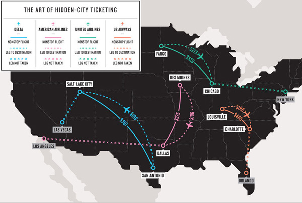
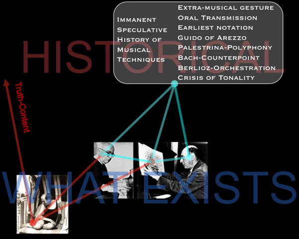
How is the scoring system determined?

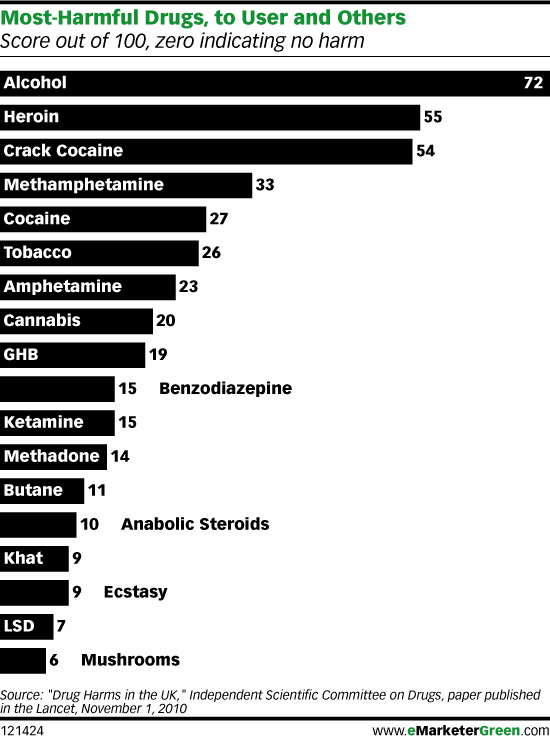
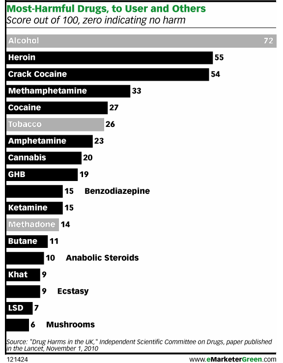
British researchers affiliated with the Independent Scientific Committee on Drugs met for a one day workshop and constructed a composite scoring system to determine which drugs are most harmful both to individuals and to society collectively. Scores can range from 0 – 100. Authors David Nutt, Leslie King and Lawrence Phillips found that,

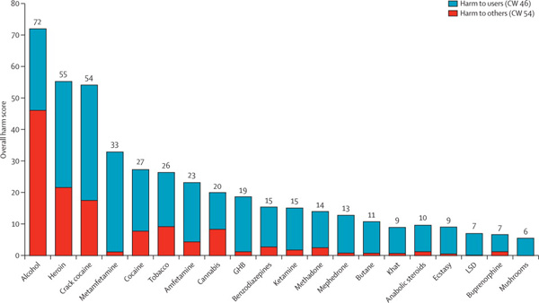
heroin, crack cocaine, and metamfetamine were the most harmful drugs to individuals (part scores 34, 37, and 32, respectively), whereas alcohol, heroin, and crack cocaine were the most harmful to others (46, 21, and 17, respectively). Overall, alcohol was the most harmful drug (overall harm score 72), with heroin (55) and crack cocaine (54) in second and third places.

The full list of factors that were included in the composite score are here:

  • Mortality
  • Damage
  • Dependence
  • Impairment of mental functioning
  • Loss of tangibles
  • Loss of relationships
  • Injuries to others
  • Crime increase
  • Environmental degradation
  • Family breakdowns
  • International turmoil
  • Economic cost
  • Loss of community cohesion and reputation

Though it is possible to go into an explanation of how each of these was measured and subsequently combined to produce the composite scores, I am going to leave that discussion to the authors of the original study. There’s an overview graph below and the full article Drug Harms in the UK: A multi-criteria decision analysis is at the Lancet.

Composite scores showing contributions from harm to individuals and harm to society

What can be done?

I found it interesting that there was no attempt made to distinguish between legal and illegal drugs. Yes, of course, some drugs are not clearly legal or illegal. They are legal when prescribed and supervised by a doctor but illegal when used off-label or outside the medical authority system (like anabolic steroids, methadone, and marijuana in California). I assumed that most methadone users are under some kind of supervision but that most anabolic steroid users are using the steroids off-label (ie illegally). You can quibble with my choices below. The point here is that I found the graph to have more context if the legality issue was visually inscribed into it.

Photoshopped version of graph that highlights legal drugs

There are age limits and places where it’s illegal to smoke or drink, but for the most part everyone will be able to use alcohol and tobacco legally for most of their lives. Methadone is probably being used legally in most cases. That’s why I shaded those bars grey. I am not expert on methadone, but I see that it is much less harmful to users and to society than heroin, the drug it stands in for, so I guess if this were the only data I had to make a decision about continuing methadone treatment programs, I would keep them going. I would also call for close scrutiny of methadone programs. Something is clearly not working as well as it could be.

As for alcohol and tobacco…well…it’s hard to argue *for* the continuing legality of alcohol. How large do detriments to society have to be to trigger additional control mechanisms? The authors of the study noted that alcohol is part of society and it isn’t going anywhere. I agree. Prohibition was a failed experiment in this country and I’m not suggested we try it again. However, I would like to reopen the debate about how the negative impacts of alcohol can be alleviated. I recommend that all new cars must have breathalyzers in them. If the driver cannot blow a legal sample, the car won’t start. Yes, people could game that system by having their friends blow for them, but often one’s friends are also drunk. And hopefully, friends really wouldn’t let their friends drive drunk. Once upon a time, seatbelts were considered extraneous and seatbelt laws were considered constraints upon American’s rights to freedom and the pursuit of happiness. Well, when a drunk driver kills one of your family members, you might decide that the sudden loss of your mother or son or niece puts a much bigger crimp in your pursuit of happiness than a breathalyzer in your car ever would have. Will breathalyzers make cars cost more? Probably. But the cost of dealing with car accidents caused by drunken driving, even when they aren’t fatal, is absorbed by random individuals who happened to be in the wrong place/time as well as tax payers who pay to repair guard rails, subsidize public hospitals and EMTs, pay cops’ salaries, and so on.

References

Nutt, David J, Leslie A King, and Lawrence D Phillips. (6 November 2010) “Drug harms in the UK: a multicriteria decision analysis” The Lancet, Vol 376(9752): 1558 – 1565.

Hidden-city airfares in the US

Excellent use of a map

I spend a lot of time explaining which uses of maps are bad. In this case, the use of a map is spot-on. Nothing could better display this information than a map. So here’s what you are seeing. Due to the mechanism that determines flight pricing, some non-stop flights from City A to City B are cheaper than multi-leg flights that take passengers from City A to City C with a layover in City B. Figuring out where these curiously expensive cities are and then booking tickets through them (instead of to them) is called hidden-city ticketing. It’s technically forbidden by the airlines because it messes up their profit-making abilities, more on that later.

There are some markets – Atlanta, Cleveland, Salt Lake City, Charlotte, Detroit, Cincinnati or Chicago O’Hare – where prices are too high compared to the rest of the airfare market. If you want the longer version of why this is true, there is an excellent, lengthy, FiveThirtyEight/Nate Silver blog post, Which Airports Have the Most Unfair Fares?, on the vagaries of airfare pricing. Suffice it to say, if you happen to need to fly into one of these expensive cities, especially if you do it often, you are interested in figuring out how to avoid feeling like you are getting ripped off.

As a visual representation of this simple-but-hard-to-explain Point A to Point C via Point B scenario, a map is the best way to clarify the concept. Just look at how the visual works. A person starts in Fargo and wants to get to Chicago. If they crank that request through kayak, they end up with a direct flight to Chicago for $586 [ouch]. But if, instead, they tell kayak that they want to go from Fargo to New York with a layover in Chicago they end up paying only $213. Kayak let’s you tell it where you’d like to have a layover. (Detroit’s airport is surprisingly nice, for instance, and if I have to layover in the summer, I’ll go through Detroit.)

How can airlines charge less to fly a person a greater distance? Not all airline pricing is driven by fuel, snacks, and human capital costs. A good bit of it is driven by demand and supply – the classic economics story from your undergrad days. Some markets are not well served creating mini-monopolies for service in and out of those airports. Other markets, like New York, have a great deal of service provision forcing airlines to pull their prices into a lower, more competitive range.

Is it legal?

Perhaps you have read somewhere in your ticket’s fine print that the airline prohibits you from bailing out of your scheduled travel halfway through the trip. The New York Times asked a lawyer whether or not it’s even legal for the airlines to penalize people this way and how far they can go to punish someone caught doing this. It turns out, there are penalties the airlines can impose, but most of them can be side-stepped by savvy travelers. The Times presented recommendations, summarized here:

Making a habit of this certainly won’t endear you to the airlines. Most of them — the major exception being free-spirited Southwest Airlines — expressly forbid it in their ticketing rules. But those rules don’t carry the force of law, and most travel lawyers say that their recourse is limited. They could probably preclude you from flying with them in the future, but their case for demanding penalties is weak, and the risk of detection is low if you don’t book these kinds of routes more often than a couple of times per carrier per year.

Also, do not end up checking bags. They will end up at your final destination. Get to the gate early enough to ensure yourself space in the overhead bins.

Book your itinerary as two one-way flights. This should be logically obvious. If you are going from Fargo to Chicago but you book your ticket through to New York, you clearly won’t be wanting a return flight from New York because you never intended to actually see the Big Apple in the first place. The other kicker is that if you fail to report for part of your ticket, the airline will probably cancel whatever remains on the ticket. So book one-ways.

Don’t lie if the airlines catch you; lying increases your likelihood of being found guilty of fraud. Honesty is the best policy.

References

Silver, Nate. (6 April 2011) Which Airports Have the Most Unfair Fares? [blog post] The New York Times, FiveThirtyEight blog.

Silver, Nate. (4 May 2011) How to beat high airfares. Sunday Times Magazine. [Graphic The Art of Hidden-City Ticketing]

Magnatune Pricing | Evidence from Voluntary Musical Album Pricing

Voluntary Pricing

I put this simple bar graph together to illustrate the following text that I got from Yochai Benkler’s paper and he got from a paper about Magnatune pricing,

In the recent paper on Magnatune, the data revealed that over a five year period, 48% of users paid $8 per album where $5 was the minimum, and only 16% paid the minimum. Another 15% paid $10, 7.3% $12, etc., up to 2.6% who paid $18 per album. Payments were highly anchored around coordination focal points — for example, the drop down menu called “$8” the “typical” donation. While 48.05% of fans paid $8, only 2.93% paid $7.50 and 0.34% paid 8.50.

I wanted to see how these numbers looked as a graphic because it was a little hard to make sense of what was happening just reading about them. What concerned me was that Benkler seemed to have crafted his text to imply – but not state directly – that voluntary music pricing schemes lead people to pay more, not less, for their music. This would make a fantastic story, but for some reason I wasn’t entirely comfortable just going ahead with that implication tucked into my subconscious mind.

When I graphed it, I added a block on the lower end of the scale to help illustrate the fact that Magnatune will not sell albums below $5. So, if we were expecting a bell curve of payment choices, all of the people who might have paid less than $5 were bunched up at the $5 mark or priced out altogether. Maybe they grumbled and agreed to pay $5 when they would have chosen $2 or $3 or perhaps they just didn’t buy the album at all. It’s hard to say.

Of course, I wouldn’t really expect people to distribute their payments for an album along a bell curve. I would have expected more clustering around the lower numbers – why would people pay more if they could pay less? Especially because they may not have taken the time to listen to the whole album for one reason or another…so they are paying for something that is not completely known. We’ve all been there before – some songs on albums just aren’t as good as others.

On the other end of the spectrum are the people who not only have taken time to get so familiar with the music that they aren’t worried about the dreadfulness of the unknown. Benkler’s paper indicates that people who develop close relationships with the musicians through collaborative efforts or fansites might be willing to pay more as a sign of respect and admiration.

Getting back to the graphic as a mechanism for making sense of the information, the point is that there are actually FEWER people in the lower range than in the higher range. Nearly half of people paid the requested amount ($8) but where they deviated from the requested amount, more people paid decided to give more, rather than less.

How can we explain that irrational behavior? I’m guessing that it has something to do with the free riders, the people who aren’t paying anything at all. These are not people who are getting their music from Magnatune, these are the friends of those paying people who are sharing iTunes accounts and getting their new music for free. There are other ways to get music for free besides sharing iTunes accounts but I’m not trying to get into all that. My point is that, after having graphed this information, I feel reasonably assured that there are quite a few people who are listening without paying a thing. It doesn’t really matter to me how they are doing that.

What matters is that the shape of the graph and the distribution of payments that we can see leads me to believe that there ought to be a substantial proportion of people – at least 14% – who are free riders. That’s a very rough estimate, but it complicates the happy story that if musicians pursued voluntary pricing they might stand to make more. It’s hard to say if that’s true or not. I guess it’s nice to allow your biggest fans to ‘vote with their dollars’ and just shrug off the free-rider problem as being outside the pricing structure. If people don’t want to pay, they are going to find ways not to pay no matter how the pricing structure is set up. But if people DO want to pay more, they can only do so under a voluntary pricing scheme. If the prices are set, they cannot opt to ‘vote’ with their dollars and pay more.

*I stick ‘vote’ in scare quotes when I am linking it up to economic activity because I like to reserve the term voting for direct political participation rather than for political participation that is supposedly possible by participating in capitalist exchanges. I hardly think that consumer behavior is as critically important as electoral behavior. Not everyone agrees with me, but that’s not a topic for this post.

References

Benkler, Yochai. (2011) “Voluntary Payment Models” in Rethinking Music. Cambridge, MA: Berkman Center for the Internet and Society at Harvard University.

Women's Clothing Size Chart by Brand

Vanity sizing = planned obsolescence

Vanity sizing is the fashion industry’s particular take on planned obsolescence, especially for women’s clothing. By incrementally expanding the measurements keyed to each size, people will continually wear smaller and smaller sizes as the year’s progress (assuming the people stay the same size). This means that if you were a size 8 last season, by next season you may not have lost a pound or toned an ab, but you will miraculously fit into a size 6 because the size 6 will now have the dimensions that the size 8 had last season. People, and women in particular, seem to get a feel-good bump out of wearing smaller sizes and will therefore buy more items in the new smaller size than they would have if their size hadn’t changed.

Goldilocks and the three dresses

Vanity sizing turns us all into Goldilocks. And you know what? I don’t care which fairy tale character is being dragged out to describe the situation of femininity today, neither I nor anyone else is trying to be a fairy tale character (exception granted to Kate Middleton). No more Cinderella, no Alice in Wonderland (falling through a looking glass is no fun at all, even if lawn bowling with flamingos and evil queens makes a good spectator sport), and Goldilocks spent most of that story lonely, frustrated, and displeased.

The chart above uses empirical evidence to *prove* that shopping will surely frustrate all women. I don’t know if men have the same problem, though I would imagine they are somewhat better off because their sizes are not just keyed to measurements, they ARE measurements. A 30×32 pair of pants is supposedly the same from one brand to the next. Maybe that’s true in mens clothes. As you can see above, women’s dress sizes certainly do not adhere to any agreed upon standard. A size 8 has a huge range of variability. However, even when women’s clothes do use measurements to describe their sizes – like jeans, which are sized not by the 0,2,4,6,8 system but by the waist measurement – a size 26 in one brand is not the same as a size 26 in the next brand. I learned that the hard way last week. And yes, I can hear fashion designers pointing out that different cuts fit differently – some are meant to be loose, others slim fitting. Maybe I’m just not fashion-aware and I’m mistaking fit differences for vanity sizing when any true fashionista would see that there is simply a different fit implied by each cut. Well. Here’s what I have to say to that: if the jeans are supposed to be 26″ in the waist, they better be 26″ in the waist. The rest of them can fit like jeggings or flare like early 1970’s bell bottoms or, heck, they can poof out like MC Hammer pants. But the waist needs to be 26″ if it is sold as a size 26″.

The graphic

This graphic is great for three reasons:

1. These folks did their homework. There are many brands represented here, from fashion labels like Marc Jacobs and Dolce and Gabbana to more affordable clothing from Old Navy and the Gap (which I always thought was the worst offender in the vanity sizing race to the biggest clothing labeled with the smallest sizes). The sheer volume of the comparison is extremely helpful.

2. The small inset of a woman’s hourglass torso acts like a site plan to the more detailed drawing. I love this. Perhaps that’s because my first drawings were architectural in nature and I like the orienting function of the relatively small overview.

3. They included three measurements – bust, waist, and hip – all three are critical to a good fit. And not all brands feel the same way about the ideal ratio of bust to waist to hip. I don’t buy button down shirts because what fits in the waist never fits in the bust.

Overall, this graphic confirms my angry fears that one day I will not be able to buy anything off the rack. Both my svelte best friend and my advisor (males) struggle to find off-the-shelf items that fit well. The smallest sizes are often too big to fit well and when they aren’t too big, they sell out very quickly. My advisor occasionally wears a shirt he inherited from his grandmother when she died. It’s a nice way to remember his grandma but it also fits better than many of his other options.

Letter to fashion world

Dear fashion world:

Please continue to make clothing for small people. And please find a way for women who are small to wear something other than ‘0’ or ’00’. Psychologically, it is bad to be called a zero; being a double zero is worse. Zeros don’t count for anything. Most people want to count for something. And since women’s identities and dress sizes are far too often conflated, wearing a size zero is like being a zero. That is an existentially dubious position to occupy.

Also, I realize that people might be inclined to buy clothing if it is a smaller size – they feel gratified that they have lost weight and are happy to buy new, ‘smaller’ clothes – but if you keep slowly enlarging the dimensions on all of the sizes, there won’t be clothing left for the small people. And at some point, losing the market share from the smaller people will trump the market share gained by getting slightly larger people to buy a little more simply because whatever they are buying is a smaller size than they thought they were. I think the solution is to put a lock on the smallest sizes and only muck around with the larger sizes – add more sizes to the top if Americans need more accommodations on that end.

Please stop expanding the dimensions of the smallest sizes. Small people need clothes that fit well, too.

– Not a zero

References

Clifford, Stephanie. (April 24, 2011) One Size Fits Nobody: Seeking a Steady 4 or a 10 [Graphic] in the New York Times, Business Day Section.

Introducing diagrams from a humanities scholar – Michael Gallope

Passing by a shared conference room last week, I was captivated by this series of graphics that Michael Gallope, a musician (electric organ) and scholar (Ph.D. student) at the NYU Humanities Initiative, developed to present his dissertation research. His work stems from his interest in music and an Adorno-inflected understanding of cultural criticism. Most of the rest of this post is by Gallope, which is for the best. He does a better job of telling you what his dissertation is about than I ever could. And I’m sure you’re sick of hearing my voice all the time.

I’m thrilled to see humanities scholars using diagrams to communicate their ideas. It helps. And that’s the point. It’s hard to get on the same page of a complex discourse if nobody is quite sure where that page is. Using words and graphics and…I don’t know…performance? Or whatever other avenues scholars have available to make sure that their points are clear and that the rest of the discourse can unfold is extremely useful. It’s not frilly, it’s not an add-on that’s ‘nice to have’. Communicating clearly is necessary for fruitful discourse. I, for one, tend to think that most academics are good at processing words and helped along by images. I don’t know if performances are always clarifying, but when the topic is music, performance is a useful mechanism for communication, not to mention a nice change of pace from the usual academic humdrum of meetings and presentations.

This is a representation of the role of negative dialectics in Theodor Adorno’s understanding of a resistant artwork.

Adorno -01
1. Below the middle line is “what exists.” Above is “what we can think.” If this were a diagram of Plato’s philosophy, everything above the line would be filled with ideal forms. But in Adorno’s philosophy, everything above the middle line is marked “historical” because Adorno believes in our power (indeed, our ethical imperative) to think about everything around us as *a congealed product of history.* Thus, if we were to think about a chair, we would not imagine a perfect immaterial chair in our heads (Plato). Instead, we would look at an actual chair and attempt to think about the history of this specific chair—all the industrial design, the history of chair-making, and the concrete manufacturing labor that brought this chair to be what it is.

Adorno -02

2. The arrows on the left side pointing down represent Adorno’s *universal* understanding of world history—that there is really just one history, and it is the history of an Enlightenment that never made any meaningful break from mythology, and thus, bequeathed to us “disaster triumphant.” We live in a world that, despite outward signs of historical progress, is in truth little more than a world of domination, cruelty, and un-reflective mechanistic thinking.

Adorno -03

3. These stick figures represent existing subjects. Their capacity to “think freely” does not escape the strictures of existence (as dictated by universal history), thus they are securely “on” the grid.

Adorno -04

4. For Adorno, there is an important way for a subject get past the impasse of a devastated world: one must find an exemplary work of art that seems, itself, to recognize the horrors of modern existence. This is represented on the diagram by the white beach-ball drawing that is attached to (but struggling out from) the grid of existence. And of all the arts, musical works were exceptional in indicating an obscure sense of resistance, suffering, or utopia, in Adorno’s vocabulary. Now the question arises: how do you know a specific musical work (like a composition by Schoenberg) is genuinely resistant?

Adorno -05

5. We answer this question by thinking of the musical work at hand as historical. In order to do that, we adopt a quick and dirty universal understanding of the history of music as having its own history of musical techniques (chant notation, polyphony, tonality, new orchestration techniques, discourses on absolute music and romanticism, a crisis of tonality, etc.). This is represented by the bubble above the musical work that, like universal history, points down to the work that exists, implying that thinking it is a necessary prerequisite for understanding a musical work. Why? Because a resistant musical work understands that it cannot just imitate the music of Bach or Mozart in the twentieth century—it must have a historically honest relationship with the modern state of musical composition. (Certain techniques, like the diminished seventh chord, have lost their power to astonish, and thus should be laid aside).

Adorno -06

6. If one links this cognitive historical recollection of music history with the act of composition (represented by the stick figure to the lower right of the work), one might end up composing a certain kind of musical work that seems to refuse the adoption of any simple musical cliches (as in some of Schoenberg’s atonal compositions). If this has happened, the work must then be heard by a listener (represented to the left of the work) who understands precisely this very same history. When composer and listener and work are linked together, one can then think of this work from the perspective of an “immanent critique” that might negate (via the red arrow) the horrors of the existing world. Only then, through a kind of mirror reflection, do we get a glimpse of what Adorno calls “truth-content” or Wahrheitsgehalt in German. By negating (and only by negating) the horrors of modern life, do we glimpse a sense of the utopian.

References

Adorno, Theodor. (1983 [1966]) Negative Dialectics. New York: Continuum.

Gallope’s music projects:

Janka Nabay and the Bubu Gang (as featured in a 2010 Village Voice article)
Skeleton$ an avant-rock project led by composer Matt Mehlan
Starring a riot-prrrog psychedelic music collective

Cost of Health Care by Country | National Geographic

Explanation

This graphic is doing a lot of work compared to how simple it looks. Here’s an annotated list for review purposes:

  1. The colors of the lines show us which countries have universal health care (most of them) and which do not (the US, Mexico). Note that these colors do not differentiate between who, precisely, is paying for this health care – that’s complicated. In many nations the state pays for some people’s care or for some care for all people, but wealthier people or particular kinds of care are not covered by the state but are picked up by private insurers. It would get much more complicated if the graphic had to have a color for each – nearly every country would end up with its own color. Even in the US, the state pays for some of very poor people’s health care and for health care for those above 65 (though there are some limits on what the state’s willing to cover).
  2. The width of the lines show us how many trips people take to the doctor. The Japanese and people in the Czech Republic appear to see their doctor more often than I see my mom. Sorry, mom. However, even though people are always at the doctor in these places, their overall health care expenditures per person are not sky high. This could lead you to conclude that going to the doctor more often means that people are getting better preventative care. Preventative care is generally cheaper than ‘fix-it’ care. It could also lead you to conclude that people who are obsessed with their health are both more invested in taking care of themselves at home and more likely to run to the doctor at the sign of any little problem (On the one hand, if they are obsessed they will recognize any little problem sooner than those who are a bit more oblivious and it would seem that they might be less likely to try ‘quackery’, preferring to go to the doctor for the official treatment. No gingko biloba or St. John’s Wart from the Vitamin Shoppe unless the doctor says so.)
  3. The length of the line means nothing. These are not time lines.
  4. The slope of the line means…well…it implies that there ought to be a relationship between health care expenditures per person and average life expectancy. The implication goes like this: a country’s ranking in terms of per capita health care expenditures ought to match their ranking in life expectancy. Granted, I think anyone who has created this kind of graph before knows that the person who made it probably spent some time trying to come up with which measure of health would be the best one to use as the proxy for success – should it be life expectancy? Should it be some conglomerate variable that combines life expectancy, infant mortality, and something else? If you play this game with yourself, you probably end up just deciding that life expectancy is the cleanest comparison. But you may admit that it is imperfect. And it is. There are so many other things that get between health care expenditures and life expectancy. There’s environment, there’s the value of a given health care dollar which is not the same from one country to the next, there are cultural attitudes supporting relatively healthier and unhealthier lifestyles that vary from country to country, and so forth. This graph ignores those issues. It has to, but you don’t. Keep all that in mind, especially when thinking about how to allocate health care dollars. Maybe those Japanese people are on to something – they go to the doctor all the time, live long lives, and don’t spend inordinate amounts on health care. I know that if I had to stand on a scale in front of my doctor once a month or even once every 6 weeks I would think twice before eating things I shouldn’t eat or chickening out on my exercise regimen. There’s just something about getting an authority figure involved in processes like these to make us accountable for our own actions.
  5. The graph implies that there is a kind of sweet-spot for per capita spending that appears to fall between $2,000 and $4,000 [2007 dollars]. The US, of course, looks ridiculously over zealous when it comes to how much we spend and dismally stupid when it comes to where we put these dollars because we spend more on health care and get less in terms of life expectancy.
  6. Rankings to rankings comparisons

    I am not a fan of these rankings to rankings comparisons overall. Yes, this particular graphic packs a bunch of information in, but I still wonder how legitimate it is to compare national rankings in per capita expenditures on health care to national rankings in life expectancy. Forgive me for being an academic who *wants* the complex story. This is over-simplified. There is absolutely nothing in this graphic that would suggest what can be done about improving a nation’s average life expectancy whatsoever. Mexico seems to be doing OK – it spends relatively little compared to where it stands in the life expectancy rankings. So, clearly, if this graphic were all that we had to base decisions on, we might not decide that universal health care would give us a bump in life expectancy. If this were all we had, we’d probably just gut spending right away because the clearest point here is that the US is spending far too much compared to other countries in absolute terms as well as in relative terms when measured by life expectancy.

    The other thing the graphic does not show – something I’m always curious about – is how much of the money we spend on health care goes to administer the system both in the US and in other places. In our fair union, with all the insurance companies requiring different claims processes, we have to hire experts at the hospitals and clinics to submit claims and experts at the insurance companies to decide what to do about the claims. We hire other experts to negotiate the terms of groups plans in the first place – and where someone gets a special deal that requires a more complicated claims process. All of the complexity of health care meets the additional complexity of administering health care the way we’re doing it now and leaves space for lawsuits. So…lawyers sue various parties for a wide variety of reasons and doctors have to buy more malpractice insurance. The system increases the costs of keeping itself going without actually adding much of anything to the quality or quantity of patient care.

    Reference

    Uberti, Oliver. (2011) “The Cost of Care” [Information graphic] in National Geographic using OECD Health Data 2009 which draws on data gathered in 2007.

Measuring the Impact of Humans on the planet | National Geographic

Note

My dad sent this along to me and I decided to leave his handwritten note at the top. Since he was interested in the graphic and not the article, I do not know exactly which article in the March 2011 issue of National Geographic contained the Human Impact graph, but my educated guess suggests it came from the one entitled, “The Age of Man” by Elizabeth Kolbert. I checked out the online version and could not find this graphic, but print and online versions of magazines do not always contain the same content.

This is why it’s nice to have parents who will cut things out of print magazines for me. Thanks, dad.

What works

The best feature of this graphic is that it provides a way for readers to understand population growth taking into consideration the qualities of the population – and the way that changes in those qualities over time mean that population growth at one point in time is not the same as population growth at a different point in time. As we all get richer, we demand more of the planet in terms of food (increased affluence leads to eating higher up the food chain which is less ecologically efficient), in terms of energy (more affluence means more demands for electricity and fossil fuels), and all of our affluence allows us to spend more time inventing things that will make our lives even better than they already are. The increase in affluence as measured by global GDP and the increase in technological sophistication as measured by patent applications are going to go hand in hand. I would point out that patent applications would not be necessary in economic systems other than capitalism, so that particular metric might be off in countries that aren’t wholly capitalist (Cuba comes to mind).

What needs work

What’s weird about this to me is that this growth is exponential and yet it has been represented linearly. I’m wondering what an exponentially growing volume looks like – probably looks pretty interesting depending on how the parameters constraining the volume are keyed to the variables. This is a tough criticism because I don’t even know the answer myself, I just know that something isn’t quite right with the tidy right angles here.

I’m a bit upset, too, about the fact that we’ve run into the apples and oranges problem again. One unit on any of these axes cannot be compared to one unit on the other two – a patent application is not like a human and neither of these are like dollars of GDP. Because I cannot compare one axis to the next, I know that I cannot use this graphic to form anything other than an impression about the factors comprising the impact of humans being born today. I cannot, say, decide that cutting back on technological growth would be better or worse for the planet than limiting population growth.

There is something good to be said about graphics that represent concepts rather than data. Impressions are not worthless so if this thing gives viewers the impression that population growth is not a problem on its own, but only a problem in the context of the way humans live, that is an accomplishment of which to be proud.

References

Tomanio, John and Bryan Christie. (March 2011) “Why is our impact growing?” [Graphic] in National Geographic p. 72.

Kolbert, Elizabeth. (2011) Age of Man National Geographic Magazine.

Loneliness and Fat Consumption among middle-aged adults | Cacioppo and Williams

What works

Written by a social neuroscientist, the book Loneliness contained this heartfelt graph on page 100. Yes, even I feel the phrase ‘heartfelt graph’ is an oxymoron. But the way that the graphic artist worked over the details here – the way the edges of the butter columns are rounded, the way that the paper is folded back, even the way that the grid lines are rendered makes this two bar graph captivating. I am also intrigued by the mix of digital and hand-rendered – most everything was hand-drawn except the axial numerals and the text labels. I like the mix. I probably would have liked it better if the lettering had also been hand-rendered but I think that’s just me being a bit too precious about hand-rendered images.

The book describes the way that loneliness is a neurological event, one that overlaps with social and psychological parameters to produce a more or less predictable set of occurrences. In this graph, authors Cacioppo and Williams are discussing recent findings that indicate lonely middle-aged adults tend to get more of their calories from fats than non-lonely middle-aged adults. For younger adults, loneliness does not seem to have an effect on either food consumption patterns or exercise patterns.

Socially contented older adults were thirty-seven percent more likely than lonely older adults to have engaged in some type of vigorous physical activity in the previous two weeks. On average they exercised ten minutes more per day than their lonelier counterparts. The same pattern held for diet. Among the young, eating habits did not differ substantially between the lonely and the nonlonely. However, among the older adults, loneliness was associated with the higher percentage of daily calories from fat that we noted earlier (and that is illustrated in Figure 6).

Perhaps because this book is about empathy-inducing loneliness, it is especially nice to see a tenderly hand-drawn graph rather than something far less engaging, the standard excel-produced item. The same numerical information would have been conveyed – and in fact that information was conveyed fairly well in the text itself – but the hand drawn element indicates that the topic is worthy of more than quantitative concern alone.

I am about halfway through this book and so far, I recommend it. Even if you are not interested in loneliness, the book does a good job of demonstrating how diverse research fields can be woven together to examine a topic common to all. The book draws from psychology, sociology, evolutionary biology, and neuroscience to help explain why some people are lonelier than others and what the impact of loneliness can be on the short-term and long-term health and social outcomes for individuals.

What needs work

For the record: I cannot draw or render or do anything good with a pencil besides finding a way to hold my hair out of my face. I tend to be overly appreciative of drawings and people who can draw. My critique here is of myself and others like me who swoon over the hand drawn.

I also wish there might have been a way to get the exercise information included, if not on the same graph, than on a companion graph right next to the butter sticks.

In a public announcement sort of way: folks lonely and nonlonely seem to take much solace in eating. That’s a large amount of fat consumption.

References

Cacioppo, John T. and William Patrick. (2009 [2008]) Loneliness: Human nature and the Need for Social Connection. New York: W.W. Norton.

Growth of the population of Hispanic and Asian children in America, 2000-2010
Growth of the population of Hispanic and Asian children in America, 2000-2010 | Wall Street Journal

What works

It’s nice to see all of the Census 2010 data coming out and generating infographics. This one comes from the Wall Street Journal which distilled the above panel of stills from an interactive graphic which also has maps for white and black kids and detailed tables by race and geography.

Though the two stills here do not do a good job of demonstrating the claim in the headline, that there are fewer white kids, the bar graph on the right and the interactive graphics, do, in fact, back up the headline claim. We could quibble about the flipside to the headline – rather than saying there are fewer white kids, should it have pointed out that there are more Hispanic and Asian kids? – but quibbling about headlines isn’t my concern here. Other news outlets did take that spin on the same set of information.

What I like here is that the graphs did not try to show everything all at once – each of the four racial categories included in this series gets its own graph. Yes, there are more than four racial categories and yes, it would be nice to see where other racial categories fit. But inasmuch as I am concerned with the overuse of mapping data, especially when those maps get layered up with all sorts of information that makes them illegible, I am happy to report that these folks had the commonsense to generate one map for each of the racial categories they decided to depict.

One of the incidental facts portrayed here is that the country continues to tip towards the southwest. The big red ‘decrease’ blobs appear in the northeast for whites and blacks and are not compensated for by blue ‘increase’ blobs among Hispanic and Asian births. Because I wouldn’t necessarily have picked this up from looking at a table, I think it’s clear to say that the use of maps was justified in this case because at least part of the story is geographic in nature.

What needs work

I have a tough time with the blob maps. I can get an overview but I have a tough time doing additions, let alone additions and subtractions. The bar graph that appears in the stills helps present the same information in a different way. In this case, the maps can only display the big picture. The bar graph is necessary to help understand how all these blobs add up. In particular, the top graph shows a large increase in the number of mixed-race kids by percentage, but this group is still so small that the absolute numbers wouldn’t even register on the blob maps.

Food for thought

The second, vertical, bar graph is my favorite part that ties all of rest of the information together. We see that white kids still make up more than half of the children born in the US, though it appears that this may not be the case in 2020. We see most clearly that Hispanic kids are growing faster than any other category of kids. I’m going to take this moment to note that Hispanic-ness is an ethnicity, not a race, and that many Hispanic kids are considered white. Remember that Central and South America were colonies of Spain and Portugal and we tend to consider Spanish and Portuguese people white. I’m not prepared to get into a discussion about what it takes to be white in America, just pointing out that Hispanic people are, in many cases, racially white even though they may consider themselves to be ethnically Hispanic. It is possible to hold both of those identities at the same time. Furthermore, if we look back in history there was a time when Irish and Italian immigrants were considered non-white. I have wondered if today’s Hispanics are similar to yesterday’s Irish and Italian immigrants in the sense that they will eventually come to be seen as white ethnics.

This is a debate I’m hardly qualified to comment on and I welcome others who are more qualified to take up this issue in the comments. In particular, I’m wondering how the numbers matter. If there are more and more Hispanics born in the US, will that mean that they are not under pressure to assimilate to mainstream white-ness and will have more opportunities to maintain a distinct identity? Or will the decreasing number of white folks mean that there is pressure to recruit new populations into the white identity as part of our one-drop anti-black legacy? I don’t know what this all means, but I do feel like the numerical balance is meaningful.

References

Frey, William H. (2011) Brookings Institution analysis of 2010 Census Data.

Dougherty, Conor. (6 April 2011) New Faces of Childhood: Census Shows Hispanic and Asian Children Surging as Whites, Blacks Shrink. Wall Street Journal.

Waterless Urinal Diagram | Wired Magazine

Accompanying text

The necessary accompanying text was not part of the image file, but here’s what it says under each panel:

Panel 1: “Instead of being flushed down with as much as a gallon of water, urine simply drains through openings in a specially designed plastic cartridge at the bottom of the bowl.”

Panel 2: “The entry chamber contains a blue liquid—a lighter-than-urine long-chain fatty alcohol. Gravity pulls urine through the liquid, but odors and sewer gases are trapped below.”

Panel 3: “As the urine descends through the cartridge chamber, its flow collides with a barrier, which prevents turbulence from displacing the floating sealant.”

Panel 4: “Urine passes beneath the barrier and into the exit chamber. When the urine level reaches the height of the drain, it spills over and empties into the outbound sewer pipe.”

Falcon Waterfree Technologies Waterless Urinal | Photo by Dan Krug

What works

I appreciate that Peter Grundy, the graphic designer, shows us the macro-scale first and then leaves the detailed working of the smaller catchment valve to the subsequent three panels. When describing something new, it’s good to start at a level that people recognize – presumably, men recognize the basic shape of a urinal more than the recognize the shape of the mechanism that makes it waterless. I probably would have made that first panel slightly bigger than the rest so that we know it isn’t four of the same things at different points in time, but one different thing and three of the same things.

I enjoy the way that the urine is displayed in balls so that it can appear bouncy. The dots are more than simply an enjoyable feature, they also help communicate about a problem in urinal design: backsplash. Urine is a bit bouncier than one might like – the text below the panel explains that dark blue liquid traps odors from seeping up but it is the L-shaped barrier that does most of the backsplash prevention work. I’m guessing it’s actually a combination of the L-shaped barrier and the blue liquid that keeps the urine from splashing. Not enough space for explanatory text to get into those details, but I appreciate the way the diagram brought attention to the backsplash problem and not just the waterlessness.

Another thing: I applaud Grundy for depicting a penis (a stylized penis, but only as stylized as the rest of the diagram) instead of a visual euphemism of the circle-and-arrow ‘male’ sign.

What needs work

The dark blue area is so dark that I initially had to sit and think about whether I was supposed to be reading it as a presence or a void. Perhaps a less dark color would have read more clearly as a presence, something we are meant to notice, than as a void. Yes, I can hear critics pointing out that since the color above the dark blue is white, one would have to assume the dark blue is presence. I speak for my eyeballs and cognitive structures when I say that I had to think about it.

That’s not all where the color critique comes from. Since water is often depicted as blue in diagrams and this diagram was supposed to be about the waterfree urinal, I probably would have chosen a color other than blue, even if the actual liquid in the device is blue. The big point is to remind us that there is no water here – we might lose sight of that amidst all the conventionally blue zones in this diagram.

I also do not quite understand the cylindricalness of this thing because the diagram makes no effort whatsoever to give depth. It’s just a section and a section of a rectangle will look the same as the section of a cylinder. Well. Except that isn’t strictly true. As far back as drafting goes, we know that there were conventions for making sure that cylinders and rectangular solids could be differentiated in section. Those rules might have been handy if extrapolated to fit this case.

The main problem I always run into with diagrams is the balance between image and text. Diagrams, in my experience, end up being more text heavy than other sorts of information graphics. This particular graphic would not work at all without the text, but that may be an unavoidable reality when it comes to diagrams. As I said above, at least the text is subordinate to the images and follows their table layout instead of sort of hanging around the fringes using arrows to connect text to image.

References

Davis, Joshua. (22 June 2010) Pissing Match: Is the World Ready for the Waterless Urinal?. Wired Magazine.

Grundy, Peter. (22 June 2010) “How it doesn’t flush” Wired Magazine. [Diagram]

Falcon Waterfree Technologies.