Uncategorized

Crony Capitalism | Original by Stephanie Herman posted to lewrockwell.com/blog

What works

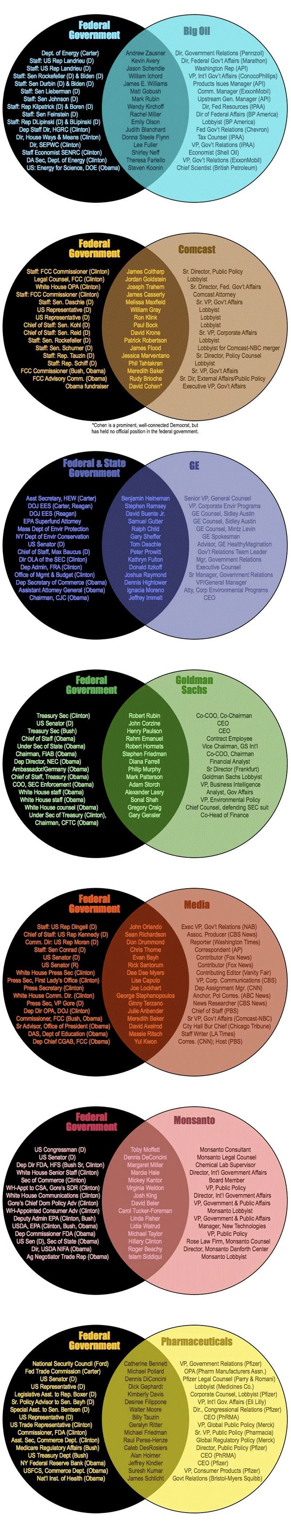
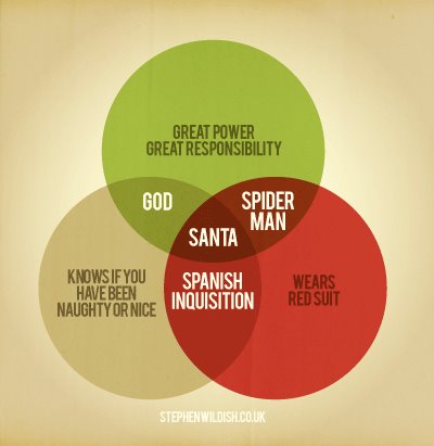
There is a lot of information here, that’s one of the best things about these Venn diagrams. People often stick a single word or a phrase in one circle, another in the next, and that’s it. But this graphic proves Venn diagrams can help organize much more detailed, drilled-down information fairly well.

What needs work

For the sake of legibility and small font sizes, I probably would have made one of the circles white instead of black, then left the colored one a color, and had the middle oval shape have a much lighter background. That might have helped make some of the text easier to read. In particular, I think it’s important to read the names themselves, so I would have worked to make sure they stood out.

I might have snugged the titles up to the curve. Their spacing is a little haphazard. Clearly, in a circular format, one cannot use a vertical margin line, but then that leaves a question about whether to mirror the shape of the circles on the outside or the ovaloid shape on the inside. I would have tried it both ways and then picked one. Not sure what happened here.

References

Herman, Stephanie. (2011) Venn diagram of Corporate Cronyism in America on geke.us

SOPA Opera in Congress

Graphic Sociology opposes PIPA/SOPA

The proposed PIPA and SOPA legislation has been roundly criticized with solid, logical arguments here by danah boyd, here by Tarleton Gillespie who links to 16 other authors who have argued against SOPA/PIPA, and here in a letter Harvard Law Professor Laurence Tribe sent to members of Congress.

As someone who is a passionate scholar of collaboration (both in its cooperative and competitive forms), I worry about the legal and economic repercussions of SOPA/PIPA that have been brought up by the authors mentioned above as well as the negative impact the threat of discretionary censorship would have on the kinds of sharing and borrowing that have made the internet and digital files such a rich source of remixing, incremental improving, and all around innovation. There is no way I could put a dollar figure or other empirical metric on what might happen to remix culture (what the cool kids call it) or innovation (what the business schools call it) under a legal regime in which just about anyone can censor just about anyone else. I can say that the internet as we know it would cease to exist. I post things here on Graphic Sociology that I have designed and created without even mentioning Creative Commons or standard copyright or anything else. If people take my work and get something out of it, that’s fantastic. I don’t even care if they give me credit, though many creative people do, and for good reason. I’m afraid if PIPA and SOPA were to pass, fewer people would re-mix my work and that’s the best kind of use, as far as I am concerned. Reposting is fine, remixing is divine.

I also post the work of others and critique them as an academic, something that is legal under the fair use doctrine. I’m not sure how SOPA and PIPA would mesh with the particular provision of the fair use doctrine that I am exercising. Presumably, they can co-exist, but I certainly don’t have the resources to hire a lawyer and defend myself against anyone who might claim that I’m violating SOPA/PIPA. And as just one of a family of bloggers, any infringement claim against any blog post on the society pages could darken the entire site. So if someone got upset with me, that would mean lights out for Sociological Images, Thick Culture, and all the rest of the blogs here.

The rest of this post is written by guest blogger Alec Campbell of Reed College in Oregon.


Guest post by Alec Campbell, Reed College


What works

This graphic clearly shows that something caused a change between January 18 and January 19. That something was almost certainly the focused attention on SOPA and PIPA resulting from shutdowns, blackouts and other actions taken or led by a number of popular Internet sites (wikipdedia, reddit, the Social Media Collective, and even here at thesocietypages there was a blackout of sorts).

What needs work

The most important flaw in this graph is that it excludes members of congress who are undecided or whose opinions are unknown. Looking at the graph it appears that the distribution of opinion moves from 72% in favor before the Internet shut down to 39% in favor after. In reality the distribution is 15% in favor, 6% opposed and 79% unknown/undecided before the shutdown and 12% in favor, 19% opposed and 69% unknown /undecided after the shutdown. The two graphs aren’t comparable because they don’t include the same total number of observations. When comparing populations of different sizes one has to compare percentages which this graphic does not do.

In fairness, the article accompanying this graphic has links to much more detailed data on SOPA
and PIPA
that does include a full accounting of all members of congress. However, those data don’t allow for comparison over time, which is the central point of this graphic.

What I can’t figure out

It’s clear that there are fewer supporters on January 19 but it isn’t clear if the people who no longer support PIPA/SOPA now oppose it or if they are now undecided. Did the Internet action make converts or agnostics? Arstechnica is keeping a running tally of Senators who are now opposing PIPA, including many of the former co-sponsors of the bill.

The graphic could have used arrows to show movement from one of the three camps (supporters, opposers, undecideds) to help illustrate where the movement happened.

Why it Matters

None of this matters much if our interest is in the fate of SOPA/PIPA. It matters a great deal if we are interested in the power of Internet protest. This graphic is about the power of protest because the prominently displayed time dimension is only relevant to this issue. This graphic overstates the power of Internet protests by omitting the unknown/undecided category making it appear that people changed their minds overnight. Clearly, some did. The number of supporters dropped in absolute terms. However, the larger effect is in convincing people to publicly state their opinion or to finally make up their minds. It is entirely possible that the major effect of the Internet protest was to get congresspersons that were leaning towards opposition to publicly state their opposition and force some supporters to claim an undecided status. That is certainly something but it isn’t the same thing as changing supporters into opponents, which is what the graphic implies.

References

propublic.org following House support of SOPA

propublic.org following Senators support of PIPA

Lee, Timothy. (19 January 2012) PIPA support collapses, with 13 new Senators opposed. [blog post] arstechnica

Wall Street shrinking graphic from Dealbook, NYTimes

What works

From the accompanying article New Normal on Wall Street: Smaller and Restrained, it is clear that Wall Street (at least as measured at Goldman and Morgan Stanley) did not have a great year in 2011 and certainly didn’t match their performance when financialization was at its height in 2006. The economic problems in the European Union are having an impact. The weak domestic economy is having an impact. Regulatory changes, especially the Volcker Rule, are having potentially long-lasting impacts by changing the rules that allowed banks to practice such widescale financialization in the first place.

The Volcker Rule, which is aimed at stopping banks from making financial bets for their own accounts, could permanently eat away at bond trading revenue. Efforts to strengthen the derivatives market — such as making sure that trades are properly backed with collateral — could deplete the profitability of this business.

Mr. Hintz estimates that a Wall Street bank currently makes a 35 percent profit margin on its derivatives businesses, but he thinks the new rules could shrink that to 20 percent.

The question remains: are these impacts part of a durable restructuring of financialized banking or are they something that the capitalist tendency towards profit-seeking can overcome?

The policy issue remains, too: keep your eye on the Volcker Rule – it may sound boring but it matters and any changes to it or reinterpretations of it are worthy of your attention.

What needs work

I’m not convinced that the graphic answers the major question: is this temporary or evidence of a lasting shrinkage of financialization? I’m not even convinced that the graphic does a great job of interpreting Wall Street’s current status as compared to 2006. At the very least, in this case I firmly believe the text is more compelling than that graphic.

  • The graphic needs to do a better job emphasizing the asset to equity ratio*. In short, this is a reflection of way each institution is leveraging its assets. That ratio is often seen as one of the simpler ways to think about what financialization means. The greater the leveraging ratio (in visual terms: the greater the difference in the size of the equity box versus the assets box), the more heavily a firm is participating in financialization – generating money from money, rather than from, say manufacturing or productivity. One simple trick I would have tried: make the assets portion of the box even lighter to help suggest an ephemeral quality.
  • I would love to see more than two years in this picture. If 2006 was the height of things, is 2011 like returning to 2005? Returning to 1990? We need more data points to fully understand this trend.

What I can’t figure out

Curiosity question: Why was Morgan Stanley more sensible about compensation in 2006 than in 2011? Wouldn’t we expect bankers to be taking less in compensation now, after the righteous indignation of the American public has rained down upon them, than they were before the crash? Yet in 2006, Morgan Stanley dedicated only 42% of its annual revenues to compensation while in 2011 it dedicated 50.6% to compensation. Is that good business sense? It surely doesn’t make for good PR if the banks are trying to suggest that they have to compensate their bankers for performance – their performance looks kind of crappy this year.

* I am a complete newbie when it comes to finance and financialization so please feel free to broaden, complicate, or wholly overturn my arguments here.

References

Eavis, Peter and Susanne Craig. (19 January 2012) New Normal on Wall Street: Smaller and Restrained Dealbook: NYtimes.com. Graphic: Shrinking Wall Street

The detailed view (before) | whitehouse.gov

What needs work

The complete view of the bureaucracy in the federal government is totally confusing, even when it is color coded and arranged so as to be easily viewed from 30,000 feet (see above).

BusinessUSA initiative aims to make it easier for businesses to interact with the US Federal government

What works

The US Federal Government has copied a kind of 311-style approach to helping businesses navigate the portions of the federal bureaucracy relevant to them. One department, one number, one website.

What interests me the most is the choice of those in the White House to promote this program through information graphics. This reflects the visual skills of Obama’s administration which have been evident since the middle of his campaign where not only those like Shepard Fairey but also his official campaign team launched an extremely successful visual campaign.

Shepard Fairey - HOPE
Obama Campaign Logo, 2008

The White House choice to use graphics in order to explain and promote their simplification of a portion of the federal government is also evidence of a growing shift towards the use of infographic stylings in the service of persuasion. Infographics gain a great deal of traction from the notion that humans tend to believe what they see. They gain even more traction when they mobilize numerical data that many people feel uncomfortable processing on their own. This graphic manipulates that sense of visual numeracy by taking a network (nest?) of dizzying resources and simplifying it into three nodes, each of which will bring businesses to the same pool of resources. ‘From many, one’ is an extremely powerful message, made all the more powerful by the strength of this visualization – it is clean, the nest part is detailed, and the resolution in the ‘one’ is not represented as a single node (which wouldn’t work as well because it would appear hyperbolic and would efface the modern entry modes into the federal government – the phone and the internet).

Deconstructing a Ford plant | The Atlantic

What works

This diagram of the closure of a Ford plant identifies both physical and temporal processes that a marvel of modern manufacturing has to undergo in order to cease production in a rational way. Environmental damage has to be mitigated – the paint shop is especially toxic and it seems to take workers years to handle that. [Let me register my vote here for automotive paneling that can be modified without paint or other dreadfully toxic processes. Surely, there has to be a better way. Sandblasting?]

The diagram is very smart. It maintains the size of the Ford plant – the thing takes up most of the visual space. Clearly, it could have taken up less space and given over more space to various explanatory text blocks and additional-information diagrams in sidebars, but I think that approach would have diminished the gargantuan nature of both the plant itself and the processes of shutting it down.

Second, the integration of a timeline measured by number of workers employed is just the perfect layer of information to pull the rest of the text-boxes together as a narrative. The timeline makes the whole graphic complete.

Third, I don’t mind the length of the text in the text blocks. It seems about right to me.

What needs work

I could have used some additional information about the relative uniqueness or typical-ness of an automotive plant closure (or even various elements of the plant closure process). The New York Times article Developers Revive Closed Auto Plants notes that about half of the nation’s 263 closed auto plants have been revived one way or another. In one case, an old Ford transmission factory now houses a community college with a 4-year nursing program on one corner, an aluminum scrap processor on another, a mobile facilities manufacturer in a third location, but is still more than half vacant. I was curious while looking at this graphic: Would Ford have had to go through the same kind of process with a transmission factory (they don’t paint transmissions so it seems it should have been easier in that regard)? When a plant is going to be repurposed, does Ford still have to do all the same ‘closing time’ activities or do those become the responsibilities of the new owner? Is that a negotiable term?

While a graphic would have been hard-pressed to answer all of those questions, I was hoping it would be able to at least address the idea that plants are both closing altogether and being repurposed – two related but not synonymous occurrences. In some places where the plants are closing, municipalities demand that their former owners take them down to slabs under the assumption that a slab is more appealing to a new owner than a facility that may need to be torn down and rebuilt.

Overall, I think the graphic is successful but could be better with more contextual information. I know some of that was in the article, but I am only reviewing the graphic, which I think should be able to stand alone.

References

Peck, Don. (April 2009) Disassembly Line. The Atlantic.

Christie, Bryan. (2009) Disassembly Line [information graphic]. The Atlantic.

Human Development Index plotted against Electricity Consumption

What works

Infrastructure is a critical resource for supporting basic human life and this graphic does a good job of indicating the geometrical returns to electrical infrastructure in poor places. A little bit of electricity goes a long way.

Electricity doesn’t cause well-­being, of course. But it is a powerful enabler. When people have lights that allow them to study and work after dark, refrigeration to keep foods and medicine fresh, pumps and purifiers to irrigate farmland and produce safe drinking water, and cell phones and computers to connect them with commercial, educational, and health care resources, they can more fully participate in the social and economic activities that drive human development.–Arun Majumdar

What needs work

The Human Development Index should be spelled out a little in graphics like this until it is clear that the average person on the street knows what is represented by the Human Development Index. [To the author’s credit, he does outline the components of the HDI in the text.] It can be a very tricky metric. The Human Development Index used by the UN uses four measures: life expectancy at birth, mean years of schooling, expected years of schooling, and gross national income per capita to create the human development index for a country. They use two measures of education so that they can be more sensitive to changes as they happen. It takes a long time to change the mean educational attainment in a country even if that country has recently put in place policies and infrastructure to educate more children for a longer period of time. All of the measures are chosen because they are relatively easy to measure and because most countries have at least sort of reliable data for all four measures.

Human development index - UNDP

I also don’t like that all of the wealthier countries are labeled but only some of the poor countries in the lower left are labeled.

I assume the colors refer to continents. A key would have helped.

To help viewers understand kilowatt hours, I would have liked to see some comparison between something a typical person would be familiar with and this magical 2500 kilowatt hour/person/year threshold. How many days could I power my iMac at that rate? A month? Half a year? What about my refrigerator? I have no idea how much 2500 kilowatt hours might be.

References

Majumdar, Arun. (2012) Electrifying the bottom of the pyramid Harvard Business Review.

UNDP. (2011) Human Development Index.

The Backbone of the Flavor Network | Ahn, Ahnert, Bagrow, Barabási

Each node denotes an ingredient, the node color indicates food category, and node size reflects the ingredient prevalence in recipes. Two ingredients are connected if they share a significant number of flavor compounds, link thickness representing the number of shared compounds between the two ingredients. Adjacent links are bundled to reduce the clutter. Note that the map shows only the statistically significant links, as identified by the algorithm of Refs.28, 29 for p-value 0.04. A drawing of the full network is too dense to be informative. We use, however, the full network in our subsequent measurements.

What Works

Trying to visualize the connections between flavors (ingredients?) is a new direction for both visualization and network research, though there has been some work on which flavors/ingredients tend to go well together (see Michael Ruhlman’s “Ratio” for basic recipe ratios and a bazillion cookbooks for specific flavor/ingredient combinations). In fact, the researchers for this article used the 56.000+ recipes at allrecipes.com, epicurious.com, and menupan.com (a Korean recipe site) to generate the network above, clearing out the noise by displaying only the biggest nodes which are the most commonly occurring ingredients.

What the researchers were after was figuring out whether similar ingredients are more likely to attract or repel each other. They broke the common ingredients down into their chemical components to help measure similarity and examined American and Korean recipes both lumped together and separately. In the separated case, they found that, “The results largely correlate with our earlier observations: in North American recipes, the more compounds are shared by two ingredients, the more likely they appear in recipes. By contrast, in East Asian cuisine the more flavor compounds two ingredients share, the less likely they are used together.” However, they figured out that some combinations of ingredients appeared so frequently in both cuisines that they were skewing the results. Americans like to use milk, butter, cocoa, vanilla, cream, and egg together. East Asians have a lot of recipes that use beef, ginger, pork, cayenne, chicken, and onion. When you sort these ingredients out, the networks are kind of silly because, at least in the American case, at least one of the ingredients on the ‘frequent’ list appears in about 75% of the recipes.

Next, they honed in on these co-occurring ingredients/flavor compounds and constructed what they call an “authenticity” score. Quoting the authors, “If an ingredient has a high level of authenticity, then it is prevalent in a cuisine while not so prevalent in all other cuisines.” The figure below highlights the ingredients, ingredient pairs, and ingredient triplets that scored high on “authenticity” using pyramids.

Flavor authenticity pyramids by ethnicity of cuisine | Ahn, Ahnert, et al

Personally, what I think this shows is that Americans like to bake much more than anyone else or at least that they are more likely to use recipes to bake. Baking is thought to be the more exacting of the cooking/baking pair, and thus would be more likely to require a recipe than would cooking. Again, I refer you to Michael Ruhlman’s “Ratio” in which he somewhat disputes the necessity of following recipes in favor of memorizing and then following ratios.

As for the success of the graphics here, I admit that I would not have read this article had it not been for the graphics. I find the methodology interesting though the findings are the kind of findings that make a lot of people shrug their shoulders and say, “um, that’s nice.” Another networks researcher, Duncan Watts, came out with a book earlier this year called: “Everything is obvious, once you know the answer” in which he argues for the kind of science that offers testable mechanisms for assessing the things we think are true. I guess if we take his point, we can feel more confident in our pronouncements about what makes American food American or East Asian food East Asian. Yes, area studies people, I know that East Asian food varies and that the trends they find in American food might also be discovered in French food. I’m just using the categories they worked with rather than those established by food studies scholars and cooks.

References

Ahn, Ahnert, Bagrow, and Barabasi. (15 December 2011) Flavor Network and the Principles of Food Pairing. Nature: Scientific Reports 1: Article 196.

Ruhlman, Michael. (2009) Ratio: The simple codes behind the craft of everyday cooking. Scribner.

Watts, Duncan. (2011) Everything is obvious, *once you know the answer. Crown Business.

Citeology - Step 1
Citeology - Step 1

Step 1

The image above was constructed using the citations from the CHI/UIST papers. CHI stands for Computer-Human Interaction; UIST stands for User-Interface Software and Technology; both are considered to be important and maybe even ‘cool’ by product designers, software designers, and those on the peripherals of the space between product design and software design. UIST had their 24th annual conference in 2011 and CHI started in 1982. By way of full disclosure: Autodesk is a major sponsor of UIST. They paid the people who put this graphic together, too.

The graphic above took the conference proceedings from these two conferences as datasets, compiling all of the articles that were included and their references. Each of the small grey-ish bars is an article.

Citeology | Tangible bits by Hiroshi Ishii and Brygg Ullmer

Step 2

Hovering a mouse over a grey-ish bar will pop up the actual title of the article. Clicking on the bar will bring up a graphic that displays both the articles which the original article cited (in blue) and the articles published after the original article that referred to the original article (in brown).

What works

How is this thing useful? Well, compare the article above about Tangible Bits with the article below about Cooperation in Computer-Aided Design. It is easy to see that The Tangible Bits article is more clearly within the mainstream of this new sub-discipline because it both refers to articles that were published in these two proceedings and is then widely referred to by future publications in the proceedings. The Cooperative Design piece was less firmly situated in the discipline, which is instantly obvious because they did not include citations from within the proceedings in their article (and they have fewer citations by others for quite a few years before this older article gets popular again). Things like disciplines and sub-disciplines are difficult to understand, difficult to define, have fuzzy borders, and suffer from all sorts of other kinds of infringements on their existence. This visualization technique at least allows us to see some of that border-making work happen by following citation patterns.

Citeology | Cooperative Computer-aided Design

To be fair, the Cooperative Computer-Aided Design paper was written when these conferences were still being established and thus the number of articles available in the proceedings were smaller back in 1990. What’s more, it was probably still a little unclear just exactly what kind of sub-discipline CHI and UIST would come to define. Building up a new research field does not happen overnight and some of the things that seem relevant at first, turn out to fit in better elsewhere.

What needs work

It is a little unclear just how important it is to understand the boundaries of a discipline. For an academic trying to shape a particular kind of career, one in which they believe getting published in CHI or UIST is important, I guess it would be nice to have something like this so they can figure out what the core of popular articles has been so they can get themselves in the stream they’d like to be in. On the other hand, I’m not sure it is always good for academics to create loops in which everyone is citing the things everyone else in their circle has read. Seems problematically narrow to me. Maybe a graphic like this could demonstrate such a narrowing (one would expect the number of cites to grow for a while and then plateau in a false narrowing situation rather than to continue to expand exponentially in a more open-minded, exploratory research field). However, my beef with this kind of thing is that it seems that as a *tool* it will be used to help induce closure in the circle of citations. At the moment, it doesn’t seem like this is happening, but then, we might not expect the closure to be evident until after authors have had a chance to use the tool for a while to help them figure out what to read and cite when they submit to these journals. It does seem like some kind of narrowing of the field happened in about 1992-ish where a plateau in the total number of articles being cited is evident. I would imagine that was a kind of natural impact of having finally settled upon a definition of what the field would be, a necessary winnowing process so that the sub-discipline could find its boundaries and come into existence as a clearly defined entity (a column of water in a glass) rather than spreading out to encompass a little bit of everything (the same water poured out over a table).

Giving credit where it’s due

Thanks to Letta Wren Page, an editor at The Society Pages, for sending the Citeology visualization along.

References

Autodesk. (2010) Citeology Part of the Visualization Project within the Learning Project group.

How many households are like yours infographic.
Overview: How Many Households Are Like Yours? | New York Times using IPUMS and Social Explorer

The American Family – A demographic portrait

The New York Times has been running a variety of stories about American demography ever since the 2010 Census results were made publicly available. In this story (which came out last June…sorry for the delay), the article focused on today’s atypical families by spending time with a family comprised of a mom who used sperm donated by a gay friend of hers to have a baby. The biological dad stayed in the picture more than he had planned, as did his partner, though the end of the article hints that the biological mom and dad might be slowly coming closer to a shared living situation that more closely mirrors the traditional set-up.

That sort of one-off telling of the tale of a particular family is not what drew my attention. The larger demographic trends are what I find more fascinating and the interactive infographic offers a much less linear tool for exploring the changes in the demography of the American family than does the article. The article offers a narrative about a particular set of relationships. The infographic presents a question and then gives users enough historical and national context to poke around the possible answers to that question for themselves.

Married Couple
Married Couple - American Family Demography

The site allows users to start with a head of household – that matches the way the Census is collected and makes sense. I picked a married couple above. Below I pick a variety of others but if you are sick of crappy screen grabs, feel free to go to the NYTimes site and choose the selections on your own.

What works

+ The graphic design is friendly without offending too many sensibilities (OK, the guy’s hair could be different to be more racially inclusive and it would be nice if the woman didn’t have to wear a skirt, but overall, I like the figures).

+ Another thing I like about the design is that they smack the percentage up there without feeling that they have to stick it in a pie chart or a graph or any other visual. They assume people have basic numeracy and can interpret a percentage without having to see it as a pac man…I mean pie chart. This leaves the visual field fairly clean and allows the focus to be on the family.

+ The graphs underneath the main family form do an excellent job of providing historical, racial, and income-based context. I love the history one – I think the big point about American family forms is that they are now and have always been subject to a fair amount of change despite the fact that it is fairly common to hear the “American family” referred to as if it were one kind of thing and had been since time immemorial.

+ The interactive component is excellent. Add some kids. Then kill them off. Or keep the kids and give them a different household head. Or get rid of the young kids and add adult kids. Or forget kids and spouses: just add siblings. Besides how much fun I had doing this, I ended up exploring many more angles of the American family demography question than I otherwise would have.

Of course, I was interested in what the story is for people like me (single women)…

American Family Demography - Single Female

if I were a man

…and whether or not my situation would be different if I were a man. I was surprised that there are more single women than men until I remembered that men die younger so I bet that the difference shows up at the later end of the life course, not so much among my age cohort.

American Family Demography - Single Man

on the other hand

…or had a child on my own like the woman in the article.

American Family Demography - Mom and Kid

What about the same sex couples? Not exactly a huge percentage of the population, but the Census data upon which this was based are having trouble keeping tabs on the variations of legal statuses of same sex cohabiting couples. In some states same sex couples could marry in 2010, in some states not so much. This is a trend to watch in 2020 and 2030.

American Family Demography - Female partners
American Family Demography - Male Partners

What needs work

I wish there were a way to visualize ‘any children’ instead of having everything broken down by age and number of children. I found myself curious to figure out how many households had kids, who they were, and whether or not they were single-headed, couple-headed, same-sex couple-headed and so on. But there’s no way to do the basic kids vs. no-kids comparison here.

Accessing good data online

This contemporary overview of American family demography was put together by some of the digital team at the New York Times and ran alongside “Baby Makes Four, and Complications”. It uses IPUMS data (which came from the US Census but had to be cleaned up and made properly malleable for crunching with statistical software before it could be analyzed).

The Integrated Public Use Microdata Series – IPUMS – is a project based at the Minnesota Population Center and used widely by American social scientists to study both domestic and international demography. Users – and just about anyone can become a user – can download subsets of the US Census suitable for data analysis on typical desktop computers. The subsets are random samples of the full Census and are generally considered to uphold the highest standards currently outlined for use with the statistical modeling techniques that common among social scientists. While IPUMS is an excellent, fantastic, extremely valuable resource for academic researchers. The Social Explorer, a website supported by Oxford University Press and headed up by Andrew Beveridge at Queens College and the CUNY Grad Center, tries harder to produce public-facing reports using data from IPUMS as well as the American Community Survey and other large-scale surveys. The Social Explorer also makes data available for others to analyze, so between IPUMS and The Social Explorer, it is much easier to get good data sets for analysis than it was in the past.

References

Kleinfield, N.R. (19 June 2011) Baby Makes Four, and Complications New York Times, NY/Region Section.

Steven Ruggles, J. Trent Alexander, Katie Genadek, Ronald Goeken, Matthew B. Schroeder, and Matthew Sobek. Integrated Public Use Microdata Series: Version 5.0 [Machine-readable database]. Minneapolis: University of Minnesota, 2010.IPUMS USA website

Beveridge, Andrew, et al. The Social Explorer website. New York: Oxford University Press.

What would Foucault say?

What works

It’s the end of the term, what works about this image is that it requires very little analytical thought. Use those brain cells for writing papers (and grading them).

References

Wildish, Stephen. (December 2011) “Santa Venn Diagram” [Graphic Design] via @HilaryGreenbaum.