stratification

race-and-ethnicity-in-america

What works

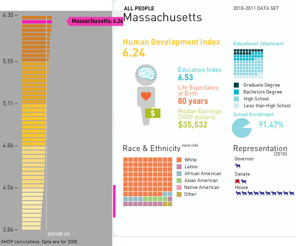
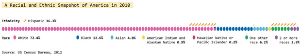
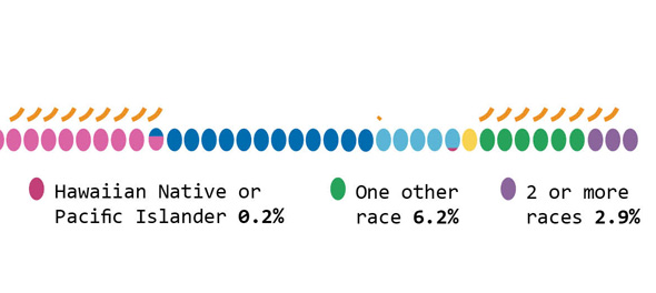
This graphic does a great job of depicting race and ethnicity as distinct concepts. The orange hash marks above the racial groupings indicate the proportion of people in the racial categories that are also Hispanic by ethnicity. I made this to correct the graphics that lump race and ethnicity together (and – bafflingly – they still add up to 100%).

Race and ethnicity are not the same. Race refers to differences between people that include physical differences like skin color, hair texture and the shape of eyelids though the physical characteristics that add up to a social decision to consider person A a member of racial group 1 can change over time. Irish and Italian people in America used to be considered separate racial groups, based in part on skin color distinctions that most Americans could no longer make. What does “swarthy” look like anyway?

Ethnicity – a closely related concept – refers to shared cultural traits like language, religion, beliefs, and foodways. Often, people who are in a racial group also share an ethnicity, but this certainly isn’t always true. American Indians are considered a racial group but there are hundreds and hundreds of distinct tribes in the US and their religions, beliefs, foodways, and languages vary from tribe to tribe. Hispanics in America often share common language(s) (Spanish and/or English) but they may not share the same race. At the moment, most Hispanics in America self-identify as white. I have often wondered if, when I’m 60, the ethnic boundaries currently describing Hispanic people will have faded away, much like the boundaries describing Italian and Irish folks faded away, becoming more of a symbolic ethnicity that can become more important during the holidays and less important during day-to-day life.

What needs work

The elephant on the blog is that I have been on hiatus since February. I’m writing my dissertation and I plan to stay on hiatus through the spring to finish that. My decision may seem irresponsible from the perspective of regular readers and I apologize for my absence.

Close-up of graphic
Close-up of graphic


As for the graphic, it was designed to run along the bottom of a two-page spread so it does not work well here on the blog. If anyone wants a higher-resolution version to use in class or in a powerpoint, shoot me an email and I’ll send it.

References

US Census, 2012 using 2010 data.

Increase and decrease in Hispanic population in the Dakotas, Minnesota, Iowa, Nebraska, Kansas, and Oklahoma | 2010 Census

What works

This is a quiet story, the kind of thing that may or may not be picked up by a major national newspaper like the New York Times. Rural America is often used as a political flag to wave by politicians, but there is not often too much coverage of day-to-day life. The 2010 Census clearly shows,

The Hispanic population in the seven Great Plains states shown below has increased 75 percent, while the overall population has increased just 7 percent.

What is equally odd is that this story is running two graphics – the set of maps above and the one below – that more or less depict the same thing. I salivate over things like this because it gives me a chance to compare two different graphical interpretations of the same dataset.

The two maps above includes a depiction of the change in the white population as a piece of contextual information to help explain where populations are growing or shrinking overall. These two maps show that 1) in many cases, cities/towns that have experienced a growth in their hispanic populations also received increases in their white populations (hence, there was overall population growth) but that 2) there are some smaller areas that are experiencing growth in the Hispanic populations and declines in the white populations.

The second map shows only the growth in the Hispanic population without providing context about which cities are also experiencing growth in the white population. Looking at the purple map below, it’s hard to tell where cities are growing overall and where they are only seeing increases in the Hispanic population which is a fairly important piece of information.

Percent change in hispanic population in the Dakotas, Minnesota, Iowa, Nebraska, Kansas, Oklahoma

What needs work

For the side-by-side maps, the empty and colored circles work well in the rural areas but get confusing in the metropolitan areas. For instance, look at Minneapolis/St. Paul. Are the two central city counties – Hennepin and Ramsey – losing white populations to the suburbs? That is kind of what it looks like but the graphic is not clear enough to show that level of detail. But at least the two orange maps allow me to ask this question. The purple map is too general to even open up that line of critical analysis.

This next point is not a critique of the graphics, but a direction for new research. The graphics suggest, and the accompanying article affirms, that Hispanic newcomers are more likely to move into rural areas than are white people. Why is that? Is it easier to create a sense of community in a smaller area, something that newcomers to the area appreciate? If that is part of the reason new people might choose smaller communities over larger ones, for how many years can we expect the newcomers to stay in rural America? Will they start to move into metro areas over time for the same reason that their white colleagues do?

Are there any other minority groups moving into (or staying in) rural America? Here I am thinking about American black populations in southern states like Alabama, Mississippi, and Arkansas. Are those groups more likely to stay in rural places than their white neighbors? For that matter, what about white populations living in rural Appalachia. Are they staying put or are they moving into cities like Memphis, Nashville, and Lexington?

How do things like educational attainment and income levels work their way into the geographies of urban migration?

References

Queens College Department of Sociology. (13 November 2011) Changing Face of the Rural Plains [information map graphics] Queens College: New York.

Sulzberger, A.G. (13 November 2011) Hispanics Reviving Faded Towns on the Plains New York Times: New York.

American Generation Age Timeline (Age measured in 2009) | Pew Research

What works

Pew Research has created a tidy series of interactive graphics to describe the demographic characteristics of American generational cohorts from the the Silent Generation (born 1928 – 1945) through the Boomers (born 1946 – 1964), Generation X (1965 – 1980) [this is a disputed age range – a more recent report from Pew suggests that Gen Xers were born from 1965-1976), and the Millennial Generation (born 1981+ [now defined as being born between 1977 and 1992]). The interactive graphics frame the data well. They offer the timeline above as contextual background and a graphic way to offer an impressionistic framework for understanding generational change.

Then users can flip back and forth between comparing each generation to another along a range of variables – labor force participation, education, household income, marital status – while they were in the 18-29 year old age group OR by looking at where each generation is now. The ability to interact makes the presentation extremely illustrative and pedagogically meaningful. It is much easier to understand patterns that are changing over time versus patterns that are life course specific.

Marital status

Marital status by generation measured when young | Pew Research
Marital status by generation measured in 2009 (snapshot) | Pew Research

For instance, marital trends have been hard to talk about because the age at first marriage moves up over time, so it’s hard to figure out at what age we can expect that people will have gotten married if they are ever going to do so (I tried looking at marriage here).

What I like about the Pew Research graphics is that they show us not only what the generations looked like when they were between 18 and 29 years old (above) but also what they look like now (below). Not only does it become obvious how many millennials are choosing to remain unmarried (either until they are quite a bit older or forever – hard to say because the oldest millennials are still in their 30s), but it also becomes clear that in addition to divorce, widowhood is a major contributor to the end of marriage. Keep that in mind: somewhere around half of all marriages end in divorce so that means the other half ends in death. I would guess that a vanishingly small number of couples die simultaneously which means there are quite a few single older folks who did not choose to be single (of course, even if they didn’t choose to outlive their spouses, they may prefer widowhood to other alternatives, especially if their spouse had a long illness).

Labor force participation

Here’s another set of “when they were young” vs. “where they are now” comparisons, this time on labor force participation. It appears that the recession has walloped the youngest, least experienced workers the hardest. They have the highest unemployment rate AND the highest rate of educational attainment (and school loan debt), which leaves them much worse off as they start out than their parents were in the Boomer Generation. Even if their parents were in Generation X, they were still better off than today’s 20-something Millennials.

American labor force participation by generation (2009) | Pew Research
American Labor Force Participation by Generation (measured in 2009) | Pew Research

What needs work – Are generations meaningful?

My first minor complaint is that the graphic does not make clear *exactly* what “when they were young” means. If we look at the first graphic in the series, the timeline, it appears that “when they were young” was measured when each generation was between 18 and 29 years old. I hope that is the case. I might have had an asterisk somewhere explaining that “when they were young = when they were 18-29 years old”.

The concept of generations, in my opinion, is a head-scratcher. The idea that I had to come update this blog because the definition Pew was using to define Millennials and GenXers changed (without explanation that I could find) adds to my initial skepticism about the analytical purchase of generational categories. What is the analytical purchase of looking at generations – strictly birth-year delimited groups that supposedly share a greater internal coherence than other affinal or ascribed statuses we might imagine? If we believe that social, technological, and most all kinds of change happen over time, of course there are going to be measurable differences between one generation and the next. I imagine, though I have never seen the comparison, that if social scientists split people into 10- or 20-year pools based on their birth years they would end up with the same sorts of results. So why not think of generations as even units? And is it clear that the meaningful changes are happening in 20-year cycles? Or would 10-year age cohorts also work?

The real trickiness comes in when we think about individuals. Say someone is like myself, born in a year on the border between one generation and the next. Am I going to be just as much like a person born firmly in the middle of my cohort as a person on the far end of it? Or will people like me have about as much in common with the people about 8 years above and below us, but less in common with the people 15 years older than us who are considered to be in the same generation, and thus to have many similar tendencies/life chances/characteristics?

A better way to measure the cohort effect would seem to be to consider each individual’s age distance from each other individual in the sample – the closer we are in age, the more similar we could be expected to be with respect to things like labor force participation and educational attainment. Large structural realities like recessions are going to hit us all when we have roughly similar amounts of work force experience, impacting us similarly (though someone 10 years older and still officially in the same generation will probably fare much better). Since it is computationally possible to run models that can take the actual age distances of individuals in the same into account, I don’t understand the analytical purchase of the concept of generations.

The take-away: great graphics, bad premise.

References

Taylor, Paul and Keeter, Scott, eds. (24 February 2011) The Millenials. Confident. Connected. Open to Change. [Full Report] [See also: Executive Summary and Interactive Infographic] Washington, DC: Pew Research Center.

Human Development Index Map
Massachusetts Human Development Index

What works

Mapping the Measure of America is a social science project that deliberately includes information graphics as a communication mechanism. In fact, it is the primary tool for communicating if we assume that more people will visit the (free) website than buy the book. And even the book is quite infographic dependent. I support this turn towards the visual. I also support the idea that they hired a graphic designer to work with them. Often, social scientists do not do well when left to their own under-developed graphic design skill set. Fair enough.

The website presents a unified view of the three images above. I couldn’t get them to fit in the 600 pixel width format, so I presented them one at a time. I encourage you to go to the website because one of the greatest strengths of this approach is the interactivity and layering. I happen to have picked Massachusetts, but each state plus DC has it’s own graphics available. There are other charts and whatnot available, but I think that this set of graphics (which you see all at once) are the strongest.

What needs work

Maps. Maps are too often used. Here’s why I think maps are a problem. Look, folks, political boundaries are meaningful when it comes to making policy or otherwise dealing with state-based funding. And that’s about it. Political boundaries occasionally coincide with geographical boundaries, but not always. Geographical boundaries are meaningful for some things – life opportunities may be based on natural resources or on historical benefits accruing to natural resources. But political boundaries and maps are often not all that useful because they imply that the key divisions are the divisions between states or counties or neighborhoods. Like I said, sometimes this is true because funding tends to be like the paint bucket tool – it flows right up to the boundaries and not beyond, even if the boundaries are arbitrary or oddly shaped. But where the issues are not heavily dependent on funding, thinking in terms of political boundaries makes it harder to see patterns that are organized along other axes. For instance, I wonder what would have happened if some of these categories – education, longevity, income – had been split between urban, suburban, and rural areas. Or urban and ex-urban areas if you prefer that perspective on the world as we know it.

In the end, I think the title is both accurate and disappointing: “Mapping the Measure of America”. Figuring out how to do information graphics well means figuring out which variables are the key variables. In this case, it seems that the graphic options might have determined the display of the information. Maps are easy enough – they appear to offer a comparison between my local and other people’s local. Those kinds of comparisons offer readers an easy way to access the information because everyone is from somewhere and there is a tendency to want to compare self to others. But ask yourself this: to what degree do you feel that state-level information is a reflection of yourself? Do you see yourself in your state?

References

Burd-Sharps, Sarah and Lewis, Kristen. (2010) Mapping the Measure of America with the American Human Development Project. Site design credit goes to Rosten Woo and Zachary Watson.

How Well Do We Take Care of America's Teeth?

How Are Our 17 Year Olds' Teeth Doing?

Dental Insurace or Health Insurance, Who Has What?

Who Has the Best Access to Dental Care?

Does More Education Mean Healthier Teeth?

Happy Halloween

This graphic is a bit too cartoon-ish for my tastes but it does a good job of illustrating a health care gap that, even during the health care debate, went over-looked. I figured Halloween – a holiday whose commercialization revolves around candy – might be a good time to post the dental health care graphics developed over at the GOOD magazine transparency blog.

In the spirit of full disclosure: I was a dental assistant for a summer. The numbers here are accurate and have very real consequences. I used to see kids who did not know (they had no idea) that drinking soda was bad for their teeth. These kids sometimes had 7 and 8 cavities discovered in one check up. For older people, dry mouth would lead them to suck on lozenges or hard candy all day and they’d end up with a bunch of cavities, too. Bathing the mouth in sugar is bad. Combining the sugar with the etching acid in soda is even worse.

Once a tooth has a cavity, it needs to be filled or the bacteria causing the decay will continue to eat away at the tooth, eventually hitting the pulp in the middle of the tooth. Once that happens, the person is usually in pain and needs a root canal. Even if they aren’t in pain, they need to have the infected tissue removed (that’s what a root canal treatment does) or the infection can spread, sometimes into the jaw bone. There is no way for the body to fight an infection in a tooth because the blood supply is just too little to use the standard immune responses.

Dental decay progresses slowly. Kids lose their primary teeth any decay in those teeth goes with them. Therefore, it’s not all that common to see teenagers needing root canals. But it does happen. Root canals are expensive. It’s a lengthy procedure requiring multiple visits and a crown. Pricey stuff. BUT, this process allows the tooth to be saved. Without dental insurance, sometimes folks opt for the cheaper extraction option. Once a tooth is extracted, that’s it. It’s gone. (Yes, there is an option to have a dental implant but that’s even more expensive.) So a teenager who likes to suck on soda all day long and who may not be all that convinced about the benefits of flossing could end up losing teeth at a young age. I can tell you because I’ve seen it: a mouth without teeth is not a happy mouth. All those teeth tend to hold each other in place. Once some of them are extracted, the others can start to migrate. Extract some more and things get more interesting and people start to build diets around soft foods. Eventually, once enough of them are extracted the entire shape of the mouth flattens out – not even a denture can hang on to help the person eat.

Unfortunately, poor dental health disproportionately impacts poor people, as these graphics demonstrate. But that disproportionate impact can double down. Dental health is often seen as a sign of class status. People with poor dental health have trouble getting good jobs, especially in a service economy. For what it’s worth, I bet they also have more trouble in the dating/marriage market.

References

Di Ieso, Robert. (2 September 2010) How well do we take care of America’s Teeth? [Centers for Disease Control; Pediatrics]

Out of wedlock childbirth rates | Heritage Foundation

Bad title

Why draw attention only to the fathers? Clearly there must be quite a few unmarried mothers out there as well. I hope this isn’t suggesting that deciding to take a relationship into marriage is somehow only or primarily the man’s responsibility. Both women and men have agency around the marital decision. It would be nice if cultural constructs supported equal opportunity for popping the question…but headlines that emphasize men’s agency over women aren’t going to get us any closer to equality on that front.

What works

It’s nice to see that this graph points out where definitions of racial categories change. It is also nice that it draws attention to the problem that many American children are being born into poverty or at least situations where resources are extremely constrained. In another graph elsewhere, the same group also reminds us that these births are largely NOT happening to teen parents.

The other critical point is that out of wedlock births are on the rise even though birth rates for teen mothers are declining. If in the past it was possible to think that the problem is just that teens are out having unprotected sex that leads to accidental births, we can no longer be so sure that this is what is happening. Age at first sex is decreasing which means that most of the people having children out of wedlock are capable of having sex without getting pregnant. They probably have been doing just that for years. Having children out of wedlock is best understood to be a choice, then, not an accident. Any efforts to prevent child poverty are probably not going to be successful if they rest on sex ed or free condoms (though I personally believe those things are important for other reasons). The American Heritage Foundation believes that if people would just get married, these kids wouldn’t be born into poverty. Others aren’t so sure it’s that simple.

What needs work

The problem with the write-up accompanying this chart is that it implies that the causal mechanism goes something like this: for whatever reason couples have children together but do not get married. The failure to get married means that these children will be far more likely to be raised in poor or impoverished conditions. For emphasis, I’ll restate: the parents’ failure to marry one another leads to children being raised in poverty.

Now. Here’s what I have to say about the chart. First, if that is the message, why not depict the out-of-wedlock birth rate by poverty status, preferably poverty status prior to pregnancy? I’d settle for poverty status at some set time – like the child’s birth or first birthday, but that isn’t as good. I feel like showing these numbers by race is subtly racist, implying that race matters here when what really matters is poverty, at least according to the story that they are telling and the story that many marriage scholars care about. Yes, it is true that poverty and racial status (still) covary rather tightly in America, but if the story being told is about poverty, I’d like to see the chart address that directly rather than through the lens of race. Furthermore, if race DOES matter, where are Asians? American Indians?

Moving away from the chart for a moment and getting back to the causal story, marriage researcher Andrew Cherlin finds that the causal arrow might go the other way. Being poor may be a critical factor in preventing folks from getting married. William Julius Wilson was an earlier proponent of this concept, especially with respect to poor African Americans. His work suggested that during and after the post-industrial decline in urban manufacturing jobs, African American men were systematically excluded from the work force and this made them appear to be poor marital material. Cherlin’s more recent work applies more broadly, not specifically to African American men, and bolsters the idea that marriage is something Americans of all backgrounds feel they shouldn’t get into until they are economically comfortable. What ‘comfortable’ means varies a lot, but most people like to have steady full-time jobs, they like to be confident that they won’t get evicted, that the heat or electricity will not be turned off, that they will have enough to eat.

The more important question would be: why don’t these assumptions apply to having children? Whereas getting married can represent an economic gain if you are marrying a working spouse, having children certainly does not (state subsidies do not cover the full cost of having children no matter how little the children’s parents make). Perhaps what we are faced with is people for whom getting married may not represent an economic gain. Marrying a person without a steady job could present more of a drain on your resources than staying single, whether or not you have kids.

EU unemployment rates Nov. 2007 through April 2009

What works

I was looking around for a nice EU-contextualized graph showing Spain’s unemployment rate. I found what you see above which shows unemployment rates in other EU countries. That was one of my requirements – in the EU economics are sort of local and then again not so local so it’s silly to try to look at one country without taking into account the others nearby. What we see, and what has continued since this graphs last data point in 2008 is that Spain has a notably high unemployment rate. News earlier this week put the current unemployment rate here (yes, I’m in Spain) at 19.7%.

Personal anecdotes with no scientific validity whatsoever

When I’m out on the street, I would say this appears to be true – everyday is like a holiday! Well, not really. There are no parades or obvious drunkenness. But there are all sorts of young, able-bodied folks walking around, having a caña, getting on with life. People’s demeanors and attitudes do not, on their surface, suggest depression, destitution, or downtroddenness. Furthermore, I had the brazenness to open my American mouth and ask a Spaniard man I barely know what he thinks of Spain’s economic situation. He said that the unemployment rate is not at all reflective of the actual unemployment rate because everyone is working under the table. That sort of reality, if it is true, would not be reflected in graphs like the ones above and below. If people are working under the table, I can’t imagine they have full time positions just judging by how many young capable-looking people are on the street on weekdays.

What needs work

I don’t know about you, but I don’t like the gradient on the graphs. Seems superfluous. I would have lost the grey background and just gone with some rather straightforward area blocks (no lines between each bar in the graph). In simplifying that portion of the visual, I think there would have been space for more contextual data. I’m no economist, so I looked around to see what economists think of as smart ways to contextualize unemployment rates.

I found this (which has a Spanish focus):

Spain |  Unemployment rate, GDP, and household savings rate
Spain | Unemployment rate, GDP, and household savings rate

What works

The story here is that – oh yes – we can see that unemployment rate bouncing right up. But we also see that Spaniards are saving more. This has been attributed to the expectation by Spaniards that they are going to be taking in their out-of-work sons, daughters, and assorted other relatives during this crisis. We would be shocked to have such a high savings rate in America.

What needs work

I am still trying to figure out what is going on in Spain. At least as I perceive the general attitude, Spaniards appear to be prepared to weather this little ripple in the amazing growth of their prosperity over the last 60+ years by either working under the table (maybe) or leaning on family. Is an 18% savings rate meaningful in the context of a nearly 20% unemployment rate? Will this crisis simply introduce more inequality – those with stable jobs will go unscathed while those without steady unemployment sink lower than family are able to stoop to help them out? And if my man on the street is any kind of correct and the unmeasured economy is booming, how do we measure it?

If you happen to have some expertise on any of these questions, please post to the comments.

Private/Public: Rethinking design for the homeless
Constituency Chart

What works

What Terri Chiao and Deborah Grossberg Katz from Columbia University’s GSAPP design school have done is come up with a way to represent percentages using a flow-chart. Not only is it creative in the sense that this sort of data rarely gets displayed this way, but it helps turn the data into a narrative. In order to figure it out, the viewer quite literally has to reconstruct a story that sounded something like this in my head: “The population they are concerned about has 40% of people already experiencing homelessness with another 60% at risk of homelessness. The folks who are already homeless are the only ones living on the street, but really, 75% of already homeless people live in shelters. As for the at-risk-of-homelessness people, 60% live with family or friends. Twenty-five percent of the at-risk population owns their homes … why, then, are they at risk of homelessness? Both the at-risk and already homeless groups have far more families than single folks. And what does it mean to be homeless in jail/prison? That you aren’t sure where you will go when you exit? Somehow I feel like that could describe a lot of the prison population. And what about half-way houses? Those still exist, right?”

The flow-chart concept is not typically used to describe the breakdown of percentages and what works here is that it forces the viewer to walk through the narrative. As a pedagogical maneuver, it’s quite successful. Because of the way the information is presented, it invites questions in a way that a pie chart or a bar graph may not. It’s also a little harder to interpret. Graphics that invite questions often are a bit more challenging to ingest, not quite so perfectly sealed as other more common strategies might appear.

What needs work

I spent a good deal of time looking at this chart trying to figure out what the blue means. I still don’t understand what the blue means.

I also would like to see on the graphic some explanation of how they determined who was at risk of being homeless. Because when I got to the section of the flow-chart that showed how many of the at-risk population owned their homes, I began to get confused. By ‘own home’ do they not mean actually owning the home, but renting it or paying a mortgage on it? And if they do mean that folks actually own their homes outright, how can they be at risk of homelessness? Is the home about to be seized by eminent domain to make way for Atlantic Yards? At risk of being condemned (I hope NYC doesn’t have so many properties at risk of condemnation)? I’m sure if the makers of the graphic ever find their way to this page they will be upset because ‘at-riskness’ is described in the paper. But in life online, stuffing a little more text into the graphic is often a good idea because cheap folks like me will take the graphic out of context and whatever isn’t included will be lost. In this case, though, all is not lost. First, you can visit the blog on which I found this lovely graphic and get the whole story. But if you aren’t ready for all that, note that the authors define those who are at risk of homelessness as anyone who has spent some time in a shelter in the past year, regardless of whether they happened to have been homeless at the time of the survey.

Bonus Graphic

They also included the graphic below. I still don’t know what the blue means. This graphic does make it easier to understand that being truly homeless appears to mean running out of friends and family who have homes to share. Because none of the truly homeless live with family and friends. It’s also clear from both graphics that most homeless people are not visibly homeless. The folks you might see sleeping on the train or the street 1) may not be homeless, they could be sleeping away from home for reasons unrelated to homelessness per se and 2) if they are homeless, they may be quite different from the rest of the homeless population. They’re more likely to be single adults than families and more likely to be men than women.

Public/Private:  Project Sites
Public/Private: Project Sites

References

Chiao, Terri and Grossberg Katz, Deborah. (11 November 2009) “Public/Private: Rethinking Design for the Homeless” at Urban Omnibus.

Where does my money go? in the UK - Open Knowledge Foundation, raphic by Iconomical

What works

This visually arresting graphic does a great job of presenting data about national spending in an apolitical but altogether fascinating way. It’s interactive, by the way, but I’m not commenting on the interactive part, just the static graphic. I find that getting the static graphic clear is an important first step towards making a functional interactive graphic. If ever I hear someone say ‘but it’s interactive’ as an excuse for having a weak static graphic, I cringe. See my post about the USDA mypyramid food guide for a case study on the importance of a strong relationship between the static and interactive iterations of graphics as tools.

Each dot represents a different department or governmental program with the size corresponding to the funding level. Smart.

If you link through to the originating site, you’ll be able to follow blog posts that take readers through the development of the graphic. They ask for input and do their best to incorporate it. I like that approach. Good use of technology, OKF.

What needs work

I can’t quite tell why the circles are arranged the way they are or why their hues are the shades they are. Graphics, especially the beautiful ones, are the best when their simple clarity gives way to an elegant complexity. In other words, when I pose the question: “why does the hue vary within given funding types?” I’d like the graphic to lead me to an answer. I’m sure there is a reason for each hue, I just haven’t been able to figure it out.

One tiny, American-centric request: Add ‘UK’ to the page or the graphic somewhere. Maybe change “Total spending” to “Total UK spending”. Or “Where does my money go?” could be “Where do UK taxes go?”. These here interwebs are global. Yes, of course, the £ symbol tends to give it away. Maybe I’m just being too picky.

References

Open Knowledge Foundation. (2009) “Where does my money go?” United Kingdom. Data available

Infant mortality gap between blacks and whites in Wisconsin

What works

I like the inset map. Architects often include a small site map in the main exterior section of a new building to help the viewer understand where the building is in relation to the rest of the world. News programs often start out international stories with maps. I love that this line graph comes with an orienting map. I might have included just a shadow of some neighboring states simply because many Americans have only a fuzzy idea of where Wisconsin is. Sad but true.

The lines show a great deal of information, some of which is not addressed in the article. Quoting the main thrust of the article:
“Here in Dane County, Wis., which includes Madison, the implausible has happened: the rate of infant deaths among blacks plummeted between the 1990s and the current decade, from an average of 19 deaths per thousand births to, in recent years, fewer than 5. The steep decline, reaching parity with whites, is particularly intriguing, experts say, because obstetrical services for low-income women in the county have not changed that much.”

Then it goes on to quote a local doctor and professor: ““This kind of dramatic elimination of the black-white gap in a short period has never been seen,” Dr. Philip M. Farrell, professor of pediatrics and former dean of the University of Wisconsin School of Medicine and Public Health, said of the progress in Dane County. “We don’t have a medical model to explain it,” Dr. Farrell added, explaining that no significant changes had occurred in the extent of prenatal care or in medical technology.”

The graph suggests an explanation that the article (and the doctor) may not have considered. Presenting information visually is about more than presentation; rearranging data to reveal patterns is a research tool in itself.

What needs work

This is a critique of the article, based on the line graph: isn’t it possible that the at-risk folks in Dane County ended up moving to Racine for some reason? Right at the time the infant mortality rate in Dane was plummeting, the rate in Racine was spiking. From the line graph it seems that this happened in the vicinity of Clinton era welfare reform. Maybe there were some reasons for the most at-risk folks to get out of Dane and into Racine at this time.

If there is no medical explanation, let’s have a look at other possible explanations.

References

Eckholm, Eric. (2009, November 26) Trying to Explain a Drop in Infant Mortality The New York Times US Section, reporting from Madison, WI.