Uncategorized

USA Today Flash Animated Graphic accompanying the headline “Deaths Down on America’s Roads”

What Works

Nothing is working here and I’m not just saying that because it’s flash and I can’t repost it. Please link through for a hot minute and look at it anyways.

What Needs Work

My problem with this graphic is that it is ONLY a map of the US, except for the few seconds when you roll your mouse over it. Even then, you don’t end up seeing a pattern, you just see little pop up windows with some numbers in them. Information graphics need to artfully, intelligently, dare I say cleverly weave the information into the graphic so that the two become greater than the sum of their parts. None of that happens here.

The map of the US is still just a map of the US. No shading, no numbers, no way to tell that we’re talking about traffic deaths. Even just mapping out the interstate highway system would have given a hint of a visual clue to tell us what we’re talking about. In the previous post, Snow stacked bars to indicate dead bodies. Maybe it’s a little over the top, but if we are addressing the notion of a change in body count, I would like to see some visual representation either of bodies or of change (change is more abstract and probably more appropriate for USA Today than a visual representation of a body count). Furthermore, I want to know if there really is a relationship between gas prices and body counts which *could* be explored looking across states. States tax gas at different rates resulting in variations from one state to the next. Sensitively factor in income and unemployment and we might be able to get a sense of how much gas prices impact mortality on the roads. Even more interesting would be whether it’s the fact that people aren’t on the road at all that prevents them from dying out there (no gas = no go) or if it is somewhat more subtle – perhaps people drive slower to be more fuel efficient rather than staying home and it is the slow down, not the no-go that keeps people alive. The more likely scenario would also point out that cars continue to get safer and that seatbelt laws work. If we could look at the data over time, we’d have a better idea how more quickly traffic fatalities dropped in 2008 than in other recent years, which would help factor in the cars-are-safer-now + more-states-have-seatbelt-laws effects.

This graphic falls woefully short of even hinting at any of these questions. I wish they had left it out altogether, forcing everyone to read the article in full.

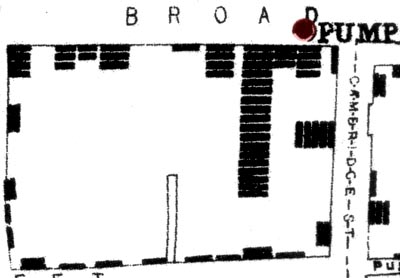
John Snow - Mapping Cholera 1854

What Works

This is a combination of a map and a chart whose creation helped epidemiologists understand that cholera was not caused by a ‘miasma’ carried by the fog from the river, but rather was a germ carried in the water. It’s one of my personal favorite early examples of information graphics as a tool not of publication, but of analysis and discovery. Snow mapped the area around the Broad Street pump and then represented deaths with bars (not dots as some later cartographers have done when re-presenting Snow’s maps). The bars end up looking like stacked bodies, reinserting the gravity of the situation into the fairly sterile context of the map as info graphic.

The pattern is imperfect, but clear. Proximity to this well is directly proportional to mortality risk. The point of this entry it to encourage the use of information graphics not only in the publication stage of the research process, but also in the analysis stage. Granted, epidemiology isn’t a social science, but this is a classic example that sets the scene for contemporary examples of graphics as tools of analysis.

What Needs Work

There are other more comprehensive maps of the whole neighborhood that show the patterns even more clearly. What I have here is just a close up, probably a mistake on my part. The full version is here as a pdf. The romantic in me wanted to restrict this post to the original grainy, scanned map* drawn by Snow himself.

The realist in me notes that even though I believe the creation of information graphics can be used as analytic tools, the story in the John Snow case isn’t a perfect fit. An article by Brody et al in The Lancet points out that, “Snow developed and tested his hypothesis will before he drew his map. The map did not give rise to the insight, but rather it tended to confirm theories already held by the various investigators.” So Snow didn’t get his brilliant insight just by examining the map but he did use the map as an analytical tool later in the process to help confirm his hypothetical hunches. It wasn’t like he just threw the map/chart together to present at a conference or while he was writing up an article which is how I feel many social scientists end up using info graphics.

*This version is actually the second version though it’s main difference from the very first map is that the pump has moved just slightly off from the exact corner of Broad Street closer to the house of 18 deaths.

Relevant Resources

John Snow website at UCLA School of Public Health where I found many maps.

Brody, H., M. R. Pip, et al. <2000) “Map-making and myth-making in Broad street: The London Cholera epidemic, 1854.” The Lancet 356, (9223): p64-68.

Problem Set at Princeton - Marriage Patterns in France from 1968 - 1987

What Works

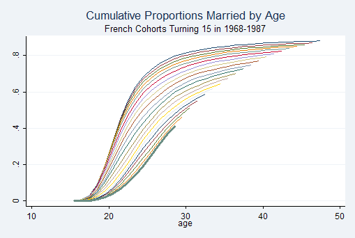
This example comes from a Princeton problem set in the Research Methods in Demography, a bit unexpectedly. What works is that the gently swooping shape is elegantly intriguing – an eye grabber that gets more interesting the harder you look at it. There is something to be said for beautiful forms, but unless there’s substance, info graphics that are only beautiful disappoint like vinyl siding. The fact that this one happens to generate such a fetching shape that it has been repeated throughout branded America is a real triumph.

Each line represents one cohort. The slope indicates the coherence within that cohort to age of first marriage – the steeper the line the more quickly the entire cohort goes from being single to being married. Later cohorts produce flatter slopes, indicating that there is a wider spread across ages of first marriage. It’s also easy to see that the age of first marriage slowly creeps up over time.

Note the popularity of this shape elsewhere:

New York Philharmonic Logo

What Needs Work

It’s not clear just which line goes with which cohort. Sure, demographers and pop culturists alike know that age of first marriage has been increasing over time and will assume that the cohorts who marry later are, in fact, the later cohorts, if we had different data that didn’t show such a smooth trend from year to year, it could be difficult to pick out which line represented just which cohort. Say there was suddenly a $10,000 incentive attached to getting married by age 22. Get married before your 22nd birthday and a giant $10,000 check arrives. That would push back the collective age at first marriage but in this chart, that line would just get buried among the earlier cohorts, or so I would predict. In this case, I might have recommended adding a year marker to every fifth line or so, just to reassure me that the pattern is smooth over time.

In 1900 the median age at first marriage was 21.9 for women and 25.9 for men and then these ages dropped til 1957 when they started rising again. Just saying. Age at marriage doesn’t have to keep going up.

Relevant Resources

German Rodriguez (2006) Office of Population Research, Princeton University. Problem Set 4: Marriage in France Research Methods in Demography.

US Census Bureau (2004) Estimated Median Age at First Marriage, by Sex: 1890 to Present in table format

Piled Higher and Deeper - PhD Humor

What Works

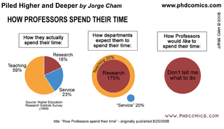
Humor is a slippery animal, indeed. I like to think of it as the pinnacle of culture, not in a high culture kind of way, but in a cultural development kind of way. Just think of trying to learn a foreign language. When you can intentionally, subtly be humorous in that language, you know you’re really getting somewhere. If you have never gotten to that point in a foreign language, just listen to kids try to tell jokes. They kind of suck. You end up laughing along because they’re kids and kids telling jokes is funny in itself, not because what they are saying is actually humorous. This is a fairly long winded way to point out that one indicator that telling stories with graphics is thick culture (thanks, Geertz) is that things like the above image are actually funny in a way that they couldn’t be funny in another format. If you had to say to someone, “man, professors spend lots of time on service activities, but the administration really doesn’t reward that or even notice” nobody would laugh. They might sigh and wish the economy were better so they could find a job that didn’t involve sitting on committees.

Bottom line: this works because we have been immersed in graphic storytelling. We get it. It doesn’t work in any other format.

Relevant Resources

Piled Higher and Deeper, a comic strip by Jorge Cham online. If you are a student or professor and haven’t discovered this, I’ll warn you that it could suck away an hour or two of your day if you click through right now.

Higher Education Research Institute at UCLA. The HERI Faculty Survey. There are fees associated with accessing the data but you can get an overview of how data about faculty time commitments is gathered.

This 2006 Obituary of Clifford Geertz in the New York Times does a good job of summarizing his life and work, for those who want to follow up on my parenthetical. His book “The Interpretation of Cultures” is a good place to start. If you want something shorter than a book, “Deep Play: Notes on a Balinese Cockfight” is worth a read.

Link to Bigger Map of Remittances from US to Mexico

What Works

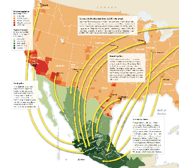
This map does a great job of demonstrating the granularity of the flow of remittances from particular cities in the US to particular cities in Mexico. It does a very good job of using a single characteristic – financial flow from the US – to illustrate a larger pattern of migration between sister cities in two countries. I talked to a restaurant chef-owner in New York on Monday and she said all of her cooks are from Puebla. This graphic could have told me about the same thing, though it wouldn’t have been able to tell me to look in the kitchen.

The graphic makes great use of color – picking one basic color for each country and increasing that color’s intensity to indicate concentrations of migration activity.

Credit for the article from which this was drawn goes to Raúl Hernández-Coss and credit for the graphic goes to Ryan Morris (I think, it’s really hard to read the fine print).

What Needs Work

Even in the bigger version of the graphic I can’t read the text in the boxes very well. I’m sure this looked good in print, but it didn’t translate well to digital. Still, even without being able to read the explanatory text, the basic point is obvious and legible.

Relevant Resources

Raúl Hernández-Coss. (2007) World Bank Working Paper 47 The U.S.-Mexico Remittance Corridor

Julie Watson (27 January 2009) Yearly Mexican Remittances Drop for the First Time in the Washington Post.

Matthew Quirk (2007) The Mexican Connection in The Atlantic. (This is where I first spotted the graphic)

Bigger Version of the Graph

Wired Magazine Features Infoporn - Playmates' Diverging Bust-to-Cup Size Ratio
Wired Magazine Features Infoporn - Playmates

What Works

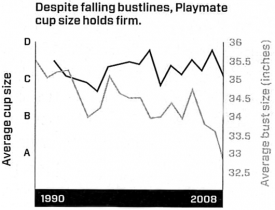
This graph does a nice job of representing three different linear scales without having to be in three dimensions. Time is on the x-axis, as it usually is. Then we see cup size on the right y-axis and bust size on the left y-axis. These two measurements use quite different scales – bust size is measured in inches and cup size is measured in two different ways, both of which are mapped onto an equidistant lettered scale. The distance between an A and a B on the left y-axis is actually about the same (1″) as the distance between 33 and 34 on the right y-axis. If you were going to set up a similar graph, it would be important to maintain the ratio between the two y-axes measurement scales. In this case, the ratio is 1:1, but you could imagine that the same style graph would work if the ratio were 1:2 or 1:3, just about any linear relationship will do.

What Needs Work

I suppose it may be more risque, but it strikes me that the same information could be conveyed with more pizzazz if the relationship were communicated visually. Most people, women included, don’t have a good sense of just what changing both cup size and bust size at the same time is going to look at. Humans are good at perceiving symmetry and proportion. Thus, I’d rather see this information as a series of clay models than as a chart. Bottom line: the information is visual to begin with, we’re talking about the way playmates look, after all. So why translate visual data (the pictures of women) into a chart?

Relevant Resources

Katharine Gammon for Wired Magazine (2009) Issue 17.02 “Infoporn: Today’s Playmates Are More Like Anime Figures Than Real Humans”

Carol Rados for the Food and Drug Administration Consumer Magazine (2005) Making an Informed Decision About Breast Implants