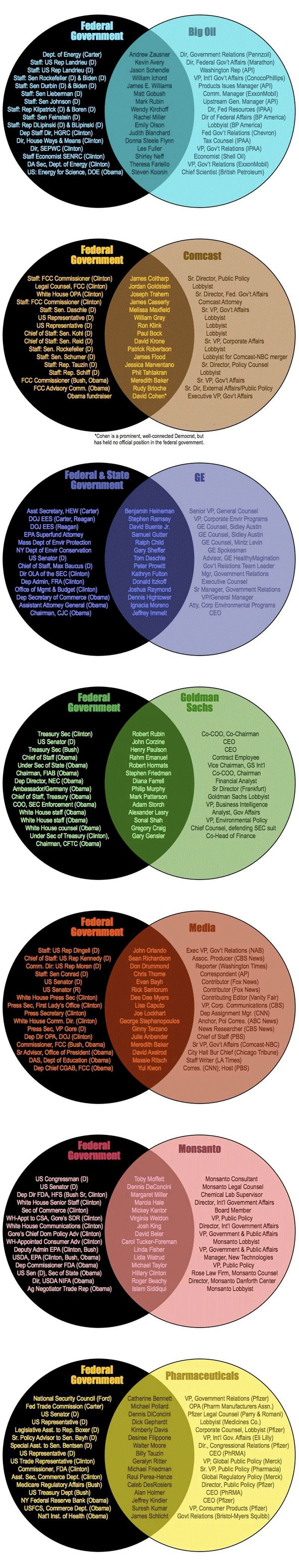
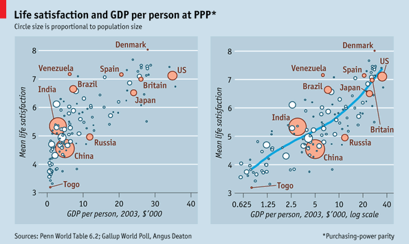
economics

The Rich Get Even Richer
The Rich Get Even Richer research by Thomas Piketty and Emmanuel Saez. Graphic by the New York Times, Stephen Rattner author.

What works

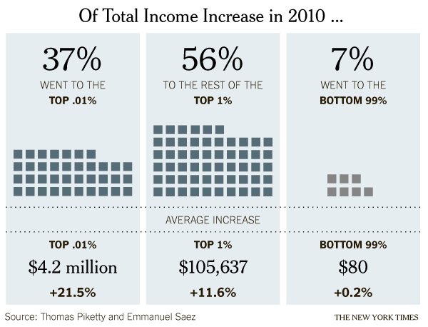
Quoting Justin Wolfers who I happen to follow on twitter, it’s generally not good practice to look at a single year’s worth of data, especially when it would be easy to get comparable data going back for years. Still, in this particular economic news climate, many of the people who are likely to see this graphic have some sense of the relevant contextual data in their heads already, thanks in part to the Occupy Wall Street movement but also to the often thankless work of social scientists and labor statisticians who have been working on issues like income distribution since long before OWS congealed. That’s a long-winded preamble to summarize two fairy simple achievements in this graphic:

  1. This graphic demonstrates that it is possible to make it appear as though there was income growth for everyone in 2010 – even that bottom 99% saw an INCREASE in income, albeit a tiny one – despite the fact that the economy was rather slack in 2010.*
  2. The graphic amply demonstrates that the post-2008 world is quite similar to the pre-2008 world in the sense that income distribution is dramatically skewed. The rich do get richer.

One thing that the article draws readers’ attention to is that the study, which looked at tax returns, and the graphic are about income. Thus, we are not talking about the distribution of wealth (ie the accumulated capital that results from single year uneven distributions of income and a lack of attendant unequal distributions of spending). The rich folks in 2010 got most of this income from labor, not from returns to investments.

What needs work

*One thing I fear is that this graphic obscures an important truth by comparing only the top 1% to the bottom 99%: many people had declining income in 2010. This graphic makes it seem like everyone got *something* but really, the folks at the bottom of this distribution got no increase or a decrease, for the most part. From a statistical leverage point of view, the 99% is just too big of a group to be all that revealing. The spotlight is on the 1% in both this graphic and the current political economic discourse in a way that curiously contributes to the inaccurate notion that America is a classless society. One of the things that makes the 1% vs. the 99% a clever rhetorical frame in America is that we all thought we were in the middle class before OWS and we can now continue to think of ourselves as one giant middle class with this troublesome small pimple of a distribution problem to sort through represented by a mere 1%. The whole 99% sounds so comfortably inclusive and that pesky 1% must, in the end, be a manageable problem because it sounds kind of small-ish. It’s only 1%.

Of course, the rhetorical move of splitting the American population into the 1% and the 99% sets up for all these fantastic (as in remarkable, not as in laudable) statements, like the one made by the graphic, that go something like: “The top 1% of the population got 93% of the income in 2011 while the bottom 99% only got 7%.” Being able to make comparisons like that is a more straightforward, empirically sound reason for the 99% vs. the 1% framing than one that seems to make an effort to avoid noting that America has a lower class.

Relative frame: US vs the world

If you are not in the 1% – and most of you are not – I imagine you might be feeling righteously indignant right now. But think of it this way. All of you have computers and internet connections, most of you are American or English according to the google analytics for this blog, and are therefore in the global 1%. It’s a golden rule problem not in the sense that you should do unto your less fortunate global neighbors what you would have your more fortunate doctors/bankers/lawyers/businesspeople do unto you – though I suppose that might apply, too – but more along the lines of, ‘those who have the gold, rule’. Revisit C. Wright Mills The Power Elite, skim a bit of Marx, and maybe look at something a little more recent like Tim Mitchell’s Rule of Experts and this graphic and the entire OWS narrative is analytically similar to a snapshot of a sports event: different in its particulars but so predictable it’s almost trite. It would be trite if there weren’t so much at stake.

References

Rattner, Stephen. (25 March 2012) The Rich Get Even Richer. In the New York Times, The Opinion Pages.
Note: The author, Mr. Rattner, is himself a member of the 1%. Sometimes when I see graphics like this, I wonder if people who know that they are in the 1% are secretly congratulating themselves for having done so well compared to the rest of us.

Crony Capitalism | Original by Stephanie Herman posted to lewrockwell.com/blog

What works

There is a lot of information here, that’s one of the best things about these Venn diagrams. People often stick a single word or a phrase in one circle, another in the next, and that’s it. But this graphic proves Venn diagrams can help organize much more detailed, drilled-down information fairly well.

What needs work

For the sake of legibility and small font sizes, I probably would have made one of the circles white instead of black, then left the colored one a color, and had the middle oval shape have a much lighter background. That might have helped make some of the text easier to read. In particular, I think it’s important to read the names themselves, so I would have worked to make sure they stood out.

I might have snugged the titles up to the curve. Their spacing is a little haphazard. Clearly, in a circular format, one cannot use a vertical margin line, but then that leaves a question about whether to mirror the shape of the circles on the outside or the ovaloid shape on the inside. I would have tried it both ways and then picked one. Not sure what happened here.

References

Herman, Stephanie. (2011) Venn diagram of Corporate Cronyism in America on geke.us

Education vs. Prison in California | Public Administration

What works

The only part of this graphic I kind of liked was the part about California. Here, we are able to compare the average cost of education for a year with the average cost of prison for a year. This is better than comparing the cost of a single school to the average cost of prison, especially when that school is as expensive as Princeton. I still have a problem with this comparison because the cost of school is running over about 8 months whereas the cost of prison is running the full 12 months, or at least that seems to be true from what I can gather. My back-of-the-envelope math suggests prison would be about $32,143 for 8 months. This is still much higher than the average of $7,463 per student spending for 8 months of school. Parent and student contributions to schooling are not factored in, though the point of the graphic is to compare what the state spends on students to what it spends on prisoners, ignoring the total amount spent on students.

What needs work

The information included in this graphic could have been presented in about one fifth of the space. I support the addition of graphical elements to information presentation only when they increase the clarity of the information provided or make the information delivery inarguably more elegant.

What I vastly dislike are the long columns of graphics stacked on top of each other, meant to be viewed as some kind of visual essay. That was where I drew the California graphic from. I pasted it below.

I’m curious. Do other people like these long, internet-only graphic essays? I find them extremely hard to digest. They seem to be plagued by apples-to-oranges faux comparisons, and unbashedly so. A year’s tuition at Princeton doesn’t include room and board. Prison does. Even if that were taken into account, the time frame is off.

One more item to highlight

Note that in the last panel they clue us into an uncomfortable reality: recent college graduates have a higher unemployment rate (12%) than the general population (9%). Ouch.

Prison vs. Princeton | Public Administration

References

Public Administration. (October 2011) “Prison vs. Princeton” [information graphic]

Resnick, Brian. (1 November 2011) Chart: One year of prison costs more than Princeton The Atlantic online.

Euro Zone Debt Crisis Visualized | Overview: It's all connected
Euro Zone Debt Crisis Visualized | The Immediate Trouble
Euro Zone Debt Crisis | The Risk of Contagion
Euro Zone Debt Crisis | A possible scenario
Euro Zone Debt Crisis | Continental Contagion
Euro Zone Debt Crisis | Global Reverberations

What works

This series of graphics by the New York Times Sunday Review does an excellent job of explaining the European debt crisis in terms of the banking relationships that exist among partners within the Eurozone as well as between Eurozone members and their trading partners outside of the Eurozone. I hardly feel like commenting. The one graphic design decision I loved the most – because it is subtle and easily overlooked – is that after the overview graphic, the total size of the graphic starts small and grows larger. This mirrors the way the crisis itself develops and reinforces that element of the message visually. It would have been extremely easy to simply use the full paste-board available for each of the images in this progression. The designers decided to use the available white space to tell part of the story.

In the overview graphic, the countries that are not impacted or impacted only slightly are represented in grey. In the more detailed graphic progression, these grey elements are dropped out and represented by white space. This is a somewhat counter-intuitive move. Information graphics are supposed to be chock-full of information, right? So why would the designers *drop* countries, especially the US, when running a graphic about the global impact of the European debt crisis in an American newspaper? Because the way they are able to use white space helps drive home one of the key elements of the debt crisis – that it is so far small and could either get much bigger or stay relatively small in the coming months, depending on what steps are taken now to mitigate the rippling out of negative impacts.

What needs work

Nothing needs work. This is a great graphic.

References

Marsh, Bill. (2011, 22 October) “It’s all connected: An overview of the Euro crisis” in nytimes.com Sunday Review. Other authors/designers listed include: Xaqun G. V., Alan McClean, Archie Tse, Seth Feaster, Nelson Schwartz, and Tom Kuntz.

Figure 5. Average Salaries in New York City | Report 12, Office of the New York State Comptroller, Thomas DiNapoli

What works

This may not be the worldest most attractive graphic, but it makes its point: financial workers have much, much higher annual income than the rest of us and the gap is growing over time. The text of the New York State Comptroller’s report said the same thing in words.

Wages (including bonuses) paid to securities industry employees who work in New York City grew by 13.7 percent in 2010, to $58.4 billion. Nonetheless, wages remained below the record paid in 2007 ($73.9 billion), reflecting job losses. In 2010, the securities industry accounted for 23.5 percent of all wages paid in the private sector even though it accounted for only 5.3 percent of all private sector jobs. In 2007, the industry accounted for 28.2 percent of private sector wages.

In 2010, the average salary in the securities industry in New York City grew by 16.1 percent to $361,330 (see Figure 5), which was 5.5 times higher than the average salary in the rest of the private sector ($66,120). In 1981, the average salary in the securities industry was only twice as high as in all other private sector jobs.

You be the judge. I think the graphic leaves a greater impact than the text alone. The two together are striking. Maybe we should…occupy Wall Street to demand a decrease in inequality?

The short report has a few more interesting graphs. First, they throw together a quick graph of Wall Street bonuses. These bonuses are tied to performance and so big that they often represent more than a finance worker’s annual salary. As you can see, they took a dip, but they didn’t disappear even though the US economy is still not great.

Wall Street Bonuses | New York State Comptroller's Report No. 12, 2011

The other interesting metric the report contains is a compensation-to-earnings ratio graph, which is the right context for this discussion. Bankers often defend their large salaries and even larger bonuses by pointing out how much money they have made for their banks. I agree with the bankers that this is the place to look. The question should not be: “How much are individual bankers making?” Rather, it should be, “How much does the banking sector make and is that the way we as a society want to distribute our surplus, primarily to banks and bankers through processes of financialization?”

Ratio of banker's (and insurer's) compensation-to-net-revenues | New York State Comptroller's Report No. 12, 2011

What needs work

The graphs are not attractive and the first one reads as cluttered. I generally go with line graphs for this kind of trend data to cut down on the clutter impact, something I have repeated again and again so I won’t hammer on that point too much. I like the information behind these graphs so I am not going to swat at them too much. Excel is not a graphic design tool for graphs; I have occasionally made some sweet tables with it.

I’m glad the report put these data points into graphs, glad that the report is available during the discussions brought on by the OccupyWallStreet crowd, and glad that the New York State Comtroller’s office rolled right on ahead with the release of some fairly damning evidence against the status quo.

Want more?

Another Society Pages blog, Thick Culture, ran a post including graphs that deal with the compensation and wealth differentials between the tippy-top echelon of financiers and the rest of us at Tax Gordon Gekko.

References

DiNapoli, Thomas and Bleiwas, Kenneth. (October 2011) “The Securities Industry in New York City” Report No. 12, Office of the State Comptroller.

See also: A blog I wrote – Americans estimate our wealth distribution and fail. Horribly. using a Dan Ariely graphic about how bad Americans are at estimating the distribution of wealth in this country. Teaser: we think it is much more equitable than it actually is.

The most popular blog post of all time on Graphic Sociology: Champagne Glass Distribution of Wealth

American Agricultural Value map | Bill Rankin, Radical Cartography
American Cropland map | Bill Rankin, Radical Cartography
American livestock map | Bill Rankin, Radical Cartography

What works

Produced by Bill Rankin, Assistant Professor of History of Science at Yale University and editor/graphic designer at Radical Cartography, these three maps work together to show how American agriculture is organized both spatially and economically. [Click through to Radical Cartography to see much bigger versions. Since that site is in Flash, I can’t embed links that take you directly to the big versions. Once you get to Radical Cartography click: Projects -> The United States -> Animal/Vegetable.] The top map here is the dollar value combination of the cropland and livestock areas in the US. For activist types, what’s even more exciting is the small black and white inset map that takes into account federal agriculture subsidies. The next two maps were combined to produce the top map – one shows how cropland is distributed, the other displays the distribution of livestock.

Bill Rankin is a rigorous researcher with a background in history and the thing he does best here is context. In order to understand the top map – which is what I believe Prof. Rankin wants viewers to store in their memory banks as the critical take-away – he first shows us how cropland and livestock land are distributed and then layers them over one another to show us how they are differentially valued. This type of data is sensitive to geography and location in two ways: 1. crops are sensitive to elements of geography like climate and available water supplies – there are no crops growing in the dessert of the American southwest 2. because the US hands out a variety of agricultural subsidies, the political boundaries of states have to be seen in conjunction with the crop distribution in order to understand how the political levers lead to the current subsidy scenario.

What needs work

The approach he takes is to color each county based on the percentage of area covered by a particular crop. This means that counties with multiple crops will end up with blended color values. For instance, cotton is coded blue and ‘fruits, nuts, and vegetables’ are coded maroon. This means that in some southern counties growing roughly equal amounts of cotton and ‘fruits, nuts, and vegetables’ the counties are neither blue nor maroon but purple. But wait. The blue of cotton might have combined not with the maroon of ‘fruits, nuts, and vegetables’ but with the brighter red of soybeans to produce that purple color. Confused? I am. I don’t know if those southern counties are a mix of peanut and cotton farms (likely) or a mix of soybean and cotton farms (also likely).

Another problem with the additive colors is that the choice of each color has a major impact on the impressionistic take-away of the maps overall. Corn is the most prevalent crop in the US covering over 144,000 square miles. The next most prevalent crop is soybeans which covers about 100,000 square miles. Soy beans and corn are often grown in the same counties (unlike, say, wheat which is a hardier crop and therefore ends up as a monoculture in northern counties where growing corn and soy are riskier endeavors). This means that soy and corn are going to have layering colors the same way that we saw crops layering with cotton along the Mississippi River in the south. Since the bright red color for soy is more aggressive than the somewhat subdued dusty orange chosen for corn, the impression we take away from the map is that soy is more prevalent than corn where the opposite is true. If the color values had been switched so that corn was coded in bright red and soy was coded in the dusty orange, the middle section of the country would end up looking like a corn field, not a soy bean field. Either way, the trouble with blending colors is that our eyes are not very good at looking at a color and saying – “Gee, that looks like it’s about 50% blue and 50% red.” We just say, “Gee, that looks like purple”. Or, in this case, “Gee, all those reddish colors either look like soy beans or maybe an 80% coverage of the ‘fruit, nut, vegetable’ category.”

A solution (that I am too lazy to put together)

In summary, the inclination to display crop and livestock coverage using maps was a solid inclination. I often criticize the inappropriate use of maps. In this case, I still think it could have gone either way. A clever Venn-diagram that used circles based on the total coverage of each crop which then overlapped with other crops in places where they are grown together could have been more illustrative. It would have been easier to see that corn is king, for instance, and that cotton and wheat are never grown together because cotton needs heat and wheat is cold-tolerant. The same sort of Venn-diagram could have been constructed for livestock. A final Venn diagram where the size of the circles is keyed to the dollar-per-square mile value of these crops could have then displayed how agriculture functions economically.

References

Rankin, Bill. (2009) Food: Animal/Vegetable” [Information Graphic, Flash] RadicalCartography.net.

American Generation Age Timeline (Age measured in 2009) | Pew Research

What works

Pew Research has created a tidy series of interactive graphics to describe the demographic characteristics of American generational cohorts from the the Silent Generation (born 1928 – 1945) through the Boomers (born 1946 – 1964), Generation X (1965 – 1980) [this is a disputed age range – a more recent report from Pew suggests that Gen Xers were born from 1965-1976), and the Millennial Generation (born 1981+ [now defined as being born between 1977 and 1992]). The interactive graphics frame the data well. They offer the timeline above as contextual background and a graphic way to offer an impressionistic framework for understanding generational change.

Then users can flip back and forth between comparing each generation to another along a range of variables – labor force participation, education, household income, marital status – while they were in the 18-29 year old age group OR by looking at where each generation is now. The ability to interact makes the presentation extremely illustrative and pedagogically meaningful. It is much easier to understand patterns that are changing over time versus patterns that are life course specific.

Marital status

Marital status by generation measured when young | Pew Research
Marital status by generation measured in 2009 (snapshot) | Pew Research

For instance, marital trends have been hard to talk about because the age at first marriage moves up over time, so it’s hard to figure out at what age we can expect that people will have gotten married if they are ever going to do so (I tried looking at marriage here).

What I like about the Pew Research graphics is that they show us not only what the generations looked like when they were between 18 and 29 years old (above) but also what they look like now (below). Not only does it become obvious how many millennials are choosing to remain unmarried (either until they are quite a bit older or forever – hard to say because the oldest millennials are still in their 30s), but it also becomes clear that in addition to divorce, widowhood is a major contributor to the end of marriage. Keep that in mind: somewhere around half of all marriages end in divorce so that means the other half ends in death. I would guess that a vanishingly small number of couples die simultaneously which means there are quite a few single older folks who did not choose to be single (of course, even if they didn’t choose to outlive their spouses, they may prefer widowhood to other alternatives, especially if their spouse had a long illness).

Labor force participation

Here’s another set of “when they were young” vs. “where they are now” comparisons, this time on labor force participation. It appears that the recession has walloped the youngest, least experienced workers the hardest. They have the highest unemployment rate AND the highest rate of educational attainment (and school loan debt), which leaves them much worse off as they start out than their parents were in the Boomer Generation. Even if their parents were in Generation X, they were still better off than today’s 20-something Millennials.

American labor force participation by generation (2009) | Pew Research
American Labor Force Participation by Generation (measured in 2009) | Pew Research

What needs work – Are generations meaningful?

My first minor complaint is that the graphic does not make clear *exactly* what “when they were young” means. If we look at the first graphic in the series, the timeline, it appears that “when they were young” was measured when each generation was between 18 and 29 years old. I hope that is the case. I might have had an asterisk somewhere explaining that “when they were young = when they were 18-29 years old”.

The concept of generations, in my opinion, is a head-scratcher. The idea that I had to come update this blog because the definition Pew was using to define Millennials and GenXers changed (without explanation that I could find) adds to my initial skepticism about the analytical purchase of generational categories. What is the analytical purchase of looking at generations – strictly birth-year delimited groups that supposedly share a greater internal coherence than other affinal or ascribed statuses we might imagine? If we believe that social, technological, and most all kinds of change happen over time, of course there are going to be measurable differences between one generation and the next. I imagine, though I have never seen the comparison, that if social scientists split people into 10- or 20-year pools based on their birth years they would end up with the same sorts of results. So why not think of generations as even units? And is it clear that the meaningful changes are happening in 20-year cycles? Or would 10-year age cohorts also work?

The real trickiness comes in when we think about individuals. Say someone is like myself, born in a year on the border between one generation and the next. Am I going to be just as much like a person born firmly in the middle of my cohort as a person on the far end of it? Or will people like me have about as much in common with the people about 8 years above and below us, but less in common with the people 15 years older than us who are considered to be in the same generation, and thus to have many similar tendencies/life chances/characteristics?

A better way to measure the cohort effect would seem to be to consider each individual’s age distance from each other individual in the sample – the closer we are in age, the more similar we could be expected to be with respect to things like labor force participation and educational attainment. Large structural realities like recessions are going to hit us all when we have roughly similar amounts of work force experience, impacting us similarly (though someone 10 years older and still officially in the same generation will probably fare much better). Since it is computationally possible to run models that can take the actual age distances of individuals in the same into account, I don’t understand the analytical purchase of the concept of generations.

The take-away: great graphics, bad premise.

References

Taylor, Paul and Keeter, Scott, eds. (24 February 2011) The Millenials. Confident. Connected. Open to Change. [Full Report] [See also: Executive Summary and Interactive Infographic] Washington, DC: Pew Research Center.

Cost of Health Care by Country | National Geographic

Explanation

This graphic is doing a lot of work compared to how simple it looks. Here’s an annotated list for review purposes:

  1. The colors of the lines show us which countries have universal health care (most of them) and which do not (the US, Mexico). Note that these colors do not differentiate between who, precisely, is paying for this health care – that’s complicated. In many nations the state pays for some people’s care or for some care for all people, but wealthier people or particular kinds of care are not covered by the state but are picked up by private insurers. It would get much more complicated if the graphic had to have a color for each – nearly every country would end up with its own color. Even in the US, the state pays for some of very poor people’s health care and for health care for those above 65 (though there are some limits on what the state’s willing to cover).
  2. The width of the lines show us how many trips people take to the doctor. The Japanese and people in the Czech Republic appear to see their doctor more often than I see my mom. Sorry, mom. However, even though people are always at the doctor in these places, their overall health care expenditures per person are not sky high. This could lead you to conclude that going to the doctor more often means that people are getting better preventative care. Preventative care is generally cheaper than ‘fix-it’ care. It could also lead you to conclude that people who are obsessed with their health are both more invested in taking care of themselves at home and more likely to run to the doctor at the sign of any little problem (On the one hand, if they are obsessed they will recognize any little problem sooner than those who are a bit more oblivious and it would seem that they might be less likely to try ‘quackery’, preferring to go to the doctor for the official treatment. No gingko biloba or St. John’s Wart from the Vitamin Shoppe unless the doctor says so.)
  3. The length of the line means nothing. These are not time lines.
  4. The slope of the line means…well…it implies that there ought to be a relationship between health care expenditures per person and average life expectancy. The implication goes like this: a country’s ranking in terms of per capita health care expenditures ought to match their ranking in life expectancy. Granted, I think anyone who has created this kind of graph before knows that the person who made it probably spent some time trying to come up with which measure of health would be the best one to use as the proxy for success – should it be life expectancy? Should it be some conglomerate variable that combines life expectancy, infant mortality, and something else? If you play this game with yourself, you probably end up just deciding that life expectancy is the cleanest comparison. But you may admit that it is imperfect. And it is. There are so many other things that get between health care expenditures and life expectancy. There’s environment, there’s the value of a given health care dollar which is not the same from one country to the next, there are cultural attitudes supporting relatively healthier and unhealthier lifestyles that vary from country to country, and so forth. This graph ignores those issues. It has to, but you don’t. Keep all that in mind, especially when thinking about how to allocate health care dollars. Maybe those Japanese people are on to something – they go to the doctor all the time, live long lives, and don’t spend inordinate amounts on health care. I know that if I had to stand on a scale in front of my doctor once a month or even once every 6 weeks I would think twice before eating things I shouldn’t eat or chickening out on my exercise regimen. There’s just something about getting an authority figure involved in processes like these to make us accountable for our own actions.
  5. The graph implies that there is a kind of sweet-spot for per capita spending that appears to fall between $2,000 and $4,000 [2007 dollars]. The US, of course, looks ridiculously over zealous when it comes to how much we spend and dismally stupid when it comes to where we put these dollars because we spend more on health care and get less in terms of life expectancy.
  6. Rankings to rankings comparisons

    I am not a fan of these rankings to rankings comparisons overall. Yes, this particular graphic packs a bunch of information in, but I still wonder how legitimate it is to compare national rankings in per capita expenditures on health care to national rankings in life expectancy. Forgive me for being an academic who *wants* the complex story. This is over-simplified. There is absolutely nothing in this graphic that would suggest what can be done about improving a nation’s average life expectancy whatsoever. Mexico seems to be doing OK – it spends relatively little compared to where it stands in the life expectancy rankings. So, clearly, if this graphic were all that we had to base decisions on, we might not decide that universal health care would give us a bump in life expectancy. If this were all we had, we’d probably just gut spending right away because the clearest point here is that the US is spending far too much compared to other countries in absolute terms as well as in relative terms when measured by life expectancy.

    The other thing the graphic does not show – something I’m always curious about – is how much of the money we spend on health care goes to administer the system both in the US and in other places. In our fair union, with all the insurance companies requiring different claims processes, we have to hire experts at the hospitals and clinics to submit claims and experts at the insurance companies to decide what to do about the claims. We hire other experts to negotiate the terms of groups plans in the first place – and where someone gets a special deal that requires a more complicated claims process. All of the complexity of health care meets the additional complexity of administering health care the way we’re doing it now and leaves space for lawsuits. So…lawyers sue various parties for a wide variety of reasons and doctors have to buy more malpractice insurance. The system increases the costs of keeping itself going without actually adding much of anything to the quality or quantity of patient care.

    Reference

    Uberti, Oliver. (2011) “The Cost of Care” [Information graphic] in National Geographic using OECD Health Data 2009 which draws on data gathered in 2007.

Life Satisfaction and GDP per capita at PPP | The Economist

What Works

This graphic comparison in The Economist is an excellent piece of evidence in support of the use of logged scales. If you are an economist or quantitative sociologist reading this, you probably just fell asleep because you know about log scales already. Still you have to agree that the graphs here do an excellent job of visually explaining why log scales are better than linear scales in this case.

One of the general rules in multi-variable models involving per capita income data is that this data should be logged. The above graphs visually describe what happens when linear wage data is logged. That is the only change made between these two graphs. On the left, the wage data is measured just as it comes, on a linear scale which assumes that the difference between one dollar of per capita GDP is the same between no dollars of per capita GDP and that very first dollar of GDP as it is between the 10,000th dollar of GDP and the 10,001 dollar of GDP. The graph on the right logs the per capita GDP. This changes the assumptions about the distance between the zeroth and first dollars of income and the distance between the 10,000th and 10,001st dollars of income. In the graph on the right, logging the per capita GDP gives us a scale that is far more sensitive to differences when integers are small than when they are large. That difference between having no per capita GDP and having just one dollar of per capita GDP, or between one dollar and ten dollars has a relatively greater impact than the difference between 10,000 and 10,001 (or between 10,000 and 10,010). Logged values are sensitive to differences in orders of magnitude. There is an order of magnitude change between 1 and 10, then not again until we get to 100, not again until we get to 1000, and not again until we get to 10,000. The distance between each of these milestones grows successively larger. That’s the mathematical logic behind logged scales. Why do they tend to produce better fit lines for per capita income level data than the linear scale does?

Imagine this: you have no money and someone gives you $10. That is quite meaningful. Now you are able to take the subway, get something to eat, and make a call at a pay phone, three things you would not have been able to do when you had nothing. Those $10 mean a whole lot to you in a way they wouldn’t if you had $10,000 and I gave you $10. With your $10,000 you would already have been able to do all the things I mentioned above. Having an extra $10 would not make much meaningful change in your immediate material conditions or your investing options. The point here is that when folks have no income, they are a lot more sensitive to small changes in income than they are when they have a measurable income. The more income they have, the less sensitive they are to small (or even moderate) changes in income. This is why economists and quantitative social scientists almost always log measures of income. The assumptions I just explained are almost always true.

In the graphs, once the per capita GDP (which isn’t exactly a measure of income, but it is closely correlated) is logged, the relationship between income and happiness is much clearer. The model fits better when per capita GDP is logged and it appears that there may be a positive relationship between money and happiness after all.

What needs work

These happiness measures are rather uninspiring. Happiness is quite possibly culturally specific – what makes my mother happy, for instance, is my singleness. What makes mothers in other places happy might be that their 30-year-old daughters are married and have healthy children. I can hear you all saying, ‘But wait! Your mom is weird, what makes her happy is singular’. And that is just exactly my point. Happiness is contingent upon so many other things that trying to measure it is difficult – what makes a person happy changes over time and place so we cannot measure happiness based on easily observed objective measures. Some people like to think they can measure levels of depression or even serotonin to figure out who’s happy or not. But I simply don’t buy it. In places where there is more health care, more people are going to be diagnosed with depression. But does that mean that a population with a high level of reported cases of depression (a seemingly scientific diagnosis of unhappiness) is any less happy than a place in which seeking a diagnosis for mental illness bears a prohibitively high financial or social cost such that people do not even seek diagnoses in the first place? Perhaps the people getting treated for depression are now happier than they were before they were treated and thus the place with a high collective rate of diagnosed depressives is actually happier than a place where people are not being treated for their depression?

Dalton Conley was on a panel I recently attended that was called together to offer thoughts on THE MEASURE OF AMERICA 2010-2011: MAPPING RISKS AND RESILIENCE”. Someone from the audience pointed out that the book tends to use measures like health, education, income, and mortality but that these may be missing the right question. The right question was something along the lines of, “But are people happy?” Dalton pointed out that this is a normative question (and thus not the point of the volume which is demographic in nature) and that it is methodologically nearly impossible. The reason the information in the book is meaningful is that the measures that have been established can be rigorously measured across time and place. And they HAVE been measured across time so we are able to see patterns. The problem with any new measure is that there isn’t much to compare it against for a couple decades. More importantly, there is no objective way to measure happiness. A pound is a pound where ever you weigh it on the face of the earth (OK, yes, there are some exceptions to this but those are for physicists). A dead person is a dead person just about no matter where they are so mortality tends to be a good measure, too. But happiness does not fit well into a measurement framework. And even if it did, we’d be back to Dalton’s first point, which is that all we could do with that information is become normative.

This increasing desire to find the roots of happiness seems both misguided and heavy handed. Just as people appreciate seasonality in nature, I tend to think there is something to be said for having a full set of emotions. If that is true, there is no particularly good reason to run around trying to doggedly pursue happiness. There are benefits to being sad and introspective just as there are benefits to being happy. What is *with* all this fixation on happiness?

You’ve heard plenty from me at this point so I’m shutting up. I would like to hear your thoughts about both log scales and measuring happiness.

References

(25 November 2010) Money and Happiness [Daily Chart] The Economist online.

Lewis, Kristen and Burd-Sharps, Sarah. (2010) The Measure of America 1900-2010: Mapping Risks and Resilience. with an introduction by Jeffrey Sachs. New York: NYU Press. Part of the American Human Development Project of the Social Science Research Council.

How Well Do We Take Care of America's Teeth?

How Are Our 17 Year Olds' Teeth Doing?

Dental Insurace or Health Insurance, Who Has What?

Who Has the Best Access to Dental Care?

Does More Education Mean Healthier Teeth?

Happy Halloween

This graphic is a bit too cartoon-ish for my tastes but it does a good job of illustrating a health care gap that, even during the health care debate, went over-looked. I figured Halloween – a holiday whose commercialization revolves around candy – might be a good time to post the dental health care graphics developed over at the GOOD magazine transparency blog.

In the spirit of full disclosure: I was a dental assistant for a summer. The numbers here are accurate and have very real consequences. I used to see kids who did not know (they had no idea) that drinking soda was bad for their teeth. These kids sometimes had 7 and 8 cavities discovered in one check up. For older people, dry mouth would lead them to suck on lozenges or hard candy all day and they’d end up with a bunch of cavities, too. Bathing the mouth in sugar is bad. Combining the sugar with the etching acid in soda is even worse.

Once a tooth has a cavity, it needs to be filled or the bacteria causing the decay will continue to eat away at the tooth, eventually hitting the pulp in the middle of the tooth. Once that happens, the person is usually in pain and needs a root canal. Even if they aren’t in pain, they need to have the infected tissue removed (that’s what a root canal treatment does) or the infection can spread, sometimes into the jaw bone. There is no way for the body to fight an infection in a tooth because the blood supply is just too little to use the standard immune responses.

Dental decay progresses slowly. Kids lose their primary teeth any decay in those teeth goes with them. Therefore, it’s not all that common to see teenagers needing root canals. But it does happen. Root canals are expensive. It’s a lengthy procedure requiring multiple visits and a crown. Pricey stuff. BUT, this process allows the tooth to be saved. Without dental insurance, sometimes folks opt for the cheaper extraction option. Once a tooth is extracted, that’s it. It’s gone. (Yes, there is an option to have a dental implant but that’s even more expensive.) So a teenager who likes to suck on soda all day long and who may not be all that convinced about the benefits of flossing could end up losing teeth at a young age. I can tell you because I’ve seen it: a mouth without teeth is not a happy mouth. All those teeth tend to hold each other in place. Once some of them are extracted, the others can start to migrate. Extract some more and things get more interesting and people start to build diets around soft foods. Eventually, once enough of them are extracted the entire shape of the mouth flattens out – not even a denture can hang on to help the person eat.

Unfortunately, poor dental health disproportionately impacts poor people, as these graphics demonstrate. But that disproportionate impact can double down. Dental health is often seen as a sign of class status. People with poor dental health have trouble getting good jobs, especially in a service economy. For what it’s worth, I bet they also have more trouble in the dating/marriage market.

References

Di Ieso, Robert. (2 September 2010) How well do we take care of America’s Teeth? [Centers for Disease Control; Pediatrics]