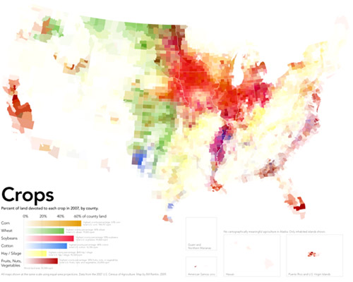
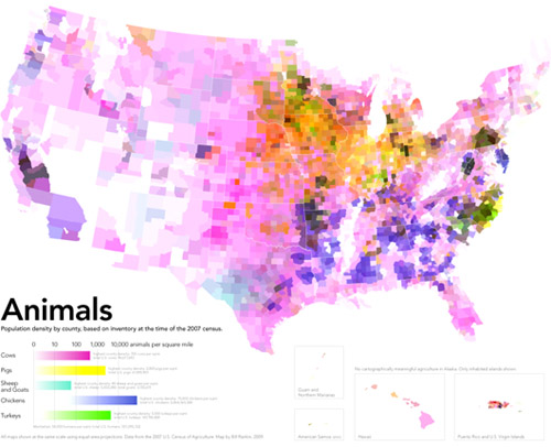
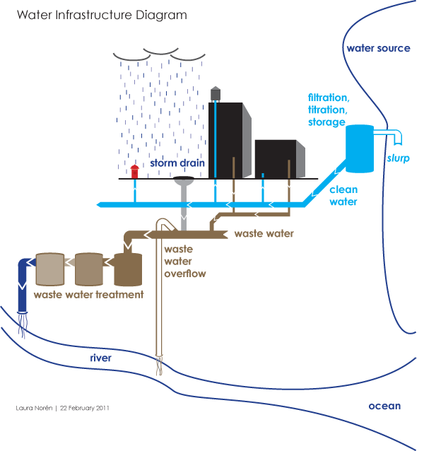
political

Patterns in political attitudes in US presidential elections from 2004-2012
Patterns in political attitudes in US presidential elections from 2004-2012 | By Amanda Cox, Ford Fessenden and Alicia Desantis nytimes.com

What works

Legend
Legend

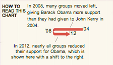
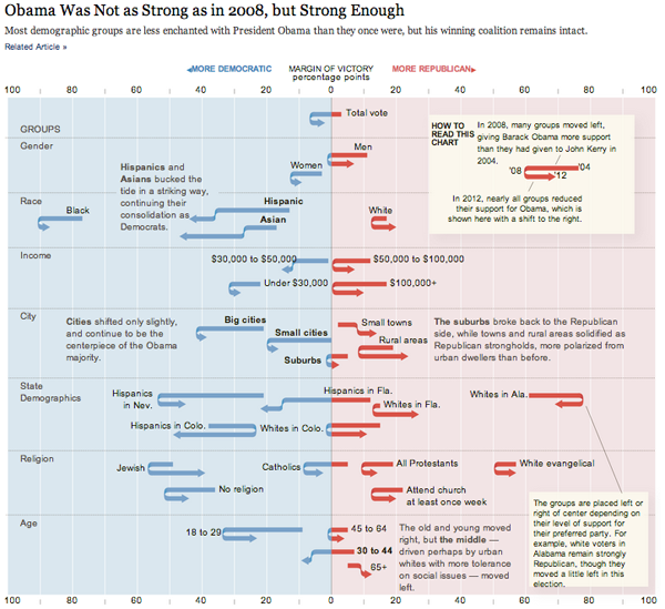
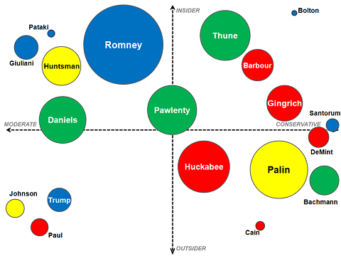
This graphic shows us data over time and is thus a kind of timeline but it uses a graphical device that I have never seen before – the U-turn arrow – to indicate changes in people’s political attitudes at three points in time. This works brilliantly for the dataset and is a strong argument for the use of design and designers in information visualization. A standard timeline would not have worked well with a dataset that has only three points in time that need to be represented for a plethora of categories (the categories are voting blocs in this case). The U-turn arrows allow us to see just how far various voting blocs moved from their 2004 position in 2008 and then again how far they moved in 2012. If the voters in these blocs became more liberal in 2008 and then slid back towards a more conservative position, the arrow makes a U-turn and it’s very easy to visually compare the length of the arms of each side of the U. If the particular voting bloc got more liberal in 2008 and continued towards an even more liberal position in 2012, the arrow does not make a U shape but it still has a kink in it at 2008 so that we can visually compare the length of the 2004-2008 section to the 2008-2012 section. The use of this type of U-turn/kinked arrow is new to me and it’s just brilliant. It’s one of those things that is so easy to understand immediately that we forget we’ve never seen it before. That’s the mark of smart design.

The other thing that this style of timeline does so well is that it allows variation on the starting points of the different voting blocs along the horizontal axis. We get to see that some groups are so far over in the liberal or conservative camps they may never be ‘in play’ and other blocs have voting patterns that push them over the critical boundary in the center of the graphic.

If this type of data were represented on a line graph, the variation in liberal vs. conservative might have been plotted on the vertical axis (though, hopefully this graphic makes it clear that chart conventions can be kicked to the curb at any point in time). Visually, I like the liberal/conservative spectrum better horizontally because it plays with the left-right semantics that are already used to discuss political beliefs.

What needs work

We need more designers working in visualization departments so that we end up with graphics like this that are tailored exactly to the structure of the data and the story it tells rather than trying to select from an existing conventional data representation type.

Kudos to Amanda Cox, Ford Fessenden, and Alicia Desantis at the New York Times.

References

Cox, Amanda; Fessenden, Ford; and Desantis, Alicia. (2012) Obama Was Not as Strong as in 2008, but Strong Enough. [information graphic] New York Times.

CNN's interactive racial voting bloc calculator
Screen capture of CNN’s interactive racial voting bloc calculator [Warning: the information in this image is misleading]

CNN’s Racial Voting Bloc Calculator is a perfect vehicle for demonstrating how to critically evaluate interactive graphical displays of data and 2) how ideological assumptions can be embedded in and reified by data, graphics and data analysis tools.

The calculator is designed to show how different patterns of racial voting might affect the upcoming election. At the top of the page five slider bars allow the user to set the level of White, Black. Latino, Asian and “Other” support for each candidate. So one can look at electoral college outcomes if say 56% of Whites, 10% of Blacks and 50% of everyone else votes for Romney.

The problem with this approach is that racial voting blocs don’t exist in the way this tool presents them. There are three ways to demonstrate this using data from the calculator and its associated data.

1) We can observe the absence of racial voting blocks directly by looking closely at the secondary data provided by the calculator. If you click on one of the state buttons a table appears at the right which lists (among other things) the vote by race for that state in 2008 based on exit poll data. The Washington state data look like this:

CNN's interactive racial voting bloc calculator for Washington
CNN’s interactive racial voting bloc calculator for Washington

Close up of the important chart:

cnn-racial-voting-bloc-WA-closeup
CNN racial voting bloc, close-up on Washington state information

The “2008 results” column shows that in 2008 55% of white voters in Washington state voted for Obama. If you look at every state, you will find that the proportion of whites that voted for Obama varied from 10% in Alabama to 86% in the District of Columbia and 70% in Hawaii. Even if we exclude the most extreme cases the middle thirty states range from 33% (Idaho and Alaska) to 53% (Minnesota and Delaware). This is nothing like the cross state racial uniformity imposed by the calculator. The implicit assumption of the racial bloc voting calculator is that racial proportions are consistent across states and this is clearly untrue.

2) The data imply that race is not very important in elections. Look again at the table for Washington and note the absence of data for Blacks, Latinos, Asians, or “Others” in 2008 despite the fact that these groups make up 17% of the Washington electorate. Washington is not unique, missing data are endemic in these results. Data for Asians and Others are missing for 48 states, data for Latinos are missing in 37 states and for Blacks in 22 states.

The great French sociologist Pierre Bourdieu once wrote that missing data are often the most important data. That is surely the case here. Media organizations spend vast sums to collect poll data on the electorate. If race isn’t important enough for data collection, then it probably isn’t very important for understanding elections. There is a general lesson here, the presence or absence of data is often an independent indicator of importance.

3) It is also possible to use the calculator to make an argument by contradiction. That is, by demonstrating that the calculator gives nonsensical results under sensible assumptions. One of the calculator’s default options is to use “approximate 2008 polls.” In this case, Obama wins with 417 electoral votes which is more than he actually won in 2008. Also interesting are the state level results under this baseline scenario. Assuming bloc voting at 2008 levels causes changes in the electoral outcomes of 23 states. Even more interesting are the specific states that change their colors. Under the kind of bloc voting that the CNN calculator allows, the south becomes very strong for Obama, who would win Alabama, Mississippi, Georgia, and Louisiana with more than 60% of the vote in each of those states. In fact, these were among the weakest states for Obama, which again, implies that bloc voting is not occurring. So, if bloc voting existed 2008 election results would have been radically different from the actual results which implies that bloc voting does not exist.

Does this mean that race does not affect politics or that political appeals to race never work? No. It means that appeals to race work – when they work at all – from a baseline that varies from place to place. A far more interesting tool would allow for increasing the vote of a particular racial group from its preexisting state baseline. With this imaginary tool, one could add some percentage of the vote to a candidate in each state without forcing racial uniformity across states. For example, if we added 5% of the White vote for Romney the white vote would rise from 88% to 93% in Alabama and from 42% to 47% in Washington.

As constituted, the racial voting bloc calculator is useless for thinking about actually existing American politics. It is useful for encouraging caste based racial fantasies. And so it is no surprise that as I write this, the top google result for the words racial voting bloc calculator link to discussion forums at the white supremacist website stormfront.org.

One such fantasy might involve setting support for Mitt Romney to 100% among whites and 0% among Blacks Latinos Asians and Others. This produces a Romney landslide with Obama collecting only 7 electoral votes. The difference between this hypothetical and reality tells me that racial voting blocs do not exist. What it tells the stormfront.org discussion participant, FunktionMann, who ran the same “simulation” is that:

We need to clean house. ALL of our problems in this nation have been delivered to us by white traitors. Until we have identified, villified and run them out of business, we will not make any progress.

I began this post saying that we would see how to critically evaluate graphic data tools and see how ideology is embedded in those tools. The racial ideology embedded in the calculator isn’t the supremacist ideology of stormfront but it is a racial essentialism that assumes and privileges racial identity while inscribing race into our understanding of politics in ways that make no sense if we but take a moment to consider them closely.

*Alec Campbell is a Visiting Associate Professor of Sociology at Reed College in Portland, Oregon. He blogs at Follow the Numbers where this post was originally published.

References

Campbell, Alec. (2012) “Racial voting bloc calculator fact or fiction” at Follow the numbers and reposted here with permission.

Merrill, Curt. (2012) CNN racial voting bloc calculator cnn.com

Crony Capitalism | Original by Stephanie Herman posted to lewrockwell.com/blog

What works

There is a lot of information here, that’s one of the best things about these Venn diagrams. People often stick a single word or a phrase in one circle, another in the next, and that’s it. But this graphic proves Venn diagrams can help organize much more detailed, drilled-down information fairly well.

What needs work

For the sake of legibility and small font sizes, I probably would have made one of the circles white instead of black, then left the colored one a color, and had the middle oval shape have a much lighter background. That might have helped make some of the text easier to read. In particular, I think it’s important to read the names themselves, so I would have worked to make sure they stood out.

I might have snugged the titles up to the curve. Their spacing is a little haphazard. Clearly, in a circular format, one cannot use a vertical margin line, but then that leaves a question about whether to mirror the shape of the circles on the outside or the ovaloid shape on the inside. I would have tried it both ways and then picked one. Not sure what happened here.

References

Herman, Stephanie. (2011) Venn diagram of Corporate Cronyism in America on geke.us

SOPA Opera in Congress

Graphic Sociology opposes PIPA/SOPA

The proposed PIPA and SOPA legislation has been roundly criticized with solid, logical arguments here by danah boyd, here by Tarleton Gillespie who links to 16 other authors who have argued against SOPA/PIPA, and here in a letter Harvard Law Professor Laurence Tribe sent to members of Congress.

As someone who is a passionate scholar of collaboration (both in its cooperative and competitive forms), I worry about the legal and economic repercussions of SOPA/PIPA that have been brought up by the authors mentioned above as well as the negative impact the threat of discretionary censorship would have on the kinds of sharing and borrowing that have made the internet and digital files such a rich source of remixing, incremental improving, and all around innovation. There is no way I could put a dollar figure or other empirical metric on what might happen to remix culture (what the cool kids call it) or innovation (what the business schools call it) under a legal regime in which just about anyone can censor just about anyone else. I can say that the internet as we know it would cease to exist. I post things here on Graphic Sociology that I have designed and created without even mentioning Creative Commons or standard copyright or anything else. If people take my work and get something out of it, that’s fantastic. I don’t even care if they give me credit, though many creative people do, and for good reason. I’m afraid if PIPA and SOPA were to pass, fewer people would re-mix my work and that’s the best kind of use, as far as I am concerned. Reposting is fine, remixing is divine.

I also post the work of others and critique them as an academic, something that is legal under the fair use doctrine. I’m not sure how SOPA and PIPA would mesh with the particular provision of the fair use doctrine that I am exercising. Presumably, they can co-exist, but I certainly don’t have the resources to hire a lawyer and defend myself against anyone who might claim that I’m violating SOPA/PIPA. And as just one of a family of bloggers, any infringement claim against any blog post on the society pages could darken the entire site. So if someone got upset with me, that would mean lights out for Sociological Images, Thick Culture, and all the rest of the blogs here.

The rest of this post is written by guest blogger Alec Campbell of Reed College in Oregon.


Guest post by Alec Campbell, Reed College


What works

This graphic clearly shows that something caused a change between January 18 and January 19. That something was almost certainly the focused attention on SOPA and PIPA resulting from shutdowns, blackouts and other actions taken or led by a number of popular Internet sites (wikipdedia, reddit, the Social Media Collective, and even here at thesocietypages there was a blackout of sorts).

What needs work

The most important flaw in this graph is that it excludes members of congress who are undecided or whose opinions are unknown. Looking at the graph it appears that the distribution of opinion moves from 72% in favor before the Internet shut down to 39% in favor after. In reality the distribution is 15% in favor, 6% opposed and 79% unknown/undecided before the shutdown and 12% in favor, 19% opposed and 69% unknown /undecided after the shutdown. The two graphs aren’t comparable because they don’t include the same total number of observations. When comparing populations of different sizes one has to compare percentages which this graphic does not do.

In fairness, the article accompanying this graphic has links to much more detailed data on SOPA
and PIPA
that does include a full accounting of all members of congress. However, those data don’t allow for comparison over time, which is the central point of this graphic.

What I can’t figure out

It’s clear that there are fewer supporters on January 19 but it isn’t clear if the people who no longer support PIPA/SOPA now oppose it or if they are now undecided. Did the Internet action make converts or agnostics? Arstechnica is keeping a running tally of Senators who are now opposing PIPA, including many of the former co-sponsors of the bill.

The graphic could have used arrows to show movement from one of the three camps (supporters, opposers, undecideds) to help illustrate where the movement happened.

Why it Matters

None of this matters much if our interest is in the fate of SOPA/PIPA. It matters a great deal if we are interested in the power of Internet protest. This graphic is about the power of protest because the prominently displayed time dimension is only relevant to this issue. This graphic overstates the power of Internet protests by omitting the unknown/undecided category making it appear that people changed their minds overnight. Clearly, some did. The number of supporters dropped in absolute terms. However, the larger effect is in convincing people to publicly state their opinion or to finally make up their minds. It is entirely possible that the major effect of the Internet protest was to get congresspersons that were leaning towards opposition to publicly state their opposition and force some supporters to claim an undecided status. That is certainly something but it isn’t the same thing as changing supporters into opponents, which is what the graphic implies.

References

propublic.org following House support of SOPA

propublic.org following Senators support of PIPA

Lee, Timothy. (19 January 2012) PIPA support collapses, with 13 new Senators opposed. [blog post] arstechnica

2008 Political Party Identification in the US | David Sparks
2008 family income | David Sparks

What works

I like these maps because they use a smoothing technique currently being developed by David Sparks, a doctoral candidate in political science at Duke University. He uses data with the same kind of granularity – county or census-tract – but then smooths over the harsh (and probably unrealistic) edges that can occur where one county or census block abuts another with a different value for the variable of interest.

Here’s an example of a typical, non-smoothed map visualization using a map made by sociology students at Queens College that I posted about last week:

Percent change in hispanic population in the Dakotas, Minnesota, Iowa, Nebraska, Kansas, Oklahoma

As you can see in this map, each county boundary is stark and it appears that there are cases in which counties with no growth in the Hispanic population are right next to counties with sizable increases in Hispanic people. While this is technically true, there are many cases in which it is more useful to give viewers a clearer impressionistic image that depicts where population concentrations are the highest overall backed up by the granular data without displaying all of the granularity itself.

When it is important to portray an impressionistic point – there are more Democrats on the coasts than in the middle of the country – a smoothed map is a much more effective tool.

Sparks was able not only to achieve a better impressionistic glance by smoothing, he also varied the transparency based on the population density. For instance, because the population density in Montana is much lower than the population density in New York, he made Montana a much more ‘transparent’ state so that it would be easy to get an impressionistic sense of the cumulative spread of the variable. When looking at the purple map of Hispanic population increase in the middle states, no consideration was made for the population densities of cities versus rural areas. This visualization style tips the impressionistic balance away from the more densely populated areas.

What needs work

Since I am generally a fan of the smoothed maps for a clear visual depiction of a data story that is meant to be digested from the 30,000-foot view rather than the microscopic examination of differences between counties or even residential blocks, there is not much to dislike in Sparks’ new smoothed maps. However, I would not recommend the use of this kind of smoothed data for looking at micro-level trends. What Sparks offers is a great way to see patterns from 30,000 feet, one that improves on existing common practices in visualizing map data.

My one issue with the distribution of people’s political persuasion in 2008 is that the colors on the ends of the spectrum – blue and red – blend to form the color in the middle of the spectrum – purple. Therefore, places in which there are lots of independents look purplish. So do places where people living close together are evenly split between Republicans and Democrats. Color choice is essential. The color mix made by the colors at the ends of the spectrum should not mix to produce the color chosen to represent a third position. Small quibble and one that Sparks would have had a hard time satisfying. The colors associated with Republicans and Democrats have already been established.

References

Sparks, David B. (2011) Isarithmic maps of public opinion data [blog post and map graphics] dsparks.wordpress.com

Who visits occupywallst.org? | Harrison Schultz and Hector R. Cordero-Guzman

What works

The graphic above was constructed using 5,006 surveys filled out by people who visited occupywallst.org. Here’s what the survey found:

Gender
Men 61%
Women 37.5%
Other 1.5%

Age
45 y/o 32%

Race/Ethnicity
White 81.4%
Black, African American 1.6%
Hispanic 6.8%
Asian 2.8%
Other 7.6%

Education
H.S. or less 9.9%
College 60.7%
Grad. School 29.4%

Annual Income
$50,000 30.1%

Employment
Unemployed 12.3%
Part-time 19.9%
Full-time 47%
Full-time student 10%
Other 10.7%

Politics
Support the protest 93%
———————
Republican 2.4%
Democrat 27.4%
Independent 70.7%

What needs work

I have two issues. First, I think the graphic is beautiful but functionally useless. It is nearly impossible to get any intuitive sense of anything at a glance. The circular shape forces the categories to come in the order of their popularity which is not always the most logical order. Look at the income data. That should come in order of least income to most income, but it doesn’t (why would anyone put incremental numerical data out of order?). The rounded sections of wedges are also nearly impossible to intuitively compare to one another in size, so I cannot figure out what the functional value of displaying demographic data in this modified pie chart is. In summary, it appears that the information part of the information graphic did not win the contest between aesthetics and utility. Remember: there should not be a contest between aesthetics and utility in the first place.

My second concern with this graphic is its overall reliability. The FastCompany article it accompanies is titled, “Who is Occupy Wall Street”. That title more than implies that this survey of visitors to a particular website associated with the movement – but not THE official website of the movement (there isn’t one) – accurately represent the protesters on the ground. I don’t think that the professor and his partner who conducted the surveys would make such grand claims.

References

Captain, Sean. (2 November 2011) Who is Occupy Wall Street? FastCompany.

Jess3. (2 November 2011) Who is Occupy Wall Street? [information graphic] FastCompany.

Beans
Beans

Overview

On Tuesday I read “When One Farm Subsidy Ends, Another May Rise to Replace it” OR “Farmers Facing Loss of Subsidy May Get New One” by William Neuman [aside: why does the NY Times frequently have two titles for the same article? One appears in the title tags in the html and in the URL, the other appears at the top of the article as it is read]. The upshot of the article is that the subsidies appear to be curtailed as cost-saving measures but come right back under new names:

It seems a rare act of civic sacrifice: in the name of deficit reduction, lawmakers from both parties are calling for the end of a longstanding agricultural subsidy that puts about $5 billion a year in the pockets of their farmer constituents. Even major farm groups are accepting the move, saying that with farmers poised to reap bumper profits, they must do their part.

But in the same breath, the lawmakers and their farm lobby allies are seeking to send most of that money — under a new name — straight back to the same farmers, with most of the benefits going to large farms that grow commodity crops like corn, soybeans, wheat and cotton. In essence, lawmakers would replace one subsidy with a new one.

Neuman also interviewed Vincent H. Smith, a professor of farm economics at Montana State University who, “called the maneuver a bait and switch” saying,

“There’s a persistent story that farming is on the edge of catastrophe in America and that’s why they need safety nets that other people don’t get. And the reality is that it’s really a very healthy industry.”

My curiousity was piqued, to say the least. Farm subsidies have long been an emotionally charged issue – Professor Smith is right to point out that the family farmer is an icon in the American zeitgeist whose ideal type gets trotted out as a narrative to support subsidies that often go to large-scale corporate agriculture. Before mounting my own angry response to what appears to be both hypocritical and a well-orchestrated marketing schmooze (ie the public proclamation by various farm lobbies that they are willing to take fewer subsidies as they band with the rest of the beleaguered American public in a collective belt-tightening process while simultaneously opening up other routes to receive the same amount of funding through different mechanisms), I decided to go in search of some hard data to see what is going on with agricultural subsidies.

Agricultural data

I found two great sources of data. First, the USDA runs the National Agricultural Statistics Service which publishes copious amounts of tables full of information about how much farmland there is in the US, what is grown on it, what the yields are, what commodity prices are, what farm expenditures are doing, and all sorts of rich information. Linked from the article was another source of data – the Environmental Working Group – which has been tracking farm subsidies for years. The Environmental Working Group also relies on the National Agricultural Statistics Service, especially for farm subsidy information. Between those two sources, the US Census, and the 2012 US Statistical Abstracts (Table 825 especially), I had more than enough information to start putting together a graphic that could describe at least part of what is going on with agricultural subsidies.

Selecting the right data

Because farming is distributed unevenly around the country, I knew I needed to come up with a set of numbers that went beyond absolute dollar amounts per state. Probably it would have been nice to see where subsidies go per crop, but other people have already done that.

To look at agricultural subsidies overall, and to work with the state-by-state data that I had, I ended up considering three approaches.

  • 1. Absolute commodity subsidy amounts per state.
  • 2. Commodity subsidy amounts per capita.
  • 3. Commodity subsidy amounts per farmland acre.

It is obvious that the third option, looking at the amount of spending per acre within each state, is the best.

Hypothesis

I expected to find that states with small amounts of farmland would be relatively more expensive per acre than states with large amounts of farmland. I assumed there would be economies of scale and that states with very large amounts of farmland probably had a lot of that land dedicated to pasture, which is pretty cheap to maintain compared to something like an orchard.

Attempt Number 1

I decided that simply showing the costs per acre might not be as interesting as keeping the absolute amount of farmland in play and doing some kind of comparison.

Rank comparisons are extremely popular and I admit I was sucked into them, though now that I’ve tried to make them, I kind of hate them. These are the kinds of comparisons that you’ll hear on the news – Ohio ranks Yth in per capita income but Zth in educational spending per pupil – and see in graphics that often look like this:

Top Ten Websites in Four African Countries | Ivanisawesome

My first attempt to do something similar looked like this.

US Agricultural Commodity Subsidies | Process Graphic 01

Here are my problems with it:

  • There is no obvious pattern – it looks like a rat’s nest.
  • The states with bad ratios – the ones where we are paying more than $10/acre – have upward sloping lines connecting them from the left column to the right column. Psychologically, the ‘bad’ deals should have downward sloping lines. It just makes better visual sense.
  • Pink was supposed to be along the lines of red on accounting sheets but it looked too cheery to indicate being ‘in the red’.

Attempt Number 2

US Agricultural Commodity Subsidies - Process Graphic 2

I got rid of the pink altogether and flipped the scale on the left so that the best deals – the lowest per acre subsidy costs – are at the top. This means that states that are taking less per acre end up having upward sloping lines more often than downward sloping lines.

Thinking through this brought up some larger concerns. Comparing by rank alone is ridiculous. The space between each listing in both columns is extremely critical in a graphic like this and needs to be scaled appropriately. For instance, look at Alabama ($6.06) and Oklahoma ($6.07) in the right hand column. They basically have the exact same amount of spending per acre and yet they are the same distance apart as Washington ($9.86) and Minnesota ($11.37). The same problem happens in the lefthand column – states with about the same amount of acreage dedicated to farmland have the same distance between them as states with large differences in the amount of acreage they have dedicated to farmland.

Attempt 3

US Agricultural Commodities by State, 2010

Click here to see a pdf of the whole graphic.

I scaled both the right and left hand columns using a log scale for farmland acreage (though the number of acres is still given in absolute millions of acres – only the visual arrangement was logged). The pattern is still messy and hard to discern, though clearer than in previous versions. In order to bolster the pattern, I turned the ‘good deals’ in the lefthand column pink. The states with less acreage dedicated to farmland routinely receive less subsidy per acre than some of the bigger states. But the very biggest farming states – like Montana and Texas – are also pretty affordable on a per acre basis. It was states near the middle of the pack that were coming in at $18 and $19 per acre of commodity subsidy spending.

I thought maybe it was a weather event that led to some of the larger subsidies. But if that were the case, states that were geographically near one another would probably have had the same drought/hurricane/flood and should have received similar funding. There is work to be done on the weather question – looking at data over time would be a good step in the right direction there.

However, I don’t know that weather is going to be the best answer to this question. Look at Washington and Oregon. They are geographically right next to each other, grow some similar kinds of things, and have a similar amount of farmland acreage yet they have dramatically different amounts of subsidy spending per acre. Washington takes $9.86 per acre; Oregon gets $2.51 per acre. It’s still unclear why there is such a great disparity between these two states in 2010.

Falsified hypothesis

Through the construction of this information graphic, I falsified my own hypothesis. The states with the smallest amount of land dedicated to farmland received the least amount of commodity subsidies.

I have some thoughts about what is going on. They will require more data analysis and graphic development to suss out and represent completely.

    New Hypotheses

  • 1. It’s the weather. It could still be the weather. I did not do enough investigation into this variable, though this seems like a weak hypothesis.
  • 2. It’s corn. The states that grow a lot of corn seem to get more subsidies. This hypothesis could easily be expanded to be something more sophisticated such as: “Subsidies per acre are sensitive to the commodity grown.”
  • 3. It’s lobbying. The states that are known to be “big farm” states seem to have more funding than smaller farm states. Maybe they are better represented by the farm lobbies and therefore end up with more subsidy per acre than states without strong representation from the farm lobby. This hypothesis has an overlap with the “it’s corn” hypothesis.

Conclusion

There are two kinds of conclusions to be drawn. On the agricultural front, it is safe to conclude that Americans spend a good bit of money per acre of farmland; there is no free market on the farms. Bigger states do not offer economies of scale compared to states with less farmland acreage. No additional conclusions can be drawn from this limited data, though interesting hypotheses can be posed about the influence of local weather events, funding for specific commodities like corn, and the impact of lobbyists efforts on agricultural funding allocations.

As a graphic exercise, I hope I have proven that rank orderings do not offer much analytical value on their own. I hope I have also suggested that graphics can be used not only for representing findings at the end of the process but for discovering patterns. Graphics are not just for display, they are also for discovery.

References

Neuman, William. (2011, 17 October) “When One Farm Subsidy Ends, Another May Rise to Replace it” Business Section, nytimes.com.

Noren, Laura. (2011) US Agricultural Commodity Subsidies by State, 2010“US Agricultural Commodity Subsidies by State, 2010” [Information graphic] and [Data Table – this is a combination of data and analysis originally published by the National Agricultural Statistics Service, a public-facing branch of the USDA].

Environmental Working Group a good source for information on agricultural subsidy spending.

United States Census Bureau, Statistical Abstract of the United States (2011) Agriculture.

United States Department of Agriculture, National Agriculture Statistics Service

American Agricultural Value map | Bill Rankin, Radical Cartography
American Cropland map | Bill Rankin, Radical Cartography
American livestock map | Bill Rankin, Radical Cartography

What works

Produced by Bill Rankin, Assistant Professor of History of Science at Yale University and editor/graphic designer at Radical Cartography, these three maps work together to show how American agriculture is organized both spatially and economically. [Click through to Radical Cartography to see much bigger versions. Since that site is in Flash, I can’t embed links that take you directly to the big versions. Once you get to Radical Cartography click: Projects -> The United States -> Animal/Vegetable.] The top map here is the dollar value combination of the cropland and livestock areas in the US. For activist types, what’s even more exciting is the small black and white inset map that takes into account federal agriculture subsidies. The next two maps were combined to produce the top map – one shows how cropland is distributed, the other displays the distribution of livestock.

Bill Rankin is a rigorous researcher with a background in history and the thing he does best here is context. In order to understand the top map – which is what I believe Prof. Rankin wants viewers to store in their memory banks as the critical take-away – he first shows us how cropland and livestock land are distributed and then layers them over one another to show us how they are differentially valued. This type of data is sensitive to geography and location in two ways: 1. crops are sensitive to elements of geography like climate and available water supplies – there are no crops growing in the dessert of the American southwest 2. because the US hands out a variety of agricultural subsidies, the political boundaries of states have to be seen in conjunction with the crop distribution in order to understand how the political levers lead to the current subsidy scenario.

What needs work

The approach he takes is to color each county based on the percentage of area covered by a particular crop. This means that counties with multiple crops will end up with blended color values. For instance, cotton is coded blue and ‘fruits, nuts, and vegetables’ are coded maroon. This means that in some southern counties growing roughly equal amounts of cotton and ‘fruits, nuts, and vegetables’ the counties are neither blue nor maroon but purple. But wait. The blue of cotton might have combined not with the maroon of ‘fruits, nuts, and vegetables’ but with the brighter red of soybeans to produce that purple color. Confused? I am. I don’t know if those southern counties are a mix of peanut and cotton farms (likely) or a mix of soybean and cotton farms (also likely).

Another problem with the additive colors is that the choice of each color has a major impact on the impressionistic take-away of the maps overall. Corn is the most prevalent crop in the US covering over 144,000 square miles. The next most prevalent crop is soybeans which covers about 100,000 square miles. Soy beans and corn are often grown in the same counties (unlike, say, wheat which is a hardier crop and therefore ends up as a monoculture in northern counties where growing corn and soy are riskier endeavors). This means that soy and corn are going to have layering colors the same way that we saw crops layering with cotton along the Mississippi River in the south. Since the bright red color for soy is more aggressive than the somewhat subdued dusty orange chosen for corn, the impression we take away from the map is that soy is more prevalent than corn where the opposite is true. If the color values had been switched so that corn was coded in bright red and soy was coded in the dusty orange, the middle section of the country would end up looking like a corn field, not a soy bean field. Either way, the trouble with blending colors is that our eyes are not very good at looking at a color and saying – “Gee, that looks like it’s about 50% blue and 50% red.” We just say, “Gee, that looks like purple”. Or, in this case, “Gee, all those reddish colors either look like soy beans or maybe an 80% coverage of the ‘fruit, nut, vegetable’ category.”

A solution (that I am too lazy to put together)

In summary, the inclination to display crop and livestock coverage using maps was a solid inclination. I often criticize the inappropriate use of maps. In this case, I still think it could have gone either way. A clever Venn-diagram that used circles based on the total coverage of each crop which then overlapped with other crops in places where they are grown together could have been more illustrative. It would have been easier to see that corn is king, for instance, and that cotton and wheat are never grown together because cotton needs heat and wheat is cold-tolerant. The same sort of Venn-diagram could have been constructed for livestock. A final Venn diagram where the size of the circles is keyed to the dollar-per-square mile value of these crops could have then displayed how agriculture functions economically.

References

Rankin, Bill. (2009) Food: Animal/Vegetable” [Information Graphic, Flash] RadicalCartography.net.

Water Supply Infrastructure Schematic
Water Supply Infrastructure Schematic | Laura Norén

Water Infrastructure Schematic Diagram*

I put together the diagram above to help me explain how water is delivered and taken away from urban locations. The point I want to make with the diagram is that the infrastructure is designed to deliver water to ‘typical’ buildings and that this means people who are wandering around cities where buildings are all private also lack access to water. There is a political debate going on right now about whether or not access to water is a human right – the UN voted on this and decided water IS a human right but large countries like the US disagreed. When the US does not back UN resolutions, those UN resolutions tend not to mean as much.

So why would the US vote against this resolution? I am not altogether sure, but I believe it has something to do with the fact that many places have privatized their water. Privatization of water takes different faces. Sometimes a system like the one diagrammed above is privatized. Studies have shown that when this happens, the company that sets up a system like the one above delivers a poorer quality product – more sedimentation and other low level contaminants which are the typical results of choosing sources quite close to cities. The closer the source is to the delivery, the lower the expenditure for engineering and installation of water mains, monitoring stations along the route, and reservoirs. The other way in which water can be privatized is through bottling – bottled water in some parts of Africa is more expensive than Coca-Cola. And this in areas that may have no access to safe alternatives for drinking water. Nestle owns the Poland Springs brand and folks in Maine are scrambling to get hydrological studies performed that can prove Nestle’s water extractions are drawing down lake volumes on adjacent properties. The only way to fight Nestle, it seems, is to prove that they are damaging one’s own property and yet water sources – rivers, lakes, oceans, springs – technically do not belong to private individuals. The individuals or corporations can own the land surrounding them, but the water is a bit like air and cannot be owned. (Rights to the fish found in the water CAN be owned. As you can see this gets complicated quickly.)

The diagram above contains none of the politics of the discussion below. For me, it is important to attempt to create graphics that are not political, even when I am creating them for the express purpose of delivering a presentation that takes a side in a political fight. For me, the challenge is two-fold. First, I face the technical difficulty of creating any kind of complex diagram. I’ll leave questions about execution out of this particular discussion though feel free to comment on execution below. Second, when I know I have a political message that I want to keep out of my graphics, I am often too far into my own head to be able to step back and determine whether I have created something that is both comprehensive enough to tell a complete (but apolitical) story and one that does not drift into the political. As it is, this diagram seems to err on the side of being incomplete rather than being more fully detailed where the details start to carry politics with them. My larger point is that this is one way in which cities are exclusionary zones by design. It would be easy to find a way to provide the basic infrastructure to supply water outside of buildings – fire hydrants do just that. But maintaining the ‘last mile’ of infrastructure is almost always completely given over to the private sector. Individuals and companies maintain bathrooms with all of their fixtures, cleaning, and maintenance requirements. This is big business. Just about every shop and restaurant on the street in New York reserves the rights to the bathroom for customers only.

2nd Avenue "no bathroom" sign, East Village, New York City (2009)

One of Starbucks redeeming qualities is that their bathrooms tend to be open to all, proving that it is possible to continue to service a relatively affluent clientele no matter who is in the bathroom.

Obama on Water

The word on the political street is that even though Obama’s stimulus efforts contain plans to address infrastructure, water infrastructure has been taken off the table at this point. Our water infrastructure is ageing; most of the current infrastructure is due to age out of acceptable functionality in the next ten years. Already there are an average of 240,000 water main breaks. Just yesterday the New York Times reported that a dam outside of Bakersfield is uncomfortably close to catastrophic failure, threatening the lives and livelihoods of thousands of people. There are another 4400 dams in the US that require work in order to fall within comfortable safety ranges. Some are publicly owned, some are privately owned. In either case, it is unclear which entities can foot the bill (projected at $16 billion dollars over 12 years).

*This diagram uses New York City as a guide. Not all cities have overflow valves that risk the release of raw sewage due to increases in rain. What’s more, in New York there are some other systems in place to recapture some of the overflow at the point of release. But this is a different kind of political discussion, one that focuses on the other typical focus of water discussions – the environment.

References

Ascher, Kate. (2005) The Works: Anatomy of a City. New York: The Penguin Press.

Bone, Kevin, ed. and Gina Pollara, Associate Ed. (2006) Water-Works: The architecture and engineering of the New York City water Supply. The Cooper Union School of Architecture, New York: The Monacelli Press.

Bozzo, Sam. (2009) Blue Gold: World Water Wars [Documentary film, available streaming for free]

Davis, Mike. (2006) Planet of Slums. Brooklyn, NY: Verso Books.

Fountain, Henry. (2011) Danger Pent Up Behind Aging Dams. New York Times. 21 February 2011.

Field of likely GOP candidates for Republican party nomination | Nate Silver

Nate Silver of 538 created this field map of the likely GOP candidates seeking the party’s nomination for President. I note, as does Mr. Silver, that none of these candidates have yet announced official intentions to run.

What works

Mr. Silver and I seem to share a fondness for two-axis field maps as a way to wrangle with a pool of qualitative information. Earlier, I used the same kind of strategy to sort my thoughts regarding peeing in public.

Here Mr. Silver is the field map approach (along with different sized/colored circles) to apply a system useful for thinking through the possible Republican nominees for President. As he explains, the x-axis is one of the most commonly used sorting devices for any candidate – political conservativism on the right, liberalism on the left. In this case, because all the candidates fall to the right of center, ‘moderate’ is used as the left hand label. Mr. Silver admits the y-axis need not have been the one he chose. But he decided to go with insider-outsider status because that will be an important element in this primary battle, given the claims made by the Tea Party.

The two axis field map works well for establishing some basic rules with which to sort out candidates who are attached to all manner of qualitative facts that may matter. The field map gives us a way to sort out messy, unmeasurable (qualitative, or quantitative but on different scales) information in a way that allows us a bit of clarity. If you want to use this as a tactic in your own work, I would suggest thinking through a number of different choices for axes. In this case, Silver was fairly confident about the x-axis (level of conservativism) but he was less sure that the y-axis was going to be the most meaningful compared to other choices. He didn’t discuss the other y-axes he might have considered – I can think of a few – but the point is that if you are using this approach in your own work, you need not limit yourself to coming up with one field map. In a situation like this one where you are reasonably certain about the x-axis, keep that same x-axis but redraw the field map with multiple y-axes. Maybe one of them will make the most sense. Likely they will all make some sense when it comes to explaining some things, but not as much when it comes to explaining something else. It is acceptable to end up with an array of field maps, not just one. The social world is a complicated places. Expecting it to fit into a two-axis field map is unrealistic, but helpful as a starting point.

Also, in this case, I like the use of different sized circles. The bigger the circle, the higher the odds of that candidate’s taking the nomination, according to a third party.

What needs work

I am unconvinced by the use of color. Silver himself wasn’t sure that it made sense to color-code these folks by their region of origin, but he threw in the color just because region of origin has mattered in some elections in the past. Again, if one variable doesn’t quite jive with what you think matters, I might try another. For instance, as the primary race heats up, maybe Silver would want to drop the concern with region-of-origin in favor of something like ‘attitude towards gun control’ or ‘attitude towards abortion’. Since neither of those are binary issues, he might be able to get away with using a single hue and darkening it for ardent supporters while moderate supports end up with lighter hues. Clearly, that graphic technique could be used to represent any kind of platform issue.

Further Reading

I encourage you to read Silver’s full post if you are interested in figuring out why he put the candidates where he did. No need to rehash what he has to say – he does a better job of explaining himself than I could.