environment

Through the Gyre by Jacob McGraw-Mickelson via GOOD Transparency

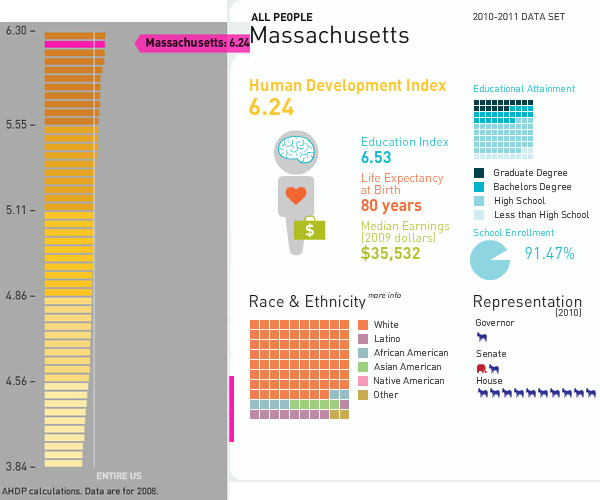
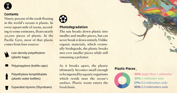
Information graphics and Illustrations

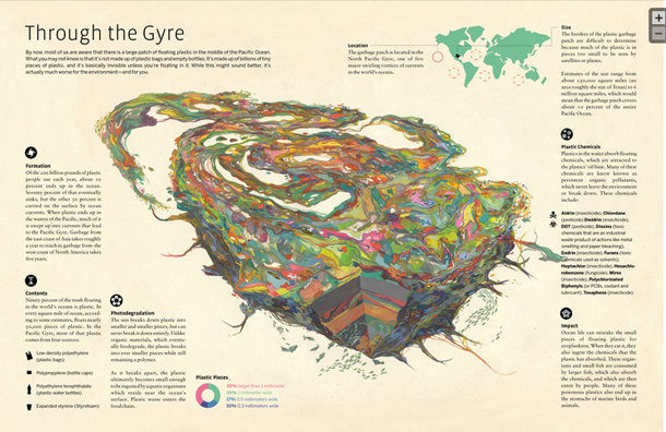
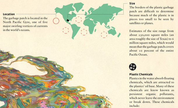
Information graphics generally do not include significant elements of illustration. It is even more rare that they are dominated by illustrations the way “Through the Gyre” is. Jacob McGraw-Mickelson created the illustration – it’s his imagination of what the Pacific Gyre might be like, not an anatomical cross-section. Using an illustration in a place where we come to expect something schematic and, therefore, representative of reality could be a dangerous play-on-truth using images and conventional expectations to convince viewers of a truth they will never be able to confirm. The Pacific Gyre is nearly impossible to visualize because it is operating at competing scales. The pieces of plastic are teeny tiny but they cover a swath of ocean that’s about as big as Texas. Reports of its density at various depths are still being developed.

Because the gyre is so difficult to visualize McGraw-Mickelson’s illustration of it has an easy time standing in for reality. We have no other photographs or scientific diagrams (yet) that aim to give us a visual overview. The ease of convincing a viewership could be seen as a kind of deceit-with-images but I prefer to think of it as art in the service of environmentalism. It may not be ‘representative’ of reality or even provide a schematic for thinking through oceanographic relationships. But it does bring gravity and depth to the following factoids that were developed as more traditional information graphics around the main illustration of the gyre.

Location of Pacific Gyre - Zoom of "Through the Gyre" by Jacob McGraw-Mickelson and GOOD transparency
Location of Pacific Gyre – Zoom of “Through the Gyre” by Jacob McGraw-Mickelson and GOOD transparency
Make-up of plastic pieces in the Pacific Gyre - Zoom of "Through the Gyre" by Jacob McGraw-Mickelson
Make-up of plastic pieces in the Pacific Gyre – Zoom of “Through the Gyre” by Jacob McGraw-Mickelson
Impact of the Pacific Gyre - Zoom of "Through the Gyre" by Jacob McGraw-Mickelson and GOOD transparency
Impact of the Pacific Gyre – Zoom of “Through the Gyre” by Jacob McGraw-Mickelson and GOOD transparency

What Works

This graphic gave me a whole new way to think through problems related to representing important concepts and ideas that do not have clear schematics, photos, or graphics but can inspire deep reflection. I bought a copy of the print of just the ‘gyre’ to remind myself to be cautious about my embrace of the American lifestyle. I could end up eating that plastic bag again someday as it makes it way into the food cycle.

References

McGraw-Mickelson, Jacob. (2009) “Through the Gyre” [illustration] featured in 2009’s best information graphics at GOOD Transparency blog

Wind Map

Viewing note

Click on the image above or here to go to the actual graphic. What you see above is just a screen grab. If you like the screen grab, you will love the active graphic in which you can see what it would look like the visualize the wind blowing across the US right now. Yes, whenever you are reading this, you can download recent data to populate the graphic.

What works

This is a great use of a map to display information. Think, for instance, what the same data would look like in a table.

State                     Speed      Direction
Bismarck, SD          16 mph     S
Columbus, OH        5 mph      W
Fargo, ND               8 mph      N
Minneapolis, MN     2 mph      SW
New York, NY         6 mph      E

In a table, cities would probably be arranged alphabetically which is fine if you want to know exactly what is happening in a given city but terrible if you are trying to discern if there’s any geographical pattern to wind flows. Looking at the map, it is easy to detect geographical patterns. In fact, it would be nearly impossible to avoid detecting geographical patterns. Huge win for the map as a graphic with respect to wind data.

The fact that the wind appears to blow is a programming achievement.

The fact that users can update the graphic with a fresh pull-down from the National Digital Forecast Database is another major programming achievement.

The creators of the graphic at hint.fm offer this disclaimer, “We’ve done our best to make this as accurate as possible, but can’t make any guarantees about the correctness of the data or our software. Please do not use the map or its data to fly a plane, sail a boat, or fight wildfires”. That being said, I think the graphic could be useful for those sorts of purposes. I also think it could be used to perform site selection for windfarms or at least as an educational tool to explain to people why the Dakotas make excellent states to harvest wind while the neighboring state Minnesota is a poor choice.

What needs work

I wish there were an easier way to find graphics like this. I stumbled upon this one via Albert Cairo’s twitter feed, but there must be other awesome graphic work out there just waiting to be discovered.

Reading suggestions

On that note, if you happen to enjoy stumbling upon information graphics, I highly recommend visiting visualizing.org and visual.ly, two websites that aggregate information graphics by allowing people to upload their own work. Both sites have relatively high collective standards for design and are trying to maintain the same high standards for data quality.

Then there’s Nathan Yau’s blog, flowingdata.com, which has long been on my list of must-reads. I assume many of my readers know about flowingdata but it is worth mentioning because it’s a great blog.

Good.is has a portion of their site set aside for GOOD information graphics.

For a more strictly aesthetic experience, behance.net is a giant collection of graphic artists’ portfolios. Looking through it is the digital equivalent of walking around in a flea market – great stuff, unique stuff, and lots that is instantly forgotten even though its presence adds to the atmosphere. Most graphic artists are not information graphic designers so much of what is on behance is not information oriented.

I sometimes find things on pinterest, too, which is more like the digital equivalent of a mash-up between jcrew and a flea market. Oddities organized. It’s much harder to find good information graphics there because, for reasons I do not understand, pinterest is dominated by the long vertical graphics that require lots of scrolling. I’m not a huge fan of those. They encourage laziness – nothing needs to be integrated when you have an infinite length of scroll to just layer unaffiliated fact upon unaffiliated fact and hope that with a picture or two thrown in, a narrative will emerge.

Besides newspapers and magazines, where else do you find information graphics?

References

hint.fm (2012) Wind Map Graphic.

visual.ly
visualizing.org
flowingdata.com
behance.net
pinterest.com

World's water resources by type of water, via The Atlantic data from the USGS

Is Minnesota like Saudi Arabia?

Minnesota is the land of 10.000 lakes and thus holds far more than its representative share of precious fresh water. Is this synonymous with the naturally granted wealth of oil in countries like Saudi Arabia? Maybe. But does that mean Minnesota is going to become a state with a similar level of political economic power? No…not so much. It is silly to compare nation states like Saudi Arabia to states in a federation like Minnesota; it is silly to think that a state with an existing economy relatively unreliant on water is going to suddenly transform itself into an economy with a single primary commodity; it is silly to think that a democratic governance system will respond like a dictatorship did to a valuable commodity. As an aside, Tim Mitchell’s latest book, Carbon Democracy makes a historically grounded argument about the relationship between the material qualities of oil and coal and the technics of the political economy that developed in concert with carbon-based wealth.

How are information graphics like propaganda?

This infographic is more than half graphic (and less than half ‘info’). Normally, that’s not the best balance for displaying social science data. Usually, social science data is multi-faceted, requires a contextual framework for adequate understanding, and the sheer amount of information necessary to tell the story makes it harder to include graphic elements that do not represent information. However, this is not social science data. Technically, it is geological data, but I think it would be more accurate to describe it as data that is being mobilized for political reasons. Hence, the title of this post makes a blatant comparison between water (blue gold) and oil (black gold) to emphasize the implicit political valence of the message in this graphic.

In short, information graphics are being mobilized for what are essentially purposes quite similar to propaganda. This particular graphic is not the best example. It is the example I happened to see yesterday, and it does a good job of demonstrating what is at stake in the current infoscape with respect to information graphics. These graphics are generally considered to be intellectual and political lightweights compared to communication that is based on the production of critical texts. Overlooking the work that these graphics do is both dangerous and foolish. For one, many critical voices from within the academy *have* critical messages they have trouble communicating with broader audiences because many audiences are unlikely to read academic writing, even if that writing is posted to blogs. If these academics can create their own graphics, they add another tool for communicating clearly just what their perspective is. Yet pretending that information graphics are either merely ‘pretty’ or that they are straightforward representations of empirical data avoids engaging with the way that political messaging is built into graphic design.

One reason this blog exists is to help people start to sharpen their critical visual analysis tools. As educators, we spend a lot of time in the classroom teaching students how to write and how to stop believing everything they read by becoming aware of rhetorical moves, selective mobilization of facts, and reliance on carefully chosen narratives that initiate particular kinds of human perceptual biases and emotional responses. Art historians teach the same kinds of critical skills for interrogating paintings and photographs. Media studies folks teach the same kinds of skills for interrogating popular culture products like television shows, films, and magazines. Social scientists would serve the discipline well if they begin to teach students how to critically consume information presented in infographics.

References

Thinking Big Series. (2012) The World’s Water Supply. The Atlantic. This series is sponsored by Fidelity Investments, LLC.

Mitchell, Tim. (2009) Carbon Democracy: Political power in the age of oil. Verso.

Measuring the Impact of Humans on the planet | National Geographic

Note

My dad sent this along to me and I decided to leave his handwritten note at the top. Since he was interested in the graphic and not the article, I do not know exactly which article in the March 2011 issue of National Geographic contained the Human Impact graph, but my educated guess suggests it came from the one entitled, “The Age of Man” by Elizabeth Kolbert. I checked out the online version and could not find this graphic, but print and online versions of magazines do not always contain the same content.

This is why it’s nice to have parents who will cut things out of print magazines for me. Thanks, dad.

What works

The best feature of this graphic is that it provides a way for readers to understand population growth taking into consideration the qualities of the population – and the way that changes in those qualities over time mean that population growth at one point in time is not the same as population growth at a different point in time. As we all get richer, we demand more of the planet in terms of food (increased affluence leads to eating higher up the food chain which is less ecologically efficient), in terms of energy (more affluence means more demands for electricity and fossil fuels), and all of our affluence allows us to spend more time inventing things that will make our lives even better than they already are. The increase in affluence as measured by global GDP and the increase in technological sophistication as measured by patent applications are going to go hand in hand. I would point out that patent applications would not be necessary in economic systems other than capitalism, so that particular metric might be off in countries that aren’t wholly capitalist (Cuba comes to mind).

What needs work

What’s weird about this to me is that this growth is exponential and yet it has been represented linearly. I’m wondering what an exponentially growing volume looks like – probably looks pretty interesting depending on how the parameters constraining the volume are keyed to the variables. This is a tough criticism because I don’t even know the answer myself, I just know that something isn’t quite right with the tidy right angles here.

I’m a bit upset, too, about the fact that we’ve run into the apples and oranges problem again. One unit on any of these axes cannot be compared to one unit on the other two – a patent application is not like a human and neither of these are like dollars of GDP. Because I cannot compare one axis to the next, I know that I cannot use this graphic to form anything other than an impression about the factors comprising the impact of humans being born today. I cannot, say, decide that cutting back on technological growth would be better or worse for the planet than limiting population growth.

There is something good to be said about graphics that represent concepts rather than data. Impressions are not worthless so if this thing gives viewers the impression that population growth is not a problem on its own, but only a problem in the context of the way humans live, that is an accomplishment of which to be proud.

References

Tomanio, John and Bryan Christie. (March 2011) “Why is our impact growing?” [Graphic] in National Geographic p. 72.

Kolbert, Elizabeth. (2011) Age of Man National Geographic Magazine.

Market data for natural gas, 1990 - 2011
Market data for natural gas, 1990 - 2011 | The New York Times

What works

If one graphic cannot tell the whole story, use three. Or four. Or four static graphics plus an interactive graphic (keep reading)! Most people would have stopped creating graphics after they produced the first graph – the one that tracks oil and natural gas prices from 1990 up to 2011. I appreciate the second graph which compresses the salient point from the first graph into a single line. It hammers home the point that what we are meant to notice is not the fluctuation in natural gas prices so much as the fluctuation in the difference between gas and oil prices. The other two graphics both deal with oil consumption only, something I find slightly odd given that the story is about natural gas. Yes, it is clear that there is a relationship between oil and natural gas consumption – we see that with the first two graphs. But we also see from the first two graphs that the relationship between oil and gas is not always predictable, especially not right now where natural gas is significantly cheaper than oil, cheaper than we would have predicted if we had to use the past as a guide. Yes, of course oil prices might go up as they respond to increasing demand from “the rest of the world” (weird terminology that means NOT US, Japan, or “developed Europe”).

It’s also true that oil prices are sensitive to political unrest in the middle east, which has been underway lately in a number of countries. It is difficult to tell if these graphs are using numbers crunched before the revolution in Egypt and unrest in Middle Eastern countries or after. The graphic was published 25 February 2011, well after the Egyptian revolution began. But the weekly price is listed in January 2011 dollars which means the rest of the information might have preceded the Egyptian revolution. Still, the path towards divergence appears to have begun in 2009, which renders the timing question I raised a bit beside the point. And this is why we look at trends over long periods of time. Point estimates can be misleading.

More is more

Natural Gas Fracking

The Times has been covering natural gas regularly, and it seems they decided that more is more in pursuit of a fully comprehensive understanding of natural gas not just as a brute commodity being traded in a free market, but as a potentially harmful environmental toxin, especially when it is seen as being at the center of brutal extraction practices. There is an elegant slideshow-animation that describes how natural gas is extracted and explains what the consequences of this practice can be as a result of the mechanical changes the drilling process leaves behind.

The combination of slideshow and animation works well here. If it were just an animation, it would be hard to fit the explanatory text within the temporal flow. Giving the viewer a chance to watch a small segment of animation and then read an explanation about what is supposed to happen and what can go wrong brings appropriate pacing to the explanatory experience. What’s more, I think it is a great idea to force the viewer to keep clicking in order to advance the slides. It’s barely above a fully passive learning experience, but anything that raises the level of participation – like reading or having to click somewhere – helps keep the viewer’s body and mind more fully engaged and pumps up retention.

My favorite slide came near the end – these people built up some narrative tension. I kept wondering where this drilling process went wrong. So when do the toxins hit my drinking water? That’s what I was wondering, and this slide filled me in. It’s a simple question, one that we know we’ll find the answer to based on the title of the slideshow, but it’s always good if your viewer goes in with some direction. An obvious question is fine. Getting viewers to envision a more complicated question might be better, but overall I think this approach works well.

Natural Gas Fracking - Water problems

Please click through to make sure you understand why fracking presents environmental problems. I do not want to spell it out here because I think that would lessen your experience of the interactive graphic as a learning tool.

References

Norris, Floyd. 25 February 2011 Two Directions for the price of natural gas and oil New York Times.

Graham Roberts, Mika GrÖndahl and Bill Marsh. 26 February 2011 Extracting Natural Gas from Rock [Interactive Graphic]. The New York Times.

PS

It feels like swearing to talk about fracking. Thank you, Battlestar Galactica.

Water Supply Infrastructure Schematic
Water Supply Infrastructure Schematic | Laura Norén

Water Infrastructure Schematic Diagram*

I put together the diagram above to help me explain how water is delivered and taken away from urban locations. The point I want to make with the diagram is that the infrastructure is designed to deliver water to ‘typical’ buildings and that this means people who are wandering around cities where buildings are all private also lack access to water. There is a political debate going on right now about whether or not access to water is a human right – the UN voted on this and decided water IS a human right but large countries like the US disagreed. When the US does not back UN resolutions, those UN resolutions tend not to mean as much.

So why would the US vote against this resolution? I am not altogether sure, but I believe it has something to do with the fact that many places have privatized their water. Privatization of water takes different faces. Sometimes a system like the one diagrammed above is privatized. Studies have shown that when this happens, the company that sets up a system like the one above delivers a poorer quality product – more sedimentation and other low level contaminants which are the typical results of choosing sources quite close to cities. The closer the source is to the delivery, the lower the expenditure for engineering and installation of water mains, monitoring stations along the route, and reservoirs. The other way in which water can be privatized is through bottling – bottled water in some parts of Africa is more expensive than Coca-Cola. And this in areas that may have no access to safe alternatives for drinking water. Nestle owns the Poland Springs brand and folks in Maine are scrambling to get hydrological studies performed that can prove Nestle’s water extractions are drawing down lake volumes on adjacent properties. The only way to fight Nestle, it seems, is to prove that they are damaging one’s own property and yet water sources – rivers, lakes, oceans, springs – technically do not belong to private individuals. The individuals or corporations can own the land surrounding them, but the water is a bit like air and cannot be owned. (Rights to the fish found in the water CAN be owned. As you can see this gets complicated quickly.)

The diagram above contains none of the politics of the discussion below. For me, it is important to attempt to create graphics that are not political, even when I am creating them for the express purpose of delivering a presentation that takes a side in a political fight. For me, the challenge is two-fold. First, I face the technical difficulty of creating any kind of complex diagram. I’ll leave questions about execution out of this particular discussion though feel free to comment on execution below. Second, when I know I have a political message that I want to keep out of my graphics, I am often too far into my own head to be able to step back and determine whether I have created something that is both comprehensive enough to tell a complete (but apolitical) story and one that does not drift into the political. As it is, this diagram seems to err on the side of being incomplete rather than being more fully detailed where the details start to carry politics with them. My larger point is that this is one way in which cities are exclusionary zones by design. It would be easy to find a way to provide the basic infrastructure to supply water outside of buildings – fire hydrants do just that. But maintaining the ‘last mile’ of infrastructure is almost always completely given over to the private sector. Individuals and companies maintain bathrooms with all of their fixtures, cleaning, and maintenance requirements. This is big business. Just about every shop and restaurant on the street in New York reserves the rights to the bathroom for customers only.

2nd Avenue "no bathroom" sign, East Village, New York City (2009)

One of Starbucks redeeming qualities is that their bathrooms tend to be open to all, proving that it is possible to continue to service a relatively affluent clientele no matter who is in the bathroom.

Obama on Water

The word on the political street is that even though Obama’s stimulus efforts contain plans to address infrastructure, water infrastructure has been taken off the table at this point. Our water infrastructure is ageing; most of the current infrastructure is due to age out of acceptable functionality in the next ten years. Already there are an average of 240,000 water main breaks. Just yesterday the New York Times reported that a dam outside of Bakersfield is uncomfortably close to catastrophic failure, threatening the lives and livelihoods of thousands of people. There are another 4400 dams in the US that require work in order to fall within comfortable safety ranges. Some are publicly owned, some are privately owned. In either case, it is unclear which entities can foot the bill (projected at $16 billion dollars over 12 years).

*This diagram uses New York City as a guide. Not all cities have overflow valves that risk the release of raw sewage due to increases in rain. What’s more, in New York there are some other systems in place to recapture some of the overflow at the point of release. But this is a different kind of political discussion, one that focuses on the other typical focus of water discussions – the environment.

References

Ascher, Kate. (2005) The Works: Anatomy of a City. New York: The Penguin Press.

Bone, Kevin, ed. and Gina Pollara, Associate Ed. (2006) Water-Works: The architecture and engineering of the New York City water Supply. The Cooper Union School of Architecture, New York: The Monacelli Press.

Bozzo, Sam. (2009) Blue Gold: World Water Wars [Documentary film, available streaming for free]

Davis, Mike. (2006) Planet of Slums. Brooklyn, NY: Verso Books.

Fountain, Henry. (2011) Danger Pent Up Behind Aging Dams. New York Times. 21 February 2011.

Human Development Index Map
Massachusetts Human Development Index

What works

Mapping the Measure of America is a social science project that deliberately includes information graphics as a communication mechanism. In fact, it is the primary tool for communicating if we assume that more people will visit the (free) website than buy the book. And even the book is quite infographic dependent. I support this turn towards the visual. I also support the idea that they hired a graphic designer to work with them. Often, social scientists do not do well when left to their own under-developed graphic design skill set. Fair enough.

The website presents a unified view of the three images above. I couldn’t get them to fit in the 600 pixel width format, so I presented them one at a time. I encourage you to go to the website because one of the greatest strengths of this approach is the interactivity and layering. I happen to have picked Massachusetts, but each state plus DC has it’s own graphics available. There are other charts and whatnot available, but I think that this set of graphics (which you see all at once) are the strongest.

What needs work

Maps. Maps are too often used. Here’s why I think maps are a problem. Look, folks, political boundaries are meaningful when it comes to making policy or otherwise dealing with state-based funding. And that’s about it. Political boundaries occasionally coincide with geographical boundaries, but not always. Geographical boundaries are meaningful for some things – life opportunities may be based on natural resources or on historical benefits accruing to natural resources. But political boundaries and maps are often not all that useful because they imply that the key divisions are the divisions between states or counties or neighborhoods. Like I said, sometimes this is true because funding tends to be like the paint bucket tool – it flows right up to the boundaries and not beyond, even if the boundaries are arbitrary or oddly shaped. But where the issues are not heavily dependent on funding, thinking in terms of political boundaries makes it harder to see patterns that are organized along other axes. For instance, I wonder what would have happened if some of these categories – education, longevity, income – had been split between urban, suburban, and rural areas. Or urban and ex-urban areas if you prefer that perspective on the world as we know it.

In the end, I think the title is both accurate and disappointing: “Mapping the Measure of America”. Figuring out how to do information graphics well means figuring out which variables are the key variables. In this case, it seems that the graphic options might have determined the display of the information. Maps are easy enough – they appear to offer a comparison between my local and other people’s local. Those kinds of comparisons offer readers an easy way to access the information because everyone is from somewhere and there is a tendency to want to compare self to others. But ask yourself this: to what degree do you feel that state-level information is a reflection of yourself? Do you see yourself in your state?

References

Burd-Sharps, Sarah and Lewis, Kristen. (2010) Mapping the Measure of America with the American Human Development Project. Site design credit goes to Rosten Woo and Zachary Watson.

Greenhouse gas emissions graph
Greenhouse gas emissions | World Resource Institue and Google's Public Data Explorer

What works

The World Resource Institute has partnered with Google to create an interactive portal for creating visualizations based on publicly available data. Google has been in the business of doing this sort of thing at least since the time they acquired Trendalyzer from Scottish-based gapminder.org in 2007. To be sure, gapminder.org is still a going concern of its own and IBM also offers free web-based visualization services through their Many Eyes program.

The focus of the trendalyzer is to show change over time and they succeed in making it quite easy to watch panel data change over time.

What needs work

BUT…I find that this particular graphic is a great example of a misleading reliance on time as the key ‘context’ variable. So the graphic above breaks down greenhouse gas emissions by US state over the course of the year. If you have already clicked over to the World Resource Institute and watched the animation of these bars pumping up and down (more up than down) and trading places with each other over time, you will surely have been fascinated. I watched it three times in a row. But I was stuck wondering what the take away was meant to be. Clearly, there is the first order take away that the bars pretty much grow over time, they do not shrink. If I were the World Resource Institute, getting that message out would be important to me. But I would hope for more than just the bullhorn approach, “More is BAD! More is BAD!” which is kind of how this hits me at the moment.

One of the biggest problems with this graphic is: not all US states are the same size. Of course Texas emits more greenhouse gases than most states – many more people live there than in, say, Kentucky, Iowa, Oregon, etc. But the World Resource Institute chose to display per capita emissions with the bubble approach (which has almost no redeeming value in my opinion because I cannot even see half of the bubbles. Maybe they all could have been reduced by half or more? And maybe instead of going with colors on a spectrum, the worst could have been red, the best could have been green, and most everyone else could have been some shade of grey? It’s just not possible to hold 50 changing variables in your active cognitive space at once. Reducing it to three variables – the good, the bad and the mediocre – could actually increase retention and pattern recognition.)

Greenhouse Gas Emissions Per Capita, US 2007
Greenhouse Gas Emissions Per Capita, US 2007 | World Resource Institute and Google

But back to the bar graph at the top. For the purposes of greenhouse gas emissions, it makes the most sense to interpret size as population not square miles, so that’s what I am going to do. In an attempt to be helpful, I threw together a bar graph of the top 10 most populous US states (using 2009 population estimates) in good old Excel. Note that our friend Texas is not the most populous state by about 12 million people – that is a lot of people. California is the biggest and they emit way less than Texas. New York is the third most populous state and we emit far less than our proportional share would suggest. Let’s hope it stays that way because I already find it unpleasant to breathe the air in Manhattan (admittedly, that could be due to many causes besides greenhouse gas emissions).

Most populous US states by size

My suggestion here is clear: prepare a bar graph per state, per capita. And, yes, I would want to see how that changes over time. I would probably watch the animation six times instead of three times. My fantasy is that we could compare not necessarily by state, because that is in many ways arbitrary, but by personal habits. Say we get the most extreme environmentalists – vegan, freegan, won’t even take motorized public transportation, never flies, prefers candles to compact fluorescents, has a composting toilet – to the somewhat average person who has a car but not an SUV, eats meat but not every day, does not pay more for organic food – to the extreme non-environmentalist who owns three houses, drives in an Escalade or something of that nature, flies internationally at least four times a year, pays extra for organic food (but at restaurants), and sends clothes to the dry cleaners twice a week. But that would probably result in a graphic best described as “info-porn”, enticing and exciting but intellectually vacuous.

Summary

The WRI is on to something with their Google partnership. My favorite of their early work is this line graph that does a better job of telling the emissions story than any data broken down by state.

greenhouse gas origins
Greenhouse Gas Origins | World Resource Institute and Google

But the other great thing about the new partnership is that they ask for suggestions and set up a google group to manage the roll-out and incorporate nay-sayers like myself.

“By pairing [the Climate Analysis Indicators Tool] CAIT data with Google’s tools, there are new possibilities for people everywhere to take part in using sound data to tell stories that frame environmental problems and solutions. In the future, we hope to include additional data sets that can tell even more stories through Google’s visualization tools.

Suggestions for what you would like to see, or have a question about CAIT-U.S. data? Let us know here or join the conversation at http://groups.google.com/group/climate-analysis-indicators-tool.”

Manhattan traffic patterns
Manhattan traffic patterns | Wired Magazine June 2010

What works

The tendency with geographical data is to try to find a way to portray everything on a map. Surely, there is a map up there, and many people will recognize that the area is Manhattan instantly by looking at the map before they read it in the title. That’s a nice thing about maps – they transcend language and bad captioning to some degree. However, much of the detail is not to be found in the map. The map just shows us where congestion tends to occur, but it doesn’t tell us when we can expect these areas to be congested or just what “congested” means. In Manhattan, the average speed is under 10 mph so does congested mean less than 5 mph? Or what?

But if we look at the other graphs and charts it is a veritable jackpot of traffic information, at least at the collective level. I wouldn’t try to use this collection of information to plan your route through the city unless, of course, this collection of information causes you to take the subway instead of driving.

I hate pie graphs (as in the “Proportion of Miles Traveled”), but I am sympathetic to the triangulated pie graphs in the “Vehicle Distribution” graphic. At least it is visually easier to calculate the volume of a true triangle than a rounded off triangle. So if you find that you have to go with a pie graph, emulate the triangulated version found here and your viewers will come away with a better understanding of the information you are attempting to convey. I was surprised at how many people take taxis to get to work. But I am even more surprised at how many fewer trips there are on weekends. Fewer than half of those made on an average weekday.

Anecdotal evidence warning: When I first moved to Manhattan, I remember sitting in the car for two hours to drive around the block. There was a street fair nearby (not on any of the sides of the block traversed in this trip) and that seemed to slow everything to a standstill.

What needs work

I would have found a way to combine the average speed and the delays and associated costs. Clearly, the two are related – lower average speed must mean more delays. I had a little trouble understanding the delays and associated costs without the text from the article. If the speed and costs had been integrated into a single graphic instead of split into two (with a big pie graph in between), I think the link between speed, delays, and costs would have started to become more intuitive.

Here’s an excerpt from that section for the curious:

“In the end, Komanoff found that every car entering the CBD causes an average of 3.23 person-hours of delays. Multiply that by $39.53–a weighted average of vehicles’ time value within and outside the CBD–and it turns out that the average weekday vehicle journey costs other New Yorkers $128 in lost time.”

For more on how that was calculated, you’ll have to read the article. But the bottom line came down to a proposed $16 toll to enter Manhattan below 60th Street. It’s about what drivers in central London pay and the proceeds would go to bolster public transportation. Such an idea – known as congestion pricing – was proposed by the Bloomberg administration but voted down in 2008.

References

Salmon, Felix. (June 2010) “The Traffic Cop.” in Wired Magazine [infographic by Pitch Interactive].

Bonanos, Christopher. (17 December 2007) “Fare Enough” New York Magazine.

World Cup Carbon Footprint | EU Infrastructure

Background

Timon Singh at EU infrastructure looked at the travel distance of the fans, the efficiency of the hotels, all the concrete used to build the new venues, and a bit of a credit for intra-venue mass-transit to create the graphic above. By way of comparison, the previous World Cup in Germany released far less carbon because the fans didn’t travel as far and they used existing venues instead of building new ones. So perhaps that isn’t even the relevant comparison, you’re thinking. Singh predicted that response and notes that this World Cup will release more carbon than the Beijing Olympics. Before I believe that claim, I’d like to see the numbers in more detail. No matter which one was worse, the point is that large-scale one-off events in which hundreds of thousands of people travel great distances come with environmental costs.

What works

I like these flower chain graphs, sort of. They are colorful and allow information of the same sort to be broken into categories; it is all about carbon emissions but we get to see all the different sources that funnel into the big pot in the middle. There’s plenty of space for labels and numbers to appear with the circles, which is critical.

What needs work

What do you think, readers? Is this kind of circle comparison easy on your eyes? I mentally struggle when circles get close in size and when I am trying to sort of visually add the area of two or more circles. Personally, I think a more linear version would have been easier for me to handle. The longest line would be the biggest carbon contributor, the color codes could have stayed, the labels could have stayed, and I would have had an easier time mentally adding one segment to the next. (I really wanted to try to mentally add all the ‘flight’ components together but I couldn’t do it visually so I ended up just doing it mathematically. But I could have done that more easily in a table.)

Reference

Singh, Timon. (June 2010) The carbon footprint of the World Cup. EU Infrastructure.