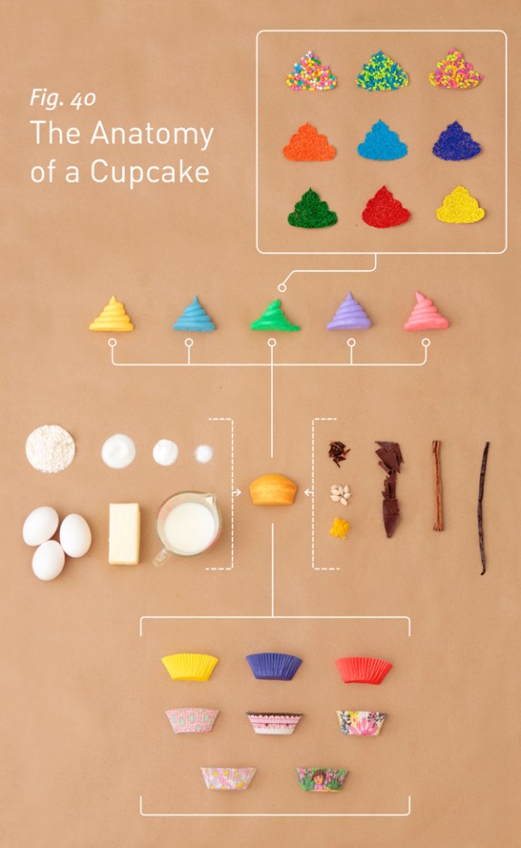
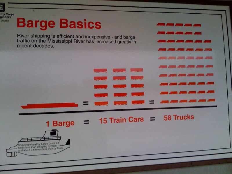
photography

Food Price Mashup | Mark Bittman

What works

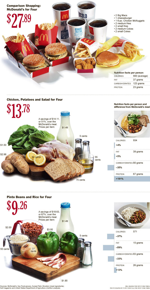
After looking at this graphic, I imagine most viewers come away thinking that fast food is more expensive than cooking at home, which was the intention of the accompanying opinion piece by Mark Bittman. The graphic succeeds in conveying visually just exactly the point that the article made using words.

The photographs are vibrant and catchy, bordering on food porn.

The sidebars feature the calorie counts for these meals in addition to the large price tags. The nutritional information graphs are useful for Bittman’s response to existing critics of the ‘cooking at home is better’ movement who have tried to argue that though fast food may be more expensive on a per meal basis, it is actually cheaper on a per calorie basis because fast food is so calorie dense (if a bit too heavily reliant on nutritionally vacuous fats and sugars). Bittman uses the nutritional information graphs to refute this claim and I applaud the graphic designer for including the rebuff of the critics in the graphic. It would have been easy enough to simply run the photos of the meals with their price tags.

What needs work

The photos take up too much space. This almost looks like an advertisement for McDonald’s, chicken, and beans.

The nutritional information bar graphs are potentially confusing. They do not measure absolutes so much as they show how each of the home-cooked meals stack up against McDonald’s. Since people are not used to thinking of their meals in comparison to what they would have eaten had they eaten at McDonald’s, I’m not sure the comparative nutritional graphs work as well as one graph that used absolute data and had all three meals on it. I am almost positive the graphic designer probably tried making just exactly that graph – if they are out there reading this I invite them to send me what that looked like to prove that my hunch to use a unified graph on this one would have been ugly, confusing, or just plain wrong.

References

Bittman, Mark. (24 September 2011) Is Junk Food Really Cheaper? New York Times, Sunday Review. Op-ed column.

Bittman, Mark. (20 September 2011) Cooking Solves Everything: How Time in the Kitchen Can Save Your Health, Your Budget, and Even the Planet [e-book] published by Byliner.

Trends in taking pictures of food | blog360i

What works

I appreciate the attempt being made here to break food photography down into a set of categories, separating the cataloguing from the art and the gross/unusual from the special occasions.

It’s nice to see that people are about as likely to be excited about their vegetables as they are to be excited about their desserts/sweets. Perhaps this tells us something about the class position behind the sustainable foods movement? (People with more money are more likely to have fancy phones and phone plans equipped for sending pictures of food around to friends, family, and blog readers. Folks who have more education and are more well-to-do are also probably the most likely to be participating in sustainable/local food projects that spotlight locally grown foods while they are still recognizable in their whole forms such as vegetables before they are incorporated into a more complicated dish.)

The icons are nicely drawn.

What needs work

The colors in the main donut are too similar, especially as they approach red, to be easily distinguished. Further, the areas of the main donut graphic (and the food-type smaller graphics) would have been easier for the human eye to ‘weigh’ if they had been presented unfurled as bar graphs rather than wrapped around each as hoops/donuts.

Wordles do not fall into the realm of useful information graphics. If there is something to be said about the use of particular words – in this case, if there is some importance tied to the intensity of the use of “breakfast”, “lunch”, and especially “dinner” – simply making those words larger relative to other words does not help readers understand any larger meaning to the pattern. In my opinion, if there is something important about word usage, the best way to explain the meaning behind that word usage would be to use…words. I would be interested in reading some paragraphs about why this pattern of generic food words “breakfast”, “lunch”, “dinner”, and “food” is meaningful. The same basic critique applies to most wordles.

The images of the phone, the polaroids, and the door opening at the bottom of the graphic take up tons of space and communicate almost nothing. Personally, I am also not convinced by the argument that since people do not mention brands in their food photography that there is a “huge opportunity for marketers” in the day-to-day practice of food photography.

Overall, there is a glaring lack of context for this information. Even as descriptive information, it is hard to make sense of food photography as a practice without knowing more about the people who are actively doing it. Is it older or younger people? What’s the gender/race breakdown? Is there a core of photographers who are snapping tons of pictures while the rest of the population barely takes any? Many questions remain.

Reference

Wasserman, Todd. (9 May 2011) “What’s behind the food photography trend?” on mashable.com.

360i (2011) “Online food and photo sharing trends” available at scribd.

Anatomy of a Cupcake | Allen Hemberger

What works

Not all information graphics arise from the same design process. In this case, the graphic creator went so far as to make a video of the creation process so, if you are so inclined, you can click through to Allen Hemberger’s “Things” blog to see how the Anatomy of a Cupcake went from sketch to photography and then to poster-sized graphic. If you love it maximally, you can even buy a print. [Note: If you like Hemberger’s work he has a food blog “The Alinea Project” and a photography blog.]

I chose this image for three reasons: first, I love that Hemberger took the time to make a video showing the process of going from idea to a tightly composed stylized photograph. Second, I am always happy to find people who construct information graphics differently. This one is a hybrid between photography and baking. What makes it work is the proper execution of both the baking and the photography as well as the care that was given to the original sketches that determined the storyboard for the idea. If the flow chart failed, he could have had the same cupcake components and the same photographic skills, but ended up with something that was merely ‘cute’ rather than something that is simultaneously aesthetically pleasing and clever.

The third reason I chose this image is even more personal than the first two. My summer research project, funded in part by Microsoft Research in Cambridge, MA, uses food blogs and food bloggers as a lens for focusing on the tensions between material and immaterial creative skills. I’m interested in figuring out how people move between the material world in which all of their senses can engage with a process and the not-quite-as-material world of the web in which the sensory world is reduced to the visual (though in some cases there is an audio component). The rest of the sensory experience of the material world has to be represented by text, photography, and graphic design. Why are there so many food blogs when food is something that has long been understood as a part of the material world that has to be tasted and smelled in order to be experienced properly? Why do people choose to blog about food and what keeps them going? Making and serving food are also ritualized practices for building connections between people – it is one of the primary physical elements through which culture is expressed. How does the collective experience of food work online?

The project has three components:

1. A web crawler is out poking around the English-speaking portion of the internet, creating a network of all of the food blogs that are linked in some way to an initial list of 50 top food blogs. So far, we have about 22,000 blogs in the English-speaking food blog network. Visualizations coming in another 6 weeks or so. The point of the web crawler is to see how many food blogs there are, how they connect to one another, and whether or not there are discernible lobes of the food blogosphere (say, for instance, a vegan lobe or a molecular gastronomy lobe). Because the food blog network is a grassroots sort of place – very few people are getting paid or prodded to start blogs and they are then free to link to whomever they want – there are some interesting social network questions we can answer about self-selecting networks. For instance, how many outlinks do food bloggers use? Is there geographical clustering or is the network oblivious to geography? Are bloggers who are more heavily linked to (or from) more likely to keep at it?

2. Once the crawler begins to reach a plateau in terms of adding new links, we will stop it, clean up the returns a bit, and then take a random sample of blogs who will receive an invitation to participate in a web-based survey. The survey does three things: it gathers blogger demographics (gender, race, age, kids or no kids, location, education, income), demographics of the blog (proportion dedicated to restaurant reviews vs. recipes, frequency of posts, perceived and measured audience, site traffic, comment traffic, presence on twitter and facebook, amount spent and earned), and the survey finishes with a few questions about motivations and perceptions of one’s blog.

3. To help construct a good survey instrument and to deepen the context within which the analysis of the survey results will take place, I am also interviewing 20-25 food bloggers. So far, the interviews have been fantastic. They are much better at getting at the nuances of practice – especially the crafting practices that are part of cooking/baking and blogging (photography, writing, graphic design, and online social networking…this last one may not be a craft practice).

All of this has been taking up a significant portion of my time and keeping me away from the blog. However, as the data comes in, I will have an opportunity to make graphics from scratch, rather than critiquing other people’s work all the time. I start to feel a bit like Oscar the Grouch when I’m in the midst of a string of critiques, especially since I know my own work is far from perfect.

If this blog uses the first person more than normal, it is because I have been reading so many food blogs where writing in first person is the norm. This just goes to show: if you want to be a good writer, be a good reader. The linguistic and grammatical styles we read eventually start to influence the way we speak and write.

References

Hemberger, Allen. “Anatomy of a Cupcake”.

Delta-Northwest Merger Deadlines by Post-It

What works

As an image, this picture does an excellent job of supporting the argument made in the accompanying article, which is basically that merging two large companies, each with their own deeply embedded systems for handling passengers, planes, workers, and baggage as well as their own attitudes about how things should be done is a task nobody can understand until they attempt it. And then it becomes tedious almost immediately. The New York Times often saves clinchers for the end of the article and this one was a good one. Peter Wilander, an executive at Delta responsible for in-flight services (talk to this guy if you have a problem with the peanuts), cannot hide his frustration,

“The amount of work is boring beyond belief,” Mr. Wilander said. “It is also critical to the airline.”

What needs work

Is there anyone else out there who feels that if the PhD in applied mathematics is resorting to a merger by post-it, that there are real shortcomings in the system’s management abilities at Delta? Theresa Wise is Delta’s Chief Information Officer and the creator of this lovely Post-It art. While the post-its are both aesthetically pleasing and instantly graspable, I could not square the idea that a bunch of post-its stuck to a wall would really be the right answer to a problem like this:

A major switch happened when the new airline canceled all Northwest’s bookings and transferred them to newly created Delta flights in January 2010. It required computer engineers to perform 8,856 separate steps stretched out over several days.

Here’s hoping that my experience with Delta later today does not involve making seat assignments with Post-Its. For all of my snarkiness, I generally find Delta to be a good airline, better than the old Northwest.

References

Mouawad, Jad. (19 May 2011) Delta-Northwest Merger’s Long and Complex Path in The New York Times, Business Day Section. [Graphic How to Merge Two Airlines]

Kira Alexander. (1976)  The Bathroom.  Urine Trajectories
Kira Alexander. (1976) The Bathroom. Urine trajectories by sex

What works

This is the most graphic of graphic sociology so far. For those of you with delicate constitutions, give yourself a pat on the back for taking a deep breath and deciding to read the rest of this post without tossing it upon first glance.

This was published in 1976 in a book that is now out of print called The Bathroom by Alexander Kira, an architect and professor at Cornell. He was interested in the bathroom as a design challenge with an eye to the ergonomics of the fixtures and spaces commonly encountered in standard bathrooms, home to standard fixtures. The bathroom is not exactly a hotbed of design revolution so many of his ideas are not only still relevant, but still fresh. This particular diagram was used to help sort out how one might go about designing a urinal for women (if not a unisex urinal that could serve both women and men, not at the same time, though).

I usually find the use of photographs in information graphics to be superfluous. Generally, there is some graph about, say poverty or out of wedlock birth and the photograph paired with the graph takes a person and turns them into a token. The homeless man as icon of poverty; the mother and child (usually a woman of color) as icon of poignant nurturance. That sort of reductive photography has no place in information graphics. Quite frankly, I’d be happy never to see predictable, reductionist photography like that anywhere.

But in this case, Kira used a grid in the photo shoot turning the resulting photograph into an infographic. Did I mention that his ideas still seem fresh? With the grid, we have a much easier time making the visual comparison between trajectories of urine between women and men.

Imagine you are a urinal designer. Ask yourself: how would I use these diagrams to help me design a urinal that works for women? Realize that you would either pursue a trough strategy or, better, a urinal that women do not face. They could stand with their backs to it and bend forward like the woman in the third panel is doing. Of course, there are sartorial concerns. Backing up to a urinal works just fine if you are naked, like our urination model is. But what if she’s wearing clothing? That’s a different design challenge. I would be interested to see what would be possible by relocating pants’ zippers so that they open between the legs rather than in the front.

What needs work

I apologize that in some of these panels it is hard to see the stream of urine, which is a necessary piece of information. With the women, it’s pretty much straight down except when bent over at the waist. For the men, it is slightly in front of the body unless he is holding his penis in which case the trajectory is quite a bit in front of him — it leaves the photographic frame.

Reference

Kira, Alexander. (1976) The Bathroom New York: Viking Adult. [out of print]

Infographic Humanitarian images in Time and Newsweek

An Original Creation – Draft Only

Jen Telesca and Nandi Dill, my fellow research assistants at the Institute for Public Knowledge, presented a paper last year based on data they gathered doing visual content analysis of Time and Newsweek during the years 2007 and 2008. They looked through each issue, identified the articles that were humanitarian in nature, and then coded those images according to geography, the type of situation depicted, and the purported status of the individuals in the image (military actor, activist, politician, celebrity, etc). I am helping create the graphics and I thought I would share this one even though it isn’t yet complete.

As per usual, I welcome your comments and criticisms with open arms. Tear it apart, but be specific.

Methods and Findings

There were a total of 130 articles containing 363 images. The above graphic is supposed to help viewers come to the realization that not all areas are equally represented. I assumed – and this is a wild leap here – that there is some baseline level of social disease and natural disaster plaguing any population. More people = more trouble though we know the relationship is imperfect. Poor areas may experience a natural disaster as a humanitarian crisis leading to orphanhood, starvation, lack of adequate food and shelter where another region would have experienced the same natural disaster as a major inconvenience but one that insurance policies would more or less cover. A natural disaster does not always become a humanitarian disaster. Variables like wealth, racism, literacy, and so forth do play a role and I cannot capture those elements by showing a simple population statistic.

Am I forgetting something major? Am I taking Time and Newsweek to be tellers of the truth, representers of the world as it is, completely objective and unbiased by budgetary constraints or political agendas? Not really. I’m also not trying to push those issues too hard. One could assume from this graphic that some regions are more likely to be represented as suffering from (or aiding in the recovery from) humanitarian emergencies than others for reasons that have nothing to do with the frequency of these kinds of emergencies.

I hope that the graphic leads you to wonder why some regions appear more frequently than others but that it does not beat you over the head with the claim that Time and Newsweek like to depict Africa and the Middle East as sufferers and the US as altruistic helpers far more than a random sample of suffering or aid giving would indicate. Just look at Europe. They appear neither to suffer from or aid in humanitarian crises much compared to how many people live there. One theory is that US based magazines prefer to show US citizens performing acts of altruistic heroism rather than showing Europeans lending a hand. To what degree is Africa over represented because there are simply more humanitarian emergencies there versus being over represented in images because in this particular moment, in these two magazines, Africa equates well with the typical imagination of victimhood?

The graphic cannot answer all those questions. Mostly it just intends to raise them. What do you think?

Please send me comments

I will post the next draft when it is ready. I’ll tell you right now that it will include an indication of how often impending or ongoing crises were associated with each region. That should make it easier to tell which geographies are shown to be full of victims and which are full of altruists.

[There is a future graphic that uses the same dataset to show that being a victim and being an altruist are more or less mutually exclusive. For instance, stories involving crises in Africa almost never show Africans helping Africans. Instead, folks from wealthy countries are usually the ones depicted doing the helping.]

Shipping by Barge
Shipping by Barge | Lock and Dam #1, Mississippi River at St. Paul/Minneapolis

What works

Amidst all that discussion of environmental sustainability and local food movements, I haven’t heard anyone even whisper a mention of barge shipping. Waterways used to be some of the best shipping lanes (sometimes some of the only shipping lanes) available. Now there isn’t much traffic of that sort at all. This graphic implies that it might be in the best interest of economical and environmental efficiency to reconsider barge shipping. It certainly got my cognitive wheels whirring.

Style points for the reduced color pallet. In my book, lots of things could be black, white, and red* all over.

*where red can be switched out for just about any color at all

What needs work

First, I apologize for the quality of the photograph. Cell phone cameras, big posters, and narrow walkways make for crappy pictures. At least it was a cloudy day and there wasn’t so much glare.

This graphic was clearly created a long time ago – I’m guessing it has been hanging in the same place for a couple decades. Still one would think that since the 1970’s, at least some people in the US have cared about fuel efficiency. This graphic only displays an odd kind of size efficiency which is incredibly difficult to understand the more you think about it. Sometimes size matters. In this case, size as measured by number of hauling units (which themselves are different sizes) is nearly irrelevant.
In my opinion, it would be better to describe efficiencies in terms of the amount of fuel required for their example trip of a bunch of wheat. Measuring fuel burned would not only allow us to be able to compare between the modes, it would also allow us to understand the cost per pound of wheat (or whatever) in terms of transport alone, which could be of interest to all the local food folks. Does living on the Mississippi make all upstream food “local” in a way that overland food isn’t, at least if it is shipped by barges?

The next step after adding some kind of measure of fuel efficiency would be to spell out the kinds of emissions that are involved with each mode of transit per pound of item delivered.

I’m also curious about what kinds of commodities can be shipped efficiently by barge – is it only commodity level items like grains, coal, corn, taconite? Or would it make financial and environmental sense to load barges up with products like cars and consumer goods? And what happens to the materials when they come off the barge? Are they mostly shipped to areas where the manufacturing takes place near the river port? Minneapolis used to be a city in which grain mills lined the banks of the Mississippi and a barge full of flour could just be brought directly from the barge into the flour mill, no trucks or trains got involved. But what about other products? Not all cities are located on navigable rivers so once goods come off the barges are they usually placed on trains, on trucks, or what?

In short, this graphic implies that barges are more efficient or more economical than train or truck shipping modes but it fails to provide enough context to support that claim or to indicate which kinds of shippable goods are best for barge shipping.

References

Photograph by Laura Norén, June 2010. Feel free to borrow it, morph it, post it elsewhere, etc.

How Genetics Works - repost from 9gag

I felt like sharing this one with you but I have no commentary because none is necessary.

Reference

9gag (photographer) How Genetics Works which was possibly originally from a book of photographs published in the 1960s. I couldn’t find that source with certainty.