Uncategorized

American Generation Age Timeline (Age measured in 2009) | Pew Research

What works

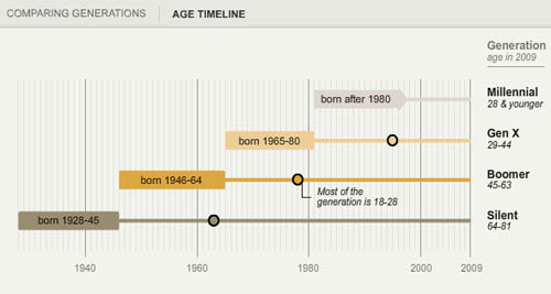
Pew Research has created a tidy series of interactive graphics to describe the demographic characteristics of American generational cohorts from the the Silent Generation (born 1928 – 1945) through the Boomers (born 1946 – 1964), Generation X (1965 – 1980) [this is a disputed age range – a more recent report from Pew suggests that Gen Xers were born from 1965-1976), and the Millennial Generation (born 1981+ [now defined as being born between 1977 and 1992]). The interactive graphics frame the data well. They offer the timeline above as contextual background and a graphic way to offer an impressionistic framework for understanding generational change.

Then users can flip back and forth between comparing each generation to another along a range of variables – labor force participation, education, household income, marital status – while they were in the 18-29 year old age group OR by looking at where each generation is now. The ability to interact makes the presentation extremely illustrative and pedagogically meaningful. It is much easier to understand patterns that are changing over time versus patterns that are life course specific.
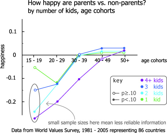
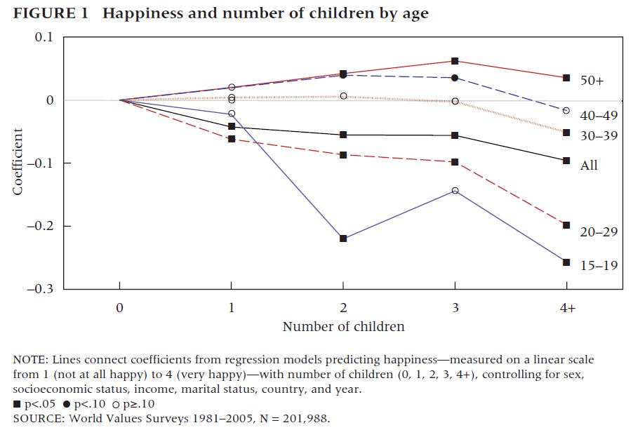
Marital status

Marital status by generation measured when young | Pew Research
Marital status by generation measured in 2009 (snapshot) | Pew Research

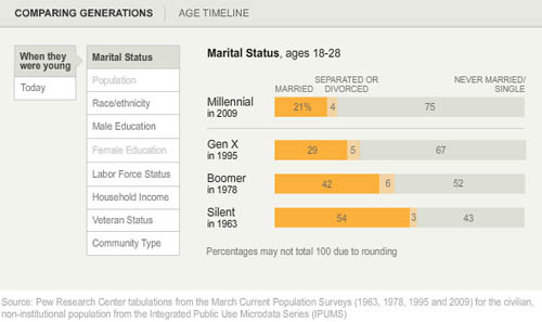
For instance, marital trends have been hard to talk about because the age at first marriage moves up over time, so it’s hard to figure out at what age we can expect that people will have gotten married if they are ever going to do so (I tried looking at marriage here).

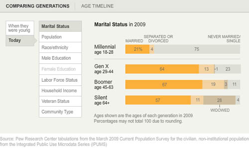
What I like about the Pew Research graphics is that they show us not only what the generations looked like when they were between 18 and 29 years old (above) but also what they look like now (below). Not only does it become obvious how many millennials are choosing to remain unmarried (either until they are quite a bit older or forever – hard to say because the oldest millennials are still in their 30s), but it also becomes clear that in addition to divorce, widowhood is a major contributor to the end of marriage. Keep that in mind: somewhere around half of all marriages end in divorce so that means the other half ends in death. I would guess that a vanishingly small number of couples die simultaneously which means there are quite a few single older folks who did not choose to be single (of course, even if they didn’t choose to outlive their spouses, they may prefer widowhood to other alternatives, especially if their spouse had a long illness).

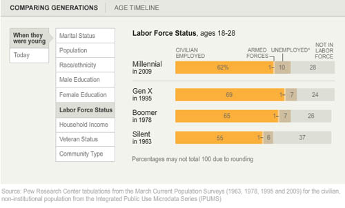
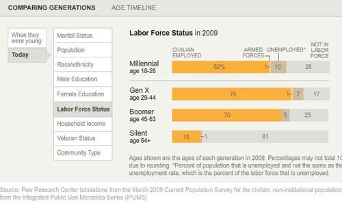
Labor force participation

Here’s another set of “when they were young” vs. “where they are now” comparisons, this time on labor force participation. It appears that the recession has walloped the youngest, least experienced workers the hardest. They have the highest unemployment rate AND the highest rate of educational attainment (and school loan debt), which leaves them much worse off as they start out than their parents were in the Boomer Generation. Even if their parents were in Generation X, they were still better off than today’s 20-something Millennials.

American labor force participation by generation (2009) | Pew Research
American Labor Force Participation by Generation (measured in 2009) | Pew Research

What needs work – Are generations meaningful?

My first minor complaint is that the graphic does not make clear *exactly* what “when they were young” means. If we look at the first graphic in the series, the timeline, it appears that “when they were young” was measured when each generation was between 18 and 29 years old. I hope that is the case. I might have had an asterisk somewhere explaining that “when they were young = when they were 18-29 years old”.

The concept of generations, in my opinion, is a head-scratcher. The idea that I had to come update this blog because the definition Pew was using to define Millennials and GenXers changed (without explanation that I could find) adds to my initial skepticism about the analytical purchase of generational categories. What is the analytical purchase of looking at generations – strictly birth-year delimited groups that supposedly share a greater internal coherence than other affinal or ascribed statuses we might imagine? If we believe that social, technological, and most all kinds of change happen over time, of course there are going to be measurable differences between one generation and the next. I imagine, though I have never seen the comparison, that if social scientists split people into 10- or 20-year pools based on their birth years they would end up with the same sorts of results. So why not think of generations as even units? And is it clear that the meaningful changes are happening in 20-year cycles? Or would 10-year age cohorts also work?

The real trickiness comes in when we think about individuals. Say someone is like myself, born in a year on the border between one generation and the next. Am I going to be just as much like a person born firmly in the middle of my cohort as a person on the far end of it? Or will people like me have about as much in common with the people about 8 years above and below us, but less in common with the people 15 years older than us who are considered to be in the same generation, and thus to have many similar tendencies/life chances/characteristics?

A better way to measure the cohort effect would seem to be to consider each individual’s age distance from each other individual in the sample – the closer we are in age, the more similar we could be expected to be with respect to things like labor force participation and educational attainment. Large structural realities like recessions are going to hit us all when we have roughly similar amounts of work force experience, impacting us similarly (though someone 10 years older and still officially in the same generation will probably fare much better). Since it is computationally possible to run models that can take the actual age distances of individuals in the same into account, I don’t understand the analytical purchase of the concept of generations.

The take-away: great graphics, bad premise.

References

Taylor, Paul and Keeter, Scott, eds. (24 February 2011) The Millenials. Confident. Connected. Open to Change. [Full Report] [See also: Executive Summary and Interactive Infographic] Washington, DC: Pew Research Center.

Food Price Mashup | Mark Bittman

What works

After looking at this graphic, I imagine most viewers come away thinking that fast food is more expensive than cooking at home, which was the intention of the accompanying opinion piece by Mark Bittman. The graphic succeeds in conveying visually just exactly the point that the article made using words.

The photographs are vibrant and catchy, bordering on food porn.

The sidebars feature the calorie counts for these meals in addition to the large price tags. The nutritional information graphs are useful for Bittman’s response to existing critics of the ‘cooking at home is better’ movement who have tried to argue that though fast food may be more expensive on a per meal basis, it is actually cheaper on a per calorie basis because fast food is so calorie dense (if a bit too heavily reliant on nutritionally vacuous fats and sugars). Bittman uses the nutritional information graphs to refute this claim and I applaud the graphic designer for including the rebuff of the critics in the graphic. It would have been easy enough to simply run the photos of the meals with their price tags.

What needs work

The photos take up too much space. This almost looks like an advertisement for McDonald’s, chicken, and beans.

The nutritional information bar graphs are potentially confusing. They do not measure absolutes so much as they show how each of the home-cooked meals stack up against McDonald’s. Since people are not used to thinking of their meals in comparison to what they would have eaten had they eaten at McDonald’s, I’m not sure the comparative nutritional graphs work as well as one graph that used absolute data and had all three meals on it. I am almost positive the graphic designer probably tried making just exactly that graph – if they are out there reading this I invite them to send me what that looked like to prove that my hunch to use a unified graph on this one would have been ugly, confusing, or just plain wrong.

References

Bittman, Mark. (24 September 2011) Is Junk Food Really Cheaper? New York Times, Sunday Review. Op-ed column.

Bittman, Mark. (20 September 2011) Cooking Solves Everything: How Time in the Kitchen Can Save Your Health, Your Budget, and Even the Planet [e-book] published by Byliner.

New Drug Wave Takes Toll | Star Tribune "A Lethal Dose" series

This graphic was subset from a larger graphic. I trimmed off the third drug comparison because it was problematic for reasons I explain below.

New Drug Wave Takes Toll | Star Tribune "A Lethal Dose" series

What works

Tracking illegal behaviors can be extremely difficult because the people participating do not want to be arrested or fined. How then, do health investigators find out what risky behaviors people are doing in their leisure time? In this case, the investigative team on the Lethal Dose series at the Minneapolis – St. Paul Star Tribune newspaper used calls to the poison control center as a proxy for tracking the rise of newly available synthetic drugs. As journalists rather than, say, doctors, they do not have access to patient data. Using poison control center calls is not a perfect indicator of the spread of the new synthetic drugs, but they have followed up these charts with an entire series in which they interview parents and friends of victims as well as a retailer more than willing to defend his right to sell.

What works for me about this graphic is that the investigators found a fairly unbiased source of information about this drug use, something that helps tie the other articles in the series together. Interviewing stubborn retailers and grieving friends and family is part of what journalists do, but those interviews are so emotionally and politically charged that it I appreciate the presence of trend information.

Because these drugs are new, it was necessary to spell out active ingredients because the average person will not know. I appreciate that they included that in the graphic rather than in a footnote.

What needs work

The shading behind the bar graphs is frivolous. It adds no information and is not necessary to guide the eye. It could be dropped and nothing would be lost.

Trend data is better as a line graph than a bar graph because it is easier for the eye to follow a line and to compare one line to another line than to follow a series of steps and compare one series of steps to another.

This blog post focuses on two drugs that use the same axis. I would have kept the same axis for the third drug even though it’s use numbers are lower. Note that all of the drugs started with low numbers and rapidly climbed – perhaps the third drug family “synthetic chemicals” is simply lagging behind by a year or so. It is hard to make that comparison when the axis is so dramatically different from the other two. There is a danger in lying with graphics here – making the third graph seem comparable to the first two implies that the third drug poses an equal threat. The numbers do not support that assumption.

References

Star Tribune staff writers. (2011) A Lethal Dose: The war on synthetic drugs Investigative reporting series.

Star Tribune. (2011) “New Drug Wave Takes Toll” [Information Graphic] American Association of Poison Control Centers, DEA.

Trends in taking pictures of food | blog360i

What works

I appreciate the attempt being made here to break food photography down into a set of categories, separating the cataloguing from the art and the gross/unusual from the special occasions.

It’s nice to see that people are about as likely to be excited about their vegetables as they are to be excited about their desserts/sweets. Perhaps this tells us something about the class position behind the sustainable foods movement? (People with more money are more likely to have fancy phones and phone plans equipped for sending pictures of food around to friends, family, and blog readers. Folks who have more education and are more well-to-do are also probably the most likely to be participating in sustainable/local food projects that spotlight locally grown foods while they are still recognizable in their whole forms such as vegetables before they are incorporated into a more complicated dish.)

The icons are nicely drawn.

What needs work

The colors in the main donut are too similar, especially as they approach red, to be easily distinguished. Further, the areas of the main donut graphic (and the food-type smaller graphics) would have been easier for the human eye to ‘weigh’ if they had been presented unfurled as bar graphs rather than wrapped around each as hoops/donuts.

Wordles do not fall into the realm of useful information graphics. If there is something to be said about the use of particular words – in this case, if there is some importance tied to the intensity of the use of “breakfast”, “lunch”, and especially “dinner” – simply making those words larger relative to other words does not help readers understand any larger meaning to the pattern. In my opinion, if there is something important about word usage, the best way to explain the meaning behind that word usage would be to use…words. I would be interested in reading some paragraphs about why this pattern of generic food words “breakfast”, “lunch”, “dinner”, and “food” is meaningful. The same basic critique applies to most wordles.

The images of the phone, the polaroids, and the door opening at the bottom of the graphic take up tons of space and communicate almost nothing. Personally, I am also not convinced by the argument that since people do not mention brands in their food photography that there is a “huge opportunity for marketers” in the day-to-day practice of food photography.

Overall, there is a glaring lack of context for this information. Even as descriptive information, it is hard to make sense of food photography as a practice without knowing more about the people who are actively doing it. Is it older or younger people? What’s the gender/race breakdown? Is there a core of photographers who are snapping tons of pictures while the rest of the population barely takes any? Many questions remain.

Reference

Wasserman, Todd. (9 May 2011) “What’s behind the food photography trend?” on mashable.com.

360i (2011) “Online food and photo sharing trends” available at scribd.

Philosophy is concerned with questions of perception. Does what I have learned to call ‘red’ elicit the same sensory experience for you? Or are we seeing two different things that become equivocal only through language?

I cannot answer that question.

But I was thinking about it recently because I spend a lot of time thinking about how physical things cross boundaries into digital space. What gets translated well? What is lost? And are there properties of physical objects that are actually richer in digital space than they were when they were physically tangible?

The Shape of a Song
The Shape of a Song

Seeing sound

Coming up with ways to visualize sound is not new. Musical scores ‘show’ players what they are supposed to do in relation to all of the other players. But any good player knows that the score is no substitute for figuring things out together – there is always more to be worked out than the score would seem to allow.

The project “Shape of a Song” by artist Martin Wattenberg and crew takes MIDI files and uses them to map out repetitive elements in songs in order to ‘see’ the patterns in the song.

The shape of "Mary Had a Little Lamb"

I found this to be quite enlightening, at least with respect to repetitive musical elements. It doesn’t do much for pitch, tempo, or anything else critical to song-making. The point is not to detail what is missing here, the point is that seeing the song diagrams helped me to think differently about the experience of listening to songs.

The shape of "Clementine"

This brought me back to the original quandary about whether humans perceive sensory input equally or differently. It seems to me that trying to depict sound as visual or the emotional register of an afternoon as sound requires border crossings, translation processes, that help pin down the original perceptual experience in such a way that it becomes more possible to assess whether the original perception is a shared experience.

The medium for this exchange seems to be a combination of emotion and hard-wired neurology which are not mutually exclusive categories. This isn’t a blog post about those questions. It is a blog for exploring the way that translating a perceptual experience – like hearing a song – into a visual infographic can change our understanding of the element (i.e. the song) in its original format.

First, just translating something into a visual medium might alter the emotional register. Colors are thought to have emotional registers. I’m not going to get into color theory in any kind of depth, but there have been a number of studies, some from evolutionary biology, that have shown red and orange to be routinely associated with danger. Thus, using them in graphics can evoke heightened awareness much like a little burst of adrenaline in a fight-or-flight situation would. Blue is supposed to be more calming; that’s probably why it is the go-to color for corporate America. All of the marketing people will have had color theory 101 beaten into them.

Secondly, translating a perceptual experience into something quantifiable offers are fairly rigid and particular framework for taking measurements and making assessments. I have a feeling that the quantitative turn itself has just as much impact on the interpreted meaning of the piece as the translation into a new perceptual format.

The shape of "The Goldberg Variations"

For ethnographers

Why are these questions about translation coming up? Because ethnographers – those whose craft is translating observations into written words – are constantly occupying themselves with the task of translating experiences and thoughts (often rather layered thoughts) into a static more-or-less linear narrative. Sometimes looking at how translation happens in another context – like from sound to image – can help isolate the process of translation so that the work of that mechanism becomes more obvious.

References

Wattenberg, Martin. (2010) “The Shape of a Song” at turbulence.org

Anatomy of a Cupcake | Allen Hemberger

What works

Not all information graphics arise from the same design process. In this case, the graphic creator went so far as to make a video of the creation process so, if you are so inclined, you can click through to Allen Hemberger’s “Things” blog to see how the Anatomy of a Cupcake went from sketch to photography and then to poster-sized graphic. If you love it maximally, you can even buy a print. [Note: If you like Hemberger’s work he has a food blog “The Alinea Project” and a photography blog.]

I chose this image for three reasons: first, I love that Hemberger took the time to make a video showing the process of going from idea to a tightly composed stylized photograph. Second, I am always happy to find people who construct information graphics differently. This one is a hybrid between photography and baking. What makes it work is the proper execution of both the baking and the photography as well as the care that was given to the original sketches that determined the storyboard for the idea. If the flow chart failed, he could have had the same cupcake components and the same photographic skills, but ended up with something that was merely ‘cute’ rather than something that is simultaneously aesthetically pleasing and clever.

The third reason I chose this image is even more personal than the first two. My summer research project, funded in part by Microsoft Research in Cambridge, MA, uses food blogs and food bloggers as a lens for focusing on the tensions between material and immaterial creative skills. I’m interested in figuring out how people move between the material world in which all of their senses can engage with a process and the not-quite-as-material world of the web in which the sensory world is reduced to the visual (though in some cases there is an audio component). The rest of the sensory experience of the material world has to be represented by text, photography, and graphic design. Why are there so many food blogs when food is something that has long been understood as a part of the material world that has to be tasted and smelled in order to be experienced properly? Why do people choose to blog about food and what keeps them going? Making and serving food are also ritualized practices for building connections between people – it is one of the primary physical elements through which culture is expressed. How does the collective experience of food work online?

The project has three components:

1. A web crawler is out poking around the English-speaking portion of the internet, creating a network of all of the food blogs that are linked in some way to an initial list of 50 top food blogs. So far, we have about 22,000 blogs in the English-speaking food blog network. Visualizations coming in another 6 weeks or so. The point of the web crawler is to see how many food blogs there are, how they connect to one another, and whether or not there are discernible lobes of the food blogosphere (say, for instance, a vegan lobe or a molecular gastronomy lobe). Because the food blog network is a grassroots sort of place – very few people are getting paid or prodded to start blogs and they are then free to link to whomever they want – there are some interesting social network questions we can answer about self-selecting networks. For instance, how many outlinks do food bloggers use? Is there geographical clustering or is the network oblivious to geography? Are bloggers who are more heavily linked to (or from) more likely to keep at it?

2. Once the crawler begins to reach a plateau in terms of adding new links, we will stop it, clean up the returns a bit, and then take a random sample of blogs who will receive an invitation to participate in a web-based survey. The survey does three things: it gathers blogger demographics (gender, race, age, kids or no kids, location, education, income), demographics of the blog (proportion dedicated to restaurant reviews vs. recipes, frequency of posts, perceived and measured audience, site traffic, comment traffic, presence on twitter and facebook, amount spent and earned), and the survey finishes with a few questions about motivations and perceptions of one’s blog.

3. To help construct a good survey instrument and to deepen the context within which the analysis of the survey results will take place, I am also interviewing 20-25 food bloggers. So far, the interviews have been fantastic. They are much better at getting at the nuances of practice – especially the crafting practices that are part of cooking/baking and blogging (photography, writing, graphic design, and online social networking…this last one may not be a craft practice).

All of this has been taking up a significant portion of my time and keeping me away from the blog. However, as the data comes in, I will have an opportunity to make graphics from scratch, rather than critiquing other people’s work all the time. I start to feel a bit like Oscar the Grouch when I’m in the midst of a string of critiques, especially since I know my own work is far from perfect.

If this blog uses the first person more than normal, it is because I have been reading so many food blogs where writing in first person is the norm. This just goes to show: if you want to be a good writer, be a good reader. The linguistic and grammatical styles we read eventually start to influence the way we speak and write.

References

Hemberger, Allen. “Anatomy of a Cupcake”.

Delta-Northwest Merger Deadlines by Post-It

What works

As an image, this picture does an excellent job of supporting the argument made in the accompanying article, which is basically that merging two large companies, each with their own deeply embedded systems for handling passengers, planes, workers, and baggage as well as their own attitudes about how things should be done is a task nobody can understand until they attempt it. And then it becomes tedious almost immediately. The New York Times often saves clinchers for the end of the article and this one was a good one. Peter Wilander, an executive at Delta responsible for in-flight services (talk to this guy if you have a problem with the peanuts), cannot hide his frustration,

“The amount of work is boring beyond belief,” Mr. Wilander said. “It is also critical to the airline.”

What needs work

Is there anyone else out there who feels that if the PhD in applied mathematics is resorting to a merger by post-it, that there are real shortcomings in the system’s management abilities at Delta? Theresa Wise is Delta’s Chief Information Officer and the creator of this lovely Post-It art. While the post-its are both aesthetically pleasing and instantly graspable, I could not square the idea that a bunch of post-its stuck to a wall would really be the right answer to a problem like this:

A major switch happened when the new airline canceled all Northwest’s bookings and transferred them to newly created Delta flights in January 2010. It required computer engineers to perform 8,856 separate steps stretched out over several days.

Here’s hoping that my experience with Delta later today does not involve making seat assignments with Post-Its. For all of my snarkiness, I generally find Delta to be a good airline, better than the old Northwest.

References

Mouawad, Jad. (19 May 2011) Delta-Northwest Merger’s Long and Complex Path in The New York Times, Business Day Section. [Graphic How to Merge Two Airlines]

How happy are parents vs. non-parents? | Graph
How happy are parents vs. non-parents? | Graphic by Norén based on Margolis and Myrskyla

Kids and happiness

Thanks to my twitter feed I landed on Philip Cohen’s blog post “Children beget happiness, eventually” on his blog Family Inequality. In the post, Cohen discusses A Global Perspective on Happiness and Fertility which appeared in Population and Development Review last March.

Margolis and Myrskyla used the World Values Survey from 1981 – 2005 for a total of 201,988 responses across 86 countries to perform their inquiry into the relationship between having kids and being happy. They measured happiness by asking people “taking all things together, would you say you are very happy, quite happy, somewhat happy, or not at all happy?”. They controlled for all sorts of things that probably matter like socioeconomic status, country level effects, and state welfare regimes. This is global evidence, folks, not US-only.

Cohen included the graph below and discussed the author’s findings which, in summary, are as follows:

1. Having kids does not lead to happiness when parents are actively involved in raising said children.
2. Older parents consistently report being happier than their childless counterparts. [My editorial comment: It is reasonable to believe that, for the most part, the children are no longer living with their parents by the time their parents start to report increases in happiness. At the very least, the kids are at least spending more time out of the home by the time mom and dad are between ages 40 and 49. The majority of kids are almost surely out of the house by the time their parents are 50+ which is the ‘happiest’ time to be a parent. Perhaps it’s because parents are proud of their kids’ accomplishments, perhaps it’s because the parents are no longer anxiously worrying about their kids well-being on a day-to-day basis. Who can say.]
3. Results in the 15 – 19 age cohort have fewer data points and are thus somewhat less representative. It’s hard to have three or four kids while in that age cohort.

Happiness and number of children by age of parent | Margolis and Myrskyla

An experiment

I used the exact same evidence to create the graph at the top of the blog because I wasn’t satisfied that the results were being clearly communicated by the graph above. Instead of plotting the happiness of age cohorts, I flipped it around and looked at happiness by number of children. Since I used the exact same information – pulling it directly from the graph because I couldn’t find a corresponding table in the paper – I do not have distinctly different findings to report. Duh. However, this is an excellent example of why visualizations are meaningful. It’s the same information, plotted in two different ways.

In my version, it is clearer to see that having 1 – 3 children represents extremely similar patterns of happiness across the life course. I discount the results at the very low age range because we know that the data at that end is less-than-representative. If we just look from the 20-29 cohort through to the 50+ cohort, we see that having more kids eventually represents more happiness for parents but that they are about equally unhappy during the most active years of child-rearing.

Having four or more kids breaks the pattern. This is evident in both graphic representations. In my opinion, it is more evident in the first version of the graph than the second version, as they appear in this post. I used a similar sensibility for the colors of 1, 2, and 3 children trends and a different kind of color for the 4+ kids scenario.

The graphs do not explain why having four (or more) kids would be so different than having, say, three kids. More study is needed.

My #1 take-away: do not have four or more children if you value your happiness.
My #2 take-away: Think twice about having any children at all if you would prefer to be happy for the twenty or so years it’s going to take those kids to move out.
My #3 take-away: Thanks, mom and dad. I hope you’re happy now.

References

Cohen, Philip. (14 May 2011) Children beget happiness, eventually [blog post] on Family Inequality.

Conley, Dalton. (2005) The Pecking Order: A Bold New Look at How Family and Society Determine Who We Are, New York: Vintage.

Margolis, Rachel and Mikko Myrskyla. (9 March 2011) A Global Perspective on Happiness and Fertility in Population and Development Review, Vol.37(1): 29-56.

What works

It’s a fun Friday post. Pull the slider to the right and watch the center of the US population move to the left (west) and south. What I like best about this is the interactivity. If it were just a static connect-the-dots it wouldn’t stay in your mind the way it does when you are the one doing the pulling of the slider. Getting those muscles involved, however minor their involvement might be, works more of your brain than if only your eyes were doing the work. My second favorite thing is more brain than brawn – the Census people found a way to remind us that in the beginning of our nation, we had fewer states. We added them as we went – almost always adding states to the west – so that can help explain why the center of the population originally started sliding leftwards. It has continued to slide leftwards (and towards the south) because those newer states have some lovely living conditions to offer. Not everyone loves the snow and ice of New England winters or the hurricanes of the southeastern seaboard.

What needs work

The center of population is a composite ‘score’ which tells us virtually nothing about why people are moving or where they are moving to…clearly, Missouri is not now a hotspot for internal migration. But if you were a school kid trying to grok the concept of the center of population, you might easily conclude that Missouri is a populous state.

I might have added some indicator of population sizes across US regions (state by state would be too confusing, but lumping by region would be fine).

References

2010 US Census. Center of Population

Drug Cartel Areas in Mexico | Christian Science Monitor

Drug cartels cause social ills

Unless you’ve had your head in a bucket since 2007, you are at least vaguely aware that Mexican drug cartels trafficking their goods into the US have caused significant social illness in Mexico, especially in areas close to the US border. Social illness here can be measured in cartel-driven murders, but that captures only the most gruesome, sensational branches of the drug virus. Besides the deaths are fear, anxiety, mistrustfulness as well as poverty, corruption, and vast inequality.

Is mapping the right way to understand Mexico’s drug trafficking problem?

The graphics here try to pack all of the complexity and destruction of those social ills into maps. Maps are rational. They allow us to feel we have a handle on the components that make up a problem. In this case, I am sure they are not explaining the whole story. I’m also not sure they are trying to explain the whole story.

What I like about the first map is that the map makers lay out the obvious: which cartels are where. Then they go one step further and highlight the contested territory. In case the colors aren’t coming through clearly, the white areas are the disputed areas. There are a lot of white areas.

And yet…

One would expect most of the violence in a situation like this to be in the disputed areas. But that isn’t the case. Most of the violence is near the US border. The border is another kind of contested territory, one that is much more important than white areas as far as violence prevention is concerned. In fact, those areas aren’t governed by one cartel or another because those areas are not critically important to drug trafficking. None of the cartels much care.

So let’s take a look at another map because I’m thinking the first one implies that we should find violence in the middle of the country.

Drugs and deaths in Mexico

Drug-related crimes south of the US border | The National Post

This graphic shows not only traffic patterns – where do the drugs go? – but also maps of where the deaths have been. It quickly becomes clear that the drug-related deaths are up near the US border, not in the ‘disputed areas’ highlighted in the previous map. In this map, (thanks unnamed National Post graphic designer) that undisputed area is left unclaimed and unlabeled. That’s a more accurate way to understand those regions and the inset series of maps below the main map do a good job of visually locating cartel-related violence.

The other thing I love about this map is that it specifies *which* drugs are being trafficked. Call me crazy, but I have found it odd that there is a great deal of talk about ‘drugs’ in Mexico as if there is no good reason to talk about which drugs are being moved where. Why is it useful to know which drugs are going where? First, it’s nice to know which drugs because different drugs have different price points per volume and weight. Economics matter. If one drug has a higher profit margin than another because it retails for more per ounce but doesn’t cost much more to produce/transport, one could assume that it will become more popular. Then again, demand matters, too. Even if pot is easy to produce, doesn’t mean you can convince cocaine users to try weed. They probably already tried it and moved on.

Another reason it matters which drugs we’re talking about is that detection and apprehension vary from drug to drug. An easy example: a pot sniffing dog probably won’t lead authorities to a stash of ephedra. What’s more, being able to tell where things are coming from and going to means that it is easier for authorities to target weak points in the routes. We know from news stories (I recommend looking at the LATimes, see references below), we know that drug runners pour much energy into protecting the drug routes right at the US border. But they aren’t digging tunnels under all of Mexico. There are points in the chain of drug traffic that are more vulnerable. Some of those points are deep within Mexico where it might be difficult to get well-trained, cooperative authorities with the necessary tools and manpower to perform raids.

My main gripe about these graphics is that they display this problem as a Mexican problem. This is not a Mexican problem. It is a Mexico-US problem. The demand in the US is pulling all those drugs up from south of the border. Looking at it this way helps introduce conversations about economic imbalances. I imagine that one of the reasons drugs come from Mexico is the same reason that many large companies choose not to have large labor forces in the US: labor is cheaper in Mexico. Various instantiations of poverty also tend to encourage corruption; encouraging local police to fight the cartels is hard when they are out-gunned and out-manned by cartels who can afford to pay off whoever they want including witnesses, other cops, border agents, and whoever else is likely to become cooperative after the application of a bit of grease.

Conclusion

The drug-related social illness in Mexico is an unfolding problem, one that has been discussed with more complexity elsewhere. I hope to illustrate that while the rationality of mapping patterns is appealing, it also tends to obscure complexity. It’s easier to misinform than inform with a map. They are deceivingly neat, these maps.

References

LATimes “Mexico Under Siege” special section, US News.

Llana, Sara Miller. (13 January 2011) “Mexico drug war death toll up 60 percent in 2010. Why?” in The Christian Science Monitor, World/Americas section.

National Post Staff. (31 December 2010) Graphic: Drug Terror Just South of the Mexico Border in The National Post. [Graphic].