Is higher education “dominated” by women?
There has been plenty of news coverage recently about the rise of women and the decline of men. While I have always disliked the irrational use of zero-sum language – why do we have to frame this discussion as men who are losing because women are making some gains? – I thought it would be worth taking a closer look at the gender ratio in higher education. I found many text-heavy stories (the Guardian, the New York Times, the Chronicle of Higher Ed, Huffington Post, The Atlantic, and many others) about female students earning more bachelors but surprisingly few graphics.
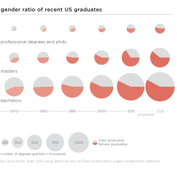
Graphics can do an excellent job of summarizing the gender gaps as they have developed over time within bachelors, masters, and professional+doctoral degrees. One graphic, quite thought provoking. All of the three degrees were more likely to be earned by men in 1970. Then between 1970 and 1980 women made rapid gains which continued through the 1980s. The gains for women slowed down once they hit the 50/50 mark for both bachelors and masters degrees and I predict they will also slow down for phd and professional degrees. Though it’s hard to tell by looking at the graphic, women are earning the largest proportion of masters degrees (projected to be 61% in 2020) which is slightly more than the 58% of bachelors degrees they are projected to earn in 2020.
Why aren’t women earning more if they are so well educated?
There is still a pay gap in earnings between men and women. Within the university, male faculty members tend to make slightly more than female faculty members. Overall, the most powerful explanation for pay gaps is not so much a failure to pay men and women equally for the same job. Rather, women are more likely to get degrees that lead to positions which are paid less than the positions men are more likely to get following their collegiate specializations. More women end up in education and nursing; more men end up in engineering and computer science. Education and nursing are not as likely to be lucrative as jobs that require engineering and computer science degrees.
To answer the question about women “dominating” higher education it is clear from the numbers that there are more female students at every level, though some majors still tilt towards men. What’s perhaps more important, women may or may not go on to match the earning potential of men, in part because they may not always choose the majors that lead to the most lucrative careers. Some argue that earning potential should drive choice-of-major but I’m still of the mind that going to school is not all about (or even primarily about) producing good workers. Going to school is about taking the time to explore different ways of thinking in depth and without undue concern for their ability to produce economic return. I’m glad that we have gotten to the point where there is enough gender parity to return to conversations about what school is for rather than who school is for…
Does the gender gap in graduation rates vary by race/ethnicity?

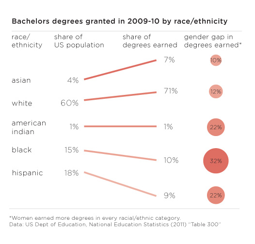
…but on the other hand, there are still critical gaps in access to higher education and degree completion that trend along racial/ethnic lines (class lines, too, but I didn’t get into that in this post). The graphic above displays the share of bachelors going to different racial/ethnic groups in 2009. In order to provide a relevant framework for comparison, I plotted the share of degrees earned next to the share of the total population of 18-24 year olds constituted by each racial group. There are some missing categories – mixed race people, for instance – but I couldn’t find graduation rates broken down any further than the five traditional racial/ethnic categories. Asians and Pacific Islanders only make up 4% of the population but they earn 7% of the bachelors in 2009 and their gender gap that year was only 10%. Whites were similarly over-represented in degree-earners and had a similar gender gap of 12%. But then things got interesting. The gender gaps for American Indians and Hispanics were much higher at 22% and the gender gap for blacks/African Americans was even higher still at 32%.
Especially when it comes to studying gender which is often constructed as a binary in which both groups make up about 50% of the whole, it is important to realize that analytical rigor might be increased by further segmenting these gender categories by some other key analytical variable. In this case, adding vectors for race/ethnicity provided a new perspective, one that might be a decent proxy for class.
References
Norén, Laura. (4 September 2012) Gender ratio of recent US graduates [infographic] New York.
Norén, Laura. (4 September 2012) US bachelors degrees by race/ethnicity [infographic] New York.
National Center for Education Statistics. (2011) Table 283: Degrees conferred by degree-granting institutions, by level of degree and sex of student: Selected years, 1869-70 through 2020-21 [Available in html and xls] US Department of Education.
National Center for Education Statistics. (2011) Table 300: Bachelor’s degrees conferred by degree-granting institutions, by race/ethnicity and sex of student: Selected years, 1976-77 through 2009-10 US Department of Education.
US Census Bureau. (2012) Table 10: Resident Population by Race, Hispanic Origin, and Age: 2000 and 2009 In The 2012 US Statistical Abstract. [Available in pdf and xls.

Comments 12
Race and gender in higher education – who gets degrees? » Graphic Sociology | Educational insights by Cindy | Scoop.it — September 4, 2012
[...] En hel del ljusa siffror.RT @mariawolters Interesting graphic summary of race and gender gap in US degrees http://t.co/pzUecOPP... [...]
Race and gender in higher education – who gets degrees … – Cracked Commissions — September 7, 2012
[...] Follow this link: Race and gender in higher education – who gets degrees … [...]
Online Articles That May Be of Interest to WIAReport Readers : Women In Academia Report — September 10, 2012
[...] us at [email protected] /* */ with suggestions of articles for inclusion in this feature.Race and Gender in Higher Education: Who Gets Degrees?University of Alabama Women Engineers Inspiring Next GenerationWomen’s Initiative Works to [...]
The Back-To-School Gender Gap | The Penn Ave Post — September 10, 2012
[...] Back-To-School Gender Gap Posted at 9:46 on September 10, 2012 by Andrew Sullivan Laura Norén charts it: All of the three [...]
Race and gender in higher education – who gets degrees? — September 10, 2012
[...] look at the gender ratio in higher education. I found many text-heavy stories (the Guardian, the New York Times, the Chronicle of Higher Ed, Huffington Post, The Atlantic, and many others) about female [...]
“The Nature Of Things” Is Constant Change | Poison Your Mind — September 10, 2012
[...] “The Nature Of Things” Is Constant Change Posted on September 10, 2012 by reflectionephemeral Via Andrew Sullivan, a chart on who earns degrees in this country: [...]
John — September 10, 2012
Love the data!
The pies are an interesting choice: they easily show the ratio of M to F, but, as usual, the size is hard to read from them. I think it would have been neater just to give the numbers in your second graphic (the table) instead of pies with the numbers inside them. (If they need the numbers, why use the pies?)
| — September 11, 2012
[...] the gender gap in higher education – while women are earning more degrees than men, they’ve still reached pay equality. I think [...]
The Changing Gender Demographics of Higher Education (infographic) | Everyday Theology — September 13, 2012
[...] a follow-up to yesterday’s post on the demise of guys, here’s an infographic on the changing demographics of higher education. As you can see, women now receive well over half of all degrees awarded, with a particularly large [...]
Weekend Reading « Backslash Scott Thoughts — September 16, 2012
[...] Race and Gender in Higher Education – Who Gets Degrees? [...]
Charlie — September 17, 2012
Unfortunately there is a disparity in wage upon graduation. But the important thing is that women and men alike continue to pursue higher education. Steven Henager College in Boise is an Institution with several top programs. Business Management, Computer Tech and Networking, Medical Specialties, and other high waging occupations are taught without discriminating against gender.
And the Diploma Goes To… » Citings and Sightings — September 19, 2012
[...] Norén recently posted an illustration of who is earning degrees in the U.S., highlighting the growing percentage of women earning bachelor’s, master’s, and professional/doctoral degrees since the [...]