

Why space exploration is like a small-group network graph
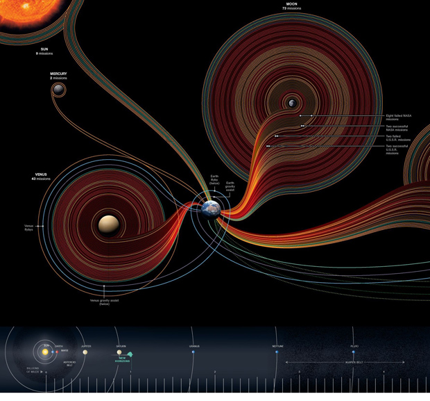
This blog is supposed to be about social data and while there are certainly social components to space exploration, that’s not the angle I am going to discuss here. [See Alex Madrigal’s piece in The Atlantic Moondoggle: The forgotten opposition to the space program” to get a taste of the sociopolitical forces behind the American space program.] Rather, what excited me about this graphic was the form and it’s potential application to relatively small network visualizations. Here’ what I’m thinking: say you have small work groups (like, for instance, in my dissertation) and you would like to visualize some kind of behavior or linkage pattern in that network. You might also like to have the power hierarchy in the visualization – and this would be the structural hierarchy that exists in relation to, but not as a cause of, the pattern of linkages and/or traffic in the network. You could use a nest-y network map like this:
OR…the formal standards in the space exploration graphic could be modified to suit network traffic, assuming a network with a small number of nodes. The planets could be people and they could be scaled and positioned to reflect their structural hierarchy. The edges – which in the space graphic are the trips – could be meetings or emails or any other kind of linkage that is important in the network. In the case of meetings, some meetings last longer or are otherwise more consequential so the edge could be thicker or more saturated with color.
Lots of network analysis looks at big networks where the nest-y network graph visualization technique is a good fit. But networks with fewer nodes and edges in which we know something about the social structure of the arrangement end up losing some of that context when they are represented in the nest-y network graphs. Those graphs are designed to help identify patterns where researchers either do not know much about the patterns in the first place or want to find an unbiased way to test their assumptions about the patterns they will find. But with the networks I am studying, I have discovered social patterns through ethnographic methods that I would like to have represented in my graphs. This space exploration graphic looks a lot like my back-of-napkin sketches for small groups. Of course, it is far more polished and more well-integrated with the ‘site plan’ running along the bottom of the graphic that helps establish scale, much like the way architect’s include a thumbnail site plan on their blue prints to establish a context for the siting of the building that’s represented in much greater detail on the plan.
Coming attractions
Over the next week, I hope to have a better sketch of a small-group network informed by ethnographic research up on Graphic Sociology.
References
Graphic Designers
Sean McNaughton, National Geographic Staff, www.nationalgeographic.com
Samuel Velasco, 5W Infographics, www.5wgraphics.com [this website was under renovation at the date of this blog post]
Madrigal, Alex. (Sept. 2012) Moondoggle: The forgotten opposition to the space program”. The Atlantic.
Hat-tip to Adam Crowe and <a href="http://www.flickr.com/photos/adamcrowe/sets/72157622579426670/"his flickr account.