
Preface to the book review series
There are two ideal types of infographics books. One ideal type is the how-to manual, a guide that explains which tools to use and what to do with them (for more on ideal types, see Max Weber). The other ideal type is the critical analysis of information graphics as a particular type of visual communications device that relies on a shared, though often tacit, set of encoding and decoding devices. The book reviews I proposed to write for Graphic Sociology include some of each kind of book, though they lean more towards the how-to manuals simply because more of that type have come out lately. As with all ideal types, none of the books will wholly how-to or wholly critical analysis.
I meant to review two of Edward Tufte’s books first so that we would start off with a good grounding in the analytical tools that would help us figure out which parts of the how-to manuals were likely to lead to graphics that do not commit various information visualization sins. However, I have spent the past six weeks at a field site (a graphic design studio nonetheless) and it rapidly became completely impractical to lug the two oversized, hard cover Tufte books around with me. I found Nathan Yau’s paperback “Visualize This” to be much more portable so it skipped to the head of the line and will be the first review in the series.
The Tufte review is next up.
Review of Visualize This by Nathan Yau
Yau, Nathan. (2011) Visualize This: The FlowingData guide to data, visualization, and statistics Indianapolis: Wiley.
Visualize This is a how-to data visualization manual written by statistician Nathan Yau who is also the author of the popular data visualization blog flowingdata.com. The book does not repeat the blog’s greatest hits or otherwise revisit much familiar territory. Rather, this was Yau’s first attempt to offer his readers (and others) a process for building a toolkit for visualizing data. The field of data visualization is not centralized in any kind of way that I have been able to discern and Yau’s book is a great way to build fundamental skills in visualization that use tools spanning a range of fields.
The three primary tools that Yau introduces in the book are two programming languages – R and python – and the Adobe Illustrator design software. Both R and Python are free and supported by a bevy of programmers in the open source world. R is a programming package developed for statistics. Python has a much broader appeal. Both of them can produce data visualizations. Adobe Illustrator is neither free nor open source but it is worth the investment if you are planning to do just about any kind of graphic design whatsoever, including data visualizations. Yau mentions free alternatives, and there are some, but none have all of the features Illustrator has.
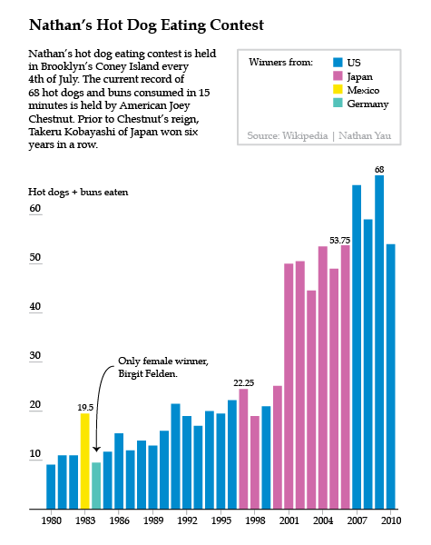
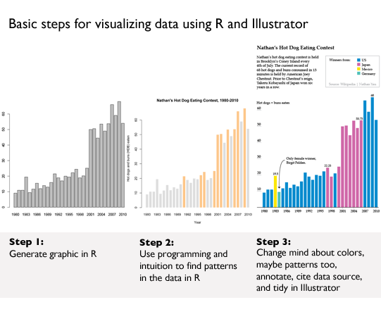
Much of the book starts readers off building the basic bones of a visualization in R or python, based on a comma-separated value data file that has already been compiled for us by Yau. He notes that getting the data structured properly often takes up more than half the time he spends on a graphic, but the book does not dwell much on the tedium of cleaning up messy data sources. Fine by me. One of the first examples in the book is a graphic built and explored in R, then tidied up and annotated in Illustrator using data from Nathan’s Hot Dog Eating contest.
This process is repeated throughout:
1. start visualizing data with programming;
2. try to find patterns with programming;
3. tidy up and annotate output from program in Illustrator.
The panel below shows you what R can do with just a few lines of code. Hopefully, it also becomes clear why it is necessary to take the output from R into Illustrator before making it public.
Great tips
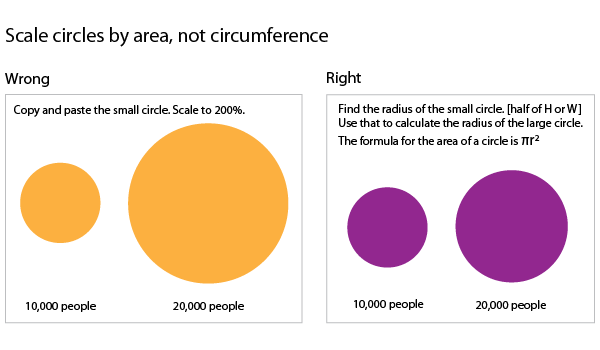
There are hints and tips sprinkled throughout the book covering everything from where to find the best datasets to how to convert them into something manageable to how to resize circles to get them to accurately represent scale changes. This last tip is one of my favorites. When we visualize data and use circles of varying sizes to represent the size of populations (or some other numerical value) what we are looking at is the area of the circle. When we want to represent a population that is twice as big as the size of some other population, we need to resize the circle so its area is twice as big, not its circumference.
More great tips:
1. First, love the data. Next, visualize the data.*
2. Always cite your data sources. Go ahead and give yourself some credit, too.
3. Label your axes and include a legend.
4. Annotate your graphics with a sentence or two to frame and/or bolster the narrative.
*Love the data means take an interest in the stories the data can tell, get comfortable with the relationships in the data, and clean up any goofs in the dataset.
Pastry graphics: Pie and donut charts
Yau’s advice about pie charts diverges from mine. I say: use them only when you have four or fewer wedges because human eyes really have trouble comparing the area of one wedge to another wedge, especially when they do not share a common axis. Yau acknowledges my stubborn avoidance of pie charts but advises a slightly different attitude:
Pie charts have developed a stigma for not being as accurate as bar charts or position-based visuals, so some think you should avoid them completely. It’s easier to judge length than it is to judge areas and angles. That doesn’t mean you have to completely avoid them though. You can use the pie chart without any problems just as long as you know its limitations. It’s simple. Keep your data organized, and don’t put too many wedges in one pie.
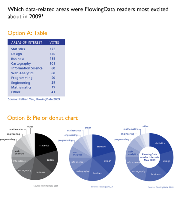
The Yau explains how to visualize the responses to a survey he distributed to his own readers at FlowingData to see what they’d say they were most interested in reading about. He showed the readers of the book a table with the blog readers’ responses which I’ve recreated below [Option A]. I think the data is easier to read in the table than in either the pie chart or the closely related donut chart [Option(s) B]. In life as in visualization, a steady stream of pies and donuts is fun but dumb. Use sparingly.
Interactive graphics
Learning about pie charts was great fun even though I don’t like pie charts because Yau taught us how to use protovis, a javascript library that yields interactive graphics. We built a pie chart just like the one(s) in Option B that popped up values on mouseover the wedges. Protovis was developed at Stanford and has now morphed into the d3.js library. The packages developed in Protovis are still stable and usable. I highly recommend this exercise for anyone who wants to make infographics for the web. It helps to have a basic understanding of html going in.
What needs work
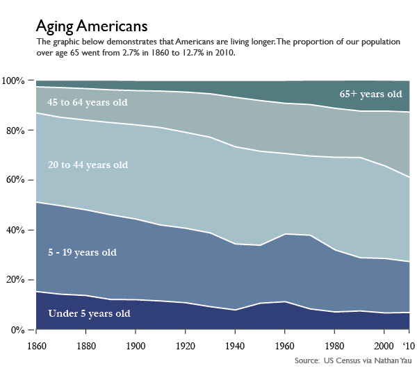
The overarching problem I had with Visualize This is that it spent relatively little time generating different types of graphics using the same data. We saw a little bit of that above when Yau used both a pie chart and a donut chart to visualize the same survey responses, but since donut charts are just variations on pie charts, it was not the best example in the book. The best example came when Yau visualized the age structure of the American population from 1860 – 2005 (I updated the end date to 2010 since I had access to 2010 census data).
First, Yau shows readers how to make this lovely stacked area graph in Illustrator. That’s right. No R. No Python. Just Illustrator.
Then Yau admits that the stacked area chart has some general limitations:
One of the drawbacks to using stacked area charts is that they become hard to read and practically useless when you have a lot of categories and data points. The chart type worked for age breakdowns because there were only five categories. Start adding more, and the layers start to look like thin strips. Likewise, if you have one category that has relatively small counts, it can easily get dwarfed by the more prominent categories.
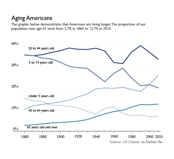
I tend to disagree that the stacked area chart ‘worked’ for displaying the age structure of the US population, but not because there were too many categories. I’ll get to why I don’t think the stacked area graph worked shortly, but first, let’s have a look at the same data represented in a line graph. This was Yau’s idea, and it was a good one. What we can see by looking at the data in a line graph rather than a stacked graph is the size ordering of these age slices. Yeah, I can kind of see that the 20-44 group was the biggest group in the stacked graph. But I had to think about it. In the line graph, I don’t wonder for a second which group was biggest. The 20-44 group is on top. The axes in line graphs just make more sense. I admit that the line graph is not an aesthetic marvel the way the area graph was. But, you know, you can figure out your own priorities. If you want pretty, go with the area graph and get smart about colors (with the wrong color scheme, any graphic can look awful. See also: what Excel generates automatically). If you want a graphic for thinking with, avoid stacked area graphs.
Coming back to what I think about visualizing the age structure of the American population. Call me old-fashioned, say that I adore my elders too much, I’ll just tell you we all stand on the backs of geniuses. I like the age pyramids for visualizing the age structure of a population. Here’s one I plucked from the Census website.
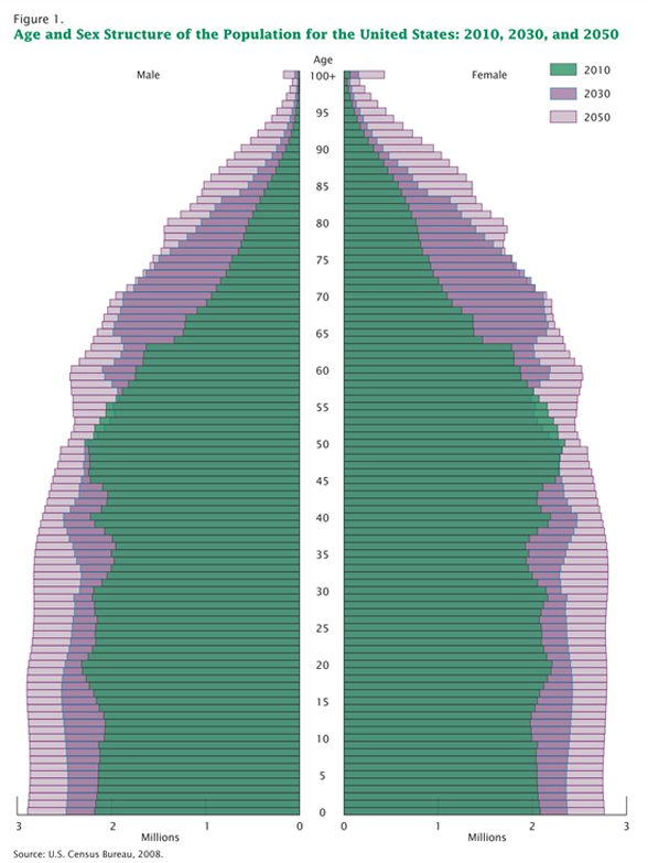
The pyramid has these advantages:
1. It shows gender differences. Males are on the left. Females are on the right.
2. This graphic does a better job of showing the structure of the population because the older people appear to balance on the younger people. This is useful because the older people actually do kind of balance on the younger people when it comes to things like Social Security. The structure of the population does not come through in the area graph or the line graph. Both of those show us that there are more old people now than there were before but displaying more is a less sophisticated visual message than showing us just how many older people and how much older and how these things have changed over time. See all those and’s in the previous sentence? Yeah. That’s how much better the pyramid is.
3. It is possible to see both the forest and the trees in this age pyramid. What do I mean? Well, the stacked area graph and the line graph had to lump rather large (and disproportionately sized) groups of ages together. In the age pyramid, the slices are even at every five years and if you happen to want to figure out just how the 20-24 year olds are changing over time, you can. But this granularity does not make it difficult to understand the overall structure of the pyramid.
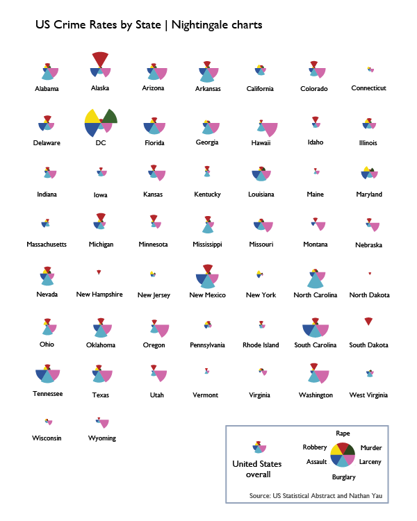
To summarize my larger disappointment, I wish that Yau had gone through a number of examples of displaying the same data with different graphics in order to teach readers how to choose the best graphic. To his credit, he did visualize crime data with a bunch of different graphics, but I didn’t like any of the graphic types. I’m including the one I liked most, but it’s mostly for historical reasons. This type of weird fanned out pie wedges is called a Nightingale chart and was developed in part by Florence Nightingale way back when information graphics didn’t exist. He visualized this same crime data with Chernoff faces and with star graphics, neither of which were interpretable, in my opinion.
Heatmaps
Unlike Chernoff faces, star charts, and Nightingale charts which I think are totally useless, heatmaps have promise as data visualizations. This is a good example of how I wished Yau would have started working hard to get the data to lash up better with the visualization. This is his final version of the heatmap of a whole bunch of different basketball game statistics with the players who were responsible for scoring, assisting, and rebounding (among many other things). I am a basketball fan. I went linsane last season. But I just do not get excited when I look at this heatmap because the visualization does not reveal any patterns. Ask yourself: would I rather have this information in a table? If the answer is yes, well, then you know there’s at least one other kind of representation besides this one that you would prefer if this is the data you are trying to display.
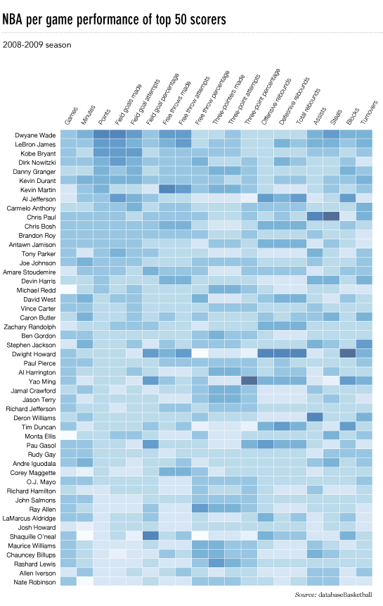
So what would I do? Well, I’d do a couple things. First, I would probably try restricting this heatmap to the top ten players or even to my favorite players. Throwing in 50 players and about 20 statistics per player without condensing anything means we are looking at 1000 data points. Ooof. So…if not cutting down the number of players, maybe put the scoring statistics in a different heatmap than all the other statistics (playtime, games played, rebounds, steals, blocks, turnovers, and so on). Maybe strip out the “attempts” and just leave the completed free throws, field goals, and three-pointers. I do not know if these things would have revealed patterns, I just know that the current graphic is still looking like a data soup to me.
Maps triumphant
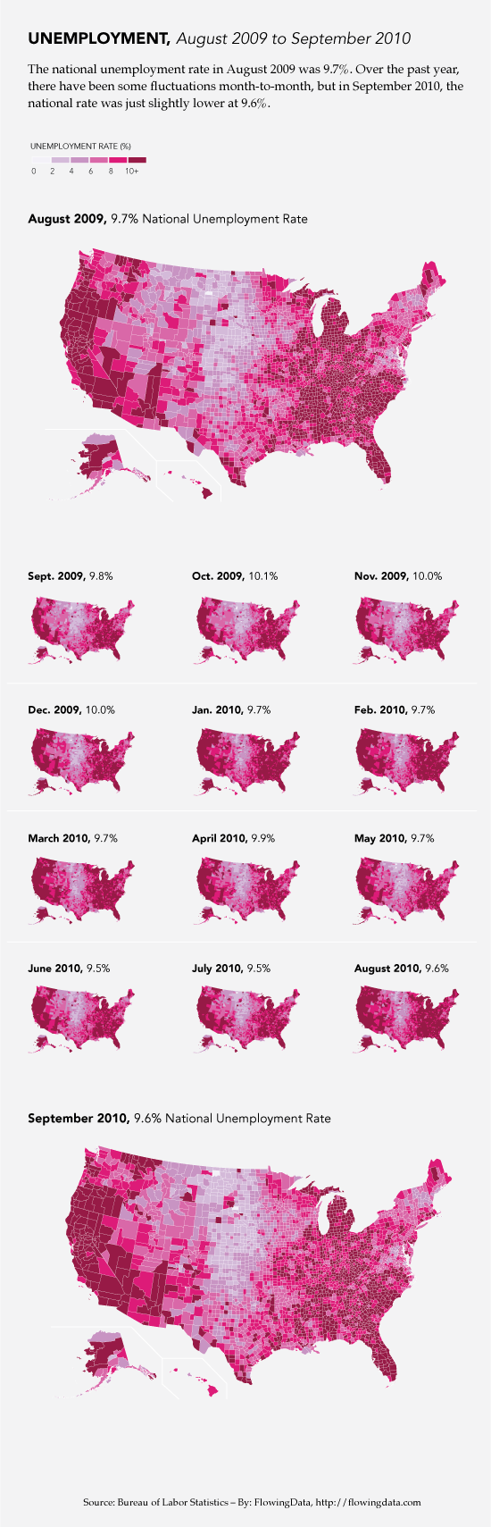
Overall, this was a great how-to for data visualization and I want to end on an appropriately high note. One of the biggest wins in the book was Chapter 8 in which Yau walks us through the most meticulous and involved demo in the book. The payoff is big. He shows us how to use google maps and FIPS codes to make choropleths (these are large maps in which colors mated with numerical values fill in small, politically bounded units, usually counties but sometimes census tracts). He does not use ArcGIS which is one of the reigning mapping tools on the market. But ArcGIS is expensive. And Yau shows us how to generate maps without spending a dime. You will have to spend some time. If you are a cartography geek or you follow the unemployment rate, you’ve probably already seen this graphic because it was widely circulated, for good reason.
Comments 1
Alec Campbell — November 17, 2012
Great Review. I particularly like your pointing out that in many instances tables are the preferred graphic.