To mark the end of Women’s History Month, we offer this compilation of our posts on women and history.
Sports:
- The Manly Origins of Cheerleading (1800s-2000s)
- The Origins of Boys and Girls Bikes (1890s)
- Women and Exclusion from Long Distance Running (1896-1984; pictured)
- Vintage Women’s Basketball Teams (1900s)
- Opportunity and Athletic Performance (1900s-2000s)
Health:
- Changing Biology: Age at First Menstruation (1840-2000)
- Prohibition and Medicinal Alcohol (1919-1933; pictured)
- Social Hygiene and the Gender of Health (1922)
- Hysteria, the Wandering Uterus, and the “Vaginal Massage” (1930s)
- VD and the Virgin/Whore Dichotomy in WWII Propaganda (1940s)
- Personifying Danger: Women as Vectors of STDS (1940s)
- The Pill and the Invention of the Monthly Cycle (1960s-2000s)
- Male and Female Victims of “Intimate” Homicide (1976-2004)
Fashion and Norms of Attractiveness: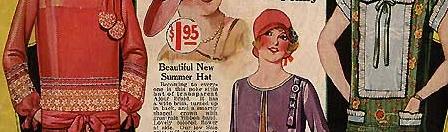
- From Manly to Sexy: The History of the High Heel (1600s, 2000s)
- Ankle Porn and Knee-Gasms: Making Sewing Sexy (1900s-1920s)
- A Historical Look at Bodies as Fashion (1900s-2000s)
- Women Wears Men’s Clothes to a Prize Fight; World Gasps (1910)
- Two Facts about Figure Skating Fashion (1920s-1930s, 1980s)
- The Feminine Ideal (1928; pictured)
- Plastic Surgery Ad (1936)
- Vintage Posters of African American Hair Products (1939)
- Putting Glamour in its Proper Wartime Place (1940s)
- “Are You Popular?”: An Educational Film (1947)
- 1950s Beauty Pageant Judging Guidelines (1959)
- Dressing Ourselves: Gendered vs. Unisex Pants (1960s-’70s)
- Regulating Black Women’s Hair (1969)
- Changing Fashion Standards: Sexy Shoes (1969)
- Gender Neutral Ruffles (1970s)
- Nipples and the Presentation of Femininity (1970s-2000s)
- Model on Cover of Elle has a Real Face (1986)
Work:
- A Historical Look at Changes in Work Type (1850-2000)
- Men Need Women’s Jobs to Avoid Being Bums (1934)
- Modern Appliance Girls (1936)
- World War II Era Chest Protector (1939)
- High-Tech Rosies in World War II (1940s; pictured)
- Myth Making and the “We Can Do It” Poster (1940s)
- The Changing Workplace: Caring for Female Workers (1940s)
- Women Soldiers During World War II (1940s)
- Guide to Hiring Women (1943)
- Vintage PSA for the Equal Pay Act… featuring BatGirl (1963)
- A List of Reasons Not to Hire Women (1963)
- Gender, the U.S. Workforce, and the Recession (1965-2005)
- Futurists Imagine the 21st Century (1967)
- “Don’t Call Me a Cowgirl!” (1969)
- Sexism in Aviation: Then and Now (1970s, 2000s)
- Job Segregation by Sex (1972-2008)
- Gender and Changes in the U.S. Occupational Profile (1972-2012)
- Kitchen and Maid Spanish (1976, 1978)
- Was “Cathy” a Feminist Heroine? (1976-2010)
- More Men and Fewer Women Earning Poverty Wages (1979, 2007)
- Women Cook, Men are Chefs (1980s)
Education:
- Women Now Graduating at Higher Rates than Men (1880s-1970s)
Marriage and Motherhood:
- Replacing Women: Slaves, Servants, and Technologies (1800s, 1940s)
- Miscegenation Ball Anti-Lincoln Cartoon (1864)
- The Two Paths: Good Mothers and Outcast Sluts (early 1900s; pictured)
- Why Did Married Mothers Go to Work? (1900-2002)
- Medicalizing Gendered Marriage (1939)
- Visions of the Future of Housework (1950s)
- Are More Women Marrying Younger Men? (1960-2007)
- Marriage Trends and Why I’m Not Married (1960-2010)
- Class Privilege and Parental Leave (1961-2008)
- “When You Marry”: A Textbook (1962)
- Of Housework and Husbands (1965-1995)
- Ritalin for Moms (1967)
- The Invention of the Playboy (1969)
- Women, Education, and Trends in Childlessness (1976-2008)
Suffrage:
- Vintage Anti-Suffragist Postcards (1900s)
- Facets of the Woman’s Suffrage Movement (1900s)
- How Suffragist Postcards Got Out the Vote (1910s)
- Delay Thanksgiving Dinners to See Suffragettes (1909)
- Against Giving Women the Right to Vote in Massachussetts (1915)
- Celebrating Women’s Suffrage (1919)
Marketing:
- Early Appropriation of the Women’s Movement in Advertising (1910)
- Anxiety about “Objectionable Hair”: Introducing Armpit Shaving (1915, 1934)
- Framing Tampon Use (1940s)
- Marketing Pre-Made, Non-Perishable Food (1940s; pictured)
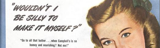
- “For Men Only”: Vintage Campbell’s Soup Ad (1940s)
- Ad Shows Husband as Primary Caretaker (1947)
- Jell-O to the Rescue (1950s)
- More Leisure through Technology (1950s, 1970s, 2000s)
- Honda Fits She’s and the Dodge LaFemme: History Repeating Itself (1950s, 2000s)
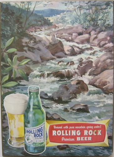
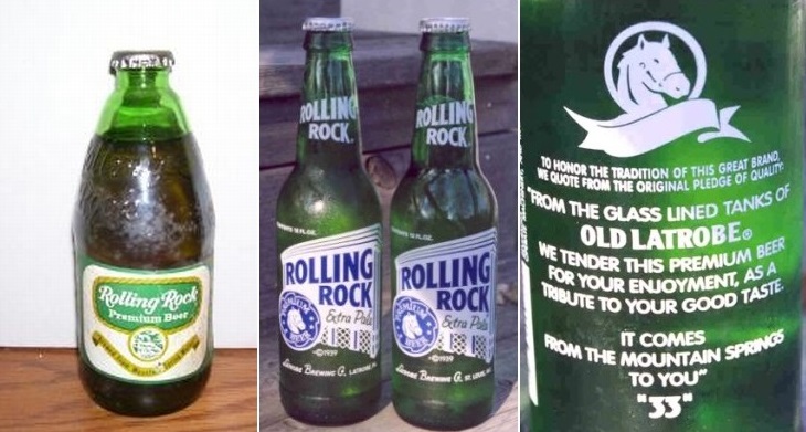
- “The Orchid of Beer”: Beer for Women (1953)
- Changing Midol Ads (1960s, 1990s, 2000s)
- “Treat Your Rifle Like a Lady” (1968)
- “You’ve Got Your Own Cigarette Now, Baby” (1969)
- Mocking Feminism in a Smirnoff Ad (1970s)
- Appropriation of the Women’s Movement (1971)
- Contrasting Stereotypes of Mexican Men and Women (1975)
- Virginia Slims Ads (1978)
- Awesome Vintage LEGO Ad (1981)
- More Gender-Neutral LEGO Ads (1982)
- Marketing the Tampon: “Will I Still Be a Virgin?” (1990s)
Children and Toys: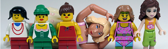
- Historical Perspective on the LEGO Gender Gap: Part I (1932-1988; pictured)
- Encouraging Girls to Identify with Barbie (1959)
- Bob Barker Harasses Little Girls on The Price is Right (1970s)
- “Particularly with the Boy”: Worries about Feminization of Boys (1974)
- Historical Perspective on the LEGO Gender Gap: Part II (1989-2003)
- Historical Perspective on the LEGO Gender Gap: Part III (2004-2011)
- Historical Perspective on the LEGO Gender Gap: Part IV (2012)
War and Military:
- War as Sexual Domination (1957)
- Recruiting Women Marines (1970s-2000s)
Activism:
- Wimbledon Cartoon Imagines Progress for Women (1927)
- Appropriating Social Movements in Playboy (1960s-1970s)
- Gender Politics in Life and Time (1971, 1977)
Color, Sound,and Language:
- Men in Pink: Two Velasquez Paintings (1650s)
- Gender and the Social Construction of Sound (1906-2006)
- Changes in Gendered Language Over Time (1930-2005)
- The History of Pink and Blue (1960s)
Just for Fun:
- The Story of the Shopping Cart (1937-2000s)
- Urinals for Women: An Alternative Reality (1953)
- Constructing a Shocking (Falsely) Sexist Past (1955, but not really)
- Disney Futurists Imagine 2010 (1958)
Lisa Wade, PhD is an Associate Professor at Tulane University. She is the author of American Hookup, a book about college sexual culture; a textbook about gender; and a forthcoming introductory text: Terrible Magnificent Sociology. You can follow her on Twitter and Instagram.