Uncategorized

Hans Rosling | MSNBC

What Works

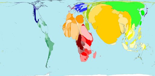
Hans Rosling argues that by raising the living standards of the globe’s poor people we can avert a population growth disaster. He uses statistics and on-stage demonstrations to do it. Worth watching. Over at TEDtalks. Happy to see a kindred spirit having his day with TED.

TED logo | TED
I approve of the rockstar version of Hans Rosling’s portrait so I cribbed it from MSNBC. Thanks graphic designer out there somewhere, working to make statisticians more visually stimulating.

References

Rosling, Hans. (July 2010) Global Population Growth TED talks.

Gap Minder is Hans Rosling’s website. It features many more animations than just the one about population growth as well as tools to build your own animations. The emphasis is on country-level data.

Axes of Peeing in Public
The social and biological axes of public peeing

What works

This was something I used to help me think through the two main axes that determine peeing behavior – biological and social control. Urination is a biological function that has been subjected to a great degree of social control. Unfortunately, urban design has not kept pace with the demand for clean, easily accessible public restrooms for humans. And there has been no attempt to create any kind of system to deal with canine urine. In most cities it is illegal for humans to pee in public but both legal and widely accepted for dogs to pee where ever they like (in New York, they cannot pee on the grass in parks).

What worked about this as a graphic is that it helped me sort out how I was thinking about the problem of access to the city when the bladder is a leash. I couldn’t quite sort out how to think about what it means that some public peeing is acceptable even though it is mostly completely unacceptable. One of the odd side effects of the introduction of the new TSA pat down procedures is that it revealed just how many people struggle with incontinence, either needing to urinate frequently or needing to wear diapers (or both). I was aware of those issues before the TSA started sticking their hands in private places, but I wasn’t sure how to simultaneously think about adult diapers, dogs peeing on the street, and taxi/truck drivers peeing in jugs while still in their cabs. Where social control is very strong – as it is in the case of urination – it can almost trump biological needs, especially if the biological needs offer a level of control. Clearly, not all peeing can be put under biological control, but a good deal of it can. I stuck vomiting on the map since that is harder to control than peeing and it was useful to include a biological drive that has not been so easy to tame with the civilizing process.

What needs work

The glaring problem here is the ‘who cares’ problem. Very few care about the axes of social and biological control, though there are a few other case types that could use these axes (burping/farting, posture, chewing, etc). But the re-use of this exact same set of axes is not the point. Nor do I particularly care if you are interested in public peeing.

I introduced this graphic because it was helpful to me in thinking through the analysis of a multi-faceted problem. All social science problems are multi-faceted. Setting up four quadrants as a field is superior to setting up four quadrants in a two by two table, though that is a variant of this approach. I find that approach is too reductive, forcing things to be lumped together that really are not all that similar. In this case, I was able to add more nuance by leaving the mid-section of the biological control vector unmarked while I singled out incontinence and retention (where retention is beyond routine continence).

This approach to thinking through forces you to come up with the two critical dimensions that organize both the empirical information you’ve gathered and the theoretical arc you would like to follow. If you are skilled, you could add a third dimension. A 2×2 table only gives you boxes, not spectrums. What’s more, the spectrum approach is more open, allowing the addition of further segmentation or layering which is not as easy to achieve in a 2×2 table.

LifeMap life timeline | Ritwik Dey

What works

This is a great timeline. If all CVs were displayed like this I think employers would have a much better idea who they’re hiring.

Here’s why I like it:

    LifeMap

  • shows simultaneity – layering colored strips
  • shows relative weights – some stripes are fatter than others
  • shows the split between two classes of life – academic and personal by simply sticking the axis between them and then emphasizing this split with a different color scheme for each class
  • mixes words seamlessly with the graphic elements – each of the activities on the map is listed only once, even if the band it occupies shifts noticeably. Re-listing each element would add clutter and the colors are easy for the eye to follow across the graph even where there are discontinuities.
  • displays location at the top without making location seem like the primary element. It’s hard to get the thing that appears at the top NOT to seem like the most important. Clearly, in the course of a life, moving from Mumbai to New York is a big deal, so this is a critical component, but it doesn’t dominate the graphic. We are able to see the elements that make the leap from one place to the next but we aren’t quite sure if it was the shift from one place to the next or from one level of schooling to the next…and maybe even Mr. Dey doesn’t know. How can anyone untangle the causality of an individual trajectory?

It’s clear to me that many of the design elements here will be useful for future portrayals of social science data. In this case, I’d say we are looking at an enhanced CV, brave enough to indicate the passing of a parent and even a mother’s new relationship (which preceded the passing of the father). Spare visual narrative, intriguing in what is left out, remarkably rich nevertheless.

What needs work

The font relative to the graphic is too small. I know that this was probably intended as a poster and displayed at such a scale that the font wasn’t a problem. I apologize that you have to click through to see all of the categories.

Another comment while we’re on the topic of fonts and words relative to graphics: Mr. Dey was able to describe all of his interests with one or two words. It looks great. He expanded his accomplishments a bit beyond the two word limit, but they are still quite brief. I like the idea of choosing the one, two or three most precise words and making sure the graphic itself can carry the rest of the message. It’s a good test to see if your design is helping – when it can speak almost on its own things are looking good.

The limited number of words makes the whole thing not only visually and verbally poetic but also increases its functional value. One of my functionality measuring sticks is the number of words a person would have to translate if they were trying to read this graphic in a foreign language. The fewer words, the easier it is for non-English speakers. The more specific the words are, the more likely they are to translate appropriately. Therefore, ‘swimming’ and ‘3D modeling’ probably translate without difficulty. I have no idea if there is any kind of meaningful translation of “scouts” or “scouting” in any language other than English, but that is not a problem any graphic designer is going to be able to solve.

I wonder, though, if no-more-than-two-words rule led to the choice of the word “derive”. I know what that means in the context of calculus. I have no idea what that means in the context of a LifeMap, but it remains salient for years so I wish I did know what it meant. Sometimes the word restriction rule leaves out the phrase that would best describe whatever it is you might be trying to describe. Or maybe Mr. Dey does a lot of theoretical derivations.

References

Dey, Ritwik. (2005) LifeMap Project for Information Design course with Dmitry Krasny at Parsons School of Design in New York City.

grain edit logo

What works

grain edit is a graphic design blog that will expand your mind’s collection of graphic design to remember. It is not restricted to information graphics – in fact, most of the work has nothing to do with information graphics – but it includes a wide variety of graphic design and illustration. I’m posting this reading suggestion on a Sunday because it is a bit off the core topic here which is supposed to be social science data presented via information graphics. Still, if you are at least mildly interested in graphic design, surely you will find something you like over at grain edit. Not only can you see what ‘the work’ looks like, you can also read interviews, and get photographic studio tours with some of the designers they feature. And if you are super keen on the whole concept, their blog roll will take you on a fantastic cyber-tour of thought provoking eye candy.

My favorite links:

References

grain edit blog

things magazine

Lumadessa

Clothing and Footwear, Global Spending 2007

Electronics, Global Spending 2007

Recreation, Global Spending 2007

What Works

I have been thinking about other ways to work with maps lately, and I stumbled upon this interactive consumption map created by the folks at the New York Times using numbers from Euromonitor International, 2007. This graph was certainly a product of a moment in time – I don’t see too many people making consumption graphs like this one these days. They might be making line graphs where the total amount of consumer spending or consumer confidence is of immense concern to finance people who are eager for the next growth period in the economy. (I’m not saying that only finance people are looking forward to economic growth, just suggesting that they are the people who spend a lot of time studying consumer behavior as they anticipate the growth period. The rest of us might be looking at our own retirement statements or home values or paychecks.)

This map approach to spending is great because the graphic designers – Hannah Fairfield, Elaine He and Kevin Quealy – realized that maps are just schematics. It isn’t necessary to stick with a country’s shape, but it is nice to keep them in about the same positions relative to one another. Freeing each country from the shape of its political boundaries allows each square country to change dimensions in direct relation to total consumer spending within a sector. The color tells us what this works out to in terms of per capita spending. If you clicked through to look at the actual interactive graphics you’ll find that if you mouse-over a country, you can see the dollar amount of the total spending for whatever sector you happen to be viewing.

The strength of this graphic is that it strips away unnecessary detail to focus your eye’s attention on the most salient information in an easy-to-digest kind of way. This is a huge improvement over the sort of thing that I see all too often (and have included a little global poverty example here). My eye is terrible at assessing relative areas when the shapes are so irregular like this. Much better to just keep the relative positions of the countries and give them square shapes that can be quickly, effortlessly scanned for the sake of comparison.

Human Poverty
Human Poverty

What needs work

I would have put the per capita spending in the roll-over as well. Right now it’s just the country’s total spending. I also would have thought about a way to represent all the countries that don’t even make this map. Something understated and subtle – a sprinkling of grey dots? But then those countries might look like dust…still thinking about that.

The other thing I might have liked would be to have either gone completely grey scale (preferred) or to have selected a single color for each sector with increasing saturation as spending increases. The second approach would have made more sense if the product was a series of print graphics, but the approach they actually took and the grayscale approach are better for this sort of interactive graphic in which the viewer sees only one at a time.

References

Hannah Fairfield, Elaine He and Kevin Quealy. (4 Sep 2008) “What your global neighbors are buying”. Business Section of the New York Times. Using Euromonitor International figures.

Fairfield, Hannah. (4 Sep 2008) Guccis or Gadgets? Business Section of the New York Times. [related article that ran with the graphic]

How Well Do We Take Care of America's Teeth?

How Are Our 17 Year Olds' Teeth Doing?

Dental Insurace or Health Insurance, Who Has What?

Who Has the Best Access to Dental Care?

Does More Education Mean Healthier Teeth?

Happy Halloween

This graphic is a bit too cartoon-ish for my tastes but it does a good job of illustrating a health care gap that, even during the health care debate, went over-looked. I figured Halloween – a holiday whose commercialization revolves around candy – might be a good time to post the dental health care graphics developed over at the GOOD magazine transparency blog.

In the spirit of full disclosure: I was a dental assistant for a summer. The numbers here are accurate and have very real consequences. I used to see kids who did not know (they had no idea) that drinking soda was bad for their teeth. These kids sometimes had 7 and 8 cavities discovered in one check up. For older people, dry mouth would lead them to suck on lozenges or hard candy all day and they’d end up with a bunch of cavities, too. Bathing the mouth in sugar is bad. Combining the sugar with the etching acid in soda is even worse.

Once a tooth has a cavity, it needs to be filled or the bacteria causing the decay will continue to eat away at the tooth, eventually hitting the pulp in the middle of the tooth. Once that happens, the person is usually in pain and needs a root canal. Even if they aren’t in pain, they need to have the infected tissue removed (that’s what a root canal treatment does) or the infection can spread, sometimes into the jaw bone. There is no way for the body to fight an infection in a tooth because the blood supply is just too little to use the standard immune responses.

Dental decay progresses slowly. Kids lose their primary teeth any decay in those teeth goes with them. Therefore, it’s not all that common to see teenagers needing root canals. But it does happen. Root canals are expensive. It’s a lengthy procedure requiring multiple visits and a crown. Pricey stuff. BUT, this process allows the tooth to be saved. Without dental insurance, sometimes folks opt for the cheaper extraction option. Once a tooth is extracted, that’s it. It’s gone. (Yes, there is an option to have a dental implant but that’s even more expensive.) So a teenager who likes to suck on soda all day long and who may not be all that convinced about the benefits of flossing could end up losing teeth at a young age. I can tell you because I’ve seen it: a mouth without teeth is not a happy mouth. All those teeth tend to hold each other in place. Once some of them are extracted, the others can start to migrate. Extract some more and things get more interesting and people start to build diets around soft foods. Eventually, once enough of them are extracted the entire shape of the mouth flattens out – not even a denture can hang on to help the person eat.

Unfortunately, poor dental health disproportionately impacts poor people, as these graphics demonstrate. But that disproportionate impact can double down. Dental health is often seen as a sign of class status. People with poor dental health have trouble getting good jobs, especially in a service economy. For what it’s worth, I bet they also have more trouble in the dating/marriage market.

References

Di Ieso, Robert. (2 September 2010) How well do we take care of America’s Teeth? [Centers for Disease Control; Pediatrics]

Cheesecake Recipe Diagram | Keys Corner

Trick or Treat

This post has nothing to do with sociology. It offers proof that I should probably learn to leave things alone sometimes.

Recipes

I have long had this hunch that recipes would be better depicted not as lists of ingredients stacked upon lists of instructions but as something more well-integrated. I have many times forgotten an ingredient or messed up an instruction, and I like to think that better graphic design might be able to get me out of this problem. Professional cooks already tend to know which ingredients require what kind of process within certain recipes. For instance, when making cookies, the first step almost always involves creaming the sugars and fats together. But if you didn’t know this and you were used to making cakes (in which the wet and dry ingredients are kept separate from one another), you might absentmindedly tally up all the dry ingredients with your fats when making cookies. That would be a mistake.

So I found the recipe diagram above which is based on the Nassi-Shneiderman structured flowchart and thought it was worthy of consideration.

But…

I wasn’t thrilled with it. In particular, I couldn’t figure out why there were so many separate ‘mix’ steps when some of those ingredients could clearly be mixed in all at the same time. I also wasn’t all that keen with the way the heating instructions were handled. I was also perplexed at the way in which the graham cracker crust was just thrown out there as an ingredient – most people make this from scratch (but I don’t have the ratios for that on hand so I didn’t try to rough them in lest someone actually use this as real recipe).

Here is my modification of the diagram, in grayscale even though I know it would look snazzy in color.

Cheesecake Diagram
Cheesecake Diagram

I still have difficulties with this diagram – where are the instructions? “Mix” is too broad a term. The other problem is that I still need to incorporate mention of tools into the diagram. This is related to the lack of instructions generally – if it said ‘hand mixer’ and ‘medium speed mix’ that would be clear enough for me. There has to be a good way to list ‘spring form pan’ in the graham cracker crust box, too. I could have just tools into the text, but that seemed to be cheating on the graphic sensibilities of the diagram. If there is a reason to be listing tools, one should have a place to put them outside the mention of instructions. That’s my biggest problem with recipes – all of the tools, times, temperatures, techniques, and ingredients are mashed together.

What needs work

I am not convinced that further modifications to the Nassi-Shneiderman flowchart are going to solve my problems. There has to be a better way to depict recipes that can provide the overview at a glance – including tools – but that doesn’t sacrifice all of the necessary details.

References

John. (2005) Key’s Corner Blog

Shneiderman, Ben. (2003, May) A Short History of Structured Flowcharts (Nassi-Shneiderman Diagrams) Department of Computer Science, University of Maryland.

Immigration to the US | Absolute Numbers
Immigration to the US | Absolute Numbers, courtesy of Thomas Brown and IBM's Many Eyes Tool


Immigration to the US 1900 - 2000 | Relative flows from sending countries
Immigration to the US 1900 - 2000 | Relative flows from sending countries, courtesy of Thomas Brown and IBM's Many Eyes Tool

What Works

Before you read any further, ask yourself which one of these graphs is most useful. Which one has the most information? If you had to get rid of one of them but still be able to explain the basic flows of people into the US over the last century, which one would you keep? And would your story be much weaker, somewhat weaker, pretty much the same after the loss of one of the graphs?

First, I was moaning the other day about a graphic – like the one I posted recently about prescriptions for treating mental illness in the US – in which color is used to make it look like there is important information being encoded when, in fact, the colors are just pretty, nothing more. I am happy to report that in this case, the colors are not only useful, but necessary. Try to imagine looking at this thing in gray scale. It would be nearly impossible to read. So kudos for color in general. In specific, I probably would have tried to group the countries that are near each other in the world within a color family. Sweden and Norway are good examples of what I would have done throughout – they are both green, just different shades. That makes good logical sense. On the other hand, Ireland and the UK are not in the same color family and it confuses me. I also don’t see great geographic or other similarities between Canada/Mexico and China. So I would have kept the Canada and Mexico as they are and found a different color for China.

Now I’m going to get back to the question I asked at the beginning of the post: could you do without one of these graphics if you had to axe one? It’s a leading question and the answer is clearly: yes. The first one is far better than the second one. Looking at absolute flows by country of origin gives a much more interesting and fully articulated picture than looking at the relative values of people coming at any one point in time.

What Needs Work

The numbers behind this graph were pulled from Census Data, a good place to go because they are the most reliable numbers we are likely to find (at least with respect to legal immigration – undocumented immigration is, well, undocumented so the Census doesn’t help). However, the thing about Census Data is that it’s going to show us flows for a decade at a time and I wonder if it might be a little misleading to show these numbers as an augmented line graph. A bar graph might be better and here’s why: smoothing the lines implies decade reliant time trends that don’t exist. Unfortunately, in the real world, important decisions do not always take place in the same year the census is taken. The Immigration Reform Act of 1965 was right between decades. Now I know you’re thinking something along the lines, ‘anyone who studies immigration is going to know when that reform act was and when WWI, WWII, the Depression, and all sorts of other important historical events took place. we’re not idiots.’. I agree; you are not idiots.

On the other hand, if I were to create this as a bar graph, I would have the freedom to actually locate the legislation as a graphic element – a line flying a flag announcing the name of the act, for instance – right between the bars for 1960 and 1970. But of course, that would make it difficult to see how the flows are changing over time, so I might superimpose a kind of shadow version of the current line graph over (or under) the bars so that the eye can be aided in its path from one bar to the next. Line graphs do show change much better. But I like the idea of being explicit with the time periods in which the measurements occur and with the notion of leaving graphical space to add important contextual details.

This graphic was created by Thomas Brown using IBM’s free Many Eyes visualization tool. I wholeheartedly support IBM and the other companies and organizations that are making powerful visualization tools available for free. In case you aren’t familiar with them, they allow users to input data and then they take that data and produce visual representations of it. In this case, the full version of the graph is interactive – hovering the mouse will reveal greater detail about any given flow at a point in time. This is a great thing. I support layering of information. The layering available at Many Eyes does not quite make up for the inability to layer in the way that I described above, but I’m not disappointed with IBM. There are already tools for manipulating graphics. The best way to use IBM’s tool is not to expect it to do everything, but to take their visualizations and then further enhance them in photoshop or your favorite image editing software.

Also Note

This graphic is about spaces but it is not a map. For whatever reason, people use maps whenever there is mention of geography, and even sometimes when there isn’t, even though the map is often not adding to the story and making it harder to immediately grok what the important patterns are. Just because geography or mobility might be part of the story you are trying to tell, it isn’t necessary to use a map to encode your narrative visually.

References

Thomas F. Brown. Immigrant Origins via email on 11 October 2010.

IBM’s Many Eyes data visualization tool.

US Census Historical Statistics for Immigration by Number and Rate and Immigration by Leading Country or Region of Last Residence.

Xanax Nation | GOOD Mag. Transparency Blog

What works

Um, so, I’m trying to think of what is working here. I guess we see that there are about 10 psychiatric drugs, that lots of people appear to be receiving treatment for anxiety (heck, two wars, an economic crisis, trapped Chilean miners, BP’s oil spill…all this anxiety makes sense to me). We are meant to believe that this represents a huge and possibly stifling example of big pharma. But really, this graphic doesn’t say that to me. It says “lots of people are anxious and choosing to take prescription drugs to cope”.

Xanax Nation without the map

What needs work

Just for some crazy antic fun, infographic style, I whipped out my digital crop tool and got rid of the map just to see what we would lose. Clearly, we lose some fun. Almost all the pretty colors are gone. But the information? It’s all still there. The map was being used as a giant and rather useless crutch in this case. This is a particularly egregious case, but there are many instances of maps that don’t encode any information that is useful for the debate of the topic at hand. Ask yourself: what did the map do? Was there any variation contained in the map? Was the dataset in question geographically oriented in any way? No. No, it was not.

Thanks to Austin Haney, Sociology grad student at Kent State for sending this our way.

References

Drugged Culture GOOD magazine, Transparency Blog.

(2010) One Nation Under Xanax in Psychiatric Times.

Same Sex Encounters Between Men | OKCupid Blog
Same Sex Encounters between Women | OKCupid Blog

What Works

I have been posting about marriage lately and I thought I would take a break from that, but stick with the relationship topic. If you haven’t discovered the blog at OKCupid, I highly recommend heading over. With a strong mathematical background, the folks at OKCupid are thrilled to take their users’ likes, dislikes, and reported behaviors, run the stats, and provide us with the infographics. I promise it will be worth your while to head over…later on in the post where I located the pie charts above, there is a quote which I am reposting here because I thought it was the most hilarious reference to Karl Marx that I’ve encountered in a very long time:

According to Verta Taylor and Leila Rupp, who wrote a piece for Contexts called “Straight Girls Kissing”, homosexual experimentation in the US is possible for women in a way that it is not for men. At first glance, much of the ‘straight girls kissing’ going on at bars and fraternity parties appears to be a rather perverse appropriation of female sexuality for the visual pleasure of men. The history of the male gaze is so entrenched here that anything sexual going on with women is assumed to be for men, even when the sexual behavior is homosexual – especially if it is done in public as spectacle. [Note: If the girls kissing get so into it that they appear to be ignoring the male attention altogether, they do risk social sanctioning laced with homophobic slurs. So straight girls kissing better make sure they maintain some kind of connection to heteronormative behavior or they could, I don’t know, have beer poured all over them. See Rupp and Taylor.] What this means is that women who have experience with other women do not necessarily fall outside of the category ‘heterosexual’ which for many women, makes the experimentation seem quite a bit safer than if they felt that any homoerotic behavior would automatically queer their social sexuality. The same is not true for men.

Rupp and Taylor found that ‘straight girls kissing’ is not just another example of girls gone wild trying to get male’s attention by flaunting ‘extreme’ sexuality. In interviews, many of the women involved reported that at least some of the instances of their public encounters with other women opened up the possibility for them to explore their self-generated (rather than crowd-generate) attractions to other women. OKCupid’s report indicates that having this culturally condoned space to get out there and try kissing girls without risking the stigma of being labeled lesbian allows a fair number of women to have enjoyable encounters with other women. What’s more, a fair proportion of the women who haven’t done it feel like they are missing out.

If our heteronormative culture could relax the rigid classification of male sexuality to afford the same kind of bi-curious space for men, maybe they would feel more free to experiment with other men and enjoy themselves.

What needs work

I hate pie charts. I would have rather seen this one as a set of bar graphs – the ‘tried it and liked it’ in the same color as the ‘haven’t tried it but want to do it’. Then the ‘never, and don’t want to’ can be lumped with the ‘tried it and didn’t like it’. Though I do wonder if the ‘tried it and didn’t like it’ might have been specific to the person they were trying it with on that occasion. It would be useful to know if those people would try it again.

Humor

I found the quote below so funny that I laughed out loud in the class where I was supposed to be serving as a TA rather than as an internet surfer. The class is taught by Paula England about Sex and Love in Modern Society, so looking at OKCupid’s blog was right on topic, but still. Laughing in class distracts the students.

“Religion is the opiate of the masses, so long as the masses are straight. However, amass a bunch of lesbians and you’re going to need actual drugs.”

Women's Personality Traits by Sexual Orientation | OKCupid Blog


Before anyone gets angry and posts to my blog, take a deep breath. Is it possible that straight people are claiming to be lesbians and then reporting drug use just to make lesbians look drugged out on OKCupid? Yes. But that’s a stretch. Is it possible that lesbians feel pressure to report being adventurous, thereby indicating an openness to drug use, if not actual use? Yes, it’s possible that they are reporting more drugs than they’re actually using or that they are the only honest people on OKCupid and all the straight people and gay men are under-reporting drug use. My point is that twisting Marx around like that was sociology nerd humor at it’s best.

OKCupid’s numbers come from 3.2 million dating profiles. Dating profiles may not be the place you’ll find soul-searching truths. However, what we do find are the embellishments people adopt to make their actual selves slouch closer to their ideal selves so as to attract their ideal mates.

References

Rupp, Leila and Taylor, Verta. (Summer 2010) Straight Girls Kissing Contexts Magazine.

Rudder, Christian. (12 October 2010) Gay vs. Straight Sex. OKCupid Blog.