
What Works
I have been thinking about other ways to work with maps lately, and I stumbled upon this interactive consumption map created by the folks at the New York Times using numbers from Euromonitor International, 2007. This graph was certainly a product of a moment in time – I don’t see too many people making consumption graphs like this one these days. They might be making line graphs where the total amount of consumer spending or consumer confidence is of immense concern to finance people who are eager for the next growth period in the economy. (I’m not saying that only finance people are looking forward to economic growth, just suggesting that they are the people who spend a lot of time studying consumer behavior as they anticipate the growth period. The rest of us might be looking at our own retirement statements or home values or paychecks.)
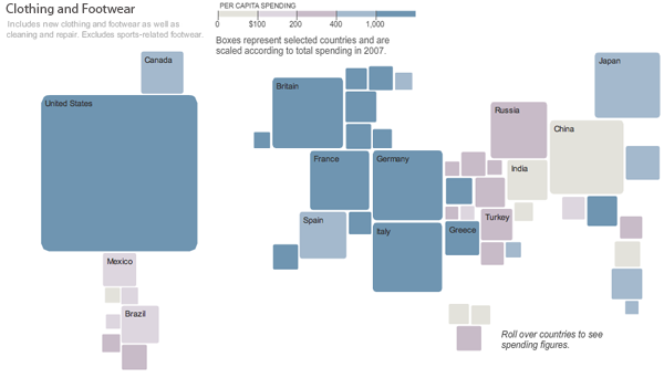
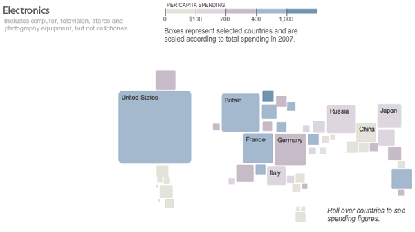
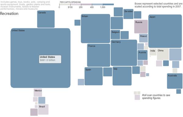
This map approach to spending is great because the graphic designers – Hannah Fairfield, Elaine He and Kevin Quealy – realized that maps are just schematics. It isn’t necessary to stick with a country’s shape, but it is nice to keep them in about the same positions relative to one another. Freeing each country from the shape of its political boundaries allows each square country to change dimensions in direct relation to total consumer spending within a sector. The color tells us what this works out to in terms of per capita spending. If you clicked through to look at the actual interactive graphics you’ll find that if you mouse-over a country, you can see the dollar amount of the total spending for whatever sector you happen to be viewing.
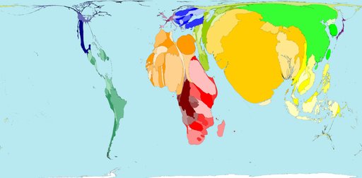
The strength of this graphic is that it strips away unnecessary detail to focus your eye’s attention on the most salient information in an easy-to-digest kind of way. This is a huge improvement over the sort of thing that I see all too often (and have included a little global poverty example here). My eye is terrible at assessing relative areas when the shapes are so irregular like this. Much better to just keep the relative positions of the countries and give them square shapes that can be quickly, effortlessly scanned for the sake of comparison.
What needs work
I would have put the per capita spending in the roll-over as well. Right now it’s just the country’s total spending. I also would have thought about a way to represent all the countries that don’t even make this map. Something understated and subtle – a sprinkling of grey dots? But then those countries might look like dust…still thinking about that.
The other thing I might have liked would be to have either gone completely grey scale (preferred) or to have selected a single color for each sector with increasing saturation as spending increases. The second approach would have made more sense if the product was a series of print graphics, but the approach they actually took and the grayscale approach are better for this sort of interactive graphic in which the viewer sees only one at a time.
References
Hannah Fairfield, Elaine He and Kevin Quealy. (4 Sep 2008) “What your global neighbors are buying”. Business Section of the New York Times. Using Euromonitor International figures.
Fairfield, Hannah. (4 Sep 2008) Guccis or Gadgets? Business Section of the New York Times. [related article that ran with the graphic]
Comments 4
Raluca — November 21, 2010
But do you know how this graphic has been made? I mean, what kind of software can do this kind of graphics? Please, excuse my english because I am romanian :)
Laura Norén — November 22, 2010
Raluca,
I do not know what the team at the New York Times used, but many basic graphics packages would work. The difficult part is translating the data into volumes, but you can do that outside of the software and then construct the graphic using your calculations. These graphics have a little bit of animation when clicking from one to the next but are more or less static images.
Personally, I am a huge fan of the Adobe suite - InDesign, Photoshop, and Illustrator.
Hope that helps.
-Laura
Raluca — November 22, 2010
Ok, thanks; I thought this graphic was made with Visual Studio C#. I guess I have to build my future graphic skills in Adobe suite :)