Uncategorized

Out of wedlock childbirth rates | Heritage Foundation

Bad title

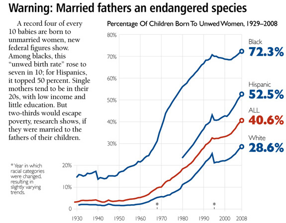
Why draw attention only to the fathers? Clearly there must be quite a few unmarried mothers out there as well. I hope this isn’t suggesting that deciding to take a relationship into marriage is somehow only or primarily the man’s responsibility. Both women and men have agency around the marital decision. It would be nice if cultural constructs supported equal opportunity for popping the question…but headlines that emphasize men’s agency over women aren’t going to get us any closer to equality on that front.

What works

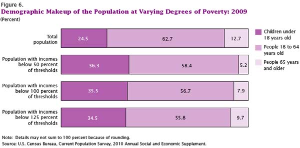
It’s nice to see that this graph points out where definitions of racial categories change. It is also nice that it draws attention to the problem that many American children are being born into poverty or at least situations where resources are extremely constrained. In another graph elsewhere, the same group also reminds us that these births are largely NOT happening to teen parents.

The other critical point is that out of wedlock births are on the rise even though birth rates for teen mothers are declining. If in the past it was possible to think that the problem is just that teens are out having unprotected sex that leads to accidental births, we can no longer be so sure that this is what is happening. Age at first sex is decreasing which means that most of the people having children out of wedlock are capable of having sex without getting pregnant. They probably have been doing just that for years. Having children out of wedlock is best understood to be a choice, then, not an accident. Any efforts to prevent child poverty are probably not going to be successful if they rest on sex ed or free condoms (though I personally believe those things are important for other reasons). The American Heritage Foundation believes that if people would just get married, these kids wouldn’t be born into poverty. Others aren’t so sure it’s that simple.

What needs work

The problem with the write-up accompanying this chart is that it implies that the causal mechanism goes something like this: for whatever reason couples have children together but do not get married. The failure to get married means that these children will be far more likely to be raised in poor or impoverished conditions. For emphasis, I’ll restate: the parents’ failure to marry one another leads to children being raised in poverty.

Now. Here’s what I have to say about the chart. First, if that is the message, why not depict the out-of-wedlock birth rate by poverty status, preferably poverty status prior to pregnancy? I’d settle for poverty status at some set time – like the child’s birth or first birthday, but that isn’t as good. I feel like showing these numbers by race is subtly racist, implying that race matters here when what really matters is poverty, at least according to the story that they are telling and the story that many marriage scholars care about. Yes, it is true that poverty and racial status (still) covary rather tightly in America, but if the story being told is about poverty, I’d like to see the chart address that directly rather than through the lens of race. Furthermore, if race DOES matter, where are Asians? American Indians?

Moving away from the chart for a moment and getting back to the causal story, marriage researcher Andrew Cherlin finds that the causal arrow might go the other way. Being poor may be a critical factor in preventing folks from getting married. William Julius Wilson was an earlier proponent of this concept, especially with respect to poor African Americans. His work suggested that during and after the post-industrial decline in urban manufacturing jobs, African American men were systematically excluded from the work force and this made them appear to be poor marital material. Cherlin’s more recent work applies more broadly, not specifically to African American men, and bolsters the idea that marriage is something Americans of all backgrounds feel they shouldn’t get into until they are economically comfortable. What ‘comfortable’ means varies a lot, but most people like to have steady full-time jobs, they like to be confident that they won’t get evicted, that the heat or electricity will not be turned off, that they will have enough to eat.

The more important question would be: why don’t these assumptions apply to having children? Whereas getting married can represent an economic gain if you are marrying a working spouse, having children certainly does not (state subsidies do not cover the full cost of having children no matter how little the children’s parents make). Perhaps what we are faced with is people for whom getting married may not represent an economic gain. Marrying a person without a steady job could present more of a drain on your resources than staying single, whether or not you have kids.

Science News Cycle | phd comics

What Works

This could easily be applied to just about all research, not just bench science.

What needs work

Why is it that the media believe their consumers to be so daft? Where did the sound bite come from and what has it done to the production of news? To the practice of scientific research?

What is missing from this depiction of the research ‘cycle’ is that some researchers interpret the pressure to turn complex reality into a series of sensational sound bites as a sign that they should alter the way that they write up results in order to better fit the media’s model of dissemination. It’s hard to say this is always a bad thing – if it means that scientists actively seek a more active role in the dissemination of their work in order to pursue a real discourse, it can be a good thing. If it means that researchers promote their results in a skewed fashion, fail to fully disclose/discuss the conditions in which their findings will hold, or start choosing projects based on what will be more likely to make the news, then this science news cycle can be sincerely detrimental.

High-Low: All Time Tallest and Shortest Athletes | Jason Lee

What Works

Imagine looking at this information in a table. It would get the job done, but it wouldn’t have as much visual legibility as this graphic does. One thing I like about the graphic is that the illustrator was not impeded by the fact that sometimes there were ties for tallest or shortest. He just kept to the same paired down one tallest/one shortest depiction.

What needs work

I would have loved to see some indication of mean height. Does it fall in the middle, does the mean cluster towards the top? Does it cluster towards the bottom for some sports (like women’s gymnastics)? Even more interesting would have been changes over time. The human population has been getting taller on average so one would expect that athletes are also getting taller. But maybe some are not, like those in sports where the age of professionals is dropping (ahem, women’s gymnastics).

My apologies for the quality of the image – the scanner is refusing service this morning.

References

Lee, Jason. [illustration] (2010, 18 October) “High-Low: some all-time tallest and shortest athletes” in ESPN The Magazine. p. 64.

Macur, Juliet. (2008, 9 August) The Teeny Tiny Matter of Age for China’s Gymnasts in The New York Times: Olympics 2008 Supplement.

Comments Closed

Regular readers, I had to close the comments on this post because I was getting spam comments faster than I could delete them (online gambling, mostly). If you are keen on commenting, email me and I will find a way to make sure your comments are heard. Wonder what the key word was that made this particular post such a spam magnet? Athlete? ESPN? Who can say.

US wealth estimates by quintiles | Andrew Price for GOOD Mag
US wealth estimates by quintiles | Andrew Price for GOOD Magazine

Giving Credit Where It Is Due

This graphic was created by Andrew Price for GOOD Magazine, inspired by a paper written by Dan Ariely (Duke University) and Daniel Norton (Harvard Business School) entitled “Building a Better America – One Wealth Quintile at a Time”.

What works

Wealth in America is heavily – extremely – concentrated among people in the top quintile. It’s not that wealthy people have a bit more than the middle class and a lot more than the lowest quintile. No. Wealthy Americans own almost 85% of assets in America. That should be surprising to you because when Ariely and Norton surveyed people to find out how much wealth folks *think* the top quintile owns, they estimate about 58%. Even that inequality is too much, the respondents think. In an ideal world, some inequality is acceptable, but the top quintile of earners should only hold about 32% of America’s wealth. And the bottom quintile would get a slice of the pie too, though at right about 10.5% it’s only one-third as big as the slice at the top. This would be a huge improvement over actual numbers where the bottom 40% owns less than 1% of America’s wealth.

What needs work

I would have put the wealthy people on the right since we usually order things from left to right. And if I were specifically trying to be polemical, I might have rotated the entire graphic and had the wealthy people on top, squeezing everyone else into the smallest possible space, kind of like a trash compactor. But, you know, I’m not trying to be polemical.

If I were trying to be polemical, I might say something along these lines: is it possible that because the bottom of our income distribution usually (though not always) has enough food to eat and a safe place to sleep, maybe even a television and a mobile phone, we have been lulled into thinking that extreme inequality is acceptable? Maybe even that extreme inequality keeps everyone pulling at their own bootstraps, trying to keep up with the Joneses, striving for some impossible future in which folks from the bottom four quintiles might make it into that top quintile? These are blunt numbers barely containing a moral question. In a wealthy society, is eradicating absolute poverty (food, shelter, safety, health care) the most morally responsible way to organize public funds? Is reducing inequality a moral imperative? Or just a bunch of belly-aching by people who should be happy that they can sit around and blog about these things?

Unfortunately, as a society we have not even been able to guarantee even an eradication of absolute poverty, let alone ushered in a debate about the moral implications of pronounced inequality. Morality is not the kind of thing social scientists are supposed to mention. The deep philosophical tenets of what it means to do the right thing are also usually absent from political debates, despite all of the overblown lamentations and soap operatic cases of individual hopes and despairs. There are still many many people who go hungry because they cannot afford to pay rent, buy food, and keep the lights on. There are still many people who cannot access basic preventive health care, either. Weren’t we all raised as children, as religious adherents or good humanists, to help those who cannot help themselves? Well. Americans aren’t so good at that. It’s easier to think that the poor aren’t really that poor (as this chart so bluntly demonstrates), that with food stamps and affordable housing vouchers they seem to be doing just fine. Maybe your neighbor tells you that they someone simultaneously holding a cardboard sign and a mobile phone. The gall of it! How can someone who so obviously has money – they are paying for that phone, aren’t they – be asking for money? When you hear that, think of this chart. Wonder about what it does to a social fabric to have such a vast difference between the wealth of the wealthiest and the poverty of the poorest (Which, by the way, includes many many people who are working. Full-time. Maybe even yourself).

It’s not my place to settle the moral debate about absolute poverty and relative poverty. But it is my place, and the point of this graphic, to raise the question and to make sure that we look at the whole graphic. It’s good to be shocked at how much the top quintile controls. But as Americans in this potpourri of a country together, we spend way too much time marveling at the monstrous wealth and not nearly enough time wondering what might be done about the dire straights of the bottom 40%-60% of us. If the graphic does nothing else, perhaps it shows you who your closest economic neighbors are – and they aren’t the folks to the left.

References

Ariely, Dan and Norton, Michael. (2010) “Building a Better America – One Wealth Quintile at a Time” forthcoming in Perspectives on Psychological Science.

Noren, Laura via Dalton Conley’s Intro to Soc text book: Champagne Glass Distribution of Wealth

Number in Poverty and Poverty Rate, 1959 - 2009 | US Census Bureau, Current Population Survey
Poverty Rates by Age, 1959 - 2009 | US Census Bureau, Current Population Survey

What Works

I love that recessionary periods are included in this graphic. They are the lavender columns and it is obvious that recessions tend to correlate with increases in the number of people in poverty and that the current recession is really a doozy.

What saddens me the most is the graphic that depicts how poverty breaks down by age. First, note that people over age 65 have the lowest poverty rate of any age group. Then remember that they receive social security and health care. Now wonder what would happen to the economy if every US citizen were supported at that level or above. I cannot answer that question, but this graphic compels me to pose it.

Second, note that the age group most likely to be poverty stricken is children. Over 20 percent of people under the age of 18 are living in poverty. Think about it: if a parent with three kids loses his or her job, that means four people are negatively impacted from that single job loss. In this economy, I’m guessing that is part of the reason we see children sliding into poverty.

Demographic Makeup of the Population at Varying Degrees of Poverty, 2009 | US Census Bureau, Current Population Survey

Third, have a look at this next graphic. Note that beyond the absolute number of poor kids and the rate of poverty among children, the proportion of impoverished Americans who are under 18 shows over-representation. Growing up poor is not only difficult for the kids, but it is not good for the future of the country. Being poor comes with all sorts of baggage for kids – they are more likely to live in poorer school districts with lower quality schools, they are more likely to live in more dangerous neighborhoods, they are more likely to have food insecurity (just try studying for a math test or writing a composition when you’re hungry), poor kids are more likely to be African or Hispanic American which might mean they are also dealing with face-to-face and institutional racism all throughout their lives, and so forth. Not trying to sound like Stevie Wonder here, but these kids are our future. As a country we’re doing a crap job at making sure they have the basic physical, social, and educational support they need to live up to their best potential. Quite stupid. Decision making made by people who have trouble seeing past the end of their own nose, perhaps?

Forgive me. I know I am supposed to keep politics out of my blog but it’s hard to see how making sure kids are not living in poverty is a political issue. It’s a human issue. I would hope we can at least agree kids should not be living in poverty. I realize that it is much more difficult to agree on how to go about getting them out of poverty and preventing others from becoming poverty-stricken in the first place.

What Needs Work

Right. So what needs work here is our economy. But that is not news so I’ll let that debate sit.

The New York Times article about this topic pointed out that what needs work is the way the poverty line is calculated. On one hand, at about $11,000 for a single adult and $22,000 for a family of four it’s awfully low. This is because when the original formula for calculating poverty was adopted, it was tied to food prices and food budgets now make up a smaller proportion of the overall family budget than they did when the formula was concocted. [Remember this example folks: equations are not unbiased.] Over the years, family food budgets have experienced a real drop due to subsidies (the true costs are not passed to consumers), technological advances (we can grow more for less $ with fertilizer, GMOs, antibiotics for livestock, and pesticides for greens/grains), and ‘advances’ in corporate agriculture (economies of scale, see Michael Pollan’s work, Eric Schlosser’s “Fast Food Nation”, Marion Nestle’s “Food Politics”). Other critical costs for surviving from day to day like housing and health care have risen. On the other hand, benefits from programs like food stamps are not included in ‘income’ so there might be a few people bouncing above that poverty line once we take their food stamps (and a few other benefits) into account. Then again, the poverty line is too low so even if food stamps sends a family above it, they are still likely to experience poverty even if they don’t fit the current fiscal definition of poverty. The other problem with the calculation is that it does not take into account differences in regional costs of living. Living in New York City is expensive. Living in a rural area may be less so though paying to own, insure, maintain, and fuel a car or two to drive to work, school, and the grocery store could hike up the rural cost of living more than I know. With an annual budget of $22,000 for a family of four, a car or two would be a real cost, one that an NYC resident would not need to handle.

There is a graphic in the report that shows where poverty rates would be if the poverty line were adjusted upward or downwards.

References

DeNavas-Walt, Carmen; Proctor, Bernadette; Smith, Jessica. (September 2010) Income, Poverty, and Health Insurance Coverage in the United States, 2009 US Census Bureau, Current Population Reports: Consumer Income.

Eckholm, Eric. (16 September 2010)
Poverty Rate Rose Sharply in 2009, Says Census Bureau
. New York Times.

Married people and their wages compared to single people, by gender

What works

Thank you, Pew Research, for all of your hard work.

This set of lines does not tell a story about marriage and wages, it poses a question. Let me first take a moment to stop and praise the graph maker for choosing lines instead of bars. This is basically a series of timelines presented on the same axes. When displaying trends, lines are better than boxes. A line can travel over time, a box just sits there. Of course, then, for time series data, unless there is a compelling reason to discourage people from feeling a sense of movement over time, then go with a line. You might want to choose a box or series of boxes if you have reason to believe your dataset is not truly continuous.

Second, let me say that I enjoy the way the context provided here forces the viewer to wonder why it was that the wages of single people flattened out. While it might be tempting – and some have done it – to assume that getting married makes you rich, looking at the trends presented the way they are here makes it hard to jump to that conclusion. We can see changes over time in the relative wages of married and single men and women, but we cannot see any reason to think that it is marriage that leads to increased wages. Folks who study marriage and wages (Andrew Cherlin, Betsy Stevenson and Justin Wolfers, Kathleen Gerson, and many others) have long pointed out that even though there has long been a correlation between marriage and wages (married people tend to have higher wages) we have no idea whether being married leads to higher wages or having higher wages leads to getting/staying married. The set of lines above does a good job of making sure it is difficult to jump to a causal conclusion.

Karen Sternheimer at Everyday Sociology blog which is part of Norton publishing covered this question a long time ago, but she focused on the gender difference in wage returns. It used to be that women benefited economically by getting married but now that women’s and men’s salaries are getting closer to parity, men see a bit more of a per capita bump than do women when they get married.

This still does not explain why single people make so much less or whether marriage preceeds the wage increase or the actual or promised high wages attract marriage partners.

Dalton Conley, in Elsewhere, USA, pointed out that what could be more alarming than the distance between single and married people is the way that equality in marriage partners (folks are starting to equalize their strategy for choosing mates – more and more we all want to marry wealthy, attractive people who are likely to continue to be wealthy and attractive. This holds regardless of whether we are men or women.). This means that folks with high incomes marry other folks with high incomes and increase the distance between top earning households and lower earning households. He calls it doubling down, though I suppose if you are a high earner married to another high earner you might consider it doubling up. Either way, the distance between the haves and the have-nots may actually be exacerbated (in some ways) by the sexual revolution, especially if single people’s wages flatten out. I’m thinking in particular of single parents, who are going to be raising kids on sole salaries lower than their married counterparts, for whatever reason. Their kids are competing for spots in the good high schools and colleges with all the kids whose high earning parents doubled up.

I love graphics that make me ask questions.

What needs work

The married men’s trend line ends up looking like a shadow of the married women’s trend line even though men are not actually women’s shadows. I would have recommended a different color scheme to make sure we don’t read men as existing in women’s shadows.

References

Sternheim, Karen. (2010, February) “Men and Marriage” at Everyday Sociology by W.W. Norton Publishing.

tokyo-map-metro
Tokyo Metro Map (click to embiggen)

Away message

Maps of public transportation are my favorite visual shorthand for any major city, not only because I have to rely on mass transit where ever I go, but also because these highly stylized versions of cities contain much more than the bare minimum amount of information to get from one point to the next. I will be in Tokyo checking out the public transit system and attending the 4S conference through the end of the month.

See you back here in September.

Worldwide Text Messaging Trends Graphic
Worldwide Texting Trends | by shanesnow for Mashable using Pew Internet research

What works

What I like most about this graphic is that it summarizes great research from Pew that many folks would not have perused by reading Pew’s publicly available reports. That’s always one of the reasons I tout information graphics – they make information accessible and interesting to people who don’t have the drive/access/time to read full reports and the graphics often give more detail than do executive summaries. Clearly, any summary cannot give all the granularity of the report, but I assume most people do not read full reports. This comprehensive visual summary packs in more information than would a journalistic article about the research that have to include the requisite interview with a teen who texts or the parent who pays her bill or the person who was injured by a texting driver (or the guilty driver). Only sprinkled among the vox populi would we see a couple of quotes from a couple of ‘experts’ who conducted the survey. And nobody can summarize all that much in a total of four-ish quotes. I am still weighing the pros and cons of recommending that standard executive summaries be replaced by (accompanied by?) information graphics like this, at least in the case of survey-based reports.

Out with the written executive summary, in with the infographic summary? Please debate.

What needs work

I couldn’t find the actual references so I added some of my own where you can corroborate things like the Finnish PM who broke up with a girlfriend over text and the story of the first text message sent by Neil Papworth. My guess is that the bulk of the information comes from Pew while a lot of the fun facts come from the other sources. But I couldn’t find that out for sure without a great deal of effort (like tracing back every single datapoint in each of the components of this graphic).

The interwebs has a social policy of hyperlinking to sources. Please folks, keep that going someway, somehow. Otherwise we risk plagiarism which is bad in itself (see my dissertation 2011). Additionally, when it is not possible to check facts, exaggerations, methodological mistakes, made up info, and just plain lies are harder to ferret out.

References

Pew Internet and American Life Project
   Report on Mobile Access (7 July 2010)
   Report on Teens and Mobile Phones (20 April 2010)

shanesnow. (18 August 2010) “US and Worldwide Texting Trends” Original post at mashable.

Boyes, Roger. (14 March 2007) How potato love affair with Finnish PM went off the boil. The Sunday Times online.

BBC News Online. (3 December 2002) Hppy Bthdy Txt.

New York mapped by geotagged photos

Just thought this was cool

This map of New York was created by Eric Fisher. He gathered the geotags of the photos uploaded to flickr. The colors work like this: blue photos were taken by locals (deemed to be local because they had taken pictures in the same location over an extended period of time), red indicates photos taken by tourists (people taking photos outside of their frequent-photo-taking-zone), and the yellow ones were indeterminate (taken by people who hadn’t uploaded any photos in the previous 30 days though we guess they might be tourists because they may be the kind of people who only take photos while on vacation).

I like the aesthetic and the method so that’s why I decided to share.

Married with Children | The Venn Diagram

What works

1. Menlo is my favorite font of the moment for information graphics.
2. I have no idea why I haven’t seen this Venn diagram before. In my humble opinion, if you are a social scientist and you are attempting to display a concept that may or may not have solid numbers to back it up, start with the Venn diagram because:
a. Venn diagrams are easy to make.
b. Venn diagrams are easy to understand.
c. Venn diagrams are not expected to represent solid numbers. They certainly can be employed in that way, but they are not always employed in that way so you are not likely to mislead readers that you are backing your claim up with census data.
3. I am doing a bit of research on marriage and I have run up against many arguments that seem to believe that marriage and childbearing always go together, or at least that they OUGHT to always go together. News flash: 36.9% of children are born out of wedlock (Cherlin, 2008). Other adults get married but do not have children. Yet other adults get married, have children, and then end up unmarried again because divorce and death ended their marriage. The above graphic should help clear up what actually happens in the world. Marriage and child raising frequently have no overlap.

What needs work

I was so upset that I didn’t stop and look up the actual data for each of these segments. In part, I wanted to leave it as a universal concept and NOT tie it to US data. But yeah, I realize it would be better if I had sat down and figured out how many people are in each of these three areas. That’s coming in the article version. And after I take a deep breath to disperse the anger I feel at people who make illogical arguments.

References

Cherlin, Andrew. (2008) “The Marriage Go-Round.” New York: Vintage.