
What Works
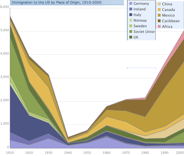
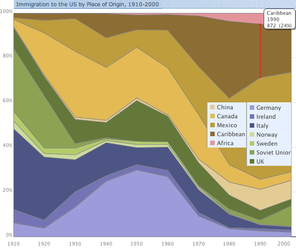
Before you read any further, ask yourself which one of these graphs is most useful. Which one has the most information? If you had to get rid of one of them but still be able to explain the basic flows of people into the US over the last century, which one would you keep? And would your story be much weaker, somewhat weaker, pretty much the same after the loss of one of the graphs?
First, I was moaning the other day about a graphic – like the one I posted recently about prescriptions for treating mental illness in the US – in which color is used to make it look like there is important information being encoded when, in fact, the colors are just pretty, nothing more. I am happy to report that in this case, the colors are not only useful, but necessary. Try to imagine looking at this thing in gray scale. It would be nearly impossible to read. So kudos for color in general. In specific, I probably would have tried to group the countries that are near each other in the world within a color family. Sweden and Norway are good examples of what I would have done throughout – they are both green, just different shades. That makes good logical sense. On the other hand, Ireland and the UK are not in the same color family and it confuses me. I also don’t see great geographic or other similarities between Canada/Mexico and China. So I would have kept the Canada and Mexico as they are and found a different color for China.
Now I’m going to get back to the question I asked at the beginning of the post: could you do without one of these graphics if you had to axe one? It’s a leading question and the answer is clearly: yes. The first one is far better than the second one. Looking at absolute flows by country of origin gives a much more interesting and fully articulated picture than looking at the relative values of people coming at any one point in time.
What Needs Work
The numbers behind this graph were pulled from Census Data, a good place to go because they are the most reliable numbers we are likely to find (at least with respect to legal immigration – undocumented immigration is, well, undocumented so the Census doesn’t help). However, the thing about Census Data is that it’s going to show us flows for a decade at a time and I wonder if it might be a little misleading to show these numbers as an augmented line graph. A bar graph might be better and here’s why: smoothing the lines implies decade reliant time trends that don’t exist. Unfortunately, in the real world, important decisions do not always take place in the same year the census is taken. The Immigration Reform Act of 1965 was right between decades. Now I know you’re thinking something along the lines, ‘anyone who studies immigration is going to know when that reform act was and when WWI, WWII, the Depression, and all sorts of other important historical events took place. we’re not idiots.’. I agree; you are not idiots.
On the other hand, if I were to create this as a bar graph, I would have the freedom to actually locate the legislation as a graphic element – a line flying a flag announcing the name of the act, for instance – right between the bars for 1960 and 1970. But of course, that would make it difficult to see how the flows are changing over time, so I might superimpose a kind of shadow version of the current line graph over (or under) the bars so that the eye can be aided in its path from one bar to the next. Line graphs do show change much better. But I like the idea of being explicit with the time periods in which the measurements occur and with the notion of leaving graphical space to add important contextual details.
This graphic was created by Thomas Brown using IBM’s free Many Eyes visualization tool. I wholeheartedly support IBM and the other companies and organizations that are making powerful visualization tools available for free. In case you aren’t familiar with them, they allow users to input data and then they take that data and produce visual representations of it. In this case, the full version of the graph is interactive – hovering the mouse will reveal greater detail about any given flow at a point in time. This is a great thing. I support layering of information. The layering available at Many Eyes does not quite make up for the inability to layer in the way that I described above, but I’m not disappointed with IBM. There are already tools for manipulating graphics. The best way to use IBM’s tool is not to expect it to do everything, but to take their visualizations and then further enhance them in photoshop or your favorite image editing software.
Also Note
This graphic is about spaces but it is not a map. For whatever reason, people use maps whenever there is mention of geography, and even sometimes when there isn’t, even though the map is often not adding to the story and making it harder to immediately grok what the important patterns are. Just because geography or mobility might be part of the story you are trying to tell, it isn’t necessary to use a map to encode your narrative visually.
References
Thomas F. Brown. Immigrant Origins via email on 11 October 2010.
IBM’s Many Eyes data visualization tool.
US Census Historical Statistics for Immigration by Number and Rate and Immigration by Leading Country or Region of Last Residence.
Comments 9
World Spinner — October 22, 2010
A Century of US Immigration | IBM's Many Eyes Tool » Graphic Sociology...
Here at World Spinner we are debating the same thing......
A Century of US Immigration | IBM's Many Eyes Tool » Graphic Sociology « Cool Immigration — October 22, 2010
[...] post: A Century of US Immigration | IBM's Many Eyes Tool » Graphic Sociology Comments [...]
Thomas Brown — October 25, 2010
Thanks for posting my graphs. I agree with your suggestion that related regions be grouped by similar colors. Many Eyes is designed to be easy to use, which means limited control over the output. Reordering the columns in the data set would give you some more control, and might have mitigated your criticism in this regard a little bit. But really you'd need a tool with more granularity to do much more with the colors.
I agree with you that the second graph is more complete than the first one. However, I think they are both useful, and the choice of which to use depends on what you're trying to portray. I use them as teaching tools. The second, 100% graph better represents the change over time in where people are immigrating from. The first, absolute graph shows that too, but in the second graph it's easier to see.
While I agree with your observations about smoothing the line, I find stacked bar graphs difficult to read. Since I had to choose, I chose the easy-to-read solution, for teaching purposes. I like your idea about superimposing a line over the bar graph though, and about adding tool tip data along a time line. But implementing such ideas would require some programming chops and a lot more time investment in the graph. Meanwhile, anyone can quickly make a basic-yet-flawed graph using Many Eyes and similar freebie tools. Once the data is cleaned and collated, it takes just a couple more clicks to make the graph.
thanks for the great blog,
thomas
Thomas Brown — October 25, 2010
"I agree with you that the second graph is more complete than the first one." Sorry, I meant that the other way around.
mike — October 25, 2010
I agree -- a great graphic! One quick correction: the Census attempts to count *everyone* regardless of whether they are documented or not. They actually go to quick extensive efforts to try to capture undocumented immigrants in addition to documented immigrants (though they do not ask about documentation). While they likely under count undocumented workers, they are included in the sampling frame.
For national statistics another possible data source to get annual estimates is the Current Population Survey.
mike — October 25, 2010
flaneuse - you are absolutely right. I thought that you were saying that the Census doesn't document undocumented immigrants by policy. You are absolutely correct that undocumented workers are severely undercounted (though efforts made by the Census to work with local groups attenuates undercounts in areas where they have a good relationship with local partners).
Sorry to hear about your students, but they're lucky to have a teacher who cares so much! Good luck with your class.
Eval Central Spotlight Oct 27, 2010 | Eval Central — October 27, 2010
[...] There is a big difference between using new visualization tools and effectively using new visualization tools. Can you tell the difference? From Graphic Sociology: A Century of US immigration IBM’s Many Eyes Tool [...]
Roisin — October 27, 2010
I love the interactiveness of the graph! Very Very cool!