
Accompanying text
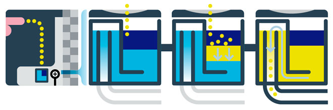
The necessary accompanying text was not part of the image file, but here’s what it says under each panel:
Panel 1: “Instead of being flushed down with as much as a gallon of water, urine simply drains through openings in a specially designed plastic cartridge at the bottom of the bowl.”
Panel 2: “The entry chamber contains a blue liquid—a lighter-than-urine long-chain fatty alcohol. Gravity pulls urine through the liquid, but odors and sewer gases are trapped below.”
Panel 3: “As the urine descends through the cartridge chamber, its flow collides with a barrier, which prevents turbulence from displacing the floating sealant.”
Panel 4: “Urine passes beneath the barrier and into the exit chamber. When the urine level reaches the height of the drain, it spills over and empties into the outbound sewer pipe.”
What works
I appreciate that Peter Grundy, the graphic designer, shows us the macro-scale first and then leaves the detailed working of the smaller catchment valve to the subsequent three panels. When describing something new, it’s good to start at a level that people recognize – presumably, men recognize the basic shape of a urinal more than the recognize the shape of the mechanism that makes it waterless. I probably would have made that first panel slightly bigger than the rest so that we know it isn’t four of the same things at different points in time, but one different thing and three of the same things.
I enjoy the way that the urine is displayed in balls so that it can appear bouncy. The dots are more than simply an enjoyable feature, they also help communicate about a problem in urinal design: backsplash. Urine is a bit bouncier than one might like – the text below the panel explains that dark blue liquid traps odors from seeping up but it is the L-shaped barrier that does most of the backsplash prevention work. I’m guessing it’s actually a combination of the L-shaped barrier and the blue liquid that keeps the urine from splashing. Not enough space for explanatory text to get into those details, but I appreciate the way the diagram brought attention to the backsplash problem and not just the waterlessness.
Another thing: I applaud Grundy for depicting a penis (a stylized penis, but only as stylized as the rest of the diagram) instead of a visual euphemism of the circle-and-arrow ‘male’ sign.
What needs work
The dark blue area is so dark that I initially had to sit and think about whether I was supposed to be reading it as a presence or a void. Perhaps a less dark color would have read more clearly as a presence, something we are meant to notice, than as a void. Yes, I can hear critics pointing out that since the color above the dark blue is white, one would have to assume the dark blue is presence. I speak for my eyeballs and cognitive structures when I say that I had to think about it.
That’s not all where the color critique comes from. Since water is often depicted as blue in diagrams and this diagram was supposed to be about the waterfree urinal, I probably would have chosen a color other than blue, even if the actual liquid in the device is blue. The big point is to remind us that there is no water here – we might lose sight of that amidst all the conventionally blue zones in this diagram.
I also do not quite understand the cylindricalness of this thing because the diagram makes no effort whatsoever to give depth. It’s just a section and a section of a rectangle will look the same as the section of a cylinder. Well. Except that isn’t strictly true. As far back as drafting goes, we know that there were conventions for making sure that cylinders and rectangular solids could be differentiated in section. Those rules might have been handy if extrapolated to fit this case.
The main problem I always run into with diagrams is the balance between image and text. Diagrams, in my experience, end up being more text heavy than other sorts of information graphics. This particular graphic would not work at all without the text, but that may be an unavoidable reality when it comes to diagrams. As I said above, at least the text is subordinate to the images and follows their table layout instead of sort of hanging around the fringes using arrows to connect text to image.
References
Davis, Joshua. (22 June 2010) Pissing Match: Is the World Ready for the Waterless Urinal?. Wired Magazine.
Grundy, Peter. (22 June 2010) “How it doesn’t flush” Wired Magazine. [Diagram]