
What works
It’s nice to see all of the Census 2010 data coming out and generating infographics. This one comes from the Wall Street Journal which distilled the above panel of stills from an interactive graphic which also has maps for white and black kids and detailed tables by race and geography.
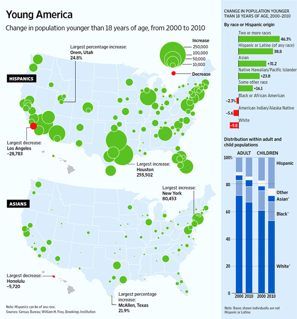
Though the two stills here do not do a good job of demonstrating the claim in the headline, that there are fewer white kids, the bar graph on the right and the interactive graphics, do, in fact, back up the headline claim. We could quibble about the flipside to the headline – rather than saying there are fewer white kids, should it have pointed out that there are more Hispanic and Asian kids? – but quibbling about headlines isn’t my concern here. Other news outlets did take that spin on the same set of information.
What I like here is that the graphs did not try to show everything all at once – each of the four racial categories included in this series gets its own graph. Yes, there are more than four racial categories and yes, it would be nice to see where other racial categories fit. But inasmuch as I am concerned with the overuse of mapping data, especially when those maps get layered up with all sorts of information that makes them illegible, I am happy to report that these folks had the commonsense to generate one map for each of the racial categories they decided to depict.
One of the incidental facts portrayed here is that the country continues to tip towards the southwest. The big red ‘decrease’ blobs appear in the northeast for whites and blacks and are not compensated for by blue ‘increase’ blobs among Hispanic and Asian births. Because I wouldn’t necessarily have picked this up from looking at a table, I think it’s clear to say that the use of maps was justified in this case because at least part of the story is geographic in nature.
What needs work
I have a tough time with the blob maps. I can get an overview but I have a tough time doing additions, let alone additions and subtractions. The bar graph that appears in the stills helps present the same information in a different way. In this case, the maps can only display the big picture. The bar graph is necessary to help understand how all these blobs add up. In particular, the top graph shows a large increase in the number of mixed-race kids by percentage, but this group is still so small that the absolute numbers wouldn’t even register on the blob maps.
Food for thought
The second, vertical, bar graph is my favorite part that ties all of rest of the information together. We see that white kids still make up more than half of the children born in the US, though it appears that this may not be the case in 2020. We see most clearly that Hispanic kids are growing faster than any other category of kids. I’m going to take this moment to note that Hispanic-ness is an ethnicity, not a race, and that many Hispanic kids are considered white. Remember that Central and South America were colonies of Spain and Portugal and we tend to consider Spanish and Portuguese people white. I’m not prepared to get into a discussion about what it takes to be white in America, just pointing out that Hispanic people are, in many cases, racially white even though they may consider themselves to be ethnically Hispanic. It is possible to hold both of those identities at the same time. Furthermore, if we look back in history there was a time when Irish and Italian immigrants were considered non-white. I have wondered if today’s Hispanics are similar to yesterday’s Irish and Italian immigrants in the sense that they will eventually come to be seen as white ethnics.
This is a debate I’m hardly qualified to comment on and I welcome others who are more qualified to take up this issue in the comments. In particular, I’m wondering how the numbers matter. If there are more and more Hispanics born in the US, will that mean that they are not under pressure to assimilate to mainstream white-ness and will have more opportunities to maintain a distinct identity? Or will the decreasing number of white folks mean that there is pressure to recruit new populations into the white identity as part of our one-drop anti-black legacy? I don’t know what this all means, but I do feel like the numerical balance is meaningful.
References
Frey, William H. (2011) Brookings Institution analysis of 2010 Census Data.
Dougherty, Conor. (6 April 2011) New Faces of Childhood: Census Shows Hispanic and Asian Children Surging as Whites, Blacks Shrink. Wall Street Journal.