Cairo, Alberto. (2013) The Functional Art: An introduction to information graphics and visualization. Berkeley: New Riders, a division of Pearson.
Overview
A functional art is a book in divided into four parts, but really it is easier to understand as only two parts. The first part is a sustained and convincingly argument that information graphics and data visualizations are technologies, not art, and that there are good reasons to follow certain guiding principles when reading and designing them. It is written by Alberto Cairo, a professor of journalism at the University of Miami an information graphics journalist who has had the not always pleasant experience of trying to apply functional rules in organizational structures that occasionally prefer formal rules.
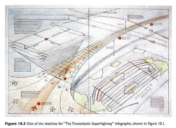
The second part of the book is a series of interviews with journalists, designers, and artists about graphics and the work required to make good ones. This part of the book is as much about the organizational culture of art and design and specifically of graphics desks in newsrooms as it is about graphic design processes. The process drawings are fantastic. I’ve included two of them here. The first by John Grimwade is multi-layered, full of color and dynamic vitality. These qualities were carried through into the final graphic but are often very difficult to build into computer-generated images. I wondered if the graphic would have been as dynamic if it had come from a less well-developed hand sketch (or no sketch at all).
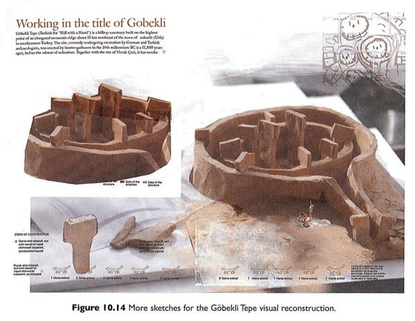
The second is a set of photographs taken of a clay model by Juan Velasco and Fernando Baptista of National Geographic that was used to recreate an ancient dwelling place call Gobekli Tepe that was in what is now Turkey. Both of these examples lead me to the iceberg hypothesis of graphic design – the more the design that shows up in the newspaper or magazine is just the tip of an iceberg of research, development, and creative work, the more accurate and engaging it is likely to be.
As a sociologist I am accustomed to reading interviews and am fascinated by the convergence and divergence in the opinions represented. In this case, I especially appreciated that Cairo’s interview questions touched on the organizational structures and working arrangements, as did his own anecdotes throughout the book, to provide an understanding of the opportunities and constraints journalists and information graphic designers face. Their work is massively collaborative and the book works to reveal the bureaucratic structures that come to promote and impinge upon design processes and products.
There is a fifth part to the book, too, a DVD of Cairo presenting the material covered in the first three chapters of the book. I admit, I have rarely been a large fan of DVD inclusions. They are easy to lose, scratch and/or break. But assuming the DVD is intact and accessible, I never know when I ought to stop reading and start watching. And even if the book has annotations indicating that an obedient reader should stop reading and start watching the DVD, this assumes the reader is willing and able to put down the book and fire up the computer. The only time I can imagine using the DVD is as a teaching aid in class to give the students a break from having to listen to me all the time. Unfortunately, that is prohibited by Pearson.
Still, it is worth watching because Cairo has a great voice and he is able to discuss interactive content/design in a way that is not easy in the pages of the book. While some of the discussion repeats themes from the first part of the book, there are new examples from additional designers, including some who have been Cairo’s students, which might be of interest to people thinking of signing up for his online course.
What does this book do well?
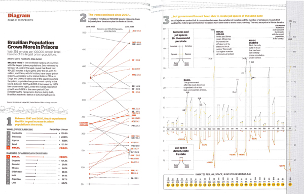
The book does a great job of explaining the decision making behind graphic design. The sketches, process drawings, and recounts of the conversations that went on in editorial meetings gave important depth of context. The organizational culture and day-to-day expectations of the newsroom tend to encourage the use of templates and discourage exuberant creativity. Cairo explained that this Brazilian prison graphic that eventually won the Malofiel design award also won him a reprimand from his boss who proclaimed it to be “ugly”. In practice, conceptual distinctions between art and technologies for comprehension are made rigid by bureaucratic structures in which, “the infographics director is subordinate to the art director, who is usually a graphic designer,” and that this arrangement, “can lead to damaging misunderstandings.”
The more prominent argument follows from these peeks into the backstage of journalism. Infographics and visualizations are technologies, not illustrations. Cairo writes that:
The first and main goal of any graphic and visualization is to be a tool for your eyes and brain to perceive what lies beyond their natural reach….The form of a technological object must depend on the tasks it should help with….the form should be constrained by the functions of your presentation….the better defined the goals of an artifact, the narrower the variety of forms it can adopt.
One of the writing techniques that Cairo uses is summarizing his take-away points from previous paragraphs in quick lists of pointers or key questions. Cairo incorporated these quick lists gracefully into the writing style and I never felt like I was reading a textbook. Still, the quick lists make it easy to use the book as a reference. The index, bibliography and detailed table of contents add strength to the book as a reference source, too. Note to the publisher: I found it frustrating that the book did not include a list of figures, especially given the subject matter.
Diversity
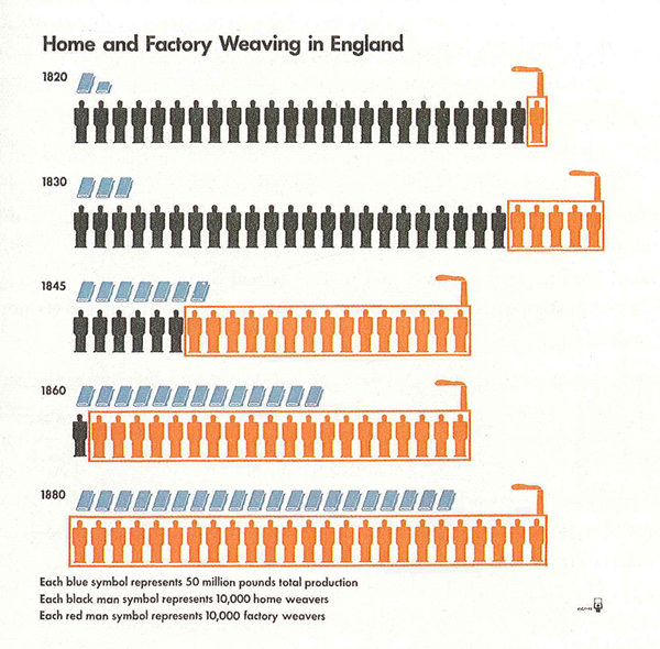
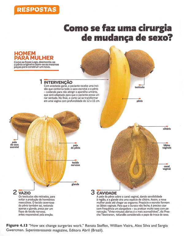
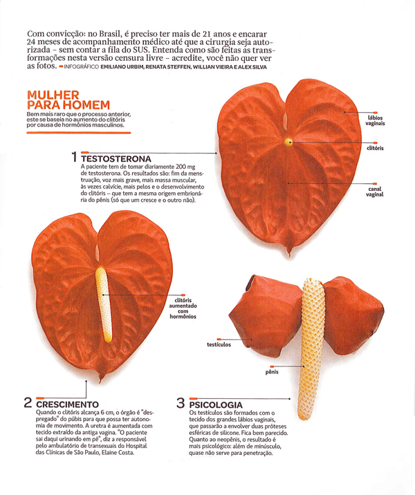
One of the greatest strengths of this book is the diversity of sources from which Cairo draws his material. Yes, he uses graphics he has developed in many cases which is hugely valuable because he is able to provide insights into the development processes. However, he also draws from graphics old and new [see an old one he pulled out of an archive at the University of Reading about weaving in the industrial revolution], from magazines, newspapers, and the internet, made by freelancers, in-house designers, and students, and in languages other than English (some of which are translated, some of which impressively need little translation). My favorite graphic in the book was one I never would have come across that uses pieces of fruit to describe the surgical procedures used to achieve sexual reassignment.
This diversity serves as an example of the breadth of Cairo’s experience in the world of journalistic information graphics. It is also a testament to his real joy in the subject. Many authors of design books are happy to fill the pages with their own work. Cairo is surely talented enough to have done. Instead, he chose to showcase an incredible range of designers and styles. This diversity, combined with the accessibility of the writing, are cause enough to recommend this book for anyone who is curious about graphics and journalism, especially journalism students.
What doesn’t this book do well?
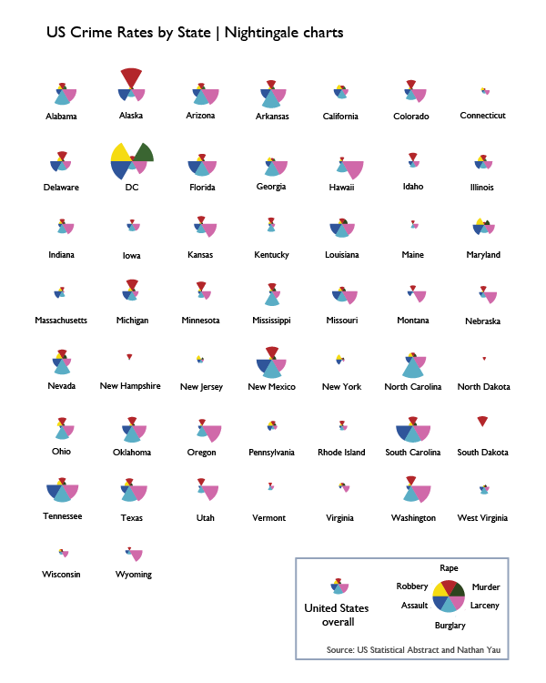
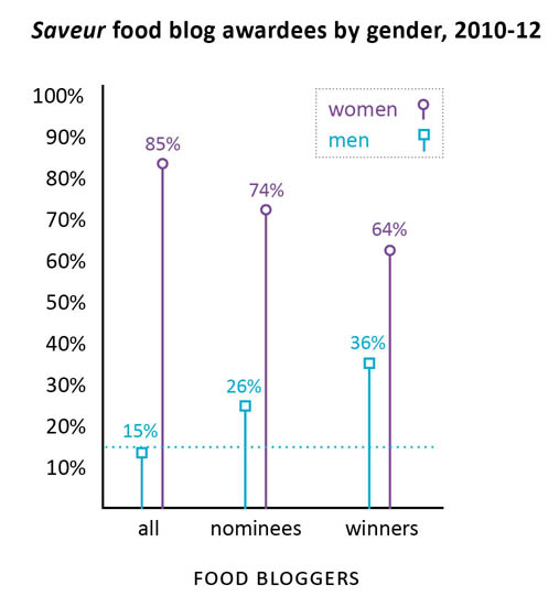
The most curious shortcoming – given the incredible diversity of designers, styles, countries, and publication types represented – is the scarcity of women designers. There are thirteen designers profiled in part IV of the book; only two are women. There were forty-seven graphics reprinted; five were designed by women. With respect to the reprints, Cairo is completely justified in reprinting his own work more often than the work of others because he knows how the design process unfolded in those cases. Since he is a man, this inflates the masculine contribution to the reprinted graphics category. Still, many of the graphics he worked on were collaborative efforts and his collaborators could have been women in a more ideal world. But mostly, they were men.
Because the information graphics world is relatively interdisciplinary and (so far as I know) has no specific professional organization whose membership includes a representative sample of practicing information graphics and data visualization professionals, it is hard to tell if the gendered pattern in Cairo’s book is due to some oversight on his part or the underlying gendered make-up of the industry or a combination of both. Even if the industry is dominated by men, it is important for people who write and edit textbooks to ensure that women are represented or they run the risk of sending the message that women may not be welcome or well-rewarded if they choose to pursue data visualization. That is unacceptable. The graphics world will lose out on half its talent pool and women might avoid careers that could have been satisfying and rewarding for them. Notably, the kinds of graphic design that require coding – like data visualization and interactive design – are better compensated than illustration and static design so it’s possible that women are being subtly nudged into the less well-compensated areas of graphic design along the line. It would have been nice if this textbook that is so diverse in so many other ways could have pushed the gender boundary and included more women.
The book also over-promises in the cognition section. The first chapter on cognition was too basic. The second and third chapters in this section had more that was directly applicable to design. All three chapters could have been condensed into one. It is certainly true that perception and cognition ought to be included and there were some useful applications derived from the three chapters, but there was too much review and too few clear applications of the basic principles of cognition and perception to graphic design.
Here are the pointers I did find useful, if you happen to want to buy the book and skip those chapters:
+ If you want viewers to estimate changes by visually comparing elements, you will have the best luck if those changes are depicted using elements of the smallest number of dimensions possible. For instance, viewers will have an easier time coming up with an accurate estimate of the difference in size between two lines (1D) than between two circles or squares (2D). It’s best to avoid 3D comparisons altogether. I would also add that regular objects like circles and squares are cognitively easier to think with than irregular objects like polygons other than squares.
+ The less frequently a color appears in nature, the more likely it is to draw the eye. Reserve the use of colors like red, pink, purple, orange, teal, and yellow for elements that are meant to draw attention.
+ Humans cannot focus on multiple elements at the same time. Design graphics that have one focal point or clear hierarchies of focal points. Do this by eliminating unnecessary use of bright color, chart junk like grid lines that aren’t absolutely necessary, and by establishing a logical information hierarchy in the page layout.
+ Landscapes have horizon lines. Humans are used to encountering the world this way. This is one reason why it is easier to make comparisons using bar graphs (where all the elements start from a common horizon line) rather than pie charts (where there is no shared horizon).
+ Eyes are good at detecting motion and they will focus attention on moving objects. Try not to ask viewers to read text and simultaneously watch a moving element in interactive graphics.
+ Human brains are good at picking out patterns. Often, fairly small changes to a graphic layout that strengthen the appearance of grouping or other types of patterns will add to the ability of the graphic to deliver an instant impression or overview of the message being communicated. For instance, changing the spacing of the bars in a bar graph so that every fourth bar has twice as much space after it as all the rest will make the graph appear to have groups of 4-bar units.
+ Interposition – placing one object in front of another so they overlap – is a good way to add depth. If objects never overlap, the opportunity for the illusion of depth is lost.
Summary
Overall, the book was well-written, included valuable insight into the process underlying the creation of strong, successful information graphics and visualizations, and would be a solid textbook for use in journalism departments. The representation of women designers was disappointingly low and the segment on cognition could be condensed or otherwise improved. Cairo is clearly a talented designer and teacher. This book meaningfully combines both of those strengths and is an important contribution to undergraduate and graduate education in the emerging sub-discipline of information visualization and design.
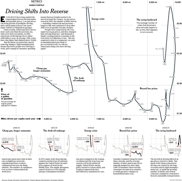
I am sending you out with one of the graphics I was most impressed by, in part because the graphic is good, but mostly because Cairo helped me to see why a rather average looking graphic is in fact rather brilliant. It is by Hannah Fairfield of the New York Times graphic desk and it shows that the driving behavior of Americans is sensitive to changes in the economy. During the 2005 recession when gas prices were high but the economy was struggling overall, Americans drove fewer miles. This pattern had only one historical precedent – the 1970s. The graphic depicts this by having a timeline that appears to walk backwards during those two periods in history, a broken pattern your pattern-loving mind is likely to fixate on once you realize this is not your average line graph. Smart.
References
Cairo, Alberto. (2013) The functional art: An introduction to information graphics and visualization.
Fairfield, Hannah. (2010) Driving Shifts into Reverse New York: New York Times.
Grimwade, John. (1996) The Transatlantic Superhighway. [information graphic]. New York: Conde Nast Traveler.
Steffen, Renata; Vieira, William; Silva, Alex and Gwercman, Sergio. “How sex change surgeries work.” Superinteressante magazine. Brazil.
Velasco, Juan and Fernando Baptista. () “Gobekli Tepe Process Shots”. National Geographic Magazine. In Cairo, Alberto (2013) The Functional Art p. 238.