graphs

Life Satisfaction and GDP per capita at PPP | The Economist

What Works

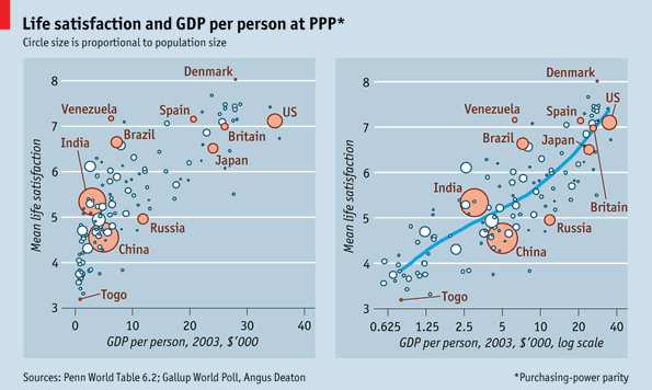
This graphic comparison in The Economist is an excellent piece of evidence in support of the use of logged scales. If you are an economist or quantitative sociologist reading this, you probably just fell asleep because you know about log scales already. Still you have to agree that the graphs here do an excellent job of visually explaining why log scales are better than linear scales in this case.

One of the general rules in multi-variable models involving per capita income data is that this data should be logged. The above graphs visually describe what happens when linear wage data is logged. That is the only change made between these two graphs. On the left, the wage data is measured just as it comes, on a linear scale which assumes that the difference between one dollar of per capita GDP is the same between no dollars of per capita GDP and that very first dollar of GDP as it is between the 10,000th dollar of GDP and the 10,001 dollar of GDP. The graph on the right logs the per capita GDP. This changes the assumptions about the distance between the zeroth and first dollars of income and the distance between the 10,000th and 10,001st dollars of income. In the graph on the right, logging the per capita GDP gives us a scale that is far more sensitive to differences when integers are small than when they are large. That difference between having no per capita GDP and having just one dollar of per capita GDP, or between one dollar and ten dollars has a relatively greater impact than the difference between 10,000 and 10,001 (or between 10,000 and 10,010). Logged values are sensitive to differences in orders of magnitude. There is an order of magnitude change between 1 and 10, then not again until we get to 100, not again until we get to 1000, and not again until we get to 10,000. The distance between each of these milestones grows successively larger. That’s the mathematical logic behind logged scales. Why do they tend to produce better fit lines for per capita income level data than the linear scale does?

Imagine this: you have no money and someone gives you $10. That is quite meaningful. Now you are able to take the subway, get something to eat, and make a call at a pay phone, three things you would not have been able to do when you had nothing. Those $10 mean a whole lot to you in a way they wouldn’t if you had $10,000 and I gave you $10. With your $10,000 you would already have been able to do all the things I mentioned above. Having an extra $10 would not make much meaningful change in your immediate material conditions or your investing options. The point here is that when folks have no income, they are a lot more sensitive to small changes in income than they are when they have a measurable income. The more income they have, the less sensitive they are to small (or even moderate) changes in income. This is why economists and quantitative social scientists almost always log measures of income. The assumptions I just explained are almost always true.

In the graphs, once the per capita GDP (which isn’t exactly a measure of income, but it is closely correlated) is logged, the relationship between income and happiness is much clearer. The model fits better when per capita GDP is logged and it appears that there may be a positive relationship between money and happiness after all.

What needs work

These happiness measures are rather uninspiring. Happiness is quite possibly culturally specific – what makes my mother happy, for instance, is my singleness. What makes mothers in other places happy might be that their 30-year-old daughters are married and have healthy children. I can hear you all saying, ‘But wait! Your mom is weird, what makes her happy is singular’. And that is just exactly my point. Happiness is contingent upon so many other things that trying to measure it is difficult – what makes a person happy changes over time and place so we cannot measure happiness based on easily observed objective measures. Some people like to think they can measure levels of depression or even serotonin to figure out who’s happy or not. But I simply don’t buy it. In places where there is more health care, more people are going to be diagnosed with depression. But does that mean that a population with a high level of reported cases of depression (a seemingly scientific diagnosis of unhappiness) is any less happy than a place in which seeking a diagnosis for mental illness bears a prohibitively high financial or social cost such that people do not even seek diagnoses in the first place? Perhaps the people getting treated for depression are now happier than they were before they were treated and thus the place with a high collective rate of diagnosed depressives is actually happier than a place where people are not being treated for their depression?

Dalton Conley was on a panel I recently attended that was called together to offer thoughts on THE MEASURE OF AMERICA 2010-2011: MAPPING RISKS AND RESILIENCE”. Someone from the audience pointed out that the book tends to use measures like health, education, income, and mortality but that these may be missing the right question. The right question was something along the lines of, “But are people happy?” Dalton pointed out that this is a normative question (and thus not the point of the volume which is demographic in nature) and that it is methodologically nearly impossible. The reason the information in the book is meaningful is that the measures that have been established can be rigorously measured across time and place. And they HAVE been measured across time so we are able to see patterns. The problem with any new measure is that there isn’t much to compare it against for a couple decades. More importantly, there is no objective way to measure happiness. A pound is a pound where ever you weigh it on the face of the earth (OK, yes, there are some exceptions to this but those are for physicists). A dead person is a dead person just about no matter where they are so mortality tends to be a good measure, too. But happiness does not fit well into a measurement framework. And even if it did, we’d be back to Dalton’s first point, which is that all we could do with that information is become normative.

This increasing desire to find the roots of happiness seems both misguided and heavy handed. Just as people appreciate seasonality in nature, I tend to think there is something to be said for having a full set of emotions. If that is true, there is no particularly good reason to run around trying to doggedly pursue happiness. There are benefits to being sad and introspective just as there are benefits to being happy. What is *with* all this fixation on happiness?

You’ve heard plenty from me at this point so I’m shutting up. I would like to hear your thoughts about both log scales and measuring happiness.

References

(25 November 2010) Money and Happiness [Daily Chart] The Economist online.

Lewis, Kristen and Burd-Sharps, Sarah. (2010) The Measure of America 1900-2010: Mapping Risks and Resilience. with an introduction by Jeffrey Sachs. New York: NYU Press. Part of the American Human Development Project of the Social Science Research Council.

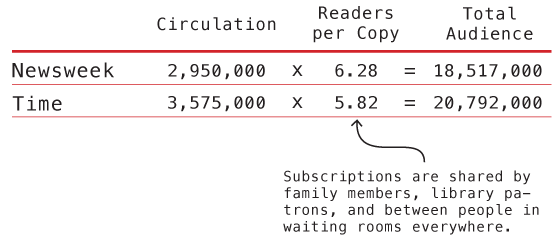
Time and Newsweek Circulation from the year 2007

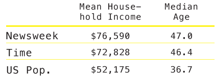
Time and Newsweek Reader Demographics - Table
Time and Newsweek Reader Demographics Table (US Pop. data from 2008 American Community Survey)

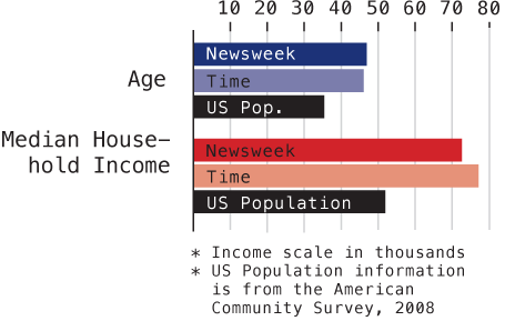
Time and Newsweek Reader Demographics - Graph

What works

These graphics accompany the graphic in my previous post about the counts of humanitarian images in Time and Newsweek. They are meant to give context to the methods section which describes these two magazines in terms of a few demographic variables and circulation information. I do not have access to the original source so I could not go back and get more demographic information besides household income and readers’ ages. It is possible that those were the only two pieces of information available in that source about reader demographics.

What needs work

The big question is: do you like the graph of the demographic data or should I just leave it in a table? I won’t tell you which way I’m leaning so as not to prejudice your opinions.

Go ahead, feel free to leave a one word comment (the one word being graph, table, or neither). If you’re feeling especially motivated, it would be nice if you explained your reasoning. But it’s August, so I’ll cut you some slack if all you can muster is a single word.

References

American Community Survey – 2008.

Mediamark Research & Intelligence (MRI). 2008 (Fall). Magazine Audience Estimates. New York: MRI.

Infographic Humanitarian images in Time and Newsweek

An Original Creation – Draft Only

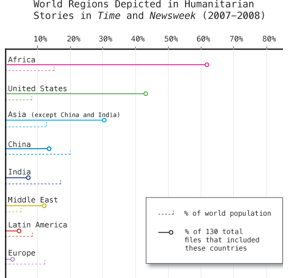
Jen Telesca and Nandi Dill, my fellow research assistants at the Institute for Public Knowledge, presented a paper last year based on data they gathered doing visual content analysis of Time and Newsweek during the years 2007 and 2008. They looked through each issue, identified the articles that were humanitarian in nature, and then coded those images according to geography, the type of situation depicted, and the purported status of the individuals in the image (military actor, activist, politician, celebrity, etc). I am helping create the graphics and I thought I would share this one even though it isn’t yet complete.

As per usual, I welcome your comments and criticisms with open arms. Tear it apart, but be specific.

Methods and Findings

There were a total of 130 articles containing 363 images. The above graphic is supposed to help viewers come to the realization that not all areas are equally represented. I assumed – and this is a wild leap here – that there is some baseline level of social disease and natural disaster plaguing any population. More people = more trouble though we know the relationship is imperfect. Poor areas may experience a natural disaster as a humanitarian crisis leading to orphanhood, starvation, lack of adequate food and shelter where another region would have experienced the same natural disaster as a major inconvenience but one that insurance policies would more or less cover. A natural disaster does not always become a humanitarian disaster. Variables like wealth, racism, literacy, and so forth do play a role and I cannot capture those elements by showing a simple population statistic.

Am I forgetting something major? Am I taking Time and Newsweek to be tellers of the truth, representers of the world as it is, completely objective and unbiased by budgetary constraints or political agendas? Not really. I’m also not trying to push those issues too hard. One could assume from this graphic that some regions are more likely to be represented as suffering from (or aiding in the recovery from) humanitarian emergencies than others for reasons that have nothing to do with the frequency of these kinds of emergencies.

I hope that the graphic leads you to wonder why some regions appear more frequently than others but that it does not beat you over the head with the claim that Time and Newsweek like to depict Africa and the Middle East as sufferers and the US as altruistic helpers far more than a random sample of suffering or aid giving would indicate. Just look at Europe. They appear neither to suffer from or aid in humanitarian crises much compared to how many people live there. One theory is that US based magazines prefer to show US citizens performing acts of altruistic heroism rather than showing Europeans lending a hand. To what degree is Africa over represented because there are simply more humanitarian emergencies there versus being over represented in images because in this particular moment, in these two magazines, Africa equates well with the typical imagination of victimhood?

The graphic cannot answer all those questions. Mostly it just intends to raise them. What do you think?

Please send me comments

I will post the next draft when it is ready. I’ll tell you right now that it will include an indication of how often impending or ongoing crises were associated with each region. That should make it easier to tell which geographies are shown to be full of victims and which are full of altruists.

[There is a future graphic that uses the same dataset to show that being a victim and being an altruist are more or less mutually exclusive. For instance, stories involving crises in Africa almost never show Africans helping Africans. Instead, folks from wealthy countries are usually the ones depicted doing the helping.]

Greenhouse gas emissions graph
Greenhouse gas emissions | World Resource Institue and Google's Public Data Explorer

What works

The World Resource Institute has partnered with Google to create an interactive portal for creating visualizations based on publicly available data. Google has been in the business of doing this sort of thing at least since the time they acquired Trendalyzer from Scottish-based gapminder.org in 2007. To be sure, gapminder.org is still a going concern of its own and IBM also offers free web-based visualization services through their Many Eyes program.

The focus of the trendalyzer is to show change over time and they succeed in making it quite easy to watch panel data change over time.

What needs work

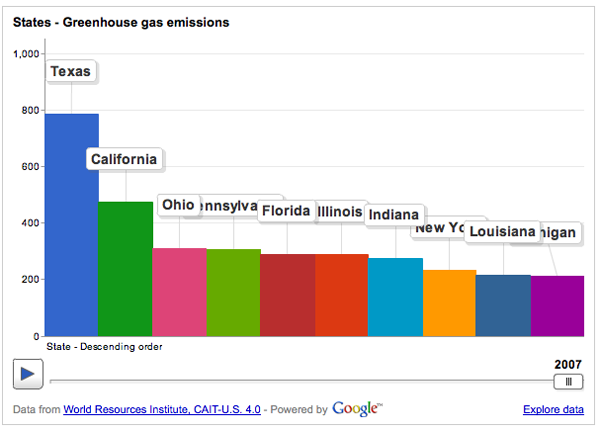
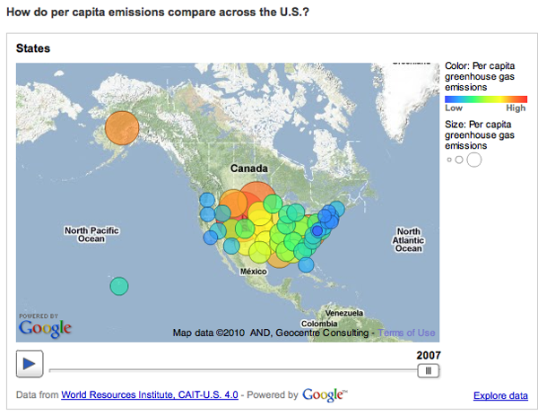
BUT…I find that this particular graphic is a great example of a misleading reliance on time as the key ‘context’ variable. So the graphic above breaks down greenhouse gas emissions by US state over the course of the year. If you have already clicked over to the World Resource Institute and watched the animation of these bars pumping up and down (more up than down) and trading places with each other over time, you will surely have been fascinated. I watched it three times in a row. But I was stuck wondering what the take away was meant to be. Clearly, there is the first order take away that the bars pretty much grow over time, they do not shrink. If I were the World Resource Institute, getting that message out would be important to me. But I would hope for more than just the bullhorn approach, “More is BAD! More is BAD!” which is kind of how this hits me at the moment.

One of the biggest problems with this graphic is: not all US states are the same size. Of course Texas emits more greenhouse gases than most states – many more people live there than in, say, Kentucky, Iowa, Oregon, etc. But the World Resource Institute chose to display per capita emissions with the bubble approach (which has almost no redeeming value in my opinion because I cannot even see half of the bubbles. Maybe they all could have been reduced by half or more? And maybe instead of going with colors on a spectrum, the worst could have been red, the best could have been green, and most everyone else could have been some shade of grey? It’s just not possible to hold 50 changing variables in your active cognitive space at once. Reducing it to three variables – the good, the bad and the mediocre – could actually increase retention and pattern recognition.)

Greenhouse Gas Emissions Per Capita, US 2007
Greenhouse Gas Emissions Per Capita, US 2007 | World Resource Institute and Google

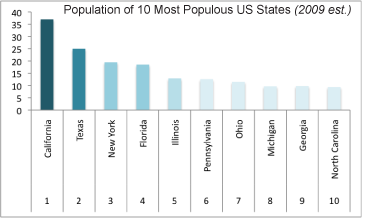
But back to the bar graph at the top. For the purposes of greenhouse gas emissions, it makes the most sense to interpret size as population not square miles, so that’s what I am going to do. In an attempt to be helpful, I threw together a bar graph of the top 10 most populous US states (using 2009 population estimates) in good old Excel. Note that our friend Texas is not the most populous state by about 12 million people – that is a lot of people. California is the biggest and they emit way less than Texas. New York is the third most populous state and we emit far less than our proportional share would suggest. Let’s hope it stays that way because I already find it unpleasant to breathe the air in Manhattan (admittedly, that could be due to many causes besides greenhouse gas emissions).

Most populous US states by size

My suggestion here is clear: prepare a bar graph per state, per capita. And, yes, I would want to see how that changes over time. I would probably watch the animation six times instead of three times. My fantasy is that we could compare not necessarily by state, because that is in many ways arbitrary, but by personal habits. Say we get the most extreme environmentalists – vegan, freegan, won’t even take motorized public transportation, never flies, prefers candles to compact fluorescents, has a composting toilet – to the somewhat average person who has a car but not an SUV, eats meat but not every day, does not pay more for organic food – to the extreme non-environmentalist who owns three houses, drives in an Escalade or something of that nature, flies internationally at least four times a year, pays extra for organic food (but at restaurants), and sends clothes to the dry cleaners twice a week. But that would probably result in a graphic best described as “info-porn”, enticing and exciting but intellectually vacuous.

Summary

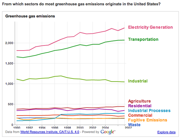
The WRI is on to something with their Google partnership. My favorite of their early work is this line graph that does a better job of telling the emissions story than any data broken down by state.

greenhouse gas origins
Greenhouse Gas Origins | World Resource Institute and Google

But the other great thing about the new partnership is that they ask for suggestions and set up a google group to manage the roll-out and incorporate nay-sayers like myself.

“By pairing [the Climate Analysis Indicators Tool] CAIT data with Google’s tools, there are new possibilities for people everywhere to take part in using sound data to tell stories that frame environmental problems and solutions. In the future, we hope to include additional data sets that can tell even more stories through Google’s visualization tools.

Suggestions for what you would like to see, or have a question about CAIT-U.S. data? Let us know here or join the conversation at http://groups.google.com/group/climate-analysis-indicators-tool.”

Trends in Marital Stability (2004) | Betsey Stevenson and Justin Wolfers

What Works

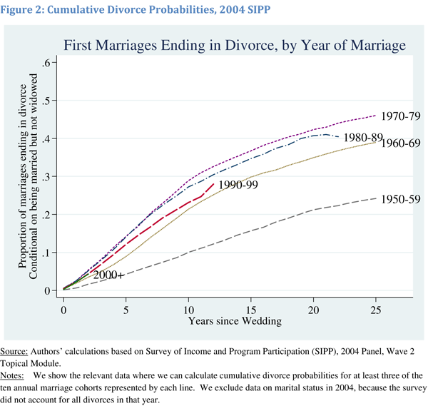
Last night this blog received a deluge of spam from someone with an IP address in Australia promoting wholesale wedding dresses. In response, I first exercised a wholesale ‘delete’ event. Now we’ve got a graph about the stability of marriage in the US since the 1950s. The next time someone tells you that 50% of marriages end in divorce, you’ll know how to show them that they’re wrong.

As you can see from the above graphic representation, marriages in the 1950’s were less likely to end in divorce within the first 25 years of marriage than any subsequent cohort of married folks. We have no idea if those were ‘good’ marriages that lasted, we just know that they were less likely to end in divorce. From the representation we see that divorce rates climbed through the 1960s and 1970s but started falling in the 1980s and continues to fall, inching back towards 1960s levels.

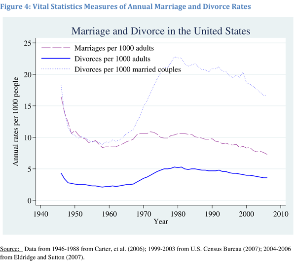
Measures of Annual Marriage and Divorce Rates | Betsey Stevenson and Justin Wolfers

Furthermore, from this next graph, we can see that the decrease in the divorce rate is not only due to marriages lasting, but that any given person is less likely to experience divorce because we are now less likely to get married in the first place. If one doesn’t get married, one cannot get divorced. It would seem that people might actually be making fairly appropriate decisions around the ‘I do’ moment because the people who choose marriage are staying married longer. In other words, the folks less likely to stay married may somehow recognize this about themselves and opt out of marriage altogether.

Using multiple graphs tells a much more complete picture than relying on just one. The first graph was designed to debunk the notion that 50% of marriages end in divorce by showing that for a brief moment, marriages formed in the 1970s may have approached that dissolution rate but that marrieds have been sticking together more and more since then. The second graph is more interesting to me because it details overall trends in marriage, including the slow slide away from marriage altogether. It could be that people are just waiting longer to get married, in which case the decline in the marriage rate recently might just be a lag. Lifetime marriage rate is something I’d still be interested in checking out, though I feel that we haven’t maxed out on age at first marriage so it would be hard to see, at least not in 2010, if the trend is toward later marriage or no marriage at all. My prediction would be that age at first marriage will start to hit a plateau at around 30 for women because reproductive ability tends to decrease markedly starting at about 35, or so I’ve been told, and many people get married at least in part because they’d like to have some kids. But we’ve got a long way to go before we hit 30 for women’s marrying age. Median age at first marriage for women is just 26 and even though it is climbing, it isn’t skyrocketing.

References

Stevenson, Betsey and Wolfers, Justin. (2007) Trends in Marital Stability. Working Paper.

Wolfers, Justin. (21 March 2008) Misreporting on Divorce. on the Freakonomics blog at the New York Times.

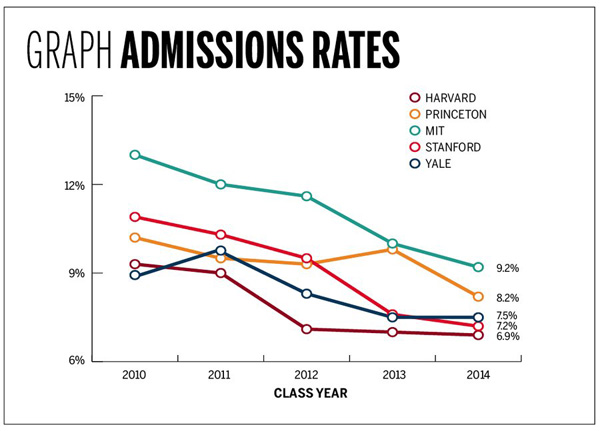
Admissions rates at top schools drop | Yale Daily News

What Works

The above graph was produced by Yale Daily News. It is clean and does a good job of displaying their admission status compared to their competitors. The reason I thought it was worth mentioning is that a few small aesthetic decisions make the graph pleasing. I like the open circles. I like the fact that the ending values are included as numbers. I would have liked it if they had included starting numerical values, too.

Comparison

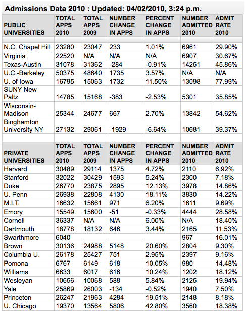
For those going through the college admissions process, it can be all-consuming. The New York Times runs a blog called The Choice that focuses solely on this process from the testing to wait lists to moving, transferring and everything in between. Unsurprisingly, then, they ran a table showing similar information about a larger number of schools which they gathered through a mix of old-fashioned reporting – contacting schools and asking them – and Web 2.0 reporting in which schools who had not made the initial deadline could email their data in to be added to the table. Have a look below.

The Choice blog at New York Times 2010 admissions data |  J. Steinberg
The Choice blog at New York Times 2010 admissions data | J. Steinberg

Ask yourself about the difference between a table and a graph when it comes to conveying information. Edward Tufte is a fan of tables because they can display a great deal more information than a graph. That is true in this case – look at how many more categories of information there are in the table. What do you think? When is it better to present a table full of all the details and when is it better to display a graph like the one above?

References

Lu, Carmen. (5 April 2010) Admissions game getting riskier. Graph. Yale Daily News.*

Sternberg, Jacques. (2 April 2010) Applications to Selective Colleges Rise as Admission Rates Fall. The New York Times “The Choice” blog.

*Note that I wonder if the graphic designer got the data from The Choice blog piece – the publication dates could just be coincidental.

Annual change in U.S. GDP under different scenarios | 2009-2019

What Works

We are able to see the results of three hypothetical assumptions regarding the treatment of unauthorized immigrants and the impact that could have on the GDP of the US from 2009-2019. While I often advocate trend lines for showing changes over time, in this case, what we are interested in is not just a trend over time, but the difference between the three outcomes in each year. For that reason, the choice of bars works better than would the choice of trend lines. Seeing all the three options on the same graph neatly summarizes the overall findings of the report. If you are interested in learning more about just how these projections were made, all of that is detailed in the report [link below in references]. One important note that the report mentioned more than once is that the cost of the mass deportation scenario does not include the cost of deporting individuals (which would be legal and physical), it just represents the impact on the economy of removing unauthorized workers.

What Needs Work

I snipped this graphic out of a report, so the following critique is for me more than for the graphic creator. Because this kind of projection requires so many assumptions and simplifications, providing summaries of the most critical assumptions is necessary for the proper cognitive digestion of the infographic. The report contains sufficient discussion and references, but in a world where people like me clip graphics and stick them in other reports or on blogs, savvy designers will include longer captions [the original caption is included in the image file] or other explanatory text even if that same information is included in the formal text. Hyper text culture is spreading. It is far more common now to put together a little bit of this from here and a little bit of that from over there in search of just that bit of information that we think we want rather than reading/watching the full, originally constituted work. Love it or hate it, this hyperlink no place is the place where we have arrived.

References

Hinojosa-Ojeda, Raúl. (7 January 2010) “Raising the Floor for American Workers: The Economic Benefits of Comprehensive Immigration Reform”. Center for American Progress.

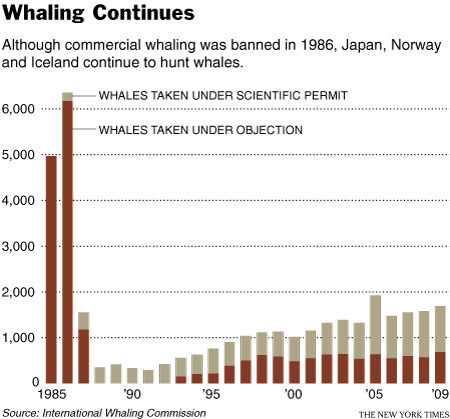
Whaling Continues | 1985-2009

What Works

It’s easy to see, even without the explanatory text, that there must have been something happening circa 1986 that changed the way whales were killed. The explanatory text is necessary to understand that it was a legislative change as opposed to a whale disease or a human health scare similar to mad cow disease (crazy whale disease?).

What I like more about this graph is that it suggests something fishy might be going on when it comes to the ‘scientific’ capture of whales. The argument goes something like this: in order to understand and protect whales and whale habitats, some whales need to be captured and killed. Just eyeballing the bars, it would seem that from 1985-1990 something like 100-300 whales were killed annually in the name of science. Then the number of whales killed for the scientific preservation of whales started to drift upwards. In 2005 my estimation suggests that well over 1000 whales were killed for science. And that 1000/year number seems to hold from there through 2009. Now, maybe whale science has grown by leaps and bounds and requires the death of about 1000 whales per year.

The article does not address the increase in scientific whale deaths so I am left to wonder if the graphic is revealing some questionable whale fatality accounting procedures. In other words, this graphic is a champion because it raises a political question in a largely apolitical way. Good work, New York Times.

Reference

Broder, John. (14 April 2010) “Whaling Continues”. In The New York Times, Environment Section.

Global Population and Cereal Production
Global Population and Cereal Production - FAOSTAT database

What Works

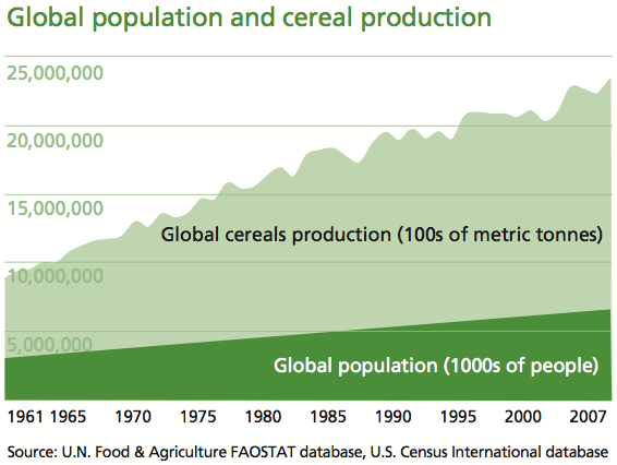
The strength of this graph is its simplicity. It shows two trends at once – neither would be all that interesting without the other, but in concert, they tell us something. It’s a simple move that most social scientists ought to consider because it isn’t all that much harder than creating two individual graphs and displaying them side by side. This simple move, contextualizing global cereals production with the growth in the global population, clearly summarizes the issue addressed in the multi-thousand word essay. That message is, as I am sure you can guess from looking at the infographic above, is that population growth is not driving the growth in world hunger. The production of cereals is outpacing the growth in overall population.

For the sake of cross-media comparison, what would that infographic look like in words?

“Scarcity is a compelling, common-sense perspective that dominates both popular perceptions and public policy. But while food concerns may start with limited supply, there’s much more to world hunger than that.

A good deal of thinking and research in sociology, building off the ideas of Nobel laureate economist Amartya Sen, suggests that world hunger has less to do with the shortage of food than with a shortage of affordable or accessible food.” –Stephen Scanlan, J. Craig Jenkins, and Lindsey Peterson, Contexts Vol. 9:1; Winter 2010, p. 34-39.

What Needs Work

The article also ran with a graphic that shows the increase in the number of calories available per capita. Personally, I would have combined this data with the rise in global population because it is a more intuitive combination, even though the y axis would no longer be quite the same (one of them would be population in millions and the other would be calories in thousands – both are absolute scales so there would be a relatively easy work around that would allow the trend lines to be compared, which is what we are aiming for in the end). The original graphic looks at cereal production next to global population growth which invites questions about what portion of caloric intake comes from cereal, how sensitive cereals are to market fluctuations, and so forth like that.

References

Scanlan, Stephen; Jenkins, J. Craig; and Peterson, Lindsey. (Winter 2010) The Scarcity Fallacy in Contexts Vol. 9:1; p. 34-39.

FAOSTAT. Food and Agriculture Organization of the United Nations.
Note: I highly recommend FAOSTAT.

Divorce rate - the short and incomplete story

Zoom in and it looks like poverty could be good for marriage

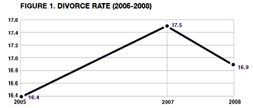
Philip N. Cohen from the Family Inequality blog (and the sociology department at UNC Chapel Hill) sent along the two line graphs in this post saying, “For the last week I’ve been steamed about these two figures from a report on marriage by W. Brad Wilcox.” [Note: W. Bradford Wilcox is the director of the National Marriage Project at the University of Virginia where he is also Associate Professor of Sociology.] The zoomed-in graph above was used in the main text to show that the divorce rate is going down during the current recession. Poverty must be great for marriage! No matter how folks feel about their spouses, they must feel more strongly about having enough money so they stay together. Or, to put it slightly differently: what unemployed person is about to leave the comforts of an intact home, even if that home is a disgruntled one?

Cohen goes on to point out that Mr. Wilcox’s strategy of zooming in on the data was also picked up by the media who are happy to run a story about the unexpected positive impact of the recession on lasting marriages.

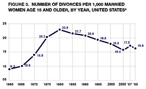
Mr. Wilcox did include a complete picture of the divorce rate since 1970 in his appendix which is copied below.

Divorce rate in the US |  1960 - 2008
Divorce rate in the US | 1960 - 2008

Zoom out and it just looks like the divorce rate hit a speedbump on the way down

As evidenced by this line graph, the divorce rate has been declining for years. The brief period of increasing divorce from 2005 to 2007 was more like a speedbump in a declining trend than the end of a trend of increasing divorce rates.

Read more about why this matters at Philip Cohen’s blog.

An improved graphic

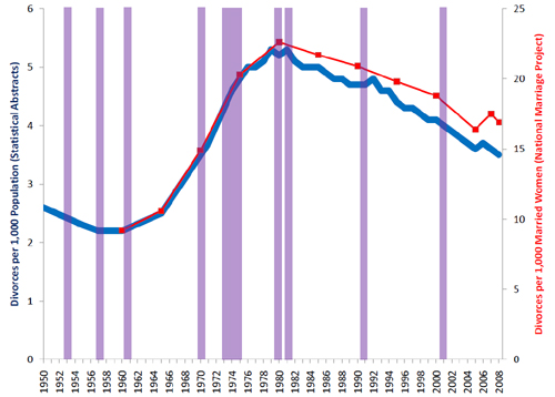
Philip Cohen's sketch including recessions in purple

My point is simply that all infographics tell richer stories the more data they depict. Zooming in is generally a bad idea because it reduces the context from which the reader can draw solid conclusions. If the recession were going to be part of the story about divorce, recessionary periods should be indicated on the graph, too. That would make it easier to tell if all recessions tend to decrease divorces or if somehow a decrease in divorce just happened to coincide with this current recession. It’s easy to ‘lie’ with info graphics by being overly selective. And lying just isn’t what we’re after.

References

Wilcox, W. Bradford. (2009, December 11) “Can the recession save marriage?” in The Wall Street Journal. Opinion Section.

Cohen, Philip. (2009) Recession, resilience, divorce?” in The Family Blog.