
Which one works?
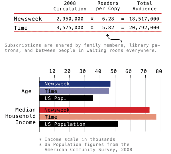
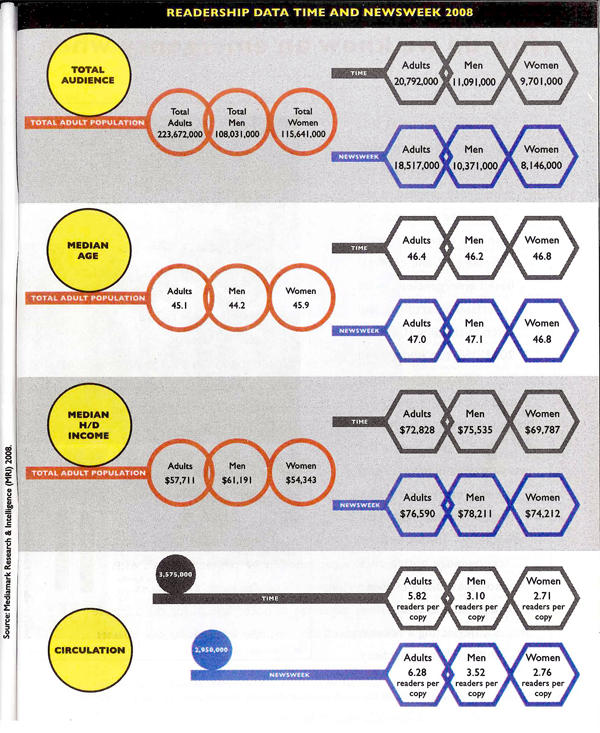
These two graphics portray some of the same information – household income, median age, audience and circulation – though the first one does not break down information between genders. Though it probably goes without saying, I like the one I designed best. The second one has some tantalizing shapes – I applaud the visual appeal – but it does nothing to aid people’s eyes as they try to compare relative sizes between the salient categories. I also happen to think it is easier to understand the complexity of the difference between audience and circulation with the textual explanation provided in the first one. I find the white-font-on-dark-background of the Time and Newsweek labels hard to read (it’s also a known graphic design no-no, especially with a small font size like this. It is easier for the human eye to grok the contrast with dark text on a light background than with light text on a dark background).
From a sociological perspective, comparing the readership of Time and Newsweek not only to each other but also to national averages provides a much deeper sense of context. The second graphic was built from the first though I never had a chance to meet with any of the writing or design team to understand why the national averages were removed.
There are other elements I dislike in the second one. I dislike, for instance, the need to repeat certain elements of text over and over again: “readers per copy” and “Total adult population” and even the “Time” and “Newsweek” headings. One of my closest friends and colleagues spends a lot of his time writing code. The best lesson I have learned from him is that where elements or actions have to be repeated over and over, there is inefficiency in the system. A better design is possible.
I would love to hear from my readers on this comparison. Am I suffering from too much ego investment in the graphic I made? Is the second graphic an improvement on the first? If so, how?
References
Norén, Laura. (2010) “Appendix: Data and Methods” in first draft of Dill, Nandi and Telesca, Jen Imagining Emergencies. [Information graphic].
Cuomo, Yolanda. (2011) “Readership Data Time and Newsweek 2008” in final draft of Dill, Nandi and Telesca, Jen Imagining Emergencies. [Information graphic].