
What works
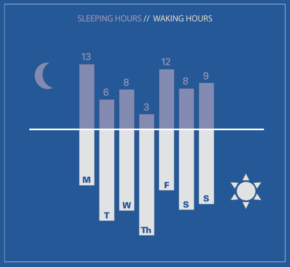
This simple graph is visually nothing all that unique but conceptually it makes a very smart use of the bar graph trope to display information. Sleeping and waking hours are taken to be each other’s opposites (and are assumed to happen in unbroken spans – no daytime naps for Danielle).
What needs work
I might have toyed with placing the waking hours on top and the sleeping hours on the bottom. Or, better yet, I might have flipped the axis and put waking hours on the right and sleeping hours on the left. But that’s simply a matter of taste. Flipping the axis doesn’t change the concept.
Quantified self
As we see more and more applications and products that aim to reveal patterns about individuals to individuals, we’ll see more and more of ourselves reflected back to us in information graphics like this one. I’m curious to find out how the visualization of the data shapes the way people use the data.
There will slowly be more on the quantified self theme here.
References
Carrick, Danielle. (May 2012) “Week of May 1st | Sleeping” [infographic].