
Passport background
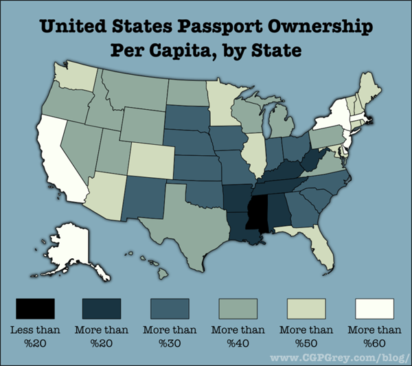
In 2008 as part of the war against terror, US citizens were required to have a passport to travel to countries like Canada and Mexico that had previously allowed passport-free travel. US citizens could drive or walk into Canada and Mexico with a driver’s license and be allowed to drive or walk right back in. In 2011, we see from this map that even now, not all US citizens have passports, not even close. Getting a passport is time consuming, costly, and generally requires some evidence that the person applying for the passport intends to travel outside the US. That last requirement is kind of a no-brainer, why would anyone want to go through the effort to obtain a passport if they never planned to leave the US?
What works
Always skeptical about mapping data that could appear in a table or chart, I have decided that I’m neutral on this particular use of mapping as a presentation device. If the map had included Canada and Mexico rather than just making the US appear to float in space, I would probably have been more convinced that the map was the way to proceed with this information. If I had created a chart or a table, I would have divided the US states into two groups: those that border foreign countries and those that do not. Have a glance at the map again and you will see that the states bordering foreign countries have higher percentages of passport holders, on average, than those states that do not border foreign countries. Florida and Illinois do not border foreign countries and yet they both have high percentages of passport holders. In the Florida case, I would say it’s almost as if Florida borders foreign countries since so many of its near neighbors are island nations – Haiti, the British Virgin Islands, the Dominican Republic, and so forth.
Illinois is home to Chicago, a destination for immigrants and immigrants often leave family in other countries whom they would like to visit. Thus, they will need passports. The same is true for most big cities – New York and California (home to New York City and Los Angeles) also have large immigrant populations and large numbers of passport holders. On the other hand, Saskia Sassen might point out that what’s going on in Chicago, LA, and New York is that all of these cities are global cities, hubs of activity in Finance, Insurance and Real Estate (FIRE industries). These FIRE industries are global industries and require their workers to travel internationally at higher rates than the same kinds of workers in other industries.
It would be interesting to compare the rates of passport holders to both the rates of first generation immigrants and the proportion of workers in the FIRE industries in all these states.
What needs work
As I mentioned, presenting this information as a map begs to have Canada and Mexico included. In order to visualize the story here, it would be helpful to see what is happening at the borders, to remind ourselves that the US does not simply float in space. It is geographically specific and it matters that some states have international borders and others do not. Sometimes these borders ARE the story and I think when we’re talking about passport holders, the borders are important.
If this information were to be presented as a set of bar graphs, we would risk some information overload since there would be 50 bars. But that might be alright if it became instantly visually clear that the border states have higher rates of passport holdership than the interior and non-bordering states. Plus, with a bar graph, the numbers could have been layered on each bar (and really, they could have been layered on each state in the map) so that we would be able to get a more precise calculation. Simply knowing that we are working with some number in a 10% range is kind of sloppy for my tastes. That’s just me. And sometimes with information like this it’s silly to try to get granular because the data collection method could have a fairly wide margin of error. Though I should hope that the feds know who is holding passports. I suppose people could apply for them in one state and then move to another state. The feds may not know about moves following passport application and that could introduce some fuzziness.
Note: I tried to go to the original source of the map several times but the page timed out repeatedly. Therefore, I ended up citing Andrew Sullivan at the Atlantic since that is where I encountered the map and it is a website that I believe you can visit whereas cgpgrey.com/blog is not visit-able. If I had been able to visit I might have been able to figure out where the passport data came from in the first place – presumably some federal department.
References
Sullivan, Andrew. (8 March 2011) Map of the Day: How many Americans have a passport, by state in The Daily Dish at The Atlantic online. [Graphic by cgpgrey.com/blog]
Sassen, Saskia. (2001 [1991]) The Global City: New York, London, Tokyo, 2nd ed. Princeton, New Jersey: Princeton University Press.
Comments 2
Sean — March 8, 2011
The color ramp seems backwards. Darker signifies intensity, but in this case it is trying to tell us that there are fewer people in a particular state than the lighter ones.
Michael Knapp — March 12, 2011
I agree with Sean's comment. I'd also add that this presentation could use other scales to add depth. State rankings on poverty rate, average personal income, average highest educational degree, or percentage foreign-born population might all have offered a significant additional axis.