design

The functional art book cover

Cairo, Alberto. (2013) The Functional Art: An introduction to information graphics and visualization. Berkeley: New Riders, a division of Pearson.

Overview

A functional art is a book in divided into four parts, but really it is easier to understand as only two parts. The first part is a sustained and convincingly argument that information graphics and data visualizations are technologies, not art, and that there are good reasons to follow certain guiding principles when reading and designing them. It is written by Alberto Cairo, a professor of journalism at the University of Miami an information graphics journalist who has had the not always pleasant experience of trying to apply functional rules in organizational structures that occasionally prefer formal rules.
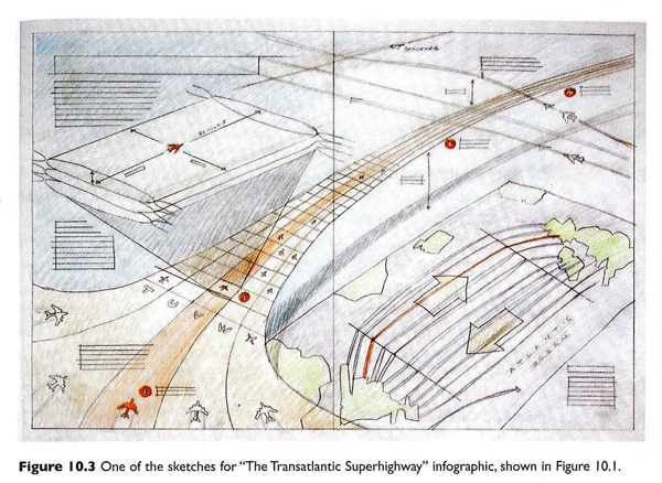
Sketch of "The Transatlantic Superhighway" by John Grimwade
Sketch of “The Transatlantic Superhighway” by John Grimwade which was originally for Conde Nast Traveler and reprinted in The Functional Art. Click for the full interview with Grimwade.

The second part of the book is a series of interviews with journalists, designers, and artists about graphics and the work required to make good ones. This part of the book is as much about the organizational culture of art and design and specifically of graphics desks in newsrooms as it is about graphic design processes. The process drawings are fantastic. I’ve included two of them here. The first by John Grimwade is multi-layered, full of color and dynamic vitality. These qualities were carried through into the final graphic but are often very difficult to build into computer-generated images. I wondered if the graphic would have been as dynamic if it had come from a less well-developed hand sketch (or no sketch at all).

Photo of clay model of Gobekli Tepe
Photo of clay model of Gobekli Tepe by Juan Velasco with Fernando Baptista for National Geographic. Click for a video of the model building process.

The second is a set of photographs taken of a clay model by Juan Velasco and Fernando Baptista of National Geographic that was used to recreate an ancient dwelling place call Gobekli Tepe that was in what is now Turkey. Both of these examples lead me to the iceberg hypothesis of graphic design – the more the design that shows up in the newspaper or magazine is just the tip of an iceberg of research, development, and creative work, the more accurate and engaging it is likely to be.

As a sociologist I am accustomed to reading interviews and am fascinated by the convergence and divergence in the opinions represented. In this case, I especially appreciated that Cairo’s interview questions touched on the organizational structures and working arrangements, as did his own anecdotes throughout the book, to provide an understanding of the opportunities and constraints journalists and information graphic designers face. Their work is massively collaborative and the book works to reveal the bureaucratic structures that come to promote and impinge upon design processes and products.

There is a fifth part to the book, too, a DVD of Cairo presenting the material covered in the first three chapters of the book. I admit, I have rarely been a large fan of DVD inclusions. They are easy to lose, scratch and/or break. But assuming the DVD is intact and accessible, I never know when I ought to stop reading and start watching. And even if the book has annotations indicating that an obedient reader should stop reading and start watching the DVD, this assumes the reader is willing and able to put down the book and fire up the computer. The only time I can imagine using the DVD is as a teaching aid in class to give the students a break from having to listen to me all the time. Unfortunately, that is prohibited by Pearson.

Still, it is worth watching because Cairo has a great voice and he is able to discuss interactive content/design in a way that is not easy in the pages of the book. While some of the discussion repeats themes from the first part of the book, there are new examples from additional designers, including some who have been Cairo’s students, which might be of interest to people thinking of signing up for his online course.

What does this book do well?
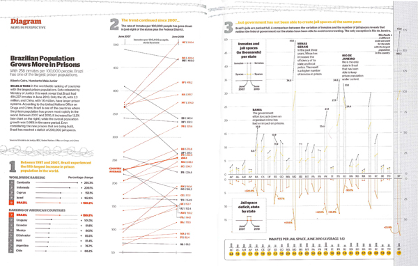
"Brazilian population grows more in prisons" graphic
“Brazilian population grows more in prisons” by Alberto Cairo originally in Epoca magazine November 2010, reprinted in “The Functional Art” by Alberto Cairo in 2013.

The book does a great job of explaining the decision making behind graphic design. The sketches, process drawings, and recounts of the conversations that went on in editorial meetings gave important depth of context. The organizational culture and day-to-day expectations of the newsroom tend to encourage the use of templates and discourage exuberant creativity. Cairo explained that this Brazilian prison graphic that eventually won the Malofiel design award also won him a reprimand from his boss who proclaimed it to be “ugly”. In practice, conceptual distinctions between art and technologies for comprehension are made rigid by bureaucratic structures in which, “the infographics director is subordinate to the art director, who is usually a graphic designer,” and that this arrangement, “can lead to damaging misunderstandings.”

The more prominent argument follows from these peeks into the backstage of journalism. Infographics and visualizations are technologies, not illustrations. Cairo writes that:

The first and main goal of any graphic and visualization is to be a tool for your eyes and brain to perceive what lies beyond their natural reach….The form of a technological object must depend on the tasks it should help with….the form should be constrained by the functions of your presentation….the better defined the goals of an artifact, the narrower the variety of forms it can adopt.

One of the writing techniques that Cairo uses is summarizing his take-away points from previous paragraphs in quick lists of pointers or key questions. Cairo incorporated these quick lists gracefully into the writing style and I never felt like I was reading a textbook. Still, the quick lists make it easy to use the book as a reference. The index, bibliography and detailed table of contents add strength to the book as a reference source, too. Note to the publisher: I found it frustrating that the book did not include a list of figures, especially given the subject matter.
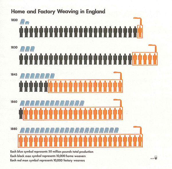
"Home and Factory Weaving in England, 1820-1880" graphic
“Home and Factory Weaving in England, 1820-1880” Otto and Marie Neurath Isotype Collection, University of Reading as seen in The Functional Art by Alberto Cairo.

Diversity

One of the greatest strengths of this book is the diversity of sources from which Cairo draws his material. Yes, he uses graphics he has developed in many cases which is hugely valuable because he is able to provide insights into the development processes. However, he also draws from graphics old and new [see an old one he pulled out of an archive at the University of Reading about weaving in the industrial revolution], from magazines, newspapers, and the internet, made by freelancers, in-house designers, and students, and in languages other than English (some of which are translated, some of which impressively need little translation). My favorite graphic in the book was one I never would have come across that uses pieces of fruit to describe the surgical procedures used to achieve sexual reassignment.
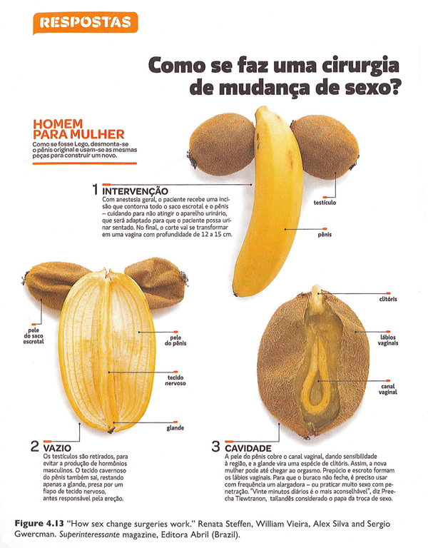

“How sex change surgeries work.” by Renata Steffen, William Vieira, Alex Silva and Sergio Gwercman in Superinteressante magazine (Brazil). Part 1 of 2.
“How sex change surgeries work.” by Renata Steffen, William Vieira, Alex Silva and Sergio Gwercman in Superinteressante magazine (Brazil). Part 2 of 2.

This diversity serves as an example of the breadth of Cairo’s experience in the world of journalistic information graphics. It is also a testament to his real joy in the subject. Many authors of design books are happy to fill the pages with their own work. Cairo is surely talented enough to have done. Instead, he chose to showcase an incredible range of designers and styles. This diversity, combined with the accessibility of the writing, are cause enough to recommend this book for anyone who is curious about graphics and journalism, especially journalism students.

What doesn’t this book do well?

The most curious shortcoming – given the incredible diversity of designers, styles, countries, and publication types represented – is the scarcity of women designers. There are thirteen designers profiled in part IV of the book; only two are women. There were forty-seven graphics reprinted; five were designed by women. With respect to the reprints, Cairo is completely justified in reprinting his own work more often than the work of others because he knows how the design process unfolded in those cases. Since he is a man, this inflates the masculine contribution to the reprinted graphics category. Still, many of the graphics he worked on were collaborative efforts and his collaborators could have been women in a more ideal world. But mostly, they were men.

Because the information graphics world is relatively interdisciplinary and (so far as I know) has no specific professional organization whose membership includes a representative sample of practicing information graphics and data visualization professionals, it is hard to tell if the gendered pattern in Cairo’s book is due to some oversight on his part or the underlying gendered make-up of the industry or a combination of both. Even if the industry is dominated by men, it is important for people who write and edit textbooks to ensure that women are represented or they run the risk of sending the message that women may not be welcome or well-rewarded if they choose to pursue data visualization. That is unacceptable. The graphics world will lose out on half its talent pool and women might avoid careers that could have been satisfying and rewarding for them. Notably, the kinds of graphic design that require coding – like data visualization and interactive design – are better compensated than illustration and static design so it’s possible that women are being subtly nudged into the less well-compensated areas of graphic design along the line. It would have been nice if this textbook that is so diverse in so many other ways could have pushed the gender boundary and included more women.

The book also over-promises in the cognition section. The first chapter on cognition was too basic. The second and third chapters in this section had more that was directly applicable to design. All three chapters could have been condensed into one. It is certainly true that perception and cognition ought to be included and there were some useful applications derived from the three chapters, but there was too much review and too few clear applications of the basic principles of cognition and perception to graphic design.

Here are the pointers I did find useful, if you happen to want to buy the book and skip those chapters:

+ If you want viewers to estimate changes by visually comparing elements, you will have the best luck if those changes are depicted using elements of the smallest number of dimensions possible. For instance, viewers will have an easier time coming up with an accurate estimate of the difference in size between two lines (1D) than between two circles or squares (2D). It’s best to avoid 3D comparisons altogether. I would also add that regular objects like circles and squares are cognitively easier to think with than irregular objects like polygons other than squares.

+ The less frequently a color appears in nature, the more likely it is to draw the eye. Reserve the use of colors like red, pink, purple, orange, teal, and yellow for elements that are meant to draw attention.

+ Humans cannot focus on multiple elements at the same time. Design graphics that have one focal point or clear hierarchies of focal points. Do this by eliminating unnecessary use of bright color, chart junk like grid lines that aren’t absolutely necessary, and by establishing a logical information hierarchy in the page layout.

+ Landscapes have horizon lines. Humans are used to encountering the world this way. This is one reason why it is easier to make comparisons using bar graphs (where all the elements start from a common horizon line) rather than pie charts (where there is no shared horizon).

+ Eyes are good at detecting motion and they will focus attention on moving objects. Try not to ask viewers to read text and simultaneously watch a moving element in interactive graphics.

+ Human brains are good at picking out patterns. Often, fairly small changes to a graphic layout that strengthen the appearance of grouping or other types of patterns will add to the ability of the graphic to deliver an instant impression or overview of the message being communicated. For instance, changing the spacing of the bars in a bar graph so that every fourth bar has twice as much space after it as all the rest will make the graph appear to have groups of 4-bar units.

+ Interposition – placing one object in front of another so they overlap – is a good way to add depth. If objects never overlap, the opportunity for the illusion of depth is lost.

Summary

Overall, the book was well-written, included valuable insight into the process underlying the creation of strong, successful information graphics and visualizations, and would be a solid textbook for use in journalism departments. The representation of women designers was disappointingly low and the segment on cognition could be condensed or otherwise improved. Cairo is clearly a talented designer and teacher. This book meaningfully combines both of those strengths and is an important contribution to undergraduate and graduate education in the emerging sub-discipline of information visualization and design.

I am sending you out with one of the graphics I was most impressed by, in part because the graphic is good, but mostly because Cairo helped me to see why a rather average looking graphic is in fact rather brilliant. It is by Hannah Fairfield of the New York Times graphic desk and it shows that the driving behavior of Americans is sensitive to changes in the economy. During the 2005 recession when gas prices were high but the economy was struggling overall, Americans drove fewer miles. This pattern had only one historical precedent – the 1970s. The graphic depicts this by having a timeline that appears to walk backwards during those two periods in history, a broken pattern your pattern-loving mind is likely to fixate on once you realize this is not your average line graph. Smart.
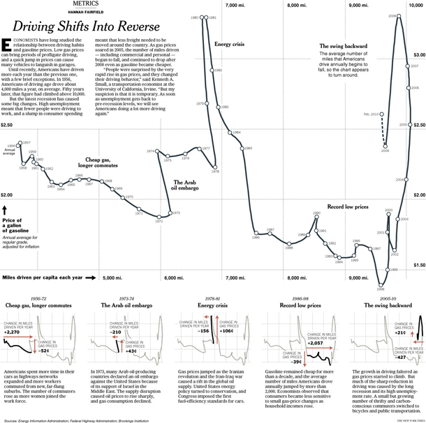
"Driving shifts into reverse" graphic
“Driving shifts into reverse” by Hannah Fairfield originally published in the New York Times, May 2010; reprinted in “The Functional Art” by Alberto Cairo, 2013.

References

Cairo, Alberto. (2013) The functional art: An introduction to information graphics and visualization.

Fairfield, Hannah. (2010) Driving Shifts into Reverse New York: New York Times.

Grimwade, John. (1996) The Transatlantic Superhighway. [information graphic]. New York: Conde Nast Traveler.

Steffen, Renata; Vieira, William; Silva, Alex and Gwercman, Sergio. “How sex change surgeries work.” Superinteressante magazine. Brazil.

Velasco, Juan and Fernando Baptista. () “Gobekli Tepe Process Shots”. National Geographic Magazine. In Cairo, Alberto (2013) The Functional Art p. 238.

Office email traffic

Editing process in graphic design

The editing process in graphic design is somewhat different than the editing process in writing. Writers tend to start with a skeleton, make sure the bones are all in the right places, and then slowly add and sculpt musculature and skin through iterative processes. Graphic designers start with a whole bunch of skeletons, subtract a few, add musculature to the rest, subtract a few of those, add skin to the remaining ones, and then only late in the process will a single design go through a final polishing process.

One of the ways social scientists teach students to become skeptical about the things they read is by teaching them how to edit their own work and the work of others. Students start to see how pieces of written work represent a series of choices. They see that what they’ve read could have gone in other conceptual directions, used different evidence, been shortened, lengthened, stripped of jargon, or otherwise constructed and styled in new ways that could have changed the meanings taken away by the readers. Learning to construct, critique, and polish writing is a major part of how readers develop the tools they need to understand and analyze the works they read.

There is far less educational time spent teaching students how to create visual work, especially visual work outside of the realm of personal expression (I feel like most arts programs emphasize personal expression which is different than creating visual work with the intent of displaying data or even political messaging). It is not surprising that we end up with a bunch of people who struggle to apply an analytic lens to information graphics. This leads to a communications power imbalance that privileges certain kinds of visual devices, including information graphics, over writing inasmuch as information graphics are more likely to be accepted without too much scrutiny since most folks do not have a good idea where to begin to scrutinize them. Information graphics combine the moral authority of numbers with the cognitive inertia of sight that lies behind the cliche that ‘seeing is believing’.

In the service of pulling back the curtain on graphic design, I thought it might be useful to save an entire series of drafts in the development process of a graphic that describes the email traffic in a small design work group. The purpose is to break the seal around the image and reveal it is a series of decisions that might easily have been otherwise.

First Draft

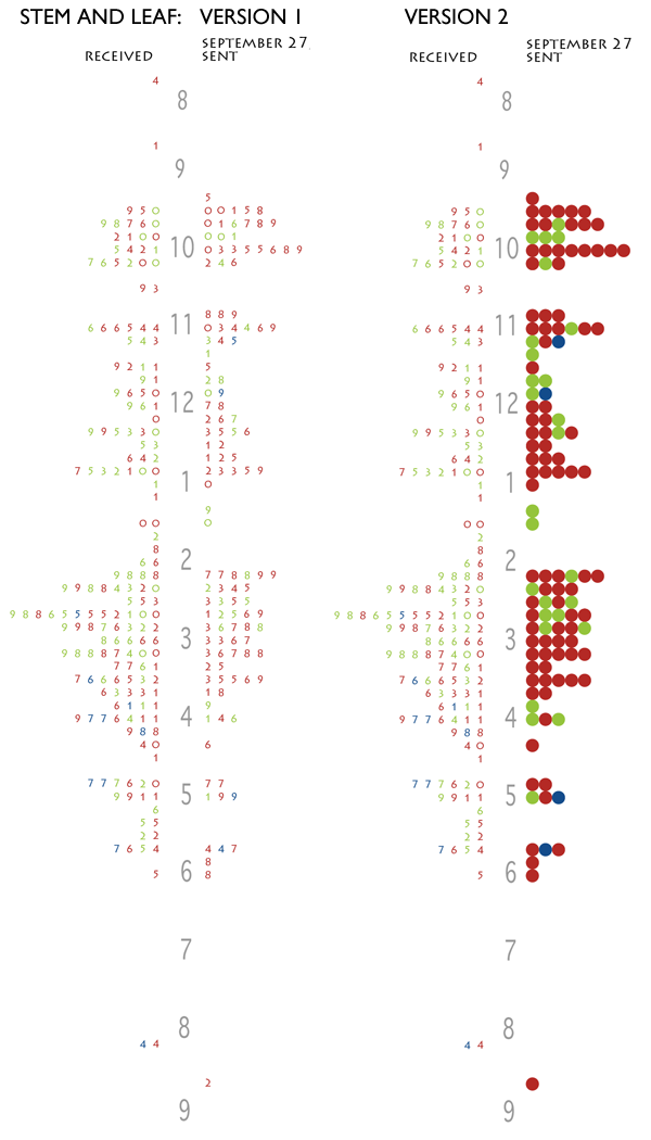
First, I thought a stem and leaf diagram might work.

Stem and Leaf diagrams of office email traffic

But these graphics failed because there was no way to keep strings of receiving or sending visually united. If the people in the office happened to be sending (or receiving) a series of email that spanned between one ten-minute period and the next ten-minute period, that run would be visually broken. I also wasn’t thrilled with the way the sent email matched up with the received email. It was hard to see that when one person in the office sent an email, it would often land in the inbox of someone else in the office.

Still, I liked the version where I turned the numbers into balls and that idea came back in a different form later in the development process.

Second Draft

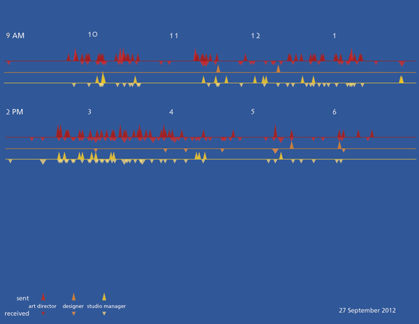
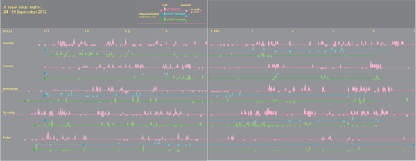
I decided to abandon the stem and leaf for a timeline. I initially imagined triangles as markers for the email because I thought the shape would indicate the directionality of an email going out into the internet.

email traffic timeline, version 1
This version has an entire day on one page, morning sits above afternoon.

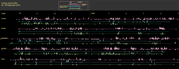
And I tried some different color schemes.

Email traffic timeline, version 1.1
Email traffic timeline, version 1.1 stretching the day across two pages.
Email traffic timeline, version 1.2

The triangles did not work and some of the color schemes created a sense of vibration. A trained graphic designer might have tried the triangles (and rejected them, of course), but they would not have made the mistakes with color that I did.

Third draft

I replotted the graphic with circles, not triangles, and added up all the emails that were received in 5-minute periods instead of plotting each individually. This lost a bit of granularity, but it made it easier to see where traffic was greatest because it allowed the height of the circles start to draw the eye.

Email timeline, version 1.3
There is another page to the right of this one but viewing the image at this scale displays more detail.

This version is much closer to the final but something was missing.

Fourth draft

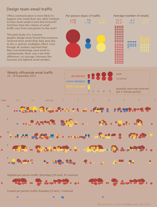
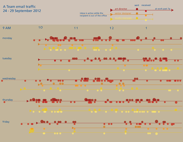
I started to realize that the timelines were difficult to analyze so I went back to the data and pulled out some summary statistics about the average number of emails each person sent and received. I also thought it would be interesting to see how much of the officewide traffic each person generated. While I was looking for new ways to help people understand what they were looking at, I also showed them the range of reality in the same timeline format by pulling out the lines for the highest traffic person-day and the lowest traffic person-day. I also remembered one of the lessons I learned from reading Nathan Yau’s Visualize This and added some descriptive text. [A full review of that book is here.]

Office email traffic

This is as far as I have gotten. But if I get good suggestions in the comments, I’ll keep improving.

What can writers learn from graphic designers

Getting through this many drafts alone was hard. It is very hard to see the same thing with new eyes. I got some help from two different people and even though neither of them said much, their opinions made a huge difference in the process. I encourage writers to find a way to share their work with others earlier in the process. It is humbling. If the comparison to graphic design is apt, earlier sharing either of the whole draft or of smaller sections will also likely lead to a stronger piece that gets written faster.

Hot Dog Eating Contest Graph
Hot Dog Eating Contest Graph – Large version

Preface to the book review series

There are two ideal types of infographics books. One ideal type is the how-to manual, a guide that explains which tools to use and what to do with them (for more on ideal types, see Max Weber). The other ideal type is the critical analysis of information graphics as a particular type of visual communications device that relies on a shared, though often tacit, set of encoding and decoding devices. The book reviews I proposed to write for Graphic Sociology include some of each kind of book, though they lean more towards the how-to manuals simply because more of that type have come out lately. As with all ideal types, none of the books will wholly how-to or wholly critical analysis.

I meant to review two of Edward Tufte’s books first so that we would start off with a good grounding in the analytical tools that would help us figure out which parts of the how-to manuals were likely to lead to graphics that do not commit various information visualization sins. However, I have spent the past six weeks at a field site (a graphic design studio nonetheless) and it rapidly became completely impractical to lug the two oversized, hard cover Tufte books around with me. I found Nathan Yau’s paperback “Visualize This” to be much more portable so it skipped to the head of the line and will be the first review in the series.

The Tufte review is next up.

Review of Visualize This by Nathan Yau

Visualize This book cover

Yau, Nathan. (2011) Visualize This: The FlowingData guide to data, visualization, and statistics Indianapolis: Wiley.

Visualize This is a how-to data visualization manual written by statistician Nathan Yau who is also the author of the popular data visualization blog flowingdata.com. The book does not repeat the blog’s greatest hits or otherwise revisit much familiar territory. Rather, this was Yau’s first attempt to offer his readers (and others) a process for building a toolkit for visualizing data. The field of data visualization is not centralized in any kind of way that I have been able to discern and Yau’s book is a great way to build fundamental skills in visualization that use tools spanning a range of fields.

The three primary tools that Yau introduces in the book are two programming languages – R and python – and the Adobe Illustrator design software. Both R and Python are free and supported by a bevy of programmers in the open source world. R is a programming package developed for statistics. Python has a much broader appeal. Both of them can produce data visualizations. Adobe Illustrator is neither free nor open source but it is worth the investment if you are planning to do just about any kind of graphic design whatsoever, including data visualizations. Yau mentions free alternatives, and there are some, but none have all of the features Illustrator has.

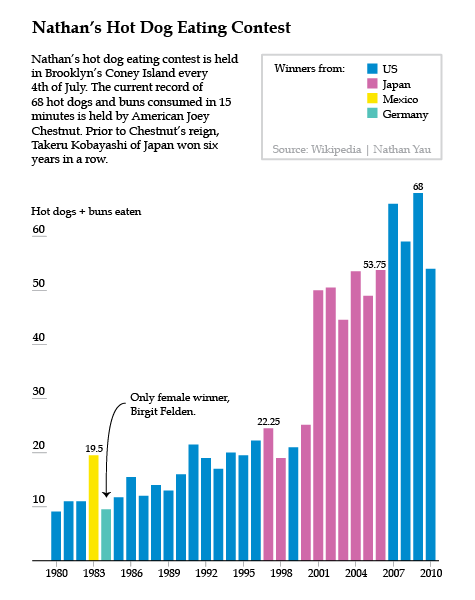
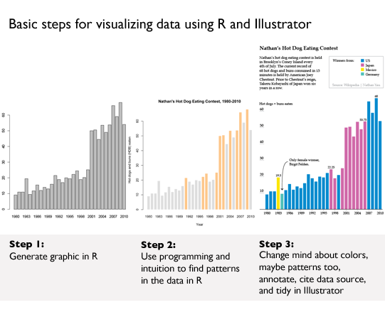
Much of the book starts readers off building the basic bones of a visualization in R or python, based on a comma-separated value data file that has already been compiled for us by Yau. He notes that getting the data structured properly often takes up more than half the time he spends on a graphic, but the book does not dwell much on the tedium of cleaning up messy data sources. Fine by me. One of the first examples in the book is a graphic built and explored in R, then tidied up and annotated in Illustrator using data from Nathan’s Hot Dog Eating contest.

This process is repeated throughout:
   1. start visualizing data with programming;
   2. try to find patterns with programming;
   3. tidy up and annotate output from program in Illustrator.

The panel below shows you what R can do with just a few lines of code. Hopefully, it also becomes clear why it is necessary to take the output from R into Illustrator before making it public.

Visualize This - example from chapter 4
Visualize This – example from chapter 4

Great tips

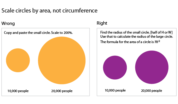
There are hints and tips sprinkled throughout the book covering everything from where to find the best datasets to how to convert them into something manageable to how to resize circles to get them to accurately represent scale changes. This last tip is one of my favorites. When we visualize data and use circles of varying sizes to represent the size of populations (or some other numerical value) what we are looking at is the area of the circle. When we want to represent a population that is twice as big as the size of some other population, we need to resize the circle so its area is twice as big, not its circumference.

How to scale circles for data visualization

More great tips:
1. First, love the data. Next, visualize the data.*
2. Always cite your data sources. Go ahead and give yourself some credit, too.
3. Label your axes and include a legend.
4. Annotate your graphics with a sentence or two to frame and/or bolster the narrative.

*Love the data means take an interest in the stories the data can tell, get comfortable with the relationships in the data, and clean up any goofs in the dataset.

Pastry graphics: Pie and donut charts

Yau’s advice about pie charts diverges from mine. I say: use them only when you have four or fewer wedges because human eyes really have trouble comparing the area of one wedge to another wedge, especially when they do not share a common axis. Yau acknowledges my stubborn avoidance of pie charts but advises a slightly different attitude:

Pie charts have developed a stigma for not being as accurate as bar charts or position-based visuals, so some think you should avoid them completely. It’s easier to judge length than it is to judge areas and angles. That doesn’t mean you have to completely avoid them though. You can use the pie chart without any problems just as long as you know its limitations. It’s simple. Keep your data organized, and don’t put too many wedges in one pie.

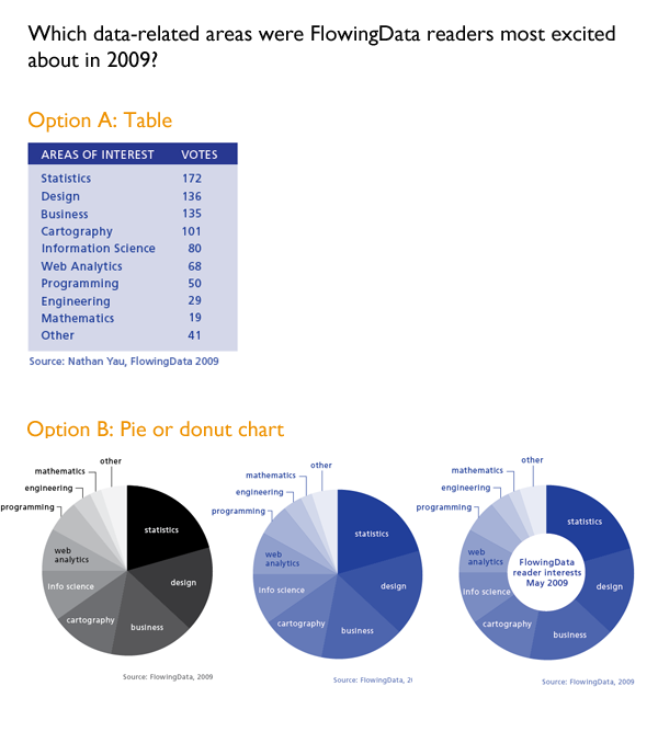
The Yau explains how to visualize the responses to a survey he distributed to his own readers at FlowingData to see what they’d say they were most interested in reading about. He showed the readers of the book a table with the blog readers’ responses which I’ve recreated below [Option A]. I think the data is easier to read in the table than in either the pie chart or the closely related donut chart [Option(s) B]. In life as in visualization, a steady stream of pies and donuts is fun but dumb. Use sparingly.

Visualize This example from chapter 5

Interactive graphics

Learning about pie charts was great fun even though I don’t like pie charts because Yau taught us how to use protovis, a javascript library that yields interactive graphics. We built a pie chart just like the one(s) in Option B that popped up values on mouseover the wedges. Protovis was developed at Stanford and has now morphed into the d3.js library. The packages developed in Protovis are still stable and usable. I highly recommend this exercise for anyone who wants to make infographics for the web. It helps to have a basic understanding of html going in.

What needs work

The overarching problem I had with Visualize This is that it spent relatively little time generating different types of graphics using the same data. We saw a little bit of that above when Yau used both a pie chart and a donut chart to visualize the same survey responses, but since donut charts are just variations on pie charts, it was not the best example in the book. The best example came when Yau visualized the age structure of the American population from 1860 – 2005 (I updated the end date to 2010 since I had access to 2010 census data).

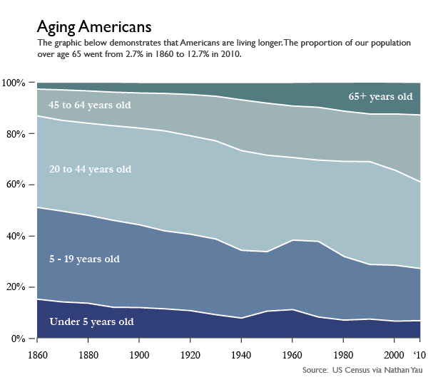
First, Yau shows readers how to make this lovely stacked area graph in Illustrator. That’s right. No R. No Python. Just Illustrator.

Aging Americans
Aging Americans | Stacked area graph version

Then Yau admits that the stacked area chart has some general limitations:

One of the drawbacks to using stacked area charts is that they become hard to read and practically useless when you have a lot of categories and data points. The chart type worked for age breakdowns because there were only five categories. Start adding more, and the layers start to look like thin strips. Likewise, if you have one category that has relatively small counts, it can easily get dwarfed by the more prominent categories.

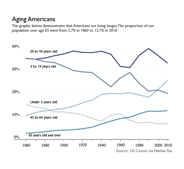
I tend to disagree that the stacked area chart ‘worked’ for displaying the age structure of the US population, but not because there were too many categories. I’ll get to why I don’t think the stacked area graph worked shortly, but first, let’s have a look at the same data represented in a line graph. This was Yau’s idea, and it was a good one. What we can see by looking at the data in a line graph rather than a stacked graph is the size ordering of these age slices. Yeah, I can kind of see that the 20-44 group was the biggest group in the stacked graph. But I had to think about it. In the line graph, I don’t wonder for a second which group was biggest. The 20-44 group is on top. The axes in line graphs just make more sense. I admit that the line graph is not an aesthetic marvel the way the area graph was. But, you know, you can figure out your own priorities. If you want pretty, go with the area graph and get smart about colors (with the wrong color scheme, any graphic can look awful. See also: what Excel generates automatically). If you want a graphic for thinking with, avoid stacked area graphs.

Aging Americans
Aging Americans | Line graph version

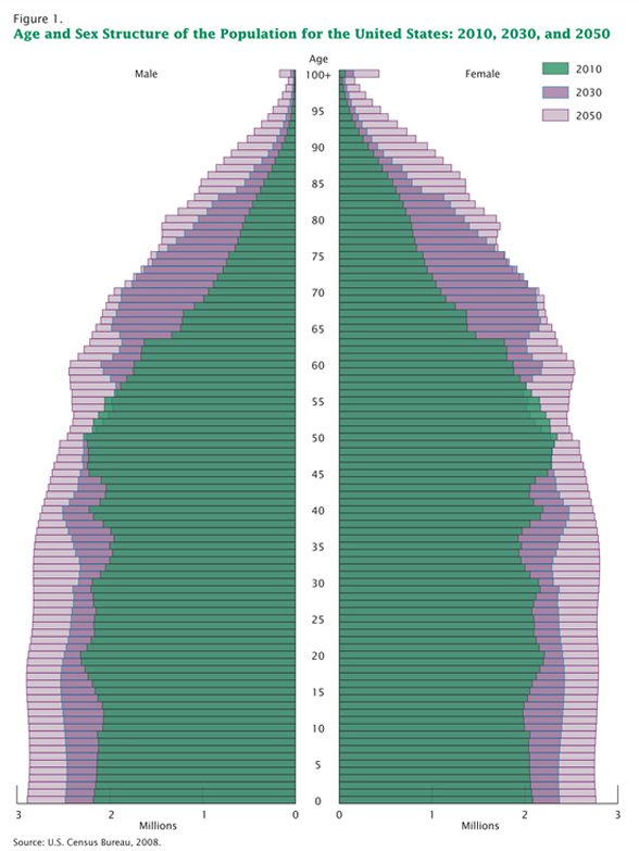
Coming back to what I think about visualizing the age structure of the American population. Call me old-fashioned, say that I adore my elders too much, I’ll just tell you we all stand on the backs of geniuses. I like the age pyramids for visualizing the age structure of a population. Here’s one I plucked from the Census website.

Population Aging in the United States | Traditional age pyramid graphic

The pyramid has these advantages:
   1. It shows gender differences. Males are on the left. Females are on the right.
   2. This graphic does a better job of showing the structure of the population because the older people appear to balance on the younger people. This is useful because the older people actually do kind of balance on the younger people when it comes to things like Social Security. The structure of the population does not come through in the area graph or the line graph. Both of those show us that there are more old people now than there were before but displaying more is a less sophisticated visual message than showing us just how many older people and how much older and how these things have changed over time. See all those and’s in the previous sentence? Yeah. That’s how much better the pyramid is.
   3. It is possible to see both the forest and the trees in this age pyramid. What do I mean? Well, the stacked area graph and the line graph had to lump rather large (and disproportionately sized) groups of ages together. In the age pyramid, the slices are even at every five years and if you happen to want to figure out just how the 20-24 year olds are changing over time, you can. But this granularity does not make it difficult to understand the overall structure of the pyramid.

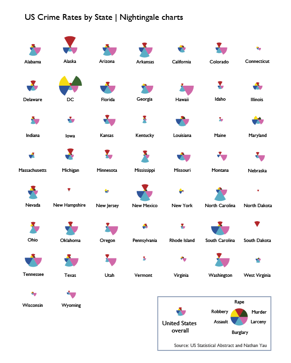
To summarize my larger disappointment, I wish that Yau had gone through a number of examples of displaying the same data with different graphics in order to teach readers how to choose the best graphic. To his credit, he did visualize crime data with a bunch of different graphics, but I didn’t like any of the graphic types. I’m including the one I liked most, but it’s mostly for historical reasons. This type of weird fanned out pie wedges is called a Nightingale chart and was developed in part by Florence Nightingale way back when information graphics didn’t exist. He visualized this same crime data with Chernoff faces and with star graphics, neither of which were interpretable, in my opinion.

US Crime Rates by State - Nightingale charts
US Crime Rates by State – Nightingale charts

Heatmaps

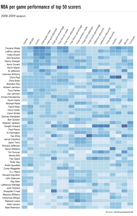
Unlike Chernoff faces, star charts, and Nightingale charts which I think are totally useless, heatmaps have promise as data visualizations. This is a good example of how I wished Yau would have started working hard to get the data to lash up better with the visualization. This is his final version of the heatmap of a whole bunch of different basketball game statistics with the players who were responsible for scoring, assisting, and rebounding (among many other things). I am a basketball fan. I went linsane last season. But I just do not get excited when I look at this heatmap because the visualization does not reveal any patterns. Ask yourself: would I rather have this information in a table? If the answer is yes, well, then you know there’s at least one other kind of representation besides this one that you would prefer if this is the data you are trying to display.

NBA heatmap via FlowingData

So what would I do? Well, I’d do a couple things. First, I would probably try restricting this heatmap to the top ten players or even to my favorite players. Throwing in 50 players and about 20 statistics per player without condensing anything means we are looking at 1000 data points. Ooof. So…if not cutting down the number of players, maybe put the scoring statistics in a different heatmap than all the other statistics (playtime, games played, rebounds, steals, blocks, turnovers, and so on). Maybe strip out the “attempts” and just leave the completed free throws, field goals, and three-pointers. I do not know if these things would have revealed patterns, I just know that the current graphic is still looking like a data soup to me.

Maps triumphant

Overall, this was a great how-to for data visualization and I want to end on an appropriately high note. One of the biggest wins in the book was Chapter 8 in which Yau walks us through the most meticulous and involved demo in the book. The payoff is big. He shows us how to use google maps and FIPS codes to make choropleths (these are large maps in which colors mated with numerical values fill in small, politically bounded units, usually counties but sometimes census tracts). He does not use ArcGIS which is one of the reigning mapping tools on the market. But ArcGIS is expensive. And Yau shows us how to generate maps without spending a dime. You will have to spend some time. If you are a cartography geek or you follow the unemployment rate, you’ve probably already seen this graphic because it was widely circulated, for good reason.

Unemployment map via FlowingData
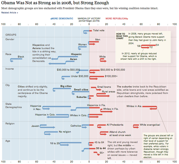
Patterns in political attitudes in US presidential elections from 2004-2012
Patterns in political attitudes in US presidential elections from 2004-2012 | By Amanda Cox, Ford Fessenden and Alicia Desantis nytimes.com

What works

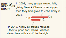
Legend
Legend

This graphic shows us data over time and is thus a kind of timeline but it uses a graphical device that I have never seen before – the U-turn arrow – to indicate changes in people’s political attitudes at three points in time. This works brilliantly for the dataset and is a strong argument for the use of design and designers in information visualization. A standard timeline would not have worked well with a dataset that has only three points in time that need to be represented for a plethora of categories (the categories are voting blocs in this case). The U-turn arrows allow us to see just how far various voting blocs moved from their 2004 position in 2008 and then again how far they moved in 2012. If the voters in these blocs became more liberal in 2008 and then slid back towards a more conservative position, the arrow makes a U-turn and it’s very easy to visually compare the length of the arms of each side of the U. If the particular voting bloc got more liberal in 2008 and continued towards an even more liberal position in 2012, the arrow does not make a U shape but it still has a kink in it at 2008 so that we can visually compare the length of the 2004-2008 section to the 2008-2012 section. The use of this type of U-turn/kinked arrow is new to me and it’s just brilliant. It’s one of those things that is so easy to understand immediately that we forget we’ve never seen it before. That’s the mark of smart design.

The other thing that this style of timeline does so well is that it allows variation on the starting points of the different voting blocs along the horizontal axis. We get to see that some groups are so far over in the liberal or conservative camps they may never be ‘in play’ and other blocs have voting patterns that push them over the critical boundary in the center of the graphic.

If this type of data were represented on a line graph, the variation in liberal vs. conservative might have been plotted on the vertical axis (though, hopefully this graphic makes it clear that chart conventions can be kicked to the curb at any point in time). Visually, I like the liberal/conservative spectrum better horizontally because it plays with the left-right semantics that are already used to discuss political beliefs.

What needs work

We need more designers working in visualization departments so that we end up with graphics like this that are tailored exactly to the structure of the data and the story it tells rather than trying to select from an existing conventional data representation type.

Kudos to Amanda Cox, Ford Fessenden, and Alicia Desantis at the New York Times.

References

Cox, Amanda; Fessenden, Ford; and Desantis, Alicia. (2012) Obama Was Not as Strong as in 2008, but Strong Enough. [information graphic] New York Times.

Spring Counter | John Maeda

What works

John Maeda (now head honcho at RISD, formerly of MIT’s Media Lab) designed this simple interactive graphic in 2006 while contemplating the cyclical nature of life during the still grey days of a New England winter. His visualization shows the number of springs men can expect to have if they live an average life span for men in their country. Users input their age and select their country. The flowers in color are those in the user’s future; the ones in grey represent the past. Simple. Elegant. An infographic haiku.

What needs work

I have a slightly sunnier view of the past than does Maeda, perhaps. I think I would have colored both the past and present flowers, just used different schemes. Maybe it’s the social scientist in me, but I believe our past and future both provide the context for our present. Perhaps some past years have been grey, but the territory of the past is not generally a cemetery.

References

Maeda, John. (2006) Life Counter. Interactive web-based graphic.

See also:
Maeda, John. (2006) The Laws of Simplicity. Cambridge, MA: MIT Press.

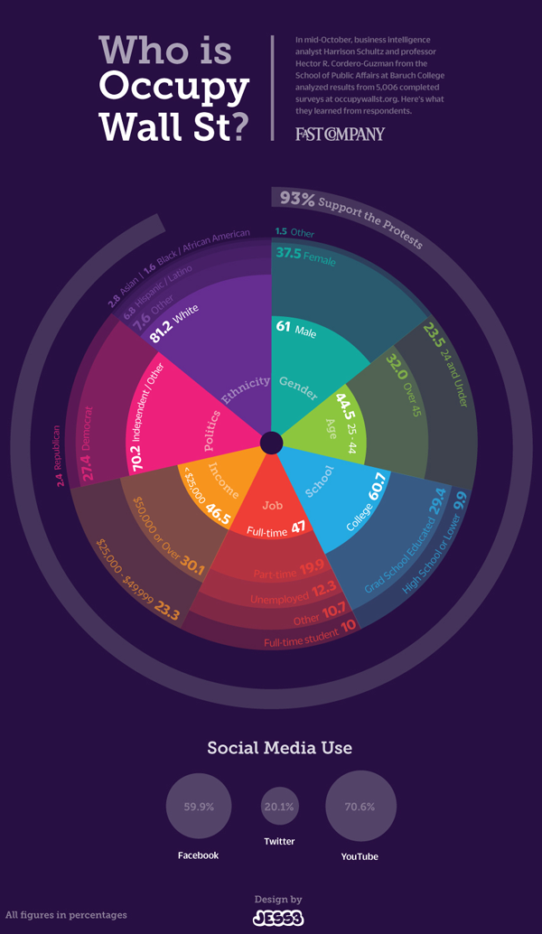
Who visits occupywallst.org? | Harrison Schultz and Hector R. Cordero-Guzman

What works

The graphic above was constructed using 5,006 surveys filled out by people who visited occupywallst.org. Here’s what the survey found:

Gender
Men 61%
Women 37.5%
Other 1.5%

Age
45 y/o 32%

Race/Ethnicity
White 81.4%
Black, African American 1.6%
Hispanic 6.8%
Asian 2.8%
Other 7.6%

Education
H.S. or less 9.9%
College 60.7%
Grad. School 29.4%

Annual Income
$50,000 30.1%

Employment
Unemployed 12.3%
Part-time 19.9%
Full-time 47%
Full-time student 10%
Other 10.7%

Politics
Support the protest 93%
———————
Republican 2.4%
Democrat 27.4%
Independent 70.7%

What needs work

I have two issues. First, I think the graphic is beautiful but functionally useless. It is nearly impossible to get any intuitive sense of anything at a glance. The circular shape forces the categories to come in the order of their popularity which is not always the most logical order. Look at the income data. That should come in order of least income to most income, but it doesn’t (why would anyone put incremental numerical data out of order?). The rounded sections of wedges are also nearly impossible to intuitively compare to one another in size, so I cannot figure out what the functional value of displaying demographic data in this modified pie chart is. In summary, it appears that the information part of the information graphic did not win the contest between aesthetics and utility. Remember: there should not be a contest between aesthetics and utility in the first place.

My second concern with this graphic is its overall reliability. The FastCompany article it accompanies is titled, “Who is Occupy Wall Street”. That title more than implies that this survey of visitors to a particular website associated with the movement – but not THE official website of the movement (there isn’t one) – accurately represent the protesters on the ground. I don’t think that the professor and his partner who conducted the surveys would make such grand claims.

References

Captain, Sean. (2 November 2011) Who is Occupy Wall Street? FastCompany.

Jess3. (2 November 2011) Who is Occupy Wall Street? [information graphic] FastCompany.

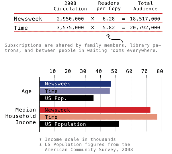
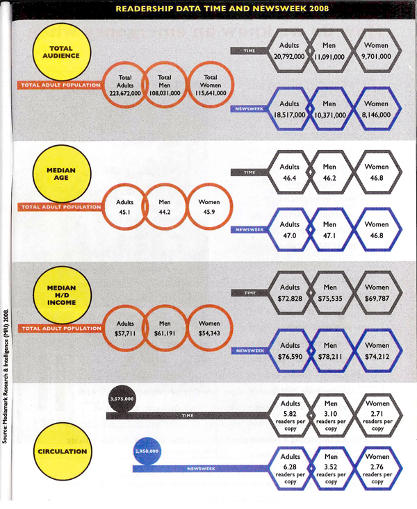
Time and Newsweek Circulation Figures | Graphic by Laura Norén
Newsweek and Time Circulation Figures | Graphic by Yolanda Cuomo

Which one works?

These two graphics portray some of the same information – household income, median age, audience and circulation – though the first one does not break down information between genders. Though it probably goes without saying, I like the one I designed best. The second one has some tantalizing shapes – I applaud the visual appeal – but it does nothing to aid people’s eyes as they try to compare relative sizes between the salient categories. I also happen to think it is easier to understand the complexity of the difference between audience and circulation with the textual explanation provided in the first one. I find the white-font-on-dark-background of the Time and Newsweek labels hard to read (it’s also a known graphic design no-no, especially with a small font size like this. It is easier for the human eye to grok the contrast with dark text on a light background than with light text on a dark background).

From a sociological perspective, comparing the readership of Time and Newsweek not only to each other but also to national averages provides a much deeper sense of context. The second graphic was built from the first though I never had a chance to meet with any of the writing or design team to understand why the national averages were removed.

There are other elements I dislike in the second one. I dislike, for instance, the need to repeat certain elements of text over and over again: “readers per copy” and “Total adult population” and even the “Time” and “Newsweek” headings. One of my closest friends and colleagues spends a lot of his time writing code. The best lesson I have learned from him is that where elements or actions have to be repeated over and over, there is inefficiency in the system. A better design is possible.

I would love to hear from my readers on this comparison. Am I suffering from too much ego investment in the graphic I made? Is the second graphic an improvement on the first? If so, how?

References

Norén, Laura. (2010) “Appendix: Data and Methods” in first draft of Dill, Nandi and Telesca, Jen Imagining Emergencies. [Information graphic].

Cuomo, Yolanda. (2011) “Readership Data Time and Newsweek 2008” in final draft of Dill, Nandi and Telesca, Jen Imagining Emergencies. [Information graphic].

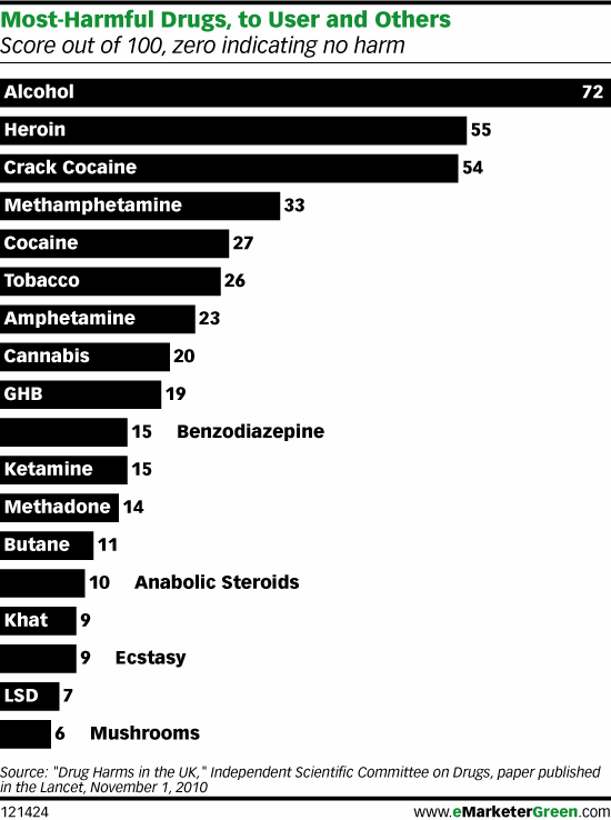
Original Version of the bar graph

How is the scoring system determined?

British researchers affiliated with the Independent Scientific Committee on Drugs met for a one day workshop and constructed a composite scoring system to determine which drugs are most harmful both to individuals and to society collectively. Scores can range from 0 – 100. Authors David Nutt, Leslie King and Lawrence Phillips found that,

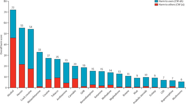
heroin, crack cocaine, and metamfetamine were the most harmful drugs to individuals (part scores 34, 37, and 32, respectively), whereas alcohol, heroin, and crack cocaine were the most harmful to others (46, 21, and 17, respectively). Overall, alcohol was the most harmful drug (overall harm score 72), with heroin (55) and crack cocaine (54) in second and third places.

The full list of factors that were included in the composite score are here:

  • Mortality
  • Damage
  • Dependence
  • Impairment of mental functioning
  • Loss of tangibles
  • Loss of relationships
  • Injuries to others
  • Crime increase
  • Environmental degradation
  • Family breakdowns
  • International turmoil
  • Economic cost
  • Loss of community cohesion and reputation

Though it is possible to go into an explanation of how each of these was measured and subsequently combined to produce the composite scores, I am going to leave that discussion to the authors of the original study. There’s an overview graph below and the full article Drug Harms in the UK: A multi-criteria decision analysis is at the Lancet.

Composite scores showing contributions from harm to individuals and harm to society

What can be done?

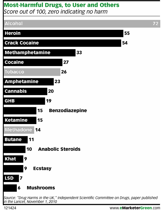
I found it interesting that there was no attempt made to distinguish between legal and illegal drugs. Yes, of course, some drugs are not clearly legal or illegal. They are legal when prescribed and supervised by a doctor but illegal when used off-label or outside the medical authority system (like anabolic steroids, methadone, and marijuana in California). I assumed that most methadone users are under some kind of supervision but that most anabolic steroid users are using the steroids off-label (ie illegally). You can quibble with my choices below. The point here is that I found the graph to have more context if the legality issue was visually inscribed into it.

Photoshopped version of graph that highlights legal drugs

There are age limits and places where it’s illegal to smoke or drink, but for the most part everyone will be able to use alcohol and tobacco legally for most of their lives. Methadone is probably being used legally in most cases. That’s why I shaded those bars grey. I am not expert on methadone, but I see that it is much less harmful to users and to society than heroin, the drug it stands in for, so I guess if this were the only data I had to make a decision about continuing methadone treatment programs, I would keep them going. I would also call for close scrutiny of methadone programs. Something is clearly not working as well as it could be.

As for alcohol and tobacco…well…it’s hard to argue *for* the continuing legality of alcohol. How large do detriments to society have to be to trigger additional control mechanisms? The authors of the study noted that alcohol is part of society and it isn’t going anywhere. I agree. Prohibition was a failed experiment in this country and I’m not suggested we try it again. However, I would like to reopen the debate about how the negative impacts of alcohol can be alleviated. I recommend that all new cars must have breathalyzers in them. If the driver cannot blow a legal sample, the car won’t start. Yes, people could game that system by having their friends blow for them, but often one’s friends are also drunk. And hopefully, friends really wouldn’t let their friends drive drunk. Once upon a time, seatbelts were considered extraneous and seatbelt laws were considered constraints upon American’s rights to freedom and the pursuit of happiness. Well, when a drunk driver kills one of your family members, you might decide that the sudden loss of your mother or son or niece puts a much bigger crimp in your pursuit of happiness than a breathalyzer in your car ever would have. Will breathalyzers make cars cost more? Probably. But the cost of dealing with car accidents caused by drunken driving, even when they aren’t fatal, is absorbed by random individuals who happened to be in the wrong place/time as well as tax payers who pay to repair guard rails, subsidize public hospitals and EMTs, pay cops’ salaries, and so on.

References

Nutt, David J, Leslie A King, and Lawrence D Phillips. (6 November 2010) “Drug harms in the UK: a multicriteria decision analysis” The Lancet, Vol 376(9752): 1558 – 1565.

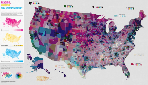
Reading, Writing, and Earning Money | GOOD Transparency Blog

What works

Nothing is working for me with this graphic except possibly the few places where the designers offered detailed information about a particular location’s high school graduation ranking, college graduation ranking, and income ranking. But that’s being generous.

What needs work

Horrible use of a map. Maps should only be used where there is good reason to believe the information being conveyed is tied closely to geography. This information is not tied closely to geography though it might be tied closely to states. But states need not always be represented as geographical entities. Often, they are political entities and their particular geography is not salient.

The math that led to the graphic flattens important details and renders this a useless graphic. What I believe the designers did was something like this:

  • They took all of their numbers and turned them into some scale between 0 and 100%
  • Then they decided to represent each of the three variables with pure Cyan, Magenta, or Yellow. The higher the state scored on the scale from 0-100, the more saturated the color value.
  • Then they gave each county a combined score by building new colors from mixing the values of the previous three. Higher scoring states ended up with more saturated colors. Basically, higher scoring states started to approach black. States that scored high on just one vector ended up having a clearer, lighter color profile.

Here’s the big problem with this. It was hard for me to explain to my MIT-educated friend so I’m not sure this is going to make sense the first time ’round. Representing everything on a scale from 0-100 is a slide towards obfuscation. The graduation rates are both unadulterated rates. The income data represents un-scaled median incomes. I appreciate that they are not scaled, but I have a hard time adding 65% with $45,000. That’s some troubled math. At least in the monochrome maps we know what we’re looking at before the three variables get added up.

A grave sin was committed when the numbers for these three different variables were added up. Now, of course, it wasn’t the numbers that were added up. It was the color values of each of the three separate data points that were added up. Additive color seems to be something that does not send up a red flag. I can guarantee you that if they had presented something – a table or graph – where they had ended up adding values from high school graduation, college graduation, and income, red flags would have been flying. Why? Well, maybe you’re starting to catch my drift, but I’ll help you by spelling it out. What happens when the colors are added is a clear violation of the ‘apples to apples’ rule. Comparisons do not work unless you are sure you are comparing like things. Graduation rates are not like income. They are two different kinds of numbers – one is a rate the other is either a linear value or a log-linear value. Either way, they cannot be added up and still make sense. It’s no surprise that the graphic ends up looking like an incomprehensible slurry of a gray area.

References

GOOD and Gregory Hubacek. (March 2011) Reading, Writing, and Earning Money in GOOD Transparency Blog.

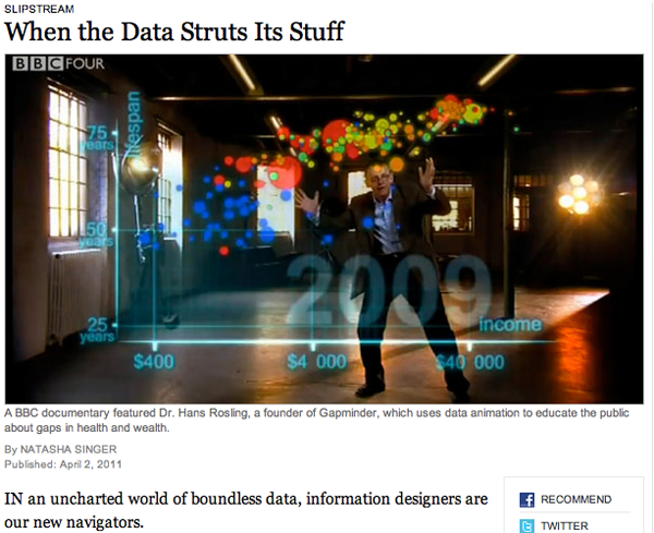
When the Data Struts Its Stuff | Natasha Singer for the New York Times

Reading Suggestion

In case you missed it over the weekend, the New York Times ran a story about information graphics and the people who use them to communicate with the public. Unsurprisingly, Hans Rosling of Gapminder in Sweden – one of the new heroic figures in infographics – was the man in the picture and the first to be quoted. Rosling deserves the attention – gapminder had fairly humble origins and has grown because it draws from sound data, it is free to use, and it does a predictably good job of providing a visual overview of country level comparisons over time. Natasha Singer, the journalist who wrote the article, also interviewed Professor Ben Schneiderman of the Human-Computer Interaction Lab at the University of Maryland and Jim Bartoo of the Hive Group. And that’s where the article obliquely addressed the growing divide between infographics that are meant to be serious, complex, and complete and those that are meant to be beautiful and compelling, but user-directed. This second sort of infographic is the sort of thing that gets accused of being ‘info-porn’ and often covers information that is of dubious social value. Do we really care about celebrity’s twitter usage patterns? Is that as important as the work Hans Rosling does? What can the academic side of information graphics makers learn from the commercial side?

The article has a slightly different take on these questions,

The fact that serious software companies are now tree mapping the pop charts is a sign that data visualization is no longer just a useful tool for researchers and corporations. It’s also an entertainment and marketing vehicle.

but it’s clear that there are some divisions within the world of infographics that are worth considering more seriously. Nobody ever claimed that all writing is of the same species or that everything on TV is trying to do the same thing. Documentaries are not like sit coms which are not like dramas which are not like soap operas…but then again, they can all be found on TV and thus have some common elements. It’s no surprise that there is a wide variety of infographics out there with distinct goals.

Figuring out just how each type fits into the information ecology and changes the expectations about the entire range of infographics is worthwhile. When graphic designers started to take infographics seriously, it raised the bar for social scientists who were trying to communicate with information graphics. No longer was a chunky bar graph going to look sophisticated. It might look so generic and grade-school that it would reflect poorly on the overall quality of the argument.

References

Singer, Natasha. (2 April 2011) When the data struts its stuff. New York Times, Business Day Section: Slipstream.

Hans Rosling. Gapminder.org Hans Rosling is also a frequent TED Talks presenter.

Jim Bartoo. Hive Group.

Ben Schneiderman. Human Computer Interaction Lab at the University of Maryland.

Hillman, Dan [Director and Producer] | Rosling, Hans [Presenter] (7 December 2010 was first broadcast date) The Joy of Stats BBC. [Documentary] 60 minutes.
In the US you can stream The Joy of Stats from Hans Rosling’s gapminder.org website. Perhaps this works in other countries as well, but I haven’t had a chance to test it.