design

A recent (well, 2010 so not *that* recent) report from the UNDP traces the history of information graphics as tools for the promotion of public health. Illustrious crusaders from the yesteryear of public health like John Snow and Florence Nightingale developed some of the earliest ‘infographics’ in service of their public health goals. I’ll post more on that portion of the report later this week. But for now, I’d like to discuss the bulk of the report which was dedicated to the decisions that César Hidalgo (Professor at MIT’s Media Lab, Student at Harvard’s Center for International Development, Associate Professor at Northeastern’s School of Art and Design) made as he developed an appropriate information graphic to represent country level data generated by the Human Development Index. (See also: Measure of America’s Human Development Index graphics for the US only and the Graphic Sociology post about them).

The graphic below this is not intended to be a graphic. It is the basic formula upon which the Human Development Index (HDI) is based. The HDI is a single number that represents a composite score that takes contributions from educational, income, and health measures (which are themselves composite scores). The authors first came up with a simple, almost graphical representation of the relationship between the contributing factors that’s a sort of formula/graphic hybrid. Many social scientists would stop here and move on to the writing of the report, content to let a table with country-level data do the reporting for them.

Basic Human Development Index Relationship | César Hidalgo

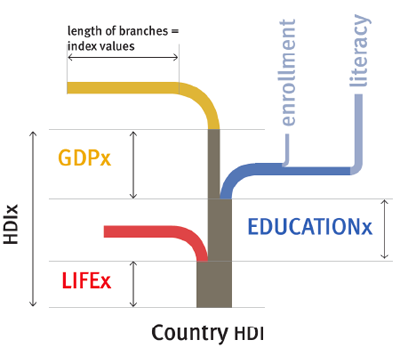
HDI Spline Tree

From this hybrid between a formula and a graphic, Hidalgo developed the spline tree you see below. It shares some aspects with the basic formula above, that much is visually clear, but already the lengths and colors of the components are taking on meaning, allowing each country/year combination to produce a tree that is distinct from other trees, but similar enough to be comparable.
The HDI Tree - Spline Design | César Hidalgo

One of designer’s common strengths/weaknesses is the inability to stop designing. Design is never done because the design has reached some obvious and agreed-upon level of perfection. Usually design is deemed ‘done’ when the deadline rolls around. It would appear that Hidalgo was ahead of schedule and decided to go for another iteration, coming up with the diamond tree you see below. Though, as you’ll also see, he did not completely abandon the spline tree. It shows up again.

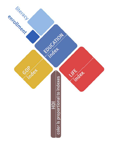
HDI Diamond Tree

The diamond HDI tree takes an area-based approach, one that is easier to understand visually at first glance than the spline tree. With the spline tree approach, the challenge is that the viewer needs to visually compare the lengths of lines that are not parallel to one another to gain full comprehension. Granted, one might most often compare the lengths of lines that ARE parallel to one another because viewers might mostly be comparing one country to the next. But that isn’t always the case. And even that is not as easy as comparing the areas in the diamond tree approach.
The Human Development Tree - Diamond Tree | César Hidalgo

The rules for the HDI diamond tree (and I’m quoting Hidalgo and team here) are as follows:

* The height of the tree trunk is proportional to the total value of the HDI
* The side of the tree branches are proportional to each sub-indicator
* The branches are ordered in increasing order from left to right
* The color of the trunk is the average color of the components

All together

And here is one country’s worth of Diamond and Spline trees, represented over time. This is where I think the two tree graphics – and the diamond tree in particular – work their magic best. Human eyes are good at doing comparison’s in this sort of way. The trees are more or less the same thing over and over again so this repetitive presentation allows the eye to pick out the relatively small changes over time, especially as they aggregate from one year to the next.

HDI in Rwanda 1970-2005 | César Hidalgo

Pan-Africa

With the last graphic in the series, you can see what it would look like to present the entire continent of Africa, by country, in two different years. It’s a little tough to fit a properly sized graphic into the format of the blog. I encourage you to click through to the full report in the references where you can see a much better version of the final graphic.
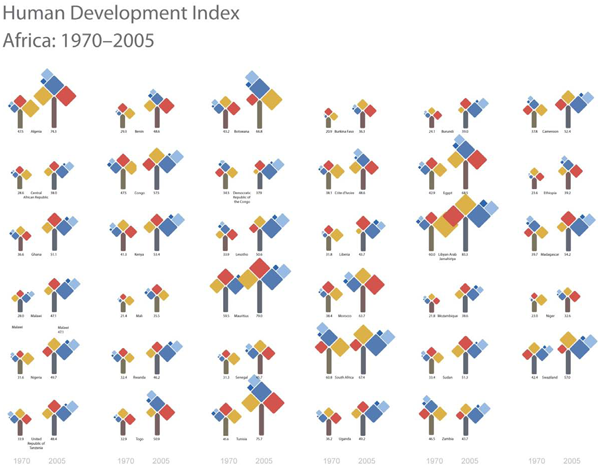
Human Development in Africa by country, 1970-2005 | César Hidalgo

Kudos

My biggest applause goes out to the Hidalgo team for abandoning the use of any map at all. This graphic should prove the point that just because one is faced with country level data – something that seems geographical in nature – one should not feel that they must use a map. A map would not have added anything to this information and it probably would have precluded the development of the tree concepts that are working pretty well.

References

Hidalgo, César A. (2010) Graphical Statistical Methods for the Representation of the Human Development Index and its Components [Research Paper] United Nations Development Program.

In theory there is an interactive portal for comparing any two HDI Diamond Trees of your choosing but I was not able to get it to work in Firefox. Worked like a charm in Safari and Chrome.

For ongoing comments on these graphics see: The HDI Tree: A visual representation at “Let’s Talk Human Development” a website published by the United Nations Development Project.

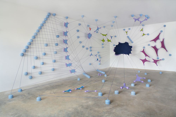
Regroup, Ex-Google workers at their next jobs | R. Justin Stewart
2am 2pm, Minneapolis Transit on a Sunday | R. Justin Stewart

Art and infographics intersect

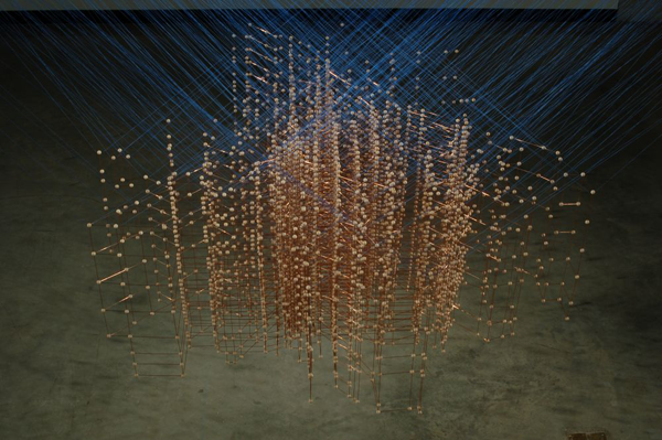
Artist R. Justin Stewart has taken infographics into the third dimension. His work is more art than information but it’s clear that it builds on the visual tropes of information graphics.

The first image depicts the way that ex-Google workers dispersed into new jobs after their time at Google. The point is not that any of us happen to care deeply about Google workers – someone does but probably not the readers of this blog – but to see how Stewart depicts network graphs in actual space.

The second two images depict a transit system in Minneapolis over a twelve hour period on a Sunday morning. It’s elegant but far too abstract to ‘work’ as an infographic. This is not a critique – I do not think Stewart wanted to make literal art – but it does not take much creativity to see that it would be easy to layer more information onto the artistry of the presentation.

My major contribution to this discussion and the reason that I decided to post Stewart’s work is that much of the art that has been inspired by the data revolution has happened in digital space. We have seen some amazing pixel-based animations and visualizations on this very blog. But I have not come across too much work in three dimensions, real space, that shares so many conventions with information graphics or data-based ways of knowing. A million points tell a story. Usually they tell that story in the same digital realm in which they were born, but Stewart takes them offline into actual spaces. They get installed. He has to come up with the way he wants to represent intangible information with tangible physical components.

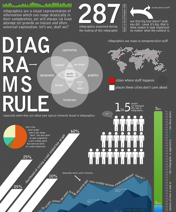
Meta Infographic | Think Brilliant

What works

Using an infographic to deconstruct and critique trends in infographic design is a bit more clever than what I do – using text to deconstruct and critique infographics – though I still think there is good reason to do what I’m doing.

Even though Think Brilliant does a good job of spelling out some of tropes of information design that often populate information graphics, they leave some of these pesky problems obvious-yet-unarticulated. In particular, I love the way they split the word DIAGRAMS in odd places so that it would conform to the shape of the text box it inhabits. I very much dislike that sort of trick. The text need not conform so tightly to its text box that it stops looking like a word and starts looking like an advertisement for the typeface.

Click through on the image or the caption and read it over yourself. Notice that Think Brilliant agrees with me about maps – they get used at times when it seems as though there is barely any geographical information being displayed. Sure, cities exist somewhere in the global geography, but if the viewer is supposed to be comparing one city to the next, it is usually far easier to do that using a graph, table, or chart than a map. If you want to tell me about the weather, go ahead and use a map. But if there is no good reason to use a map rather than a chart or table, using that map often dilutes the message by implying that geography is the primary element determining the quantities in question when it is rarely the case that geography is primary.

I also dislike 3D graphs because they make it harder for the eye to connect the bar back to the axis in for purposes of interpretation. And even though it often seems that infographics have the number one purpose of being pretty, in fact, their number one purpose is to make complicated multi-variable situations easier to interpret.

Well done, Think Brilliant.

Friday afternoon thoughts about infographics vs. writing

Writing about something generally requires a linear interpretation because it is nearly impossible to read two things at the same time and it isn’t all that easy to read something that does not have a singular flow. I guess one could read unordered, bulleted lists…but that’s tedious and inelegant. Making an infographic does not require linearity. It does require just as much thought and craft as writing. Where the story is mostly linear, by all means do us all a favor and write about it. Unless you cannot write and then you are welcome to try your hand at infographic creation (ahem, NYU undergrads, that bit about not being able to write well includes more of you than you think).

In the best of all possible worlds, graphics will be used alongside writing in order to offer readers/viewers multiple ways to understand and engage with your work. Social scientists generally present multi-layered research findings based on sometimes complex sets of assumptions. Asking the reader to get with the program and hold all those moving parts in mind at once can be a lot to ask. For all we know, the reader has not consumed anywhere near the amount of caffeine that they need to operate at peak efficiency. Help the reader. Tell the same story with your words, graphics, and images. This goes for both qualitative and quantitative methods. Just because a project is based on interview and ethnographic data does not mean it is impossible to make graphics or acceptable to skip their inclusion in your work.

As you can see from the graphic above, people can see through designerly gimmicks. Folks want meaningful information in their graphics. Better to create a simple infographic that risks being a bit plain than to skip creating a graphic (or to turn a simple graphic into something that makes ridiculous use of 3D, color, maps, typeface, layout, or any other graphic design trope applied without any value-add in the meaning department).

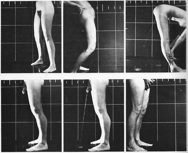
Kira Alexander. (1976)  The Bathroom.  Urine Trajectories
Kira Alexander. (1976) The Bathroom. Urine trajectories by sex

What works

This is the most graphic of graphic sociology so far. For those of you with delicate constitutions, give yourself a pat on the back for taking a deep breath and deciding to read the rest of this post without tossing it upon first glance.

This was published in 1976 in a book that is now out of print called The Bathroom by Alexander Kira, an architect and professor at Cornell. He was interested in the bathroom as a design challenge with an eye to the ergonomics of the fixtures and spaces commonly encountered in standard bathrooms, home to standard fixtures. The bathroom is not exactly a hotbed of design revolution so many of his ideas are not only still relevant, but still fresh. This particular diagram was used to help sort out how one might go about designing a urinal for women (if not a unisex urinal that could serve both women and men, not at the same time, though).

I usually find the use of photographs in information graphics to be superfluous. Generally, there is some graph about, say poverty or out of wedlock birth and the photograph paired with the graph takes a person and turns them into a token. The homeless man as icon of poverty; the mother and child (usually a woman of color) as icon of poignant nurturance. That sort of reductive photography has no place in information graphics. Quite frankly, I’d be happy never to see predictable, reductionist photography like that anywhere.

But in this case, Kira used a grid in the photo shoot turning the resulting photograph into an infographic. Did I mention that his ideas still seem fresh? With the grid, we have a much easier time making the visual comparison between trajectories of urine between women and men.

Imagine you are a urinal designer. Ask yourself: how would I use these diagrams to help me design a urinal that works for women? Realize that you would either pursue a trough strategy or, better, a urinal that women do not face. They could stand with their backs to it and bend forward like the woman in the third panel is doing. Of course, there are sartorial concerns. Backing up to a urinal works just fine if you are naked, like our urination model is. But what if she’s wearing clothing? That’s a different design challenge. I would be interested to see what would be possible by relocating pants’ zippers so that they open between the legs rather than in the front.

What needs work

I apologize that in some of these panels it is hard to see the stream of urine, which is a necessary piece of information. With the women, it’s pretty much straight down except when bent over at the waist. For the men, it is slightly in front of the body unless he is holding his penis in which case the trajectory is quite a bit in front of him — it leaves the photographic frame.

Reference

Kira, Alexander. (1976) The Bathroom New York: Viking Adult. [out of print]

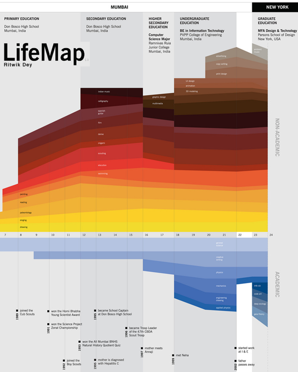
LifeMap life timeline | Ritwik Dey

What works

This is a great timeline. If all CVs were displayed like this I think employers would have a much better idea who they’re hiring.

Here’s why I like it:

    LifeMap

  • shows simultaneity – layering colored strips
  • shows relative weights – some stripes are fatter than others
  • shows the split between two classes of life – academic and personal by simply sticking the axis between them and then emphasizing this split with a different color scheme for each class
  • mixes words seamlessly with the graphic elements – each of the activities on the map is listed only once, even if the band it occupies shifts noticeably. Re-listing each element would add clutter and the colors are easy for the eye to follow across the graph even where there are discontinuities.
  • displays location at the top without making location seem like the primary element. It’s hard to get the thing that appears at the top NOT to seem like the most important. Clearly, in the course of a life, moving from Mumbai to New York is a big deal, so this is a critical component, but it doesn’t dominate the graphic. We are able to see the elements that make the leap from one place to the next but we aren’t quite sure if it was the shift from one place to the next or from one level of schooling to the next…and maybe even Mr. Dey doesn’t know. How can anyone untangle the causality of an individual trajectory?

It’s clear to me that many of the design elements here will be useful for future portrayals of social science data. In this case, I’d say we are looking at an enhanced CV, brave enough to indicate the passing of a parent and even a mother’s new relationship (which preceded the passing of the father). Spare visual narrative, intriguing in what is left out, remarkably rich nevertheless.

What needs work

The font relative to the graphic is too small. I know that this was probably intended as a poster and displayed at such a scale that the font wasn’t a problem. I apologize that you have to click through to see all of the categories.

Another comment while we’re on the topic of fonts and words relative to graphics: Mr. Dey was able to describe all of his interests with one or two words. It looks great. He expanded his accomplishments a bit beyond the two word limit, but they are still quite brief. I like the idea of choosing the one, two or three most precise words and making sure the graphic itself can carry the rest of the message. It’s a good test to see if your design is helping – when it can speak almost on its own things are looking good.

The limited number of words makes the whole thing not only visually and verbally poetic but also increases its functional value. One of my functionality measuring sticks is the number of words a person would have to translate if they were trying to read this graphic in a foreign language. The fewer words, the easier it is for non-English speakers. The more specific the words are, the more likely they are to translate appropriately. Therefore, ‘swimming’ and ‘3D modeling’ probably translate without difficulty. I have no idea if there is any kind of meaningful translation of “scouts” or “scouting” in any language other than English, but that is not a problem any graphic designer is going to be able to solve.

I wonder, though, if no-more-than-two-words rule led to the choice of the word “derive”. I know what that means in the context of calculus. I have no idea what that means in the context of a LifeMap, but it remains salient for years so I wish I did know what it meant. Sometimes the word restriction rule leaves out the phrase that would best describe whatever it is you might be trying to describe. Or maybe Mr. Dey does a lot of theoretical derivations.

References

Dey, Ritwik. (2005) LifeMap Project for Information Design course with Dmitry Krasny at Parsons School of Design in New York City.

grain edit logo

What works

grain edit is a graphic design blog that will expand your mind’s collection of graphic design to remember. It is not restricted to information graphics – in fact, most of the work has nothing to do with information graphics – but it includes a wide variety of graphic design and illustration. I’m posting this reading suggestion on a Sunday because it is a bit off the core topic here which is supposed to be social science data presented via information graphics. Still, if you are at least mildly interested in graphic design, surely you will find something you like over at grain edit. Not only can you see what ‘the work’ looks like, you can also read interviews, and get photographic studio tours with some of the designers they feature. And if you are super keen on the whole concept, their blog roll will take you on a fantastic cyber-tour of thought provoking eye candy.

My favorite links:

References

grain edit blog

things magazine

Lumadessa

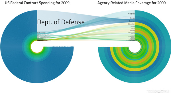
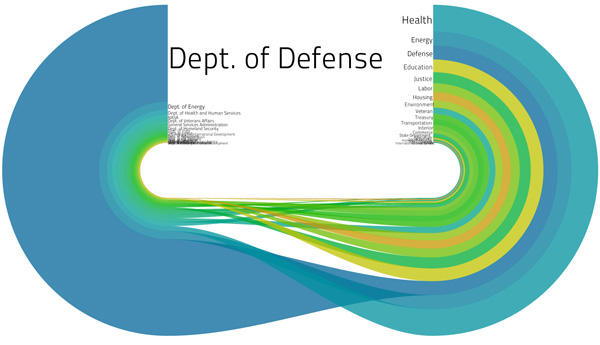
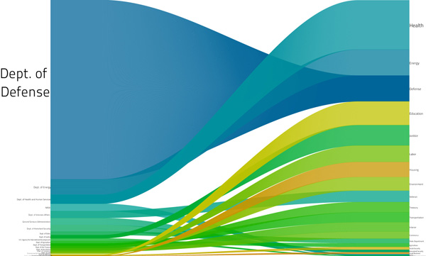
US Federal Contract Spending | Pitch Interactive for Design for America Contest
Another Iteration | Pitch Interactive for Design for America contest
US Federal Contract Spending, the straight story | Pitch Interactive for Design for America contest

What works

What I especially like about the full blog post describing the development of this graphic is that it presents multiple iterations of the same design as the designers respond to difficulties they uncovered along the way as well as criticisms from the blogging world.

The third one, that loses the circle concept, works best for me. The labels are legible and I understand how contract spending and the media coverage (they used the New York Times, so that’s how you should interpret the term ‘media coverage’ here) of contract spending are related more clearly than in the circular version where the implication that the flow is not a simple one-way deal gets lost. And confuses things.

What needs work

Honestly, there have been plenty of criticisms of this graphic already. Rather than repeat what others have said, I’m going to introduce you to Matthias Shapiro at Political Math (a stranger to me) who has provided an intelligent critique of the above visualization series. He says,

Pitch Interactive has gotten beaten up a great deal over this visualization and they have been nothing but gracious throughout. So I just want to take a moment to say that I think their work is remarkable and that the problems with this graph are a series of very honest mistakes.

But one of the things my blog does is point out mistakes to increase understanding.

My biggest problem with the image is that it still perpetuates the stereotype that the federal government spends most of its money on defense. This image in particular drives that point home by ranking the spending areas according to their “media coverage” ranking where we can see the extent of media coverage each department saw (based on the New York Times API). “Defense” reporting is clearly out of proportion to Defense spending.

The first problem has been addressed elsewhere… it’s the issue of scaling the radius instead of the area of the circles. If the numbers were a correct representation of federal spending (more on that later), the circle visualization commits this “radius is not equal to area” visual error that really bugs me. I even gave it a couple pages in my book chapter (now available online for the low, low price of free) and mentioned it in my Microsoft talk on visualization because it is such a common mistake.

But I encourage you to click through and read his entire post. And read the entire post that Pitch Interactive wrote, too. I figure with all that reading you won’t care to slog through my opinion.

The general question, I would say, is whether or not this kind of graphic works for displaying relational data – Pitch Interactive is trying to show how fiscal data measured in dollars relates to media coverage measured in mentions in a particular newspaper. What do you think? Does it work for them? Is it a relationship we should care about? And is this kind of depiction something that will work for relating other sets of data that use different measurement scales?

References

Pitch Interactive original blog about the graphics, updated. (1 June 2010) US Federal Contract Spending in 2009 vs. Agency Related Media Coverage.

Shapiro, Matthias. (28 May 2010) Government Spending Visualization Misses the Mark at Political Math: Political Information Visualization and other Math-y Things.

Sunlight Labs Design for America contest.

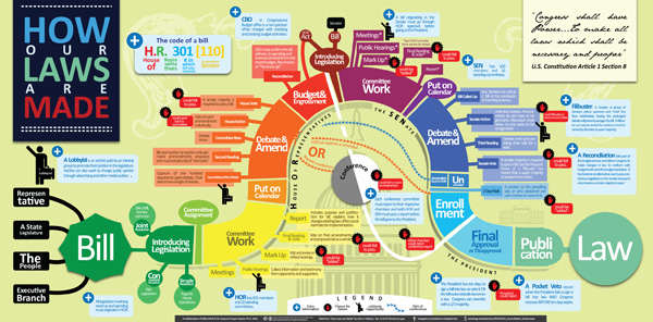
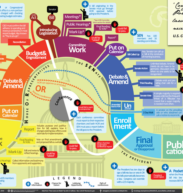
How a Bill Becomes a Law | Mike Wirth

Click through to get the full version or be lazy and just look at the graphic excerpt below

How our laws are made - excerpt | Mike Wirth

What works

My favorite part of this graphic is the inclusion of lobbyists along the way. I might have represented them with some sort of hint about the fact that lots of their power comes from money. Maybe some bills popping out of their suitcase?

Furthermore, it’s impressive that each step is so fully spelled out. Filibusters are in, as they should be.

What needs work

This is so busy. Information graphics are supposed to be relatively easy for the eye to digest. With this one, I do know where to start, but I get lost trying to follow the process along.

Here are some concrete suggestions:

  • Instead of gray-scaling the House of Representatives, the Senate and the President in underneath the curve, just make the segments related to the House, say, all one color, the Senate all another color, and the President a third color. To show variation within those three, play with saturation. It becomes less colorful but more intuitive.
  • The font sizes that vary within a segment and in the title are confusing. Just one font size per segment. This is a graphic, not a wordle. Plus, I never liked wordles. Words are mostly for writing, sometimes for labeling, but they do not make good graphics on their own with very few exceptions. Use words as words, not as graphics.
  • I would have tried to find a way to incorporate some of the balloons hanging off the main body into the main body. Aesthetic decision, but the whole thing looks hairy with all those balloons, lobbyist icons, kill points, and so on. Get some of that content into the segments, even if the segments have to expand to accept a bit of explanation.
  • I am not a fan of the buildings and whatnot sort of faded into the background. They don’t add to the story and the image is already too cluttered. Nix ’em.
  • The color of the conference committee – gray and white – makes it seem as though it is unrelated to the House or the Senate or anything else going on here. Maybe the members are extras from Twilight? This is actually the one place where a bit more color would have made sense. Blend the color of the HOR and the Senate and get them swirling around in conference.
  • The terms that are randomly defined or explained in blue boxes in what would have been ‘white space’ around the snake could have been collected and stuck into a single box somewhere. They could have been numbered and the numbers could have been applied to the graphic at the point where the viewer might have been most likely to wonder about them. Or not. With fewer than 10 terms, I think people would find their way through them without too much trouble even if they weren’t numbered and keyed directly to a particular spot on the graphic.

What needs to be said

This graphic was a winnner at Sunlight Labs Design for America contest. So all of my criticisms are, apparently, bunk. Because this one was judged to be the best of the “how the bill becomes a law” submissions. More from this design series coming soon. I can just tell you’re all getting excited about the IRS themed graphics.

References

Mike Wirth. “How a Bill Becomes a Law”

Johnson, Clay of Sunlight Labs. (26 May 2010) Design for America contest.

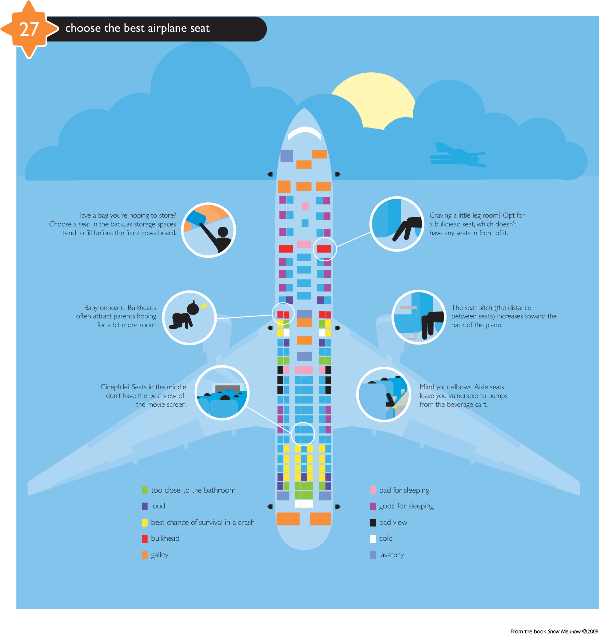
Airplane Seating Diagram | Show Me How
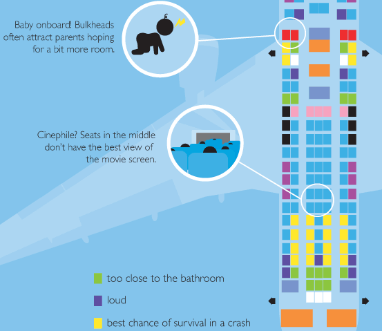
Airplane Seating Diagram - detail | Show Me How

What works

The diagram assumes a number of user groups – parents of youngsters, sleepers, long-leggers – in addition to universal concerns like not dying in a crash or understanding that your appendages are more likely to be run over by the beverage cart if you’re seated on the aisle. Friend of mine broke a foot that way so I’d say it’s a non-trivial concern and lends support to the choice of the bulkhead rather than an aisle seat for those with long legs.

What needs work

This blog needs work. I haven’t posted any non-standard graphics lately. Boring. Even though this has nothing to do with sociology, it’s a necessary inclusion.

Reference

Smith, Lauren and Fagerstrom, Derek. (2008) Show Me How. Collins Design.

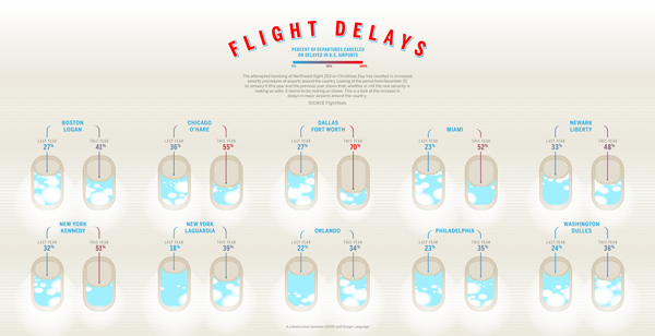
Flight Delays - from GOOD magazine's Transparency blog

Above

The entire graphic is quite large. If you click on the image or here you will be able to see it in all its glory. Hope you invested in some screen real estate because GOOD is making some optimistic assumptions about the size of your monitor(s).

Below

I took the liberty of including a close-up here. Should suffice.

Flight Delays - Close Up

What Works

The window up and down is cute and of course I am thrilled that they included the percentages those window shades are representing with actual numbers.

What Needs Work

This strikes me as one of those graphics that looks far more clever than it actually is. I have no reason to believe that security measures caused flight delays, except that the explanatory text suggests it is so. Here’s why I have logical doubts. First, the period over the Christmas/New Year’s holiday season is notorious for weather related delays. Maybe some of these cities had some nasty weather in one year that they didn’t have the previous year? I didn’t actually look this up, but the point is that if I were to be convinced that security alone could cause flights to be delayed I would need to know about other likely reasons for delays. Another problem could have been the relative level of fullness of the flights – fuller flights take longer to board and deboard.

From my anecdotal experience, another cause of delays has been the increase in baggage fees. Due to the fees, more people try to cram all their luggage into the overhead compartment which makes planing and deplaning an agonizing experience. I’m quite sure we’ve watched someone about my height (short) struggle to remove an uncommonly heavy and unwieldy bag from the overhead compartment a few rows BEHIND their assigned seat. The fight goes on for at least two minutes and could include the passenger standing, one leg in each aisle seat. Hey, kids, that’s entertainment. If everyone involved is lucky, nobody gets hurt. If not, the bag is a hard-sided suitcase full of, say, sociology text books, that lands on the head of an unhelpful but otherwise blameless person sitting in the seat below. Then there are at least five minutes of first aid, profuse apologies, tardy offers of assistance from some passenger who had been standing around making impatient grumpy faces up to this point, and general pandemonium.

My point is: this graphic seems to be based on convenient rather than thorough research. Maybe the delays were caused by increased security measures alone. But as a logical consumer of infographics (and frequent flyer) I admit, I’m skeptical. Could have been weather, could have been fuller flights, could have been the restructuring of baggage handling, or, more likely, some combination of all those things.

References

GOOD Magazine and Design Language. (2010) “Flight Delays”.

endcarryoncrunch.org