
What works
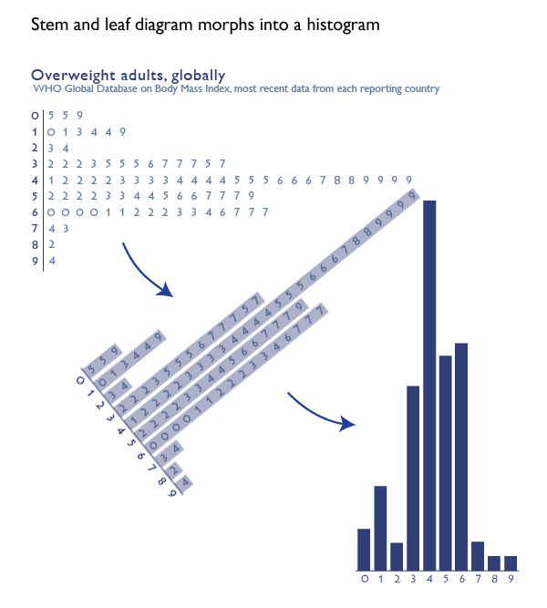
The stem and leaf diagram is an old stand-by that has largely been abandoned in social science as it morphed into the histogram. It is a rather ingenious graphical device that could be created even with a typewriter, which is how people used to prepare documents not that long ago. And when I say ‘people’ used to prepare documents, I am actually imagining wives and girlfriends of the husbands and boyfriends who were preparing final drafts of their dissertations and later the (mostly female) secretaries, administrators, and lab assistants typing up articles and figures for (mostly male) professors. [Refer to this graphic on the gendered nature of degrees at the doctoral level for supporting evidence that it was mostly men writing dissertations and then getting the jobs available to people who had written dissertations.]
How to make a stem and leaf diagram
1. Start with numerical data. Organize it from least to greatest.
2. Think of each number as having a stem and a leaf. The stem is the more durable part of the number and the leaf is the more sensitive part of the number. For a number like 57, the more durable part of the number is the ‘5’ because even if there was some variation in the measure, the number in the 10’s spot might not change but the ‘7’ in the singles spot is more sensitive and thus more likely to flutter like a leaf. If we were measuring temperature, for instance, it would be a lot more likely that the day would have temperatures like 56 and 58 than 60-something and 40-something. Thus, the tens spot is the stem and the singles spot is the leaf in this case. It would be possible to use measurements in the hundreds or even thousands.
3. Once you have identified your stems and leaves, type the lowest stem value. Then type a bar or some other vertical device to separate your stem from your leaves. Then look at all the observations you have for that stem value. Type in every single observed leaf value for that stem, starting with the lowest one. So if you are creating a diagram of all the temperatures registered at noon for the month of November, you will have 30 values to stick in your chart. You will probably have something like three values in the 30s – say, 35, 37, and 38. This would mean you would type a 3, then a vertical bar, then 5, 7, and 8. If there were also nine values in the 40s – say 40, 41, 42, 42, 43, 45, 45, 46, and 48 you would hit carriage return. Then you’d type a 4, a vertical bar, and 0 1 2 2 3 5 5 6 8. You see how people (mostly women) could use typewriters to make graphics.
The strength of this technique is that it forces the actual dataset into a visually organized diagram. All of the values can be read right out of the graph but the device as a whole gives an impression of the overall pattern.
4. At some point after typewriters, the stem and leaf diagram morphed into a histogram. I think Excel had something to do with this, but I am still researching just how it was that the stem and leaf diagram was relegated to the dustbin while the histogram rose to take its place.
Worth thinking about
Stem and leaf diagrams are close cousins of bar charts and histograms. While bar charts and histograms might be more attractive in some ways, they are, in fact, less data-rich. It is not possible to read the actual values out of a colored bar. Despite the fact that the histogram chart form *could* be more visually pleasing than the stem and leaf diagram the fact that histograms allow more space for aesthetics means that they can just as easily be uglier, not more appealing, than stem and leaf diagrams. Dumb and ugly is no good at all. Still, bar charts gave rise to things like stacked bar charts that allow us to visualize observations for multiple investigations that share the same variables so I do not consider them a step backwards.
What about global body mass index?
The information in the graphs above comes from the World Health Organization’s database of global body mass index. The numbers represent the percentage of people in the overweight or obese range of the body mass index in individual countries, NOT the average body mass index of individual countries. Notice that one country [American Samoa] has over 90% of its adult population in the overweight or obese range. If you’re curious, the US has 66.9% of our adults in the overweight+obese range. Vietnam is on the low end with only 5% of its adults overweight or obese.
References
World Health Organization Global Database on Body-Mass Index. [Last accessed 17 November 2012]