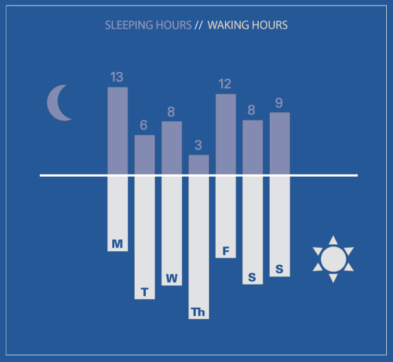
Sleep-wake graph of Danielle Carrick’s week, May 1st, 2012 | via daniellecarrick.com
What works
This simple graph is visually nothing all that unique but conceptually it makes a very smart use of the bar graph trope to display information. Sleeping and waking hours are taken to be each other’s opposites (and are assumed to happen in unbroken spans – no daytime naps for Danielle).
What needs work
I might have toyed with placing the waking hours on top and the sleeping hours on the bottom. Or, better yet, I might have flipped the axis and put waking hours on the right and sleeping hours on the left. But that’s simply a matter of taste. Flipping the axis doesn’t change the concept.
Quantified self
As we see more and more applications and products that aim to reveal patterns about individuals to individuals, we’ll see more and more of ourselves reflected back to us in information graphics like this one. I’m curious to find out how the visualization of the data shapes the way people use the data.
There will slowly be more on the quantified self theme here.
Geography of twitter in a tree map. Graphic created using TreeMappa. Data gathered by Devin Gaffney; analysis by Monica Stephens and Mark Graham.
What works
1. Boxes-in-a-box diagrams aka treemaps achieve an efficient use of space without sacrificing granularity of information.
2. Intelligent grouping – all of the countries from each continent are grouped together in boxes that fit neatly into the perimeter of the overall boundary.
3. The color in the boxes does not obscure the labels. Also, the font size is well chosen.
4. The treemappa algorithm rigorously adheres to scale which is critical for visual analysis. Scale communicates across language barriers and that’s one of the reasons visual communication has advantages over text-only communication.
1a. The legend is efficiently small to benefit the efficiency goals of the design, but it doesn’t explain what numerical value underlies the High, Medium, and Low internet users-to-tweets ratio. The blog post accompanying the graphic does not describe this ratio either though I would imagine it is discussed in the as-yet-unpublished manuscript “Where in the world are you? Geolocation and language identification in Twitter” listed (but not linked) in the references. We’ll have to wait for formal publication.
1b. We also can’t tell what the scale is with respect to the activity comparisons between countries. Scale is extremely important for interpretation [see number 4 above]. It’s critical to include numbers in the legend so that viewers can calculate ratios. [For instance, I would like to know if they’re using a log or a linear scale but without a numerical legend I can’t tell…]
2. The biggest problem with this graphic is a problem I have been contemplating about many different information graphics: information graphics are consumed as hermetically sealed information objects that offer a kind of apolitical truthiness. Within the social science tradition – and within most scientific traditions – it’s incredibly important to make the messiness of research transparent. In this particular case, the blog author does an excellent job of representing the dubious validity of this research in the blog post that accompanies this image when he writes:
As a first step, we decided to collect all georeferenced tweets sent between March 5 and March 13, 2012. It is important to point out that georeferenced tweets comprise fewer than 1% of all tweets and it is possible that significant geographic biases exist in where and how people georeference their content.
So should we trust that the numbers above are representative of the actual geolocation of tweets? Well, we should only assume that this is a good representation if we believe that there is no systematic geographical correlation between users who include geolocation data with their tweets and those who do not. I am not a twitter expert, but it’s hard for me to swallow the idea that users of twitter have the same attitudes about privacy and competence with privacy settings the world over.
The tyranny of beauty
The bigger question for information graphics, though, is how can we ensure that the graphics themselves reveal their own messiness, incompleteness, and methodological underpinnings? If information graphics are to become legitimate components of (social) scientific practice, they need to find ways to include the kinds of doubts, disclaimers, and methodological difficulties that appear in the discussion section of academic papers.
I struggle with this immensely in the graphics I make. I’ve found that the designerly desire that graphics be beautiful in order that they communicate instantaneously through first impressions lead to a tyranny of aesthetics in which graphics that are deemed “good” are those that specifically avoid messiness and present a sanitized, sealed, image-as-object that deliberately obscures many of the problems that remain open questions. The graphic presents itself as an answer. In text, it is possible to differentiate between the elements of questions that are leaning towards answers. In photographs, interpretations can be meaningfully multiple. But in information graphics, the image is often so tightly bounded that it leaves no invitation to skepticism.
Boxes-in-a-box diagrams like the tree map above is a particularly clear illustration of the larger tension in which information graphics are asked to present clear and complex information at the same time that academic requirements ask that they make their messiness and unknowns obvious. The graphics were created in order to present information efficiently at first glance and then reveal granular detail upon further inspection. This is a worthy set of goals and the boxes-in-a-box tree map diagrams deliver on both of those goals. I would argue that those goals satisfy only one side of the problem – to communicate what is known in a clear, compelling fashion – leaving aside the notion that much remains unknown, that many other relationships have been left out, and that even the things we think we know rely on sound methodology which may or may not be possible. Social science research has always been blessed/plagued with the challenges of drawing meaning from incomplete, intersecting, and incommensurable information.
This is an issue I’ll continue to explore and I encourage both designers and social scientists to share thoughts about the benefits and drawbacks of ‘beautiful’ information.
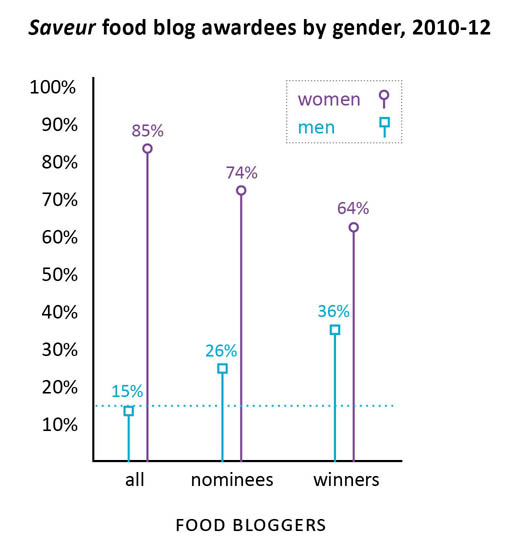
Saveur food blog award nominees and winners by gender, 2010-2012
Gender in food blogging
Last summer I conducted a survey of food bloggers (N=283) which found that 85% of food bloggers are women (see here for more demographic statistics from the survey). I also conducted interviews with food bloggers and started to get the impression that food blogging is a community dominated by women in which the relatively few men end up being disproportionately successful. This kind of gender disparity – a group that is overwhelmingly women in which men are more likely to occupy positions of power or prestige – has been written about in the sociological literature with respect to elementary school teaching and nursing. In elementary schools, for example, the majority of the teachers were women but administrators (like the principal and vice principals) were disproportionately likely to be men. This gender disparity in the schools is no longer as pronounced as it once was. Women now occupy more of the administrative positions but men have not moved in to occupy more teaching positions. If food blogging follows the same trajectory, we can expect women to occupy more of the most prominent food blogging positions over time.
But what is a ‘prominent food blogging position’?
Since food bloggers are not working professionals within a clear hierarchy like teachers and nurses, I decided to look at food blog awards data as a proxy for success in the food blog world. The magazine Saveur hosts the longest running, most extensive set of food blogging awards of any organization. I used their awards nominees and winners to pull together the graphic above and find out how gender and success in food blogging interact.
Using the Saveur awards data, it is clear that there is a pattern of disproportionate male success within the food blog nominees and winners. In a perfectly gender-neutral world, we would expect that when 15% of the food blogs are written by men, 15% of the food blogging awards will be distributed to men. In fact, 26% of the nominees (chosen by Saveur) were men and 36% of the winners (voted on by the internet audience) were men. In other words, both the Saveur selections and the internet-audience voters were inclined to select men more often than strict chance would have predicted.
My interviews indicated that there could be a few explanations for this kind of pattern. However, I’m curious to hear what food bloggers – especially those who voted for or won Saveur‘s awards – have to say.
The comments are open.
Methodological note
N=194
I removed blogs whose writers’ genders were not revealed and blogs written by couples or other mixed-gender groups. I also removed blogs that did not meet my original definition of food blog which include the two categories for blogs about alcohol and the category for blogs about kitchen tools/gadgets.
They make good use of the vertical layout by building in a vertical pagination. It’s a decent way to make a graphic web-friendly, narrative in structure, but with enough structure that it doesn’t suffer from the ‘infinite scroll’ phenomenon in which a person can get lost in a band of information lacking delineation of any kind.
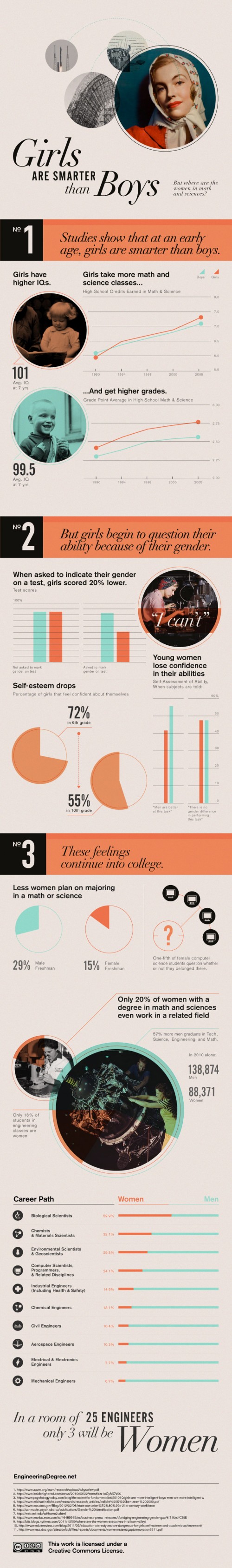
The career path graphic in No. 3 is a great use of a hybrid table/graph display that does a good job of indicating how gender and major interact.
It works to compare the descriptive statistics about girls to the same statistics about boys. This graphic mostly includes girl/boy comparisons (see No. 1 and two-thirds of No. 3), but in some cases it only presents statistics about girls. For instance in No. 2 we see that girls don’t do as well on exams when they are asked to indicate their gender. Are boys the same? This particular piece of data needs more context before I would feel as though I properly understand the correlation. If girls do not mark their genders is it as if they have set gender aside for a moment and were able to take the test without remembering to ‘play dumb’? Or do they feel that they are trying as hard on either the gender-marked or the non-marked test but they do more poorly without deliberately playing dumb? Does everyone – male or female – feel more pressure the more their tests are associated with markers of identity like gender and therefore maybe all of us do worse the more we have to disclose about ourselves? Bottom line: the least they could have done was included the male comparison for all of the data points.
What needs work
I’m not a huge fan of the pictures. They imply that this is an old-fashioned problem, and I suppose it is a rather OLD problem, but it has significant contemporary impacts. I’m also not convinced that any images would have added to the information component so perhaps this is a case of ‘less is more’.
Some of the text is awfully small.
In general, I wish these vertical strips of individuated graphics could find a way to feel more like a single graphic and less like a curated collection of related data points.
Women in engineering majors
I’m including a snippet from the article that was accompanied by this graphic because the author was able to make a point that the graphic failed to depict which is that there are ways to make engineering education more welcoming to women. The strategies suggested here are so obvious that it’s hard to believe someone had to articulate them, but I think many people who have gone through undergraduate education know that advising is a rather haphazard affair.
More broadly, what the studies found was that “the climate of the department makes a really big difference about who’s attracted to the major, who chooses to stay in the major and eventually graduates,” St. Rose said. “The active recruitment of students is absolutely necessary. That’s a no-brainer but a lot of departments don’t do it, they just say, ‘Students will choose the majors they decide on,’ but inviting students to take an introductory course or to consider the major can really help.”
World's water resources by type of water, via The Atlantic data from the USGS
Is Minnesota like Saudi Arabia?
Minnesota is the land of 10.000 lakes and thus holds far more than its representative share of precious fresh water. Is this synonymous with the naturally granted wealth of oil in countries like Saudi Arabia? Maybe. But does that mean Minnesota is going to become a state with a similar level of political economic power? No…not so much. It is silly to compare nation states like Saudi Arabia to states in a federation like Minnesota; it is silly to think that a state with an existing economy relatively unreliant on water is going to suddenly transform itself into an economy with a single primary commodity; it is silly to think that a democratic governance system will respond like a dictatorship did to a valuable commodity. As an aside, Tim Mitchell’s latest book, Carbon Democracy makes a historically grounded argument about the relationship between the material qualities of oil and coal and the technics of the political economy that developed in concert with carbon-based wealth.
How are information graphics like propaganda?
This infographic is more than half graphic (and less than half ‘info’). Normally, that’s not the best balance for displaying social science data. Usually, social science data is multi-faceted, requires a contextual framework for adequate understanding, and the sheer amount of information necessary to tell the story makes it harder to include graphic elements that do not represent information. However, this is not social science data. Technically, it is geological data, but I think it would be more accurate to describe it as data that is being mobilized for political reasons. Hence, the title of this post makes a blatant comparison between water (blue gold) and oil (black gold) to emphasize the implicit political valence of the message in this graphic.
In short, information graphics are being mobilized for what are essentially purposes quite similar to propaganda. This particular graphic is not the best example. It is the example I happened to see yesterday, and it does a good job of demonstrating what is at stake in the current infoscape with respect to information graphics. These graphics are generally considered to be intellectual and political lightweights compared to communication that is based on the production of critical texts. Overlooking the work that these graphics do is both dangerous and foolish. For one, many critical voices from within the academy *have* critical messages they have trouble communicating with broader audiences because many audiences are unlikely to read academic writing, even if that writing is posted to blogs. If these academics can create their own graphics, they add another tool for communicating clearly just what their perspective is. Yet pretending that information graphics are either merely ‘pretty’ or that they are straightforward representations of empirical data avoids engaging with the way that political messaging is built into graphic design.
One reason this blog exists is to help people start to sharpen their critical visual analysis tools. As educators, we spend a lot of time in the classroom teaching students how to write and how to stop believing everything they read by becoming aware of rhetorical moves, selective mobilization of facts, and reliance on carefully chosen narratives that initiate particular kinds of human perceptual biases and emotional responses. Art historians teach the same kinds of critical skills for interrogating paintings and photographs. Media studies folks teach the same kinds of skills for interrogating popular culture products like television shows, films, and magazines. Social scientists would serve the discipline well if they begin to teach students how to critically consume information presented in infographics.
References
Thinking Big Series. (2012) The World’s Water Supply. The Atlantic. This series is sponsored by Fidelity Investments, LLC.
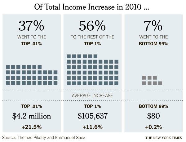
The Rich Get Even Richer research by Thomas Piketty and Emmanuel Saez. Graphic by the New York Times, Stephen Rattner author.
What works
Quoting Justin Wolfers who I happen to follow on twitter, it’s generally not good practice to look at a single year’s worth of data, especially when it would be easy to get comparable data going back for years. Still, in this particular economic news climate, many of the people who are likely to see this graphic have some sense of the relevant contextual data in their heads already, thanks in part to the Occupy Wall Street movement but also to the often thankless work of social scientists and labor statisticians who have been working on issues like income distribution since long before OWS congealed. That’s a long-winded preamble to summarize two fairy simple achievements in this graphic:
This graphic demonstrates that it is possible to make it appear as though there was income growth for everyone in 2010 – even that bottom 99% saw an INCREASE in income, albeit a tiny one – despite the fact that the economy was rather slack in 2010.*
The graphic amply demonstrates that the post-2008 world is quite similar to the pre-2008 world in the sense that income distribution is dramatically skewed. The rich do get richer.
One thing that the article draws readers’ attention to is that the study, which looked at tax returns, and the graphic are about income. Thus, we are not talking about the distribution of wealth (ie the accumulated capital that results from single year uneven distributions of income and a lack of attendant unequal distributions of spending). The rich folks in 2010 got most of this income from labor, not from returns to investments.
What needs work
*One thing I fear is that this graphic obscures an important truth by comparing only the top 1% to the bottom 99%: many people had declining income in 2010. This graphic makes it seem like everyone got *something* but really, the folks at the bottom of this distribution got no increase or a decrease, for the most part. From a statistical leverage point of view, the 99% is just too big of a group to be all that revealing. The spotlight is on the 1% in both this graphic and the current political economic discourse in a way that curiously contributes to the inaccurate notion that America is a classless society. One of the things that makes the 1% vs. the 99% a clever rhetorical frame in America is that we all thought we were in the middle class before OWS and we can now continue to think of ourselves as one giant middle class with this troublesome small pimple of a distribution problem to sort through represented by a mere 1%. The whole 99% sounds so comfortably inclusive and that pesky 1% must, in the end, be a manageable problem because it sounds kind of small-ish. It’s only 1%.
Of course, the rhetorical move of splitting the American population into the 1% and the 99% sets up for all these fantastic (as in remarkable, not as in laudable) statements, like the one made by the graphic, that go something like: “The top 1% of the population got 93% of the income in 2011 while the bottom 99% only got 7%.” Being able to make comparisons like that is a more straightforward, empirically sound reason for the 99% vs. the 1% framing than one that seems to make an effort to avoid noting that America has a lower class.
Relative frame: US vs the world
If you are not in the 1% – and most of you are not – I imagine you might be feeling righteously indignant right now. But think of it this way. All of you have computers and internet connections, most of you are American or English according to the google analytics for this blog, and are therefore in the global 1%. It’s a golden rule problem not in the sense that you should do unto your less fortunate global neighbors what you would have your more fortunate doctors/bankers/lawyers/businesspeople do unto you – though I suppose that might apply, too – but more along the lines of, ‘those who have the gold, rule’. Revisit C. Wright Mills The Power Elite, skim a bit of Marx, and maybe look at something a little more recent like Tim Mitchell’s Rule of Experts and this graphic and the entire OWS narrative is analytically similar to a snapshot of a sports event: different in its particulars but so predictable it’s almost trite. It would be trite if there weren’t so much at stake.
References
Rattner, Stephen. (25 March 2012) The Rich Get Even Richer. In the New York Times, The Opinion Pages. Note: The author, Mr. Rattner, is himself a member of the 1%. Sometimes when I see graphics like this, I wonder if people who know that they are in the 1% are secretly congratulating themselves for having done so well compared to the rest of us.
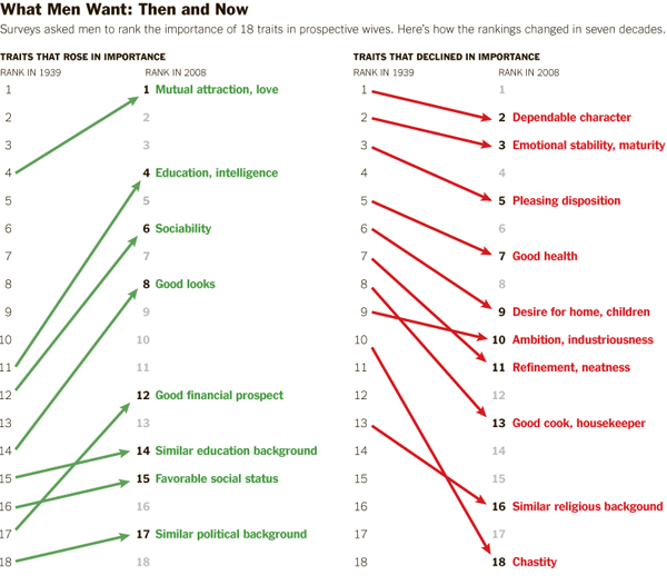
What a man wanted, what a man wants | Boxer, Noonan, and WhelanWhat Men and Women Want in a Mate, 1939-2008 | Boxer, Noonan, and Whelan
Update on references
As you can see in the comments, Christie Boxer, the lead author of the journal article behind the Coontz Opinionator piece has contacted me to let us all know that the article is currently in revise and resubmit phase but will be published in Journal of Family Issues shortly.
What works
The graphic is more legible than the chart from which the data originated. I’m guessing the Journal of Family Issues would not allow such a “fancy” series of graphics in the final published piece so I don’t mean this as a critique of the article’s authors. Just pointing out that there is good reason for journals and other publishers to reconsider their policies about how data can most usefully be presented.
I happen to have created a few graphics in this style myself and tend to favor it over the chart (e.g. this one about agricultural subsidies) in the past and think they work well for displaying changes in attitudes over time.
What needs work
Illustrations to Accompany "The M.R.S. and the PhD" by Stephanie Coontz, New York Times
The article from which this news story is drawn clearly provides information on both what women want and what men want in greater detail than what’s seen here. Why did the news story choose to run with less than half the data?
The chart clearly contains information on what men want in a mate AS WELL AS what women want in a mate. I see no reason for going (less than) halfway on this story. In fact, what I find most interesting is the convergence on some things – nobody cares much about chastity in a mate any more – and divergence on other traits – women rank men’s desire for home and children much higher than men rates women’s desire for home and children. That’s a puzzler worthy of thought in a way that a story that reflects only what men want is…well…just not all that interesting. Pair bonding takes two, as I’m sure Coontz knows because she’s been researching marriage for years. It’s unclear if the Times pressured her to come up with a more attention grabbing headline “The M.R.S. and the PhD” or if she chose that on her own or if it was a combination of factors.
I’m glad to see that, at least as far as I can tell from what is available to scholars other than Coontz (who might have an early full-length, unreleased draft of the Boxer, Noonan, Whelan paper), the scholars whose data led to the graphic were not so singly concerned with what men want in a mate. They were looking at how mate selection characteristics have been adjusted over time for both men and women and I hope that their article looks at the consonance and dissonance between the two genders’ mate selection ideals.
I would have preferred more attention paid to the graphic – like, say, the inclusion of what women want or an integrated graphic that displayed the overlaps and distances between what men and women want – and less time put into the accompanying illustrations which I have included to the left. I welcome regular readers of Sociological Images (and others) to comment on the messages coming out of the illustrations.
Boxer, Christie; Noonan, Mary; and Whelan, Christine. (forthcoming) “Measuring Mate Preferences: A Replication and Extension” Journal of Family Issues. [Table drawn from Christine Whelan’s research webpage]
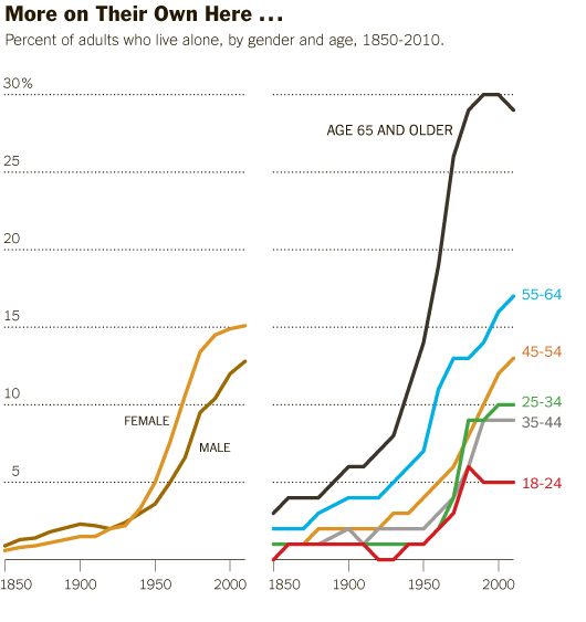
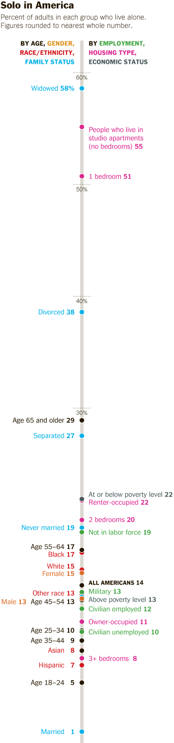
Living Alone by Gender, Age Cohort in the US since 1850
What works
This post is an update to an earlier post about the increasing rate of Americans living alone. The first graph does an excellent job of visualizing the change in Americans’ tendencies to live alone, by age and gender. It’s clear that living alone is on the rise, especially for Americans over 45. It’s interesting that there seems to be a collective slow down in this trend in the decade between 35 and 45 when I suppose some of the late-to-marry people finally settle down and before the marital dissolution rate starts to fire up.
The graphics in this post accompanied an article by Eric Klinenberg in the New York Times Sunday Review that laid out the basic findings in his latest book, “Going Solo” that was based on 300 interviews with people living alone. He finds that while for some, living alone is an unwanted, unpleasant experience, most people who live alone are satisfied with their personal lives more often than not. In fact, they are more social, at least in some ways, than are their counter-parts who live with others. Singletons (his word, not mine. I prefer ‘solos’ in part because it’s an anagram), go to restaurants and other social spaces more often than do those who live with others.
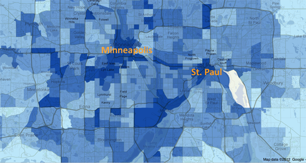
Living alone in Minneapolis
In a number of cities, including Minneapolis, more than 40% of households are single-people households. The article included an interactive map down to the census tract level that shows what percentage of households in that tract were single-person households in 2010. I took a look at Minneapolis and St. Paul and found that the map supported Klinenberg’s qualitative findings. The highest concentration of solos is in the center city areas where opportunities to get out and be social in the community are the highest. The suburbs and rural areas have fewer solos.
I encourage others to use the map and see if their local cities replicate this pattern, that more solos live in ‘happening’ areas than in quieter areas. Of course, this could be caused by a third variable, the presence of households that are affordable for single-earner households…but there isn’t enough analytical power in the map tool to be able to sort out the dependencies.
What needs work
The information about who lives alone by age, marital status, and race that is displayed in the following long skinny stack of datapoints is the right kind of detailed information to use as an entrance into a deeper discussion about living alone, now that we’ve gotten a sense of the view from 30.000 feet. The problem is that this graphic is hard to read, too long for a single computer screen (but in order to make sense of it, one needs to see the whole thing at once), and too optimistic about what color differences are able to do than is reasonable.
The article does a better job of subtly navigating the movement from historical and international context into a detailed, robust analysis. By awkwardly pinning all the data points onto the stalk at once, viewers lose the ability to see patterns within data subsets. Here’s a test. Look at the following data and try to explain to yourself how race and living alone go together. Or how age and living alone go together. The graphic designer was hoping color would be able to do more than it has been able to accomplish here. The color is supposed to tunnel your vision down to a particular color-coded subset so that you can start to understand well just what it is about race or age or marital status that produces particular patterns in living alone. But I had a lot of trouble with the color frame because, quite literally, I had to keep shifting the frame around this graphic – it didn’t fit on my laptop screen. [Graphic designers often work on nice, roomy screens where they end up seeing more at once than their eventual audience who is probably peering at this thing from a web browser on a laptop or occupying half of a monitor somewhere.]
All the clustering around the mean is another problem that could have been avoided had the graphic been organized differently. As it is, all sorts of groups lump on top of one another down around 14%.
I also kind of hate that I can’t add categories together in any meaningful way here. I can tell that being a widow would put someone at high risk for living alone, but that’s kind of a no-brainer, isn’t it? I would have gotten more mileage out of visualizing the absolute numbers of people living alone by marital status, age, and race. Maybe over half of all widows live alone, but I haven’t the faintest idea how many widows there are in America so I don’t know if half of all widows is half a million people? Or 3 million people? Or whether it’s more or less than the 38% of separated people who are living alone. 19% of never married’s live alone, but because these people are likely to be young, maybe that is actually a larger absolute group than the 58% of widows living alone.
Final verdict: There was both a data fail and a graphic design fail.
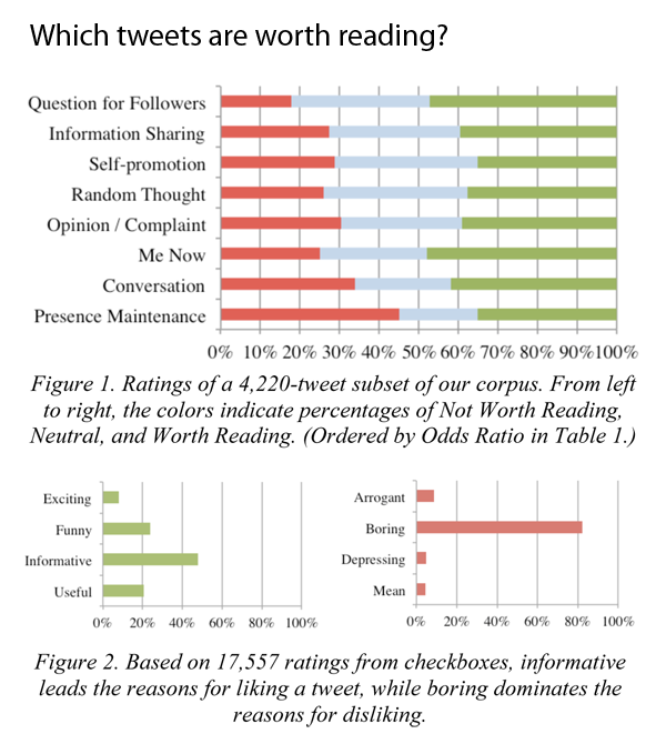
Figures 1 and 2 from "Who Gives a Tweet?" by André, Bernstein, and Luther CSCW paper
What works
A new study will be presented in a couple weeks at CSCW by researchers in Human-Computer Interaction and Social Computing that used 43,000 ratings of tweets to explain what content twitter readers find useful.
In short, worthwhile tweets:
1. Are informative NOT boring
2. Are funny
3. Are concise (even shorter than 140 characters!)
4. Are hyper-timely
5. Avoid whining and navel gazing (Tweets about meals past, present, or future are ‘boring’)
6. Avoid using too much twitter mark-up like @ replies, hashtags, multiple links)
The graphics do a good job of providing a visual overview of the study’s findings. With my brief textual synopsis and the two graphics here I bet many of you reading this will feel like there is no need to go read the study itself. Just in case that’s true, you should know that in the author’s discussion section, they note that their raters were volunteers who were not randomly chosen and skewed towards the tech crowd. Perhaps there’s reason to believe that tech people would be more likely to appreciate informative tweets? Not sure. But I can say from my own research that there is a noticeable portion of the twitterverse that appreciates food-related tweets. Even within that sub-group, people tend to appreciate tweets about recipes or with pictures over tweets that just say, “I had a great #sandwich at lunch! Fresh mozzarella rocks.” A recipe is informative. A recounting of lunch or a whiny tweet about missing lunch is boring at best and annoying at worst.
The thing I like best about this piece is that many of the findings apply to communication in general, not just tweets. Folks, it’s probably true that whether you are tweeting or talking, nobody wants to know what you had for lunch unless they want to have what you’re having. And if they do, they’ll probably ask. No need to volunteer. Also: brevity is the soul of wit; and wit is wonderful.
As an aesthetic point, I think they got the colors about right. Red represents the not-worthy or bad votes that ought to stop; blue represents the neutral position; and green represents the good tweets tweeps should go for.
What needs work
This graphic came without a title and I added “Which tweets are worth reading?” because it was really hard to interpret the graphs at first glance without a title. There is enough information for interpretation in the caption, but I think a caption should not stand in for a title.
The title is the first thing we see.
The graph is the second thing we see.
The caption is the third thing we see.
In order to understand the graph, then, it’s logical to have a title first so that readers’ don’t get frustrated that they have no idea what these colorful bars represent (the axes only get us halfway there in this case).
The title follows their own recommendations: questions work well as tweets. I figured I would try it here as a title, see what happens.
References
P. André, M. Bernstein, and K. Luther. (In press). “Who Gives A Tweet: Evaluating Microblog Content Value.” To appear in CSCW ’12: Proceedings of the 2012 ACM Conference on Computer Supported Cooperative Work. (Best Paper Award honorable mention; top 5% of submissions)
John Maeda (now head honcho at RISD, formerly of MIT’s Media Lab) designed this simple interactive graphic in 2006 while contemplating the cyclical nature of life during the still grey days of a New England winter. His visualization shows the number of springs men can expect to have if they live an average life span for men in their country. Users input their age and select their country. The flowers in color are those in the user’s future; the ones in grey represent the past. Simple. Elegant. An infographic haiku.
What needs work
I have a slightly sunnier view of the past than does Maeda, perhaps. I think I would have colored both the past and present flowers, just used different schemes. Maybe it’s the social scientist in me, but I believe our past and future both provide the context for our present. Perhaps some past years have been grey, but the territory of the past is not generally a cemetery.
References
Maeda, John. (2006) Life Counter. Interactive web-based graphic.
Analyzing the visual presentation of social data. Each post, Laura Norén takes a chart, table, interactive graphic or other display of sociologically relevant data and evaluates the success of the graphic. Read more…