
What works
A new study will be presented in a couple weeks at CSCW by researchers in Human-Computer Interaction and Social Computing that used 43,000 ratings of tweets to explain what content twitter readers find useful.
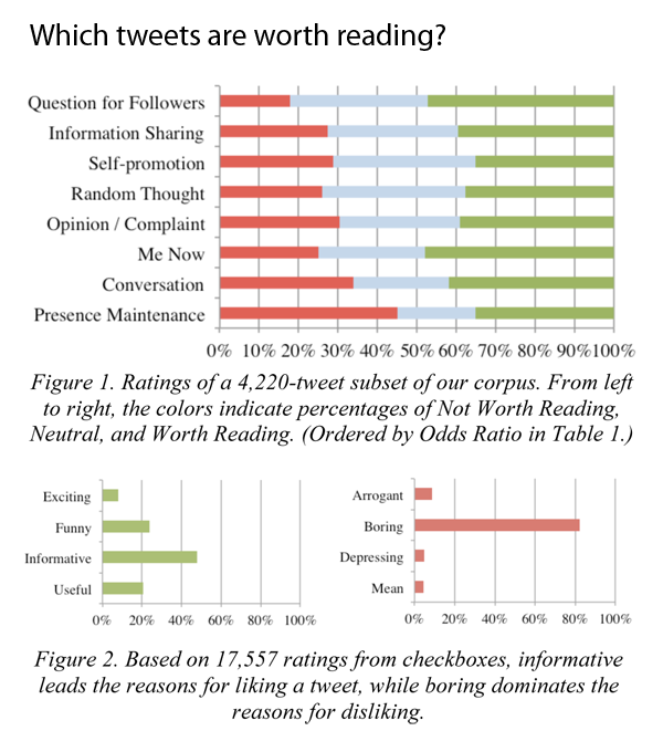
In short, worthwhile tweets:
1. Are informative NOT boring
2. Are funny
3. Are concise (even shorter than 140 characters!)
4. Are hyper-timely
5. Avoid whining and navel gazing (Tweets about meals past, present, or future are ‘boring’)
6. Avoid using too much twitter mark-up like @ replies, hashtags, multiple links)
The graphics do a good job of providing a visual overview of the study’s findings. With my brief textual synopsis and the two graphics here I bet many of you reading this will feel like there is no need to go read the study itself. Just in case that’s true, you should know that in the author’s discussion section, they note that their raters were volunteers who were not randomly chosen and skewed towards the tech crowd. Perhaps there’s reason to believe that tech people would be more likely to appreciate informative tweets? Not sure. But I can say from my own research that there is a noticeable portion of the twitterverse that appreciates food-related tweets. Even within that sub-group, people tend to appreciate tweets about recipes or with pictures over tweets that just say, “I had a great #sandwich at lunch! Fresh mozzarella rocks.” A recipe is informative. A recounting of lunch or a whiny tweet about missing lunch is boring at best and annoying at worst.
The thing I like best about this piece is that many of the findings apply to communication in general, not just tweets. Folks, it’s probably true that whether you are tweeting or talking, nobody wants to know what you had for lunch unless they want to have what you’re having. And if they do, they’ll probably ask. No need to volunteer. Also: brevity is the soul of wit; and wit is wonderful.
As an aesthetic point, I think they got the colors about right. Red represents the not-worthy or bad votes that ought to stop; blue represents the neutral position; and green represents the good tweets tweeps should go for.
What needs work
This graphic came without a title and I added “Which tweets are worth reading?” because it was really hard to interpret the graphs at first glance without a title. There is enough information for interpretation in the caption, but I think a caption should not stand in for a title.
The title is the first thing we see.
The graph is the second thing we see.
The caption is the third thing we see.
In order to understand the graph, then, it’s logical to have a title first so that readers’ don’t get frustrated that they have no idea what these colorful bars represent (the axes only get us halfway there in this case).
The title follows their own recommendations: questions work well as tweets. I figured I would try it here as a title, see what happens.
References
P. André, M. Bernstein, and K. Luther. (In press). “Who Gives A Tweet: Evaluating Microblog Content Value.” To appear in CSCW ’12: Proceedings of the 2012 ACM Conference on Computer Supported Cooperative Work. (Best Paper Award honorable mention; top 5% of submissions)