
What works
It works to start with a provocative question.
They make good use of the vertical layout by building in a vertical pagination. It’s a decent way to make a graphic web-friendly, narrative in structure, but with enough structure that it doesn’t suffer from the ‘infinite scroll’ phenomenon in which a person can get lost in a band of information lacking delineation of any kind.
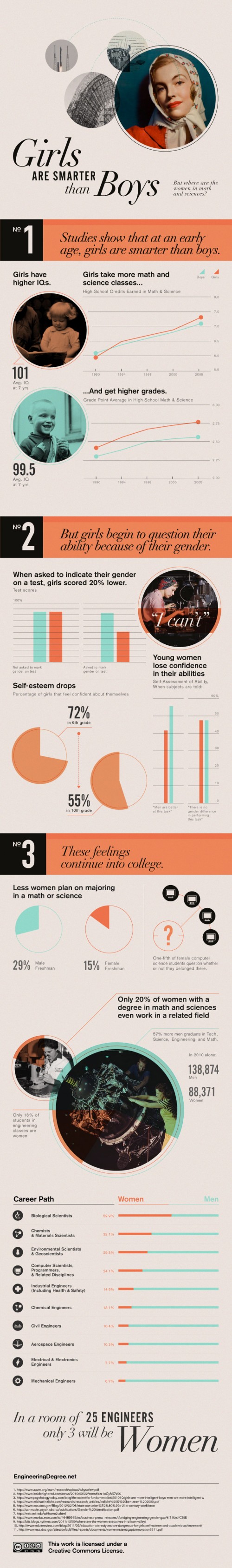
The career path graphic in No. 3 is a great use of a hybrid table/graph display that does a good job of indicating how gender and major interact.
It works to compare the descriptive statistics about girls to the same statistics about boys. This graphic mostly includes girl/boy comparisons (see No. 1 and two-thirds of No. 3), but in some cases it only presents statistics about girls. For instance in No. 2 we see that girls don’t do as well on exams when they are asked to indicate their gender. Are boys the same? This particular piece of data needs more context before I would feel as though I properly understand the correlation. If girls do not mark their genders is it as if they have set gender aside for a moment and were able to take the test without remembering to ‘play dumb’? Or do they feel that they are trying as hard on either the gender-marked or the non-marked test but they do more poorly without deliberately playing dumb? Does everyone – male or female – feel more pressure the more their tests are associated with markers of identity like gender and therefore maybe all of us do worse the more we have to disclose about ourselves? Bottom line: the least they could have done was included the male comparison for all of the data points.
What needs work
I’m not a huge fan of the pictures. They imply that this is an old-fashioned problem, and I suppose it is a rather OLD problem, but it has significant contemporary impacts. I’m also not convinced that any images would have added to the information component so perhaps this is a case of ‘less is more’.
Some of the text is awfully small.
In general, I wish these vertical strips of individuated graphics could find a way to feel more like a single graphic and less like a curated collection of related data points.
Women in engineering majors
I’m including a snippet from the article that was accompanied by this graphic because the author was able to make a point that the graphic failed to depict which is that there are ways to make engineering education more welcoming to women. The strategies suggested here are so obvious that it’s hard to believe someone had to articulate them, but I think many people who have gone through undergraduate education know that advising is a rather haphazard affair.
More broadly, what the studies found was that “the climate of the department makes a really big difference about who’s attracted to the major, who chooses to stay in the major and eventually graduates,” St. Rose said. “The active recruitment of students is absolutely necessary. That’s a no-brainer but a lot of departments don’t do it, they just say, ‘Students will choose the majors they decide on,’ but inviting students to take an introductory course or to consider the major can really help.”
References
Hill, Catherine; Corbett, Christianne; St. Rose, Andresse. (2010) Why So Few?: Women in Science, Technology, Engineering, and Mathematics. [Report] American Association of University Women.
Epstein, Jennifer. (2010) Attracting Women to Stem Inside Higher Ed
Comments 6
Mike — June 4, 2012
Totally agree on the need for context with some of the girl only statements.
Not trying to be a jerk, but if girls were systematically getting lower grades than boys I doubt the conclusion would be "boys are smarter than girls." See also: A minimal difference in average IQ. I understand the goal is to be provocative, and agree with the overall message. But I'm not sure I can get behind the tone of #1.
SummerD — June 9, 2012
I have to say that strictly speaking, the information in the graphics would lead an educated adult to conclude that the person who made it was stupid - not exactly a great way to make an impression such an exacting area as STEM.
No. 1 begins with a conclusion that no one who understands the meaning if IQ measurements or who has taken a statistics course would make, that a 1.5 difference in IQ is statistically significant; it's so small as to be considered irrelevant. Additionally such a small difference means that another sample taken at another time could show a reversal or larger difference, and yet mean the same thing. A medical or educational professional would also be extremely disturbed at the conclusion that low test scores (non-IQ) means low intelligence, especially given that boys are thought to suffer from a greater range of issues such as ADHD, which do not reflect intelligence. One major issue in feminist or ethnic studies has been whether these tests are reflective of intelligence or different types of intelligence in general - and so to make such a incorrect conclusion is simply regurgitating the same old attacks on women in another form.
No. 2 also makes a conclusion that is unsupported by any evidence, since surveys show that as women enter young adulthood, their confidence levels decrease across the board on a range of issues, only to see those levels increase as they get older. A similar pattern is seen with men but at a different age. Additionally there is a strong element of cultural-centricism inherent in the belief that "self-confidence" gives rise to achievement. Other cultures view this in reverse. Among many East Asian cultures for example, it is one's achievements which give rise to confidence, and the better one does the more one should be confident. Many women from other countries would balk that they had to "feel confident" as a precursor to doing well in the sciences.
No. 3 is the only interesting page simply because it contrasts the numbers in simple terms, leaving it up to the viewer to interpret the need for action. It doesn't resort to cliched and unsupportable interpretations to make a point, but rather, as scientists strive do (but often fail), let the results speak for themselves.
Carol — June 15, 2012
I agree with Mike. I think that the assumption that girls are smarter than boys at an early age can indirectly feed into some of these negative self-images for girls and women at a later age. For example, later in life when the same female-bodied person who used to excel in everything encounters male-bodied competition, they may feel that they themselves have gotten dumber and will begin to question their current intelligence, which doesn't help confidence. And of course the assumption doesn't help young boys achieve their potential either. There is some basis to the observation that the female and male brain develop at different paces, but to just make the claim that "girls are smarter than boys" is a very inefficacious generalization.
We have the information about how boys do on tests when asked to reveal their gender. It is in the graph. According to the studies (references?), boys do better.
Carol — June 15, 2012
Sorry, the references are at the bottom of the piece. However, it would be a good idea to link the refs to your claims using footnotes.
Prof. ART — June 18, 2012
All I can say, as an extremely well educated man, is that the smartest men and women I ever knew just did what they needed to do to succeed--with NO EXCUSES.
I think that the oft referred to 'self confidence' that young women seem to lose is more a matter of menarche (first period) and less a matter of being in the presence of competitive males. When female physiology changes so that procreation is possible it makes sense that women in general begin to seek out males who can protect them as potential mothers.
Whether it is fair or not, the general tenor of the human race is that men don't tend to find women who enter a male realm like STEM as attractive potential mates. It is not a matter of whether women belong on STEM, it is a matter of US women, generally speaking, entering these fields taking on masculine personas. Men simply don't know what to do with this. In essence, if a woman is acting like a man amongst other men, then generally the best she can do is to be accepted as a 'male'. That is, men need to know how to assign a defacto gender to anyone who confuses them. At the same time, many women find being treated like a male as objectionable—thus creating a Catch 22.
Professional women acting like men--masculinized women--may be a peculiar feature of the US, from my experience. That is, having worked in the Middle East for several years around women biochemists, hospital administrators, physicians, haematologists, etc. from several non-US countries, I have never seen such women act in masculine ways. They are totally professional and in my presence never evinced a sense of being threatened by men who might be knowledgeable of their fields. Simply put, I have only seen this in the US.
Having followed, formally and informally, the US educational system since the 80s, I have notice (as others here) a distinct increase in emphasis on self esteem 'programs', and a distinct decrease in emphasis in serious academic studies in K12. As a result, many HS school students are ill-prepared to enter serious university studies--this has been widely documented.
I taught Academic Writing to sophomores at a very good SE university in the US from 05 to 08, and found that these medical science majors (pharmacy up thru med/vet) couldn't write their way out of a paper bag--if I could have marked based on their actual writing skill, most would have gotten Cs, Ds, or Fs. Because college students--having been exposed to 12 years of 'you are special' education--now feel entitled to good grades and indeed are not emotionally prepared to deal with 'failure'--I had to GIVE them mostly As. How pathetic.
With our K12 and university programs doing such a poor job, can anyone seriously question why not enough women or men are not entering STEM?
We need to sing the 'you are special song' less in K12 and get serious about EVERYONE's educational prospects.
Young women who are interested in STEM should be encouraged--just as should males, but no standards should be changed to somehow make these fields more feminized. For instance, many HS in the US now teach mathematics which exclusively contains words because females like words more compared to symbols. In and of itself having such courses as an option is fine, but make no mistake entering the professional areas of STEM means understanding the parlance of symbols so that as scientists, chemists, physicists, mathematicians, engineers, and physicians they can communicate with other such professionals worldwide. This is the very reason why we have the language of science.
Finally, US women should better understand the basic psychology of men--just as they demand men be able to understand how to fit into more feminine areas of work such as teaching. Talk to any man who has tried, for instance, to enter to world of primary school teaching, which is distinctly female turf. Again, fair or not, women primary schools teachers frequently badger and harangue such males out of primary school teaching, when in fact a male presence there is very much needed.
I don't hear anyone complaining about a conspiracy to keep males out of primary school teaching--that men lose confidence as a result of female pressures or that males who should be interested in teaching somehow show lowered IQs.
The above 'data' is unscientific and is being used to create a specious argument.
Logan D. A. Williams — June 19, 2012
The pictures remind me of the Petticoats and Slide-rules exhibit by the Society of Women Engineers (SWE) that was located at Iowa State one year when I was an undergraduate there. Beautiful pictures but old and only showing one facet of women in STEM. Why are the women in the STEM infographic only Caucasian-American in appearance? Why are they typically shown alone? Reading alone? Working alone? And wearing only one (old) style of clothing? :)
If you look at the Society of Women Engineers Magazine -- they have done a much better job of including 'diversity' in: their advertising pages from various companies, and in the topics of the magazine, and the featured articles which predominantly discuss women engineers.
These women look glamorous in 'business casual' and/or are portrayed in their 'work' clothes in turn. They are working in typically male-dominated sub-fields of engineering: petroleum rigs in the deep ocean, departments of transportation or construction management companies. They are also working in other sub-fields: as consultants for cell phone companies, and designing airplanes or biomedical prosthetics. In many of the images in the SWE magazine, they are smiling at their male and female co-workers.
Best of all they are Blind, African-American, Asian-American, Latin-American, and Caucasian-American. Some of the advertisements and articles talk about other professional organizations such as NSBE and SHPE that SWE members can have a reduced membership cost when they co-enroll with SWE.
This ad is not very good at showing diversity and its data is old. I don't know why but it seems as if the scholars who investigate women in STEM are reinventing the wheel every time they write; they have such passion for the topic but they are neglecting a basic literature review. Also, to my mind, much of the scholarship says the same thing - for the past 20 years. It needs an STS injection.