
What works
Thank you, Pew Research, for all of your hard work.
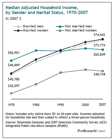
This set of lines does not tell a story about marriage and wages, it poses a question. Let me first take a moment to stop and praise the graph maker for choosing lines instead of bars. This is basically a series of timelines presented on the same axes. When displaying trends, lines are better than boxes. A line can travel over time, a box just sits there. Of course, then, for time series data, unless there is a compelling reason to discourage people from feeling a sense of movement over time, then go with a line. You might want to choose a box or series of boxes if you have reason to believe your dataset is not truly continuous.
Second, let me say that I enjoy the way the context provided here forces the viewer to wonder why it was that the wages of single people flattened out. While it might be tempting – and some have done it – to assume that getting married makes you rich, looking at the trends presented the way they are here makes it hard to jump to that conclusion. We can see changes over time in the relative wages of married and single men and women, but we cannot see any reason to think that it is marriage that leads to increased wages. Folks who study marriage and wages (Andrew Cherlin, Betsy Stevenson and Justin Wolfers, Kathleen Gerson, and many others) have long pointed out that even though there has long been a correlation between marriage and wages (married people tend to have higher wages) we have no idea whether being married leads to higher wages or having higher wages leads to getting/staying married. The set of lines above does a good job of making sure it is difficult to jump to a causal conclusion.
Karen Sternheimer at Everyday Sociology blog which is part of Norton publishing covered this question a long time ago, but she focused on the gender difference in wage returns. It used to be that women benefited economically by getting married but now that women’s and men’s salaries are getting closer to parity, men see a bit more of a per capita bump than do women when they get married.
This still does not explain why single people make so much less or whether marriage preceeds the wage increase or the actual or promised high wages attract marriage partners.
Dalton Conley, in Elsewhere, USA, pointed out that what could be more alarming than the distance between single and married people is the way that equality in marriage partners (folks are starting to equalize their strategy for choosing mates – more and more we all want to marry wealthy, attractive people who are likely to continue to be wealthy and attractive. This holds regardless of whether we are men or women.). This means that folks with high incomes marry other folks with high incomes and increase the distance between top earning households and lower earning households. He calls it doubling down, though I suppose if you are a high earner married to another high earner you might consider it doubling up. Either way, the distance between the haves and the have-nots may actually be exacerbated (in some ways) by the sexual revolution, especially if single people’s wages flatten out. I’m thinking in particular of single parents, who are going to be raising kids on sole salaries lower than their married counterparts, for whatever reason. Their kids are competing for spots in the good high schools and colleges with all the kids whose high earning parents doubled up.
I love graphics that make me ask questions.
What needs work
The married men’s trend line ends up looking like a shadow of the married women’s trend line even though men are not actually women’s shadows. I would have recommended a different color scheme to make sure we don’t read men as existing in women’s shadows.
References
Sternheim, Karen. (2010, February) “Men and Marriage” at Everyday Sociology by W.W. Norton Publishing.
Comments 2
cim — September 14, 2010
This still does not explain why single people make so much less or whether marriage preceeds the wage increase or the actual or promised high wages attract marriage partners.
It's a graph of household rather than individual income, so for the married people there's a guarantee that they live in a household with at least two potential income earners, which there isn't a guarantee of for the non-married people (though many will, of course). So you'd expect the lines for married people to be largely identical because they're effectively asking the same households twice.
It says "adjusted for household size" but that presumably means "adjusted for differences in costs with household size" rather than "adjusted for differences in potential income with household size".
My interpretation would be that there are two effects: married couples with children have more expenditure than single men without, so in the 70s when women rarely worked for high salaries, the increased expenditure from supporting a family outweighed the small increase in household income.
As women's salaries increase, the increase in household income for a married opposite-gender couple becomes significant, and so married couples overtake single men. Women are still not paid as much as men, however, and are the majority of single parents, so the single women line doesn't rise as fast.
Greg — September 16, 2010
Also, I find it confusing to include both "Married men" and "Married women" because if we're looking at household income, and marriage (by law for most of the relevant time and places) combines one woman and and one man into a single household.
Shouldn't their household income be exactly the same? Am I missing something?