gender

Intro to assisted fertility

Any successful pregnancy is viable with just one egg. As an increasing number of women delay pregnancy until their 30s and 40s, getting pregnant is increasingly a sociotechnical process. Assisted reproductive technologies can force women’s ovaries to produce a clutch of eggs at once…but it cannot force women to produce high quality, viable eggs. Quality still depends on age, with a higher rate of chromosomal abnormalities present in any given egg, the older mom is. The question becomes: what quantity of mixed quality eggs is enough to get to a live birth? Is the likelihood of getting a live birth correlated with the number of eggs retrieved? Yes. But how many eggs does it take?

As with almost all fertility issues, that question rests on the age of the egg. Usually, the age of the egg is the same as the age of the mom-to-be. Now that eggs can be frozen (in time and in the freezer), the age of the egg can be younger than the age of the mom-to-be.

A study by Sunkara, Rittenberg, Raine-Fenning et al. looked at data from 400,135 IVF cycles performed in the UK from 1991 to 2008. They found that 15 eggs is basically the magic number. No matter her age, a woman’s chance of getting a live birth increases up to ~15 eggs. Less than that OR more than 20, her chances for live birth are lower. Notably, most women did not make 15 eggs: “The median number of eggs retrieved was 9 [inter-quartile range (IQR) 6–13] and the median number of embryos created was 5 (IQR 3–8).”

For those freezing eggs, it is especially productive to wonder how the number of frozen eggs impacts the chance of a live birth because egg freezers could opt for more than one cycle (if they can afford it). The study I am quoting does NOT look at egg freezers, it only looks at IVF patients. There are not enough egg freezers who have gone on to try to become moms to produce data nearly this robust. Biologically, the stimulation protocol for egg freezers and IVF patients is largely the same so the number of eggs harvested should be decently reliable across populations. Egg freezers may produce more eggs than IVF patients, because egg freezers aren’t reporting infertility. On the other hand, IVF patients in this study were infertile for a number of reasons, the largest percentage had male-factor infertility. Pregnancy rates may vary between IVF and egg freezing patients. IVF patients usually get pregnant using fresh embryos. If they do freeze material before implantation, they usually freeze embryos which survive the thawing process better than a single egg does.

What Works

The nomogram above is able to display chances of live birth by age group using a U-turn in the trend line for each age cohort. This demonstrates that the chance of live birth rises until 15 and then drops for egg counts higher than ~20 no matter how old the woman.

This graphic has a number of key characteristics. First, it is legible in black and white, which is key for printing in academic journals. Academic journals rarely print in color. Second, the nomogram allows each age cohort to be visualized without overlap. If this were presented with a million lines – one for each age cohort – there would be overlap or bunching and it would be harder to understand each age cohort clearly. Third, the U-turn shape allows us to see that there is an optimal number of eggs, above and below which sub-optimal outcomes arise. Fourth, the authors do not try to hide the fact that these types of assisted fertility are low probability events. The maximum probability of a live birth is just over 40% for the youngest cohort of women who produce the optimal number of eggs for retrieval.

Overall, the two key strengths of the nomograph type are that it is able to show each age cohort without overlap and that it allows for the data to U-turn in cases where there is an inflection point.

What needs work

Many of us are accustomed to comparing slopes in trend lines. This format does not allow for any kind of slope, making it difficult to visualize the shape of the trend. From looking at other plots, live-by-birth by eggs retrieved appears to be a Poisson distribution. In other words, it is a lot better to have, say, 8 eggs retrieved than 7, but only a little bit better to have 15 eggs retrieved than 14 because the slope rises faster for smaller numbers. The nomogram *does* visualize this. Look at all the space between 1 and 2 eggs retrieved and the small amount of space between 14 and 15 eggs retrieved. I happen to think it is easier to understand the changes in relative marginal impact with slopes than distances. That could simply be because I am more used to seeing histograms and line charts than nomograms, but I see no reason to pretend that visual habits don’t matter. Because people are used to making inferences based on slopes, using slopes to visualize data makes sense.

What does this mean for fertility

Women who are undergoing IVF – meaning that they are aiming to end up with a baby ASAP – cannot do much more than what they are already doing to increase their egg count. Women who are planning to freeze their eggs for later use may be able to use this information to determine how many cycles of stimulation they undergo. One cycle may not be enough, especially if they are expecting to have more than one child. Eggs from two or more stimulation cycles can be added up to get to the 15-20 egg sweet spot per live birth.

Of course, egg freezing is still an elective procedure not covered by insurance. The cost is likely to prohibit many women from pursuing even one round of egg freezing, let alone multiple rounds.

References

Sesh Kamal Sunkara, Vivian Rittenberg, Nick Raine-Fenning, Siladitya Bhattacharya, Javier Zamora, Arri Coomarasamy; Association between the number of eggs and live birth in IVF treatment: an analysis of 400 135 treatment cycles. Hum Reprod 2011; 26 (7): 1768-1774. doi: 10.1093/humrep/der106

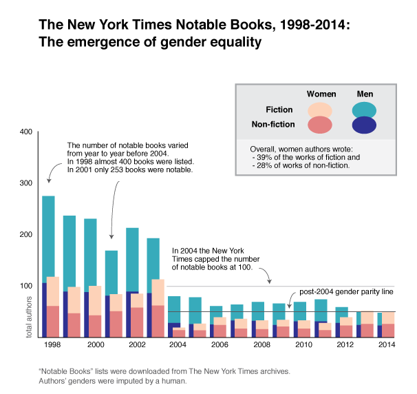
The New York Times Notable Books, 1998-2014; The emergence of gender equality

What works

The above graphic represents the absolute volume of authors who have been mentioned in The New York Times year-end list of notable books. Since 2004 the newspaper has capped the list at 100 books, but prior to that the total number of listed books varied significantly from year to year. Therefore, displaying the absolute number of books considered notable is more illustrative of patterns within the organization than showing only the relative percentage of authors by gender.

One of the interesting things that this visualization implies is that capping the list at 100 at first drastically reduced the absolute number of authors who were mentioned in the list, but that this burden hit women hardest. During the first year after the cap was introduced only five women who wrote works of non-fiction in the previous year were mentioned. Fourteen women novelists and poets were listed. That’s only 19% of the hundred authors considered notable that year. In fact, I would argue that the most notable quality of the list that year was its dismal gender parity. It is possible some in the organization were able to confront the gender disparity because it started to move closer to 50/50, jumping to 39/61 the next year. But then…the best intentions may have faltered as the proportions slipped little by little back towards the one-third women, two-thirds men scenario that was more or less the pattern in the pre-2004 years.

Then in 2012 numbers once again jumped to 40/60. And in 2013 and 2014 the numbers held steady at an even split overall AND there was gender parity within the fiction and non-fiction verticals. In my head, I imagine some firm voice at a meeting demanding a quota, dammit, because all past efforts to agree to do the right thing with respect to gender parity had resulted in a lukewarm 40/60 that couldn’t hold up for more than a year at a time. This same voice probably also pointed out that it was not going to work to disproportionately recognize women novelists and poets and continue to leave women non-fiction writers under-appreciated. The quota covered the overall balance of the 100 notables and it applied within the fiction/poetry and non-fiction verticals. OK. That took a while.

Gender isn’t the only category of interest in these top book lists. Back in 2011 I looked at the number of academic authors who had made the list to better understand the backgrounds of our public intellectuals. Unsurprisingly, the NYTimes turned out to be partly populist, partly academic aristocracy.

What needs work

As with so many depictions of gender, this one is locked into a gender binary. There were some trans authors mentioned. For example, Deirdre McCloskey’s Crossing: A memoir made the list in 1999. In her case, since she currently identifies as a woman, I counted her as a woman even though her book was about the experience of transitioning from one gender to another. It is an exemplary instance of why it might be more accurate to have a gender spectrum instead of a gender binary. Alas, I didn’t visualize that here. I’m not yet up to that challenge. I also failed to deal with publications released by committees or coalitions. Since they were impossible to categorize with respect to gender I left them out. The best example of a left out publication is the 9/11 report.

Another problem with this graphic is that it is static, not interactive. It would be more interesting if it had hover-over capabilities that could pop up the absolute numbers to which the area of the shapes are representing.

The gender disparity in the highest reaches of the literary scene is well known and widespread. Keep reading for some history on the gender parity problem in the literary profession that demonstrates both how well known and widespread it is. Choosing to represent only a single reviewing organization – The New York Times notable books list – is faulty in a couple ways. First, it implies that this particular organization is somehow at fault for a pattern that has been shown to be endemic in the field. Second, The New York Times has taken what appear to be successful steps towards ensuring an equal number of women and men get accolades for their work, regardless of whether they write fiction or non-fiction. This is a great success with respect to gender equity within that particular list, but it is lazy to assume other literary review organizations have been as successful. In fact, VIDA reports that most other organizations are still struggling to get to gender parity in terms of the authors whose books are reviewed and in terms of which types of people are publishing the reviews.

The history of gender equity in literary publishing

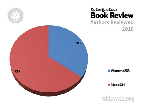
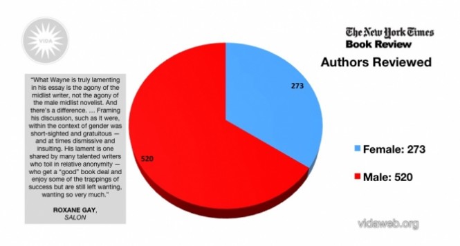
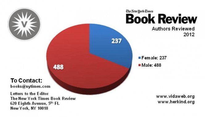
There is an entire organization set up to investigate the gender parity problem in literary circles called VIDA. Their mission is to “to increase critical attention to contemporary women’s writing as well as further transparency around gender equality issues in contemporary literary culture” using a “research driven” methodology. Since 2010 they have been putting together pie charts that show the gender parity within a whole range of literary field publications, including The New York Times book review, The New York Review of Books, n+1, The New Yorker, and many others. Also, they look at the gender of the people writing the reviews in addition to the gender of the people whose books are being reviewed.

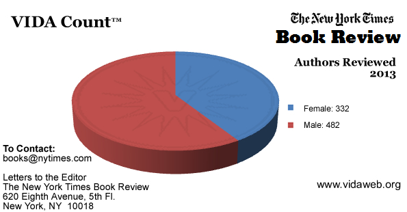
These pie charts are all from The New York Times book review because that is where the data for the chart above was published. VIDA has many more pie charts available. Part of what I was trying to do with the chart above is improve on the pie chart visualization technique.

VIDA-New-York-Times-Authors-2010

VIDA-New-York-Times-Authors-2011

VIDA-New-York-Times-Authors-2012

VIDA-New-York-Times-Authors-2013

VIDA uses a team of interns to gather the publication history of all the newspapers and magazines they consider part of the literary scene. Mostly, these interns are unpaid. That is amazing. For the chart above, I grabbed all the data and did not rely on what they had done.

What else could work: A Datathon

Most savvy computational sociologists would recommend using a web scraper to generate a database with publication information and take a first pass at assigning a gender to the authors and reviewers. Some authors and reviewers will use initials (e.g. J. K. Rowling), have gender-ambiguous names (e.g. Pat, Parker, Taylor), or have otherwise difficult to gender-ize names. These would still need to be investigated by humans equipped with a search engine, but the workload would be dramatically reduced.

Does anyone feel like getting together at a datathon and scraping all the web-based publishers in a single weekend? Reply in comments.

References

100 Notable Books of 2014 The New York Times Published 2 December 2014.

100 Notable Books of 2013 The New York Times Published 27 November 2013.

100 Notable Books of 2012 The New York Times Published 27 November 2012.

100 Notable Books of 2011 The New York Times Published 21 November 2011.

100 Notable Books of 2010 The New York Times Published 24 November 2010.

100 Notable Books of 2009 The New York Times Published 6 December 2009.

100 Notable Books of 2008 The New York Times Published 26 November 2008.

100 Notable Books of 2007 The New York Times Published 2 December 2007.

100 Notable Books of 2006 The New York Times Published 3 December 2006.

“100: Fiction and Poetry Notable Books of the Year.” New York Times (1923-Current file): 3. Dec 04 2005. ProQuest. Web. 27 Jan. 2015. [Note: This file also included non-fiction titles though that would not be implied from the document’s title. For inexplicable reasons, the 2005 Notable Books list was not available through The New York Times search function at nytimes.com and had to be downloaded through the ProQuest database which is a proprietary service that I accessed through the New York University library.]

100 Notable Books of 2004 The New York Times Published 5 December 2004.

Notable Books of 2003 The New York Times Published on 7 December 2003.

Notable Books of 2002 The New York Times Published 8 December 2002.

Notable Books of 2001 The New York Times Published 2 December 2001.

Notable Books of 2000 The New York Times Published 3 December 2000.

Notable Books of 1999 The New York Times Published 5 December 1999.

Notable Books of 1998 The New York Times Published 6 December 1998.

VIDA Count of books reviewed by the New York Times book review in 2010 VIDA Published 16 May 2011.

VIDA Count of books reviewed by the New York Times book review in 2011 VIDA Published 28 January 2012.

VIDA Count of books reviewed by the New York Times book review in 2012 VIDA Published 28 January 2013.

VIDA Count of books reviewed by the New York Times book review in 2013 VIDA Published 24 February 2014.

The functional art book cover

Cairo, Alberto. (2013) The Functional Art: An introduction to information graphics and visualization. Berkeley: New Riders, a division of Pearson.

Overview

A functional art is a book in divided into four parts, but really it is easier to understand as only two parts. The first part is a sustained and convincingly argument that information graphics and data visualizations are technologies, not art, and that there are good reasons to follow certain guiding principles when reading and designing them. It is written by Alberto Cairo, a professor of journalism at the University of Miami an information graphics journalist who has had the not always pleasant experience of trying to apply functional rules in organizational structures that occasionally prefer formal rules.

Sketch of "The Transatlantic Superhighway" by John Grimwade
Sketch of “The Transatlantic Superhighway” by John Grimwade which was originally for Conde Nast Traveler and reprinted in The Functional Art. Click for the full interview with Grimwade.

The second part of the book is a series of interviews with journalists, designers, and artists about graphics and the work required to make good ones. This part of the book is as much about the organizational culture of art and design and specifically of graphics desks in newsrooms as it is about graphic design processes. The process drawings are fantastic. I’ve included two of them here. The first by John Grimwade is multi-layered, full of color and dynamic vitality. These qualities were carried through into the final graphic but are often very difficult to build into computer-generated images. I wondered if the graphic would have been as dynamic if it had come from a less well-developed hand sketch (or no sketch at all).

Photo of clay model of Gobekli Tepe
Photo of clay model of Gobekli Tepe by Juan Velasco with Fernando Baptista for National Geographic. Click for a video of the model building process.

The second is a set of photographs taken of a clay model by Juan Velasco and Fernando Baptista of National Geographic that was used to recreate an ancient dwelling place call Gobekli Tepe that was in what is now Turkey. Both of these examples lead me to the iceberg hypothesis of graphic design – the more the design that shows up in the newspaper or magazine is just the tip of an iceberg of research, development, and creative work, the more accurate and engaging it is likely to be.

As a sociologist I am accustomed to reading interviews and am fascinated by the convergence and divergence in the opinions represented. In this case, I especially appreciated that Cairo’s interview questions touched on the organizational structures and working arrangements, as did his own anecdotes throughout the book, to provide an understanding of the opportunities and constraints journalists and information graphic designers face. Their work is massively collaborative and the book works to reveal the bureaucratic structures that come to promote and impinge upon design processes and products.

There is a fifth part to the book, too, a DVD of Cairo presenting the material covered in the first three chapters of the book. I admit, I have rarely been a large fan of DVD inclusions. They are easy to lose, scratch and/or break. But assuming the DVD is intact and accessible, I never know when I ought to stop reading and start watching. And even if the book has annotations indicating that an obedient reader should stop reading and start watching the DVD, this assumes the reader is willing and able to put down the book and fire up the computer. The only time I can imagine using the DVD is as a teaching aid in class to give the students a break from having to listen to me all the time. Unfortunately, that is prohibited by Pearson.

Still, it is worth watching because Cairo has a great voice and he is able to discuss interactive content/design in a way that is not easy in the pages of the book. While some of the discussion repeats themes from the first part of the book, there are new examples from additional designers, including some who have been Cairo’s students, which might be of interest to people thinking of signing up for his online course.

What does this book do well?

"Brazilian population grows more in prisons" graphic
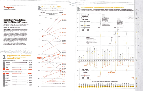
“Brazilian population grows more in prisons” by Alberto Cairo originally in Epoca magazine November 2010, reprinted in “The Functional Art” by Alberto Cairo in 2013.

The book does a great job of explaining the decision making behind graphic design. The sketches, process drawings, and recounts of the conversations that went on in editorial meetings gave important depth of context. The organizational culture and day-to-day expectations of the newsroom tend to encourage the use of templates and discourage exuberant creativity. Cairo explained that this Brazilian prison graphic that eventually won the Malofiel design award also won him a reprimand from his boss who proclaimed it to be “ugly”. In practice, conceptual distinctions between art and technologies for comprehension are made rigid by bureaucratic structures in which, “the infographics director is subordinate to the art director, who is usually a graphic designer,” and that this arrangement, “can lead to damaging misunderstandings.”

The more prominent argument follows from these peeks into the backstage of journalism. Infographics and visualizations are technologies, not illustrations. Cairo writes that:

The first and main goal of any graphic and visualization is to be a tool for your eyes and brain to perceive what lies beyond their natural reach….The form of a technological object must depend on the tasks it should help with….the form should be constrained by the functions of your presentation….the better defined the goals of an artifact, the narrower the variety of forms it can adopt.

One of the writing techniques that Cairo uses is summarizing his take-away points from previous paragraphs in quick lists of pointers or key questions. Cairo incorporated these quick lists gracefully into the writing style and I never felt like I was reading a textbook. Still, the quick lists make it easy to use the book as a reference. The index, bibliography and detailed table of contents add strength to the book as a reference source, too. Note to the publisher: I found it frustrating that the book did not include a list of figures, especially given the subject matter.

"Home and Factory Weaving in England, 1820-1880" graphic
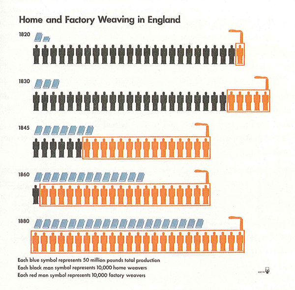
“Home and Factory Weaving in England, 1820-1880” Otto and Marie Neurath Isotype Collection, University of Reading as seen in The Functional Art by Alberto Cairo.

Diversity

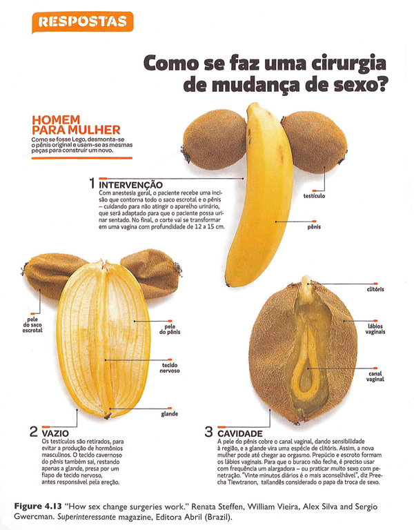
One of the greatest strengths of this book is the diversity of sources from which Cairo draws his material. Yes, he uses graphics he has developed in many cases which is hugely valuable because he is able to provide insights into the development processes. However, he also draws from graphics old and new [see an old one he pulled out of an archive at the University of Reading about weaving in the industrial revolution], from magazines, newspapers, and the internet, made by freelancers, in-house designers, and students, and in languages other than English (some of which are translated, some of which impressively need little translation). My favorite graphic in the book was one I never would have come across that uses pieces of fruit to describe the surgical procedures used to achieve sexual reassignment.

“How sex change surgeries work.” by Renata Steffen, William Vieira, Alex Silva and Sergio Gwercman in Superinteressante magazine (Brazil). Part 1 of 2.
“How sex change surgeries work.” by Renata Steffen, William Vieira, Alex Silva and Sergio Gwercman in Superinteressante magazine (Brazil). Part 2 of 2.

This diversity serves as an example of the breadth of Cairo’s experience in the world of journalistic information graphics. It is also a testament to his real joy in the subject. Many authors of design books are happy to fill the pages with their own work. Cairo is surely talented enough to have done. Instead, he chose to showcase an incredible range of designers and styles. This diversity, combined with the accessibility of the writing, are cause enough to recommend this book for anyone who is curious about graphics and journalism, especially journalism students.

What doesn’t this book do well?

The most curious shortcoming – given the incredible diversity of designers, styles, countries, and publication types represented – is the scarcity of women designers. There are thirteen designers profiled in part IV of the book; only two are women. There were forty-seven graphics reprinted; five were designed by women. With respect to the reprints, Cairo is completely justified in reprinting his own work more often than the work of others because he knows how the design process unfolded in those cases. Since he is a man, this inflates the masculine contribution to the reprinted graphics category. Still, many of the graphics he worked on were collaborative efforts and his collaborators could have been women in a more ideal world. But mostly, they were men.

Because the information graphics world is relatively interdisciplinary and (so far as I know) has no specific professional organization whose membership includes a representative sample of practicing information graphics and data visualization professionals, it is hard to tell if the gendered pattern in Cairo’s book is due to some oversight on his part or the underlying gendered make-up of the industry or a combination of both. Even if the industry is dominated by men, it is important for people who write and edit textbooks to ensure that women are represented or they run the risk of sending the message that women may not be welcome or well-rewarded if they choose to pursue data visualization. That is unacceptable. The graphics world will lose out on half its talent pool and women might avoid careers that could have been satisfying and rewarding for them. Notably, the kinds of graphic design that require coding – like data visualization and interactive design – are better compensated than illustration and static design so it’s possible that women are being subtly nudged into the less well-compensated areas of graphic design along the line. It would have been nice if this textbook that is so diverse in so many other ways could have pushed the gender boundary and included more women.

The book also over-promises in the cognition section. The first chapter on cognition was too basic. The second and third chapters in this section had more that was directly applicable to design. All three chapters could have been condensed into one. It is certainly true that perception and cognition ought to be included and there were some useful applications derived from the three chapters, but there was too much review and too few clear applications of the basic principles of cognition and perception to graphic design.

Here are the pointers I did find useful, if you happen to want to buy the book and skip those chapters:

+ If you want viewers to estimate changes by visually comparing elements, you will have the best luck if those changes are depicted using elements of the smallest number of dimensions possible. For instance, viewers will have an easier time coming up with an accurate estimate of the difference in size between two lines (1D) than between two circles or squares (2D). It’s best to avoid 3D comparisons altogether. I would also add that regular objects like circles and squares are cognitively easier to think with than irregular objects like polygons other than squares.

+ The less frequently a color appears in nature, the more likely it is to draw the eye. Reserve the use of colors like red, pink, purple, orange, teal, and yellow for elements that are meant to draw attention.

+ Humans cannot focus on multiple elements at the same time. Design graphics that have one focal point or clear hierarchies of focal points. Do this by eliminating unnecessary use of bright color, chart junk like grid lines that aren’t absolutely necessary, and by establishing a logical information hierarchy in the page layout.

+ Landscapes have horizon lines. Humans are used to encountering the world this way. This is one reason why it is easier to make comparisons using bar graphs (where all the elements start from a common horizon line) rather than pie charts (where there is no shared horizon).

+ Eyes are good at detecting motion and they will focus attention on moving objects. Try not to ask viewers to read text and simultaneously watch a moving element in interactive graphics.

+ Human brains are good at picking out patterns. Often, fairly small changes to a graphic layout that strengthen the appearance of grouping or other types of patterns will add to the ability of the graphic to deliver an instant impression or overview of the message being communicated. For instance, changing the spacing of the bars in a bar graph so that every fourth bar has twice as much space after it as all the rest will make the graph appear to have groups of 4-bar units.

+ Interposition – placing one object in front of another so they overlap – is a good way to add depth. If objects never overlap, the opportunity for the illusion of depth is lost.

Summary

Overall, the book was well-written, included valuable insight into the process underlying the creation of strong, successful information graphics and visualizations, and would be a solid textbook for use in journalism departments. The representation of women designers was disappointingly low and the segment on cognition could be condensed or otherwise improved. Cairo is clearly a talented designer and teacher. This book meaningfully combines both of those strengths and is an important contribution to undergraduate and graduate education in the emerging sub-discipline of information visualization and design.

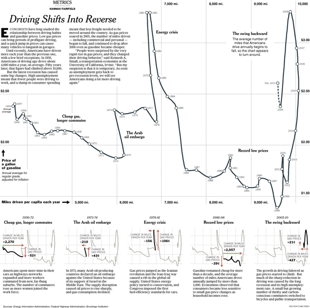
I am sending you out with one of the graphics I was most impressed by, in part because the graphic is good, but mostly because Cairo helped me to see why a rather average looking graphic is in fact rather brilliant. It is by Hannah Fairfield of the New York Times graphic desk and it shows that the driving behavior of Americans is sensitive to changes in the economy. During the 2005 recession when gas prices were high but the economy was struggling overall, Americans drove fewer miles. This pattern had only one historical precedent – the 1970s. The graphic depicts this by having a timeline that appears to walk backwards during those two periods in history, a broken pattern your pattern-loving mind is likely to fixate on once you realize this is not your average line graph. Smart.

"Driving shifts into reverse" graphic
“Driving shifts into reverse” by Hannah Fairfield originally published in the New York Times, May 2010; reprinted in “The Functional Art” by Alberto Cairo, 2013.

References

Cairo, Alberto. (2013) The functional art: An introduction to information graphics and visualization.

Fairfield, Hannah. (2010) Driving Shifts into Reverse New York: New York Times.

Grimwade, John. (1996) The Transatlantic Superhighway. [information graphic]. New York: Conde Nast Traveler.

Steffen, Renata; Vieira, William; Silva, Alex and Gwercman, Sergio. “How sex change surgeries work.” Superinteressante magazine. Brazil.

Velasco, Juan and Fernando Baptista. () “Gobekli Tepe Process Shots”. National Geographic Magazine. In Cairo, Alberto (2013) The Functional Art p. 238.

Stem and leaf diagram becomes a histogram

What works

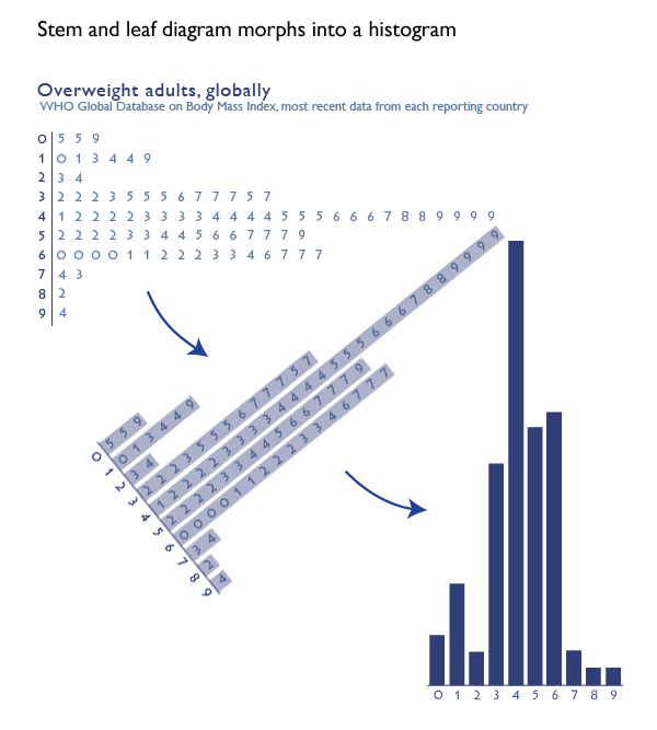
The stem and leaf diagram is an old stand-by that has largely been abandoned in social science as it morphed into the histogram. It is a rather ingenious graphical device that could be created even with a typewriter, which is how people used to prepare documents not that long ago. And when I say ‘people’ used to prepare documents, I am actually imagining wives and girlfriends of the husbands and boyfriends who were preparing final drafts of their dissertations and later the (mostly female) secretaries, administrators, and lab assistants typing up articles and figures for (mostly male) professors. [Refer to this graphic on the gendered nature of degrees at the doctoral level for supporting evidence that it was mostly men writing dissertations and then getting the jobs available to people who had written dissertations.]

How to make a stem and leaf diagram

1. Start with numerical data. Organize it from least to greatest.

2. Think of each number as having a stem and a leaf. The stem is the more durable part of the number and the leaf is the more sensitive part of the number. For a number like 57, the more durable part of the number is the ‘5’ because even if there was some variation in the measure, the number in the 10’s spot might not change but the ‘7’ in the singles spot is more sensitive and thus more likely to flutter like a leaf. If we were measuring temperature, for instance, it would be a lot more likely that the day would have temperatures like 56 and 58 than 60-something and 40-something. Thus, the tens spot is the stem and the singles spot is the leaf in this case. It would be possible to use measurements in the hundreds or even thousands.

3. Once you have identified your stems and leaves, type the lowest stem value. Then type a bar or some other vertical device to separate your stem from your leaves. Then look at all the observations you have for that stem value. Type in every single observed leaf value for that stem, starting with the lowest one. So if you are creating a diagram of all the temperatures registered at noon for the month of November, you will have 30 values to stick in your chart. You will probably have something like three values in the 30s – say, 35, 37, and 38. This would mean you would type a 3, then a vertical bar, then 5, 7, and 8. If there were also nine values in the 40s – say 40, 41, 42, 42, 43, 45, 45, 46, and 48 you would hit carriage return. Then you’d type a 4, a vertical bar, and 0 1 2 2 3 5 5 6 8. You see how people (mostly women) could use typewriters to make graphics.

The strength of this technique is that it forces the actual dataset into a visually organized diagram. All of the values can be read right out of the graph but the device as a whole gives an impression of the overall pattern.

4. At some point after typewriters, the stem and leaf diagram morphed into a histogram. I think Excel had something to do with this, but I am still researching just how it was that the stem and leaf diagram was relegated to the dustbin while the histogram rose to take its place.

Worth thinking about

Stem and leaf diagrams are close cousins of bar charts and histograms. While bar charts and histograms might be more attractive in some ways, they are, in fact, less data-rich. It is not possible to read the actual values out of a colored bar. Despite the fact that the histogram chart form *could* be more visually pleasing than the stem and leaf diagram the fact that histograms allow more space for aesthetics means that they can just as easily be uglier, not more appealing, than stem and leaf diagrams. Dumb and ugly is no good at all. Still, bar charts gave rise to things like stacked bar charts that allow us to visualize observations for multiple investigations that share the same variables so I do not consider them a step backwards.

What about global body mass index?

The information in the graphs above comes from the World Health Organization’s database of global body mass index. The numbers represent the percentage of people in the overweight or obese range of the body mass index in individual countries, NOT the average body mass index of individual countries. Notice that one country [American Samoa] has over 90% of its adult population in the overweight or obese range. If you’re curious, the US has 66.9% of our adults in the overweight+obese range. Vietnam is on the low end with only 5% of its adults overweight or obese.

References

World Health Organization Global Database on Body-Mass Index. [Last accessed 17 November 2012]

Congressional demographics
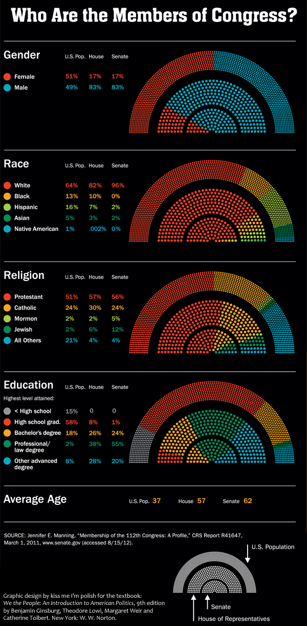
Congressional demographics | “Who are the members of Congress?” graphic by Kiss Me I’m Polish from the textbook “We the people: An introduction to American politics” by Ginsberg, Lowi, Weir, and Tolbert.

What works: Big picture

In the midst of election season, it can be easy to lose sight of the forest because we’re so entranced by the trees (or the leaves, for that matter). This graphic was developed by the design firm kiss me i’m polish in partnership with W. W. Norton and the authors of “We the People” to help students think through what it means to live in a representative democracy. The biggest outer arch of the rainbow depicts the breakdown of the total US population. So, for instance, we are split 50/50 when it comes to gender and just slightly less than half of us are Protestant. Then the middle arch illustrates how the 435 members of the House are divided and the smallest inner arch does the same thing for the 100 members of the Senate. It’s a great way to keep students thinking about not only the members of Congress but also about how that membership compares to the population they are supposed to represent.

The graphic lead me to wonder how it is that we come to collectively held opinions about what kind of parity is important. Gender parity – having about the same percentage of women in the House and Senate as we do in the general population – is a worthy goal. But age parity and educational parity are murkier. Legally, there are age minimums for serving in the House and Senate so we are never going to have age parity. I tend to agree with the founding folks who believed that wisdom and age have a measurable positive correlation, though I would probably argue that age is simply a fairly reliable proxy for experience. A young person with a great deal of life experience might be considerably wiser than an older person with very little life experience.

It would be easy enough to argue that we should also elect more well-educated people and feel like we are making a sensible choice as we do so. Right? More well-educated people have taken up lots of the facts and ideas circulating in a given time and place so education is probably a good thing for representatives to have. But education is correlated with class. Electing people who are overwhelmingly more well-educated also tends to mean we elect higher class folks. Of course, this is not a perfect relationship and it matters only if we think that class and political behavior are related. And, well, they are, but not in entirely linear ways, especially if education is our only proxy variable for class.

The main concern of this particular post is to show you a graphic that does an excellent job of raising fairly complicated questions without simultaneously implying answers. I am not going to push closer to any answers about how to understand the meaning of parity between individuals and their elected representatives is something we’d like to see in our representative democracy.

What works: Specific details

Color: The use of color here – especially for race – overcomes the typical tendency to try to use pink for women and maybe something dark brown for African American people. Yeah, both of those choices may make sense in some contexts, but unless there is a great justification for reinforcing stereotypes, buck stereotypes.

Fan + rainbow shape: The fan + rainbow shape is striking from a distance and allows for both segments and stripes. It offers more visual vectors for categories than I would have imagined. I probably would have gotten hung up thinking only about the stripes in rainbows and forgotten that the rainbow shape is also like a fan, and fans have segments.

Rainbow and Fan

Numbers are not layered over the graphic: The graphics stand on their own and the numbers are presented directly adjacent to them in small tables. This is a best-of-both-worlds approach that displays the actual numbers accompanying the impressionistic visualization of the data without having to deal with the clutter of seeing the numbers layered over or arrowing into the data which messes up the visual comparison task and also makes the numbers harder to read.

What I would have liked…

The age variable is listed as averages here, nothing visual. That’s fine, but whether or not the information is displayed just as a mean or it is developed as a graphic similar to the others, it would have been nice to be reminded that Senators have to be at least 30 and Representatives have to be at least 25 years old. This is a relevant contextual touch, helping to remind the (young) students that there are slightly different elements structuring the age disparity. Some of the extremely astute students might have been reminded that the racial category used to have a similar asterisk pointing to the role of law in politics.

References

(2012) “Who are the members of Congress?” [infographic] by kiss me i’m polish. New York.

Ginsberg, Benjamin; Lowi, Theodore; Weir, Margaret; and Tolbert, Caroline. (2012) We the people: An introduction to American politics, 9th edition. New York: W. W. Norton.
[Note: The link here goes to the web page for the 8th edition of this book but the graphic was taken from the 9th edition. A similar graphic was included in the 8th edition. The 9th edition image above includes updates that reflect the results of elections that have happened since the 8th edition was published but the overall look-feel and the design concept remained the same.]

Graphic: Gender ratio of recent US graduates by degree
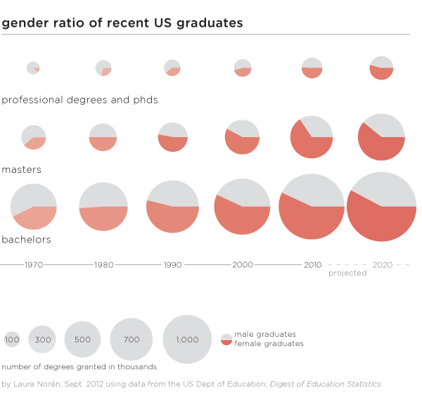
Gender ratio of recent US graduates by degree | Laura Norén | click caption for pdf

Is higher education “dominated” by women?

There has been plenty of news coverage recently about the rise of women and the decline of men. While I have always disliked the irrational use of zero-sum language – why do we have to frame this discussion as men who are losing because women are making some gains? – I thought it would be worth taking a closer look at the gender ratio in higher education. I found many text-heavy stories (the Guardian, the New York Times, the Chronicle of Higher Ed, Huffington Post, The Atlantic, and many others) about female students earning more bachelors but surprisingly few graphics.

Graphics can do an excellent job of summarizing the gender gaps as they have developed over time within bachelors, masters, and professional+doctoral degrees. One graphic, quite thought provoking. All of the three degrees were more likely to be earned by men in 1970. Then between 1970 and 1980 women made rapid gains which continued through the 1980s. The gains for women slowed down once they hit the 50/50 mark for both bachelors and masters degrees and I predict they will also slow down for phd and professional degrees. Though it’s hard to tell by looking at the graphic, women are earning the largest proportion of masters degrees (projected to be 61% in 2020) which is slightly more than the 58% of bachelors degrees they are projected to earn in 2020.

Why aren’t women earning more if they are so well educated?

There is still a pay gap in earnings between men and women. Within the university, male faculty members tend to make slightly more than female faculty members. Overall, the most powerful explanation for pay gaps is not so much a failure to pay men and women equally for the same job. Rather, women are more likely to get degrees that lead to positions which are paid less than the positions men are more likely to get following their collegiate specializations. More women end up in education and nursing; more men end up in engineering and computer science. Education and nursing are not as likely to be lucrative as jobs that require engineering and computer science degrees.

To answer the question about women “dominating” higher education it is clear from the numbers that there are more female students at every level, though some majors still tilt towards men. What’s perhaps more important, women may or may not go on to match the earning potential of men, in part because they may not always choose the majors that lead to the most lucrative careers. Some argue that earning potential should drive choice-of-major but I’m still of the mind that going to school is not all about (or even primarily about) producing good workers. Going to school is about taking the time to explore different ways of thinking in depth and without undue concern for their ability to produce economic return. I’m glad that we have gotten to the point where there is enough gender parity to return to conversations about what school is for rather than who school is for…

Does the gender gap in graduation rates vary by race/ethnicity?

Graphic: 2009 US bachelors degrees by race/ethnicity and gender
2009 US bachelors degrees and gender gaps by race/ethnicity | Laura Norén | click caption for pdf

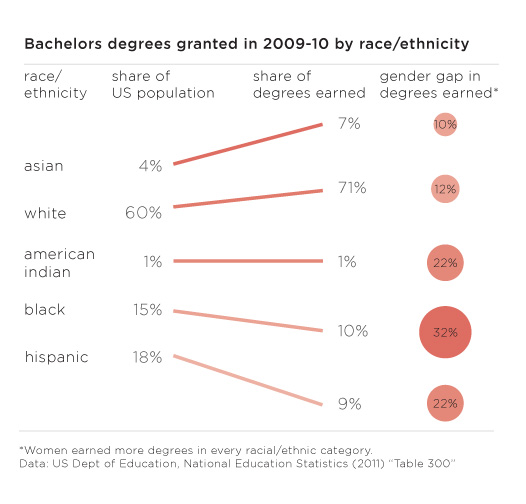
…but on the other hand, there are still critical gaps in access to higher education and degree completion that trend along racial/ethnic lines (class lines, too, but I didn’t get into that in this post). The graphic above displays the share of bachelors going to different racial/ethnic groups in 2009. In order to provide a relevant framework for comparison, I plotted the share of degrees earned next to the share of the total population of 18-24 year olds constituted by each racial group. There are some missing categories – mixed race people, for instance – but I couldn’t find graduation rates broken down any further than the five traditional racial/ethnic categories. Asians and Pacific Islanders only make up 4% of the population but they earn 7% of the bachelors in 2009 and their gender gap that year was only 10%. Whites were similarly over-represented in degree-earners and had a similar gender gap of 12%. But then things got interesting. The gender gaps for American Indians and Hispanics were much higher at 22% and the gender gap for blacks/African Americans was even higher still at 32%.

Especially when it comes to studying gender which is often constructed as a binary in which both groups make up about 50% of the whole, it is important to realize that analytical rigor might be increased by further segmenting these gender categories by some other key analytical variable. In this case, adding vectors for race/ethnicity provided a new perspective, one that might be a decent proxy for class.

References

Norén, Laura. (4 September 2012) Gender ratio of recent US graduates [infographic] New York.

Norén, Laura. (4 September 2012) US bachelors degrees by race/ethnicity [infographic] New York.

National Center for Education Statistics. (2011) Table 283: Degrees conferred by degree-granting institutions, by level of degree and sex of student: Selected years, 1869-70 through 2020-21 [Available in html and xls] US Department of Education.

National Center for Education Statistics. (2011) Table 300: Bachelor’s degrees conferred by degree-granting institutions, by race/ethnicity and sex of student: Selected years, 1976-77 through 2009-10 US Department of Education.

US Census Bureau. (2012) Table 10: Resident Population by Race, Hispanic Origin, and Age: 2000 and 2009 In The 2012 US Statistical Abstract. [Available in pdf and xls.

Expert commentators on women's issues in American media | 4thEstate.net
Expert commentators on women’s issues in American media | 4thEstate.net

What works

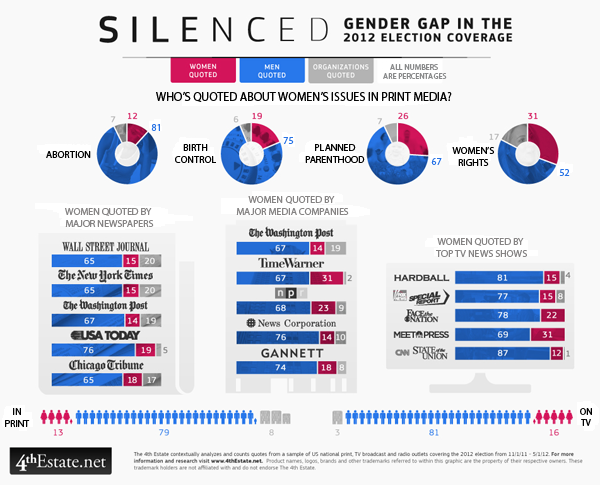
Election coverage dominates the American media in the months before any presidential election and the group (of unnamed people) over at the 4thestate.net are covering the coverage of the election. They tend to share their findings as graphics. The graphic above came from a special report on gender that looked at the gender of the experts who are called upon to comment on women’s issues like abortion, birth control, planned parenthood, and women’s rights. I can already tell that the first criticism is going to be that these issues are not just women’s issues. Fair enough. The point that they are trying to make, though, is that even in a media system that some say has a “liberal bias” women are significantly under-represented as expert voices. Or any kind of voices.

The graphic does a good job of showing THREE categories of commentators – men, women, and institutions.

In terms of color, the graphic resorts to a men-are-blue, women-are-red division which is fairly stereotypical. I am glad that women are not pink (see this post for an example of what happens when light blue and pink are used to represent gender). While I feel a lot of pressure to escape traditional gender binaries, in graphic design, harnessing people’s existing stereotypes is often a powerful way to make an instant impression. So while these designers could have used any two colors to represent men and women – purple and yellow, orange and green, teal and chartreuse – the fact that they leveraged the underlying American stereotypes associated with the gendering of colors gave them a way to tie together different graphical elements into one infographic. Personally, it does not bother me that women are represented as red and men are represented as blue, even if it is stereotypical. Some stereotypes hurt; this isn’t one of them as far as I am concerned. Pastel colors like light blue and light pink tend to infantilize the appearance of presumably adult behaviors and I would avoid using those to represent adults. But the red and blue used here are plenty grown up. Feel free to scold me about gender stereotypes in the comments if you disagree.

What needs work

Graphical donut - Women quoted in print media in 2012 election coverage on abortion
Graphical donut – Women quoted in print media in 2012 election coverage on abortion

I am on the fence about the donuts. Would the donut be easier to read as a bar graph? Perhaps. But turning the circle form into a bar form would eliminate a good deal of the natural division in the graphic between print media – all donuts – and specific media outlets – collections of bar graphs. Right now, without even bothering to read the titles, I can tell that the donuts are all comparable to one another but not necessarily directly comparable to the other elements of the graphic. This prompts me to read the titles to figure out how I ought to be making comparisons between the graphic elements. If the donuts were straightened out into bar graphs, I’m not sure I would instantly sense that they were unlike the rest of the graphic because they would look the same even if they had different titles. The graphical forms should emphasize the text of the headings and the designers here got that right.

My question about what needs work is that I am not sure any comparisons between donuts and bar graphs are easy to make because it seems like some members of the 4th estate team wanted to see the data broken down by issue, others wanted to see it broken down by specific publication, and instead of choosing one or the other, they compromised and showed both. Rather than thinking of this as a comparison issue, I guess I will think of it as simply two different sets of data that both deal with the question of how women are denied roles as expert commenters when it comes to women’s issues.

Acknowledgements

Thanks to Letta Wren Page for sending me the graphic and to the 4thestate for their decidedly graphic coverage of the 2012 election.

References

4th Estate. (2012) Silenced: Gender gap in 2012 election coverage [infographic] 4thestate.net

Global smoking rates by gender chart
Global smoking rates by gender | The Lancet via The Economist Daily Charts

What works

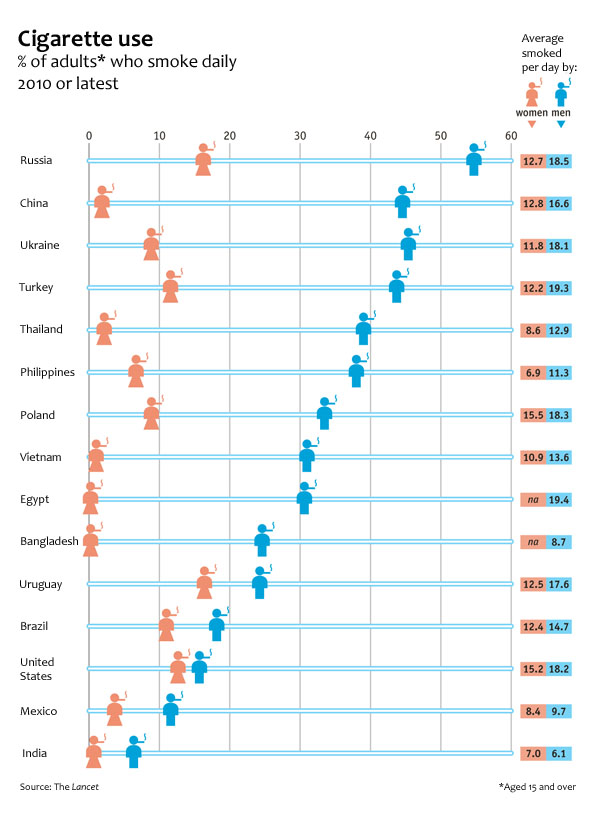
The Economist put together an infographic using data from a study published last week in The Lancet collected by an impressively large team of researchers from three different institutions in three different countries (The World Health Organisation, America’s Centres for Disease Control and the Canadian Public Health Association). The article in the Lancet has much more detailed data about all sorts of smoking traits that did not make it into this chart, but the chart succeeds in portraying two gendered vectors of smoking behavior: the different rates of smoking between men and women and the difference in the number of cigarettes smoked between the two genders.

Globally speaking, it is safe to say that smoking is a masculine activity. There is no country in which more women than men are smokers. That particular take-away is made extremely clear in the chart. Just a glance is enough exposure to the data to absorb the idea that smoking is somehow masculine.

What needs work

The graphic designers at the Economist try to expand on the notion that smoking is “somehow masculine” by layering another set of findings onto the basic rates of smoking by men and women. Way off to the right they have what is essentially two columns of a table that report the average number of cigarettes smoked by men and women. My fuzzy and addled brain wants this little table to be more like a bar chart in which the length of the bars corresponds to the number of smokes. Countries where smoking rates are highest would have longer bars. Countries where smoking rates are low would have shorter bars. Visually, the impact would increase dramatically if the size of the bar corresponded to the amount of cigarettes smoked.

Importantly for the point about the gendered nature of smoking, we could see another way in which smoking is gendered by looking at how many cigarettes are smoked by each gender. Some countries have dramatic differences: in Russia and Turkey men smoke about 1.5 times as many cigarettes as women. This is a marked contrast to the other end of the spectrum where in India, women who smoke (and there are very few women who smoke in India), smoke 7 cigarettes per day while the smoking men only smoke 6.1 cigarettes per day. If that part of the graphic had been given more space, it would have been easier to quickly absorb that pattern. As it is, only a careful reading of that table yields insight; we might as well just look at the data in Excel.

The other change I would order up for this graphic is to make the blue horizontal bars that run the full length of the graphic a different color than the male icon. My best option would have been to make the horizontal bars grey and truncate them after the male icon. There’s no need for them to go all the way across and it makes the table slightly harder to read. I realize that changing the horizontal bars to grey would then give the whole table a gridlike look due to the presence of the vertical bars. I would just shorten the vertical bars to tick marks at the top and tick marks at the bottom (it is a tall chart so tick marks only at the top or only at the bottom would be invisible to people who have to scroll to see the whole graphic).

I like the coral color used for the female icons. I would have turned the men navy because coral and navy are complimentary colors and look especially good together.

I wasn’t able to add the bar graphs out to the side or to fully eliminate the baby blue, but I did make some of the changes I suggested on the jpg below for your viewing ease.

Remix of The Economist Daily Chart from 20 August 2012 - Puffed Out: Daily cigarette smoking by men and women

References

The Economist. (20 August 2012) Puffed Out: Daily cigarette smoking by men and women The Economist: Daily Charts. [graphic design]

Giovino, Gary, et al. (18 August 2012) Tobacco use in 3 billion individuals from 16 countries: an analysis of nationally representative cross-sectional household surveys. The Lancet, Volume 380, Issue 9842, Pages 668 – 679, doi:10.1016/S0140-6736(12)61085-X

Food blog content characteristics and frequency of use | The Food Blog Study

What works

I conducted a web-based survey of food bloggers last summer as a doctoral intern at Microsoft Research in the Social Media Collective. I am now analyzing the mountains of data that I gathered in the interviews (N=30), survey (N=303), and web crawler (N=30,000) and getting ready to send out papers for publication. I thought it would be nice to share some of the findings here in advance of the slow academic publishing process.

Since I made the graphic and since I am modest, I’ll just say that I like the colors and I like that I was able to find a way to keep all of the granular detail of tabular data while adding visual impact.

If you would rather hear about the substance of the study than about the struggles I had while creating the graphic, skip to the bottom third of the post and the “What surprised me” heading.

What needs work

Since I have the benefit of having seen the data I can say that two things certainly need work. First, the survey asked about many more behaviors than I have decided to depict in this graphic. I left out data mostly because I want to be able to publish it and publishers are not keen on accepting already-published material. Some of them are not too bothered if bits and pieces of the findings are blogged about here and there. Some of them are hugely bothered and will not accept submissions that have been written about on blogs at all. There are good reasons for subjecting the findings to peer-review – like having smart people verify that the findings are not fabricated from thin air or otherwise constituted by complete rubbish. All that being said, my biggest problem with this graphic is that it is just the tip of the iceberg in terms of what the survey had to say about the characteristics of food blog content.

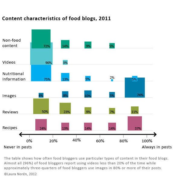
The second big problem with this is that I had a very difficult time dealing with proportional data in the rows and the columns. In case you still haven’t figured out what this graphic is saying – and I don’t blame you if you find it hard to digest – the graphic is depicting the frequency with which about 300 food bloggers (303 to be exact) reported using the listed types of content. For example, 96% of food bloggers report using video 20% of the time or less. Video just is not all that common on food blogs and most food bloggers hardly ever use it. Images, on the other hand, are included in food blog posts most of the time by most food bloggers. Seventy-four percent of food bloggers use photos 80% of the time or more. Reviews of restaurants, cookbooks, and kitchen gear, on the other hand, end up on 11% of food bloggers posts very frequently (80% or more posts contain reviews) while fully half of food bloggers hardly ever post reviews (20% or fewer of their posts contain reviews).

Since most food bloggers like to mix things up at least a little – hardly anyone has such a firmly established template for their blog content that 100% of their posts contain recipes and photos while 0% of their posts contain videos or discussion of non-food content (which would include mentions of important life events like getting a book contract, having a child, getting married, or getting cancer). With content, then, I wanted to let food bloggers explain about how often they posted a variety of different kinds of content. But then I had this difficulty of having proportions in the rows and the columns of the graphic which makes it difficult to interpret. Believe me, the tabluar data without the blocks changing sizes and colors was even harder to interpret so turning this information into a visual did help the analysis along by making the patterns clearer.

What surprised me

I was expecting many more bloggers to report including recipes more often. Only 37% said that 80% or more of their posts contained recipes. From what I gathered in the interviews, having someone else make your recipe and then leave a comment about it is one of the routine gratifications associated with food blogging. Web traffic to the site from google.com and on mini-search engines within the site is generally related to recipes, as well. So whether food bloggers care about the deeper meaning associated with food blogging and being part of a community or the hard-nosed economics and web traffic side of writing a blog, from the interviews, I was expecting recipes to be a bigger part of reported content than what I found in the survey. Recipes are one of the main activities around which both creativity and community are wound. They also draw a lot of traffic. On blogs, traffic often equals money (though not all that much money, which is why I think the meaning associated with recipes is more interesting than the money associated with recipes).

I was not at all surprised that most bloggers ignore nutritional information but I think that people who have never done much with food blogs would be surprised to see that three-quarters of bloggers mention nutrition and nutritional information 20% of the time or less. Food blogging gets its meaning and importance through practices of creating and community-making, not because the blogs are used as archives or tracking devices for those trying to lose weight or achieve other health goals. There are blogging communities organized around those things, but generally speaking, folks in those communities do not identify with the term ‘food blogger’.

Reference

Norén, Laura. (2012) Infographic: The Content of Food Blogs. The Food Blog Study. [www.foodblogstudy.info/findings.html]

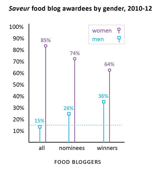
Saveur food blog award nominees and winners by gender, 2010-2012

Gender in food blogging

Last summer I conducted a survey of food bloggers (N=283) which found that 85% of food bloggers are women (see here for more demographic statistics from the survey). I also conducted interviews with food bloggers and started to get the impression that food blogging is a community dominated by women in which the relatively few men end up being disproportionately successful. This kind of gender disparity – a group that is overwhelmingly women in which men are more likely to occupy positions of power or prestige – has been written about in the sociological literature with respect to elementary school teaching and nursing. In elementary schools, for example, the majority of the teachers were women but administrators (like the principal and vice principals) were disproportionately likely to be men. This gender disparity in the schools is no longer as pronounced as it once was. Women now occupy more of the administrative positions but men have not moved in to occupy more teaching positions. If food blogging follows the same trajectory, we can expect women to occupy more of the most prominent food blogging positions over time.

But what is a ‘prominent food blogging position’?

Since food bloggers are not working professionals within a clear hierarchy like teachers and nurses, I decided to look at food blog awards data as a proxy for success in the food blog world. The magazine Saveur hosts the longest running, most extensive set of food blogging awards of any organization. I used their awards nominees and winners to pull together the graphic above and find out how gender and success in food blogging interact.

Using the Saveur awards data, it is clear that there is a pattern of disproportionate male success within the food blog nominees and winners. In a perfectly gender-neutral world, we would expect that when 15% of the food blogs are written by men, 15% of the food blogging awards will be distributed to men. In fact, 26% of the nominees (chosen by Saveur) were men and 36% of the winners (voted on by the internet audience) were men. In other words, both the Saveur selections and the internet-audience voters were inclined to select men more often than strict chance would have predicted.

My interviews indicated that there could be a few explanations for this kind of pattern. However, I’m curious to hear what food bloggers – especially those who voted for or won Saveur‘s awards – have to say.

The comments are open.

Methodological note

N=194

I removed blogs whose writers’ genders were not revealed and blogs written by couples or other mixed-gender groups. I also removed blogs that did not meet my original definition of food blog which include the two categories for blogs about alcohol and the category for blogs about kitchen tools/gadgets.

References

Saveur Food Blog Awards 2012.
Saveur Food Blog Awards 2011.
Saveur Food Blog Awards 2010.

Norén, Laura. (2012) Saveur food blog award nominees and winners by gender, 2010-2012. [Blog post] Graphic Sociology blog.