gender

Image created by EngineeringDegree.net

What works

It works to start with a provocative question.

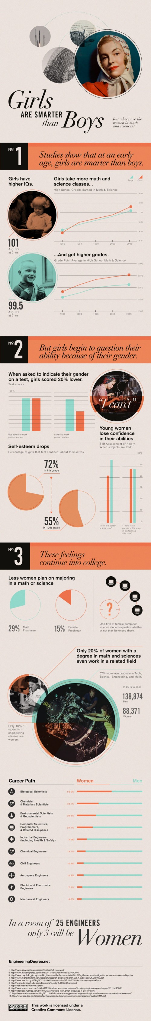
They make good use of the vertical layout by building in a vertical pagination. It’s a decent way to make a graphic web-friendly, narrative in structure, but with enough structure that it doesn’t suffer from the ‘infinite scroll’ phenomenon in which a person can get lost in a band of information lacking delineation of any kind.

The career path graphic in No. 3 is a great use of a hybrid table/graph display that does a good job of indicating how gender and major interact.

It works to compare the descriptive statistics about girls to the same statistics about boys. This graphic mostly includes girl/boy comparisons (see No. 1 and two-thirds of No. 3), but in some cases it only presents statistics about girls. For instance in No. 2 we see that girls don’t do as well on exams when they are asked to indicate their gender. Are boys the same? This particular piece of data needs more context before I would feel as though I properly understand the correlation. If girls do not mark their genders is it as if they have set gender aside for a moment and were able to take the test without remembering to ‘play dumb’? Or do they feel that they are trying as hard on either the gender-marked or the non-marked test but they do more poorly without deliberately playing dumb? Does everyone – male or female – feel more pressure the more their tests are associated with markers of identity like gender and therefore maybe all of us do worse the more we have to disclose about ourselves? Bottom line: the least they could have done was included the male comparison for all of the data points.

What needs work

I’m not a huge fan of the pictures. They imply that this is an old-fashioned problem, and I suppose it is a rather OLD problem, but it has significant contemporary impacts. I’m also not convinced that any images would have added to the information component so perhaps this is a case of ‘less is more’.

Some of the text is awfully small.

In general, I wish these vertical strips of individuated graphics could find a way to feel more like a single graphic and less like a curated collection of related data points.

Women in engineering majors

I’m including a snippet from the article that was accompanied by this graphic because the author was able to make a point that the graphic failed to depict which is that there are ways to make engineering education more welcoming to women. The strategies suggested here are so obvious that it’s hard to believe someone had to articulate them, but I think many people who have gone through undergraduate education know that advising is a rather haphazard affair.

More broadly, what the studies found was that “the climate of the department makes a really big difference about who’s attracted to the major, who chooses to stay in the major and eventually graduates,” St. Rose said. “The active recruitment of students is absolutely necessary. That’s a no-brainer but a lot of departments don’t do it, they just say, ‘Students will choose the majors they decide on,’ but inviting students to take an introductory course or to consider the major can really help.”

References

Hill, Catherine; Corbett, Christianne; St. Rose, Andresse. (2010) Why So Few?: Women in Science, Technology, Engineering, and Mathematics. [Report] American Association of University Women.

Epstein, Jennifer. (2010) Attracting Women to Stem Inside Higher Ed

What a man wanted, what a man wants | Boxer, Noonan and Whelan
What a man wanted, what a man wants | Boxer, Noonan, and Whelan
What Men and Women Want in a Mate, 1939-2008
What Men and Women Want in a Mate, 1939-2008 | Boxer, Noonan, and Whelan

Update on references

As you can see in the comments, Christie Boxer, the lead author of the journal article behind the Coontz Opinionator piece has contacted me to let us all know that the article is currently in revise and resubmit phase but will be published in Journal of Family Issues shortly.

What works

The graphic is more legible than the chart from which the data originated. I’m guessing the Journal of Family Issues would not allow such a “fancy” series of graphics in the final published piece so I don’t mean this as a critique of the article’s authors. Just pointing out that there is good reason for journals and other publishers to reconsider their policies about how data can most usefully be presented.
I happen to have created a few graphics in this style myself and tend to favor it over the chart (e.g. this one about agricultural subsidies) in the past and think they work well for displaying changes in attitudes over time.

What needs work

Illustrations to Accompany "The M.R.S. and the PhD" by Stephanie Coontz, New York Times

The article from which this news story is drawn clearly provides information on both what women want and what men want in greater detail than what’s seen here. Why did the news story choose to run with less than half the data?
The chart clearly contains information on what men want in a mate AS WELL AS what women want in a mate. I see no reason for going (less than) halfway on this story. In fact, what I find most interesting is the convergence on some things – nobody cares much about chastity in a mate any more – and divergence on other traits – women rank men’s desire for home and children much higher than men rates women’s desire for home and children. That’s a puzzler worthy of thought in a way that a story that reflects only what men want is…well…just not all that interesting. Pair bonding takes two, as I’m sure Coontz knows because she’s been researching marriage for years. It’s unclear if the Times pressured her to come up with a more attention grabbing headline “The M.R.S. and the PhD” or if she chose that on her own or if it was a combination of factors.

I’m glad to see that, at least as far as I can tell from what is available to scholars other than Coontz (who might have an early full-length, unreleased draft of the Boxer, Noonan, Whelan paper), the scholars whose data led to the graphic were not so singly concerned with what men want in a mate. They were looking at how mate selection characteristics have been adjusted over time for both men and women and I hope that their article looks at the consonance and dissonance between the two genders’ mate selection ideals.

I would have preferred more attention paid to the graphic – like, say, the inclusion of what women want or an integrated graphic that displayed the overlaps and distances between what men and women want – and less time put into the accompanying illustrations which I have included to the left. I welcome regular readers of Sociological Images (and others) to comment on the messages coming out of the illustrations.

References

Coontz, Stephanie. (2012) “The M. R. S. and the PhD”. The New York Times, Sunday Review, Opinionator. [Information graphic by Bill Marsh/The New York Times]

Boxer, Christie; Noonan, Mary; and Whelan, Christine. (forthcoming) “Measuring Mate Preferences: A Replication and Extension” Journal of Family Issues. [Table drawn from Christine Whelan’s research webpage]

Living Alone by Gender, Age Cohort in the US
Living Alone by Gender, Age Cohort in the US since 1850

What works

This post is an update to an earlier post about the increasing rate of Americans living alone. The first graph does an excellent job of visualizing the change in Americans’ tendencies to live alone, by age and gender. It’s clear that living alone is on the rise, especially for Americans over 45. It’s interesting that there seems to be a collective slow down in this trend in the decade between 35 and 45 when I suppose some of the late-to-marry people finally settle down and before the marital dissolution rate starts to fire up.

The graphics in this post accompanied an article by Eric Klinenberg in the New York Times Sunday Review that laid out the basic findings in his latest book, “Going Solo” that was based on 300 interviews with people living alone. He finds that while for some, living alone is an unwanted, unpleasant experience, most people who live alone are satisfied with their personal lives more often than not. In fact, they are more social, at least in some ways, than are their counter-parts who live with others. Singletons (his word, not mine. I prefer ‘solos’ in part because it’s an anagram), go to restaurants and other social spaces more often than do those who live with others.

Living alone in Minneapolis

In a number of cities, including Minneapolis, more than 40% of households are single-people households. The article included an interactive map down to the census tract level that shows what percentage of households in that tract were single-person households in 2010. I took a look at Minneapolis and St. Paul and found that the map supported Klinenberg’s qualitative findings. The highest concentration of solos is in the center city areas where opportunities to get out and be social in the community are the highest. The suburbs and rural areas have fewer solos.

I encourage others to use the map and see if their local cities replicate this pattern, that more solos live in ‘happening’ areas than in quieter areas. Of course, this could be caused by a third variable, the presence of households that are affordable for single-earner households…but there isn’t enough analytical power in the map tool to be able to sort out the dependencies.

What needs work

The information about who lives alone by age, marital status, and race that is displayed in the following long skinny stack of datapoints is the right kind of detailed information to use as an entrance into a deeper discussion about living alone, now that we’ve gotten a sense of the view from 30.000 feet. The problem is that this graphic is hard to read, too long for a single computer screen (but in order to make sense of it, one needs to see the whole thing at once), and too optimistic about what color differences are able to do than is reasonable.

The article does a better job of subtly navigating the movement from historical and international context into a detailed, robust analysis. By awkwardly pinning all the data points onto the stalk at once, viewers lose the ability to see patterns within data subsets. Here’s a test. Look at the following data and try to explain to yourself how race and living alone go together. Or how age and living alone go together. The graphic designer was hoping color would be able to do more than it has been able to accomplish here. The color is supposed to tunnel your vision down to a particular color-coded subset so that you can start to understand well just what it is about race or age or marital status that produces particular patterns in living alone. But I had a lot of trouble with the color frame because, quite literally, I had to keep shifting the frame around this graphic – it didn’t fit on my laptop screen. [Graphic designers often work on nice, roomy screens where they end up seeing more at once than their eventual audience who is probably peering at this thing from a web browser on a laptop or occupying half of a monitor somewhere.]

All the clustering around the mean is another problem that could have been avoided had the graphic been organized differently. As it is, all sorts of groups lump on top of one another down around 14%.

I also kind of hate that I can’t add categories together in any meaningful way here. I can tell that being a widow would put someone at high risk for living alone, but that’s kind of a no-brainer, isn’t it? I would have gotten more mileage out of visualizing the absolute numbers of people living alone by marital status, age, and race. Maybe over half of all widows live alone, but I haven’t the faintest idea how many widows there are in America so I don’t know if half of all widows is half a million people? Or 3 million people? Or whether it’s more or less than the 38% of separated people who are living alone. 19% of never married’s live alone, but because these people are likely to be young, maybe that is actually a larger absolute group than the 58% of widows living alone.

Final verdict: There was both a data fail and a graphic design fail.

Who lives alone?
Who lives alone? A demographic breakdown

References

Going Solo Cover
Going Solo Cover

Klinenberg, Eric. (2012) Going Solo: The Extraordinary Rise and Surprising Appeal of Living Alone. The Penguin Press HC.

Klinenberg, Eric. (2012) One’s a Crowd. New York Times Sunday Review.

Weber, Susan and Beveridge, Andrew. (2012) [infographics]
Solo in America graphic Line graph looking of the changing percentage of singleton households in America, 1850-2000
More on their own here…and even more abroad American and International singleton households.
Mapping the US Census: Percentage of Households with only one occupant Interactive graphic of US singleton households by census tract.