Uncategorized

Marijuana Arrests in New York City 1977 - 2006 (Harry G. Levine)

What Works

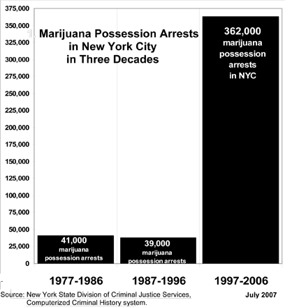
Sometimes simple is powerful. Everything here is well-labeled, the time periods move in even intervals and the source is cited. The point that arrests for marijuana possession have skyrocketed comes across almost instantly.

The graphic is taken from testimony given by Harry G. Levine, Professor of Sociology at Queens College and the CUNY-Grad Center to the New York State Assembly on Codes and Corrections:

“New York City has arrested about 100 mostly young people a day, every day, for the last ten years. By the end of today another 90 to 100 will be arrested. About 85% of the people arrested are Black or Latino, most are working class or poor, from the outer boroughs and from less affluent and poorer neighborhoods.”
Marijuana Arrests in New York 1987-2006 | Whites, Blacks, Hispanics

What Works

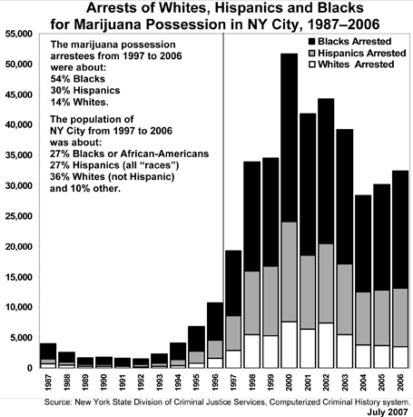
Levine includes this graphic in his testimony to demonstrate the uneven distribution of all these marijuana possession arrests across racial/ethnic boundaries. He is right to make sure to include a little decoder text about the distribution of whites, blacks, and hispanics as percentages of population of New York overall. Remember that in a world of equal arrest rates, whites would be arrested for possession roughly according to their percentage of the population, which is 36% in New York during the 1987-2006 period. But they were only accounted for 14% of the possession arrests. On the other hand, blacks should have been arrested 27% of the time but instead were arrested 54% of the time. Hispanics were the closest to even, representing 27% of the total population and 30% of the possession arrests.

What Needs Work

These stacked bar graphs always confuse people. So here we can use the y-axis to determine absolute number of arrests by racial/ethnic group but in other uses of this technique I’ve seen the bars all add to 100% and the viewer is supposed to suss out the relative proportion of the bar dedicated to the categorical break down. That clearly is not how this graph works, but still, where there is any chance of confusion, more work needs to be done to clear things up. I might have tried a hint of 3D, popping the white bar in front of the grey bar and the grey bar in front of the black bar just so that each bar reads as a distinct entity.

I would also have stuck the arrestee percentages directly next to the population percents. It would look more like:

Arrestees          Population
Blacks     54%     27%
Hispanics 30%     27%
Whites     14%     36%

Simple to do. Makes much more sense to read that data across rows. I would then have stuck the color shading key to the left of that little table and cut the “blacks arrested”, “whites arrested”, and “hispanics arrested” labels which would have cut down on the total amount of text the viewer would have to read through.

Go ahead and click through to the full report to see the other graphics and read the whole story about the astronomical increase in marijuana possession arrests in NYC with the disappointing follow-on that the arrests are being doled out in minority communities disproportionately more often than elsewhere in the city.

One parting quote to provoke you to jump across and read it all, in response to why there are so many arrests so unevenly distributed across the city’s population, “it is not because of any dramatic increase in marijuana use – which has not changed significantly since the early 1980s. Nor is the dramatic racial imbalance in the arrests the result of marijuana use patterns. In fact, marijuana use among Blacks and Hispanics is lower than for Whites, and has been for decades, as U.S. government statistics show. “

One More Thing

If you’re wondering where all the weed comes from, as I was, you might want to link through to the 2007 article “Home Grown” in The Economist via Proquest (subscription required) which notes in classically dry Economist fashion, “Marijuana is now by far California’s most valuable agricultural crop. Assuming, very optimistically, that the cops are finding every other plant, it is worth even more than the state’s famous wine industry.”

Relevant Resources

Becker, Howard. (1953) On Becoming a Marihuana User originally in American Journal of Sociology Vol. 59 November 1953 (235-242).

Dwyer, Jim. (30 April 2008) On Arrests, Demographics, and Marijuana The New York Times, NY/Region Section.

Levine, Harry G. (May 2007) Testimony before the New York State Assembly Committees on Codes and Assemblies.

Schlosser, Eric. (2003) Reefer Madness: Sex, Drugs and Cheap Labor in the American Black Market. First Mariner Books.

Home Grown: Cannabis in California (20 October 2007) in The Economist Vol. 385, Issue 8551 (60).

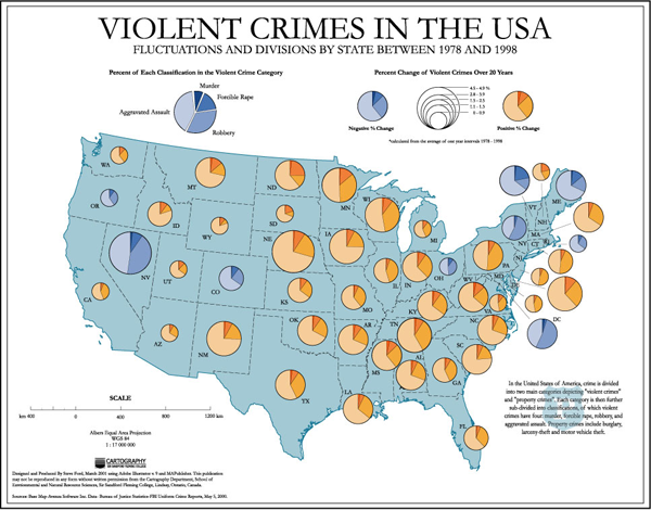
Violent Crimes in the USA | Change from 1978-1998

What Works

This map uses a two color pie chart scheme to represent increases and decreases in violent crime respectively. It also breaks the pie into pieces for added granularity of detail – one for murder, one for forcible rape, one for armed robbery, one for aggravated assault. (also known as mincemeat pie, right?)

What Needs Work

I still think there’s got to be a better way to represent gains and losses on a spectrum. Changing from one color pie to another at zero is a little arbitrary. Three dimensions might help – states with increases in crime could bulge while states with decreases could sink.

I included this graph not so much as a particularly good or bad example of building an info graphic but as a contrast to the previous post. This is a typical depiction of crime mapping. It depicts violent crime by victimization. Most crime coverage focuses on this salacious category – rapes and murders and beatings.

Relevant Resources

Ford, Steve. (2006) Map of Violent Crime in the USA 1978-1998

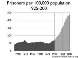
Prisoners of the Census - Prisoners per 100,000 (1925-2001)

Crime and Criminal Justice

The theme for this week, in case you haven’t figured it out by glancing at the graphics, is crime, deviance and justice in these here United States. I thought it would be a nice exercise to see what is available from official sources (ie government agencies). In the US, we’ve got the CIA, the FBI, the Bureau of Justice Statistics, and then lots of state and local agencies. I stuck with the feds here but the rest of the week will look at cities and states as the level of analysis. So far, none of the federal agencies has produced a graphic that tells a comprehensive story about incarceration, crime, and/or justice in the US. I couldn’t even find much about the immense expenditures dedicated to incarceration (in a handful of states, more is spent on criminal justice, including incarceration, than on education). There also were very few graphics dedicated to the differential impact of incarceration practices on poor and minority communities.

CIA

The CIA doesn’t do much with graphics, but this is what they had to say about the US and drugs: “world’s largest consumer of cocaine (shipped from Colombia through Mexico and the Caribbean), Colombian heroin, and Mexican heroin and marijuana; major consumer of ecstasy and Mexican methamphetamine; minor consumer of high-quality Southeast Asian heroin; illicit producer of cannabis, marijuana, depressants, stimulants, hallucinogens, and methamphetamine; money-laundering center”

I would love to see this on a map, especially if the map were able to show how much of our illicit habit, by weight, is made in America and how many people and plants in other countries are dying to stock our habits.

FBI

The FBI doesn’t do much with graphics either, but they had this factoid box:

FBI Crime Clock - 2007

This is an easy but illogical way to summarize data points. This style of arbitrary ratio style summary misses opportunities to provide context and compelling visuals. X crimes per unit of time seems a strange way to measure; going by victims or convicted criminals by 100,000 people or by percentage of the total population might make more sense. Furthermore, a good information graphic should begin to tell the story at first glance, before you have to read anything. One quick test: if someone who doesn’t speak the language can’t make heads or tails of the graphic, it just isn’t that good. Granted, language is often necessary to pin down the details, but the overall theme should be clear without resorting to text. There’s no way to tell this is about crime in America. Again, I’m always skeptical of these ratio summaries. It’s really hard to understand much about crime by recounting how often it happens. Then smaller populations are going to look safer because crime happens less often even though it might be just as common in terms of the percent of the population who ends up becoming a victim or a perpetrator.

Bureau of Justice Statistics

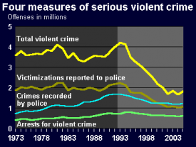
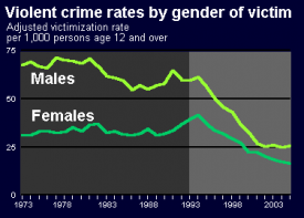
The Bureau of Justice Statistics had by far the most info graphics though, as you can see, they are all the same style. As for “What Works”, well, it works that they tried to map trends in crime over time graphically. What needs work? Besides the rather uninventive presentation – I think these line graphs are easily understood but so standard in appearance that they risk putting people to sleep – my biggest concern is that there is no overview graphic that tells the whole story. All of these graphs tell one tiny little part of the story and are designed to be read in isolation from all the other graphics. In that sense, they help viewers understand crime and punishment in America about as much as that FBI Crime Clock factoid box does. Information graphics are at their most deceiving when they appear to be depicting simple, straightforward relationships in absence of all the messy real life context that frames just about any problem on the ground.

Bureau of Justice Statistics - Four Measures of Serious Violent Crime (to 2006)
Bureau of Justice Statistics - Four Measures of Serious Violent Crime (to 2005)

Bureau of Justice Statistics - Violent Crime by Gender of Victim (to 2005)
Bureau of Justice Statistics - Violent Crime by Gender of Victim (to 2006)
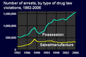
Bureau of Justice Statistics - Arrests by Type of Drug Law Violated (to 2006)

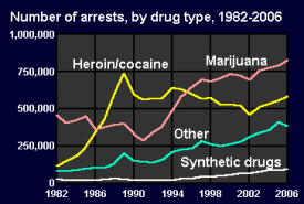
Bureau of Justice Statistics - Arrests by Type of Drug  (to 2006)
Bureau of Justice Statistics - Arrests by Type of Drug (to 2006)

Just to take one example, the graph showing victims by gender is on the brink of revealing one of the most interesting elements of the bursting incarceration system. Violent crimes are way down but the prisons are bursting indicating that more and more of the people in prison are serving time for property crimes. That’s why I included the arrest rates for drug crimes – the huge majority are for possession, most likely possession of marijuana. It bothers me that I have to throw in little graph after little graph to tell a partial story. I couldn’t even find a little graphic that shows that black folks are far more likely to be arrested for possession than white folks even though white folks are slightly more likely to use (marijuana) than black folks. Community policing gone wrong? Perhaps.

If you know of a graphic that attempts to tell the story of the three-strikes/broken windows policy impacts on incarceration practices all in one image, please send it in and I’ll amend this post and thank you profusely.

Relevant Resources

FBI Crime Clock

CIA World Fact Book – United States

Bureau of Justice Statistics – Key Facts at a Glance

State of the World's Fisheries and Aquaculture - UNEP GRID-Arendal

What Works

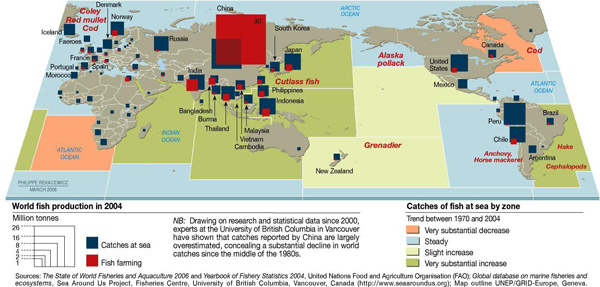
I couldn’t end the agriculture week without including a bit about the state of the oceans as a source of food. To be clear, agriculture is often related to farming the land and raising land-based livestock. Aquaculture is the term used to talk about fish farming. Catching fish out of the open water is not considered agriculture. I ought to have used the broader theme of food production.

I like this graphic because it’s got multiple levels of information – aquaculture vs. open water catches by volume, fish catch by country, and the status of the stocks by oceanic region. It can be difficult to figure out how to represent global level data when it isn’t possible to fall back on national boundaries. It’s a little odd to see the oceans chunked into squares, though.

What Needs Work

This graphic has a sort of not-quite-done look to it overall. The treatment of the aquaculture vs. open water catch could have been more elegantly integrated – superimposing the red and blue blocks on one another makes it look a little bit like the kids left their wooden blocks laying around on top of a map. I might have preferred pie charts with two pie pieces – one for the aquaculture bit and one for the open catch bit to communicate relative share. The size of the pies would be determined by absolute value of the total catch + aquaculture.

What I really would have liked to see would have been a more logical representation of the catch volume by oceanic region. The colors chosen don’t indicate much of anything, except perhaps the static areas which are just blue, standard ocean color. What would have been great would have been to indicate the relationship between areas that have decreased yields because they have been overfished and areas that are currently being overfished which will soon have decreased yields even though their current yields are high. This is complicated because the largest increase and the largest decrease are far more closely related to one another than they are to steady areas or areas with only a slight increase. It would be great if the ocean regions could be depicted by the replacement rate with an extra classification for areas that have been severely over-farmed to the point that the concept of replacement rate no longer has the same meaning.

Relevant Resources

United Nations Environment Programme – GRIDA (2009) State of the World’s Fisheries and Aquaculture

Public Service Announcement: The amount of mercury and arsenic found in predator fish is high enough that people who eat these fish recently can suffer the effects of heavy metal poisoning. To figure out what is safe to eat and what should be avoided, check out the Monterrey Aquarium, one of the best, if not *the* best source for guidelines about what to eat when what you’re eating lived in the water. They even have an iPhone app for easy reference at the grocery store and your favorite restaurants.

Monterrey Aquarium Seafood Watch

US Milk Production 1980 and 2003 by Region

What Works

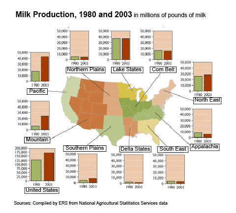
The first map was produced by the USDAs Economic Research Service in 2004 to show the change in milk production by US region from 1980 – 2003. The accompanying text is surprisingly brief, “Since 1980, milk production in the U.S. has increased almost 33 percent. Regional production growth has been most pronounced in the Pacific and Mountain regions, the result of development of low-cost systems of milk production in the Pacific region and some Mountain States. Growth has been much slower in the Northeast and Southern Plains, and the other six regions have seen essentially flat or declining production.”

The graphic is a fairly straightforward way to combine a map with a bar graph. I like it better than if it were just a bar graph with regional labels, but I would like it even more if it were better integrated so that the data from the graphs were embedded in the map, maybe by showing the change in production by color or by applying concavity/convexity to the map.

What Needs Work

There is a serious drawback to the map + graph combination. One of the problem with images is that they tend to appear as sealed, complete narratives that are telling the whole story. It’s hard to interrogate an image, harder than interrogating a text. We’re taught not to believe everything we read, but those strategies don’t translate directly into the world of images. The important missing information here is that the population in the US is shifting to the south and west out of the north east. The image doesn’t suggest causal links; but the text does. However, it leaves out the no-brainer that since milk is a localized commodity, population growth is generally going to result in increased milk production in that area.

US Population Change, 1970-2030

Bonus Image

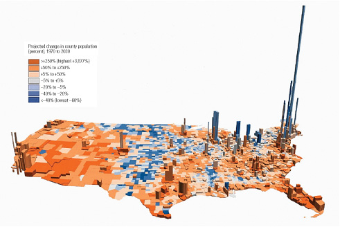
I found this image depicting population density and population change in the US. Cool colors indicate a loss of population; warm ones suggest growth. The z-axis represents human volume. A solid graphic. I have looked and looked and been unable to find the original source which just goes to show that once information hits the digital domain it really does have a life of its own. Hackers were right about that, information wants to be free.

Relevant Resources

Blayney, Donald. (2004) Milk production shifts West USDA Economic Research Center.

Dupuis, E. Melanie. (2002) Nature’s Perfect Food: How Milk Became America’s Drink. New York: NYU Press.

Mendelson, Anne. (2008) Milk: The Surprising Story of Milk Through the Ages. Knopf.

Wired magazine info porn - World Food Supply and Demand Diverge

What Works

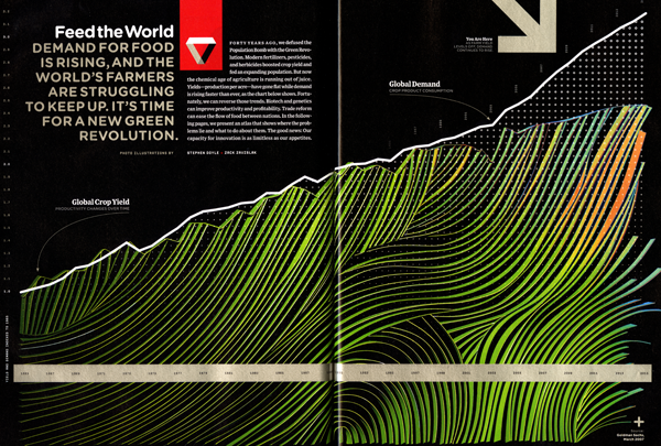
This is a simple concept, displayed beautifully. The demand for food will outstrip our current ability to produce it.

What Needs Work

Since the timeline is already marching along the x-axis I want to see some context. Tell me when Nobel Peace Prize winner Norman Borlaug revolutionized agriculture and increased yields by orders of magnitude. Show me how global population maps onto the demand for food. Tell me if I should be concerned about the growing Chinese and Indian middle classes who will probably demand more meat (and hence more land per kcalorie). This data is out there and adding it to this graphic would have elevated it from simply beautiful, to being both beautiful and smart.

Relevant Resources

Doyle, Stephen and Zavislak, Zack. (November 2008) “The Future of Food.” in Wired Magazine. 188-205 [So sorry, but I cannot find this article online. If you want to see more, let me know, because the food info porn went on for pages and I scanned them all. There was a centerfold on cows.]

Nobelprize.org Norman Borlaug Biography

Naim, Moises. (March/April 2008) Can the World Afford a Middle Class? in Foreign Policy.

Watts, Jonathan. (20 May 2008) More wealth, more meat. How China’s rise spells trouble in The Guardian.

Huge Flow of Waste - New York Times

What Works

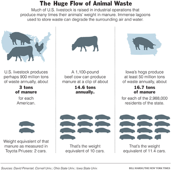
The clean color palette gives this graphic the aseptic look of ‘pure information’ while the inclusion of the numerical data (in tons of manure) backs up the intention of the graphical representation with checkable facts. I like the three different versions of the same concept; it increases my confidence in the basic point that raising livestock produces vast quantities of waste. It’s mostly a pigs and cows problem but it isn’t restricted to Iowa.

Measuring animal waste per capita is a brilliant way to remind readers that they play a role in this system. These animals are a special class of animals called livestock which means that they only exist to provide food for humans. Measuring waste per capita is a subtle, but incontrovertible way to remind us that all animal eaters are contributing to the pile-up of animal waste.

What Needs Work

The animal cut-outs overlaying the outline of the nation in the first panel and Iowa in the third panel seem like a first draft idea, not a final draft idea. The relative size of the animals seem to relate to their ability to fit within the outline behind them more than to relative proportions of waste.

I have no idea why animal waste should be related to the weight of a Prius. This is an unnecessary politicization of the data. There is no logical reason to measure animal waste in Priuses. I can only think of political reasons to do so. Tons is just fine. The Prius portion of this graphic could be lopped off and no information would be lost.

It makes sense to me to move sequentially through levels of analysis. In that case, I would have put Iowa in the middle so that our thoughts would move from largest level of analysis to smallest. This is especially true in this case where the Iowa level data and the national level data measure animal waste per capita while the cow’s waste is measured annually, not per capita. I would have translated the cow’s waste into per capita data, too, just to make the narrative of the graphic more cohesive.

Bittman writes, “Americans are downing close to 200 pounds of meat, poultry and fish per capita per year (dairy and eggs are separate, and hardly insignificant), an increase of 50 pounds per person from 50 years ago. We each consume something like 110 grams of protein a day, about twice the federal government’s recommended allowance; of that, about 75 grams come from animal protein. (The recommended level is itself considered by many dietary experts to be higher than it needs to be.) It’s likely that most of us would do just fine on around 30 grams of protein a day, virtually all of it from plant sources.” And that’s something I’d like to see represented in the graphic too – the fact that Americans don’t need meat to meet their nutritional needs. That isn’t to say we could easily do without meat – much of eating is cultural and from that perspective many Americans would be set adrift, at least from a culinary perspective, without meat.

Bonus: I would like to see more about the waste lagoons – something that talks about what happens to the waste over time would be incredibly useful because this graphic begs the “where does it all go?” question.

Relevant Resources

Bittman, Mark. (27 January 2008) Rethinking the Meat Guzzler in The New York Times, The World.

Flora, Jan; Chen, Qiaoli; Bastian, Stacy; Hartmann, Rick. (October 2007) Hog CAFOs: The Impact on Local Development and Water Quality in Iowa Report from the Iowa Policy Project.

The Design of Everyday Things by Donald Norman

Book Recommendation

Donald Norman’s “The Design of Everyday Things” is currently my commuting book which I’ve had ample opportunity to read because the F train here in NYC is the most capricious multi-ton object I’ve ever encountered. This is a good book if you want a straightforward introduction to basic design principles. Norman is an engineer by training which means he comes from a different tradition than, say, an architect. He goes through all sorts of examples of commonly encountered objects – keyboards, sinks, ovens, telephones – to help demonstrate that good design would benefit from prototyping and user-testing because, in the end, humans are fairly adept at taking clues about how to use an object from their first glance. When things aren’t obvious, it’s the fault of the design, not the fault of the person who has trouble figuring out how to put someone on hold or transfer a call with a phone system that can likely ONLY be used by a robot or an algorithm. He opposes beautiful design for the sake of beauty – glass doors stripped of plates and hand bars in service to the sleek glossiness of glass’s amazing material properties are no good if people end up pushing on the hinged side of the door when they should be pulling on its swinging side.

Norman offers users a set of criteria by which everyday design can be critiqued as well as some rules of thumb for figuring out particularly obtuse design challenges. He absolves humans their occasional mechanical buffoonery, “Humans, I discovered, do not always behave clumsily. Humans do not always err. But they do when the things they use are badly conceived and designed.” Norman doesn’t go so far as to suggest that the objects themselves possess agency, it’s not the fault of the things, but of the people who designed them, “When you have trouble with things…it’s not your fault. Don’t blame yourself; blame the designer. It’s the fault of the technology, or more precisely, of the design.” This part of his theory is the weakest. It’s rather simplistic to blame the designers without interrogating why they produce shoddy designs. He hints that designing for the sake of beauty is part of the problem and that user testing happens in the market place where negative reactions are likely to kill the product line altogether rather than resulting in intelligent, sensitive redesign. Luckily, other books (Harvey Molotch’s “Where Stuff Comes From” for example) do a better job of revealing the motivations and constraints on designers.

Where Norman is at his best is in the many detailed examples of everyday objects gone screwy with clear, diagramatic prescriptions for improvement. Norman never rants about bad design just to sharpen his teeth. His examples are accompanied by constructive suggestions that are so clearly spelled out that readers are capable of critiquing his suggestions, a sure sign that the book succeeds as a teaching tool. Furthermore, Norman illustrates his discussion with photos, sketches and diagrams throughout which enriches the legibility of the project and subtly introduces readers to the practice of learning through drawing that is common in design practice, but not all that common outside of it.

Relevant Resources

Norman, Donald A. (1998) “The Design of Everday Things” Cambridge, MA: MIT Press.

Molotch, Harvey. (2003) Where Stuff Comes From: How Toasters, Toilets, Cars, Computers and Many Other Things Come to Be As They Are. New York: Routledge.

Where Stuff Comes From - Harvey Molotch
Example of a wordle
Example of a wordle

What Works

Wordles are generated by inserting a block of text into an algorithm that filters out typically common words like ‘the’ and ‘they’ and then picks out frequently used but relatively uncommon words like ‘Mexico’ and ‘resistance’. These images get used occasionally in academia on websites where people want to use images to represent something like a talk or paper where they don’t actually have images that go with that talk or paper, but they do have an abstract, transcript, or full text of the talk or paper. In the sense, that a wordle is a relevant image to stick in the hole reserved for images. In another sense, I encourage you to go out and find public use images that are available, relevant to the talk/paper, and intellectually provocative rather than creating a Wordle.

What Needs Work

Wordles appear to tell you something you didn’t know by revealing patterns. In fact, Wordles are bizarre artifacts that sit somewhere between images and text. As images, they are fairly ugly agglomerations. As text, they don’t make much sense. In fact, I think Wordles are excellent when referred to as icons of the dystopic side of instantly available, decontextualized factoids that anchor the downside of the internet era. With but a click a block of carefully crafted (well, maybe it was carefully crafted) writing is blown apart and reconstructed as a brightly colored lettered blob that is somehow supposed to indicate the essential components of the piece of writing. A bit insulting to the person who wrote the text, if nothing else. A good abstract or even list of works cited says more than a Wordle in a clearer fashion.

Relevant Resources

Jonathan Feinberg of IBM Research created the Wordle Generator.

key

Web Map of thesocietypages.org

What Works

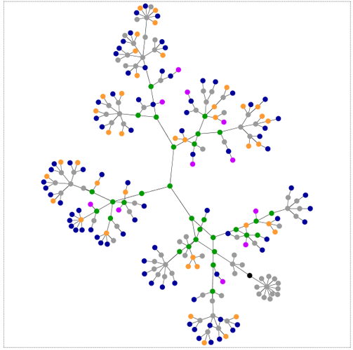
This is a map of a website.

Let’s reflect on that seemingly straightforward sentence for a moment. This is a map of something that does not exist in space. Baudrillard comes to mind here – “Abstraction today is no longer that of the map, the double, the mirror or the concept. Simulation is no longer that of a territory, a referential being or a substance. It is the generation by models of a real without origin or reality: a hyperreal. (from Simulacra and Simulations, Baudrillard)” I’ll let you decide whether or not you want to accept the notion that there is such a thing as the hyperreal without any further digression down that rabbit hole.

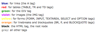
The visual elegance here cannot be overstated. It’s a simple non-cartesian network map with absolutely no frills, labels, anything besides a hint of color. As a graphic, what works here is that, if you happen to have a basic understanding of how websites are built, you can quickly see what kind of site you’re looking at. Lots of blue means lots of links, lots of green means the designer is using a lot of css, lots of red (tables) is kind of old-school (not in a good way), and so on. But it does require some knowledge of how websites are put together to decode this representation. That being said, it’s a brilliant way to reveal the skeleton supporting the visual skin of the websites you visit. See the links at the bottom to be taken to the applet that will allow you to map out the structure of any site you like.

Though this may not at first glance appear to have anything to do with my post earlier this week about John Snow, both Snow and the Aharef web-map generator represent tools for the examination of patterns. Pattern recognition is an undersung analytic tool in the social sciences.

What Needs Work

I wouldn’t mind a little more color in order to break out the grey “other” category a little more. I would also love a color that indicated use of javascripting and flash, but I understand that would be a different technical hurdle altogether. If this kind of map could be combined with page traffic information, we’d really have an amazing graphic. Just imagine that the traffic following each link could be mapped, say by making the node larger or smaller based on flow (or we could stick with the color thing, and lighter hues would indicate less traffic while darker ones indicate more traffic). It would also be nice to get some meaning related to the length between nodes. Right now that distance seems fairly arbitrary, constrained by the size of the viewing window.

Relevant Links

Generate your own webmap for any site

Original post about this applet tool by it’s creator Aharef on Aharef

Baudrillard, Jean. (1998) Simulacra and Simulations from Jean Baudrillard, Selected Writings, ed. Mark Poster.