
What Works
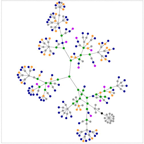
This is a map of a website.
Let’s reflect on that seemingly straightforward sentence for a moment. This is a map of something that does not exist in space. Baudrillard comes to mind here – “Abstraction today is no longer that of the map, the double, the mirror or the concept. Simulation is no longer that of a territory, a referential being or a substance. It is the generation by models of a real without origin or reality: a hyperreal. (from Simulacra and Simulations, Baudrillard)” I’ll let you decide whether or not you want to accept the notion that there is such a thing as the hyperreal without any further digression down that rabbit hole.
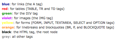
The visual elegance here cannot be overstated. It’s a simple non-cartesian network map with absolutely no frills, labels, anything besides a hint of color. As a graphic, what works here is that, if you happen to have a basic understanding of how websites are built, you can quickly see what kind of site you’re looking at. Lots of blue means lots of links, lots of green means the designer is using a lot of css, lots of red (tables) is kind of old-school (not in a good way), and so on. But it does require some knowledge of how websites are put together to decode this representation. That being said, it’s a brilliant way to reveal the skeleton supporting the visual skin of the websites you visit. See the links at the bottom to be taken to the applet that will allow you to map out the structure of any site you like.
Though this may not at first glance appear to have anything to do with my post earlier this week about John Snow, both Snow and the Aharef web-map generator represent tools for the examination of patterns. Pattern recognition is an undersung analytic tool in the social sciences.
What Needs Work
I wouldn’t mind a little more color in order to break out the grey “other” category a little more. I would also love a color that indicated use of javascripting and flash, but I understand that would be a different technical hurdle altogether. If this kind of map could be combined with page traffic information, we’d really have an amazing graphic. Just imagine that the traffic following each link could be mapped, say by making the node larger or smaller based on flow (or we could stick with the color thing, and lighter hues would indicate less traffic while darker ones indicate more traffic). It would also be nice to get some meaning related to the length between nodes. Right now that distance seems fairly arbitrary, constrained by the size of the viewing window.
Relevant Links
Generate your own webmap for any site
Original post about this applet tool by it’s creator Aharef on Aharef
Baudrillard, Jean. (1998) Simulacra and Simulations from Jean Baudrillard, Selected Writings, ed. Mark Poster.

Comments 1
Graphic Sociology » Mapping the Internet - Network Structure — February 25, 2009
[...] [There is another post on Graphic Sociology about mapping the internet about visualizing the map of an individual site which is here.] [...]