What Works
I couldn’t end the agriculture week without including a bit about the state of the oceans as a source of food. To be clear, agriculture is often related to farming the land and raising land-based livestock. Aquaculture is the term used to talk about fish farming. Catching fish out of the open water is not considered agriculture. I ought to have used the broader theme of food production.
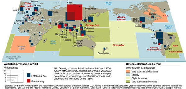
I like this graphic because it’s got multiple levels of information – aquaculture vs. open water catches by volume, fish catch by country, and the status of the stocks by oceanic region. It can be difficult to figure out how to represent global level data when it isn’t possible to fall back on national boundaries. It’s a little odd to see the oceans chunked into squares, though.
What Needs Work
This graphic has a sort of not-quite-done look to it overall. The treatment of the aquaculture vs. open water catch could have been more elegantly integrated – superimposing the red and blue blocks on one another makes it look a little bit like the kids left their wooden blocks laying around on top of a map. I might have preferred pie charts with two pie pieces – one for the aquaculture bit and one for the open catch bit to communicate relative share. The size of the pies would be determined by absolute value of the total catch + aquaculture.
What I really would have liked to see would have been a more logical representation of the catch volume by oceanic region. The colors chosen don’t indicate much of anything, except perhaps the static areas which are just blue, standard ocean color. What would have been great would have been to indicate the relationship between areas that have decreased yields because they have been overfished and areas that are currently being overfished which will soon have decreased yields even though their current yields are high. This is complicated because the largest increase and the largest decrease are far more closely related to one another than they are to steady areas or areas with only a slight increase. It would be great if the ocean regions could be depicted by the replacement rate with an extra classification for areas that have been severely over-farmed to the point that the concept of replacement rate no longer has the same meaning.
Relevant Resources
United Nations Environment Programme – GRIDA (2009) State of the World’s Fisheries and Aquaculture
Public Service Announcement: The amount of mercury and arsenic found in predator fish is high enough that people who eat these fish recently can suffer the effects of heavy metal poisoning. To figure out what is safe to eat and what should be avoided, check out the Monterrey Aquarium, one of the best, if not *the* best source for guidelines about what to eat when what you’re eating lived in the water. They even have an iPhone app for easy reference at the grocery store and your favorite restaurants.

Comments 2
Food Colonialism | The Global Sociology Blog — February 14, 2009
[...] case is especially crucial when one looks at the state of the world’s fisheries (via Graphic Sociology). [...]
chuk — February 16, 2009
The map needs info on the projected amounts of fish actually in the sea. When I first glanced at it, and scanned its legend, I thought it was telling me that stocks were actually increasing in the West Pacific, and Indian Oceans.
It tells us that lots of fish are being fished, but it doesn't adequately express what I think the authors hope to communicate: the threat of overfishing.